Android Customization: How to Build a UI Component That Does What You Want
It is not uncommon for developers to find themselves in need of a UI component that is either not provided by the platform they are targeting or is, indeed, provided, but lacks a certain property or behavior. The answer to both scenarios is a custom UI component. The Android UI model is inherently customizable, offering the means to create custom UI components in various ways.

It is not uncommon for developers to find themselves in need of a UI component that is either not provided by the platform they are targeting or is, indeed, provided, but lacks a certain property or behavior. The answer to both scenarios is a custom UI component. The Android UI model is inherently customizable, offering the means to create custom UI components in various ways.

Ahmed is an Android expert with a passion for intuitive user experience and snappy app performance.
Expertise
It is not uncommon for developers to find themselves in need of a UI component that is either not provided by the platform they are targeting or is, indeed, provided, but lacks a certain property or behavior. The answer to both scenarios is a custom UI component.
The Android UI model is inherently customizable, offering the means of Android customization, testing, and the ability to create custom UI components in various ways:
-
Inherit an existing component (i.e.
TextView,ImageView, etc.), and add/override needed functionality. For example, aCircleImageViewthat inheritsImageView, overriding theonDraw()function to restrict the displayed image to a circle, and adding aloadFromFile()function to load an image from external memory. -
Create a compound component out of several components. This approach usually takes advantage of Layouts to control how the components are arranged on the screen. For example, a
LabeledEditTextthat inheritsLinearLayoutwith horizontal orientation, and contains both aTextViewacting as a label and anEditTextacting as a text entry field.This approach could also make use of the previous one, i.e., the internal components could be native or custom.
-
The most versatile and most complex approach is to create a self drawn component. In this case, the component would inherit the generic
Viewclass and override functions likeonMeasure()to determine its layout,onDraw()to display its contents, etc. Components created this way usually depend heavily on Android’s 2D drawing API.
Android Customization Case Study: The CalendarView
Android provides a native CalendarView component. It performs well and provides the minimum functionality expected from any calendar component, displaying a full month and highlighting the current day. Some might say it looks good as well, but only if you are going for a native look, and have no interest in customizing how it looks whatsoever.
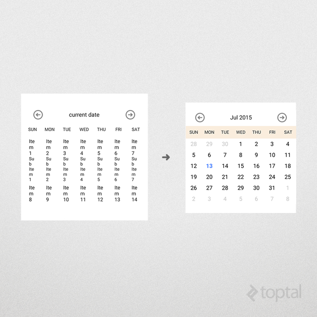
For instance, the CalendarView component provides no way of changing how a certain day is marked, or what background color to use. There is also no way of adding any custom text or graphics, to mark a special occasion, for example. In short, the component looks like this, and almost nothing can be changed:
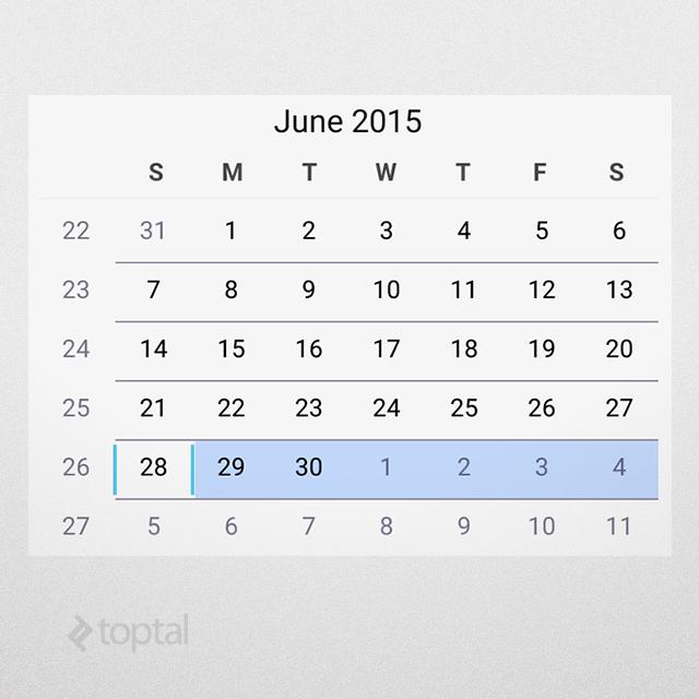
CalendarView in AppCompact.Light theme.
Make Your Own
So, how does one go about creating one’s own calendar view? Any of the approaches above would work. However, practicality will usually rule out the third option (2D graphics) and leave us with the two other methods, and we will employ a mixture of both in this article.
To follow along, you can find the source code here.
1. The Component Layout
First, let’s start with how the component looks. To keep thing simple, let’s display days in a grid, and, at the top, the name of the month along with “next month” and “previous month” buttons.
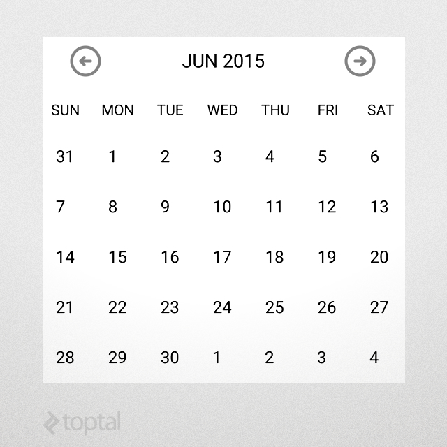
This layout is defined in the file control_calendar.xml, as follows. Note that some repetitive markup has been abbreviated with ...:
<?xml version="1.0" encoding="utf-8"?>
<LinearLayout
   xmlns:android="http://schemas.android.com/apk/res/android"
   android:orientation="vertical"
   android:layout_width="match_parent"
   android:layout_height="match_parent"
   android:background="@android:color/white">

   <!-- date toolbar -->
   <RelativeLayout
      android:layout_width="match_parent"
      android:layout_height="wrap_content"
      android:paddingTop="12dp"
      android:paddingBottom="12dp"
      android:paddingLeft="30dp"
      android:paddingRight="30dp">

      <!-- prev button -->
      <ImageView
         android:id="@+id/calendar_prev_button"
         android:layout_width="30dp"
         android:layout_height="30dp"
         android:layout_centerVertical="true"
         android:layout_alignParentLeft="true"
         android:src="@drawable/previous_icon"/>

      <!-- date title -->
      <TextView
         android:id="@+id/calendar_date_display"
         android:layout_width="wrap_content"
         android:layout_height="wrap_content"
         android:layout_centerVertical="true"
         android:layout_toRightOf="@+id/calendar_prev_button"
         android:layout_toLeftOf="@+id/calendar_next_button"
         android:gravity="center"
         android:textAppearance="@android:style/TextAppearance.Medium"
         android:textColor="#222222"
         android:text="current date"/>

      <!-- next button -->
      <ImageView
         android:id="@+id/calendar_next_button"
         ... Same layout as prev button.
         android:src="@drawable/next_icon"/>
   </RelativeLayout>

   <!-- days header -->
   <LinearLayout
      android:id="@+id/calendar_header"
      android:layout_width="match_parent"
      android:layout_height="40dp"
      android:gravity="center_vertical"
      android:orientation="horizontal">

      <TextView
         android:layout_width="0dp"
         android:layout_height="wrap_content"
         android:layout_weight="1"
         android:gravity="center_horizontal"
         android:textColor="#222222"
         android:text="SUN"/>

      ... Repeat for MON - SAT.
   </LinearLayout>

   <!-- days view -->
   <GridView
      android:id="@+id/calendar_grid"
      android:layout_width="match_parent"
      android:layout_height="340dp"
      android:numColumns="7"/>
</LinearLayout>
2. The Component Class
The previous layout can be included as-is in an Activity or a Fragment and it will work fine. But encapsulating it as a standalone UI component will prevent code repetition and allow for a modular design, where each module handles one responsibility.
Our UI component will be a LinearLayout, to match the root of the XML layout file. Note that only the important parts are shown from the code. The implementation of the component resides in CalendarView.java:
public class CalendarView extends LinearLayout
{
   // internal components
   private LinearLayout header;
   private ImageView btnPrev;
   private ImageView btnNext;
   private TextView txtDate;
   private GridView grid;

   public CalendarView(Context context)
   {
      super(context);
      initControl(context);
   }

   /**
    * Load component XML layout
    */
   private void initControl(Context context)
   {
      LayoutInflater inflater = (LayoutInflater)
         context.getSystemService(Context.LAYOUT_INFLATER_SERVICE);

      inflater.inflate(R.layout.control_calendar, this);

      // layout is inflated, assign local variables to components
      header = (LinearLayout)findViewById(R.id.calendar_header);
      btnPrev = (ImageView)findViewById(R.id.calendar_prev_button);
      btnNext = (ImageView)findViewById(R.id.calendar_next_button);
      txtDate = (TextView)findViewById(R.id.calendar_date_display);
      grid = (GridView)findViewById(R.id.calendar_grid);
   }
}
The code is pretty straightforward. Upon creation, the component inflates the XML layout, and when that is done, it assigns the internal controls to local variables for easier access later on.
3. Some Logic is Needed
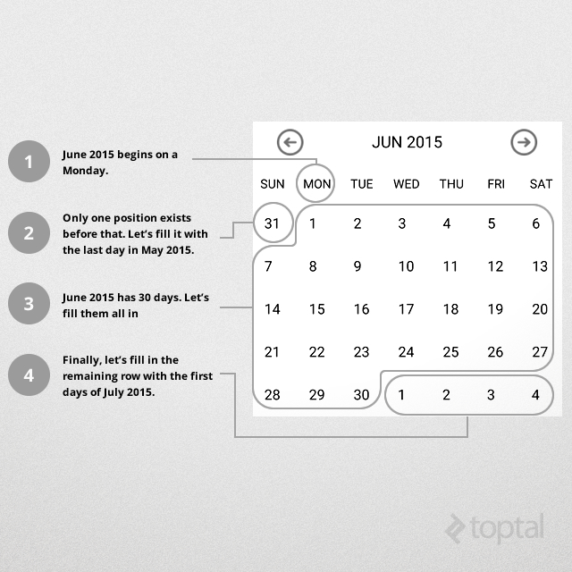
To make this component actually behave as a calendar view, some business logic is in order. It might seem complicated at first, but there is really not much to it. Let’s break it down:
-
The calendar view is seven days wide, and it is guaranteed that all months will start somewhere in the first row.
-
First, we need to figure out what position the month starts at, then fill all the positions before that with the numbers from the previous month (30, 29, 28.. etc.) until we reach position 0.
-
Then, we fill out the days for the current month (1, 2, 3… etc).
-
After that come the days for the next month (again, 1, 2, 3.. etc), but this time we only fill the remaining positions in the last row(s) of the grid.
The following diagram illustrates those steps:
The width of the grid is already specified to be seven cells, denoting a weekly calendar, but how about the height? The largest size for the grid be can be determined by the worst case scenario of a 31-days month starting on a Saturday, which is the last cell in the first row, and will need 5 more rows to display in full. So, setting the calendar to display six rows (totalling 42 days) will be sufficient to handle all cases.
But not all months have 31 days! We can avoid complications arising from that by using Android’s built-in date functionality, avoiding the need to figure out the number of days ourselves.
As mentioned before, the date functionalities provided by the Calendar class make the implementation pretty straightforward. In our component, the updateCalendar() function implements this logic:
private void updateCalendar()
{
   ArrayList<Date> cells = new ArrayList<>();
   Calendar calendar = (Calendar)currentDate.clone();

   // determine the cell for current month's beginning
   calendar.set(Calendar.DAY_OF_MONTH, 1);
   int monthBeginningCell = calendar.get(Calendar.DAY_OF_WEEK) - 1;

   // move calendar backwards to the beginning of the week
   calendar.add(Calendar.DAY_OF_MONTH, -monthBeginningCell);

   // fill cells (42 days calendar as per our business logic)
   while (cells.size() < DAYS_COUNT)
   {
      cells.add(calendar.getTime());
      calendar.add(Calendar.DAY_OF_MONTH, 1);
   }

   // update grid
   ((CalendarAdapter)grid.getAdapter()).updateData(cells);

   // update title
   SimpleDateFormat sdf = new SimpleDateFormat("MMM yyyy");
   txtDate.setText(sdf.format(currentDate.getTime()));
}
4. Customizable at Heart
Since the component responsible for displaying individual days is a GridView, a good place to customize how days are displayed is the Adapter, since it is responsible for holding the data and inflating views for individual grid cells.
For this example, we will require the following from our CalendearView:
- Present day should be in bold blue text.
- Days outside current month should be greyed out.
- Days with an event should display a special icon.
- The calendar header should change colors depending on season (Summer, Fall, Winter, Spring).
The first three requirements are simple to achieve by changing text attributes and background resources. Let’s us implement a CalendarAdapter to carry out this task. It is simple enough that it can be a member class in CalendarView. By overriding the getView() function, we can achieve the above requirements:
@Override
public View getView(int position, View view, ViewGroup parent)
{
   // day in question
   Date date = getItem(position);

   // today
   Date today = new Date();

   // inflate item if it does not exist yet
   if (view == null)
      view = inflater.inflate(R.layout.control_calendar_day, parent, false);

   // if this day has an event, specify event image
   view.setBackgroundResource(eventDays.contains(date)) ?
      R.drawable.reminder : 0);

   // clear styling
   view.setTypeface(null, Typeface.NORMAL);
   view.setTextColor(Color.BLACK);

   if (date.getMonth() != today.getMonth() ||
      date.getYear() != today.getYear())
   {
      // if this day is outside current month, grey it out
      view.setTextColor(getResources().getColor(R.color.greyed_out));
   }
   else if (date.getDate() == today.getDate())
   {
      // if it is today, set it to blue/bold
      view.setTypeface(null, Typeface.BOLD);
      view.setTextColor(getResources().getColor(R.color.today));
   }

   // set text
   view.setText(String.valueOf(date.getDate()));

   return view;
}
The final design requirement takes a bit more work. First, let’s add the colors for the four seasons in /res/values/colors.xml:
<color name="summer">#44eebd82</color>
<color name="fall">#44d8d27e</color>
<color name="winter">#44a1c1da</color>
<color name="spring">#448da64b</color>
Then, let’s use an array to define the season for each month (assuming northern-hemisphere, for simplicity; sorry Australia!). In CalendarView we add the following member variables:
// seasons' rainbow
int[] rainbow = new int[] {
      R.color.summer,
      R.color.fall,
      R.color.winter,
      R.color.spring
};

int[] monthSeason = new int[] {2, 2, 3, 3, 3, 0, 0, 0, 1, 1, 1, 2};
This way, selecting an appropriate color is done by selecting the appropriate season (monthSeason[currentMonth]) and then picking the corresponding color (rainbow[monthSeason[currentMonth]), this is added to updateCalendar() to make sure the appropriate color is selected whenever the calendar is changed.
// set header color according to current season
int month = currentDate.get(Calendar.MONTH);
int season = monthSeason[month];
int color = rainbow[season];

header.setBackgroundColor(getResources().getColor(color));
With that, we get the following result:
Important Note due to the way HashSet compares objects, the above check eventDays.contains(date) in updateCalendar() will not yield true for date objects unless they are exactly identical. It does not perform any special checks for the Date data type. To work around this, this check is replaced by the following code:
for (Date eventDate : eventDays)
{
   if (eventDate.getDate() == date.getDate() &&
         eventDate.getMonth() == date.getMonth() &&
         eventDate.getYear() == date.getYear())
   {
      // mark this day for event
      view.setBackgroundResource(R.drawable.reminder);
      break;
   }
}
5. It Looks Ugly in Design Time
Android’s choice for placeholders in design-time can be questionable. Fortunately, Android actually instantiates our component in order to render it in the UI designer, and we can exploit this by calling updateCalendar() in the component constructor. This way the component will actually make sense in design time.
If initializing the component calls for lots of processing or loads lots of data, it can affect the performance of the IDE. In this case, Android provides a nifty function called isInEditMode() that can be used to limit the amount of data used when the component is actually instantiated in the UI designer. For example, if there are lots of events to be loaded into the CalendarView, we can use isInEditMode() inside the updateCalendar() function to provide an empty/limited event list in design mode, and load the real one otherwise.
6. Invoking the Component
The component can be included in XML layout files (a sample usage can be found in activity_main.xml):
<samples.aalamir.customcalendar.CalendarView
   android:id="@+id/calendar_view"
   android:layout_width="match_parent"
   android:layout_height="wrap_content"/>
And retrieved to be interacted with once the layout is loaded:
HashSet<Date> events = new HashSet<>();
events.add(new Date());

CalendarView cv = ((CalendarView)findViewById(R.id.calendar_view));
cv.updateCalendar(events);
The above code creates a HashSet of events, adds the current day to it, then passes it to CalendarView. As a result, the CalendarView will display the current day in bold blue and also put the event marker on it:
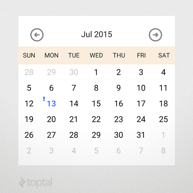
CalendarView displaying an event
7. Adding Attributes
Another facility provided by Android is to assign attributes to a custom component. This allows Android developers using the component to select settings via the layout XML and see the result immediately in the UI designer, as opposed to having to wait and see how the CalendarView looks like in runtime. Let’s add the ability to change the date format display in the component, for example to spell out the full name of the month instead of the three-letter abbreviation.
To do this, the following steps are needed:
- Declare the attribute. Let’s call it
dateFormatand give itstringdata type. Add it to/res/values/attrs.xml:
<resources>
   <declare-styleable name="CalendarDateElement">
      <attr name="dateFormat" format="string"/>
   </declare-styleable>
</resources>
- Use the attribute in the layout that is using the component, and give it the value
"MMMM yyyy":
<samples.aalamir.customcalendar.CalendarView
   xmlns:calendarNS="http://schemas.android.com/apk/res/samples.aalamir.customcalendar"
   android:id="@+id/calendar_view"
   android:layout_width="match_parent"
   android:layout_height="wrap_content"
   calendarNS:dateFormat="MMMM yyyy"/>
- Finally, have the component make use of the attribute value:
TypedArray ta = getContext().obtainStyledAttributes(attrs, R.styleable.CalendarView);

dateFormat = ta.getString(R.styleable.CalendarView_dateFormat);
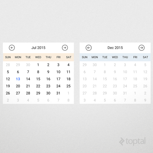
] Build the project and you will notice the displayed date changes in the UI designer to use the full name of the month, like “July 2015”. Try providing different values and see what happens.
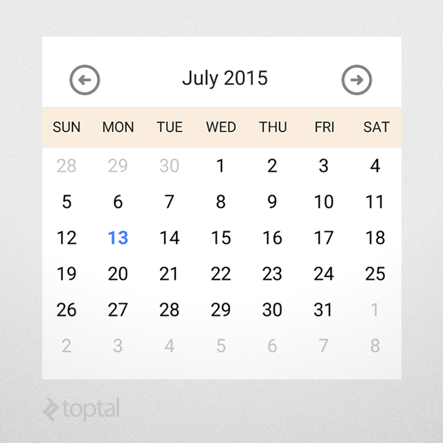
CalendarView attributes.
8. Interacting With the Component
Have you tried pressing on a specific day? The inner UI elements in our component still behave in their normal expected way and will fire events in response to user actions. So, how do we handle those events?
The answer involves two parts:
- Capture events inside the component, and
- Report events to the component’s parent (could be a
Fragment, anActivityor even another component).
The first part is pretty straightforward. For example, to handle long-pressing grid items, we assign a corresponding listener in our component class:
// long-pressing a day
grid.setOnItemLongClickListener(new AdapterView.OnItemLongClickListener()
{

   @Override
   public boolean onItemLongClick(AdapterView<?> view, View cell, int position, long id)
   {
      // handle long-press
      if (eventHandler == null)
      return false;

      Date date = view.getItemAtPosition(position);
      eventHandler.onDayLongPress(date);

      return true;
   }
});
There are several methods for reporting events. A direct and simple one is to copy the way Android does it: it provides an interface to the component’s events that is implemented by the component’s parent (eventHandler in the above code snippet).
The interface’s functions can be passed any data that is relevant to the application. In our case, the interface needs to expose one event handler, which is passed the date for the pressed day. The following interface is defined in CalendarView:
public interface EventHandler
{
   void onDayLongPress(Date date);
}
The implementation provided by the parent can be supplied to the calendar view via a setEventHandler(). Here is sample usage from `MainActivity.java’:
@Override
protected void onCreate(Bundle savedInstanceState)
{
   super.onCreate(savedInstanceState);
   setContentView(R.layout.activity_main);

   HashSet<Date> events = new HashSet<>();
   events.add(new Date());

   CalendarView cv = ((CalendarView)findViewById(R.id.calendar_view));
   cv.updateCalendar(events);

   // assign event handler
   cv.setEventHandler(new CalendarView.EventHandler()
   {
      @Override
      public void onDayLongPress(Date date)
      {
         // show returned day
         DateFormat df = SimpleDateFormat.getDateInstance();
         Toast.makeText(MainActivity.this, df.format(date),  LENGTH_SHORT).show();
      }
   });
}
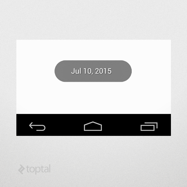
Long-pressing a day will fire a long-press event that is captured and handled by the GridView and reported by calling onDayLongPress() in the provided implementation, which, in turn, will show the date of the pressed day on the screen:
Another, more advanced way to handle this is by using Android’s Intents and BroadcastReceivers. This is particularly helpful when several components need to be notified of the calendar’s event. For example, if pressing a day in the calendar requires a text to be displayed in an Activity and a file to be downloaded by a background Service.
Using the previous approach will require the Activity to provide an EventHandler to the component, handling the event and then passing it to the Service. Instead, having the component broadcast an Intent and both the Activity and Service accepting it via their own BroadcastReceivers not only makes life easier but also helps decouple the Activity and the Service in question.
Conclusion
So, this is how you create your own custom component in a few simple steps:
- Create the XML layout and style it to suit your needs.
- Derive your component class from the appropriate parent component, according to your XML layout.
- Add your component’s business logic.
- Use attributes to enable users to modify the component’s behavior.
- To make it easier to use the component in the UI designer, use Android’s
isInEditMode()function.
In this article, we created a calendar view as an example, mainly because the stock calendar view is, in many ways, lacking. But, you are in no way limited as to what kind of components you can create. You can use the same technique to create anything you need, the sky is the limit!
Thank you for reading this guide, I wish you the best of luck in your coding endeavors!
Further Reading on the Toptal Blog:
Melbourne, Victoria, Australia
Member since June 11, 2014
About the author
Ahmed is an Android expert with a passion for intuitive user experience and snappy app performance.