Looking at Ro-Lu: A Usability Case Study
How do designers balance a website’s originality with its user-friendliness? Do they retreat to the safety of what is acceptable and risk the design falling flat, or implement a risky but unique design?

How do designers balance a website’s originality with its user-friendliness? Do they retreat to the safety of what is acceptable and risk the design falling flat, or implement a risky but unique design?

Darko is a UX/UI designer and founder. He takes ideas and transforms them into smart, well-designed, intuitive products.
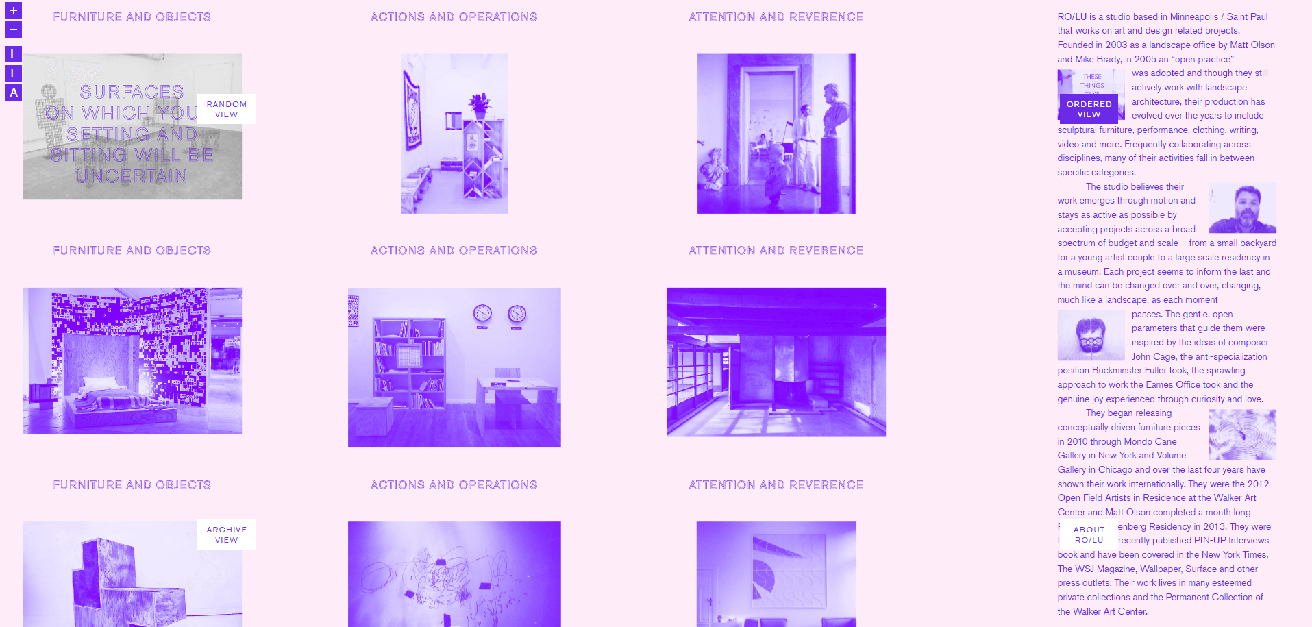
Ro-Lu is a furniture, landscape, and environmental design studio that also works on art and other design-related projects. The studio identifies with having an open, exploratory practice and has ventured into many other disciplines. It is assumed that when the site was conceived, the intention of the design was to reflect their style and ideology.
What follows is a dialogue between Toptal designers Darko Stanimirovic and Kent Mundle as they explore Ro-Lu’s site and discuss its aesthetics, usability, and overall user experience. (Editor’s note: The site has changed its design since the discussion.)
This project challenges many assumptions of what a design studio’s web-based portfolio could be, including its user experience. It is possible that some visitors to the site may consider that the experimental look and feel compromises its usability.
Some of the central questions being asked are: Is it acceptable for visual aesthetics to take center stage while sacrificing UX? What does this site say to other designers about challenging the status quo? Has it pushed things too far?
Kent: Darko, have you previously encountered an interface like this one?
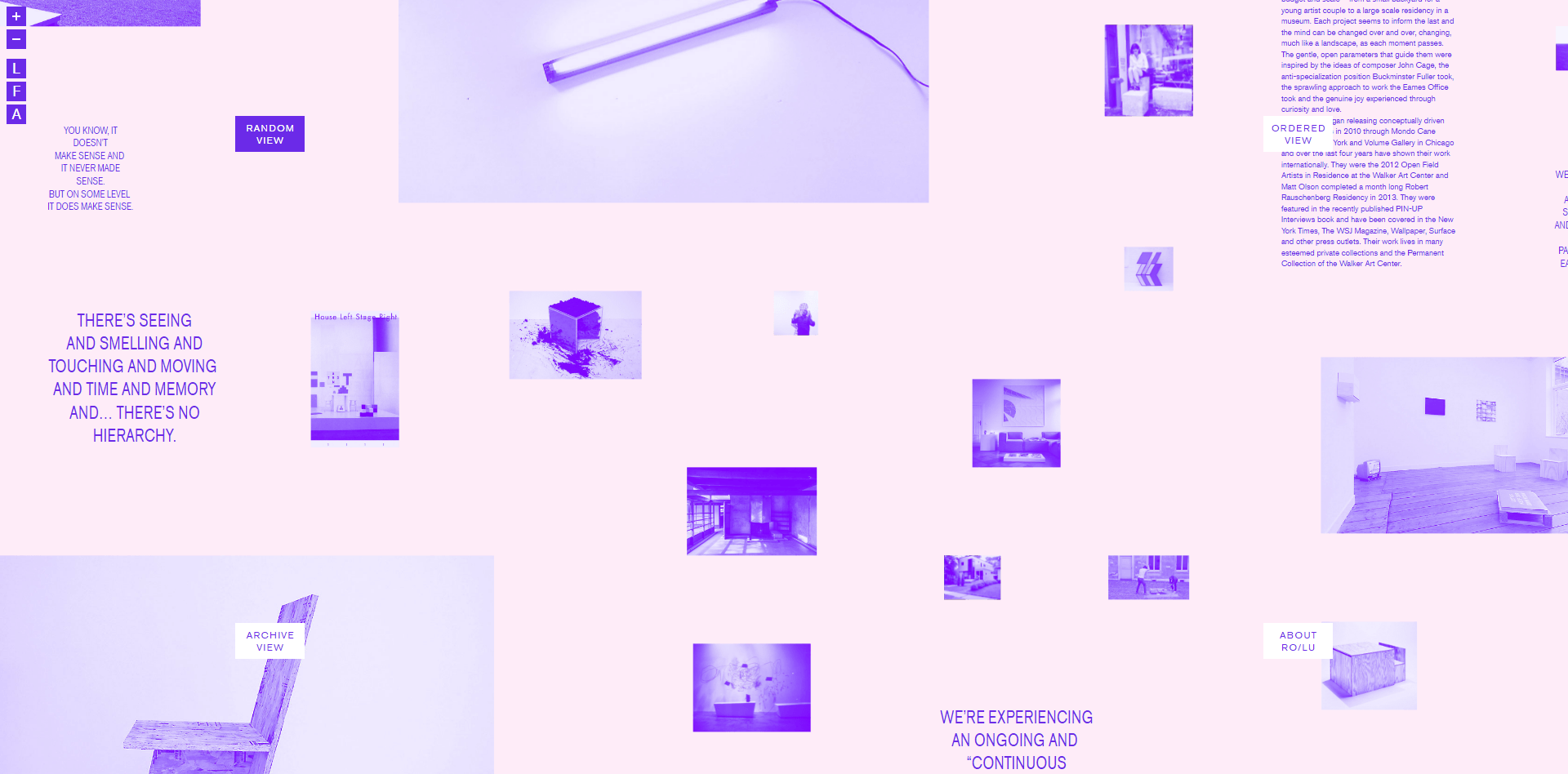
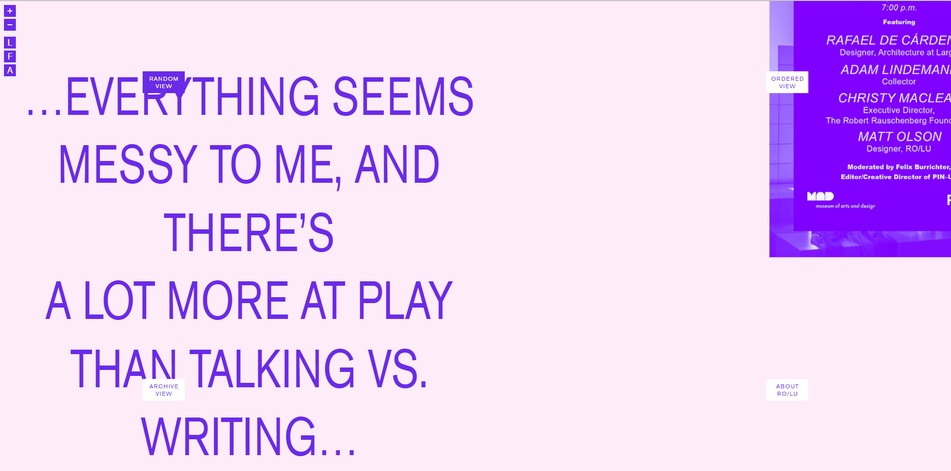
Darko: I came to the page without any real knowledge of this group’s history, or that of the designer behind the site, so I was able to see it with fresh eyes. I found it visually interesting—the colors and layout are great, but there was nothing to inform me of what the site was about, nor how to interact with it. My first inclination was toward understanding how the site worked, and how to engage with it, rather than learning who the artists were.
I imagine that most UX designers visiting the site would disapprove of it because of its poor navigation and lack of a coherent structure. It’s unclear where you are, or what the available options for exploration are. But, at the same time, I think it communicates the studio in a unique way—it’s certainly memorable.
Even if you came to the site with a specific intent to find a certain project or the latest exhibition, you’d be hard pressed to find your way around. The studio’s designers and the site designer seem indifferent to the needs of the site’s visitors and more interested in providing a unique experience, no matter how disconcerting the user experience.
An interesting portfolio design is conceived as a sort of exhibition, rather than a simple catalog of work.
Kent: Is it an inherent quality of some designers’ online portfolios that allows the design to break out of the norm?
Darko: Design studios’ web portfolios are typically done by designers rather than developers. Often, they have no idea how to develop the site but are free to think about the project in a different way. Like the Ro-Lu site, the most interesting online portfolios are conceived as a sort of online exhibition in a virtual gallery rather than a simple catalog of work.
Typically, a designer would ask: “What is the goal of the site? What impression do we want to leave visitors with? Where will we collect emails? etc.” In this case, it feels as though we are being invited to an exhibition that presents the studio’s work conceptually. The digital screen is treated by the site designer as if it were the rooms and walls of a gallery, or a page in a glossy magazine, and there is not much consideration given to the needs of the visitor.
Kent: How might a designer improve the navigation without compromising the site’s intended design?
Darko: There may be ways in which a designer could make this site more effective, but I’m not sure how interested the designers were in making the navigation more obvious. Traditional graphic designers who do web design often have a casual attitude toward visitors figuring out how to navigate a site effectively—as if it was a game, and their “discovery” part of the fun. In my opinion, this is counterproductive.
If I were to redesign this site, I would signal to visitors that this is a canvas showcasing work, with more to it than meets the eye. When a visitor first lands on the site, it looks as if what they see is what they get, and there is nothing more to explore; nothing signals what is clickable in order to move anywhere (lack of signifiers to give clues to people). This is a major usability failure, and detrimental to the site’s purpose.
I would somehow communicate that the intention is for the user to interact with the flat board of pictures through motion. Perhaps on entry, the entire page could quickly shift, just slightly, and then be left in place. Or the individual elements could be identified with a slight motion. Perhaps then, people would realize that the UI can be explored through various means. Maybe a picture could move a little bit to one side, a piece of text to another, somehow signaling to visitors that they’re interactive.
Likewise, the option to zoom in on the canvas is not obvious. Situated in the top left corner, the buttons are too small to be noticed. Furthermore, once zoomed in, not much more is visually engaging, so there’s little reward for doing so. It’s too gimmicky, leaving visitors feeling even more lost and not sure what to do.
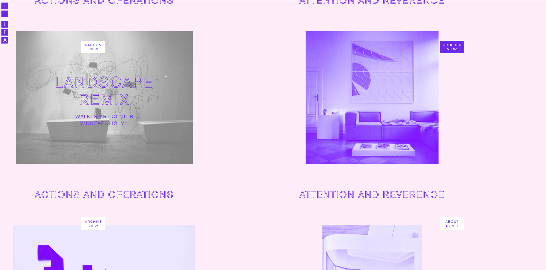
Attention is also needed within the projects themselves. After selecting a project, it’s unclear what to do next. With a tablet, as opposed to a desktop, the cursor cannot change on hover to indicate that the main image is clickable, signifying a move forward to the next stage.
Once a visitor is finally in, the four navigation arrows on the UI are confusing. The left and right on their own seem straightforward and provide a logical progression—adding the top and bottom compromises the whole structure.
Part of this portfolio design is about playing with limitations.
Kent: Do the unique qualities of this experience justify the drawbacks of the experiment?
Darko: The concept of the loose canvas could be kept while also making the site more usable. To improve the usability doesn’t necessarily mean falling back into a traditional masonry web layout. The main issue here is that the user is forced to go on a journey of “discovery.” This is a mistake. It’s not something people are expecting or prepared to do when visiting a website.
There’s some built-in friction in getting to know this site—maybe that friction is what makes the site so unique. That said, I don’t think people should be “made to work” to enjoy a website. Too much friction can push things too far, causing visitors to abandon the site in frustration.
Kent: Can the good intentions of the site’s designer relieve the product of its negative qualities?
Darko: I do believe that much of this is intentional and that the randomness is not random, as it resembles a trend in graphic design called exposed content that has been popular for a while now. The issue here is that design on the web is not graphic design; it’s web design.
A lot of traditional web design standards are thrown out for clients who are well-known, all in the name of experimentation and wanting to be “different.” Rather than focusing on presenting it in the most efficient way, with the best UX, this site represents how the creators think about their work, their practice, and how they want to present it to the world.
For example, on their “About” page, they display elements that seem irrelevant at first—such as the thumbnail photos mid-sentence. To an average person, these bits may seem redundant or useless, but it really shows how this studio takes every opportunity to express their style and communicate to visitors who they are.
This site is an example demonstrating that a portfolio doesn’t simply have to let the work speak for itself, but how it is presented can also express the values of the individual.
Kent: Although much of what is being challenged in this website is specific to the portfolio type of content, are there lessons that can be applied in general to web design?
Darko: Although a portfolio project is inherently more flexible in that it doesn’t always need to communicate everything perfectly, this website does show that experimentation in web design is possible, and that it’s needed.
Most web designers begin mockups with components that are not interactive; this website would be impossible to conceive in that way. But rather than shying away from it, I think it’s important that we analyze what this website is trying to do because it clearly wasn’t easy to execute.
The web still has its limitations, but in my opinion, web designers often feel overly constrained by them. This site shows how to begin to expand the possibilities, and shouldn’t simply be disregarded as an “artsy portfolio site,” where a designer is free to do whatever they want.
The question then becomes, how do we do this without breaking usability?
Kent: Often, of course, it’s difficult to reinvent the wheel within the limits of budgets and timelines.
Darko: Yes, often those restraints force designers to retreat to the safety of what is already out there—or what people are used to. This speaks to a wider discussion around the importance of originality in web design, and understanding those advantages—or disadvantages. Where should we sacrifice usability for originality, or vice versa? How do we find that balance? It’s an interesting debate.
(The Ro-Lu website was designed by Dylan Fracareta and Eric Price. Fracareta, who is now a design director at the Museum of Contemporary Art in Chicago used to run an independent design practice, focusing on design for art, architecture, fashion, and cultural sectors. Price is a graphic designer and programmer with a focus on digital media, publications, and identity design for the art and cultural sectors.)
Further Reading on the Toptal Blog:
Understanding the basics
How do you define usability?
A bedrock of great user experiences, usability is a quality attribute that assesses how easy user interfaces are to use. Usability is defined by certain usability principles, such as providing users with consistency, feedback, system status, user control and flexibility, easy recovery from errors, and more.
What is an example of usability?
An important usability best practice is giving the user freedom and control to navigate and perform desired actions as well as error prevention: to undo any accidental actions.
How do you achieve usability?
Usability is a combination of factors and is about the effectiveness, efficiency, and overall satisfaction of the user. Top usability principles include: intuitive design, efficiency of use, making it easy for new users to learn how a site/system works, and making sure the user enjoys using a site/system.
What is important about UX design?
UX design stands for “user experience,” and it’s important because it aims to deliver optimum experiences for users of digital products. Great UX design incorporates usability best practices, meaning, it’s not enough to simply design a digital product it has to be usable by people.
Why is digital accessibility important?
According to the US Census Bureau, almost one in five people, or 19 percent of the population, had a disability in 2010. Digital accessibility is an important usability practice that considers what may cause difficulties of access or usability for people with disabilities (visual, auditory, motor, or cognitive).
Belgrade, Serbia
Member since August 18, 2015
About the author
Darko is a UX/UI designer and founder. He takes ideas and transforms them into smart, well-designed, intuitive products.