How to Approach SVG Animations in CSS
Animations make websites look more polished and exciting, and help improve user experience. Explore how the combined potential of SVG and CSS can be leveraged to create animations without relying on external libraries.
Animations make websites look more polished and exciting, and help improve user experience. Explore how the combined potential of SVG and CSS can be leveraged to create animations without relying on external libraries.

Filip is a web developer with expertise in highly interactive front-end applications. He helped build data visualizations for several BI products while working for companies such as AlignAlytics and Captario.
Animations are a ubiquitous part of the web. Unlike the flashing GIF images that plagued websites in the internet’s earlier days, today’s animations are more subtle and tasteful. Designers and front-end specialists use them to make websites look more polished, enhance the user experience, call attention to important elements, and convey information.
Web developers can benefit from combining the power of SVG and CSS to create animations without using external libraries. This SVG animation tutorial shows how to build custom animations for real-world projects.
SVG Animation: CSS and Core Concepts
Before using CSS to animate SVGs, developers need to understand how SVGs work internally. Fortunately, it’s similar to HTML: We define SVG elements with XML syntax and style them with CSS, just as if they were HTML.
SVG elements are purposely built for drawing graphics. We can use <rect> for drawing a rectangle, <circle> for drawing circles, etc.—SVG also defines <ellipse>, <line>, <polyline>, <polygon>, and <path>.
Note: The full list of SVG elements even includes <animate>, which allows you to create animations using synchronized multimedia integration language (SMIL). However, its future is uncertain and the Chromium team recommends using a CSS- or JavaScript-based approach to animating SVGs whenever possible.
The available attributes depend on the element, so while <rect> has width and height attributes, the <circle> element has the r attribute, which defines its radius.

While most HTML elements can have children, most SVG elements cannot. One exception is the group element <g>, which we can use in order to apply CSS styles and transformations to multiple elements at once.
The <svg> Element and Its Attributes
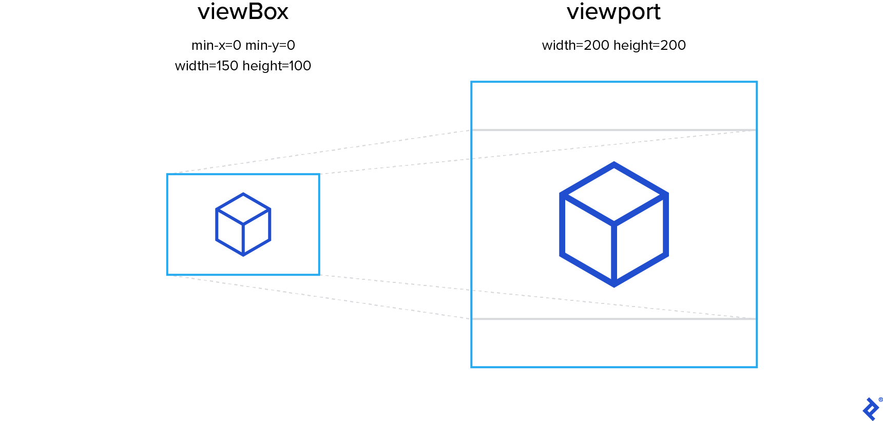
Another important difference between HTML and SVG is how we position elements, notably via the viewBox attribute of a given outer <svg> element. Its value consists of four numbers separated by whitespace or a comma: min-x, min-y, width, and height. Together, these specify how much of our SVG drawing we want the browser to render. That area will be scaled to fit the bounds of the viewport, as defined by the width and height attributes of the <svg> element.
When it comes to letterboxing, the ratio of the width and height attributes of the viewport may indeed differ from the ratio of the width and height parts of the viewBox attribute.
By default, the aspect ratio of the SVG canvas will be preserved at the expense of a larger-than-specified viewBox, thereby causing a smaller, letterboxed rendering within the viewport. But you can specify a different behavior via the preserveAspectRatio attribute.
This allows us to draw images in isolation and be confident that all elements will be positioned correctly no matter the context or rendering size.
While you can code SVG images by hand, more complex images may require a vector graphics program (our SVG animation tutorial demonstrates both techniques). My editor of choice is Affinity Designer, but any editor should provide enough functionality for the simple operations covered here.
SVG Animation Examples Using CSS Transitions and Animations
CSS transitions allow us to define the rate and duration of property changes. Instead of jumping instantly from the starting value to the end value, the values transition smoothly as in this example in which the color of an SVG circle changes when you hover over it with a mouse:
See the Pen Transition example by Filip Defar (@dabrorius) on CodePen.
We can define transitions with the transition property, which accepts the name of the property that we want to transition, the duration of the transition, a transition timing function (also known as easing function), and the length of the delay before the effect begins:
/* property name | duration | easing function | delay */
transition: margin-right 4s ease-in-out 1s;
We can define transitions for multiple CSS properties, each of which can have separate transition values. However, there are two obvious limitations to this approach.
The first limitation is that transitions are triggered automatically when a property value changes. This is inconvenient in some use cases. For example, we can’t have an animation that loops infinitely.
The second limitation is that transitions always have two steps: the initial state and the final state. We can extend the duration of the animation, but we can’t add different keyframes.
This is why a more powerful concept exists: CSS animations. With CSS animations, we can have multiple keyframes and an infinite loop:
See the Pen Animation example by Filip Defar (@dabrorius) on CodePen.
To animate CSS properties over multiple keyframes, first we need to define the keyframes using an @keyframes at-rule. The timing of keyframes is defined in relative units (percentages) because at this point, we haven’t yet defined the animation duration. Each keyframe describes the values of one or more CSS properties at that point in time. CSS animations will ensure smooth transitions between keyframes.
We apply the animation with described keyframes to the desired element using the animation property. Similar to the transition property, it accepts a duration, an easing function, and a delay.
The only difference is that the first parameter is our @keyframes name instead of a property name:
/* @keyframes name | duration | easing-function | delay */
animation: my-sliding-animation 3s linear 1s;
How to Animate SVG/CSS for a Hamburger Menu Toggle
Now that we have a basic understanding of how animating SVGs works, we can start building a classic animation—a menu toggle that smoothly transitions between a “hamburger” icon and a close button (an “X”):
See the Pen Hamburger by Filip Defar (@dabrorius) on CodePen.
This is a subtle but valuable animation. It attracts the user’s attention, informing them that the icon can be used to close the menu.
We start our demonstration by creating an SVG element with three lines:
<svg class="hamburger">
  <line x1="0" y1="50%" x2="100%" y2="50%"
    class="hamburger__bar hamburger__bar--top" />
  <line x1="0" y1="50%" x2="100%" y2="50%"
    class="hamburger__bar hamburger__bar--mid" />
  <line x1="0" y1="50%" x2="100%" y2="50%"
    class="hamburger__bar hamburger__bar--bot" />
</svg>
Each line has two sets of attributes. The x1 and y1 represent the coordinates of the start of the line, while x2 and y2 represent the coordinates of the end of the line. We’ve used relative units to set positions. This is a simple way to ensure that image contents get resized to fit the containing SVG element. While this approach works in this case, there is one big drawback: We can’t maintain the aspect ratio of elements positioned this way. For that, we would have to use the viewBox attribute of the <svg> element.
Note that we applied CSS classes to SVG elements. There are many properties that can be changed via CSS, so let’s apply some basic styling to our SVG elements.
We’ll set the size of the <svg> element, as well as change the cursor type to indicate that it’s clickable. But to set the color and thickness of the lines, we’ll use the stroke and stroke-width properties. You might have expected to use color or border, but unlike <svg> itself, SVG sub-elements are not HTML elements, so they often have different property names:
.hamburger {
  width: 62px;
  height: 62px;
  cursor: pointer;
}
.hamburger__bar {
  stroke: white;
  stroke-width: 10%;
}
If we render at this point, we’ll see that all three lines have the same size and position, overlapping each other completely. Unfortunately, we can’t change the starting and ending positions independently via CSS, but we can move whole elements. Let’s move the top and bottom bars with the transform CSS property:
.hamburger__bar--top {
  transform: translateY(-40%);
}
.hamburger__bar--bot {
  transform: translateY(40%);
}
By moving the bars on the Y axis we end up with a decent-looking hamburger.
Now it’s time to code our second state: the close button. We rely on an .is-opened CSS class applied to the SVG element to toggle between the two states. To make the result more accessible, let’s wrap our SVG in a <button> element and handle clicks on that level.
The process of adding and removing the class will be handled by a simple JavaScript snippet:
const hamburger = document.querySelector("button");
hamburger.addEventListener("click", () => {
  hamburger.classList.toggle("is-opened");
});
In order to create our X, we can apply a different transform property to our hamburger bars. Because the new transform property will override the old one, our starting point will be the original, shared position of the three bars.
From there, we can rotate the top bar 45 degrees clockwise around its center, and rotate the bottom bar 45 degrees counterclockwise. We can shrink the middle bar horizontally until it is narrow enough to be hidden behind the center of the X:
.is-opened .hamburger__bar--top {
  transform: rotate(45deg);
}
.is-opened .hamburger__bar--mid {
  transform: scaleX(0.1);
}
.is-opened .hamburger__bar--bot {
  transform: rotate(-45deg);
}
By default, the transform-origin property for SVG elements is normally 0,0. This means that our bars will be rotated around the top-left corner of the viewport, but we want them to rotate around the center. To fix this, let’s set the transform-origin property to center for the .hamburger__bar class.
Animating CSS Properties With transition
The transition CSS property tells the browser to smoothly transition between two different states of CSS properties. Here we want to animate our changes to the transform property, which dictates the positions, orientation, and scale of the bars.
We can also control the duration of the transition using the transition-duration property. To make the animation and resulting SVG transition look snappy, we’ll set a short duration of 0.3 seconds:
.hamburger__bar {
  transition-property: transform;
  transition-duration: 0.3s;
  ...
}
The only piece of JavaScript we need is the bit that makes the icon state toggleable:
const hamburger = document.querySelector("button");
hamburger.addEventListener("click", () => {
  hamburger.classList.toggle("is-opened");
});
Here, we select the outer SVG element by its .mute class using querySelector(). We then add a click event listener. When a click event is triggered, we toggle the .is-active class only on the <svg> itself—no deeper in the hierarchy. Because we made the CSS animation only apply to elements with the .is-active class, toggling this class will activate and deactivate the animation.
As a final touch, we’ll convert the HTML body to a flex container, which will help us center the icon horizontally and vertically. We’ll also update the background color to a very dark gray and the icon color to white, to attain a sleek “dark mode” look and feel:
body {
  display: flex;
  justify-content: center;
  align-items: center;
  background-color: #222;
  height: 100vh;
}
With that, we’ve built a fully functional animated button using some basic CSS and a short JavaScript snippet. It’s easy to change the transformations we’ve applied to make a variety of animations. Readers can simply fork the CodePen—which includes a bit of extra CSS for polish—and get creative.
Working With SVG Data From External Editors
Our hamburger menu is extremely simple. What if we want to make something more complex? That’s where coding SVG by hand becomes difficult and vector graphics editing software can help.
Our second SVG animation is a mute button showing a headphones icon. When the music is active, the icon will pulsate and dance; when it’s muted, the icon will be crossed out:
See the Pen Mute button - 5 - red strikethrough by Filip Defar (@dabrorius) on CodePen.
Drawing icons would be outside of the scope of this tutorial (and probably your job description), so we are going to start with a pre-drawn SVG icon. We’ll also want the same body styling as our hamburger menu example.
You might want to clean up the SVG code before working with it. You can do this with svgo, an open-source, Node.js-based SVG optimizer tool. This will remove unnecessary elements and make the code easier to edit by hand, which you will need to do in order to add classes and combine different elements.
SVG icons created in image editing software are unlikely to use relative units. Additionally, we want to make sure that the icon’s aspect ratio is maintained, regardless of the aspect ratio of the SVG element containing it. To make this level of control possible, we will use the viewBox attribute.
It’s a good idea to resize the SVG so that viewBox can be set to some easy-to-use values. In this case, I’ve converted it to a viewBox that is 100 x 100 pixels.
Let’s make sure the icon is centered and appropriately sized. We’ll apply the mute class to our base SVG element and then add the following CSS styles:
.mute {
  fill: white;
  width: 80px;
  height: 70px;
  cursor: pointer;
}
Here, the width is slightly greater than the height to avoid clipping during the rotations of our animation.
Our SVG Animation Starting Point
The now-clean SVG contains a single <g> element that contains three <path> elements.
The path element allows us to draw lines, curves, and arcs. Paths are described with a series of commands that describe how the shape should be drawn. As our icon consists of three unconnected shapes, we have three paths to describe them.
The g SVG element is a container used to group other SVG elements. We use it to apply the pulsating and dancing transformations on all three paths simultaneously, rather than animating SVG paths with CSS separately.
<svg class="mute" viewBox="0 0 100 100">
  <g>
    <path d="M92.6,50.075C92.213,26.775 73.25,7.938 50,7.938C26.75,7.938 7.775,26.775 7.388,50.075C3.112,51.363 -0.013,55.425 -0.013,60.25L-0.013,72.7C-0.013,78.55 4.575,83.3 10.238,83.3L18.363,83.3L18.363,51.6C18.4,51.338 18.438,51.075 18.438,50.813C18.438,33.275 32.6,19 50,19C67.4,19 81.563,33.275 81.563,50.813C81.563,51.088 81.6,51.338 81.638,51.6L81.638,83.313L89.763,83.313C95.413,83.313 100.013,78.563 100.013,72.713L100.013,60.263C100,55.438 96.875,51.362 92.6,50.075Z" />
    <path d="M70.538,54.088L70.538,79.588C70.538,81.625 72.188,83.275 74.225,83.275L74.225,83.325L78.662,83.325L78.662,50.4L74.225,50.4C72.213,50.4 70.538,52.063 70.538,54.088Z" />
    <path d="M25.75,50.4L21.313,50.4L21.313,83.325L25.75,83.325L25.75,83.275C27.788,83.275 29.438,81.625 29.438,79.588L29.438,54.088C29.45,52.063 27.775,50.4 25.75,50.4Z" />
  </g>
</svg>
To make the headphones pulsate and dance, transition won’t suffice. This is an example that is complex enough to need keyframes.
In this case, our starting and ending keyframes (at 0% and 100% of the animation, respectively) use a slightly shrunken headphones icon. For the first 40% of the animation we grow the image slightly and tilt it 5 degrees. Then, for the next 40% of the animation, we scale it back down to 0.9x and rotate it 5 degrees to the other side. Finally, for the last 20% of the animation, the icon transformation returns to the same initial parameters in order to loop smoothly.
@keyframes pulse {
  0% {
    transform: scale(0.9);
  }
  40% {
    transform: scale(1) rotate(5deg);
  }
  80% {
    transform: scale(1) rotate(-5deg);
  }
  100% {
    transform: scale(0.9) rotate(0);
  }
}
CSS Animation Optimizations
To show how keyframes work, we left our keyframe CSS more verbose than it needs to be. There are three ways we could shorten it.
Since our 100% keyframe sets the entire transform list, if we were to omit rotate() entirely, its value would default to 0:
  100% {
    transform: scale(0.9);
  }
Secondly, we know we want our 0% and 100% keyframes to match because we’re looping the animation. By defining them with the same CSS rule, we won’t have to remember to modify both of them if we want to change this shared point in the animation loop:
  0%, 100% {
    transform: scale(0.9);
  }
Lastly, we’ll soon apply transform: scale(0.9); to the mute__headphones class, and when we do, we won’t need to define the starting and ending keyframes at all! They’ll default to the static style used by mute__headphones.
Now that we’ve defined the animation keyframes, we can apply the animation. We add the .mute__headphones class to the <g> element so that it affects all three parts of the headphones icon. First, we once again set transform-origin to center as we want the icon to rotate around its center. We also scale it so that its size matches the initial animation keyframe. Without this step, switching from the static “muted” icon to the animated one will always result in a sudden jump in size. (Either way, switching back to muted will cause a jump in scale—and likely rotation too—if the user clicks while the scale is larger than 0.9x. We can’t do much about that effect with CSS alone.)
We apply the animation using the animation CSS property but only when the .is-active parent class is present, similar to how we animated our hamburger menu.
.mute__headphones {
  transform-origin: center;
  transform: scale(0.9);
}
.is-active .mute__headphones {
  animation: pulse 2s infinite;
}
The JavaScript we need to let us switch between states follows the same pattern as the hamburger menu too:
const muteButton = document.querySelector(".mute");
muteButton.addEventListener("click", () => {
  muteButton.classList.toggle("is-active");
});
The next piece we’ll add is a strikethrough line that appears when the icon is inactive. As this is a simple design element, we can code it manually. This is where having simple and reasonable viewBox values is useful. We know that the edges of the canvas are at 0 and 100 so it is easy to calculate the start and end positions for our line:
<line x1="12" y1="12" x2="88" y2="88" class="mute__strikethrough" />
Resizing vs. Using Relative Units
A case can be made for using relative units instead of resizing the image. This applies in our example because we are adding only a simple SVG line over our icon.
In real-world scenarios you might want to combine more complex SVG content from several different sources. This is where making them all a uniform size is useful, as we can’t manually hard-code the relative values like we did in our example.
Because we applied a class directly to our strikethrough <line> element, we can style it via CSS. We just need to make sure that the line is not visible when the icon is active:
.mute__strikethrough {
  stroke: red;
  opacity: 0.8;
  stroke-width: 12px;
}
.is-active .mute__strikethrough {
  opacity: 0;
}
Optionally, we can add the .is-active class directly to the SVG. This will make the animation start as soon as the page is loaded, so we effectively change the initial state of the icon from non-animated (muted) to animated (non-muted).
CSS-based SVG Animation Is Here to Stay
We’ve only scratched the surface of CSS animation techniques and how viewports work. It’s worth knowing how to write SVG code by hand to keep simple animations simple, but it’s also important to know how and when to make use of graphics created with external editors. While modern browsers enable us to create impressive animations using only built-in functionality, for (very) complex use cases, developers might want to explore animation libraries like GSAP or anime.js.
Animations don’t have to be reserved for extravagant projects. Modern CSS animation techniques allow us to create a wide array of engaging and polished animations in a simple, cross-browser-compatible way.
Special thanks to Mike Zeballos for this article’s technical review!
Further Reading on the Toptal Blog:
Understanding the basics
What is an SVG used for?
SVG (scalable vector graphics) is an XML-based markup language for describing vector images. Browsers can render images built this way cleanly at any size—creating perfect crisp edges without any blur. Additionally, SVGs tend to be significantly smaller when compared to raster images, which helps websites to load faster.
Is SVG better than PNG?
SVG (scalable vector graphics) is a vector image format, which makes it ideal for user interface elements, logos, icons, diagrams, and similar images. In these cases, it will provide better image quality and smaller file size than a PNG version of the image. SVG is almost always a better choice.
Can an SVG be animated?
Yes. An SVG is a vector image format that has syntax very similar to HTML, which makes it convenient for animating. Use DOM selectors to target various SVG elements and animate them using either CSS or JavaScript.
How do you animate SVG?
There are several ways to animate SVG images. For moderately complex animations, the most straightforward approach is to use CSS transitions or CSS animations. For more complex cases, you can use native JavaScript animations or an external library such as GSAP or anime.js.
Zagreb, Croatia
Member since May 12, 2014
About the author
Filip is a web developer with expertise in highly interactive front-end applications. He helped build data visualizations for several BI products while working for companies such as AlignAlytics and Captario.