
Mastering Mobile Typography: Font Usage Tips and Best Practices
Don’t let inconsistent typefaces or subpar spacing impede accessibility or hurt your brand. These mobile typography guidelines will help enhance user experience and increase engagement.

Charles Matthew Atos

Supporting Diverse Needs: A Rebranding Success Story
Brand designer Bari Keenam shares how he turned a tricky logo redesign into a brand overhaul that helped his client establish an emotional connection with its customers.

Bariledum Keenam

Lines of Communication: A Typeface History (With Infographic)
Typeface evolution has been slower than other areas of design but looking back over the past 500+ years shows staggering advancements, from the invention of the printing press to variable web fonts.

Cameron Chapman
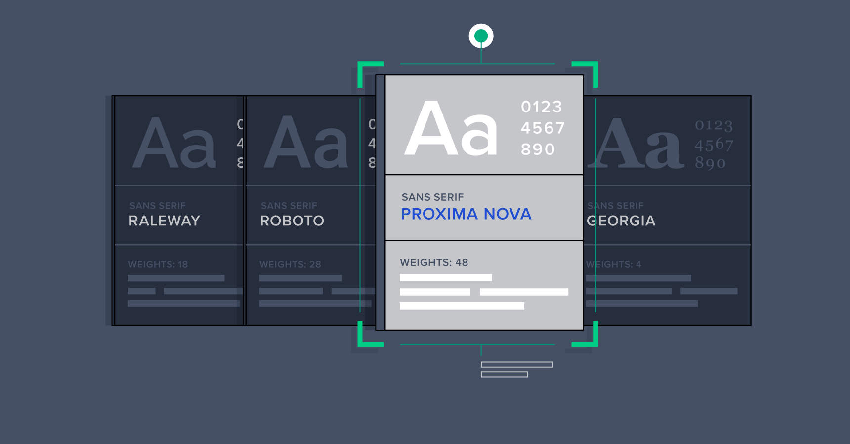
Tips and Considerations When Choosing a Typeface (with Infographic)
The right typeface can make a design, while the wrong one can definitely break it. There are a few things designers can keep in mind to make typeface selection easier and more focused.
Cameron Chapman

Mini Tutorial: A Guide to Font Combinations
Effective font combinations are a hallmark of good design. It’s vital that designers master this skill if they want to create exceptional designs that set them apart from their contemporaries.
Cameron Chapman
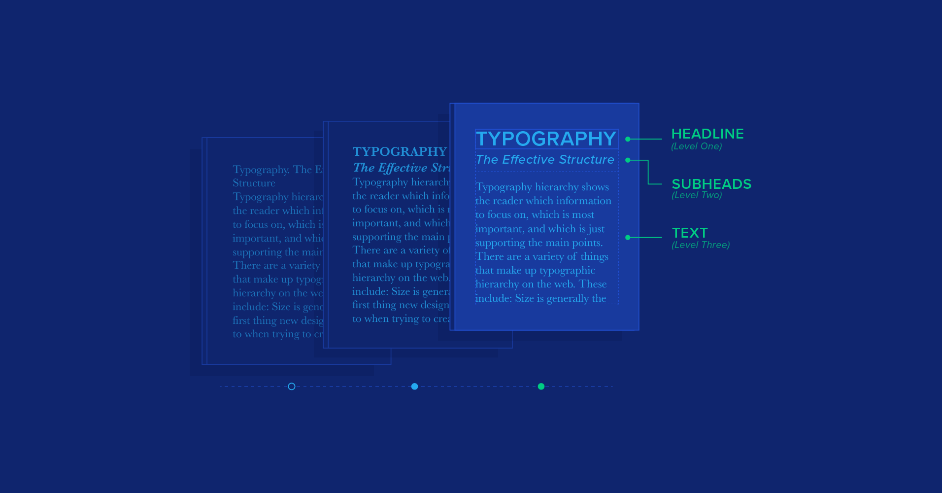
How to Structure an Effective Typographic Hierarchy
Since designers work with so much text-based content, creating an effective typographic hierarchy—one that clearly shows what information is most important—is a vital skill for designers to master.
Cameron Chapman

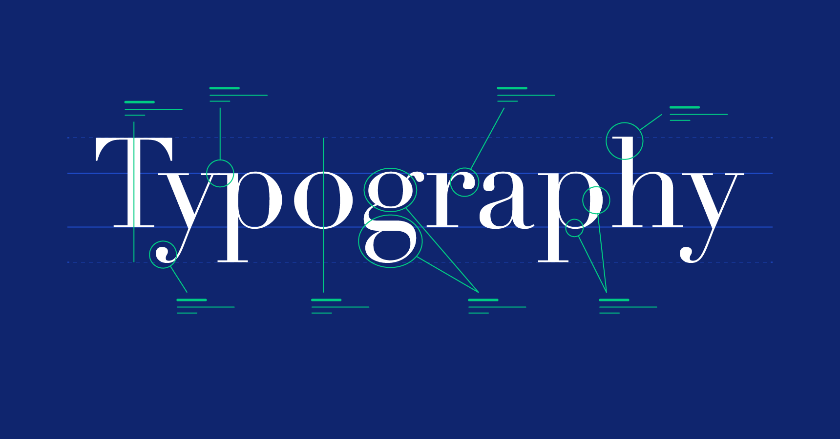
Dissecting the Intricacies of Typography Anatomy (with Infographic)
The letters used to construct our written languages have their own anatomical features. Here is a collection of lesser-known letter parts that every designer should be aware of (with an awesome infographic).

Micah Bowers
Understanding the Nuances of Typeface Classification
Possibly with the exception of color, the typeface styles used in a design have a greater impact on the way a user perceives that design than virtually any other individual design element.
Cameron Chapman

UI Design Best Practices and Common Mistakes
The most progressive and interesting designers steer clear of visually stale design solutions and ditch restrictive rules by learning UI design best practices and avoiding common design mistakes. 🔊
Micah Bowers
World-class articles, delivered weekly.
Toptal Designers
- Adobe Creative Suite Experts
- Agile Designers
- AI Designers
- Art Direction Experts
- Augmented Reality Designers
- Axure Experts
- Brand Designers
- Creative Directors
- Dashboard Designers
- Digital Product Designers
- E-commerce Website Designers
- Full-Stack Designers
- Information Architecture Experts
- Interactive Designers
- Mobile App Designers
- Mockup Designers
- Presentation Designers
- Prototype Designers
- SaaS Designers
- Sketch Experts
- Squarespace Designers
- User Flow Designers
- User Research Designers
- Virtual Reality Designers
- Visual Designers
- Wireframing Experts
- View More Freelance Designers
Join the Toptal® community.