Presentation Design and the Art of Visual Storytelling
Discover a practical approach to designing results-oriented presentations and learn the importance of crafting a compelling narrative.

Discover a practical approach to designing results-oriented presentations and learn the importance of crafting a compelling narrative.

Micah helps businesses craft meaningful engagement through branding, illustration, and design.
Expertise
Presentations Must Tell a Story
We’ve all been there, dutifully enduring a dull presentation at work or an event. The slides are packed with text, and the presenter feels obligated to read every single word. There are enough charts, graphs, and equations to fill a trigonometry book, and each screen is awash in the brightest colors imaginable.
As the presentation drags on, the lists get longer. “We do this, this, this, this, this, and oh yeah, this!” Unfortunately, everyone in the audience just wants it to be over.
This is a major opportunity missed for a business, and we designers may be part of the problem. No, it’s not our fault if a presenter is unprepared or uninspiring, but if we approach our clients’ presentations as nothing more than fancy lists, we’ve failed.
See, presentations are stories, not lists, and stories have a structure. They build towards an impact moment and unleash a wave of momentum that changes people’s perceptions and preconceived notions. Good stories aren’t boring and neither are good presentations.
But before we go any further, it’s important to ask why presentations exist in the first place. What’s their purpose? Why are they useful?
Presentations exist to…
Inform
Presentations impart new and sometimes life-changing knowledge to an audience.
Instruct
Most presentations provide a practical method for using the knowledge that is shared.
Entertain
If executed correctly, presentations are able to captivate an audience’s imagination and lead them to consider the worth of what they’re learning.
Inspire
Well-crafted presentations have the power to arouse feelings that can influence an audience’s behavior.
Activate
Presentations ready people to move, to act on their feelings and internal analysis.
Persuade
Ultimately, presentations make an appeal to an audience’s logic, emotions, or both in an attempt to convince the audience to act on the opportunity shared by the presenter.
With this kind of power, designers can’t afford to view presentations as “just another deck.” We shouldn’t use the same formulaic templates or fail to educate our clients about the importance of high-quality image assets.
Instead, we need to see presentation design as an opportunity to craft a compelling narrative that earns big wins for our clients.
Need more convincing? Let’s take a quick look at how a few big brands merge storytelling with world-class presentation design.
Salesforce – Write the Narrative First

The overarching emphasis of any presentation is its narrative. Before any flashy visuals are added, the presentation designer works hand-in-hand with the client to establish the narrative and asks big questions like:
- Who are we presenting to?
- Why are we presenting to them?
- How do we want them to respond?
The marketing team at Salesforce, the world’s leading customer relationship management platform, answers these questions by first writing presentations as rough essays with a beginning, middle, and end. As the essay is fleshed out, themes emerge and section titles are added.
From here, the presentation is broken into slides that present the most impactful topics and information the audience needs to know. Only a few select words and phrases will make it onto the screen, but the essay draft will be rich with insights for the presenter to further refine and share in their oral narrative.
Writing the narrative first prevents the chaos of slide shuffling that occurs when a presentation’s stories aren’t clearly mapped out. With no clear narrative in place, slides don’t transition smoothly, and the presentation’s momentum dissipates.
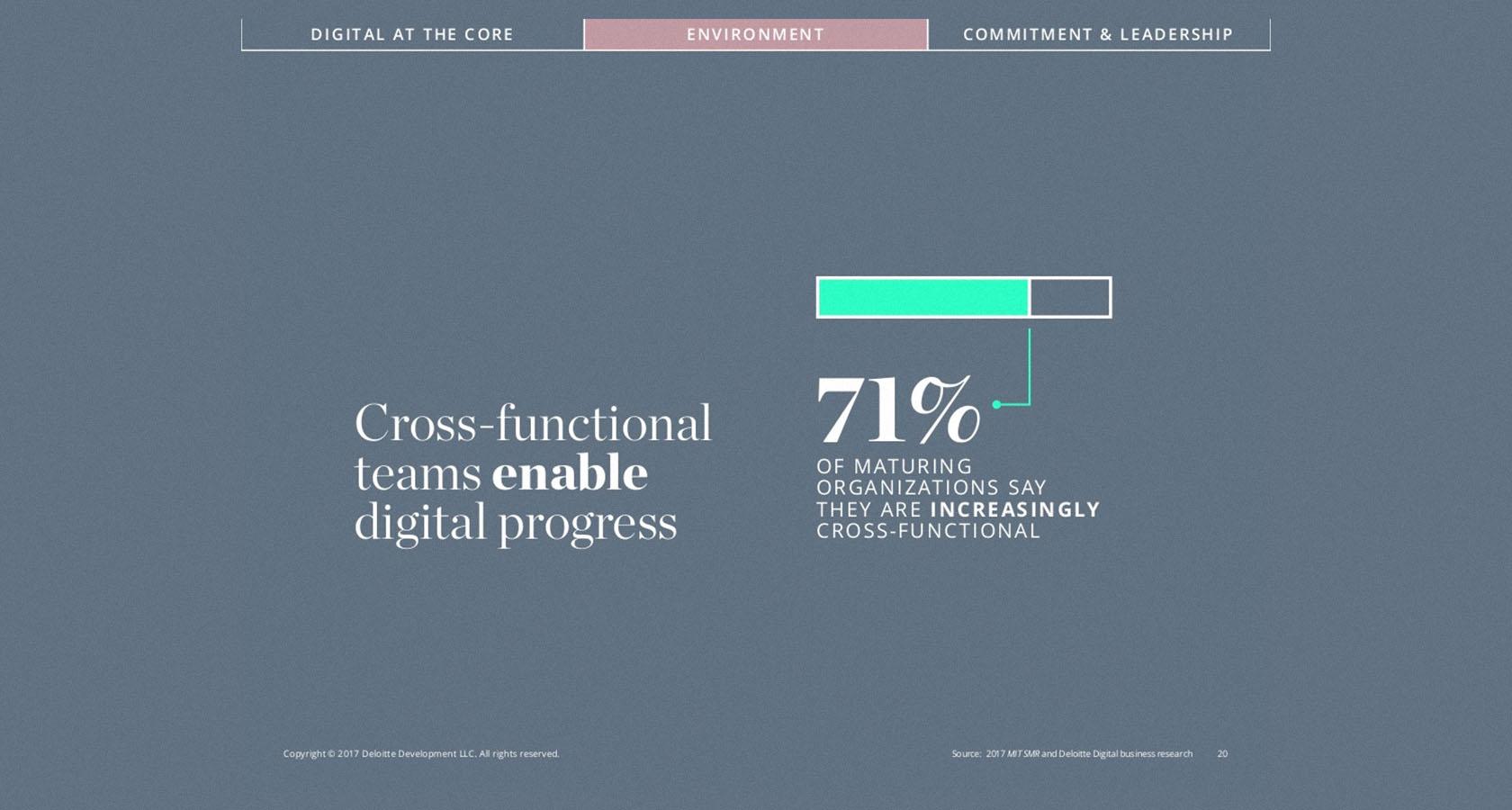
Deloitte – Establish Credibility
Within the first few moments of meeting someone new, we quickly assess whether or not we feel they’re trustworthy.
Presenters are typically afforded an initial level of trust by virtue of being deemed capable of talking in front of a large group of people. But if that trust isn’t solidified within the first minute of a presentation, it can vanish in an instant.
Deloitte is a global financial consultant for 80 percent of all Fortune 500 companies. Naturally, they understand the need to quickly establish credibility. The slide used in the example above is number five in a thirty-slide deck. Right from the outset, Deloitte establishes their authority on the topic, in essence saying, “We’ve been at this awhile.”
Including a slide like this in a client’s deck can be a real confidence booster because it allows them to quickly secure expert status. Establishing credibility also helps an audience relax and engage with what they’re learning.
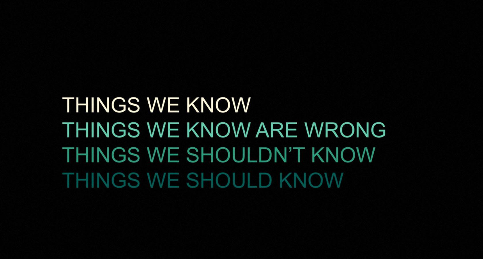
iControl – Define the Problem Visually

It’s not always possible to express a complex problem or solution with a single visual, but when it happens, it can be a powerful experience for an audience.
iControl is a Swedish startup that built an iPad app designed to replace paper and create better documentation at construction sites. They aren’t a big brand, but their investor pitch deck powerfully identifies a huge audience problem with a single slide—too much paper wasted, too many documents to track. An image like this so clearly identifies the problem that it simultaneously intensifies the need for a solution.
Defining the problem visually is an awesome strategy, but use it with care because an image that’s confusing or overly specific to an industry can leave audience members feeling like outsiders.
Arrange a Compelling Narrative
“Storytelling” is everywhere these days. Social media platforms have cleverly packaged the promise that our every post, image, and interaction is part of an ongoing story, but most of what we call “stories” are loosely related moments strung together by the happenstance of time and technology.
So what’s the distinction between narrative and story? How do they relate, and how do they differ? And most importantly, how do they tie into a compelling presentation?
Story
A story is bound by time. It has a beginning, a middle, and an end. It details events and orders them in a way that creates meaning. In a presentation, stories speak to specific accomplishments and inspire action—“We did this, and it was amazing!”
Narrative
A narrative is not bound by time. It relates separate moments and events to a central theme but doesn’t seek resolution. In a presentation, the narrative encompasses the past, present, and future—“Where we’ve come from. Where we are. Where we’re headed.”
How does this information impact the presentation designer? Here’s a simple and practical example.
You have a client who makes amazing paper clips that always bend back to their intended shape no matter how much they’re twisted. They ask you to design a presentation that highlights the paper clips and their company vision to “forever change the world of office products.” How do you begin?

Start with the Narrative
The narrative is the overarching emphasis of a presentation.
In this example, you would shape the presentation around your client’s company vision of forever changing the world of office products.
Advance the Narrative with Stories
Use succinct stories that highlight challenges, improvements, big wins, and daily life.
Perhaps the paper clip company’s research and development team faced several setbacks before a eureka moment made mass production cheaper than traditional paper clips.
Use stories like this as brush strokes on a canvas, each one contributing towards a more complete picture of the narrative.
Support Stories with Visuals
This is where the simple, yet stunning slides you design come into play.
In this case, you could show a simple graph that compares the production cost of traditional paper clips to your client’s innovative paper clips. And, to make sure you’re reinforcing the narrative, you could add a short title to the slide: “Game. Changed.”
Conflict Is the Engine of Memorable Presentations
In his bestselling book Story, Hollywood screenwriting guru Robert McKee writes, “Nothing moves forward in a story except through conflict.” This advice is extremely valuable for the presentation designer.

An overly optimistic presentation packed with positive information simply crashes over an audience and sweeps away their enthusiasm. Each rosy insight is less impactful than the one prior. Before long, all the audience hears is, “Good, better, best. We’re just like all the rest.”
An effective presentation designer looks for ways to create internal conflict within an audience. This means they feel the weightiness of a problem and actively hope for the relief of a solution. The yin and yang of problem and solution is the presentation designer’s true north, the guiding principle of every piece of information included in a deck.
One tried and true way to ensure a healthy positive/negative balance, without overly dramatizing a presentation is withholding information.
For instance, in our example of the paperclip company, this could mean devoting an extra slide or two to the research and development process. These slides would hint at the soon-to-be-revealed production costs and build anticipation without providing actual numbers.
Then, when the cost comparison chart is finally shared, the audience is genuinely eager for the information it holds, and the payoff is far more rewarding and memorable.
Unlock the Power of Clear, Consistent, and Compelling Content
Content doesn’t exist apart from the narrative; it enhances it. Once the narrative is in tip-top shape, it’s time to make the content shine, but before we dive into slide design, let’s take a quick detour.
Imagine we’re reviewing an investor pitch deck and we take an elevator into the sky to observe the presentation from an aerial view. From this lofty position, the deck’s content should have a cohesive appearance that ties in with the brand, organization, or topic being presented.
If you’ve ever been hired to work on a company’s pitch deck design, you understand how challenging this can be.
Many times, clients already have some sort of skeleton deck in place before they hire a presentation designer. Sometimes, these decks are packed with a dizzying assortment of charts, graphs, fonts, and colors. Here, you have two unique responsibilities.
First, you must help your client understand how the disunity of their content detracts from the narrative. Then, you must provide a way forward and present them with a practical vision for remaking things in a cohesive style.
Be warned that you may have to sell this idea, especially if your client thinks that their visual content is presentation ready and only in need of some “design magic” to make it look good.
If this happens, remember to be gracious, and acknowledge the role that their expertise played in generating such valuable information. Then, bring the conversation back to results. “This is a compelling topic. I want your audience to be in awe as you present, but for that to happen, I need to recreate the visuals.”
This is a tough chore, but as designers, we’re hired to improve the way our clients communicate—not fill their heads with false affirmations of poor content.
Essential Slide Design Principles
Slide design is an important part of presentation design, and effective slides are rooted in visual simplicity. But the strange thing about simplicity is that it stems from a thorough grasp of complexity. If we know something well, we can explain it to someone who does not in just a few words or images.
In this section, we’ll look at hierarchy, typography, image selection, and color schemes, but know that these design elements are rooted in a proper understanding of a presentation’s narrative and content. If we start the design process with slides, we seriously risk equipping our clients with presentations that are unfocused and unimpactful.
Create Emphasis with Slide Hierarchy
Design hierarchy relates to the placement of visual elements in a way that creates emphasis. For the presentation designer, this means asking, “What two or three things do I want the audience to see on this slide?
Do’s and Don’ts
- Do create visual contrast through scale, color, and alignment.
- Don’t try to visually highlight more than three ideas per slide.
Pro Tip
Whenever a really important idea comes up, be brave and only use a few words in bold type to communicate it. This kind of simplicity signals to an audience that it’s time to intensify their focus and really listen to what the presenter has to say.
Overcome Ambiguity with Thoughtful Typography
Most presentations are built on words, so it’s important to know which words to include and how to style them. This starts by choosing the right font, then knowing how big to make the words and where to include them.
Do’s and Don’ts
- Do ask if your client has any designated fonts listed in their brand style guide.
- Don’t use more than two fonts in your presentation, and avoid text blocks and lengthy paragraphs like the plague.
Pro Tip
Try not to use anything smaller in size than a 36 point font. Some designers believe it’s ok to use sizes as small as 24 point, but this often leads to packing slides with more text. Remember, slides are a speaking prompt, not promotional literature.
Communicate Authority Through Graphic Simplicity
Every chart, graph, icon, illustration, or photograph used in a presentation should be easy to see and understand. Images that are difficult to interpret or poor in quality can erode the trust of an audience.
Do’s and Don’ts
- Do look for ways to use symbols, icons, or illustrations as they have a way of communicating ideas more quickly than photography.
- Don’t use more than one photograph per slide, and don’t use stock photography that conflicts with your client’s brand (e.g., too funny, serious, or ethereal).
Pro Tip
During the consultation phase of a presentation design project, ask your potential client to see existing charts or graphs they’re hoping to include. If anything is confusing, pixelated, or inconsistent, tell them you’ll need to remake their graphics. Be prepared to show high-quality examples from well-known companies to sell your point.
Add Energy and Meaning with Bold Color Schemes
Color plays an important role in nearly every design discipline, and presentation design is no different. The colors used for a presentation affect the tone of the topic being shared and influence the mood of the audience.
Do’s and Don’ts
- Do keep color schemes simple. Two or three colors should make up the majority of slides.
- Don’t use complementary colors for text and background (e.g., blue background with orange text). This has a way of making words vibrate with nauseating intensity.
Pro Tip
Identify a few high-contrast accent colors to make strategic cameos for added impact.
The Mission of Every Presentation Designer
It can’t be overstated; presentations are huge opportunities for designers to positively impact their clients’ businesses. Innovation and advancements in culture and technology are occurring so rapidly that it’s become absolutely vital to be able to tell a good story. No one has time for poorly communicated ideas.
Here’s the simple truth: A bad presentation designer dresses up junk content with no thought for narrative and dumps a pile of slides into their client’s lap. Maybe the presentation looks pretty, but it doesn’t inspire, doesn’t activate, and certainly doesn’t sell.
To be effective, results-driven presentation designers means that we must empower our clients with an efficient tool. We carefully consider each slide, word, and visual for maximum impact, and we remember that presentations are intended for a human audience. Whether it’s a room of investors or a conference hall packed with consumers, it’s our job to provide our clients with opportunities to change minds and win business.
Understanding the basics
What is presentation design?
Presentation designers craft an array of ideas, stories, words, and images into a set of slides that are arranged to tell a story and persuade an audience.
Why is storytelling so important?
Where numbers, lists, and facts merely inform, storytelling has the power to make an audience care about and act on information that is being presented.
What are the basic elements of a slide?
The basic elements of a slide are its dimensions, text, images, layout, and color.
Micah Bowers
Vancouver, WA, United States
Member since January 3, 2016
About the author
Micah helps businesses craft meaningful engagement through branding, illustration, and design.