Paving the Path to Purchase: E-commerce UX Best Practices
Mobile e-commerce may be the future, but desktop sites are digital gold mines. To engage shoppers, boost product value, and unlock more revenue, designers must master these e-commerce UX best practices.

Mobile e-commerce may be the future, but desktop sites are digital gold mines. To engage shoppers, boost product value, and unlock more revenue, designers must master these e-commerce UX best practices.

Micah helps businesses craft meaningful connections through branding, illustration, and design.
Expertise
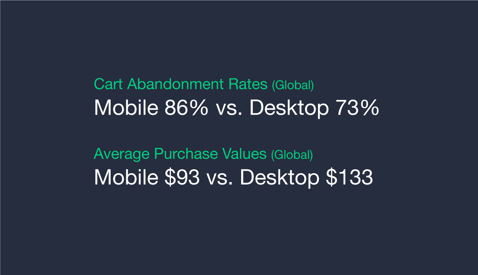
E-commerce sales continue to rise. Mobile devices comprise the bulk of e-commerce traffic, yet desktop sites have lower cart abandonment rates and higher average purchase values. Mobile e-commerce is the future, but if designers wish to maximize profits in the present, they must enhance desktop sites with e-commerce UX best practices.
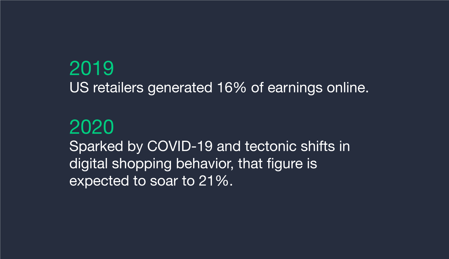
The potential is staggering. Year after year, e-commerce earnings climb higher. Offline sales still account for the majority of retail revenue, but the upward arc of e-commerce is undeniable. This year, e-commerce retailers in the U.S. are projected to achieve $840 billion in sales, a level they were not expected to reach until 2022.
Swirling within the statistical splendor are proclamations of an e-commerce future dominated by mobile—and for good reason. Mobile devices generate the most traffic and retail revenue worldwide. Unfortunately, mobile fails to satisfy two key metrics: Mobile sites have higher cart abandonment rates and lower average purchase values than desktop sites.
Is the destiny of e-commerce mobile? Undoubtedly. Is there significant money to be made by optimizing desktop sites with e-commerce UX best practices? Absolutely.
The E-commerce Experience in Four Pages
On desktop, nearly all e-commerce sites rely on a similar sequence of pages to funnel shoppers through the sales process.
- Uncluttered homepages with irresistible value propositions
- Well-organized category pages that are easy to navigate
- Polished product pages that combine social proof and compelling content
- Uncomplicated checkout pages that show progress and make shoppers feel secure
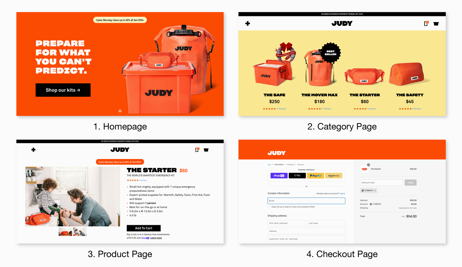
The layout, content, and navigation of each page exist to help shoppers find the information they’re looking for—while ushering them ever closer to purchase. All four pages must work in tandem to create the seamless e-commerce experiences shoppers desire. It all starts with the homepage.
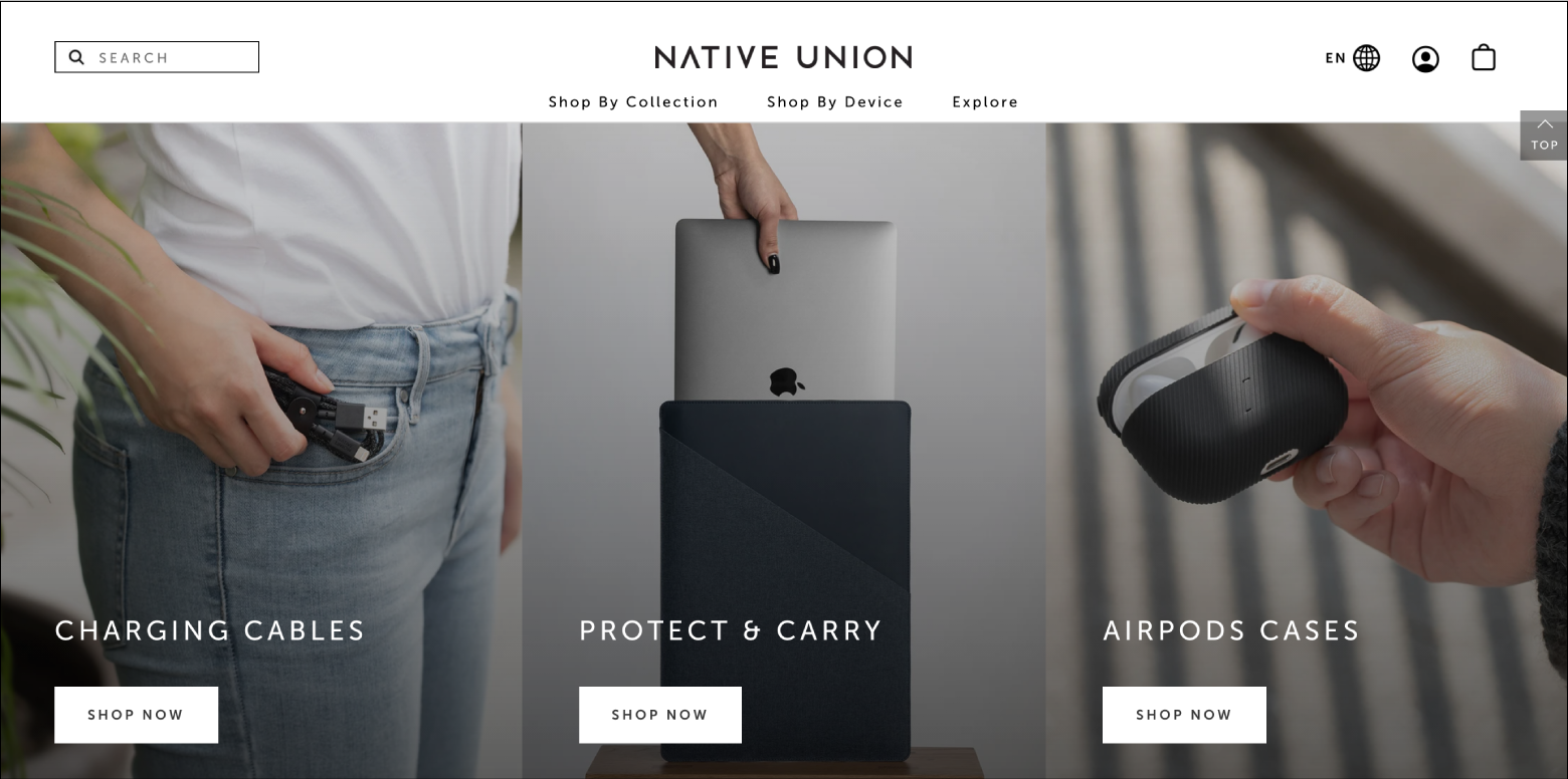
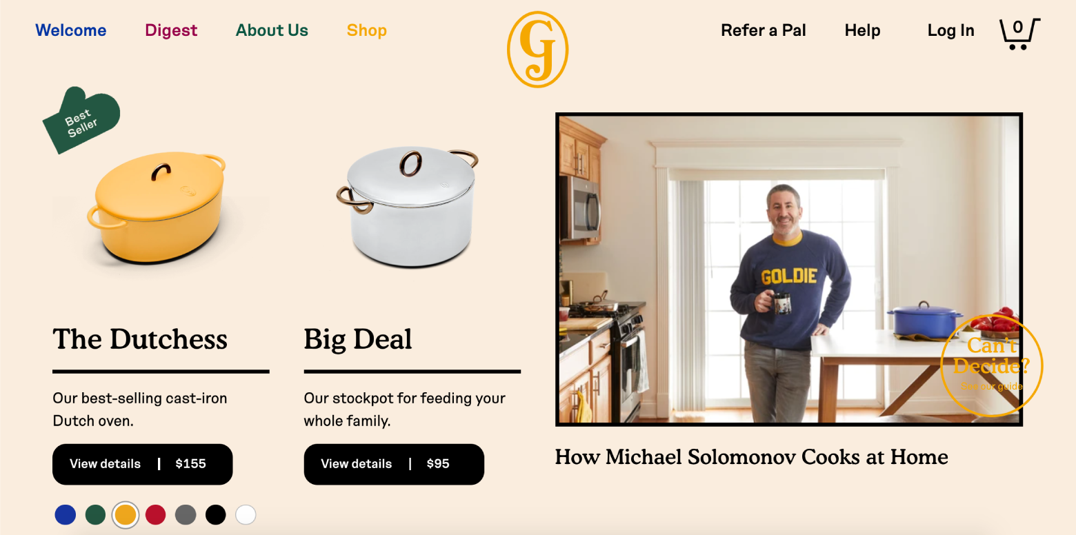
Uncluttered Homepages
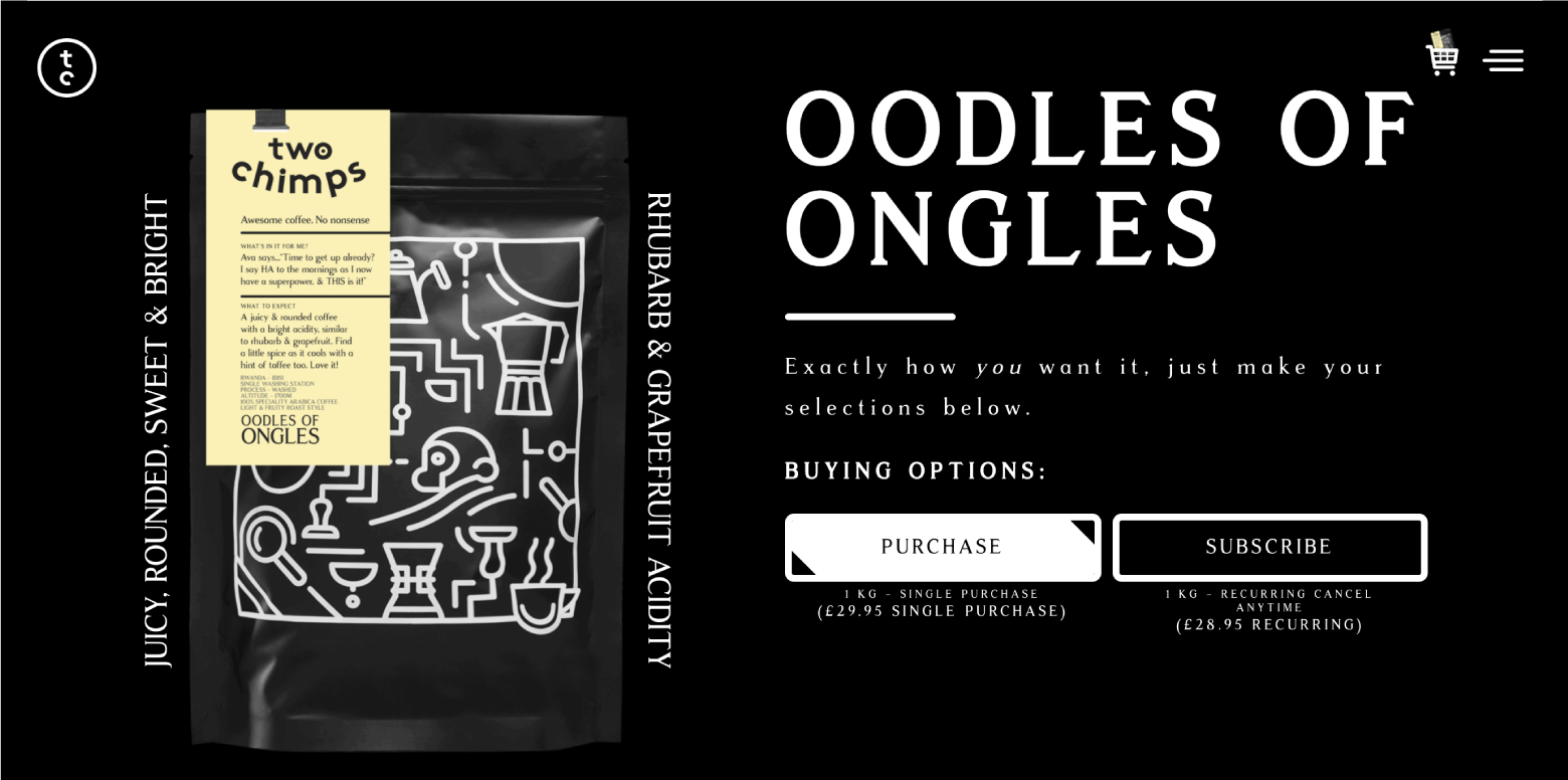
1. Make Product Value Instantly Apparent
A homepage is a first impression. Shoppers must be able to quickly ascertain a product’s value. Don’t use the homepage to drone on about technical features. Help shoppers envision how products will solve their problems and improve their lives (the Jobs to Be Done framework is a useful starting point).
Keep copywriting short and to the point. Use photos that illustrate product benefits. If shoppers have to read a lot, scroll a lot, or watch long-winded explainer videos to understand value, then value isn’t instantly apparent.
2. Enable Search From Anywhere
E-commerce sites that only sell a few items may not need search bars, but as offerings increase, search becomes an essential way for customers to find products according to their mental models. Sticky search bars ensure that search is available everywhere on every page, but it’s best to remove search from checkout pages for the sake of conversion.
3. Give Products Names That Make Sense to Shoppers
Product names that make sense internally can leave shoppers perplexed. Provide decision-making context. Names based on model numbers or underlying technology risk alienating the layperson. The same is true of overly cute or creative titles. Choose product names that indicate utility or value from shoppers’ perspective.
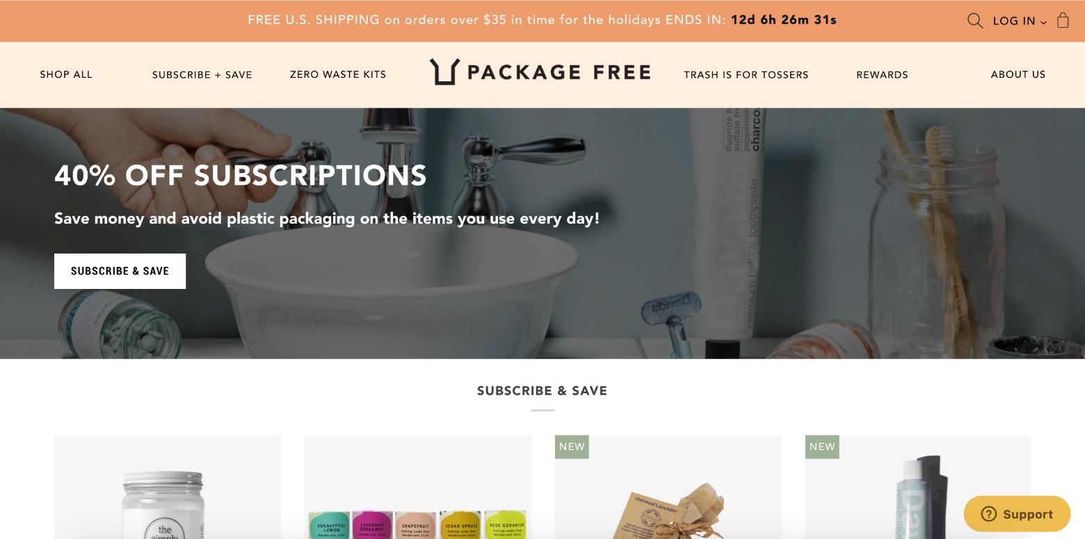
4. Highlight Deals and Promotions
Shoppers come to e-commerce sites with specific products in mind. When deals and promotions blend into homepages, they go unnoticed. Call out deals with bright colors, bold text, and full-page photos.
If a sale is of secondary importance, it should be noticeable but shouldn’t compete with the homepage’s primary value proposition. If a promotion is the number one thing shoppers need to know about, shine a spotlight on it.
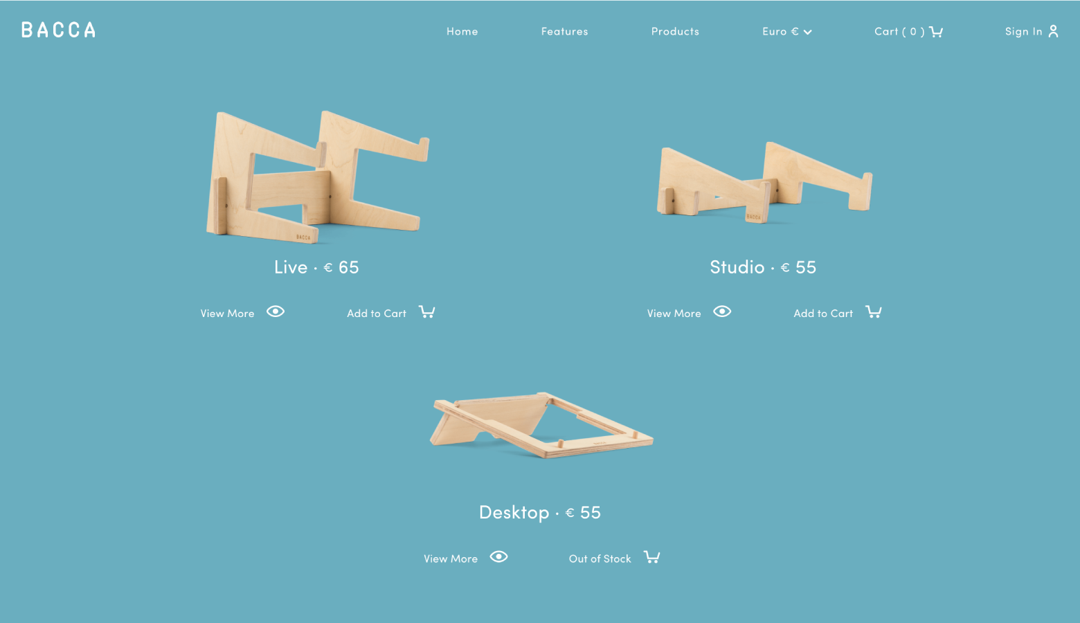
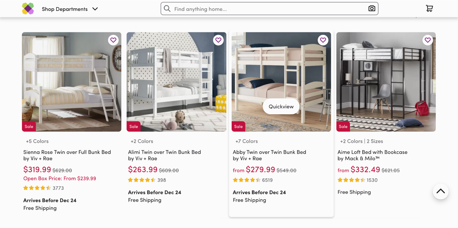
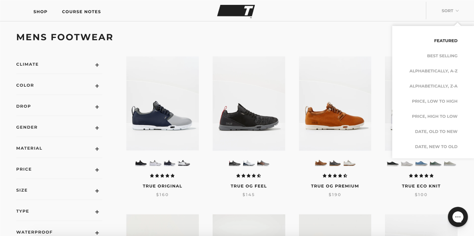
Well-organized Category Pages
1. Present Products in Grids
The space afforded by desktop screens is perfect for product grids. Grids align with F-pattern scanning and enable shoppers to compare multiple products quickly. They are especially effective for items that are easy to explain in pictures. To maximize the benefit of grids, try to keep the number of items per row between two and four. At five or more products, grids become significantly harder to scan.
Bonus: List views do work, but they’re best suited for products that require more detailed explanations.
2. Ensure Effortless Navigation
Navigation needs to be intuitive. Shoppers shouldn’t struggle to switch between category pages or enable product filters. Sites with large numbers of products in a single category should use the left-column navigation to allow shoppers to sort products according to different attributes (faceted search).
3. Showcase Bestsellers
Mark bestselling items with unique icons or place them in bestseller sections. Why? Bestsellers are a form of social proof. When people are uncertain, they’ll look to the actions of others to determine their own. This is particularly true of new shoppers.
A similar principle applies to recently launched products. Showcasing new and improved items is more than just a one-time sales tactic; it’s a way to entice shoppers to return for updates in the future.
Polished Product Pages
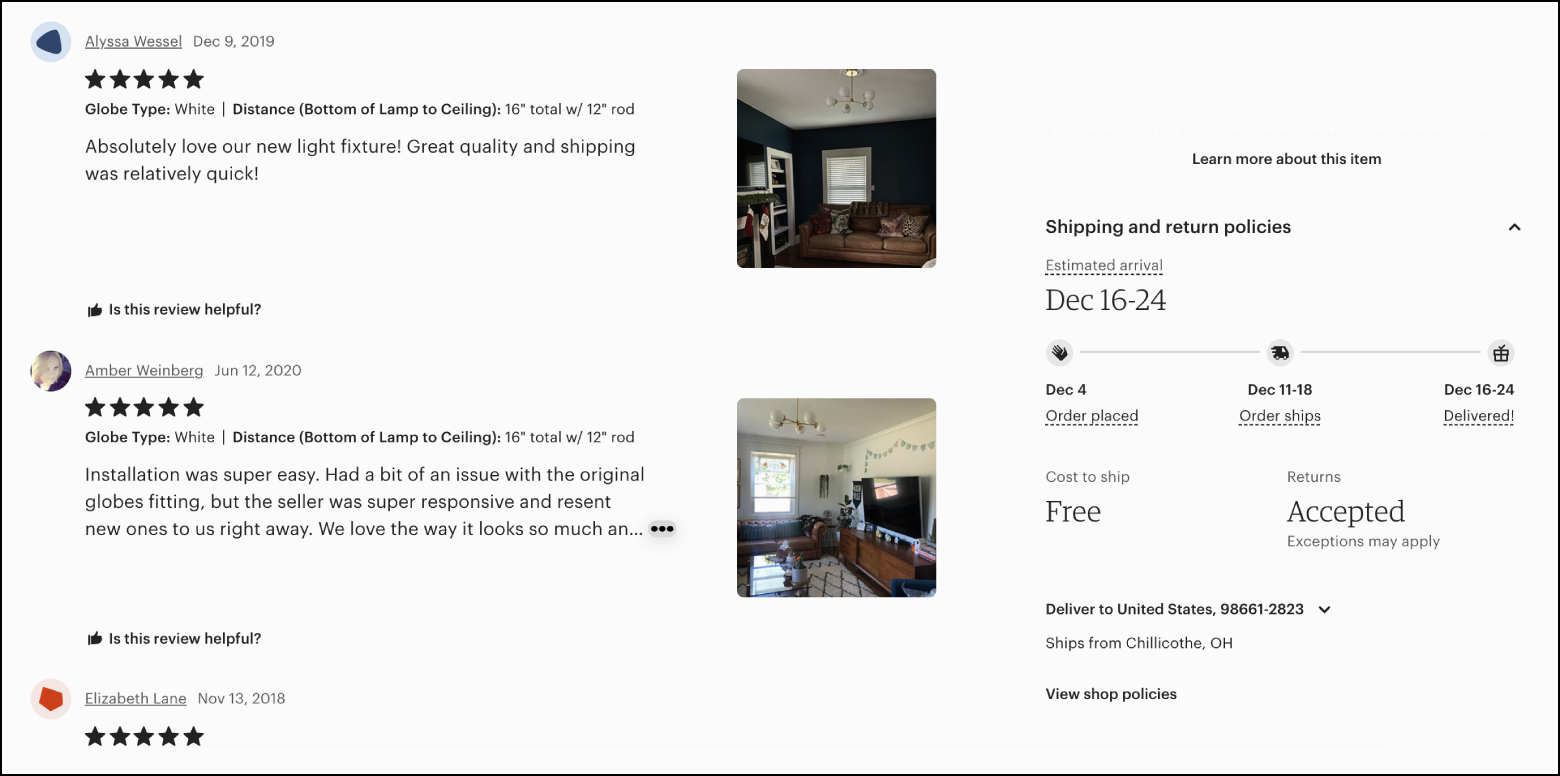
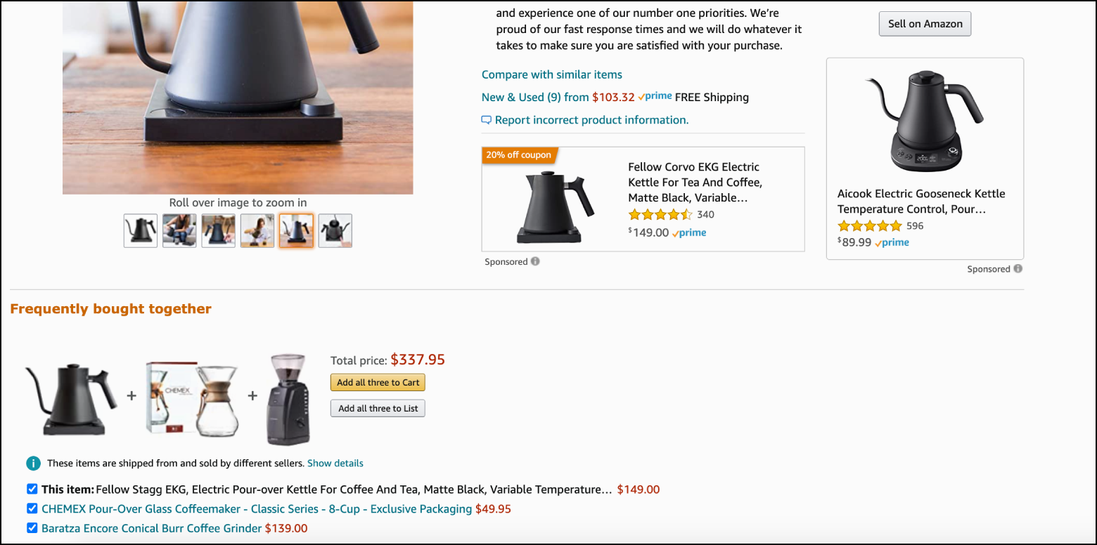
1. Entice with Social Proof
Social proof instills trust in shoppers. Ratings and reviews have a profound impact on purchasing decisions, but desktop sites are spacious enough to handle other forms of social proof as well:
- Product photos taken by customers
- Celebrity and influencer endorsements
- Quotes from experts
- Approval badges from independent review sites
The goal of social proof is to help shoppers feel like they’re making informed decisions that align with other people’s positive experiences.
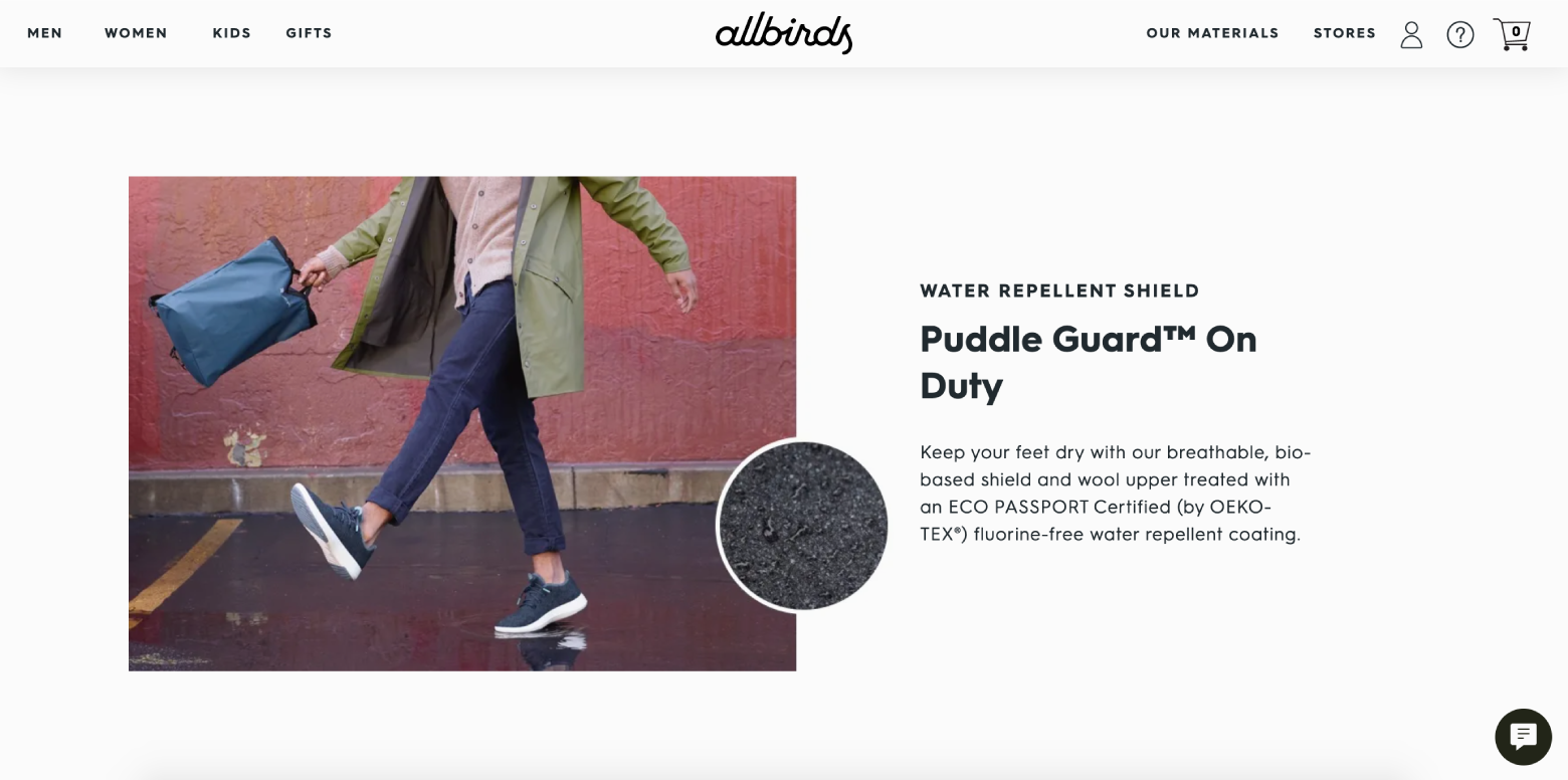
2. Use Copy and Imagery to Show the Good Life
E-commerce content should be informative, but there’s more to persuasion than facts and feature lists. Use text and imagery to help shoppers imagine the good life awaiting them after checkout.
Here again, desktop sizes are an advantage. There’s no reason not to use colossal photos and videos or show products from multiple angles. The same goes for copy. Don’t hesitate to make headers huge and surround text blocks with generous amounts of whitespace.
3. Earn More with Upsells and Related Products
If shoppers aren’t satisfied with what they see on product pages, they shouldn’t have to navigate back to category pages to find other options. Instead, show them alternative products at similar price points or more expensive options with better features, reviews, or brand recognition.
It’s also possible to suggest related items that complement the product page. Buying shoes? Why not get shoelaces and arch supports too? To reduce friction, make sure that related items have an “Add to Cart” option.
4. Design Big and Bold “Add to Cart” Buttons
When it comes to product pages, “Add to Cart” buttons have to stand out. Make them big, high contrast, and easy to click. Resist the urge to be witty and write call-to-action text that is unambiguous and action-oriented.
Shoppers must receive visual feedback when they add items to their shopping carts. Many desktop sites do this with cart-summary overlays that slide in momentarily from the side of the screen (a creative way to allow shoppers to transition to checkout or keep browsing).
Straightforward Checkout Pages
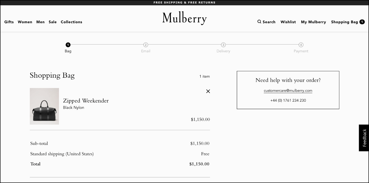
1. Show Shoppers Checkout Progress
E-commerce shoppers spend a great deal of time and energy looking for products online. When they’re ready to buy, they need reassurance that the end of the process is in sight. A progress bar is a simple way to show shoppers where they are during each stage of checkout.
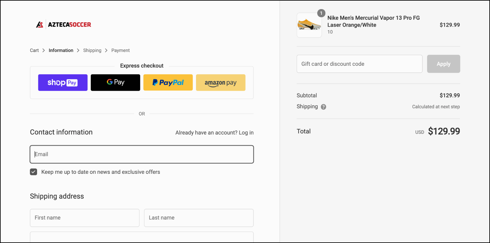
2. Accept Multiple Forms of Payment
Convenience and security are shoppers’ primary concerns when they reach payment gateways, and they’re two of the top reasons for cart abandonment. Luckily, there’s a growing number of online payment options that alleviate security fears and expedite checkout. Third-party payment options backed by trusted companies (like Amazon and Apple) may be more appealing to shoppers than entering credit card information.
It’s also worth considering “buy now, pay later” (BNPL) options like Paypal Credit and Klarna. BNPL is a form of point of sale credit that allows customers to pay for products over time after receiving the goods.
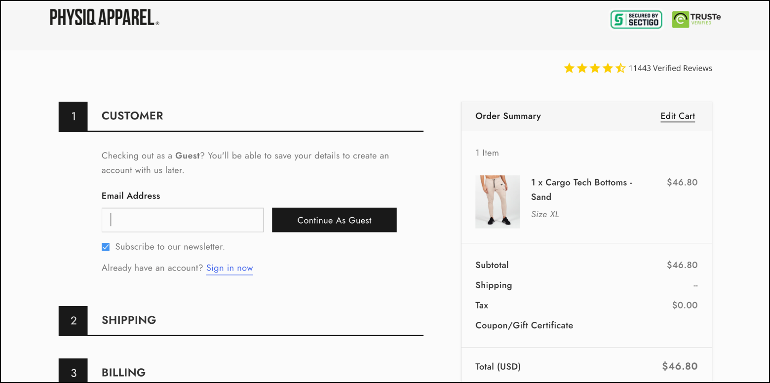
3. Consider Guest Checkout
Guest checkout may not be right for all e-commerce retailers, especially those whose business strategies revolve around generating customer accounts. However, it’s proven to accelerate checkout, prevent account-creation fatigue, and reduce cart abandonment.
An alternative is requiring emails for order confirmation, then following up with deals in shipping and delivery messages.
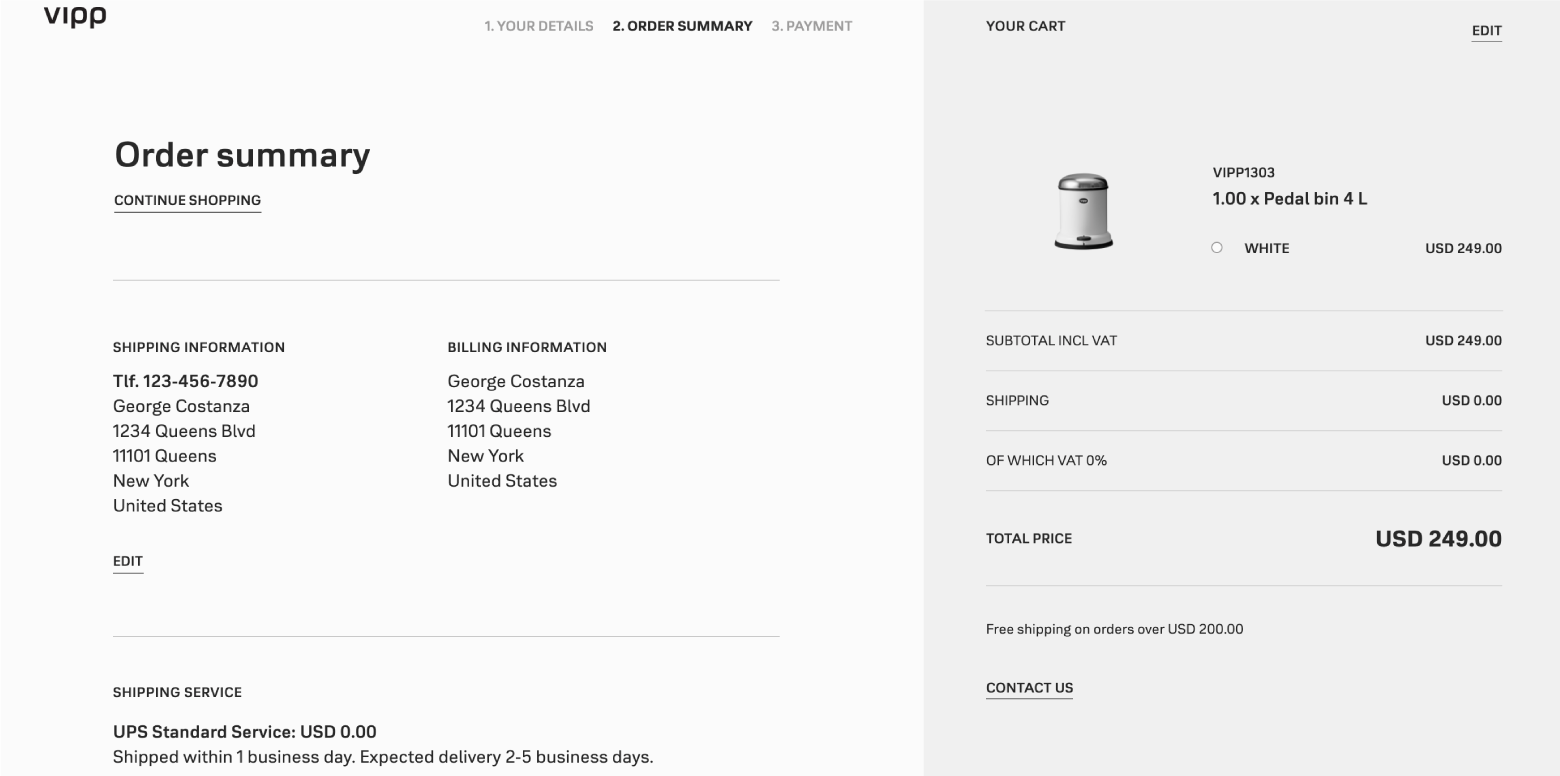
4. Provide a Clear Order Summary
This one’s mandatory. Give shoppers concise order summaries that include:
- Product details and quantities
- A breakdown of all fees
- Shipping and billing information
It’s also smart to show product pictures, but make sure attributes match customers’ selections (color, size, finish, etc.).
5. Boost Trust with Security Badges and Customer Support
Give shoppers confidence by displaying security badges and third-party endorsements. Checkout is a great place to remind shoppers of verified rankings and reviews.
Nearby, include support features like chatbots, return policies, links to FAQs, and customer support lines. Shoppers may not use these resources at checkout, but they’ll have peace of mind knowing they exist.
Observe E-commerce UX Best Practices
Shopping is tactile. The weight of an object, its angles and edges, its fit and feel—these things matter. In the absence of presence, familiarity and display size are crucial. Desktop delivers both. It’s a comfortable paradigm where screens are spacious, navigation is straightforward, and images and videos are more true to life.
Mobile retail is a relatively new field. There are kinks to untangle, but it remains the future of online shopping. Until then, designers are wise to profit from the present by optimizing desktop sites with e-commerce UX best practices.
Let us know what you think! Please leave your thoughts, comments, and feedback below.
Further Reading on the Toptal Blog:
Understanding the basics
How can e-commerce websites improve user experience?
Websites can improve e-commerce UX by optimizing home, category, product, and checkout pages. e-commerce UX best practices build trust and help shoppers make informed decisions. For example, image grids work better than lists on category pages, and most shoppers won’t complete checkout without an order summary.
What are UX best practices?
UX design is based on a user-centered approach to design. User-centered design is founded on a body of design methods and best practices that exist to help users meet goals. Ultimately, these methods enable designers to create intuitive experiences that align with users’ expectations.
What is UX in e-commerce?
E-commerce user experience is designing for sites that sell products online. Successful e-commerce UX design provides intuitive shopping experiences, employs best practices, gives businesses advantages over their competition, and extends brand reach and appeal.
What makes a good e-commerce experience?
High-quality e-commerce experiences have similar attributes: intuitive layouts, compelling copywriting, and illustrative visuals. e-commerce pages should make value propositions apparent and provide shoppers with the information and navigation components needed to make effortless purchases.
What is e-commerce design?
There are several aspects of e-commerce design. Brand, visual, UI, copywriting, and e-commerce UX must work in tandem to highlight product value and motivate shoppers to make purchases. Successful e-commerce sites are iterative, meaning all design elements are continuously measured and improved.
Micah Bowers
Vancouver, WA, United States
Member since January 3, 2016
About the author
Micah helps businesses craft meaningful connections through branding, illustration, and design.