E-commerce UX: Essential Design Strategies and Principles
E-commerce sales are expected to more than double by 2021. E-commerce retailers and designers who pay close attention to user experience and follow e-commerce UX design principles can capitalize on this growth.

E-commerce sales are expected to more than double by 2021. E-commerce retailers and designers who pay close attention to user experience and follow e-commerce UX design principles can capitalize on this growth.

Stan is a UX/UI consultant who specializes in e-commerce. His ultimate goal is to provide a concrete ROI for his clients.
Expertise
As the overall retail landscape continues to evolve and brick-and-mortar chains struggle, the e-commerce market is poised for growth. By 2021, global e-commerce sales are expected to grow to more than 4.48 trillion dollars, which is more than double the numbers from 2017.
E-commerce retailers and designers who pay close attention to user experience and adhere to a standard set of e-commerce UX design principles for the customer shopping flow can capitalize on this market growth and see tangible financial returns.
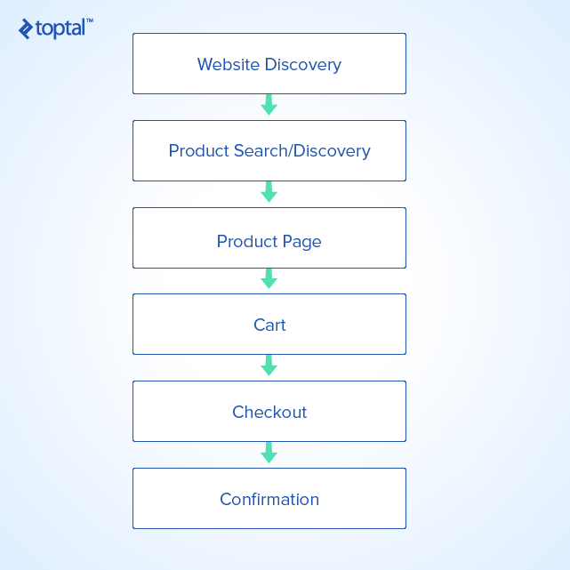
The shopping flow is a general user journey that, when implemented properly, results in more impulse purchases, less cart abandonment, and higher overall conversion.
The user journey includes:
- Website discovery
- Product search and browse
- Product page
- Cart
- Checkout
- Confirmation
This article covers these key points of the user journey and how e-commerce designers can make the customer’s experience enjoyable, straightforward, and hassle-free.
Website Discovery
Position the Brand Clearly
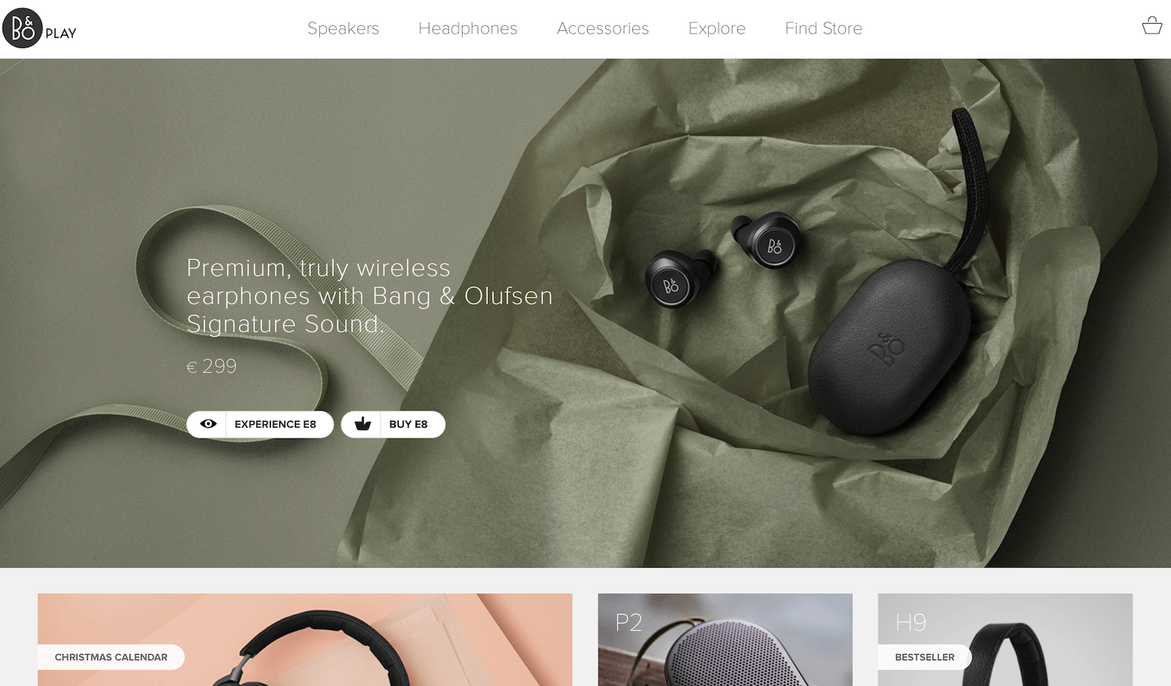
Visitors form first impressions of a website in as few as 50 milliseconds. An e-commerce website needs to grab the user’s attention by clearly and quickly showing what it sells and where it fits in the overall market.
For example, a luxury jewelry retailer’s website would likely look and feel very different than a site for a budget-conscious big box store. High-end electronics retailer Bang & Olufsen conveys its brand quality by using elegant fonts, a sophisticated color palette, and sleek product images.
Show Relevant Calls to Action
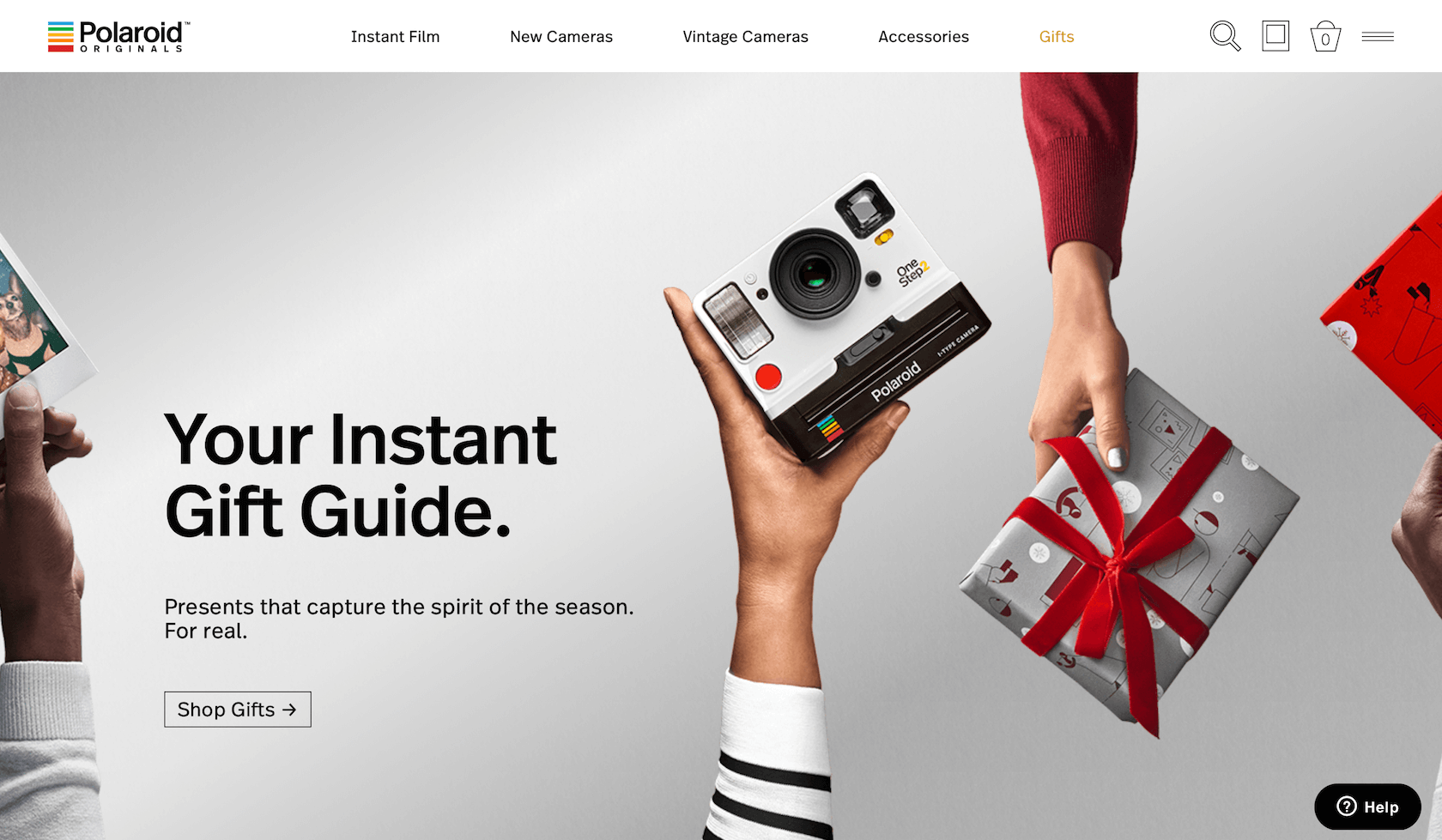
When the user arrives on the home page, greet them with timely content and specific calls to action (CTAs). A large banner image that corresponds to the current season or a specific event along with an appropriate CTA helps the user move to the next step in the shopping process. When creating CTAs, avoid generic phrases like “get started” that don’t clearly tell the user what’s coming next.
Polaroid created an effective CTA during the holiday season by helping users who were shopping for presents. Rather than using a generic phrase, Polaroid used “Shop Gifts,” making it clear that the user would be taken to an area on the site with gift suggestions.
Tailor Landing Pages for SEO
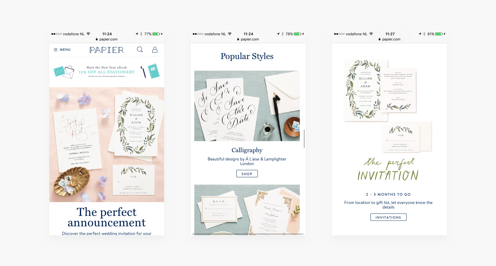
By connecting the user’s search terms from search engines like Google to specific landing pages, e-commerce retailers can capture users who are on a mission to find a specific product.
When a user searches for something, there’s a good chance they may be looking to buy it. Creating a custom landing page for common product search terms increases a retailer’s chance of snagging a sale (and maybe a new customer). Stationery company Papier does this well with a page specifically crafted for wedding invitations that appears in Google search results.
Product Search and Browse
Provide On-site Search
While it may seem quite basic, many sites still don’t offer a general site-wide search, or if they do, it isn’t properly optimized. But on-site search is fundamental to a solid e-commerce shopping experience.
According to Invesp, 60% of online purchases are not impulsive. People often know what they are looking for, and typing their query into a search bar on an e-commerce website—such as a product name or model number—is far faster than sifting through menu options.
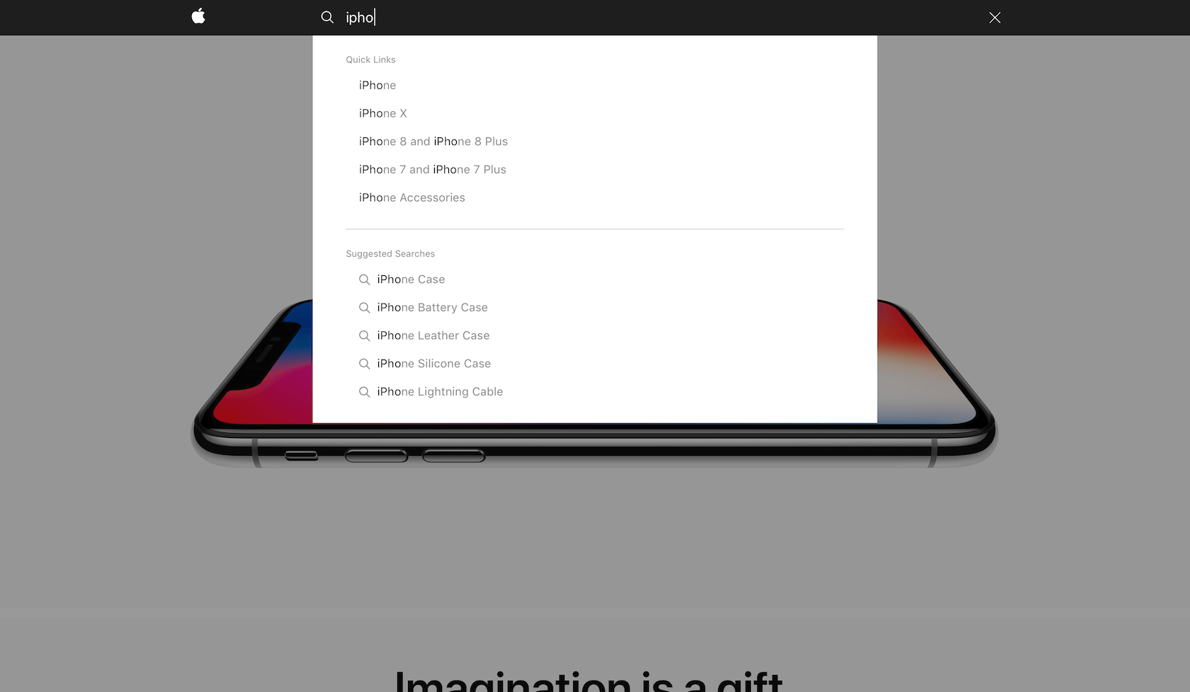
Additional features like predictive search or autocomplete help users see options quickly. Apple uses this tactic with a search field that dynamically updates with quick links to products and popular suggested searches.
Inspire Visitors in Discovery Mode
While many shoppers have a specific item in mind for purchase, not all visitors are as certain. According to Nielsen Norman, there are five types of e-commerce shoppers, one of which is the “browser.” Browsers aren’t necessarily looking for something specific. Rather, they are leisurely looking around to see if they find something interesting.
E-commerce websites can support the shopper in discovery mode by showing them new or best-selling products and allowing them to easily and quickly see product categories.
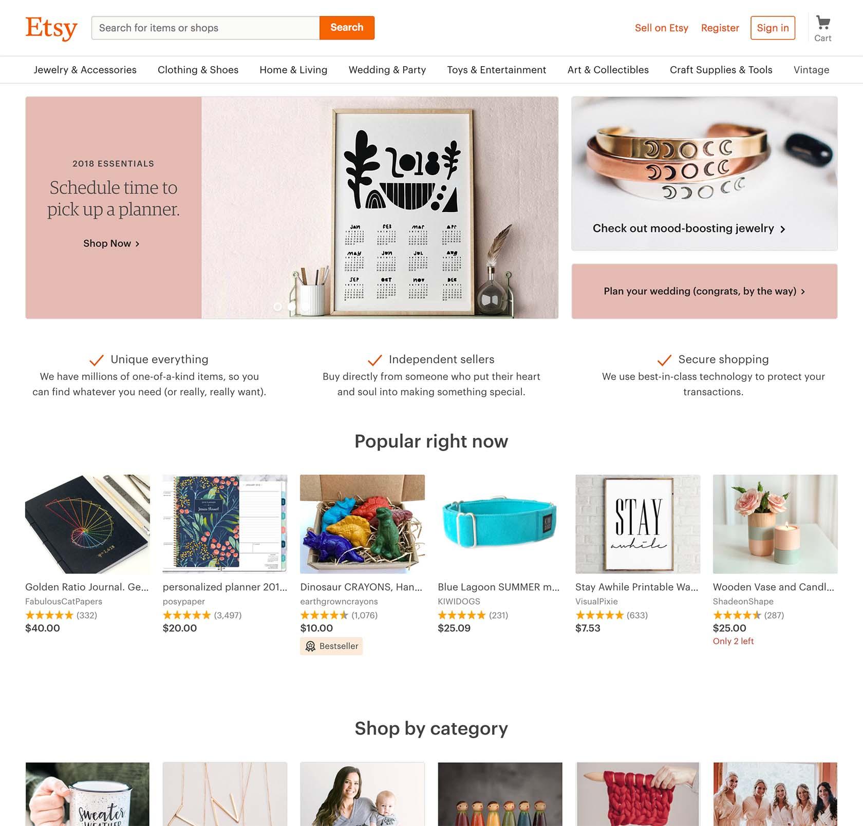
Etsy engages browsers by showing them what’s popular right now as well as clearly displaying overall product categories, both in the navigation and on the home page content.
Use Filters and Faceted Search
Faceted search uses filtering and takes it one step farther by allowing users to select multiple attributes at a time.
When creating filters, rather than limiting options to general criteria like size, color, or price, add specific filters for categories specific to the products being sold. Those filters could be things like fit or fabric for clothing, fonts, or occasion for invitations, and screen size or processor for gadgets.
Once a user applies filters, it should be immediately apparent in the UI what filters have been applied. The user should also be able to easily remove applied filters.
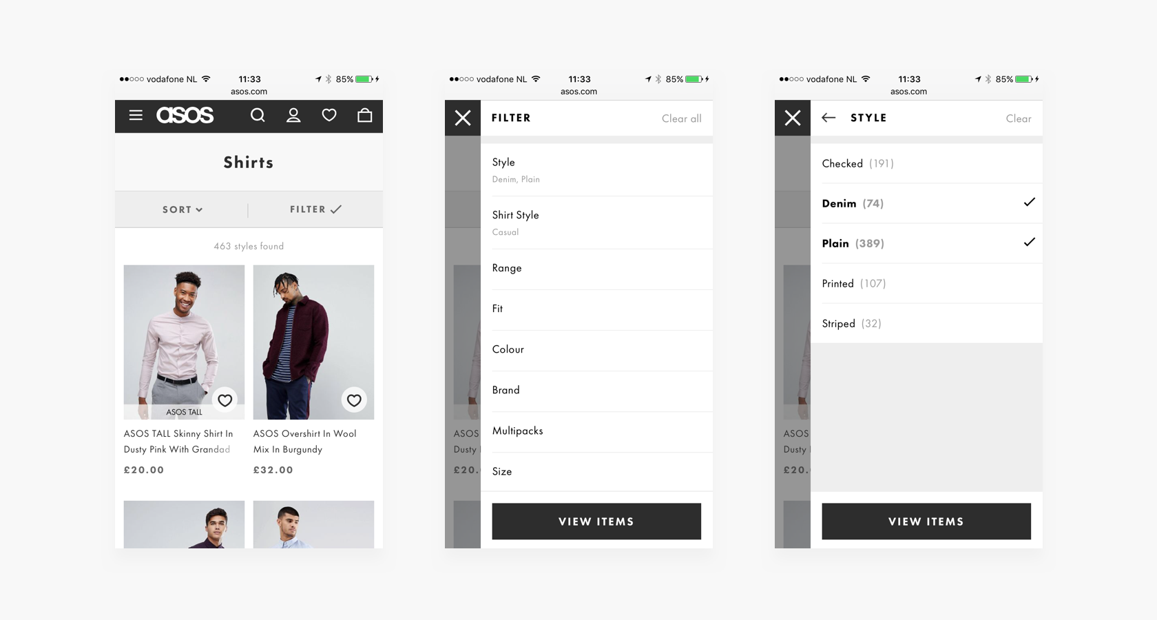
ASOS shows a detailed range of filters for each category and clearly shows which filters have been applied.
Product Page
Prominently Display Primary Actions
The user should never wonder how to do something important, like placing a product in their shopping cart. Display primary actions like “add to cart” or “buy now” as buttons, and put them in a prominent location on the screen relative to the rest of the content.
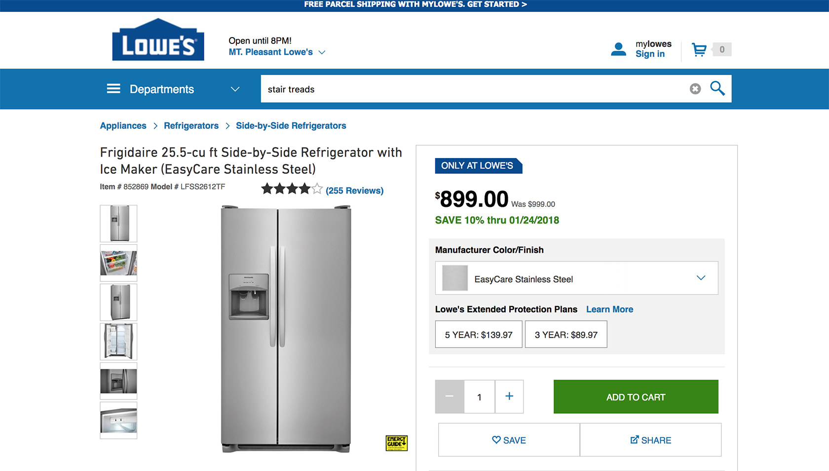
Home improvement retailer Lowe’s lets the user know how to add a product to their cart with a large, green button as one of the most prominent things on the page.
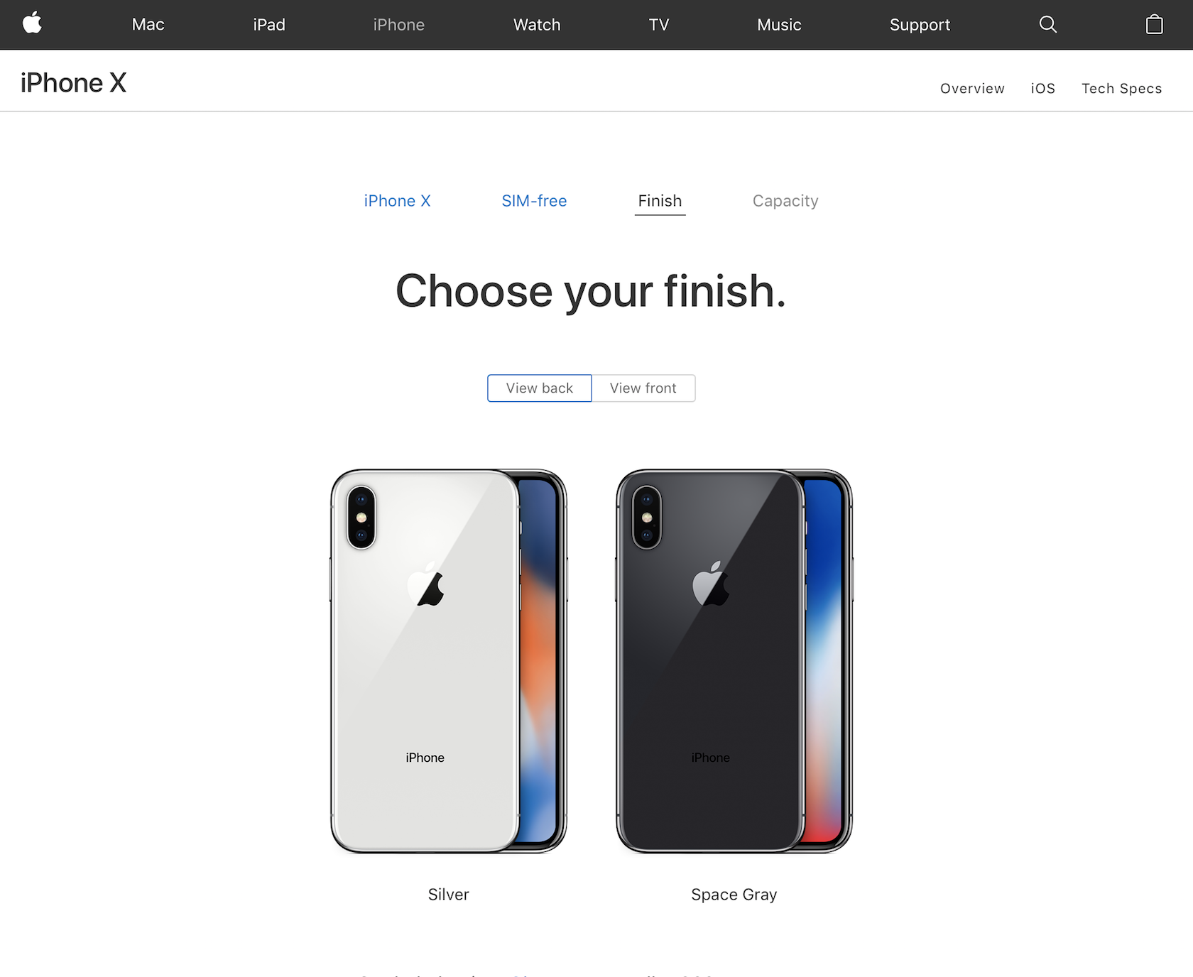
Provide Detailed Product Information
Show high-quality, professional photos and detailed descriptions to help buyers understand the product.
Use progressive disclosure and visual hierarchy to give the user the right amount of information as they need it. Give them the most important information immediately, then add details farther down the page for users who want to learn more.
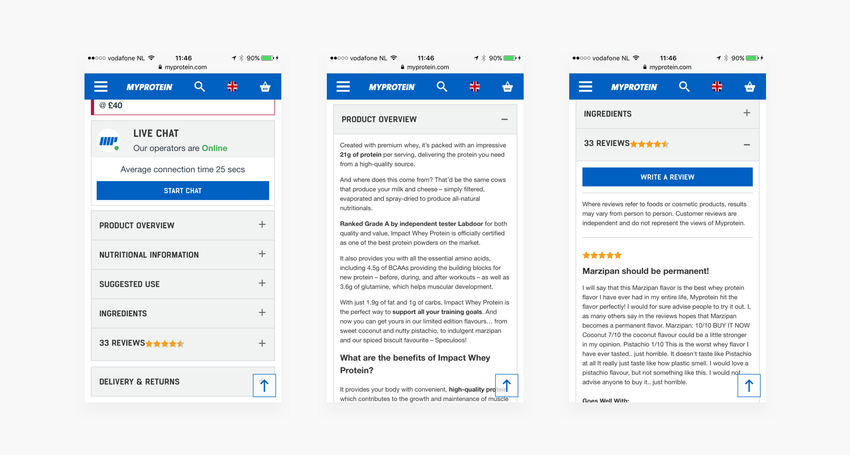
Break long descriptions into sections; for example, overview, sizes/dimensions, detailed features, and shipping information. Using expand/collapse navigation for additional sections, as Myprotein does, helps keep the user from feeling overwhelmed.
Build Customer Trust
Avoid leaving customers guessing about shipping options, product availability, and return policies. Making sure all of this information is readily available, which builds customer confidence and trust and may help push an uncertain customer toward a purchase. Knowing if and how they can return something helps them make more informed decisions.
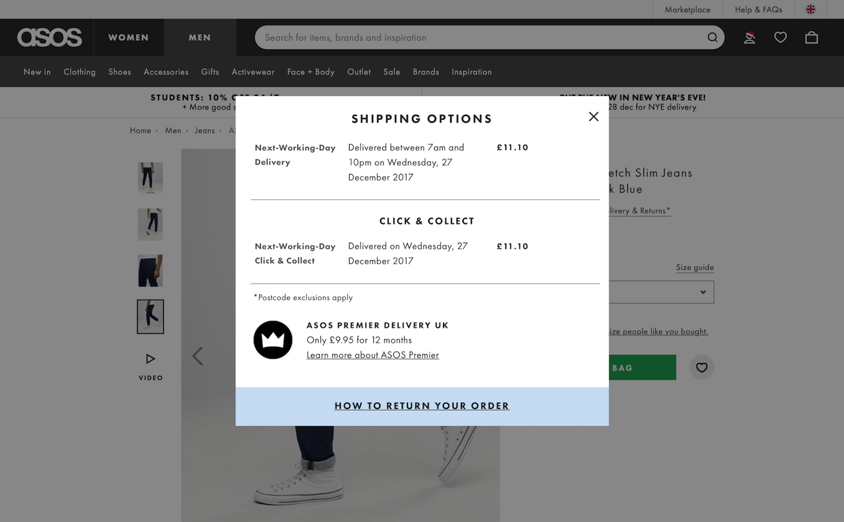
ASOS clearly displays important shipping and return information on each product page using a modal accessed from a link under each product name.
Add Social Proof
Social proof is a concept that means people are influenced by the behavior of others. The concept is part of Dr. Robert Cialdini’s (a leading researcher in the science of influence) principles of persuasion and has been proven to work.
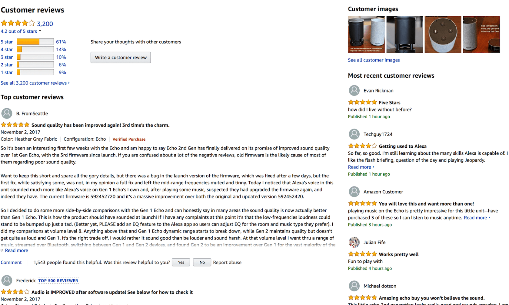
E-commerce retailers can bolster buyer confidence with social proof by adding customer ratings, reviews, and comments. Products on Amazon often have thousands of reviews, and users can sort them by star rating level.
Shopping Cart
Show a Clear Order Summary
Before the buyer finishes their purchase, show them a clear and concise order summary that includes items purchased, the quantity and price of each item, and the order total. Allow the user to edit any items they may want to update or delete, and avoid shipping charge surprises by including a shipping summary.
The Modist shows both a clear order summary and a receipt. The user can easily manage items they have selected (move to wishlist, remove, change quantity) and see both a summary and a detailed breakdown of shipping and taxes.

Checkout
Let Users Check Out as Guests
Impulse purchases represent almost 40% of all money spent in e-commerce. Eliminate the extra hurdle of creating an account or logging in by allowing buyers to check out as guests. During the check-out-as-guest process, a simple integration to create an account may convert some guests to account users.
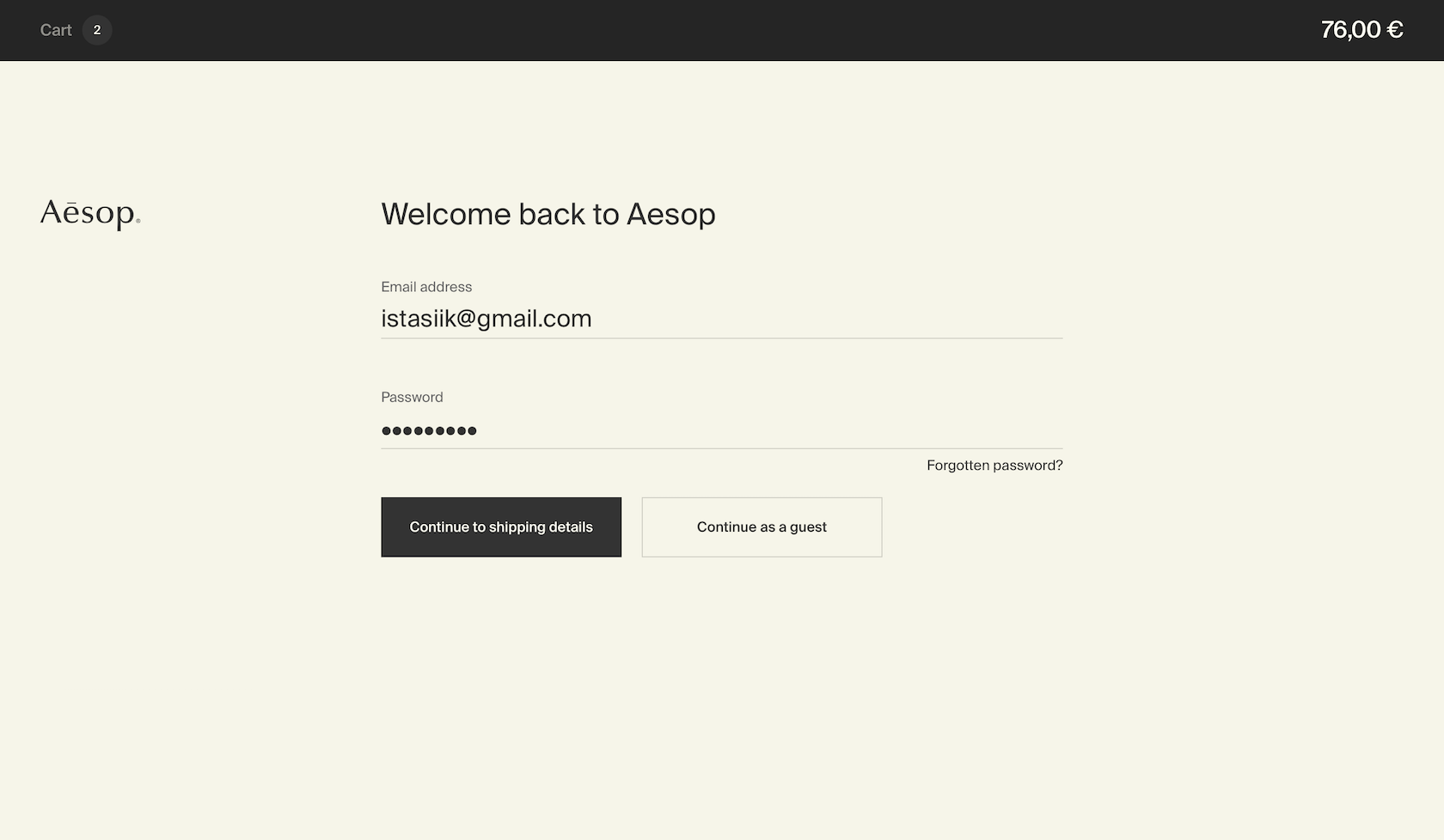
Aesop allows users to easily check out as guests while also giving the option to sign in or register. Providing multiple options in a single form removes potential purchase blockers for those who want to check out quickly, but also gives users who want to sign up the chance to do so.
Provide Visual Feedback During the Checkout Process
Including a progress bar helps customers understand where they are in the checkout process and how much they have left to complete.
Apple shows the user each step in the process and allows them to navigate between the steps using the progress links. The progress is saved, so the user doesn’t lose anything while moving between steps.
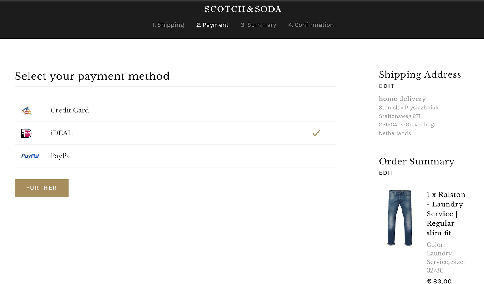
Use Common Payment Methods
In addition to allowing payment via major credit cards, adding other popular payment methods like PayPal may increase conversion for buyers who don’t want to hand over their credit card information.
In the Netherlands, iDEAL is often used for e-commerce transactions, and 60% of Dutch consumers have used it in a recent purchase. Clothing retailer Scotch & Soda allows buyers to check out with iDEAL and PayPal.
Order Confirmation
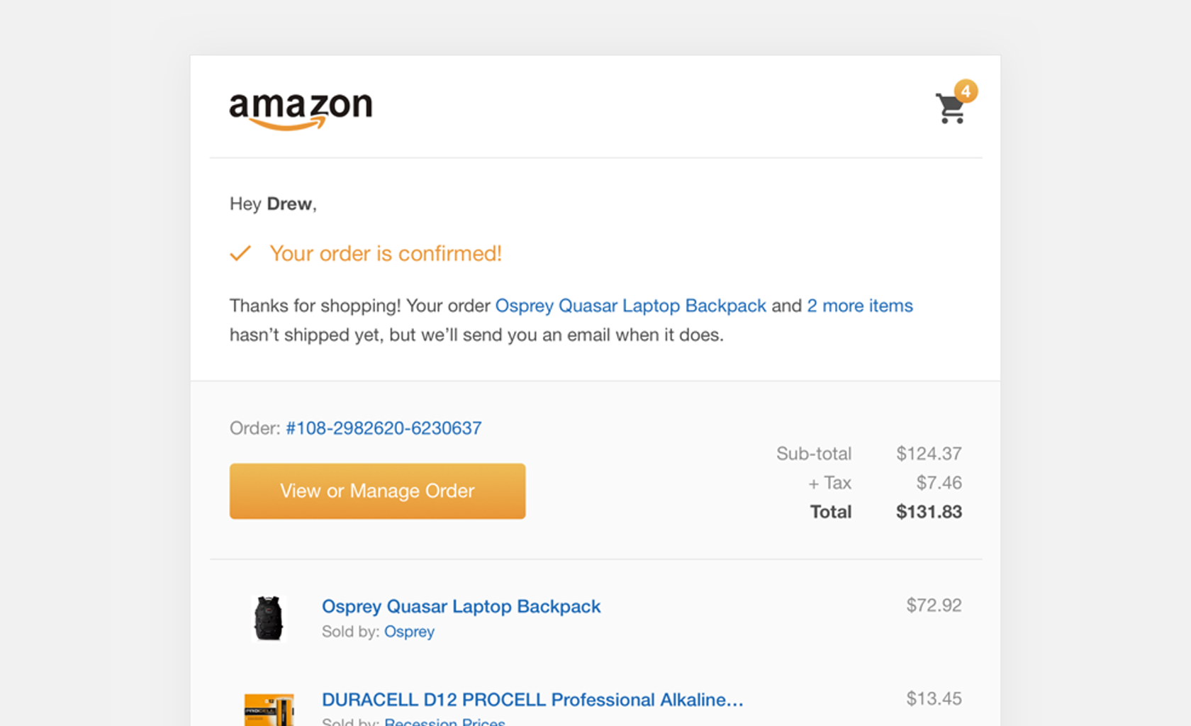
Display a Detailed Order Confirmation After Purchase
Once the customer completes the purchase, give them confirmation that includes successful payment processing and delivery details like address, delivery method, and expected delivery date.
This concept of a confirmation email for Amazon shows the order number, gives an overview of purchased items, and provides a shipping date and some recommendations for future purchases.
Send Order and Shipping Updates via Email
In addition to the confirmation screen, sending a confirmation email helps keep the user informed on the status of their purchase. While all customers should receive email confirmation, this is particularly helpful in instances where users have checked out as guests and don’t have an account on the website to check their past orders.
If anything changes with the order, like a delay in delivery, send an update. Once the item ships, send an email update with the tracking number.
Summary
The principles in this article provide a baseline of user journey touchpoints that every e-commerce designer should follow, but it’s just the beginning. For additional learning on more specifics about mobile e-commerce UX, visit e-commerce for the Mobile Experience or read more about landing page design How to Design Effective Landing Pages.
The growing e-commerce market represents many opportunities for retailers. Those that recognize the importance of UX and follow best practices for the e-commerce user journey can remain competitive and positively affect their bottom line.
Further Reading on the Toptal Blog:
Understanding the basics
What is an e-commerce retailer?
E-commerce retailers are online stores that have added the ability for customers to browse for and purchase items through a website.
What are the benefits of an e-commerce website?
With the increased and projected growth in online shopping, retailers who follow key e-commerce UX design principles can capitalize on a tremendous market growth.
What is a call to action on a website?
E-commerce website calls to action help guide the buyer through the shopping process. They are often displayed as buttons.
The Hague, Netherlands
Member since July 19, 2017
About the author
Stan is a UX/UI consultant who specializes in e-commerce. His ultimate goal is to provide a concrete ROI for his clients.