Consistency Is Key: How to Build a Figma Design System
Figma has advanced features that are tailored to meet expectations for consistency during the design process. This tutorial outlines how a Figma component library can work well within a design system.

Figma has advanced features that are tailored to meet expectations for consistency during the design process. This tutorial outlines how a Figma component library can work well within a design system.

Jason is an experienced designer with a talent for UX, strategy, and creating innovative solutions from first principles.
Expertise
It is common knowledge among designers that a good design system can have a huge impact on the quality of products we ship and the pace at which we can develop them. As the case for creating a comprehensive design system has been made clear many times over, with companies like Google, GitHub, IBM, and others using them to create better products at greater pace, the question has shifted from “Why should we have a design system?” to “How can we create a great design system?”
So what precisely is a design system? Will Fanguy defines it as “a collection of reusable components, guided by clear standards, that can be assembled to build any number of applications.” A design system may include not only a UI component library and a pattern library, but a style guide, best practices, code, and more. Just like an architect’s blueprint for a building, a design system also serves as the “single source of truth” for the product team while building products, as well as helping to maintain consistency.
GitHub has even gone so far as to share their Figma component library—a great example of a Figma-based design system. More extensive tools like Storybook and Component-Driven Development are also extremely useful resources for implementing and documenting a design system.
A design system maintains design consistency and should be useful to everyone involved in creating a product. It’s a toolkit that helps designers create new screens, flows, and prototypes faster. A good design system helps developers understand the logic behind design decisions, and helps to create a more cohesive product. It speeds up the design process and allows designers more time for experimentation.
For those designers working with Figma, let’s look at how creating a component library in Figma can be a key part of a comprehensive design system.

The Power of a Component Library
Sometimes, it can be counterproductive to invest in creating a design system too soon. In the early stages of designing a product, the process is still fluid. For example, if two primary navigation bars are being experimented with, adding both to a component library would not make sense, as it will confuse everyone on the team. It’s better to wait until the product design has settled—preferably tested and somewhat finalized.
If a product is a mature one and doesn’t have an existing component library, the design system should already be determined by the current implementation. But it’s not codified yet. At this point, it would be advantageous to define the common UX patterns and distill the product into a set of components that are regularly used throughout the product. Additionally, it’s ideal if the library of components is kept in a central location that is easily accessible to all.
A Design System Is Primarily a Toolkit
Trying to use a design system like a toolkit is a great litmus test for its effectiveness. If multiple designers use it regularly in order to speed up their process, it’s doing a good job. If developers can reference it for colors, typestyles, or to do work with less input from designers, that’s also a good sign.
It’s generally not useful to include highly complex components or those that may only be used once or twice in the product. The more reusable something is, the more it belongs in a design system.
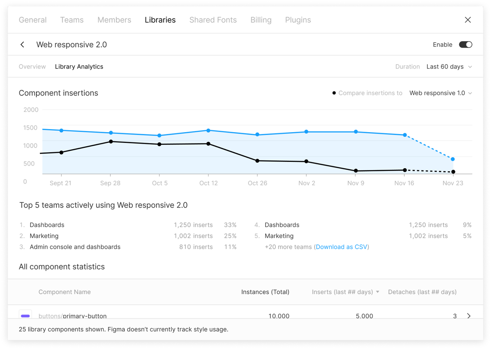
Figma recently released design system analytics for organizations, where teams can see how effective different parts of a design system are and help optimize it.
Why Figma Is Great for Creating a Component Library
Figma is a powerful design tool with many great features, but there is a subset of elements that become particularly useful when designing complex products: Styles, Components, and Library Files. These features help keep design systems up to date, help maintain consistency between designs, and provide a shortcut for updating multiple designs from a central location.
- Styles are colors and typestyles (font, size, weight, etc.) that are defined in one place and can be applied to many objects.
- Components are things like buttons or chat bubbles and can be built from Styles, objects such as shapes and text, and other Components.
- Library Files allow Styles and Components to be shared between multiple files and with a team or organization.
Figma has collaboration and sharing at its core. Design files can be edited by anyone in the browser, shared freely, and they update in real time as multiple users can edit them simultaneously. This opens up the design system to more efficient collaboration not only between designers but also with developers and other stakeholders.

Creating a Library File
In Figma, a library file that will more or less serve as the inception of a design system can be created. Here, we can define Styles and Components that are then shared throughout the team or organization and used in multiple designs. Styles and Components can be updated in one place, and these changes can then be brought in to all the individual design files automatically.
This has a couple of key advantages:
- Speed. It saves time by removing the need for a designer to update potentially hundreds of designs manually. By having components managed in a single library file, updating a color in one place can propagate throughout every design created using the component library with just a few clicks.
- Consistency. It reduces the likelihood of error by automating the task.
Organization
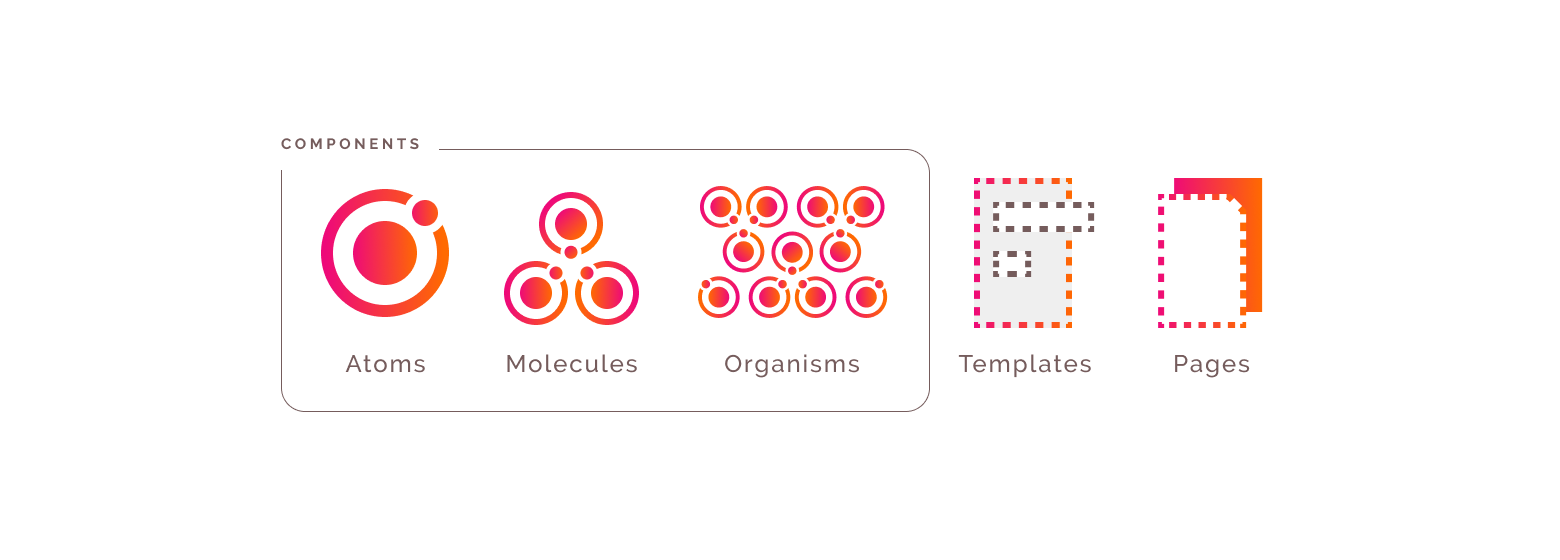
When constructing a design system in Figma, it’s useful to draw parallels between the tools and the theory. For example, Styles in Figma could be considered the most basic level, even more basic than Atoms in Brad Frost’s Atomic Design model. These are things like color and font that help make up the aesthetic of the product.
A simple Figma component would be considered an atom in the Atomic Design model, e.g., a button. A more complex Figma Component would be considered a molecule or organism, which is then used to construct templates and pages.
Some of the most useful things to have in a component library are:
- Colors
- Fonts
- Brand assets, logo, etc.
- Navigation
- Buttons
- Notifications
- Modals
- Form elements and validation
Building a Design System in Figma – Getting Started
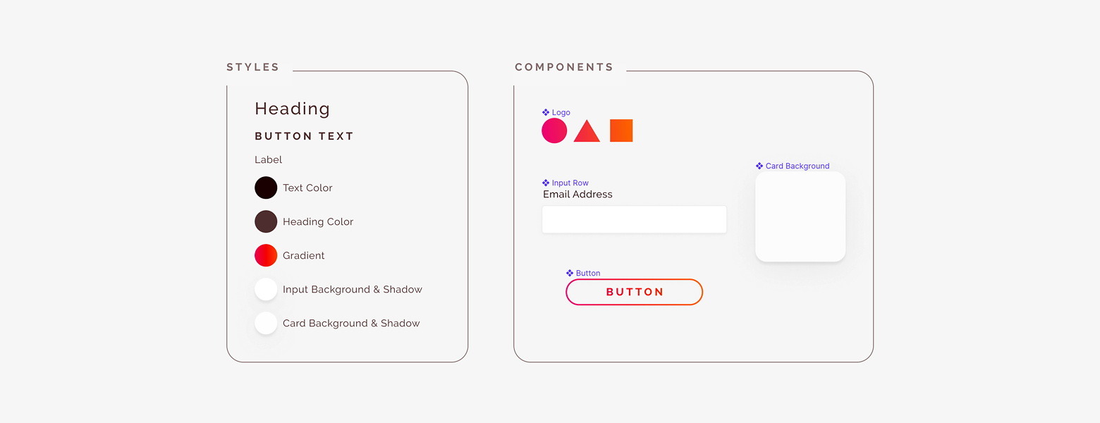
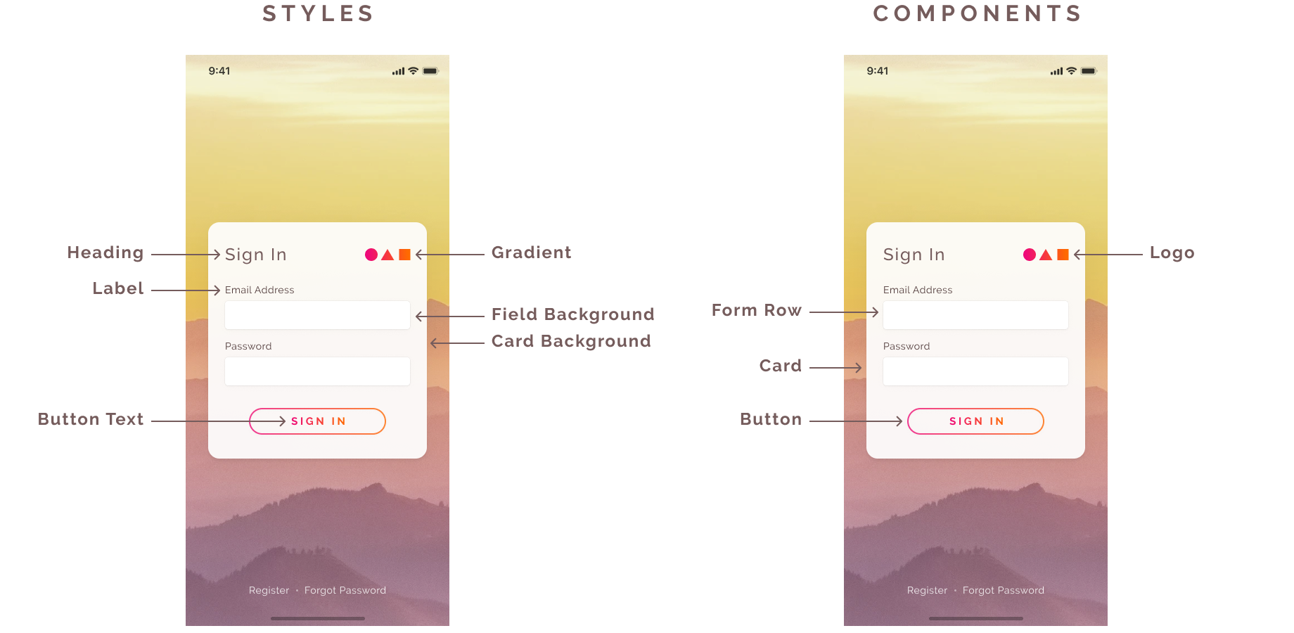
In this example, we’ll create a simple sign-in form and explain the Components and Styles that can be inferred and used.
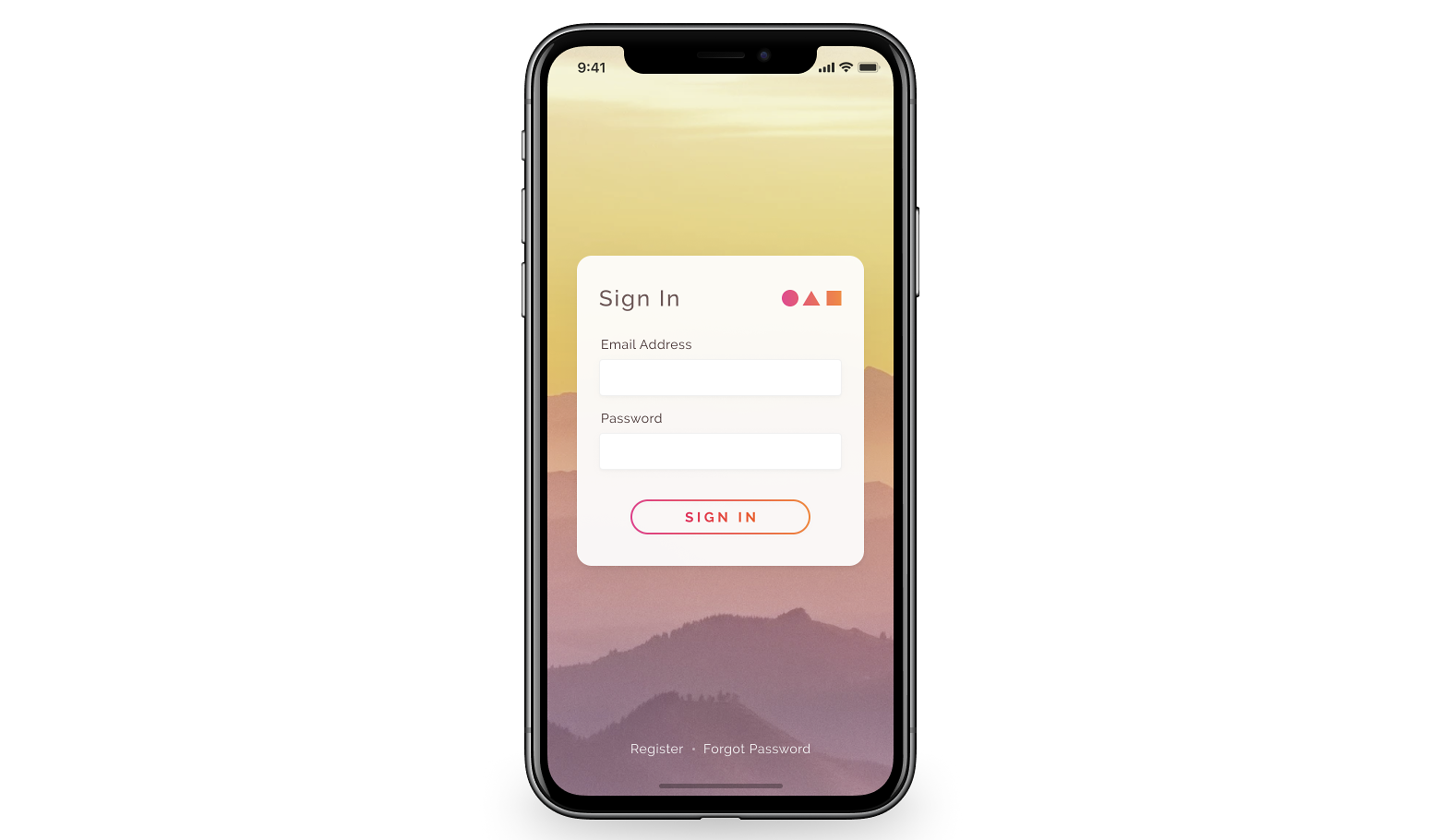
First, let’s think about the Components and Styles that are likely to be reusable from this form. There’s a card containing a logo, form fields, and a button. There are also three font styles and a few different colors and effects that may be useful.
Once the Styles and Components to be included are identified in the Library as above, it’s time to create a Library file and begin populating it.
Create a Figma Library File
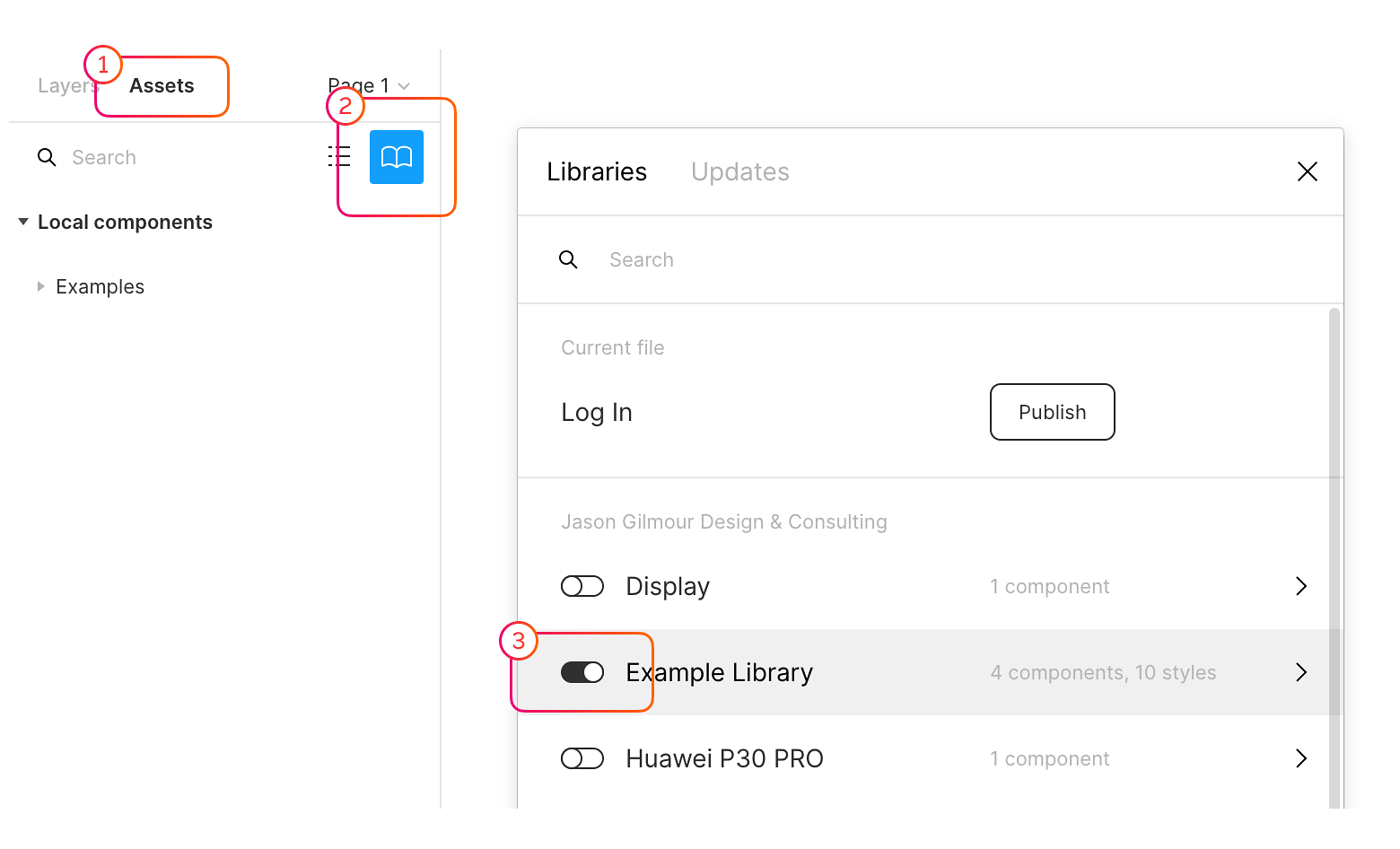
Create a new file and publish it as a Library. Once a new file is created, click on the Assets tab, click the Library icon, and then click Publish. This publishes the Styles and Components in the library file so they can be used in other files.
Styles and components can now be created in the library file and can be used in other files and updated from the central library file.
How to Create a Figma Style
Creating Styles is the same in Library files as it is in any other file, outlined in the steps below.
- Select the object you want to create a Style from. Styles can be colors, text properties, effects, and layout grids.
- Click the Styles button (four dots in a square) next to the property to be used in the new Style, then click the plus button in the popover to create a new Style.
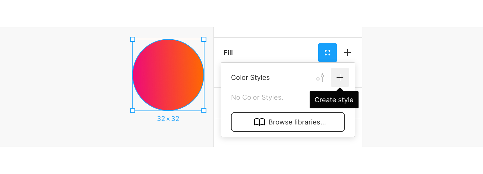
- This will show a modal to name the Style. It’s often helpful to use a semantic name rather than a presentational name, e.g., “Primary Color” instead of “Green” so it’s clearer what the Style is intended to be used for.
- Publish the Style to your Team Library using the pop-up that appears in the bottom right of the screen, or repeat the steps taken to publish the Library in the first instance.
Here’s Figma’s tutorial on how to create a style.
How to Create a Figma Component
Creating a Component is also very easy. Simply select the object you want to create a Component from, then right-click and select “Create Component.”
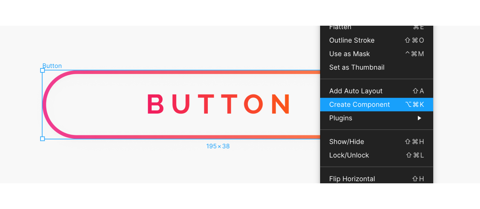
Components are published to the Team Library in the same way as Styles.
Here’s Figma’s tutorial on how to create a component.
Once a few Styles and Components have been created, the Library file can be shared with the team, and the Styles and Components can be used in any number of files.
Using the Figma Library
To use these Styles and Components in another file, the Library file needs to link to an existing design file we want to use the new Styles and Components in. Simply open the Libraries modal again (Assets, Library icon) and turn on the toggle switch for the Library file to be used.

The Component Library is now ready to be used. Components can be placed by dragging them into the design file from the Assets tab on the left of the screen. Library styles can be used in the same way as local styles when changing text styles, fill colors, strokes, effects, and layout grids.

When Components and Styles are updated in the Library, the files using them need to accept the changes. Figma will show a notification when updates are made in the Library file, giving the option to publish them. Once published, any files using the Components and Styles will have to accept the change via a similar notification or the assets tab to update their components and styles. This prevents changes from being published and updated unexpectedly.
Beyond Building a Component Library in Figma
Figma only covers the component library part of a fully fledged design system. For a fully rounded out design system, it’s worth considering other pieces that could be incorporated, such as brand guidelines, content style guides, and developer documentation.
Mailchimp’s content style guide is an excellent example, detailing the tone of voice and branding through content. GitHub has some great documentation for how their component library works in code, and Google’s Material Design System also has some excellent examples of documenting the logic behind the design system.
As a design tool, Figma has matured a lot, and new features are constantly added. The addition of a Figma design system with built-in analytics that is accessible to the entire organization is a giant step forward. The addition of these features indicates that Figma aims to be a fully fledged, comprehensive design tool, and it’s well on its way to accomplishing that.
Further Reading on the Toptal Blog:
Understanding the basics
Is Figma free to use?
Yes, Figma has a free plan they call a “Starter Package,” which can be used for up to two editors and three projects. This plan also provides unlimited cloud storage and a 30-day version history.
What is Figma design?
Figma is a UI design application and a team-based collaborative design tool that runs in web browsers so it can be used on any platform (Windows, Mac, Linux, and Chromebook). It uses vector tools to create various designs, has the ability to create animated prototypes, and provides code generation for handoff.
What is Figma used for?
Figma is a cloud-based design tool used for designing websites and mobile apps. It’s similar to Sketch in functionality and features but with differences that make Figma better for team collaboration. It can be used for creating wireframes and prototypes and for building a design system for teamwide collaboration.
What is the purpose of a design system?
A design system is typically built for product teams (designers, engineers, and product managers) to act as the connective tissue that holds together the entire product. It can act as the “single source of truth” to go to when anyone on the team builds new screens or pages from its various components and styles.
What is a UI design system?
A UI design system is a collection of standards for design and code along with elements such as styles and components that unite the disciplines, helping them complement one another and produce a precise result. It’s similar to an inventory that can be used to pick up resources and use them in a design.
Edinburgh, United Kingdom
Member since August 28, 2019
About the author
Jason is an experienced designer with a talent for UX, strategy, and creating innovative solutions from first principles.