Framer Tutorial: How to Create Stunning Interactive Prototypes
Framer, the most powerful interactive prototyping tool, just became even more powerful with their latest release. In this tutorial, you will learn how to create prototypes in Framer the same way Uber, Dropbox, and Google do.

Framer, the most powerful interactive prototyping tool, just became even more powerful with their latest release. In this tutorial, you will learn how to create prototypes in Framer the same way Uber, Dropbox, and Google do.

Wojciech is a product designer and web designer with eight years of experience. He’s passionate about typography and sound design.
Expertise
PREVIOUSLY AT

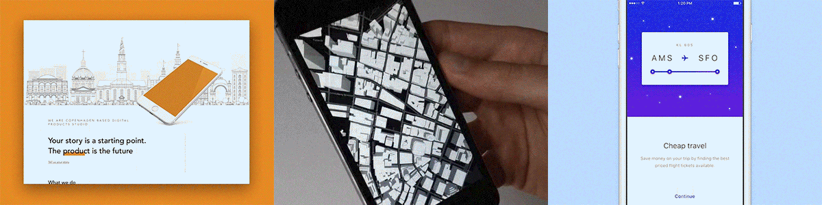
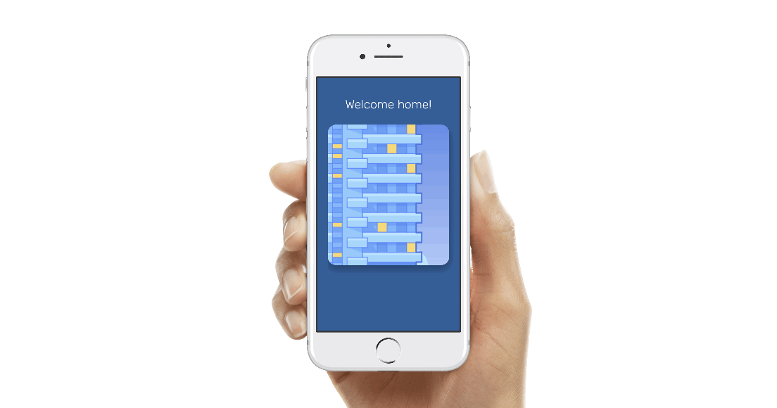
Take a look at the example prototypes below. These were done in Framer. After this tutorial, you will be able to start creating your own stunning animated prototypes in no time.
Framer came out with its newest version a week ago, and the prototyping market will never be the same. The Framer prototyping tool used to be hard to master but useful as the most accurate and limitless prototyping software. Now, things have changed. Framer now comes with Design + Code + Collaborate features, meaning you can create your prototype directly inside Framer, developing a fully functional prototype without any third-party software and without any coding skills.
Here, I’ll teach you how to use simple Framer code without any prior knowledge of coding required. You will learn how to combine the best features from design and code mode in Framer to create animated and interactive prototypes. So let’s jump into this tutorial and grab some small code snippets to improve your prototypes.
Framer Basics
Let’s get started! Just go to framer.com and download a trial version. They are giving you two weeks of their fully functional demo, and trust me, it is enough time to learn a lot about this prototyping software.
After installation, you may want to go through some of the examples they provide and play with them a bit. When you are done, it’s time to start prototyping.
(In this Framer tutorial, I will be focusing on creating prototypes directly in Framer.js. You should also know there are other ways to start prototyping in Framer. For example, you can work directly with Sketch files. I will cover that workflow in another article.)
The All-new Framer – Design Mode
In this article, we will create three cool prototypes within minutes with minimal code usage: basic interactions, scrolling component, and page component

The newest version of Framer has a great new feature: design mode. It allows you to work almost the same way as you do in Sketch or Figma. You can create vector layers, import images, or create and style text layers. All of this becomes very handy when you want to prototype quickly without any third party apps.
Let’s Create an App-type Design
In the first part of this tutorial, we will prepare a playground for our Framer prototype. We will create an app-type design, with three different types of layers: vector, image, and text.
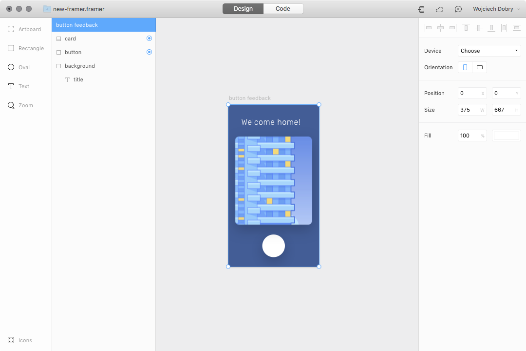
Step 1: Create a simple button and background.
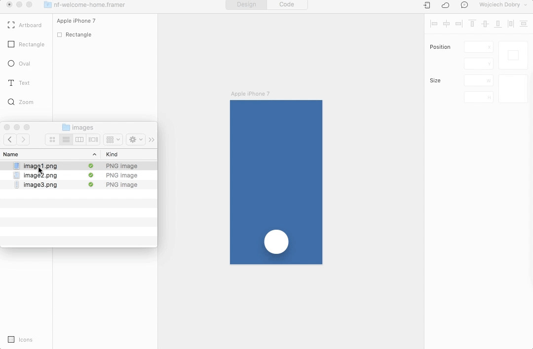
To start your design, select the first tab—which is design mode—and add an artboard, just like in Sketch. In this tutorial, we will be working on an iPhone 7 prototype, so I’ve picked this preset as my artboard size. I’ve also added a blue background fill.
Next, select the rectangle tool and create a shape in the form of a simple round button.

Step 2: Add a card with an image.
The second method of adding layers is the drag and drop feature. You can select any image file from your computer, drop it into Framer, and style it using the right sidebar. I used a simple illustration and styled it as a card.
Step 3: Add an app title.
Framer also allows you to add a text layer. Again, styling it is basically the same as in any graphic software. You can choose font, size, alignment, letter spacing, and more.

Step 4: Tell Framer which layers are interactive.
We have one more step before starting our Framer prototype. We just have to tell Framer which layers will be interactive. Just click the dot next to the layer name inside the layer panel. It’s good to name each layer properly for further use. I named my layers card and button.

Step 5 (Bonus): Define your global colors.
A good practice is to define some variables for the whole prototype. You can set the color palette, typography, and basic dimensions you will be using from the beginning. This helps save time down the line.
When you are setting up your colors, just name them in the code editor, and provide HEX, RGB, or RGBa values after the appropriate “=” sign. Remember to keep all variables at the very top of your code.
#	variables -------------------------------

blue = "#005D99"
green = "#3DBE8B"
white = "#FFFFFF"

Step 6 (Bonus): Adding relative position.
With the new Framer, it is very easy to keep your prototype responsive. You can set relative positions from the design mode, as demonstrated below:

Here is a short list of properties that are useful for aligning and calculating layer position directly in the code. You can do the necessary math to calculate layer positions. This becomes necessary when you are adding interactions later and you want to keep your prototype responsive.
# This is how you can align layer position:

	x: Align.center(0) # align layer horizontaly
	x: Align.center(200) # align layer horizontaly with 200 offset
	x: Align.right(0)
	x: Align.left(0)

	y: Align.center(0) # align layer verticaly
	y: Align.top(0)
	y: Align.bottom(0)

# You can use also some variables

	width: Screen.width # current device width
	height: Screen.height # current device height

# As a reference you can also user layer names

	x: layerA.x # layerA horizontal position
	y: layerA.y # layerA vertical position

	width: layerA.width # layerA width
	height: layerA.height # layerA height

# You can combine all of this into the simple math to calculate position or dimensions
	width: Screen.width / 2 - layerA.width
Now You’re Set Up—Let’s Start Our Project
We have created different types of Framer layers. Now our interaction playground is ready to go.

Finally! The boring part has come to an end. Now it’s time for some interaction design.
Download the whole prototype here.
1. Creating a Button Feedback Interaction
To design any interaction, we need a trigger to make it happen. It can be almost anything: a screen tap, the end of an animation, the end of an image loading, or your phone accelerometer.
Step 1: Creating the event for interaction.
We will keep it simple. Let’s create a button feedback when you tap it, using the following command:
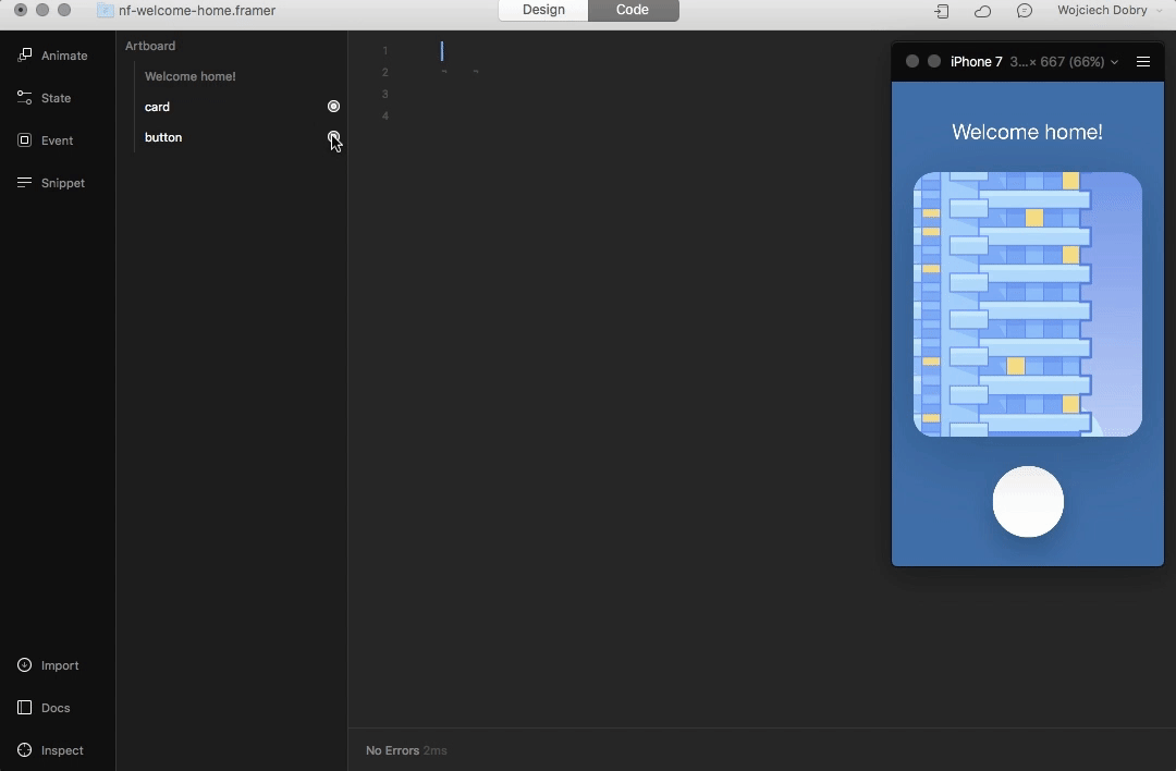
layerA.onTap (event, layer) ->
Framer just wrote this line of code for you. It means that when you tap the button layer, something will happen.
Step 2: Adding animation to the event.
Let’s start an animation after this trigger. To do this, click on the dot next to the button layer in the layer panel, then pick Add Animation. When you are adding an animation, Framer jumps into animation editing mode. You can scale, move, rotate, or change any parameter of the layer:

Framer added a few more lines of code. (Not to worry—you are still able to edit your animation with the animation panel.)
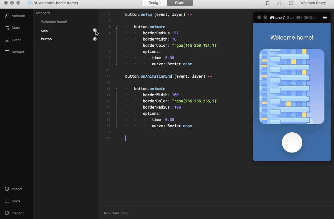
button.onTap (event, layer) ->

	button.animate
		borderRadius: 27
		borderWidth: 10
		borderColor: "rgba(115,250,121,1)"
		options:
			time: 0.30
			curve: Bezier.ease
Congratulations! You just created your first interaction. It works only once right now, but we will fix that. The reason you can trigger this animation only once is that there is nothing set to happen after the animation is finished. We have to reset all the parameters after the first animation ends to how they were before.
Step 3: Resetting animation.
Add another event, almost as we did before. The difference is that we are looking for an event when the animation ends:

This time, code added by Framer will look like this:
button.onAnimationEnd (event, layer) ->
So, when the animation on the button layer is finished, we can add the next animation that will reset the button layer parameters:
button.onAnimationEnd (event, layer) ->

	button.animate
		borderWidth: 100
		borderColor: "rgba(255,255,255,1)"
		borderRadius: 100
		options:
			time: 0.3
			curve: Bezier.ease
That’s it! We now have working feedback after a tap on our button.

2. Creating Different States for Card Layer Interactions
Ok, now you know how to design an animation and trigger it. More often, you have to design different states of a layer. You can design multiple states of the same layer by changing only some parameters, like position, size, or opacity.
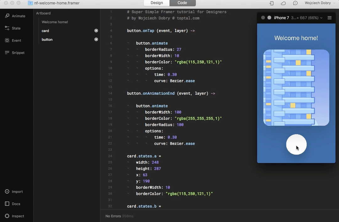
Step 1: Adding and creating states for a card layer.
The way to add a state to the card is almost the same as adding an animation. You have to click on the dot next to the card layer and then click Add State. Now you’ve jumped into state edit mode. Design it how you like:
Please pay attention to the indentation of the code. It should start from the first row.
I’ve designed two different states for my card layer:
card.states.a =
	width: 248
	height: 287
	x: 63
	y: 190
	borderWidth: 10
	borderColor: "rgba(115,250,121,1)"

card.states.b =
	x: 139
	y: 529
	width: 98
	height: 98
	borderRadius: 49
	borderWidth: 1
	borderColor: "rgba(255,255,255,1)"
Step 2: Adding events.
There is only one more step to make it work. We have to create an event for changing these states.
button.onTap ->
	card.stateCycle()
What this does is change all states of the layer one by one, every time you make an action. So, in our case, every time we tap the button layer, we change to the card state. If you would like to create more states and trigger them correctly, the snippet below will work for you much better:
button.onTap ->
	card.stateSwitch("b")
This snippet is useful when you want to trigger a particular state of the layer.
The last adjustment I made to my prototype is a change of animation speed and curve between states:
card.animationOptions =
	curve: Spring
	time: 0.8
There is a lot more what you can do with events, but at this point, you will be able to create almost any basic interaction. It is one of the best-written documentations I have ever seen.
Speeding Up Your Work in Framer: Components
The time has come to add in components for speeding up your work. To get the most out of this tutorial from this point on, download this prototype.
1. The First Component: Scrolling

I have modified our prototype a bit. Now we have a list inside, but its height is above the screen resolution. We have to create scrolling to be able to see the whole list in the prototype.
Step 1: Creating layers and setting up components.

Let’s start by creating a layer with a height bigger than our screen. Mark this layer as interactive and name it list. Then jump to code mode. We will not use the handy left sidebar this time. Let’s set up our whole screen to be scrollable:
scroll = new ScrollComponent
	width: Screen.width
	height: Screen.height
This code creates an invisible area with the width and height of the current device.
Step 2: Tell Framer what layers you want to scroll.
Nothing has happened yet. We have to tell Framer which layers should be scrollable. To do this, we add our list layer to the scroll component:
list.parent = scroll.content
Step 3: Locking vertical scroll.
We are allowed to scroll now, but it is happening in all directions. We have to lock scroll on a vertical axis:
scroll.scrollHorizontal = false
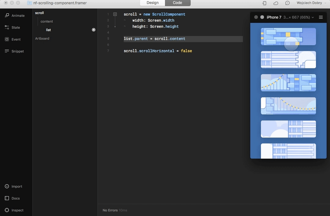
Wow! You created a scroll inside your app with just five lines of simple code.
2. The Page Component: Swiping Screen to Screen
A very popular interaction for switching between screens is swipe. The idea here is very similar to the scrolling component. You can download a working prototype here.
Step 1: Setting up the component.
First, we have to create a “box” in the code editor where the magic will happen:
page = new PageComponent
	width: 315
	height: Screen.height
	x: Align.center
	scrollVertical: false
	clip: false # the content outside the box won't be clipped
At this point, you should be familiar with all the code here. It is just a simple setup of the component and its area. Now we have to create some layers to swipe.
Step 2: Creating layers
We will use our first prototype design and modify it a little. Instead of one card image, this time I imported two images.
At first, we have to make the artboard two times wider. In the artboard properties panel, find width and multiply it by two (or just add *2). Place the cards next to each other, activate them with the blue dot, and name them properly: card1 and card2.

Step 3: Adding layers to the page component.
At the end of our code in the code editor, we have to add:
card1.parent = page.content
card2.parent = page.content
That means we are adding these layers to the component.

The page component is now ready to go!
Final Word
That’s All, Folks! I hope you found this Framer tutorial useful to start your journey with the most powerful prototyping tool in the market. Also, you should consider joining the Framer group on Facebook. There is a huge community around, and they are helpful when you are starting out.
If you would like to go even deeper inside Framer, try reading the Framer documentation.
Further Reading on the Toptal Blog:
Wojciech Dobry
Kraków, Poland
Member since November 17, 2016
About the author
Wojciech is a product designer and web designer with eight years of experience. He’s passionate about typography and sound design.
Expertise
PREVIOUSLY AT