Framer Tutorial: 7 Simple Microinteractions to Improve Your Prototypes
Framer Studio is a powerful tool for creating interactive prototypes. Learn how to create seven useful microinteractions in no time to improve your prototype.
Framer Studio is a powerful tool for creating interactive prototypes. Learn how to create seven useful microinteractions in no time to improve your prototype.

Wojciech is a product designer and web designer with 8 years of experience. He’s passionate about typography and sound design.
PREVIOUSLY AT

Welcome to the second installment of our Framer tutorial series. In the last article, we learned about the basics of using Framer in Design mode, as well as how to write some simple code to make our designs come to life. In this piece, we will focus on using Framer to create microinteractions and animated transitions. We will walk through how to create seven useful interactions for your prototypes.
Why Should You Prototype Small Interactions?
Smooth movement, state changes, and subtle transitions help a user understand how to use your interface by giving them feedback on certain actions. Often, these transitions will echo real-world analogs (such as the sliding of a switch control) or utilize common device interaction patterns (such as tap-to-expand). In this tutorial, we will focus on interactions that add a finishing touch to the interface to guide understanding and spark delight in the user.
Take a look at the examples below. Designers all over the world are creating these microinteractions in various products.


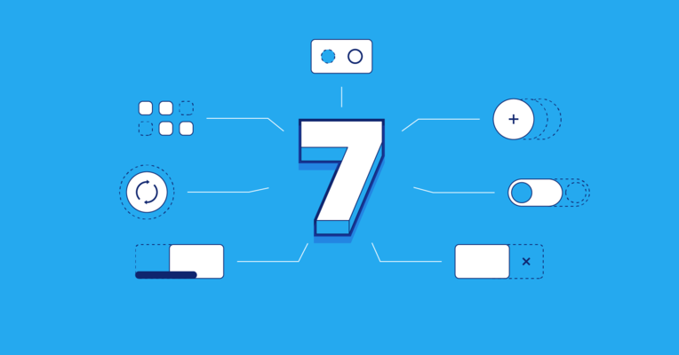
The 7 Prototypes
In this tutorial, I will give you an overview of each microinteraction and some code snippets. We will be using several different techniques, so you will be able to choose the one that best fits your product. There is no “right” way to create anything inside Framer Studio—as I mentioned in my previous article, Framer gives you a lot of freedom to create the way you want to.
Have you seen interactions like these before? Sure, you have! You see them every day on your smartphone. It’s time to create your own.
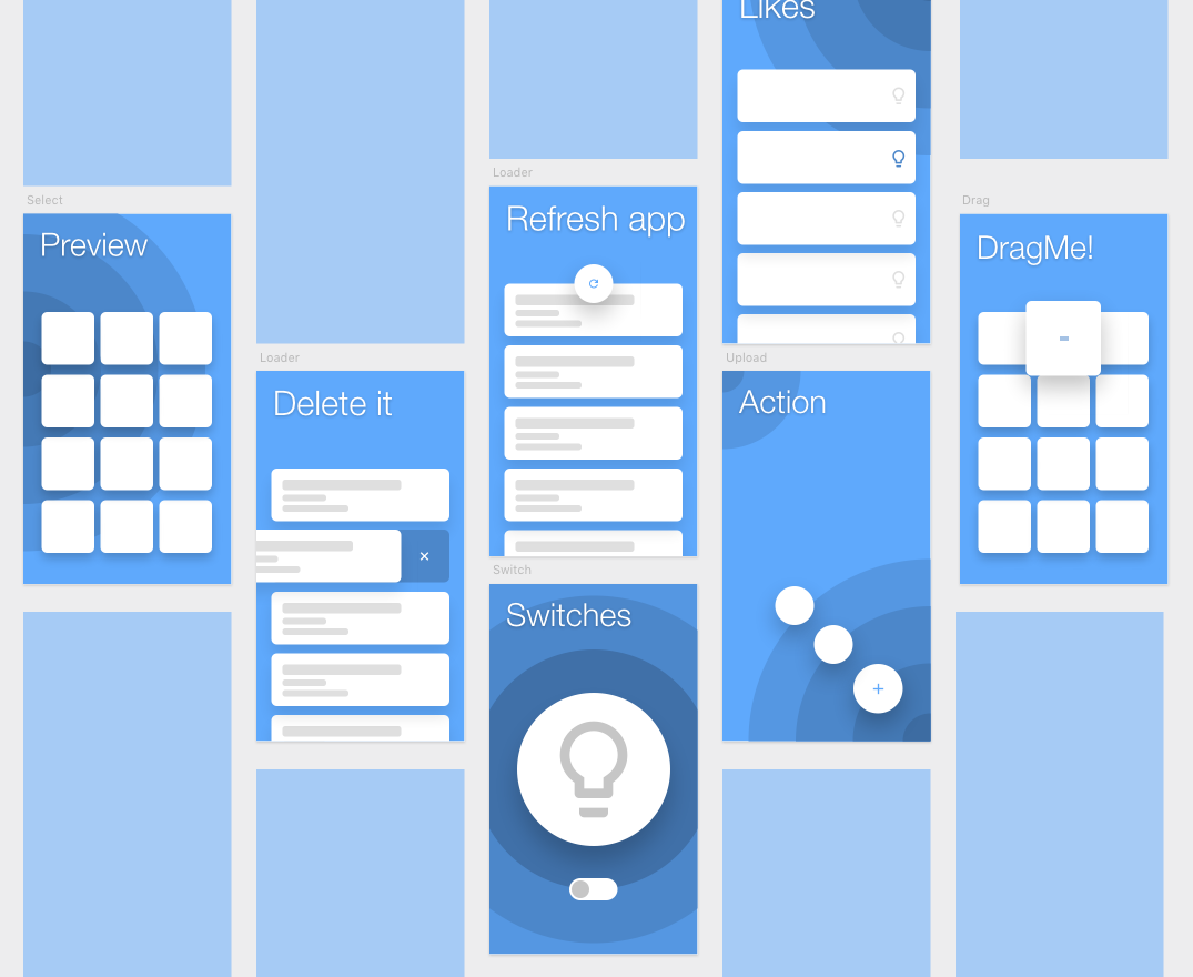
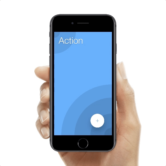
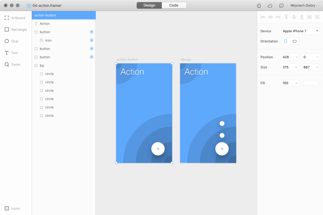
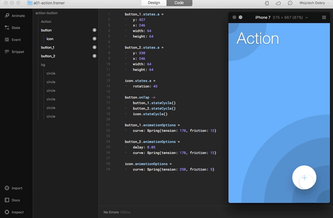
1. Action button
The action button often represents the main action of the current screen. Sometimes it contains several actions inside. We will be creating an interaction for the second case. Download the working prototype here: https://framer.cloud/ShBnH
Step 1: Create three circle-shaped buttons
To start, create one main circle-shaped button with an icon inside and two smaller buttons placed under the main button. Don’t forget to mark all of these layers as interactive in the design mode (with the target indicator).
Step 2: Design two states for all layers
Create two different states for the layers. Use the code below to make the smaller buttons move above the main one and to rotate the icon 45°:
button_1.states.a =
	y: 427
	x: 246
	width: 64
	height: 64

button_2.states.a =
	y: 330
	x: 246
	width: 64
	height: 64

icon.states.a =
	rotation: 45
Step 3: Add an event
To make this prototype animated, we have to add an event. After tapping the action button, change the states of all of the layers:
button.onTap ->
	button_1.stateCycle()
	button_2.stateCycle()
	icon.stateCycle()
Step 4: Spring animation

At this point, the animation looks very mechanical. To add a human touch, we will add in a spring animation for all of the layers:
button_1.animationOptions =
	curve: Spring(tension: 170, friction: 12)

button_2.animationOptions =
	delay: 0.05
	curve: Spring(tension: 170, friction: 12)

icon.animationOptions =
	curve: Spring(tension: 250, friction: 5)
The action button is ready to go!
2. Interactive switches
The steps below will enable you to create your own switch interaction. Download the working prototype here: https://framer.cloud/ieypV

Step 1: Design a switch playground
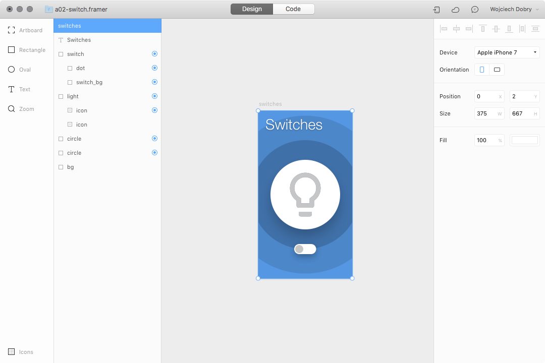
You will need only two things: the switch itself, which contains at least two layers (background and dot), and some layers to animate after using the switch.
Step 2: Create states
Do you remember from the first article how to design states directly in Framer Studio? Design your states how you like, or use my settings:
dot.states.a =
	x: 50
	backgroundColor: "rgba(5,106,161,1)"

switch_bg.states.a =
	backgroundColor: "rgba(0,136,205,1)"

icon.states.a =
	opacity: 0

circle.states.a =
	x: 37
	y: 183
	width: 301
	height: 301

circle_1.states.a =
	x: 20
	y: 166
	width: 337
	height: 337
Step 3: Add an event
To make the prototype work, we have to add an event to the switch. After tapping the switch, we will change the state of all the layers:
switch_1.onTap (event, layer) ->
	dot.stateCycle()
	switch_bg.stateCycle()
	circle.stateCycle()
	circle_1.stateCycle()
	icon.stateCycle()
Step 4: Adjust the timing
To make everything more natural, adjust the time and delay of all states:
dot.animationOptions =
	time: 0.2

switch_bg.animationOptions =
	time: 0.2

circle_1.animationOptions =
	time: 0.5
	curve: Spring

circle.animationOptions =
	time: 0.5
	delay: 0.05
	curve: Spring

icon.animationOptions =
	time: 0.5
	curve: Spring
Now our prototype is done!
3. List item swipe action
This is a typical interaction for removing, archiving, or saving items from a list. Swipe left or right, and an item will be cleared away. Download the prototype here: https://framer.cloud/rzMWP

Step 1: Create a prototype in Design mode
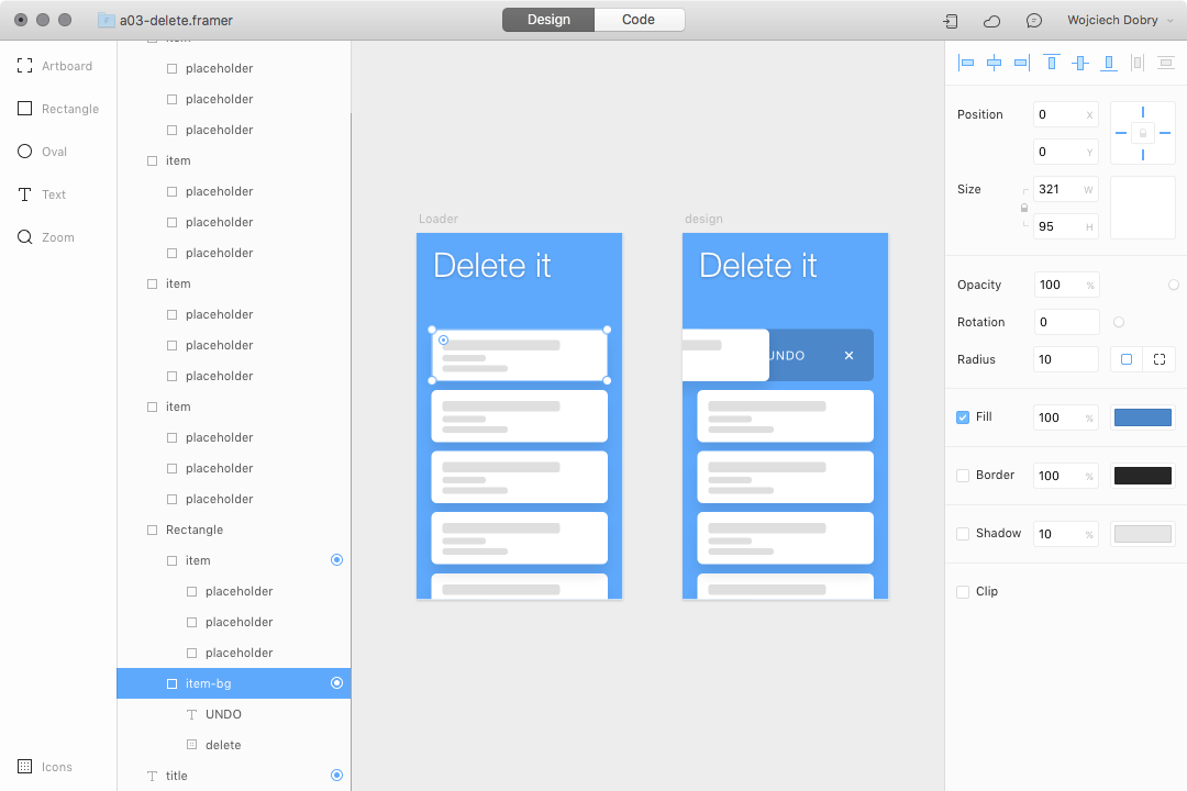
You can use your own design, if you wish. You just have to keep the same structure of the layers. As you can see in the image above, all of the list items have an “undo” button under them.
Step 2: Make items draggable
To keep it simple, we will create an interaction only for the first list item. First, make the list item draggable: item.draggable = true.
Then lock the vertical axis: item.draggable.vertical = false.
Set up the constraints of the draggable area: item.draggable.constraints
And finally set the size to the item size: size: item.
This is how the whole code looks:
item.draggable = true
item.draggable.vertical = false
item.draggable.constraints =
	size: item
Now you can swipe left and right, and the item will always return to its original position.
Step 3: Create state
Next, create the state for the list item when it’s removed. I simply moved it outside the screen using the x-axis.
item.states.a =
	x: -360
Step 4: Change state after swipe
Finally, we have to create a trigger to start the interaction. When we drag the item to the left side of the screen, it should be removed. The code will look like this:
item.onMove ->
	if item.x < -70
		item.stateCycle("a")
In this case, we are using an “if” statement. The above code basically says, when we move the item layer more than 70px, then change item state to state ‘a.’ You can read about if statements in the Framer Studio documentation: https://framer.com/getstarted/programming/#conditional
Step 5: Undo action after tap
We are almost done with this interaction. The only thing left is to undo this action:
item_bg.onTap ->
	item.stateCycle("default")
You should be familiar with this code from the previous tutorial.
Step 6 (optional): Adjust animation timing
If you would like, you can adjust the timing of the animation:
item.animationOptions =
	time: 0.75
	curve: Spring
4. Button loader
This is a very useful interaction for actions that require loading or wait times for the user. When we create this interaction, you will learn how to manage many animations that are happening one-by-one. Download the prototype here: https://framer.cloud/FxmHN

Step 1: Create a prototype in Design mode
Create a simple button with four sublayers: a progress bar and three icons for different states. I designed my button with an upload icon visible, a progress bar at the bottom with a width of 0, and two more hidden icons.
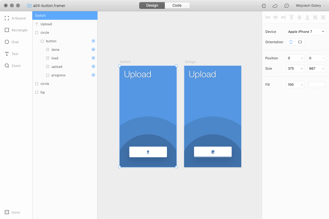
Step 2: Add an event
This whole prototype can be made without writing a single line of code, just by using Framer’s autocode features.
First, add an event. We will trigger the whole interaction with a tap on the button layer:

This is the code Framer wrote for you:
button.onTap (event, layer) ->
Step 3: Design animations
We will use Framer’s autocode features to design all animations:

I’ve designed four animations with different timing:
- The first animation is changing the width of the progress bar.
- The second is hiding the upload icon with opacity.
- The third is rotating and showing the loader icon.
- The last one is showing and scaling the check icon.
Here is the code that Framer wrote for each of these animations:
	# change progress bar width
	progress.animate
		width: 247
		options:
			time: 1.4
			curve: Bezier.ease

	# hide upload icon
	upload.animate
		opacity: 0.00
		y: 39
		options:
			time: 0.2
			curve: Bezier.ease

	# show and rotate loader icon
	load.animate
		opacity: 1.00
		rotation: 360
		options:
			time: 1
			curve: Bezier.ease

	# show and scale check icon
	done.animate
		opacity: 1.00
		scale: 1.4
		options:
			time: 0.2
			curve: Bezier.ease
			delay: 1.00
Step 4: Reset loading animation
As you may have noticed, we didn’t hide the loader icon after the animation finishes. To finish this prototype, trigger another animation using this event: load.onAnimationEnd ->
	load.animate
		opacity: 0.00
		options:
			time: 0.2
			curve: Bezier.ease
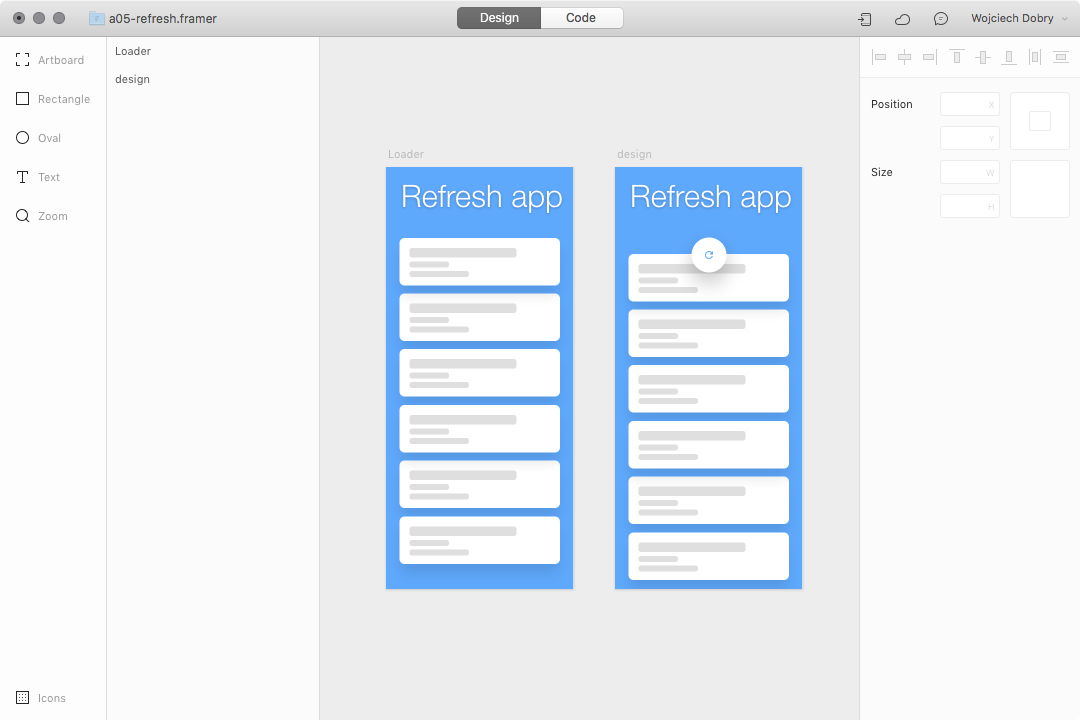
5. Pull to refresh
Almost every single product with a list inside it uses this type of interaction. The user pulls down the whole list to refresh it. It’s very easy to create. Download the prototype here: https://framer.cloud/DgMDw

Step 1: Design a simple list with refresh icon
We can jump straight into design mode. We need two things: a list and a refresh icon. The crucial thing here is to hide the refresh icon with opacity and put it on our list:
Step 2: Create a Scroll Component
We want to make our list scrollable. To do this, use a scroll component and add a list layer to it:
scroll = new ScrollComponent
	size: Screen
	scrollHorizontal: false

list.parent = scroll.content
Step 3: Make the refresh icon visible
Create a simple state for the icon:
icon.states.a =
	opacity: 1
Step 4: Add an event after pulling down
Our list is scrollable right now. That means when we are scrolling up or down, the whole scroll content is moving on the ‘y’ axis. With this knowledge, we can create an event:
scroll.content.onMove ->
	if scroll.content.y > 180
		icon.stateCycle("a")
Again we are using an “if” statement. If the list is pulled down (moved on the y-axis) more than 180px, we will trigger an action. In this case, we will animate two layers: the list and the refresh icon.
scroll.content.onMove ->
	if scroll.content.y > 180
		icon.stateCycle("a")

		list.animate
			y: 210
			options:
				time: 1
				curve: Bezier.ease

		refresh.animate
			rotation: 360
			options:
				time: 1
We are using “animate” to move the list down 210px and rotate the refresh icon 360°.
Step 5: Reset all states
The prototype is almost working, but we have to reset all the layers after the refresh animation. To do this, we will use an event after the animation ends:
icon.onAnimationEnd ->
We are animating the rotation of the refresh icon back to its original position, and by using state cycle, we are resetting the list and icon background state:
scroll.content.onMove ->
	if scroll.content.y > 180
		icon.stateCycle("a")

		list.animate
			y: 210
			options:
				time: 1
				curve: Bezier.ease

		refresh.animate
			rotation: 360
			options:
				time: 1

		icon.onAnimationEnd ->
			refresh.animate
				rotation: 0
			list.stateCycle("default")
			icon.stateCycle("default")
That’s it!
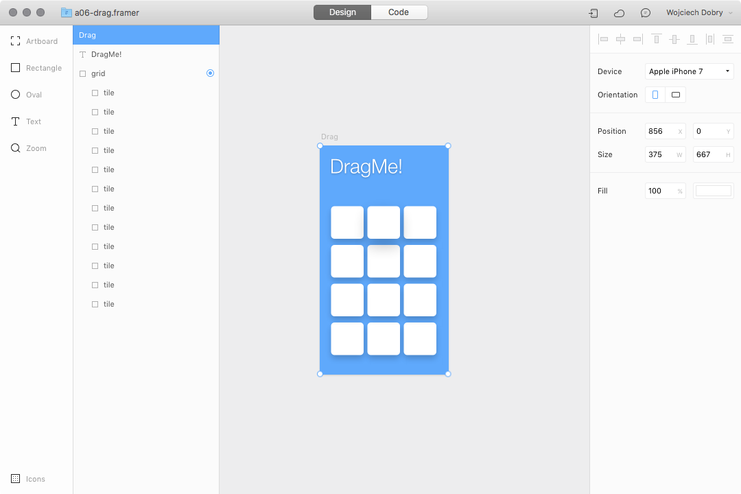
6. Dragging interaction
Have you ever noticed that while you are dragging an item inside an app, there is always something happening with the item itself? Sometimes the item shrinks, maybe other items are blurred, or the opacity changes. Let’s learn how to create this kind of interaction. Download the working prototype here: https://framer.cloud/YstiW

Step 1: Design a simple grid with tiles
Create a grid of tiles, and make sure they are inside the parent element.
Step 2: Use “for” loop to target all tiles
“for loop” might sound scary, but it is really simple. If you are not familiar with for loops, you can read a little bit of background first: https://framer.com/getstarted/programming/#loops-and-arrays
We will use the for loop to target all the tiles inside our grid:
for item in grid.subLayers
With this simple line of code, you targeted all layers inside the grid layer.
Step 3: Make tiles draggable
Make each item inside the grid draggable:
for item in grid.subLayers
	item.draggable = true
Step 4: Design a dragging state
All items should have a state while they are being dragged. You have to start from code, but later you will be able to edit this state in the Layer Editor:
for item in grid.subLayers
	item.draggable = true

	item.states.a =
		scale: 1.1
		shadowBlur: 50
		shadowColor: 'rgba(0,0,0,0.5)'
Step 5: Drag events
We have to create events to trigger different states while the item is being dragged. The first event will trigger an action while we start to drag:
for item in grid.subLayers
	item.draggable = true

	item.states.a =
		scale: 1.1
		shadowBlur: 50
		shadowColor: 'rgba(0,0,0,0.5)'

	item.onDragStart ->
		this.bringToFront()
		this.stateCycle("a")
I used this.bringToFront() to make sure the item is always above the other layers.
The second trigger will reset the item’s state:
for item in grid.subLayers
	item.draggable = true

	item.states.a =
		scale: 1.1
		shadowBlur: 50
		shadowColor: 'rgba(0,0,0,0.5)'
	item.onDragStart ->
		this.bringToFront()
		this.stateCycle("a")
	item.onDragEnd ->
		this.sendToBack()
		this.stateCycle("default")
At this point, we have a working prototype.
Step 6 (optional): Play with timing
Interaction always happens along a timeline. It’s good to adjust the timeline to achieve a perfect effect:
for item in grid.subLayers
	item.draggable = true

	item.states.a =
		scale: 1.1
		shadowBlur: 50
		shadowColor: 'rgba(0,0,0,0.5)'
	item.onDragStart ->
		this.bringToFront()
		this.stateCycle("a")
	item.onDragEnd ->
		this.sendToBack()
		this.stateCycle("default")
	item.animationOptions =
		time: 0.3
		curve: Spring
7. Multiple “like” buttons (advanced)
In this prototype, we will use more advanced techniques to show you a different way of targeting layers in Framer Studio, which will build more responsive interactions with less time. If you are not familiar with basic coding, I encourage you to read this article first: https://blog.framer.com/code-less-achieve-more-with-arrays-in-framer-c43594d13d59
For this interaction, we will skip the design part and use a prototype I’ve created specifically for this article: https://framer.cloud/SZMCH

Step 1: Create arrays
Take a look at the structure of the layers inside Framer Studio:
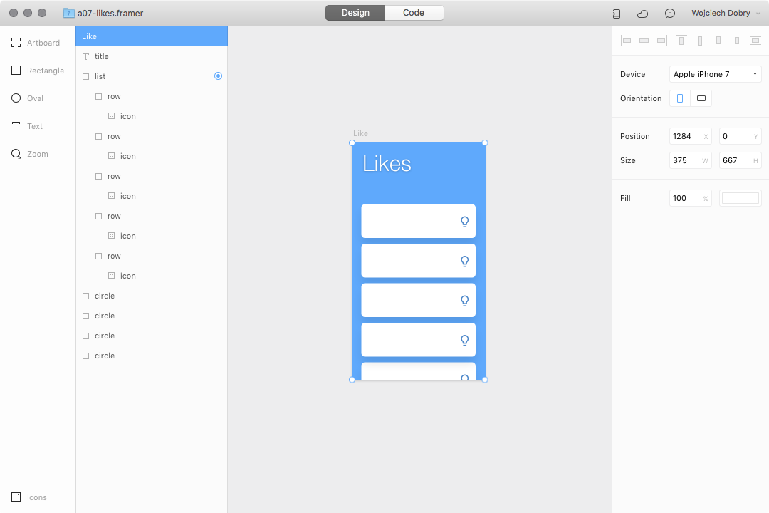
We have a “button” inside a “row” in the “list” group. We will be creating an interaction on the button layers, so we have to target them. But first, we have to find all the row layers and put them inside an array:
rows = list.children

buttons = []
I’ve also created an empty array for all “button” layers: buttons = [].
Step 2: Add a sublayer to array
Let’s start from the “for loop”:
for i in rows
	buttons.push(i.children[0])
To add layers into the array, we will use: buttons.push(). This means that we are putting the first layer of each “row” group inside an array.
Step 3: Create state and event
Now we will create a state for our “like” buttons, and add an event to them while tapping:
for i in buttons
	i.states.a =
		scale: 1.2
		hueRotate: -80
	i.onTap ->
		this.stateCycle()
	i.animationOptions =
		time: 0.3
		curve: Spring
You can use this technique to recreate all the previous prototypes and make them more complex.
Final Note
When you are creating microinteractions, you are focusing on the smallest details. You can create animations triggered by any type of action and make them absolutely perfect. Keep in mind that there are hundreds of ways to create the same prototype, and you should use the method that fits your skills and the needs of your product designs.
Further Reading on the Toptal Blog:
Wojciech Dobry
Kraków, Poland
Member since November 17, 2016
About the author
Wojciech is a product designer and web designer with 8 years of experience. He’s passionate about typography and sound design.
PREVIOUSLY AT