Ace Your Online Conversion: SaaS Landing Page Best Practices
The pandemic has fueled a boom in software services. Learn how to sell the benefits of these complex products with lessons from sharp, trust-inspiring SaaS landing pages that convert.

The pandemic has fueled a boom in software services. Learn how to sell the benefits of these complex products with lessons from sharp, trust-inspiring SaaS landing pages that convert.

Muhammad is a senior product designer and strategist who delivers compelling customer experiences for companies around the world, including Ulster Bank and Bayer.
Expertise
PREVIOUSLY AT

The pandemic has fueled a boom in software services to help us connect, work, learn, and play. Today, SaaS customers have more options than ever. How do you pack the highlights of such complex products into sharp, trust-inspiring SaaS landing pages that convert?
During the pandemic, the number of meeting participants using Zoom exploded from 10 million in December 2019 to 300 million in April 2020, and 125,000 school systems around the world were using the platform to reach children while they couldn’t be in class. Companies leveraging the cloud are booming overall: According to Bessemer Venture Partners, the industry is now collectively worth $2 trillion, with the top five providers—PayPal, Adobe, Salesforce, Shopify, and Zoom—achieving a combined 70% increase in year-over-year value.
The appeal of consumer SaaS products is that you don’t have to buy the products—you simply subscribe to them. There might be apps, but you can often use services through any web browser, too. They’re generally cost-effective relative to upfront purchases, as you only pay for what you use.
But software services can be difficult to explain—much less sell—in just a few words and pictures. Customers might be savvier than they were a year ago, but they’re still not experts, and the value proposition of a particular software service can be complex. A landing page needs to strike the right balance between providing enough information to encourage that click without overwhelming—or boring—your customer.
As software services exist to help customers do things better or more simply, delivering that messaging optimally is your goal. A user-centered design approach will help you reach your customers more effectively.
Address Your Users’ Needs
As a software service provider, you should already have a good idea of your users’ concerns and challenges, and what problems they’re trying to solve with your product. Let these UX insights inform your landing page, too.
Recently, I worked on a landing page for a customer success product called Cohere. Not only had it launched, it had gone through several releases. The insights the company had gathered during the development of the product informed the page’s design in a number of ways.
The majority of the company’s clients were using Cohere to:
- Help address their customers’ concerns and questions.
- Convert prospects and help them with onboarding.
- Monitor their customers’ activities on their respective websites to understand customer interactions with the interfaces.
We used this data to segment the landing page to showcase features addressing each of the three scenarios. The user can toggle between each case to see how the product works in each instance.

Achieve Your Goals by Showcasing Value
Every landing page must guide the user to a clearly defined goal. For consumer software service providers, the goal is often to entice customers to sign up for a free trial with an option to transition to the paid service after a certain period of time or to engage with a minimalist free version with an option to pay for more features.
Slack, for example, wants new customers to sign up for a free, no-commitment trial, so it showcases how the application can work regardless of team size, type of project, or type of engagement.
The landing page highlights the value Slack offers in a wide variety of scenarios, beginning with allowing the user to select the size of their team. That selection serves up several relevant examples from companies of similar size, making it easy for the user to understand how their team could use it as well.
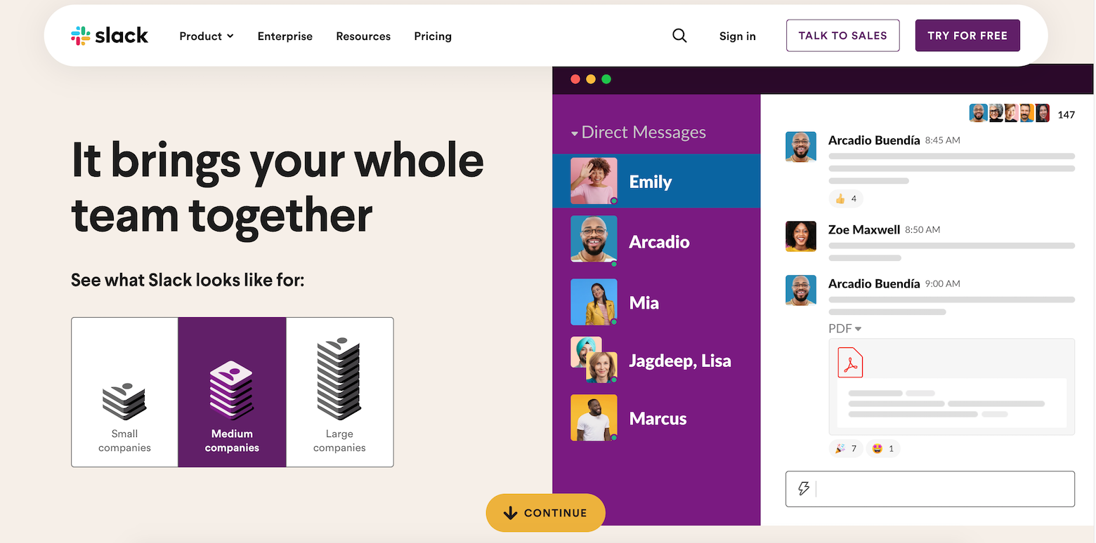
This keeps the user engaged enough to keep scrolling down to more universal benefits such as video chat and the ability to work with external teams. The page sums up a variety of statistics related to productivity and community, alongside the option to implement a free trial on the spot or speak with a sales representative for more information.
Choose Your Hero (Image) Wisely
You only have 50 milliseconds to capture your user’s attention so you have to be very selective in what you choose to show. For a SaaS product, that’s extra challenging, because there’s no tangible product to tout. It’s essential to showcase the product’s features, and anticipate and answer users’ questions without distracting visuals or extraneous information.
The team behind the project management tool Monday does an excellent job of capturing the product’s value proposition by using screenshots to highlight all the ways it can be customized.

The catchphrase—“Work Without Limits”—captures attention, addresses needs, and piques curiosity. The subheading adds interest by summarizing the value proposition of the product and invites prospective customers to learn more about how it might apply to their lives. Phrasing that invitation as a question encourages interaction with the site. Below that are visuals of workflows tailored to a wide variety of specific industries, prompting the user to think about how it might work for theirs.
It’s often helpful to emphasize benefits over features. This is a great strategy if your product is difficult to visualize or too nuanced to condense into a few catchy words. Instead of showing off all a product’s features, you can focus on what means the most to users.
Pipedrive’s landing page does a good job of illustrating the value of using its customer relationship management (CRM) system. The page presents all the product’s key benefits concisely to avoid the need for scrolling. At a glance, the user can:
- Gain context and knowledge of CRM.
- Visualize the results they can anticipate from using the product.
- Understand how Pipedrive’s product stands out from the crowd.
- Learn how the product works for large teams, key to attracting major companies.

Finally, consider an interactive approach. SaaS products can be dull, but their landing pages don’t have to be. Interactive design can keep users engaged long enough for you to communicate product information and value, as well as your brand story.
The Cuberto agency’s landing page concept for the mobile banking app Wickret uses interaction and a minimalistic design to keep users interested.
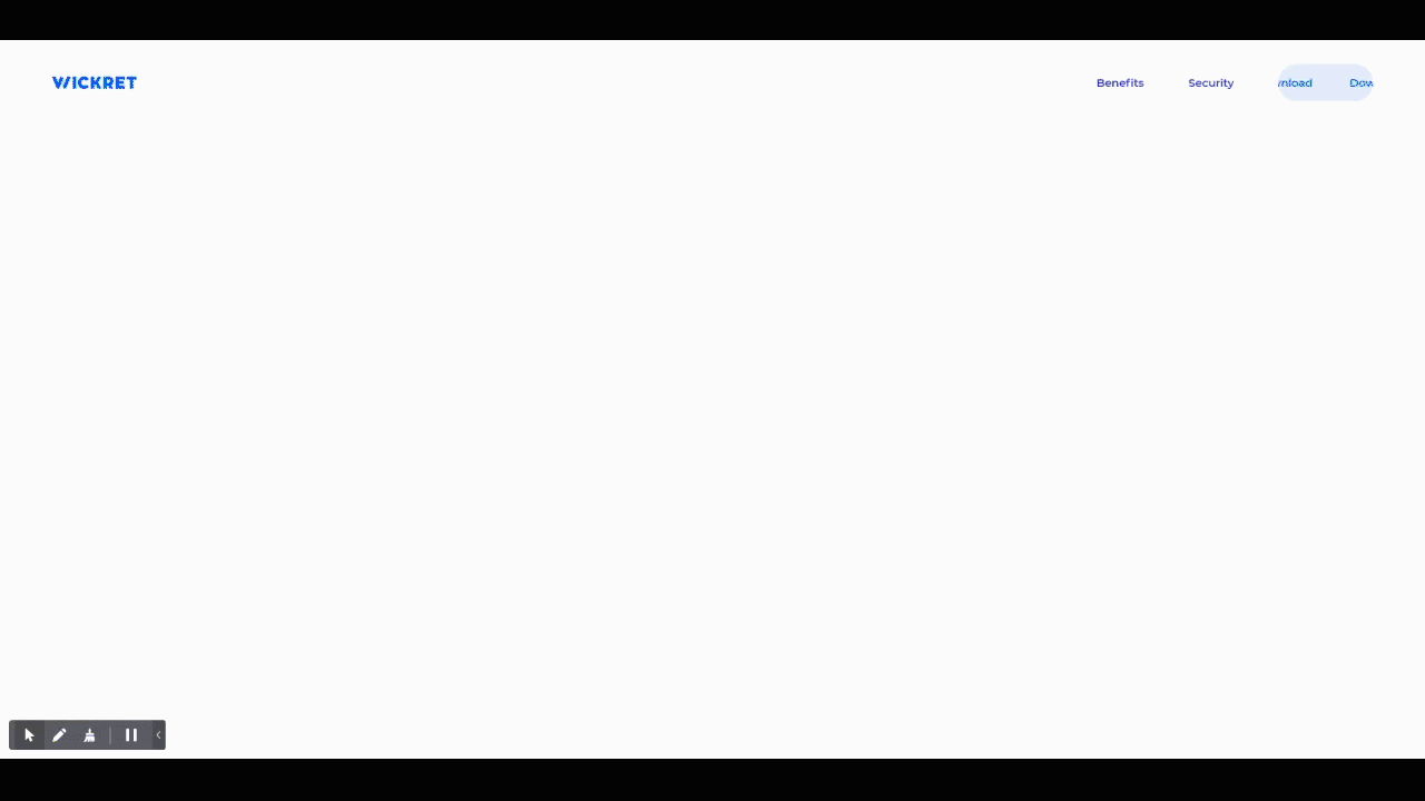
The interactive copy a user encounters as they scroll down the page, as well as the clever ways the custom cursor animates the elements of the screen, makes the simple messaging come to life. Notice how the microinteraction in the call to action—“Download”—helps it stand out against the rest of the page.
This is a fun, engaging way to show off a minimalist product.
Design With Mobile Users in Mind
Half of your users will be browsing your website through their mobile devices. But your landing page doesn’t just need to shrink to a smaller screen, it needs to be optimized for mobile devices.
Be mindful of the type of interactions that users can have on mobile and simplify the page’s structure so users can navigate it seamlessly. When a website is merely responsive, the content is usually shifted to a smaller grid and stacked vertically. This change of content architecture can reduce the power of your messaging, so you have to be thoughtful about whether a vertical stacked layout is best for your design. In some cases, alternative solutions like horizontal carousels or tabs can be more effective.
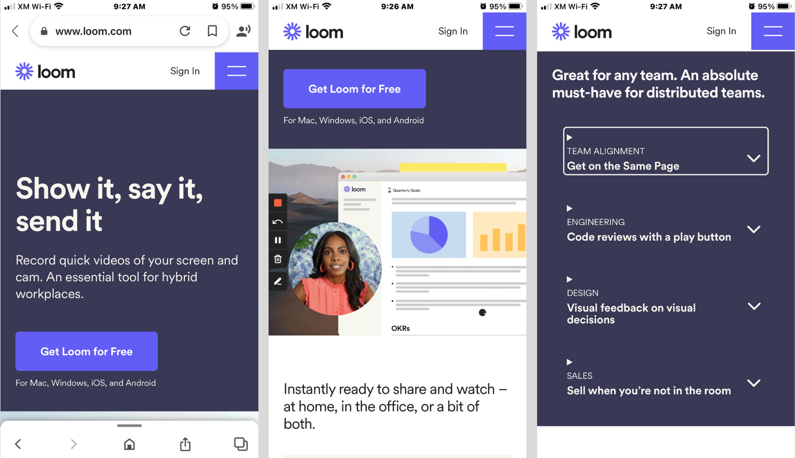
Failing to communicate your product well on mobile devices can cause your conversions to decline. The video-messaging service Loom has done a great job of translating the interactive components and visual storytelling used on its website to mobile devices by simplifying the content architecture where required and using an alternative approach for tabs.
Build Trust From the Ground Up
Imagine walking into a room full of strangers and wondering if you’re in the right place. That’s similar to what a user feels visiting a new product website. At a party, once you see some familiar faces, you start to feel more comfortable.
The same idea is true for SaaS products. Even though customers have problems they want to solve, it can be intimidating to learn and integrate a new product into their routines. That can make it hard for customers to rationalize the risk of handing over their contact and payment information.
You can promote trust in many ways:
- Be sure to have an SSL certificate.
- Structure your URL concisely and informatively.
- Make sure there are no unnecessary redirects.
- Avoid copy that sounds desperate for leads.
- Make your page intuitive and easy to use.
These are simple ways to build a rapport with your users and create an experience where they feel valued and informed. But you shouldn’t stop there.
Show Users How It Works for Them
You can reduce uncertainty and project trustworthiness by demonstrating that you know how your customers might use your product. Showing them how your product fits into their routine can answer a lot of questions very quickly.
For example, Monday.com offers a quick tour, helping a user see how they would interact with the site.

The prototyping tool Framer goes a step further, with an animation that shows the development of a working prototype within the Framer interface. Additional interactivity enables the user to click through different projects in order to get a better sense of the possibilities.

Social Proof Is Essential
Social proof is especially important for SaaS products. Showing your customers trusted partners goes a long way toward boosting users’ willingness to try your product.

Another great form of social proof is positive peer pressure. How often have you checked reviews of a restaurant before booking a table or purchased something online based on its positive reviews? According to BrightLocal, 87% of consumers do just that.
Endorsements can be a powerful tool, but they must be informative and relevant to the user. Done well, they can do several things at once. Zoom shows how reviews can:
- Show you’re in demand. Zoom’s endorsements show that the product is well recognized and used by big companies across various industries.
- Create a sense of community among customers. Sharing feedback and thoughts from a number of customers communicates a big user base, which makes new customers feel more welcome.
- Promote credibility. Users see purchases being made by recognizable customers—giving credibility to your product and building trust.

End on the Right Foot
Even if a user has made it all the way through your page, there are a number of reasons why they may not be ready to make a decision:
- They are interested in your SaaS product but want more information.
- They have questions or concerns that haven’t been addressed.
- They don’t trust the product or the brand.
How do you design the bottom of your page to address these issues? First, make sure there is a clear section, button, or link where users can access instant support or reach out to someone who can address their questions and concerns. You can offer additional opportunities to connect through chat or provide an FAQ.
Another way to hook your curious-yet-reluctant users is to provide additional perspective. If a free trial isn’t your primary call to action, then offering a demo may help capture users still on the fence. Alternatively, you might provide case studies from a variety of users.
Your footer should open a door to users, allowing them to create a stronger, more personalized connection to your product. Don’t just see it as the end of the page: Treat it as the start of a new journey for your users.
Mix and Match for Success
Conversion isn’t a consistent formula that will work the same for every product. Rather, a successful SaaS landing page will include a compilation of variables, which can be controlled, tuned, and composed in order to create a site that achieves the three Cs:
- Conveys your product story in the most effective way.
- Captures your users’ attention, interest, and actions.
- Converts them.
###
Further Reading on the Toptal Blog:
Understanding the basics
What makes a good SaaS landing page?
In addition to utilizing general landing page best practices, a good SaaS landing page should also address the product’s key users’ goals, using data acquired during testing, and build trust by removing uncertainty about how the product works or fits into the user’s lives.
What should a landing page include?
A landing page should include: A clear, specific call to action; relevant imagery; copy that highlights benefits, not features; social proof; an uncluttered layout; and mobile friendliness.
How do I optimize a landing page?
You can optimize an SaaS landing page by tailoring it to key users of the application, using data acquired during the product’s development. You should also minimize uncertainty by showing how the product fits into the users’ lives.
Muhammad Junaid
Lahore, Punjab, Pakistan
Member since January 29, 2020
About the author
Muhammad is a senior product designer and strategist who delivers compelling customer experiences for companies around the world, including Ulster Bank and Bayer.
Expertise
PREVIOUSLY AT