The Origins of Bad Logo Redesigns
A logo redesign without controversy is like a workout with no sweat. It’s possible, but is it impactful? We scrutinize high-drama logo updates and ask why they caught fire in the public arena.

A logo redesign without controversy is like a workout with no sweat. It’s possible, but is it impactful? We scrutinize high-drama logo updates and ask why they caught fire in the public arena.

Micah helps businesses craft meaningful engagement through branding, illustration, and design.
Expertise
Logo redesigns are a lot like a tightrope act—on a windy day, in a pouring rain, no nifty balancing pole or safety net below. The risks are high, and the margin for error is thin. What’s at stake?
Confusion.
Outrage.
Social media “shame-on-you”s.
We form deep, emotional ties with logos. The shock of change has the power to trigger a disproportionate reaction regardless of a redesign’s quality.
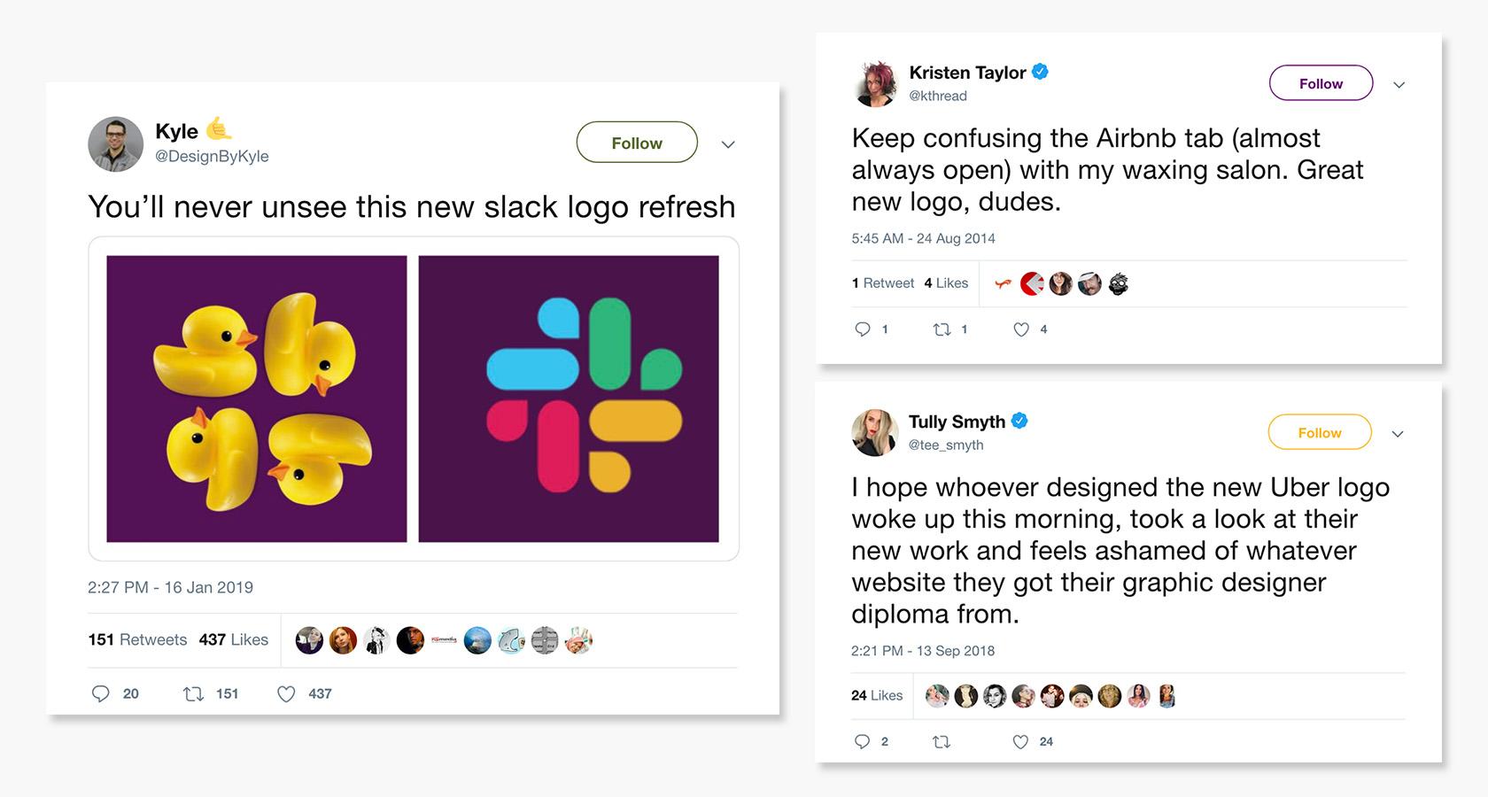
Sometimes, a new logo is an obvious step in the wrong direction. Maybe it’s lacking character or misrepresents the mood of the brand. Other times, a redesign is a definite upgrade, but because it’s different, it takes a while to win us over.
Either way, there are lessons to be learned from high-profile logo updates gone awry, and the takeaway isn’t always “Do better.”
Whether it’s telling the perfect backstory, nailing the unveiling, or simply embracing the reality that it’s impossible to make everyone happy, there are uncomplicated strategies that can favorably influence the public’s perception of logo redesigns.
It Cost How Much?
Logos aren’t cheap. They shouldn’t be. They’re enduring tokens of trust and quality that embody brand values in a single expression of visual clarity. That said, there’s a running list of exorbitantly priced logos that people love to loathe:
- Pepsi—$1 million (2008)
- BP—$5.9 million (2000)
- Citibank—$1.5 million (1998)
- BBC—$1.8 million (1997)
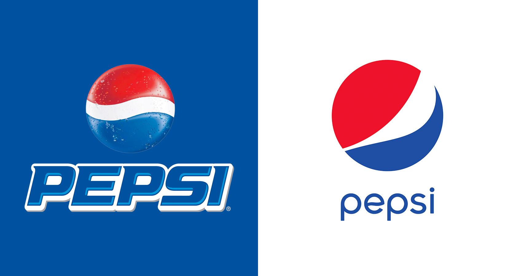
Rather than highlight one unlucky logo to criticize, let’s dig a bit deeper.
When a dollar sign is followed by six or seven digits, something in our brain malfunctions and all expectations become instantly unrealistic. Expensive logos aren’t impartially judged for design quality. They’re weighed against their extravagant price tags and almost always found wanting.
What can we learn?
Logos are a long play. They require time to create, time to implement, time to be trusted—and time ain’t cheap.
That said, paying hundreds of thousands of dollars for a logo will never make sense to a vast majority of the population. No amount of editorializing the intricacies of the design process will help because the public’s perception of value isn’t business-centric.
Many don’t realize that design is an investment. One without risks? No, but case after case has proven that it powers profits. Big-budget businesses agree, but the average Joe scrolling headlines might choke on his morning muffin when he reads how much ACME paid for its new anvil logo. “My house, car, degree, and wedding cost less—combined!”
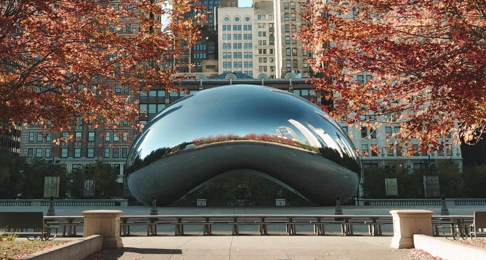
For those facing negative feedback from a high-priced logo project, there’s a helpful parallel to be drawn from civic art installations, an arena where criticism and public outcry are in ample supply. Here’s the progression:
- First, installations disrupt the known environment, and we wonder how such an intrusion could ever be commissioned.
- Then, they become familiar landmarks used to orient our everyday activities.
- At last, they mature into cherished symbols, crowning jewels of community and culture.
Kinda Looks Like They’re…
Chess is a game of purpose. It has a way of permeating one’s mind and becoming a lens through which to view life. Engrossing? Yes.
But is it…sensual? As we’ll see, that’s open to interpretation.
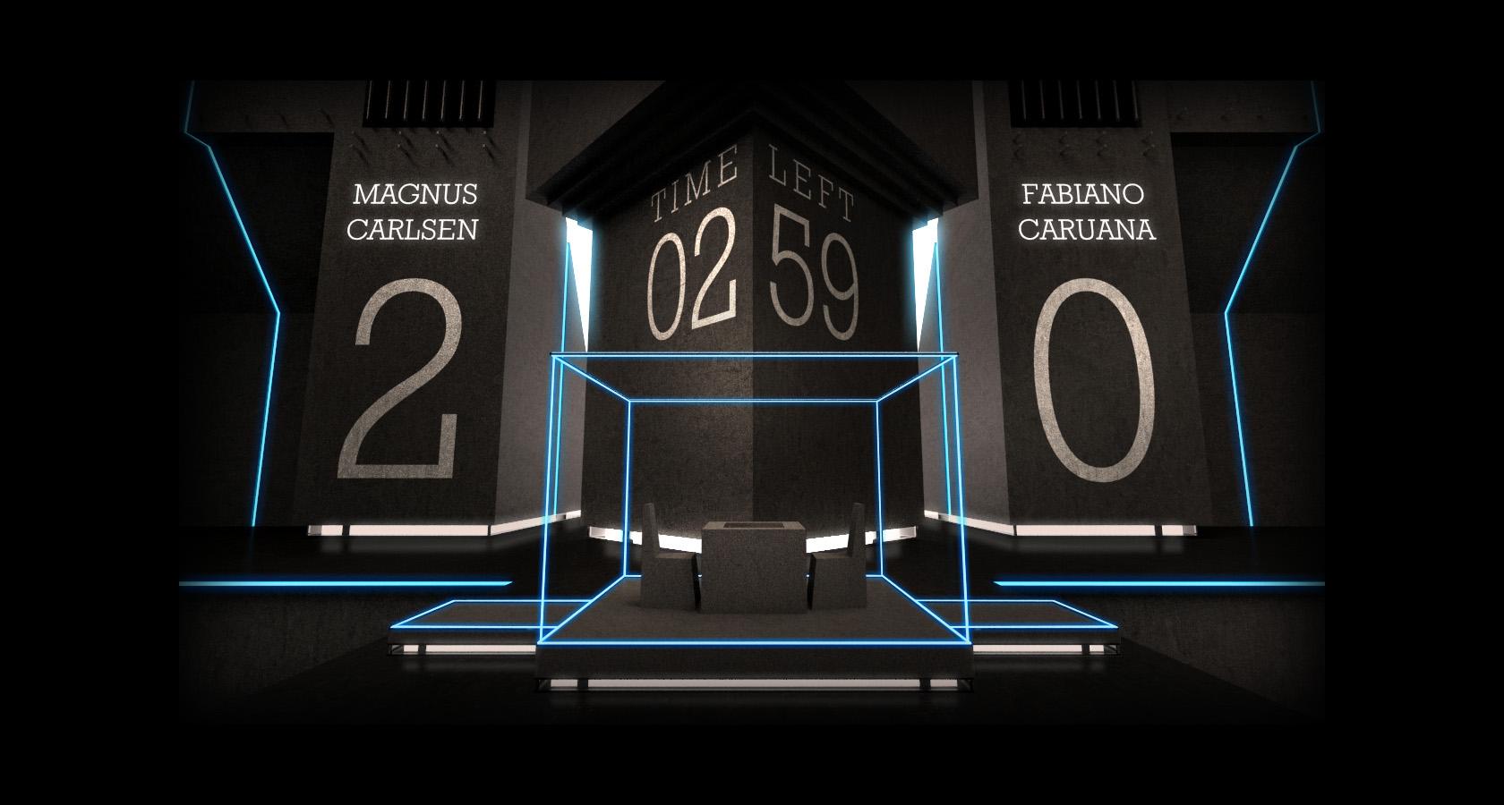
Every other year, the world’s two best players engage in a 12-game match, and the winner is crowned World Chess Champion. The event, run by FIDE and World Chess, is typically surrounded by some level of controversy, and for good reason.
Chess, while loved by many, doesn’t necessarily attract a massive viewership or high-level sponsors, so FIDE and World Chess have had to find ways to infuse the World Chess Championship with entertainment value.
In 2016, the identity for the championship mirrored its host city, New York, with visuals full of bustling bravado.
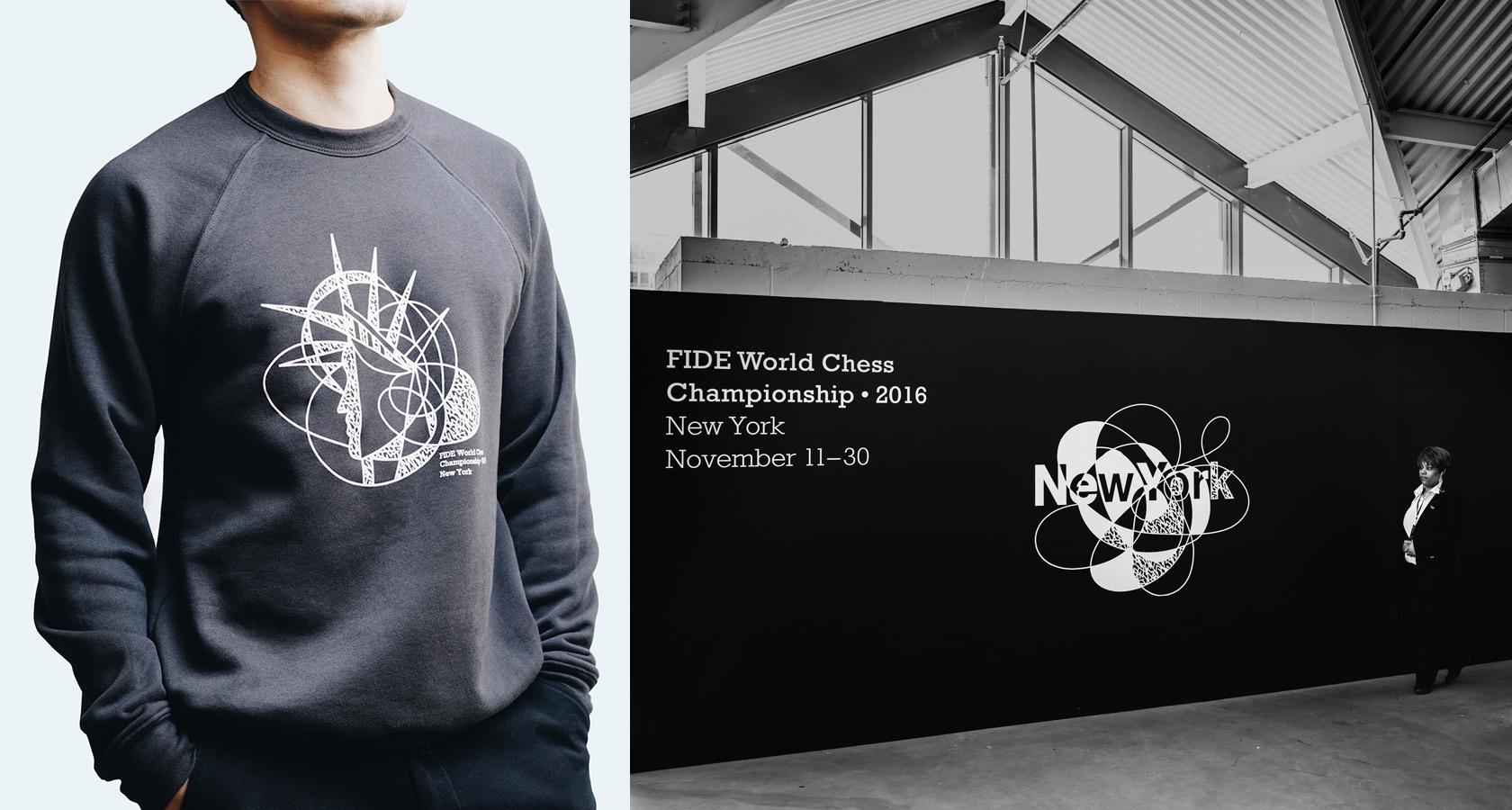
The bar for 2018’s branding was set high, and Shuka, the firm hired for the job, didn’t balk at boldness.
Primary visuals are comprised of complex arrangements of interwoven shapes and patterns. Typography is clean and sophisticated. The system is flexible and full of character. It’s everything one would expect from an Avante-Garde identity for an international event.
Except…
One element, an alternate logo, started feeling frisky and ended up adding a whole new layer of meaning to the phrase “opening moves.”
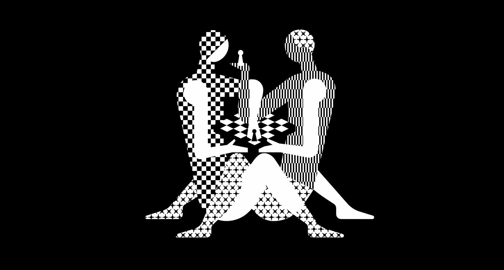
The pretzeling pawn stars ignited a spark of rage within the chess community and fueled a firestorm of debate on social media and major news networks. The campaign certainly grabbed attention, but did it go too far?
What can we learn?
Designing a memorable logo requires a measure of fearlessness, a willingness to push boundaries, but there’s also a degree of conceptual balance needed or else the logo’s core audience may be alienated. These are the people that carry a brand through thick and thin. Beware of straining their loyalty, specifically when the goal of a redesign is little more than a ratings boost from a wider audience only interested in the sugar-rush of controversy.
FIDE’s 2018 championship logo was a brazen move, but more than a desperate grab for attention, it was a calculated play made in alignment with the organization’s overarching mission to increase the appeal of chess globally. The takeaway? Don’t be scared to prod customers in new stylistic directions, but do so with intentionality and strategic vision.
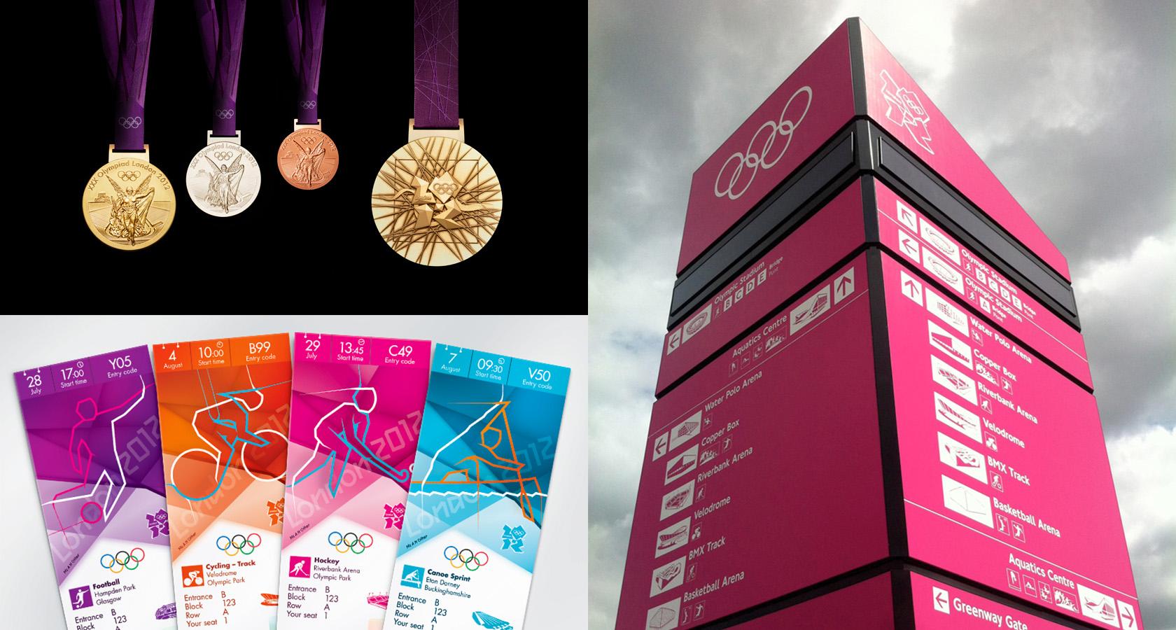
The Medal for Mediocrity
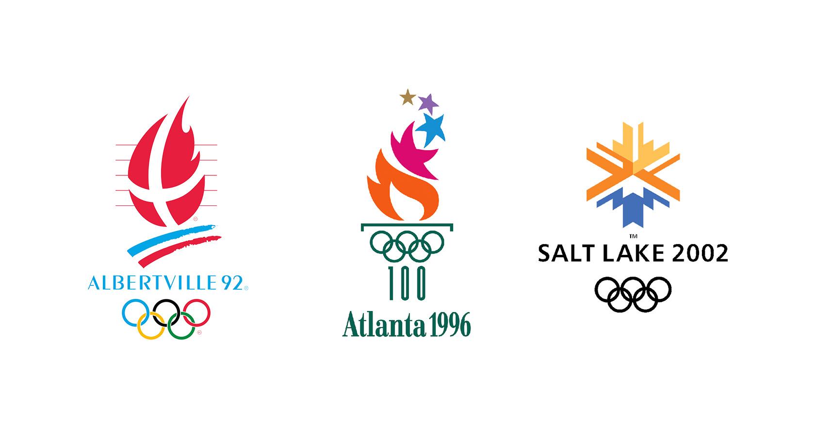
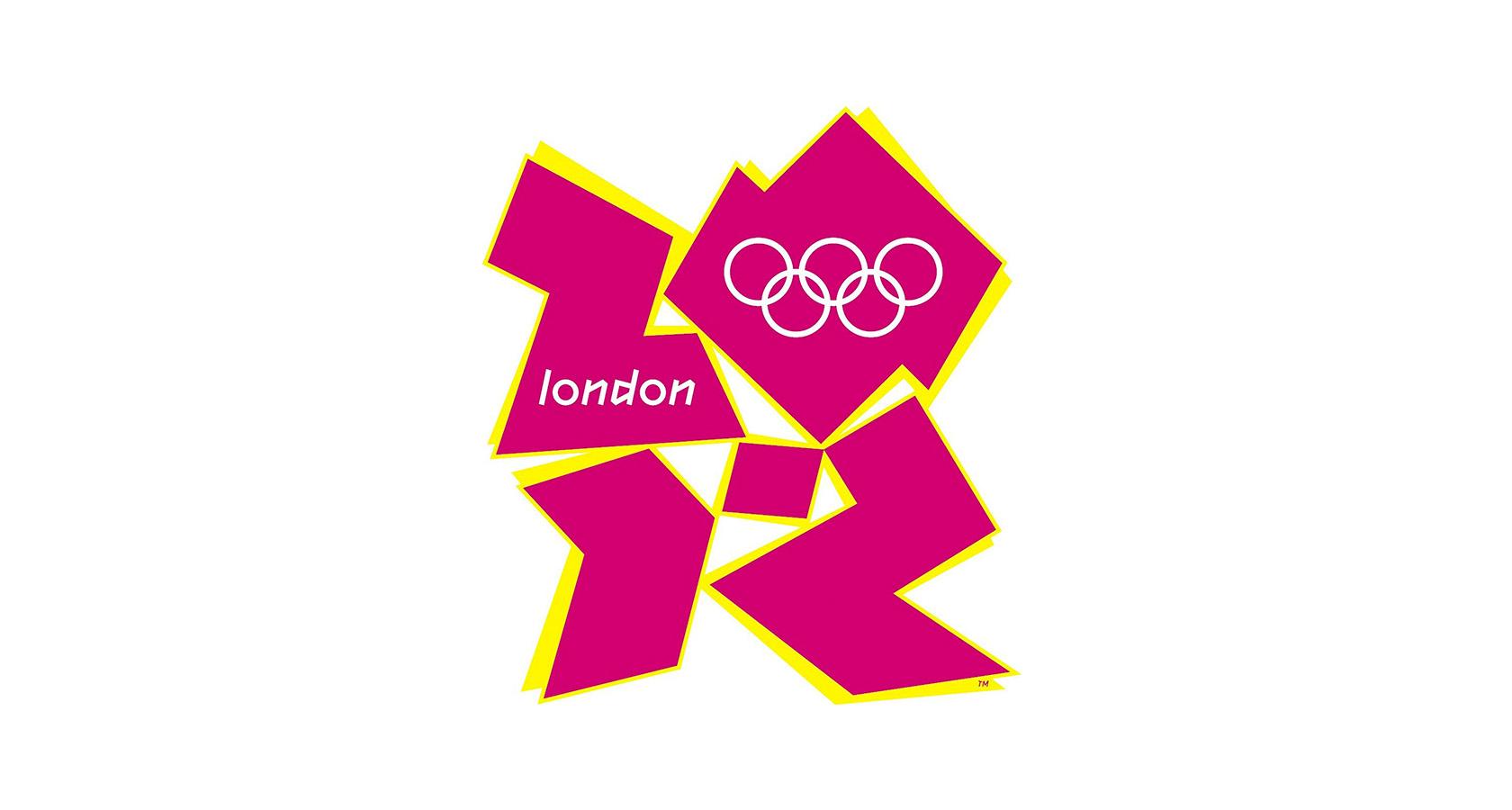
The Olympic Games are a shrine to human potential—unrivaled displays of pageantry, spectacle, and willpower—but there’s a long streak of Olympic futility that few people know about.
Barring one exception, the modern games have never seen a host-city logo make it to the medal stand of public approval. Not in summer, not in winter, and judging by the reactions to the logos revealed for the next four games (2020-2028), not any time soon.
Designing an identity for the Olympics is an epic challenge. How does one visually capture the spirit of a global event and the uniqueness of a single city while acknowledging multiple cultures and ages of athletic tradition?
And how do we make that identity engaging, fresh, and flexible enough to flourish within an expansive list of use cases?
Most importantly, can that identity, which surely starts with the best intentions, withstand the onslaught of nitpicking by planning committees, city officials, and governing bodies and still manage to emerge in its final form with some degree of design integrity?
What can we learn?
Big, multinational events are a difficult design ask.
Err on the safe side? “Generic!”
Dare to go bold? “Rubbish!”
Ask the public for creative input? “Cop out!”
Olympic identities are more than a logo. They’re visual systems built for numerous touchpoints. The system is the hero. The logo is a facet of its powers.
But when a logo is the first (and only) element that the public is introduced to, sitting there all awkward and isolated on a blank white background, it’s understandable if people aren’t receptive.
There’s no frame of reference to judge by, no story to latch onto, and no way to imagine a world where the logo struts its stuff.
Whenever possible, present logos within the context of a system. Show how the elements of the system play off one another—how colors enliven typography, how icons invigorate signage, and how the logo ties them all together.
AI Ain’t All That
Neural networks. Generative design. Machines are learning!
With the unbridled upswing of artificial intelligence, the day is coming when a high-profile company will choose to entrust the entirety of its logo refresh project to a robot, and we don’t mean one of those freebie logo generators sitting unused on the interwebs.
No, we’re talking highly advanced tech developed by some of the world’s most intelligent people. All involved will be supremely confident, and they’ll unveil their AI-designed logo with much self-importance, and everyone who witnesses their creation will be…
Profoundly underwhelmed?
It’s inevitable. Really smart people with state-of-the-art equipment and lots of money love to hype the hell out of their achievements, but at the end of the day, we’re talking about a logo, not a Mona Lisa. There’s bound to be a disconnect when people see said logo and realize—it’s still a logo.
What can we learn?
Soon, AI will be a prominent part of the logo design process, but it will be most beneficial as a tool. Like all tools, those who spend the time to learn its capabilities and how to harness is peculiarities will create the most interesting work.
Two words sum up everything we need to know about the future of AI and design:
Curate and communicate.
Humans aren’t giving up image creation. It’s a highly complex, profitable, and fulfilling line of work, but we’ll be more than happy to invite AI to assist, even extend, our design efforts. When we do, we’ll need to learn how to intelligently define constraints and curate the output.
Then, we’ll need to communicate AI’s role. No matter how ubiquitous the tech becomes, people will want to know “Is it real? Or is it AI?” and we’d better have a more enlightening answer than “Uh, both.”
Learn from Logo Redesigns, Even “Bad” Ones
Maybe “bad” logo redesigns aren’t that bad after all. Maybe they’re simply “different” or “misunderstood,” but those descriptors require patience—a willingness to wait and watch as a new logo spreads roots and solidifies its place in the public’s mind.
We don’t like patience.
We like lighting up that little blue bird with sick burns and clever comments, but it doesn’t take an ounce of talent or taste to make a snap judgment, and inner-industry sniping on social doesn’t further design or designers.
It makes us cautious, risk-averse, and bland.
We design not to be criticized, nor to be different, and strive to meet a shifting standard of approval in hopes of hearing other designers say, “So inspired by your work!” Before long, we arrive at some goofy trend that everyone copies until it becomes absolutely unbearable.
Are we being shortsighted? How do we know that today’s ridiculed redesign won’t become the standard by which all of tomorrow’s logos are judged?

The next time a popular logo gets made over, resist the impulse to join the online judgment posse and ask, “Why?”
“Why did the designer choose those shapes?”
“Why did they use that typeface?”
“Why did the logo need to be redesigned in the first place?”
And perhaps, “Why do I dislike it so much?”
There’s more to learn than personal taste and public opinion can teach. Logo redesigns that stir controversy or inspire ridicule are treasure troves of professional wisdom. They can help us grow and become better designers—but only when we’re willing to swim against the frenzied currents of mock indignation and groupthink.
Further Reading on the Toptal Blog:
Understanding the basics
What are the qualities of a good logo?
1) Simple—not overly detailed or ornamental. 2) Versatile—works across a number of use cases. 3) Distinct—stands out in multiple environments and the customer’s mind. 4) Relevant—lines up with what customers expect of a brand. 5) Timeless—a quality logo isn’t trendy or likely to lose its appeal quickly.
How do I come up with a logo?
1) Investigate—research the company, what it stands for, and the people it’s trying to reach. 2) Ideate—sketch ideas, photograph real-world inspiration, and collect shapes and symbols that may be useful. 3) Design + Iterate—put everything together in a cohesive concept, present to the client, and refine the logo.
Why is a good logo important?
It’s important to have a good logo because logos are enduring tokens of trust and quality that embody brand values in a single expression of visual clarity. A good logo is memorable and becomes an instantly recognizable symbol that people look for when making a purchasing decision.
Can a company have multiple logos?
It’s possible for a company to have multiple logos, but if that’s the case, the logos should relate to each other visually. Sometimes, this is referred to as a logo “system,” and in today’s world of multiple brand touchpoints, it can be quite useful for a company to have different versions of their logo.
Why a logo is important to an organization?
A quality logo is a visual design element that acts as a representation of a brand. It is meant to embody a brand’s personality and serves as an easily identifiable (and memorable) link between the customer and the expectation that they have of the brand.
Micah Bowers
Vancouver, WA, United States
Member since January 3, 2016
About the author
Micah helps businesses craft meaningful engagement through branding, illustration, and design.