Mobile UX Design Principles
Designers only have a few seconds to catch the attention of mobile users before they abandon an app or site. Following established mobile UX design principles creates a better overall user experience.

Designers only have a few seconds to catch the attention of mobile users before they abandon an app or site. Following established mobile UX design principles creates a better overall user experience.

Good design is good design, right? True, but there are specialized considerations that come into play depending on the medium for that design. design principles for something like an app made to run on a desktop computer are usually slightly different from the most effective mobile UX design conventions.
Even within an umbrella category like “mobile UX design” there are differences between designing an app and designing a mobile website. When users download an app, they don’t just want the mobile version of the website. They want a unique experience that justifies the time they spent downloading the app (as well as the space it takes up on their phone). Users have no qualms about deleting an app they don’t find worthwhile—75% of apps downloads are only opened once.
Mobile design, in general, cannot be overlooked. Worldwide, more people access the internet from their mobile and tablet devices than from desktop computers. Ignoring those users is no longer something that UX designers can justify. It’s important for mobile designers to consider mobile UX best practices at every step of the design process.
Put the User First
This should go without saying, but in any design project, the user should always come first, and user needs are even more important (and more specific) on mobile devices. If designers don’t cater to mobile users’ needs, those users will very quickly move on to other websites, apps, or distractions.
Following are a few things designers can do to meet the specific needs of mobile users.

Make Navigation Intuitive
Navigation on mobile sites and apps needs to be more intuitive than it is on desktop sites. Users need to be able to immediately identify how to get around a mobile app or website. This can be achieved through recognizable design patterns (such as hamburger menus) as well as recognizable icons (a “home” icon for the home screen, a chat bubble for messaging, etc.).
If users have to think about how to navigate, they’re more likely to disengage from the website, or close the app and look for a simpler solution.
Create a Seamless Experience Across Devices
Whether a user is accessing content on an app, mobile website, or desktop website, the transition between using them needs to be seamless. The design elements should mirror one another (designers shouldn’t use blue for the app and red for the website, for example).
Not only does a seamless experience make things easier for people using a website or app, but it also builds trust with the brand.

Focus on User Goals
The goals a person has on a mobile app or website are probably different than those they have on a full desktop site. For example, on a restaurant app, a visitor is likely going to want to do only a handful of things: view the menu, make a reservation, or get directions. In most cases they aren’t looking up the full history of the business on their mobile phone—that kind of content can be hidden in menus or submenus.
Think through what a user actually wants to do on a mobile app. One important thing designers often overlook is requiring a login for basic tasks. Banking apps, for example, often ask for a login in order to do anything on the app. But tasks like finding the location of the nearest ATM don’t really need the user to sign in. Making those features easy to access is a great way to improve UX.
Allow for Personalization
For mobile apps, personalization is key to improving the user experience. Personalization can also help achieve marketing goals. It’s a win-win for all the stakeholders involved.
Personalization should push users toward content that they’re looking for and away from content that’s irrelevant to them. It can also eliminate distractions on the site, streamline components like the purchase process, and make sure that marketing messages are in sync with what the visitor actually wants.
However, too much personalization can be an easy trap to fall into. The level of personalization needs to match the level of trust a user has with the app and the company. How often do people feel disconcerted or strange when a website displays ads for something they were thinking about (or talking about) but haven’t even searched for? Sure, it’s just the predictive nature of advanced advertising algorithms, but that level of personalization can still leave visitors feeling apprehensive.
Always Make Things Easier
When a person visits a website or app on a mobile device, they want to complete the task at hand as quickly as possible. It’s up to the designer to make completing necessary tasks as easy as possible. Eliminating everything that isn’t absolutely vital to each task is a great place to start. Making necessary tasks simpler on a mobile interface is also key.
For example, many eCommerce apps and sites now offer a camera option for inputting credit card information. Rather than typing in a card number, shoppers can aim their camera at their credit card and the app will automatically read the number.
Other things like specifying the type of input in form fields (so that, for example, when an email address is the expected input then the @ symbol and “.com” pop up on the main keyboard screen).
Good Onboarding Practices
Good onboarding is essential for mobile apps. But the definition of “good” varies greatly between different kinds of apps. Apps that are straightforward to use—things like to-do lists or web browsers—need minimal onboarding. A couple of splash screens that point out unique features is all most users will need to get started.
But more complex apps, like those for financial services or project management, need more comprehensive onboarding.
Use Established Gestures
This one should go without saying, but mobile designers need to consider established gestures people are already used to using on their devices. Things like pinching to zoom or swiping have become intuitive for most users and should be employed whenever possible.

In instances where a designer decides to deviate from an established gesture, it’s important to clue users into this deviation, either during the onboarding process or when the use-case appears for the first time.
Mobile Layout Design
Designing mobile layouts isn’t entirely different from designing any other kind of layout, but there are certain considerations designers need to take into account.
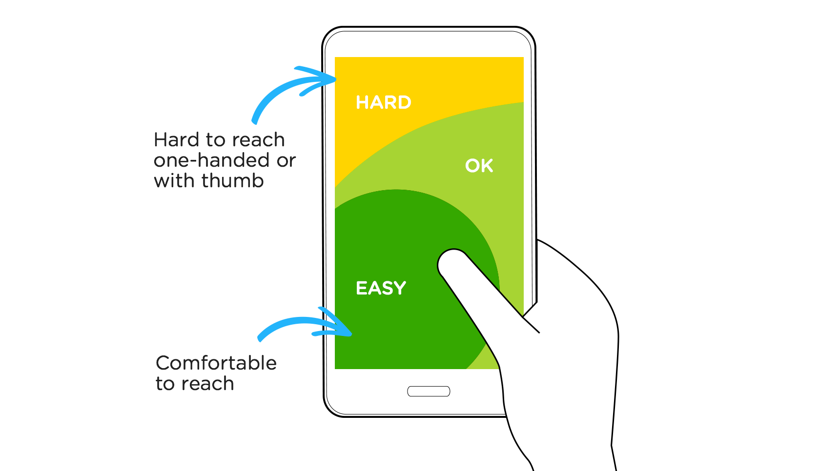
One of the biggest considerations is the size of touchscreen targets. While a mouse or trackpad can click with pinpoint accuracy, fingertips are much less accurate. Ideally, targets should be 7-10mm on a mobile device’s screen. This allows for a fingertip to tap the target without having to aim too carefully.
A related area to consider is hand position controls and the “thumb zone” on mobile devices—the area of a phone’s screen that can be easily accessed with the thumb when a person is holding their phone with one hand. Putting the majority of interactive content (and particularly calls-to-action) in this zone is vital to creating a positive user experience.
It’s important for mobile designs to cut out as much clutter as possible. Minimalism is a designer’s friend when it comes to mobile apps. Trying to cram everything in a desktop UI into a screen that’s a fraction of the size makes the design look cramped and can be overwhelming.
Focusing on goals, minimizing navigation options (menus and submenus can help with this), and generally eliminating any element that is not essential for users to do what they need to do will create a more streamlined and user-friendly UI.
While cutting out the on-screen clutter, designers have to be sure not to overlook some key design considerations. One such consideration is making sure various design elements have sufficient contrast. People often look at their mobile devices in less-than-ideal conditions. Things like bright sunlight can make elements on a screen hard to see, but high contrast helps to make elements more visible.
Typography is another key consideration. It’s important to have a clearcut typographic hierarchy in a mobile design. Titles and headers should be easy to spot, and fonts, in general, should be larger. No one enjoys squinting at their screen to try to read big blocks of text on their phone. Clear headers, bulleted or numbered lists, and short paragraphs all make mobile text more legible.
A final UI consideration is the use of transitions and animations. An animation can be an important signal to a user that whatever action they just took did something. Animations and clear transitions between screens or functions in a mobile app are key bits of feedback that create a more satisfying user experience.
Mobile UX Best Practices
All of the above are important considerations when designing mobile apps and websites. But there are additional mobile UX best practices to follow to ensure the best possible user experience.
Focus on Speed
Despite widespread 4G data availability, mobile networks are still generally slower than wifi or broadband services. And in many parts of the world, 4G doesn’t exist, and mobile users are stuck with either 3G or slower data speeds.

That means mobile websites and especially mobile apps need to be fast. Including content in an app that doesn’t need to be downloaded every time the app loads will make the app faster. As will only loading content as it becomes necessary (although anticipating content that will be needed and pre-loading it can make an app appear faster to the user).
It’s a balancing act between not loading content that won’t be used (and using up data) and creating the perception of speed by preloading content users are likely to need next.
One way to create the illusion of speed and soothe impatient users is to use placeholders until content loads. Facebook’s mobile app does this, with what effectively appears to be a polished wireframe loading as soon as the app opens, holding space for the posts that load as they download. This transitional screen signals to users that something is happening with the content before it actually loads.
Provide Feedback to Users
Giving users feedback as they perform actions on a mobile app is an important aspect of a positive user experience. As mentioned previously, animations and transitions are one way to give feedback.
Tactile and audio feedback is also possible with mobile devices. Providing touch feedback when certain actions are performed is particularly popular with mobile games, and also with error messages. Audio feedback is popular with functions on all kinds of apps. Nonetheless, designers shouldn’t rely on audio feedback since so many people keep their phone silenced at all times.
Minimize Data Input
Another key mobile UX best practice is to minimize the amount of data input required. This was touched on previously, but the more data a person has to enter into a mobile app, the more likely they are to abandon the task.
Filling out a form with four or five fields might not be a big deal on a desktop or laptop computer, but on a mobile device, those four or five fields might be enough to turn a user away, especially if they can’t see their purpose. Make sure that every single field in a form being filled out on a mobile device is necessary. Eliminate any that aren’t.
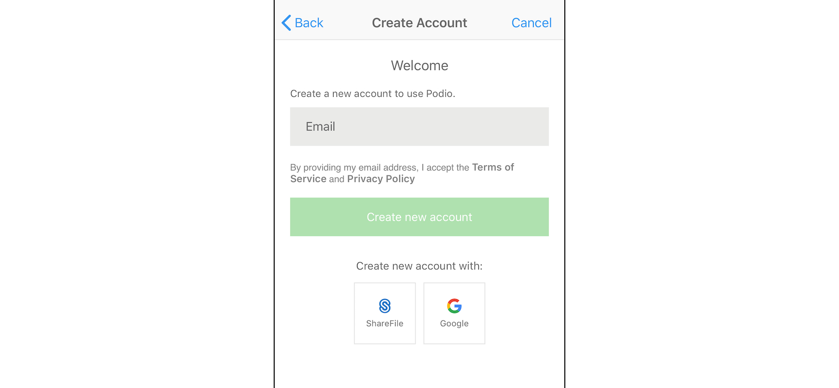
This is one area where giving people the option to use one of their existing accounts (such as a Facebook, Google, or Twitter account) rather than signing up from scratch can greatly improve conversions. When a user only has to click to authorize access rather than fill out a form for a new registration, they’re more likely to do so. Just don’t rely solely on these secondary apps—some users are still distrustful of linking their accounts and will take the time to fill out a form.
Conclusion
Following these established mobile UX design principles will create a better overall user experience for people visiting a mobile site or using a mobile app. Designers only have a few seconds to catch people’s attention before they abandon an app or site in favor of one that’s more user-friendly, intuitive, or streamlined.
Great mobile designs are becoming more common, and the bar has been raised even further in terms of what users expect from their mobile apps. Designers can no longer view mobile design as an afterthought, and instead need to put just as much time, consideration, and resources into them as they do for designs on other formats.
Further Reading on the Toptal Blog:
- Mobile UX Design Constraints, Best Practices, and Working With Developers
- Retain Users With These Mobile App Onboarding Inspirations
- Swipe Right: 3 Ways to Boost Safety in Dating App Design
- E-commerce UX for the Mobile Experience
- The Fundamental Guide to Mobile Usability
- Heuristic Principles for Mobile Interfaces
Understanding the basics
Why do we need UX?
UX simply refers to user experience. User experience exists whether designers actively follow UX principles and patterns or not. But following established UX design processes and mobile UX design principles allows designers to create user experiences that leave their visitors delighted and satisfied.
What is the difference between UX and UI?
UX refers to user experience, while UI stands for user interface. The design of the user interface has a direct impact on the user experience. Good UX practices incorporate UI design, user research, usability, branding, functionality, and mobile UX design principles among other aspects of design.
What is a mobile first approach?
Mobile UX best practices demand a mobile-first approach. It’s when a UX designer starts with the mobile version of a website and then creates the desktop version as an extension of that, rather than the other way around. Most mobile UX patterns work well on desktop sites, but the reverse is not always true.
What is UCD in UX?
User-centered design (UCD) is a problem-solving framework for design that focuses on user needs at every stage of the design process. Everything from the tasks and workflow of a product to usability goals and user characteristics are considered at every step. It’s particularly useful in mobile UX projects.
Why is user centered design important?
User-centered design is an important framework for creating designs with effective user experience (UX). UCD in mobile UX best practices focuses on how users actually use a product (including mobile apps and websites), rather than expecting users to adapt their behavior to the way a product works.