What Not to Do: The Beauty of Bad Product Design (with Infographic)
Jacques Carelman’s bad product design was wonderfully absurd, but he wasn’t interested in humor for humor’s sake. We’re showcasing an infographic of his wildest inventions.
Jacques Carelman’s bad product design was wonderfully absurd, but he wasn’t interested in humor for humor’s sake. We’re showcasing an infographic of his wildest inventions.
Micah helps businesses craft meaningful connections through branding, illustration, and design.
Expertise
For good reason, the bulk of design literature expounds the principles and practices of great design, yet there’s much to be learned from bad design. Absurdity accentuates the elegance of logic. Perhaps no one does this better than French poet, artist, and inventor of the world’s worst products, Jacques Carelman.
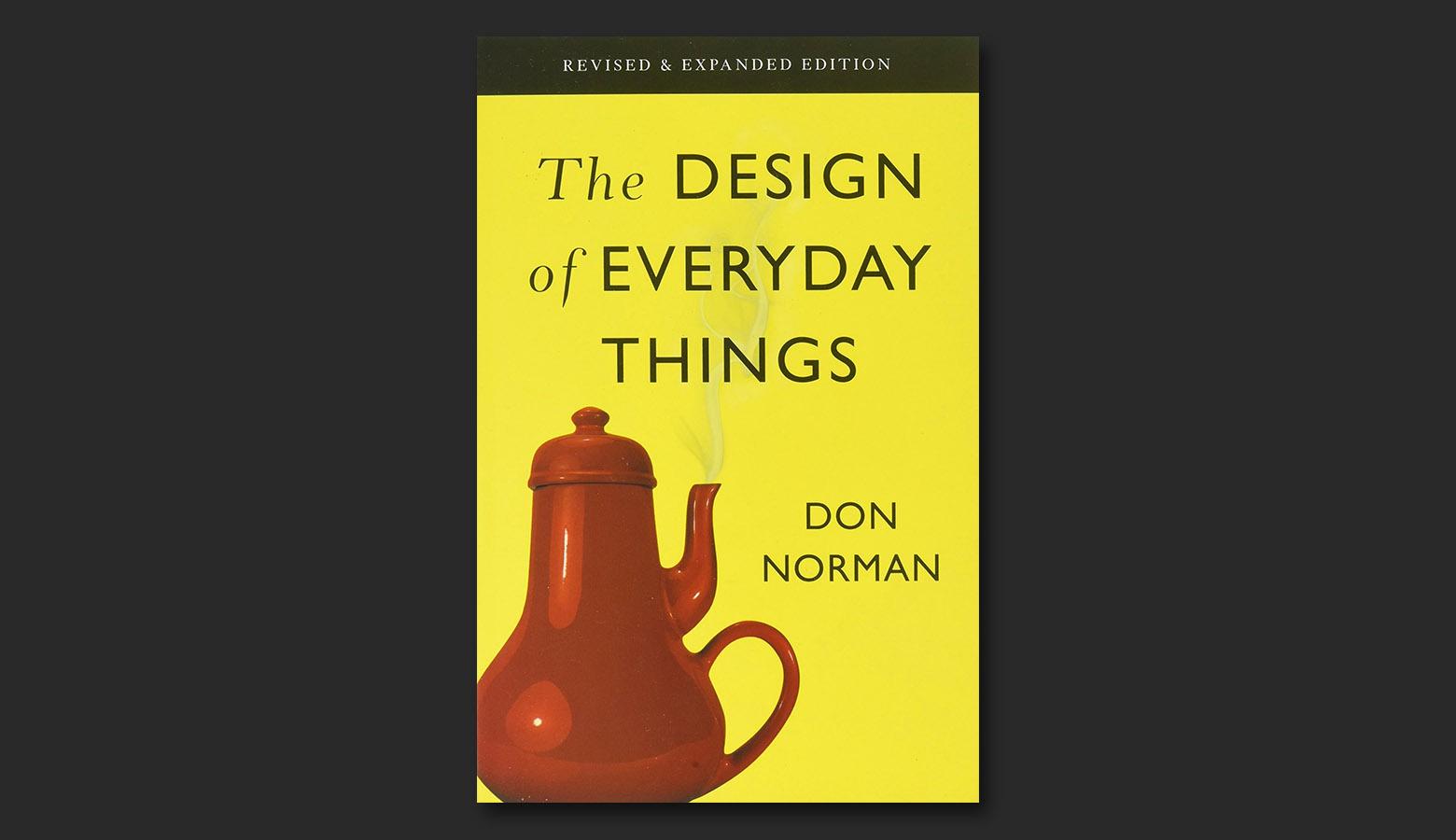
There’s a charming little coffee pot on the cover of Don Norman’s classic, The Design of Everyday Things. Its rounded curves and red enamel pop against a canary yellow backdrop. Steam rises from the spout, enveloping the title text. It’s perfectly pleasant, the kind of piece one might expect to find in a well-appointed kitchen. There’s just one problem.
It’s a coffee pot for masochists.

On first pass, the unwitting observer may not notice that the spout is situated just above the handle. Anyone who pours a cup from this pot is in for a world of pain. Who would devise such a devilish device? Surely not Don Norman, the godfather of user experience design.
No, this creation was conjured by the wild and whimsical mind of Jacques Carelman, a Frenchman with a flair for irony. Born in Marseille in 1929, Carelman was a painter, poet, trained dental surgeon, and designer of impossibly ridiculous objects.
A two-piece puzzle.
A hieroglyphic typewriter.
A hammock suspended midair by helium balloons.
But Carelman’s work wasn’t absurd for absurdity’s sake. He had a point to make. “I make people take another look at things that are so familiar they don’t see them anymore. I clean people’s eyes.”

The most famous of all Carelman’s efforts was The Catalog of Extraordinary Objects (Catalogue d’objets introuvables), an illustrated collection of illogical products that served as a critique of the mass-produced goods found in the mail-order catalogs of old. Carelman’s catalog is filled with examples that delight, challenge, and offend.
A glass-headed hammer.
A human wheelbarrow.
A slingshot attachment—for a pistol.
The objects are altogether strange, stupid, and hilarious, but if they only elicit a chuckle, we miss the point.

The genius of Carelman’s bad product design is its ability to hide defects in plain sight. Many of his objects appear benign, and some are quite beautiful. On further inspection, there’s always a twist.
Carelman perceived a level of laziness in design, a tendency to burden capable products with pointless features and market the updates as life-changing. His humor is a vehicle for an unspoken warning, one articulated by none other than Don Norman: “The design of everyday things is in great danger of becoming the design of superfluous, overloaded, unnecessary things.”
Ultimately, Carelman reminds us how easily we succumb to design blindness, how decisions that ought to be outrageous suddenly seem like a good idea. His work elucidates the ways we sacrifice usability for the sake of visual trends, novel features, and needless improvements.
Bad design is rarely as ironic as the masochist’s coffee pot, but the metaphor is worth remembering.
*Editor’s Note: All illustrations included in the infographic are based on inventions found in The Catalog of Extraordinary Objects.

Further Reading on the Toptal Blog:
Understanding the basics
What are some examples of bad design?
The world is full of bad product design examples. Door handles, control panels, and keyboards are universally frustrating. Many apps and websites are confusing to users. Wearable technology may be the future, but several large companies have been derided for launching lackluster products, like glasses.
What is bad design?
Bad design makes life more complicated. We often see this in examples of bad product design. An object is intended to make a task easier or faster, but it ends up confusing the user or failing to perform as expected. Bad design is also unnecessary, meaning it leads to objects that aren’t truly needed.
What is good product design?
Good product design can be simple or complex, but ultimately, it provides people with things that they actually need, things that improve their lives. By contrast, poorly designed products are superfluous, confusing, and typically frustrate users. Good design is a byproduct of understanding the needs of users.
What is simple product design?
One of the hallmarks of horribly designed products is unneeded complexity. Simple product design aims for solutions that are easily understood and usable in a few steps. For instance, the iPhone is packed with complex tech, but it’s designed with such simplicity that even a young child can operate it with ease.
What does product design consist of?
There are many branches of product design. Most people think of digital products or household and consumer goods, but product design is an integral part of industries like medicine, agriculture, finance, energy, and more. In all these fields, the aim is products that improve the lives of users.
Micah Bowers
Vancouver, WA, United States
Member since January 3, 2016
About the author
Micah helps businesses craft meaningful connections through branding, illustration, and design.

