A Step-by-Step Guide to UI Animation With Principle and Sketch
Animated UI elements improve the user experience, but how exactly are they made? These short tutorial videos demonstrate the most effective animation techniques using Principle for Mac.

Animated UI elements improve the user experience, but how exactly are they made? These short tutorial videos demonstrate the most effective animation techniques using Principle for Mac.

Tidjane is a UX/UI design leader who connects users’ needs and goals to deliver strategic solutions for companies like Adobe and Google.
Designing a UI interface with animation and transitions in mind is a great way to plan a better user experience (UX) for your next app. Animated micro-interactions are the perfect way to stimulate user engagement, in a world of short attention spans. This is why Airbnb recently introduced Lottie—its “new open-source tool that makes adding animation to native apps a snap.”
Projects like Lottie show the increasing importance of adding motion as a new element for crafting enhanced UX for both apps and websites.
In this tutorial, you will learn effective UI animation techniques using Principle for Mac. After you’ve gone through this guide, ’ll be able to turn dull and static mockups into interactive prototype to better showcase your work. You can apply what you’ll learn here to improve your next UI pitch and Dribbble shots.
Let’s get started.
Download These Free Resources to Follow Along
You’ll only need Principle and Sketch apps to follow along. If you don’t have them already, you can download a free trial using the links below.
-
Download a free Principle trial here.
-
Download a free Sketch trial here.
-
Download the free tutorial source file here.
An Overview of Principle Interface
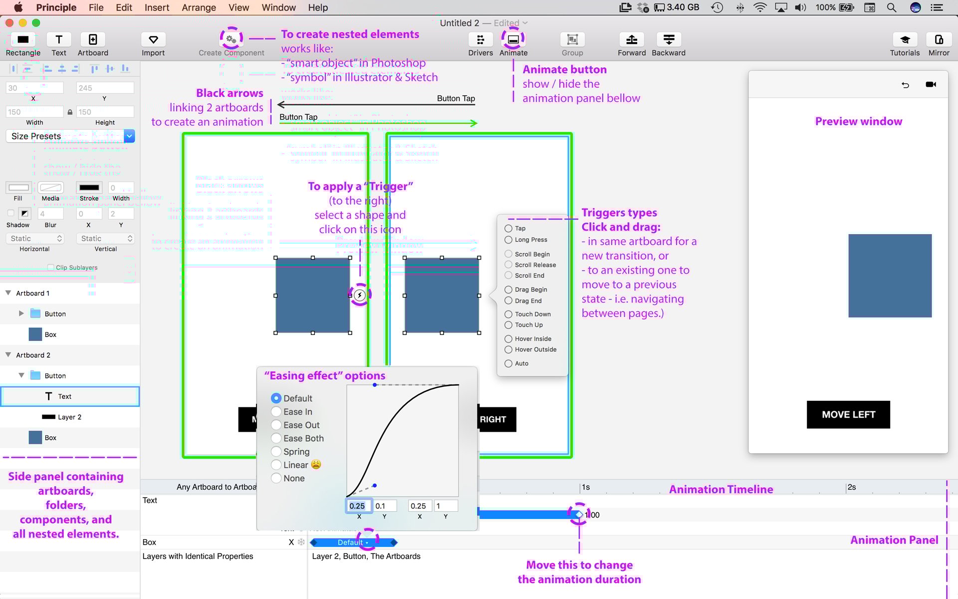
If you’re used to the Mac OS, then Principle’s interface will look very familiar. It has three main sections: a sidebar, a design area that shows the artboards, and the preview window you can resize and move around.
Understanding Basic Animation Concepts in Principle
It is relatively simple to animate with Principle. You don’t need to have an animation background to get started. In fact, most of the heavy lifting is automated by Principle, and you only need to focus on what starts an animation (i.e. a button, a link, a scroll event), how the animation starts, and how it ends.
To help you better follow along, here’s a brief lexicon of terms you’ll see throughout the guide.
- Component: A component is a kind of grouping that helps contain elements and even animations. It’s the equivalent of a “smart object” in Photoshop or a “symbol” in Illustrator.
- Trigger: A way of starting an animation - i.e. by tapping, scrolling, hovering, etc. In Principle, a trigger can be defined by selecting any element inside Principle and clicking on the icon that appears on its right side with a lightning bolt icon.
- Transition: A change of state from one artboard to another, i.e. sliding left or right.
- Easing effect: The level of smoothness of a transition based on how the animation starts and ends.
A. Trigger and Transition

The first step to animate with Principle is to setup a trigger (the behavior or action that starts the animation) on an element (i.e. a button, or link), and to alter its initial and/or final state (i.e. its position or scale from the beginning to the end of the animation).
- Define an initial state: how your UI elements look at the beginning before the animation takes place.
- Define the trigger: by selecting the interaction element and which action activates the animation.
- Define the final state: how the elements are displayed at the end of the animation.
Once you have the animation set, you can preview it in the preview window.
B. Animation Length and Easing Effect

By default, Principle creates a half-second animation. Sometimes that’s not enough to see the transition effect in detail. You can change the duration and the “easing” effect from the animation panel by following these three steps.
- Open the Animation Panel: Select the black arrows between two artboards, and click on the “Animate” button located on the top bar.
- Extend the animation length: Move the endpoints of the blue lines.
- Apply Easing: Select all the diamond-shaped points, and choose “Ease Both” from the dropdown to smooth out the transitions.
What You’ll Get
This video shows you what you’ll be able to create once you go through this tutorial. The demo app showcases Google’s Material Design color palette and gives you more details once you select a color. You’ll create a loading animation, some page transitions with a smooth parallax effect, and a menu slider.
Make sure you download the free tutorial source file here.
Let’s get started.
Going From a Sketch File to Principle
- Move the artboards to prepare for natural transitions between them: For example, a screen sliding from the right should be touching the right edge of the screen it’s replacing over the animation.
- Once your Sketch file is all set, jump into Principle, create a blank document matching the 360x640 ratio, and click on the “Import” button.
Removing the Screens Headers for Seamless Scrolling
To create a seamless transition between pages, you can remove each header except the first one. The headers were initially added just to showcase the app’s look and feel. You’ll only keep the header on the “Welcome” screen, and it will serve as a sticky to bar with the menu and app title.
Creating the Loading Animation: The Shapes
- Select the loading shapes group, and click on “Create Component” containing the loading shapes and text. Create a Component for the text within the first symbol; we’ll animate the text separately right after.
- Select the grouped shapes. Choose the “Tap” trigger, and drag and drop on top of the same artboard to create a duplicate.
- The second artboard represents the final state of the animation, and you can rotate the group using the angle property. Give different angle values to the “fill” and “outline” to create a more interesting effect.
- To finish, select the arrows between the artboards, click on “Animate” to open the “animation panel,” and change the duration by sliding the end points to about 1.00 s.
Creating the Loading Animation: The Text
- First, create the slide-up animation. Select the button shape, and apply the “Tap” trigger event. In the new artboard move all the screens up by 640 px (equal to the current artboard height).
- Now, let’s create the parallax. Go to the previous artboard, on the welcome screen, move the geometric shapes and text down at different Y values.
- Finally, inside the animation panel, extend the timeline, say to 1s. Apply an “Ease Both” effect to the timeline (make sure you’ve selected all the diamond-shaped points, and click on any blue line to apply the effect to all).
- Preview your animation and move the shapes around until the parallax effect looks good to you.
Creating the Parallax Effect: Welcome Page
- Select the loading component and apply the “Tap” trigger by dragging an arrow from it anywhere in the artboard.
- Select all the screens (from the master group), and move it up by 640 px. This step brings up the Welcome screen on view.
- Go back to the previous artboard, and move the shapes on the “Welcome” screen downward. This creates the asynchronous sliding effect called parallax.
- Adjust the animation by adding time to the transition inside the animation panel: Select the arrow between the artboard, then drag the endpoints on the blue lines to about 1s.
Creating the Parallax Effect: About Page
- Select the down-arrow button (make sure you select the entire group), and apply the “Tap” trigger by dragging an arrow from it anywhere in the artboard.
- Select all the screens (from the master group), and move everything up by 640 px. This step brings up the About screen on view.
- Go back to the previous artboard, and move the shapes on the “About” screen downwards. This creates the asynchronous sliding effect called parallax.
Creating the Parallax Effect: Colors Page
- Apply the “Tap” trigger to the down arrow button (make sure you select the entire group), and that will create a new artboard.
- On the new artboard, select all the screens and move them up by 640 px.
- On the previous artboard, move the colors and text downwards. Note that the lower you move an object, the longer it takes to slide back up, so make sure to use different placement to create a more dynamic effect.
- Finally, by extend the animation, and apply an “ease both” on all blue timelines inside the animation panel.
Sliding a Page From the Side: Color Selection Page
- Apply a “Tap” trigger to the “Load More” button on the “Colours” screen.
- In the new artboard, move the “Colours” and “Selection” content to the left by 360 px (artboard width)
- Go back to the previous artboard and move the screen content in the opposite direction - right.
- Note that you can also animate the opacity of the screen sliding in from zero percent to 100 percent.
- Play with animation duration and easing effect to tweak the transition effect.
Animating the Menu Icon
- Note that any layer and shape that had an effect (like shadows) from Sketch original file is imported into Principle as an image. If you need to edit shapes inside Principle, try not to add any special effect until after the import.
- That being said, using the existing icon as a guide, draw three thin rectangles, and group them to create the hamburger menu icon. Now, you can delete, or hide the previous menu icon.
- Select the newly created icon, and apply a “tap” trigger to it.
- In the new artboard, rotate the top and bottom rectangle on the menu icon, make sure they are center-aligned, and give zero percent opacity to the middle one.
- To see the animation you’ve just created, link back the changed menu icon to the preview artboard with a “Tap” trigger, and test it.
Creating the Menu Slider Effect
- On the end-state artboard, move the screens to the right until the menu links are aligned to the left of the closing menu icon.
- Select everything inside the “Colors” folder except the menu content and the light-gray background, and reduce the opacity to 25 percent. The animation will fade out the page content to focus on the menu.
- Extend the animation duration, and go to the previous artboard to slightly move the menu content to create a smooth effect.
Moving to the Contact Screen
- On the open menu, apply a “Tap” trigger on the “Contact Us” button.
- On the newly created artboard, move all the screens up by 640 px.
- Then go back to the previews artboard, and move the elements from the “Form” page down.
- Move the elements at different Y values to create the parallax effect.
- Finally, select the arrows between the artboards, extend the animation length and apply “Ease Both” to the blue timelines.
Ending With the Thank You Page
- Apply a “Tap” trigger on the “send message” button.
- On the new artboard move all the screens up by 640 px.
- Then go back to the previews artboard and move the elements from the “Confirmation” page down.
- Play with scale and rotation for the colored icon to create a more dynamic effect.
- Make sure you add to the animation length to better perceive the transition effect.
The Simplicity of Adding Animations With Principle.
Principle is a fantastic tool to make your UI interaction ideas come to life.
The interface is Mac-friendly and was built to work seamlessly with Sketch files.
Principle automates most of the animation and transition effect for you. All you need to do is apply a trigger to a shape on one artboard and change any property for the elements you want to animate on the final artboard.
Please leave any questions in the comments below. I’m happy to answer them.
Further Reading on the Toptal Blog:
About the author
Tidjane is a UX/UI design leader who connects users’ needs and goals to deliver strategic solutions for companies like Adobe and Google.