Mini Tutorial: A Guide to Font Combinations
Effective font combinations are a hallmark of good design. It’s vital that designers master this skill if they want to create exceptional designs that set them apart from their contemporaries.

Effective font combinations are a hallmark of good design. It’s vital that designers master this skill if they want to create exceptional designs that set them apart from their contemporaries.

Cameron Chapman
Cameron comes from a design background and is the author of two web design books: Color for Web Design and The Smashing Idea Book.
Expertise
“Typography is two-dimensional architecture, based on experience and imagination, and guided by rules and readability.” —Herman Zapf
Just a few short years ago, designers were severely restricted in their choice of web fonts. The options were generally limited to system fonts and hoping that the site’s visitors had those fonts installed.
While web fonts were technically possible in the late 90s, they didn’t become widely used until 2009, when the WOFF format became available and part of the W3C open standards. That opened up an entirely new world of typographic options for designers.
And therein lies the dilemma: now that there are literally thousands of typefaces available for web designers, how does one go about creating font combinations that work well together and support the content being presented?
Good typography and using the best font combinations elevate a design from its peers and create a more delightful user experience. Effective type combinations add visual interest to a design that can keep a visitor on the page longer.
Bad type, by contrast, can make content harder to read and less pleasurable for the person reading it.
Learning to combine fonts effectively is an important stepping stone in a designer’s education, and one that should continuously be refined and improved upon. Designers who master typography can make even the simplest design more effective. Following basic typography guidelines for combining fonts is the best place to start. Once those “rules” are mastered, designers can branch out and experiment to create typographic combinations that bend or break those rules.
Type Characteristics
With the hundreds of thousands of typefaces available, trying to figure out where to start can be overwhelming, even for advanced designers. Understanding the characteristics of different typefaces is the first step in learning how to combine them effectively.
Learning how these characteristics relate to one another allows designers to combine fonts with confidence and to experiment with unexpected combinations. Experimentation and practice are where designers can truly hone their font combination skills and create designs that set them apart from other experts. Sometimes, listening to their intuition is the best way to create a typeface pairing that really shines.
Classification
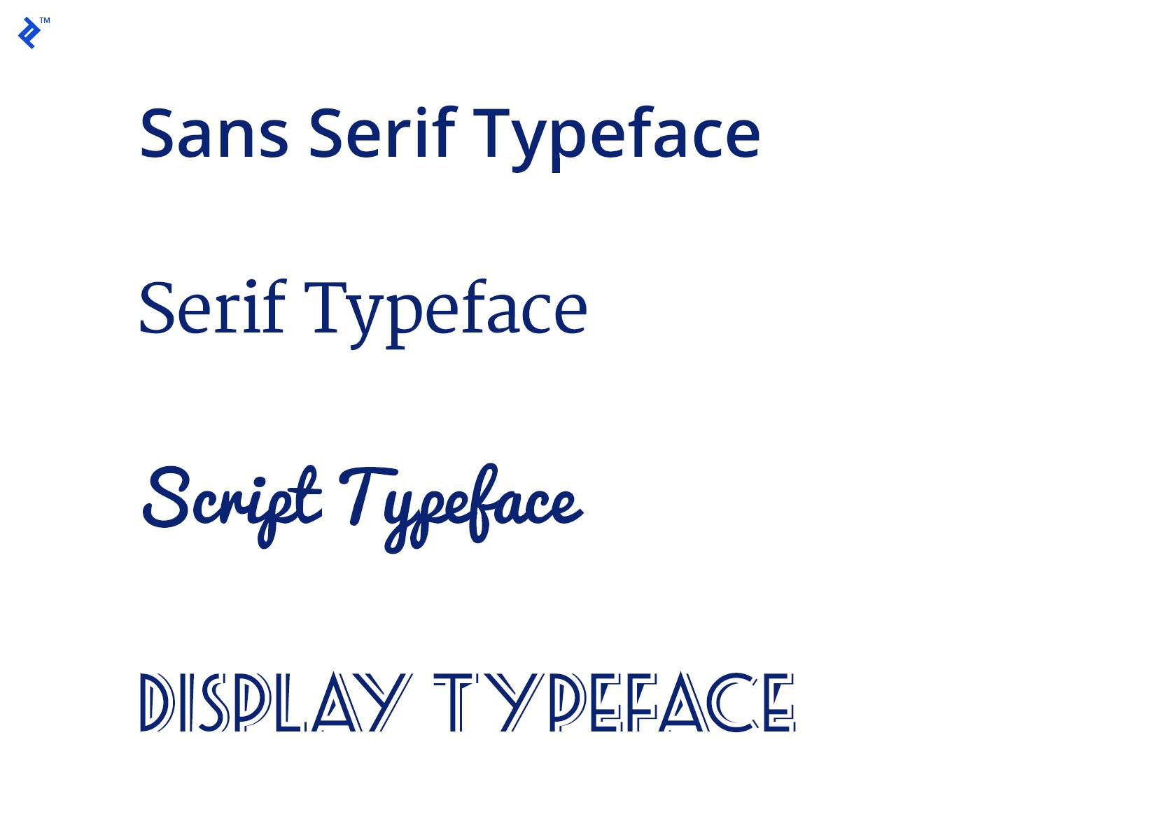
Typeface classification is one of the most fundamental concepts to understand. There are four primary classifications to learn: serif, sans serif, script, and decorative.
Serif and sans serif typefaces are suitable for both headlines and body text. Script (sometimes also called handwriting fonts) and decorative typefaces, however, are generally only acceptable for headlines and titles, or other small chunks of text.
Serif fonts are considered more readable for long chunks of text (such as body text), particularly in print designs, where the serif feature can help guide the reader’s eye along each line. But sans serif typefaces can also be highly readable and excel at smaller sizes (such as those used for captions or meta information).
Sans serifs are also more popular for use on the web and are widely believed to be more readable than serif typefaces. Part of that stems from the early days of computing, when lower resolution screens made serif fonts somewhat blurry, depending on size. With modern HD and Retina screens, this is less of an issue and serif and sans serif typefaces can both be used effectively.
Combining typefaces from different classifications is often simpler than combining within classifications, as there’s a level of contrast between fonts already built-in. That said, it’s also possible to effectively combine typefaces in the same class, as long as other characteristics are considered.
Weight
Weight refers to the thickness of a font within a typeface. Thin, regular, semibold, bold, and black are examples of weights.
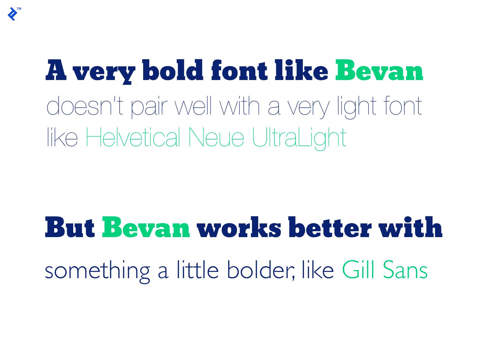
Contrast between weights is essential when combining typefaces. Combining a very thick font with a very light one often feels unbalanced. But combining typefaces that are the same weight can also be a challenge.
Instead, especially when starting out with font combinations, finding typefaces that have noticeable but not extreme differences in weight is easiest. Designers can branch out from there into more prominent distinctions.
Style
While style is sometimes used interchangeably with classification, in this case, it’s referring to a font either being normal, italic, or oblique.
When combining fonts where different styles are used, it’s important to make sure that the italic or oblique styles work as well together as the normal style. Sometimes italic styles are vastly different from the normal style of the same font, which can make fonts that would otherwise work well together suddenly clash.
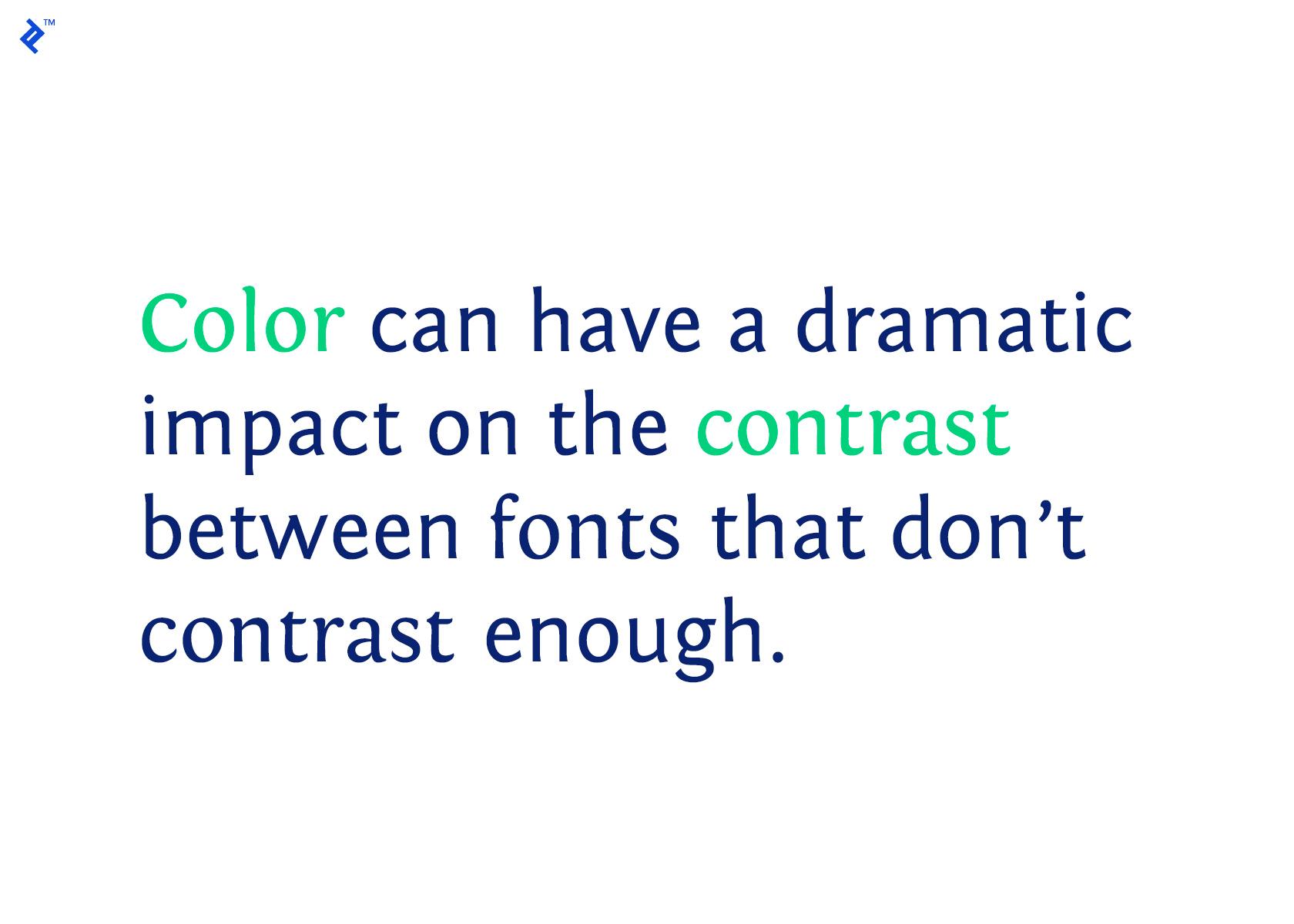
Contrast
Contrast in combining typefaces can be tricky. Too little contrast can make fonts clash, while too much contrast can do the same.
Contrast when combining fonts refers to any way in which the fonts are different, including classification, weight, style, and structure.
When starting out, it’s best to focus on the contrast between only one or two of those things, while making sure the others are very similar. Weight is one of the easiest ways to create contrast between fonts. As already mentioned, too much contrast in weight can be just as jarring as too little.
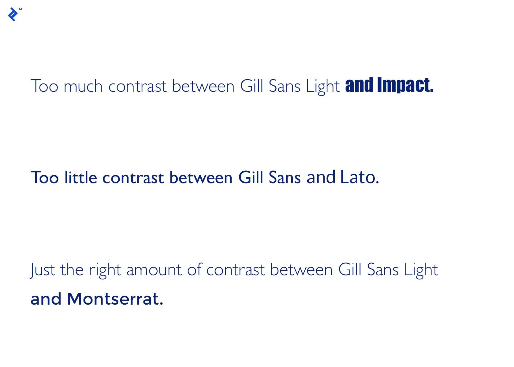
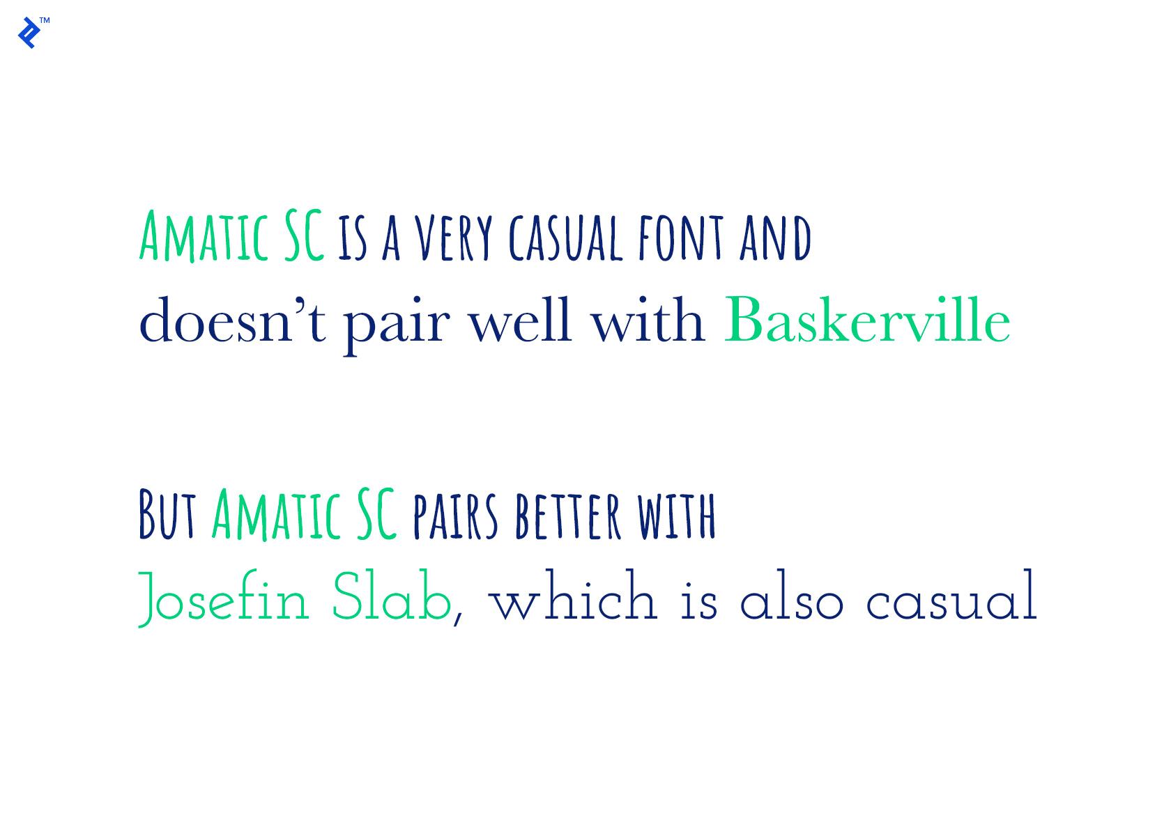
Another easy way to create contrast is by combining different classifications of fonts, such as sans serif and serif or script and serif, etc. In these cases, making sure the mood of the two fonts matches up is essential.
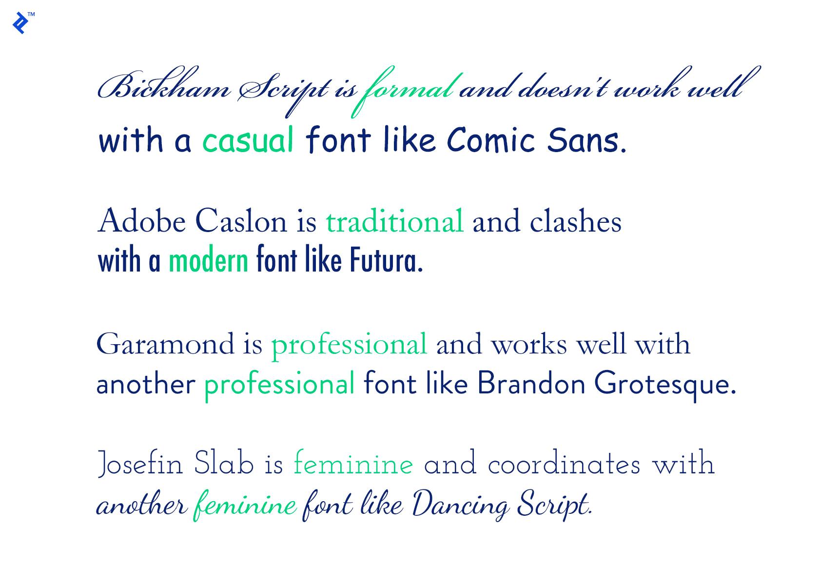
For example, combining a more casual font like Amatic SC with a very formal font like Baskerville will clash rather than contrast. But combining something like Amatic SC with another casual font like Josefin Slab works beautifully.
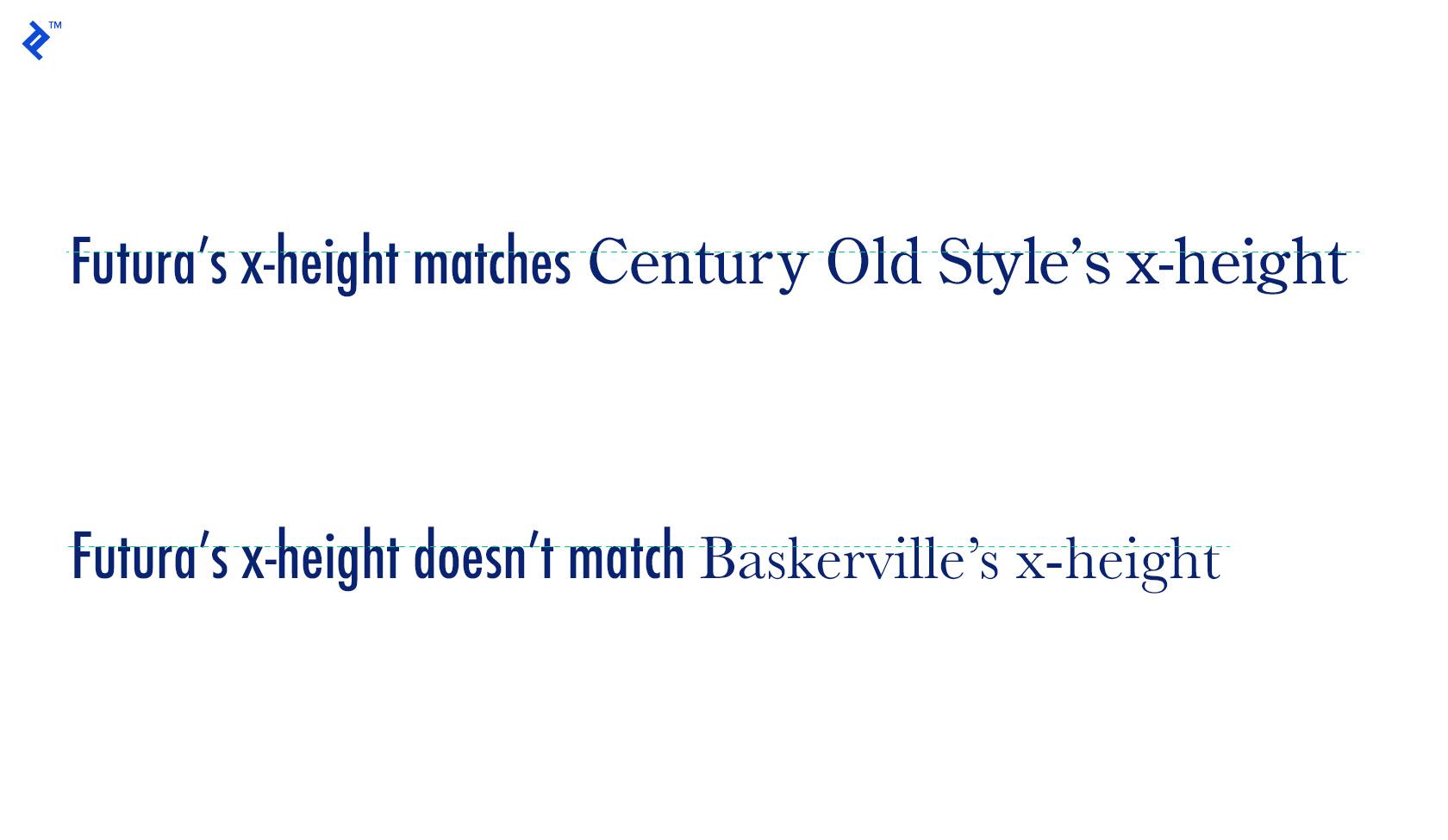
X-height
X-height refers to the height of individual characters within a typeface, specifically the lowercase x. Typefaces with similar x-heights will work better together than those with varying x-heights.
Structure
The underlying structure of a typeface includes all its characteristics, plus things like the basic shape of the characters and their spacing. Creating contrast with the structure of fonts is an established method of combining fonts. But it’s a good idea to pick fonts that have at least some structural elements in common (such as x-height or the weight of the “normal” style) rather than those that are wildly different.
Mood
Mood is one of the more subjective areas of typography. It refers to how formal or informal a typeface is, as well as whether it’s playful, feminine, masculine, casual, serious, etc.
For example, Comic Sans is an extremely informal font that’s inappropriate for use in most situations. Bickham Script, on the other hand, is very formal but gives the wrong impression for things like business correspondence.
When combining fonts, it’s important to find typefaces with similar moods. Combining a playful font with a very serious one is going to be jarring to the eye.
Decoration, Color, and Texture
These things aren’t inherent characteristics of typefaces, but they are useful when combining fonts. Unifying (or creating more contrast) through color, decoration (such as underlining), and texture can be a very effective technique.
Effective Font Combinations
There is a seemingly endless supply of sites with beautiful typography out there, along with an equally endless supply of those with bad or just lackluster type. Studying sites that get it right is a great way to learn how to combine fonts when designers are starting out or trying to take their skills to the next level.

Work Notes combines the serif typeface Adobe Caslon Pro with the sans serif Interstate to create a type combination that has a nod toward tradition without feeling stale or old-fashioned. Combining different weights and styles adds additional visual interest and makes the typography feel more complex than it actually is.

Adjuvant Capital uses the modern, slightly whimsical serif typeface Orpheus Pro combined with the modern GT America sans serif typeface. For a financial services firm, this is a very modern choice but works well with their mission of socially responsible global investing.

Bloomscape uses the casual serif typeface Morion along with the sans serif Raisonné to create a striking, modern typographic design. Morion wouldn’t necessarily be an obvious choice for body type due to its more decorative letterforms, but when used at an appropriate size (as it is here), it’s great for shorter chunks of body text. Raisonné has similarly decorative letterforms, which makes the two web fonts work beautifully together.

Vogue uses the modern, elegant Savoy serif typeface paired with the grotesque sans serif Franklin Gothic, which was originally designed in 1902. The combination of the two creates an upscale type design that appeals to the cultured audience the magazine targets.

Southern lifestyle magazine Garden & Gun has more complex typography on their site than the others included here, which really sets it apart. The site uses four main typefaces throughout: The main article titles are the serif Domaine Display; body text and some headlines on the homepage are the serif font Domaine Text; meta information, navigation, and section headers use the sans serif Avenir Next; and additional section headers on the homepage are in Domaine Sans Display.
Using multiple fonts from within a larger type family is a tried-and-true way of creating a complex typography design that coordinates perfectly. Adding in Avenir Next breaks things up and adds additional visual interest.
Your choice of typeface is as important as what you do with it.
— Bonnie Siegler
Conclusion
Effective font combinations are a hallmark of good design. Designers must master this skill if they want to create exceptional designs that set them apart from their contemporaries.
Consider the guidelines included here as jumping-off points to explore how to combine type effectively. A solid foundation allows for more efficient experimentation, without spending hours on completely unsuitable combinations. From here, designers can practice creating their own style and methods for effectively combining fonts, deviating from the guidelines as necessary with more confidence that their final product will be a delight to users.
Further Reading on the Toptal Blog:
Understanding the basics
What fonts go well together?
Which font combinations go together comes down to a few things: contrast, structure, x-height, mood, and weight. Considering and comparing the relationship between those things allows designers to choose fonts that look like they were made to go together, even if they’re wildly different on the surface.
How do you choose complementary fonts?
When choosing complementary font combinations consider the following: classification, mood, weight, contrast (not too much or too little), and x-height and structure of each typeface. Complementary fonts should have a balance of characteristics in common (such as x-height) and differences (such as classification).
What are the three most common font styles?
There are four common font classifications (sometimes referred to as styles): serif and sans serif are the most common, while display and script typefaces are also widely used. Monospaced typefaces make up a fifth style that is less commonly used (though popular for things like displaying code).