Exploring the Gestalt Principles of Design
Gestalt principles are an important set of ideas for any designer to learn and their implementation can greatly improve the aesthetics of a design as well as its functionality and user-friendliness. 🔊

Gestalt principles are an important set of ideas for any designer to learn and their implementation can greatly improve the aesthetics of a design as well as its functionality and user-friendliness. 🔊

Listen to the audio version of this article
Negative space has long been a staple of good design. Leaving white space around elements of a design is the first thing that usually comes to mind. But then there are designs that use that white space to infer an element that isn’t actually there (the arrow hidden between the E and X in the FedEx logo immediately comes to mind as an example).

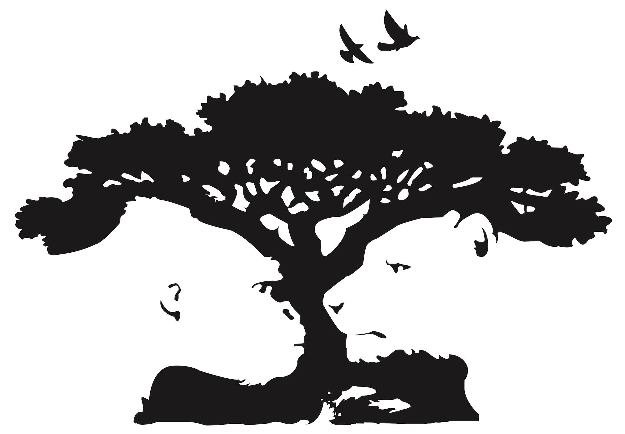
The human brain is exceptionally good at filling in the blanks in an image and creating a whole that is greater than the sum of its parts. It’s why we see faces in things like tree leaves or sidewalk cracks.
This principle is one of the most important underlying ideas behind the gestalt principles of perception. The most influential early proposal written about the theory was published by Max Wertheimer in his 1923 Gestalt laws of perceptual organization, though Wolfgang Köhler’s 1920 discussion of Physical Gestalten also contains many influential ideas on the subject.
Regardless of who first proposed the ideas (there have been essays dating back as far as 1890), gestalt theory principles are an important set of ideas for any designer to learn, and their implementation can greatly improve not just the aesthetics of a design, but also its functionality and user-friendliness.
In the simplest terms, gestalt theory is based on the idea that the human brain will attempt to simplify and organize complex images or designs that consist of many elements, by subconsciously arranging the parts into an organized system that creates a whole, rather than just a series of disparate elements. Our brains are built to see structure and patterns in order for us to better understand the environment that we’re living in.
There are six individual principles commonly associated with gestalt theory: similarity, continuation, closure, proximity, figure/ground, and symmetry & order (also called prägnanz). There are also some additional, newer principles sometimes associated with gestalt, such as common fate.
Similarity
It’s human nature to group like things together. In gestalt, similar elements are visually grouped, regardless of their proximity to each other. They can be grouped by color, shape, or size. Similarity can be used to tie together elements that might not be right next to each other in a design.
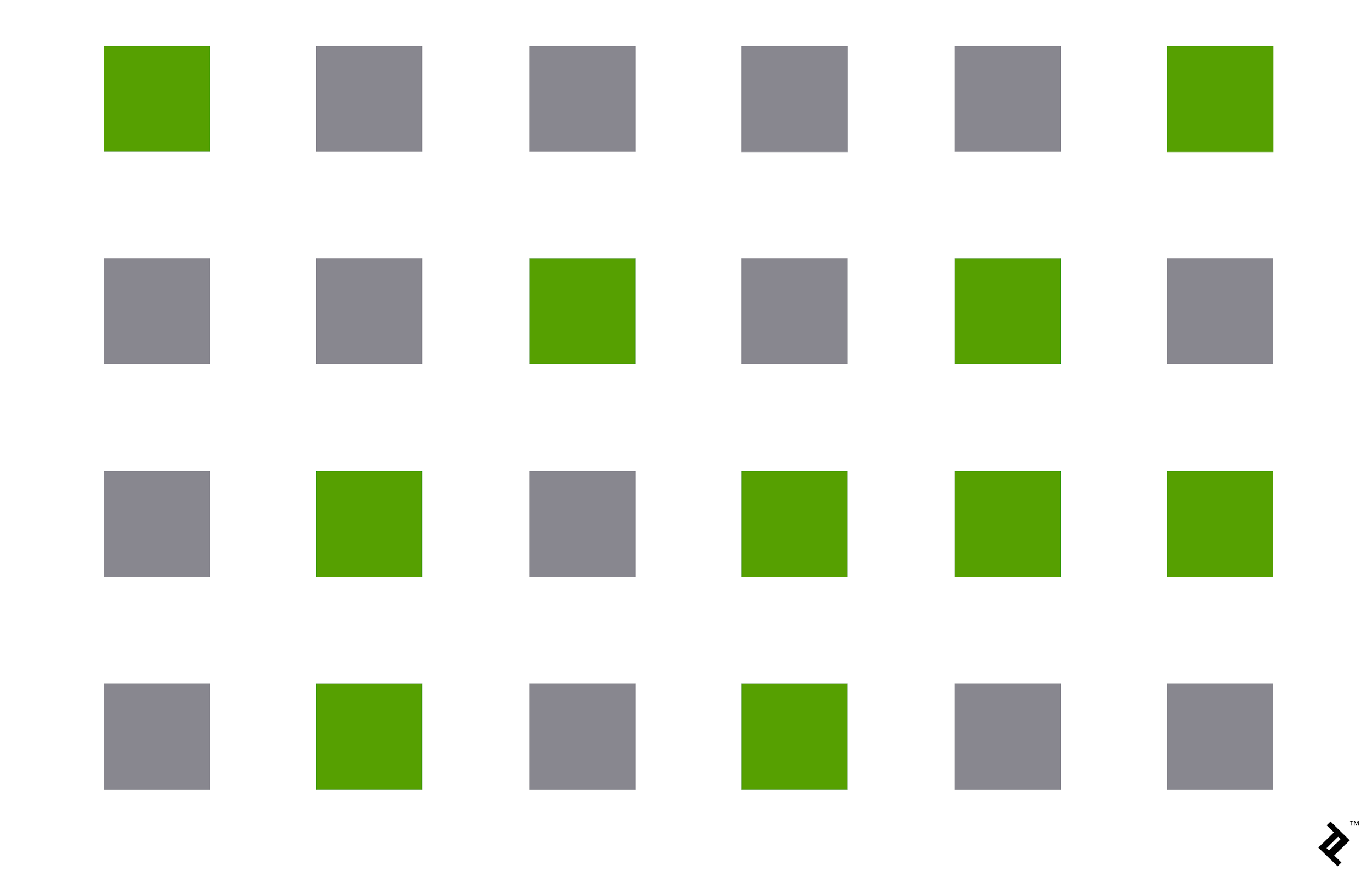
Of course, you can make things dissimilar if you want to make them stand out from the crowd. It’s why buttons for calls to action are often designed in a different color than the rest of a page—so they stand out and draw the visitor’s attention to the desired action.
In UX design, using similarity makes it clear to your visitors which items are alike. For example, in a features list using repetitive design elements (such as an icon accompanied by 3-4 lines of text), the similarity principle would make it easy to scan through them. In contrast, changing the design elements for features you want to highlight makes them stand out and gives them more importance in the visitor’s perception.
Even things as simple as making sure that links throughout a design are formatted in the same way relies on the principle of similarity in the way your visitors will perceive the organization and structure of your site.
Continuation
The law of continuity posits that the human eye will follow the smoothest path when viewing lines, regardless of how the lines were actually drawn.
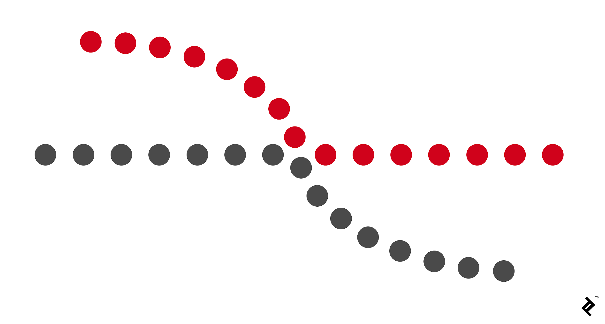
This continuation can be a valuable tool when the goal is to guide a visitor’s eye in a certain direction. They will follow the simplest path on the page, so make sure the most vital parts they should see fall within that path.
Since the eye naturally follows a line, placing items in a series in a line will naturally draw the eye from one item to the next. Horizontal sliders are one such example, as are related product listings on sites like Amazon.
Closure
Closure is one of the coolest gestalt design principles and one I already touched on at the beginning of this piece. It’s the idea that your brain will fill in the missing parts of a design or image to create a whole.
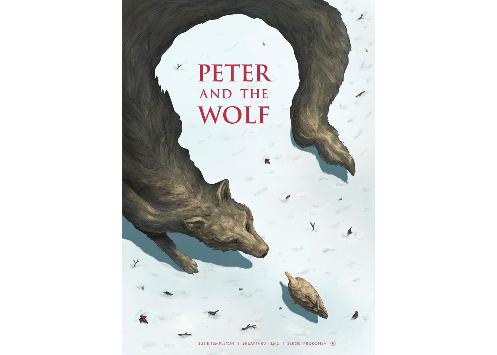
In its simplest form, the principle of closure allows your eye to follow something like a dotted line to its end. But more complex applications are often seen in logos, like that for the World Wildlife Fund. Large chunks of the outline for the panda are missing, but your brain has no problem filling in the missing sections to see the whole animal.

Closure is quite often used in logo design, with other examples including those for the USA Network, NBC, Sun Microsystems, and even Adobe.
Another very important example of closure at work in UX and UI design is when you show a partial image fading off the user’s screen in order to show them that there is more to be found if they swipe left or right. Without a partial image, i.e., if only full images are shown, the brain doesn’t immediately interpret that there might be more to be seen, and therefore your user is less likely to scroll (since closure is already apparent).

Proximity
Proximity refers to how close elements are to one another. The strongest proximity relationships are those between overlapping subjects, but just grouping objects into a single area can also have a strong proximity effect.
The opposite is also true, of course. By putting space between elements, you can add separation even when their other characteristics are the same.
Take this group of circles, for example:
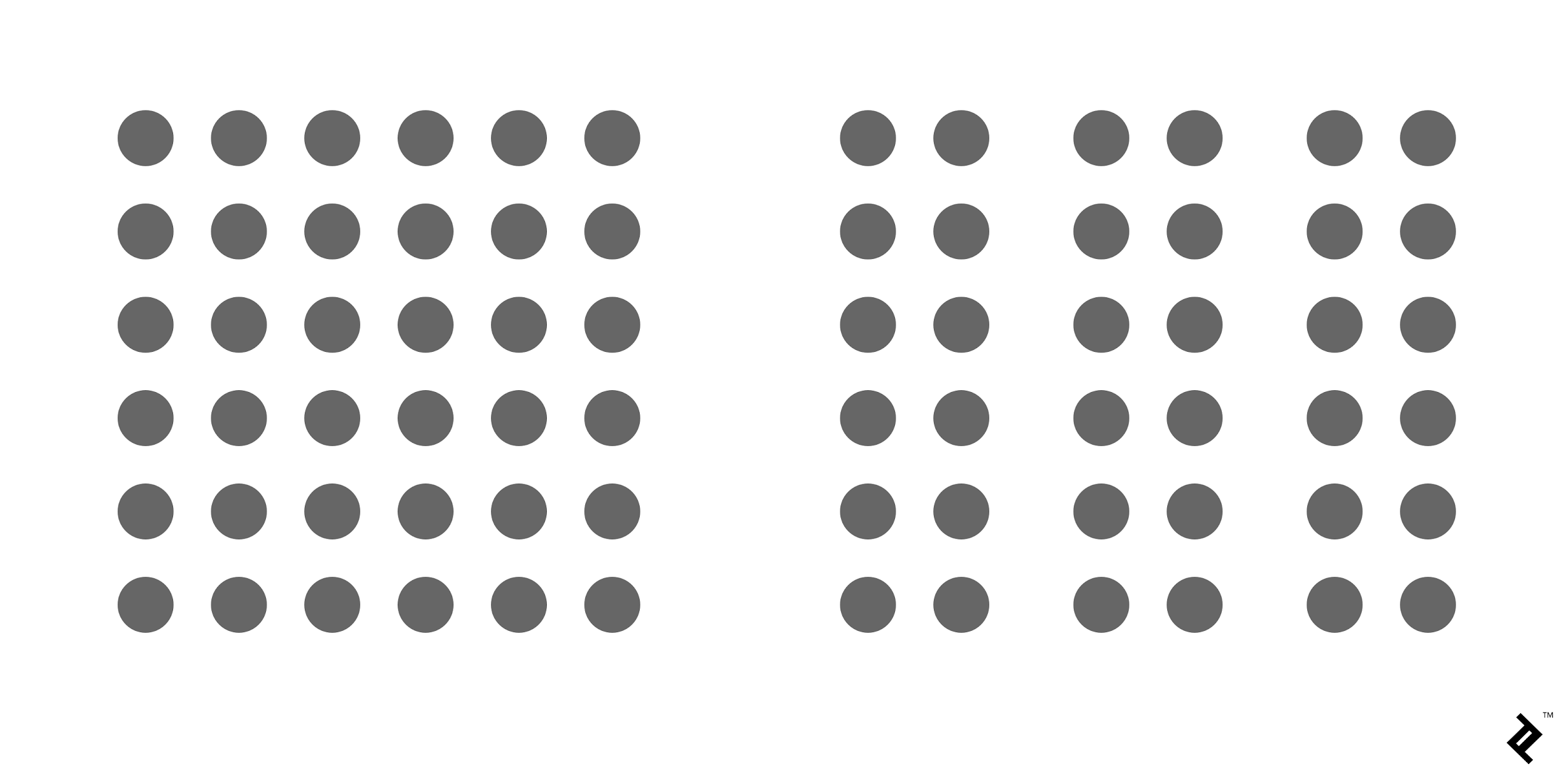
In UX design, proximity is most often used in order to get users to group certain things together without the use of things like hard borders. By utilizing gestalt grouping principles and putting like things closer together, with space in between each group, the viewer will immediately pick up on the organization and structure you want them to perceive.
Figure/Ground
The figure/ground principle is similar to the closure principle in that it takes advantage of the way the brain processes negative space. You’ve probably seen examples of this principle floating around in memes on social media, or as part of logos (like the FedEx logo already mentioned).
Your brain will distinguish between the objects it considers to be in the foreground of an image (the figure, or focal point) and the background (the area on which the figures rest). Where things get interesting is when the foreground and background actually contain two distinct images, like this:
A simpler example can be seen with this image, of two faces creating a candlestick or vase between them:
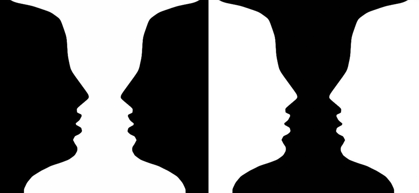
In general terms, your brain will interpret the larger area of an image as the ground and the smaller as the figure. As shown in the image above, though, you can see that lighter and darker colors can influence what is viewed as the figure and what is viewed as the ground.
The figure/ground principle can be very handy when product designers want to highlight a focal point, particularly when it is active or in use—for example, when a modal window pops up and the rest of the site fades into the background, or when a search bar is clicked on and the contrast is increased between it and the rest of the site.
Symmetry and Order
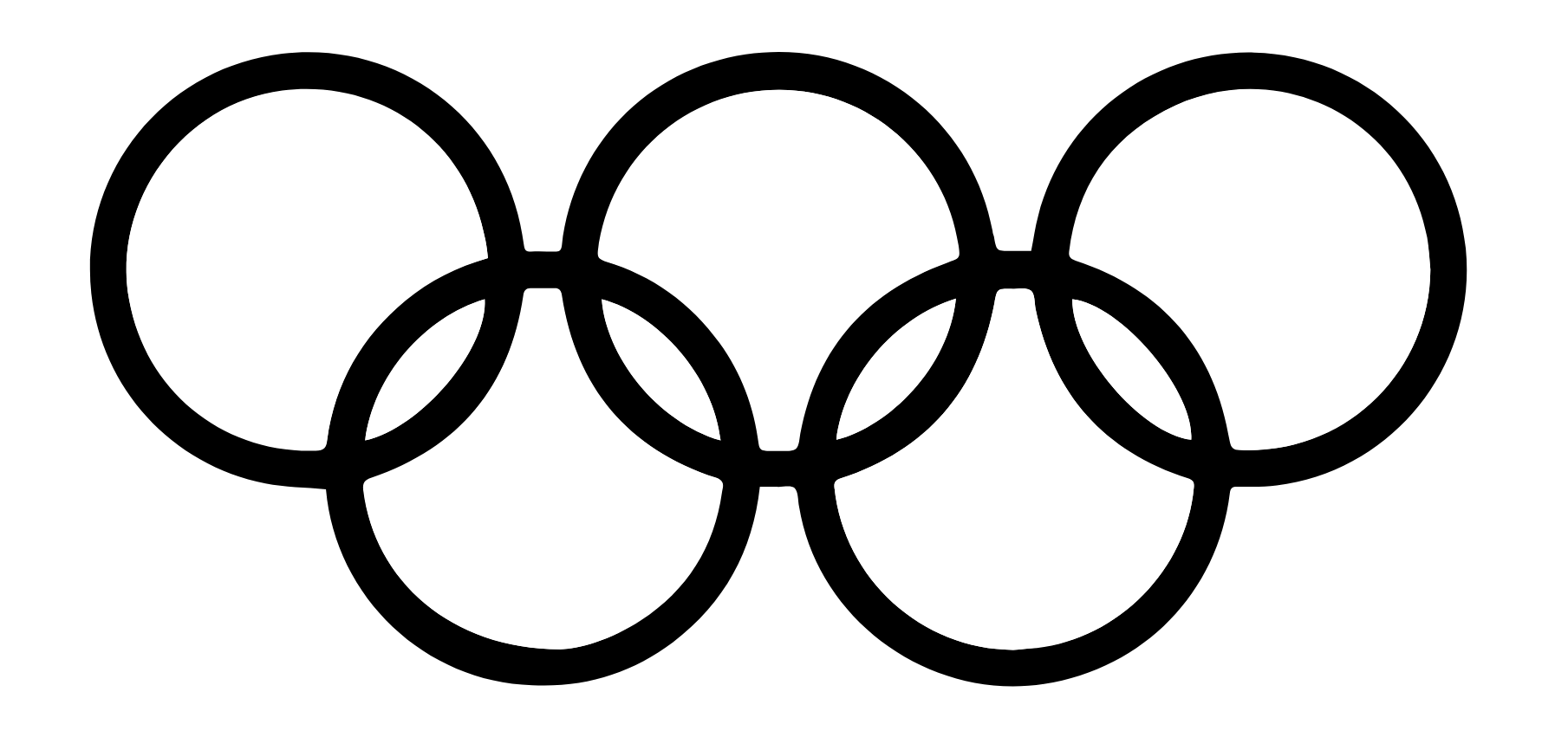
The law of symmetry and order is also known as prägnanz, the German word for “good figure.” What this principle says is that your brain will perceive ambiguous shapes in as simple a manner as possible. For example, a monochrome version of the Olympic logo is seen as a series of overlapping circles rather than a collection of curved lines.
Here’s another good example of the gestalt design principle “prägnanz”:
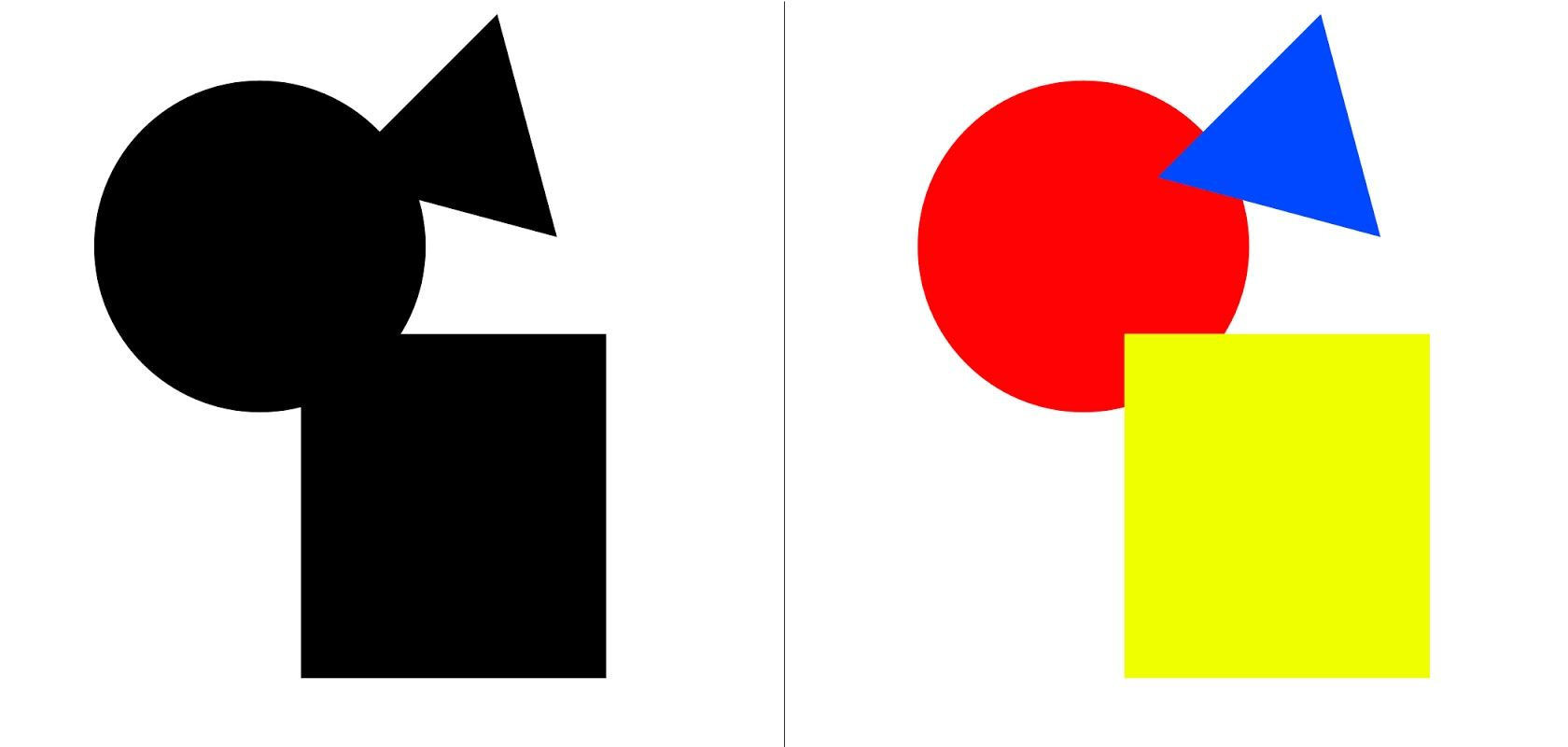
Your brain will interpret the image on the left as a rectangle, circle, and triangle, even when the outlines of each are incomplete because those are simpler shapes than the overall image.
Common Fate
While common fate was not originally included in gestalt theory, it has since been added. In UX design, its usefulness can’t be overlooked. This principle states that people will group together things that point to or are moving in the same direction.
In nature, we see this in things like flocks of birds or schools of fish. They are made up of a bunch of individual elements, but because they move seemingly as one, our brains group them together and consider them a single stimulus.

This is very useful in UX as animated effects become more prevalent in modern design. Note that elements don’t actually have to be moving in order to benefit from this principle, but they do have to give the impression of motion.
Gestalt Principles in UX Design
As with any psychological principle, learning to incorporate the visual perception principles of gestalt into your design work can greatly improve the user experience. Understanding how the human brain works and then exploiting a person’s natural tendencies creates a more seamless interaction that makes a user feel comfortable on a website, even if it’s their first visit.
Gestalt laws are relatively easy to incorporate into just about any design and can quickly elevate a design that seems haphazard or like it’s fighting for a user’s attention to one that offers a seamless, natural interaction that guides users toward the action you want them to take.
Further Reading on the Toptal Blog:
Understanding the basics
What are the gestalt principles of design?
The classic principles of the gestalt theory of visual perception include similarity, continuation, closure, proximity, figure/ground, and symmetry & order (also known as prägnanz). Others, such as “common fate,” have been added in recent years.
Why is gestalt theory important?
Gestalt principles can quickly elevate a design that seems haphazard or like it’s fighting for a user’s attention to one that offers a seamless, natural interaction that makes your site feel familiar while guiding users toward the action you want them to take.
What is visual hierarchy in design?
In design, visual hierarchy is the arrangement or positioning of different design elements to give them greater or lesser importance. The various gestalt principles heavily influence visual hierarchy.
What is the gestalt theory of perception?
The gestalt theory of perception attempts to explain the way the human brain interprets information about relationships and hierarchy in a design or image based on visual cues like proximity, similarity, and closure.