Words and Actions: A Guide to Microcopy
Without interface copy, there’d be UX chaos on a global scale. Thankfully, we can use words whenever we want, but how do we use them well? These easy-to-use principles lead to convincing microcopy.

Without interface copy, there’d be UX chaos on a global scale. Thankfully, we can use words whenever we want, but how do we use them well? These easy-to-use principles lead to convincing microcopy.

Milan is a UX design expert with a love for helping companies develop clean and lean mobile apps.
Expertise
PREVIOUSLY AT

Take a look at a digital interface. What stands out? The colors? The iconography? The splashy photos? Sure. But if all those things were to disappear, what would happen to the design?
It’d still work.
How’s that possible? Words. They provide 95% of the communicative information we need. Remove them and the design is useless.
Strangely, design experts still treat UX copy as an afterthought, especially when it comes to microcopy, the short snippets of text that help users find what they need from an interface. When executed poorly, button labels, error messages, UI hints, and calls-to-action can destroy even the most elegant design.
Picking the right words removes ambiguity and increases confidence in an interface—a key component of conversion.

Design Thrives on Words
As designers, we work hard to make interfaces that are intuitive and easy to navigate.
We strive to reduce friction and help users do what they aim to do, but we can’t allow the intensity of our efforts to inflate our egos. No design explains itself perfectly. We need words to bridge the gap between our design intentions and the reality of user interactions.
Writing microcopy doesn’t need to be a long and arduous task. Designers working without the benefit of an experienced UX writer on-team simply don’t have the time to toil over every word choice. But they can call on a handful of easy-to-use principles that lead to clear and convincing microcopy.
1. Write Single Snappy Sentences
Too much text. It’s a classic folly of many apps and websites. We want users to know everything we think they need to know, and we forget that most people simply won’t take the time to read dense paragraphs. The problem intensifies with mobile interfaces and on-boarding scenarios, where user attention-spans are at their lowest. The solution?
Single. Snappy. Sentences.
Ask, “How can I say everything that needs to be said in the most succinct way possible but still be interesting?” Cut all the fluff, refuse to settle for sentences with more than 8 words, and don’t forget to be snappy. Snappy is memorable, economical, energized, and in some cases, rhythmic.

2. Avoid Jargon
Extensive domain knowledge makes it easy for technical jargon to creep into our designs, but these words and phrases are experiential dead-ends for the majority of users. We’re quick to forget: A company’s internal knowledge and nomenclature mean nothing to customers.
Small, straightforward words speak louder than big, important-sounding words, but jargon still manages to sneak into our interfaces. To combat this problem, test microcopy with users.
No budget? Ask friends and family to have a peek, and don’t provide a primer beforehand. When the text makes sense to those with no insider understanding, it’s ready for launch.

3. Pair Visuals with Words
The impact of visual design elements like photos, icons, and illustrations isn’t in question. Images are processed faster by the human eye, and they have the ability to convey ideas with brevity and nuance that words can’t match.
But the interpretation of images varies wildly in comparison to words. Culture, age, gender, socioeconomic status, and a host of other factors make images tricky to translate. A few well-chosen words can provide instant clarity.

4. Be Current and Human
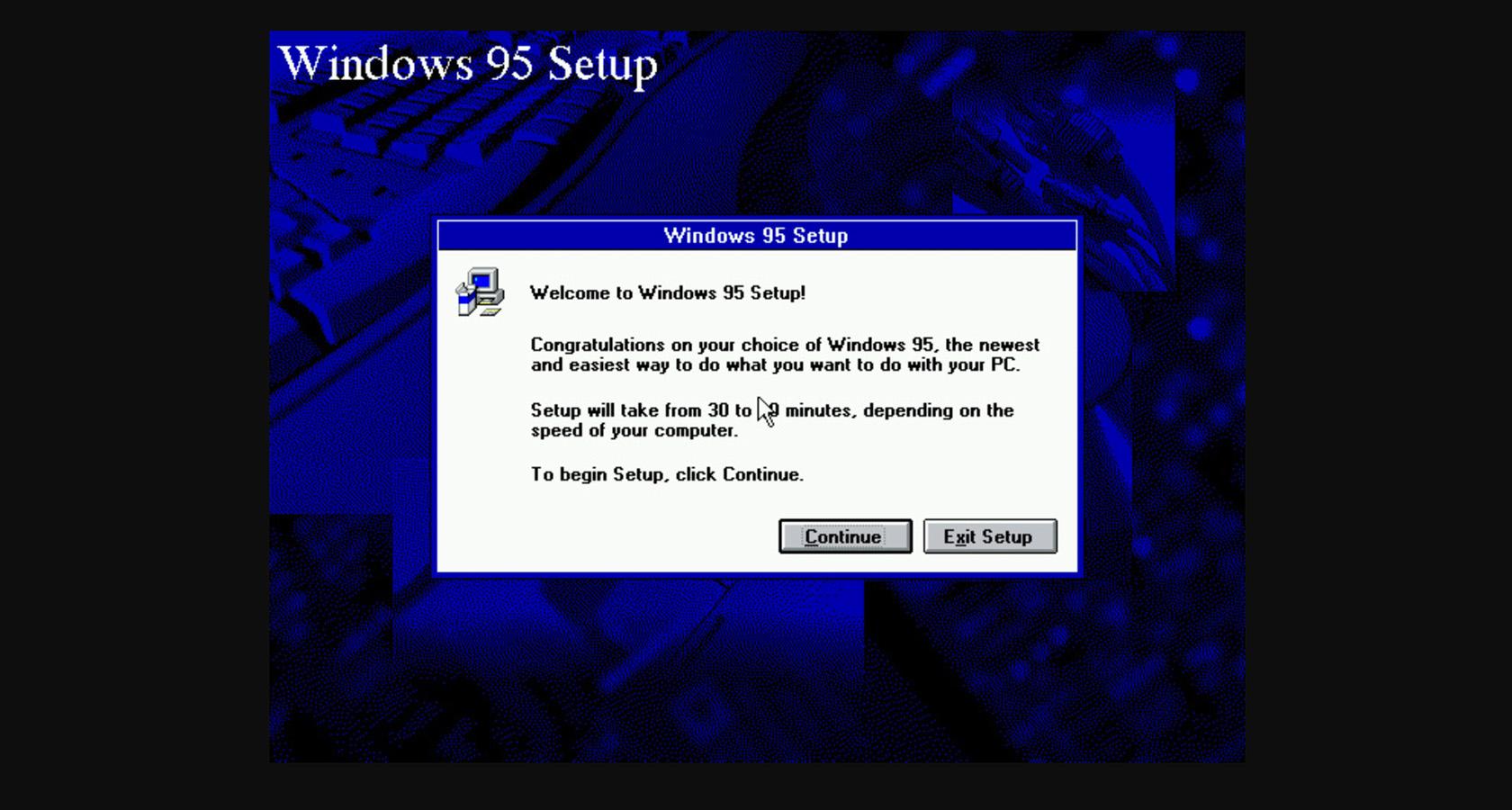
In its day, the Windows 95 Installation Wizard was a wonder to behold, but a quarter-century has passed, and it’s no longer a benchmark of UX best practice. Microcopy that travels back in time with phrases like “Press ‘Next’ to begin installation” or “Click one of the buttons below” is an engagement opportunity wasted.
This doesn’t mean that microcopy needs to sound like it was written by some teenage YouTube influencer. Be fresh. Be authentic. Just don’t be lazy.
5. Guide Users in the Second or First Person
A quick refresher for those of us who forget grammar rules:
- Second person = you or your
- First person = I, me, or my
How do we use these points of view to guide users through an interface?
Second person (you or your) is how we normally speak with conversation partners. In most cases, second person is the go-to microcopy option because it makes users feel like the UI is addressing them directly.
Use first person (I or my) when underscoring the user’s ownership of content or actions.
*Bonus: Utilize Resources
There’s a lot to consider when it comes to microcopy. To write it well requires an ongoing willingness to learn. Users and technology are partners in an unpredictable dance. They switch lead often—sometimes seamlessly, then jarringly.
Designers can’t be content to rely on UX writing that used to be current, but it’s not as if they must channel the spirit of an avant-garde novelist to write relevant microcopy. There are resources for that.
Whether it’s the Material Design writing guide, the Apple HIG terminology recommendations, or the nifty Hemingway App, the web is teeming with resources geared towards writing rich and effective microcopy.

Write Microcopy with a Mission
Mark Twain once wrote, “Writing is easy. All you have to do is cross out the wrong words.” Anyone who’s ever agonized over the right words can appreciate the irony.
Words, in any context, hold weight. In our digital products, they make the difference between an exceptional user experience and a lackluster one. Microcopy ought to provide users with clarity and confidence, “If I do X, then Y will happen.”
Beyond that, microcopy is an opportunity for businesses to engage users by coupling aspects of their brand voice with an interface’s functionality.
It might not be easy to break from the templatized words we’re all familiar with (Click Here, Sign Up, Submit), but it’s well worth the effort to uncover microcopy details that delight users and boost conversion.
Further Reading on the Toptal Blog:
Understanding the basics
What is UX microcopy?
Apps, websites, and physical spaces (like brick and mortar retail) are brimming with touchpoints that customers interact with. UX microcopy helps customers understand and navigate these touchpoints. It consists of single words, phrases, and short sentences—all aimed at improving conversion.
What is UX copywriting?
UX copywriting is composing words to provide people with decision-making clarity when interacting with a product or environment. UX copy is a guiding voice that leads users through a product’s most important interactions and infuses digital experiences with brand personality and cohesiveness.
What is a conversion copywriter?
Conversion copywriting is meant to help people understand the value they can get from a product or service. It goes beyond a simple description and touches on the needs and desires of potential customers. To do this well, conversion copywriters must understand the pain points of the people they’re writing for.
Why is UX writing important?
UX writing is important because words provide users with decision making context. Even the most basic visual design elements like icons and photos have the potential to be misinterpreted by users. UX writing clears up confusion and helps users do what they intend to do when visiting an app or website.
Milan Jovanovic
Barcelona, Spain
Member since November 29, 2018
About the author
Milan is a UX design expert with a love for helping companies develop clean and lean mobile apps.
Expertise
PREVIOUSLY AT