Rethinking User Interface Design for the TV Platform
Designing for television has become part of the continuum of devices that require a rethink of how we approach user interfaces and user experiences.

Designing for television has become part of the continuum of devices that require a rethink of how we approach user interfaces and user experiences.

With 12 years in UI/UX and creative direction, Pascal has delivered immersive experiences led design teams for Sony, Fox, Disney, and more.
Expertise
PREVIOUSLY AT

An Introduction to the Basic Ingredients of a TV UI
A huge majority of consumers these days are cutting the cord with paid TV but this doesn’t mean they have shied away from the big screen to consume their content. According to a data release by Nielsen, the viewing habits of U.S. adults found that 92% of all viewing still takes place on the TV screen. These are pretty huge numbers.
Over 92% of viewing among U.S. adults still happens on the TV screen.
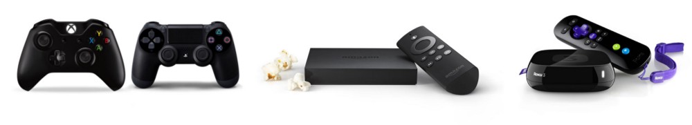
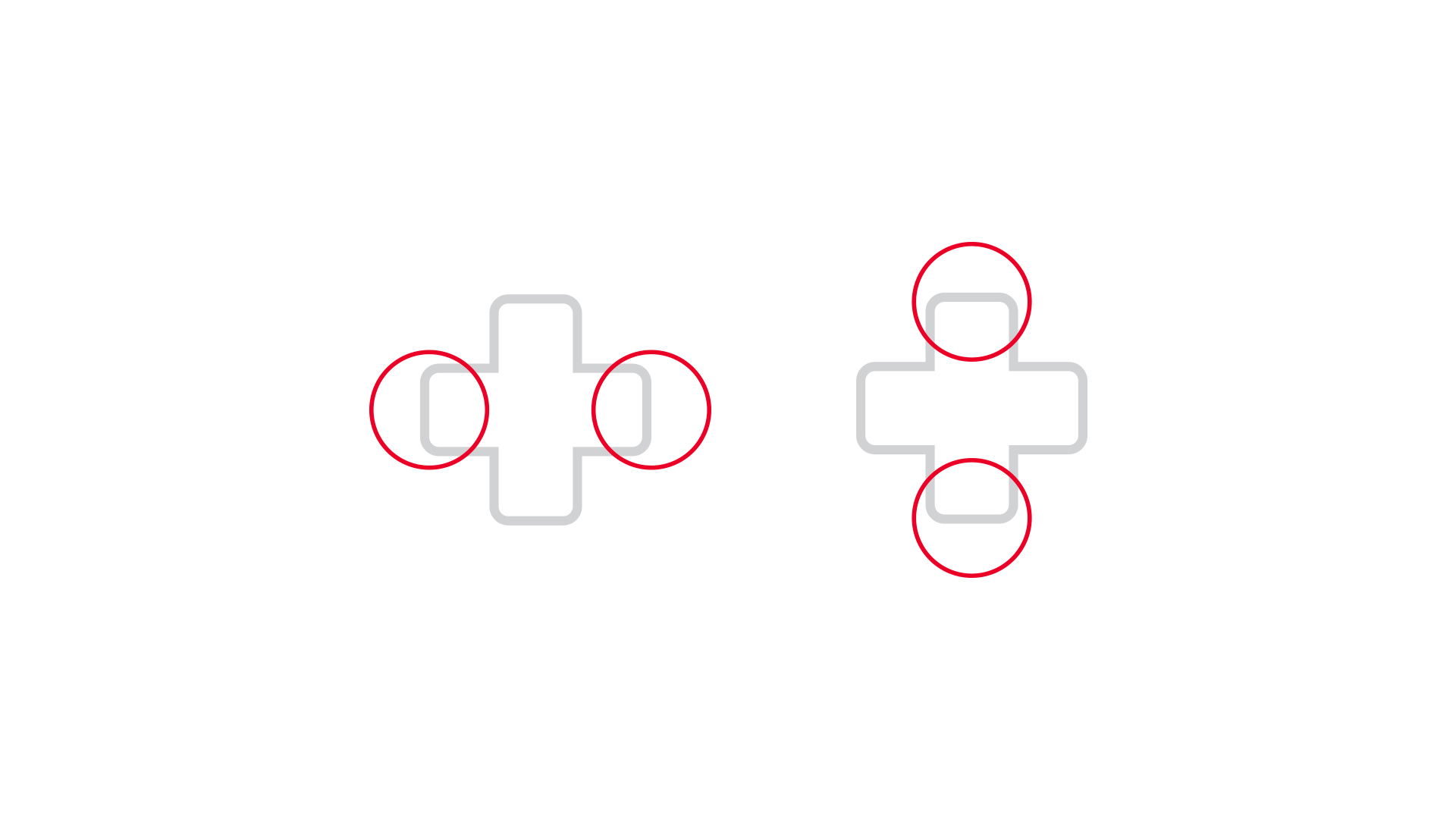
The meaning of “watching TV” has changed a great deal over the past few decades. We are no longer limited to a remote and cable box to fill our screens; we’re using Smart TVs, or streaming using pucks like Roku, Amazon Fire, and Apple TV, or connecting video game consoles like Xbox and Playstation. And each of these devices allows a user interface that’s much more powerful than your old-fashioned on-screen guide.
Paying to watch broadcast or VOD programming via subscription based online services such as Hulu, Netflix or Amazon represents 26% of global online respondents (Nielsen ). This is a significant number. However, 72% of the respondents confirmed they still pay to watch their content via a traditional TV connection.
Does this mean that the traditional TV connection is here to stay?
We all seem to think that the cord-cutters out there would represent a higher number. Nielsen reports that 116.4 million homes in the US were expected to watch TV during the 2015-16 season. This is a huge number and the report also found that about 9.5 million of those homes have switched over to free OTA TV. Of all the streaming services out there, Netflix (60.7%) seems to be ahead of the game followed by Amazon Prime Video (49.4%) and by Hulu (26%). I believe one of the biggest reasons people are cutting the cord is that we only want to pay for what we use.
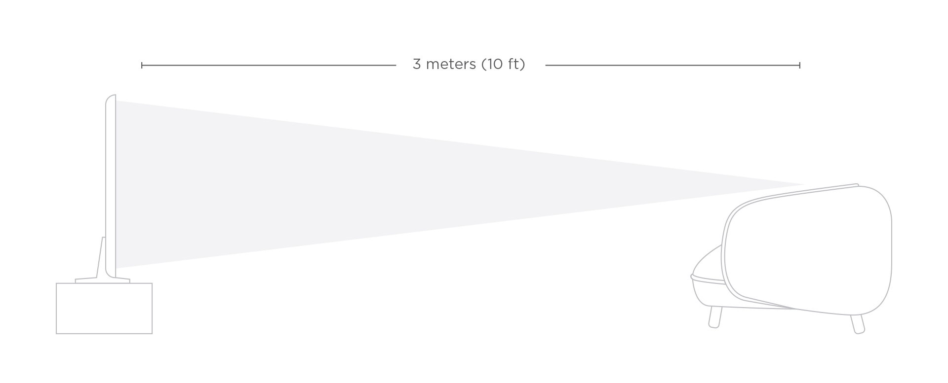
When compared to computers and even mobile phones, designing UIs for TV is still a relatively new area. It’s also a fundamentally different platform and the way we consume our content is different. Design for TV requires a unique set of considerations, including screen size and viewer distance, technical constraints, and context of use. Users are in a “lean back” experience, sitting an average of 10 feet away and the user interface and experience need to reflect this. Contrary to touchscreen tablets and phones, the interactions on televisions are done via D-pad (directional control pad) using a remote or a video game controller, which ads to the complexity.
The Display
Televisions are not like tablets and phones.
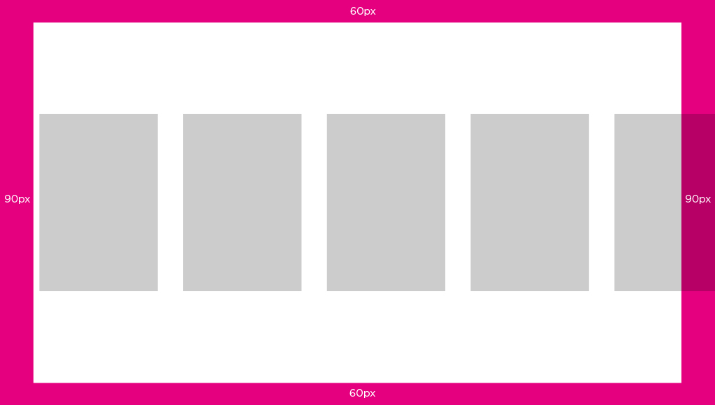
TVs have changed a lot over time from a huge clunky piece of furniture to a sleek minimalist display hanging on a wall. Back when televisions would take up the entire living room, they used a technology which produced inconsistent images across TV sets, especially close to the edges. To compensate for these issues, CRT TVs were subject to overscan. This just means that the images were slightly enlarged so the edges were not outside the bounds of the viewing area.
Traditionally, broadcasters anticipated this and wanted to avoid any of their critical information being shown too close to the edges of the screen. To solve this issue, they created a title safe area to display the text with no distortion and an action safe area where the image could be safely displayed.

For reasons out of our control, overscan is still a thing… even on your new HDTVs. The amount of overscan is not consistent across TVs. To ensure that all of your primary information such as titles and important actions are safe, keep them inside the safe margins.
There is currently not a set “standard” for safe action areas; it is mostly defined by the platform itself. Google keeps their safe area narrow and Apple’s is a little more generous. From my many searches on the web, these zones will vary between 85% and 95% of a television screen from the center. In order to meet the requirements from all different platforms you might be working on, I would suggest using a safe zone of 60px top and bottom margins and 90px side margins. This means that all of your primary information will need to fit within this area in order to accommodate all tv screens and meet every platform requirement.
To start off your new television user interface design, create a new 1920 x 1080 canvas. Your padding (safe zone) should be 90 pixels on the sides (left and right) as well as 60 pixels for top and bottom. You can get your free file download here.
Navigation
How up-down-left-right shapes TV interfaces.
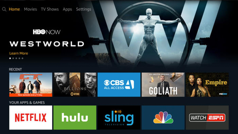
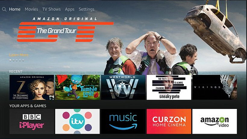
As a designer, the hardware we design against will define some of our design patterns. On mobile, we swipe, tap, long press, pull, etc. to perform actions. Tabs and menus are used as navigation patterns on our devices. Television offers a great big canvas which can easily become overly complex if not done right. Seeing long rows of content in order to maximize the amount of it visible to the users has become a standard element of television UIs.
Unlike mobile devices which we control with our fingers, the majority of TV UIs are controlled by a D-pad and used at a distance from the screen. Whether on a remote or a gamepad, the D-pad limits navigation to four directions: up, down, left, and right.
Each platform also has its own established conventions. On Xbox, for example, the triggers provide a “Page Up” and “Page Down” control while the bumpers are used to tab between content views. There are also a number of “power user” buttons on each platform that more experienced gamers would be familiar with.
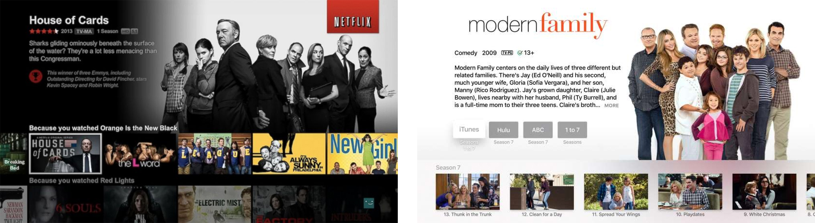
The other critical element in TV UIs is the focus state. Without the ability to touch the screen or use a mouse, users must navigate to the element they want to select. As the user navigates within the app, different UI elements should be highlighted indicating that an navigation element is in focus.
Focus and highlight states when designing for television are very important. That focus state is the element that highlights a selectable component and signifies the user’s current on-screen location. The form in which the focus is displayed may vary; depending on the component, however, consistency will always be key. A clear and highly visible focus helps the user to quickly recognize their current on-screen location and eases navigation. When a user glances away momentarily from the TV and then return their gaze, it should automatically be clear what option is currently selected for navigation. Every item on the screen must be reachable by the cursor, and it should always be clear where the cursor can move next.
Examples of designs which could leave users wondering where they are in the app. These examples do not provide enough visual indication (focus state) of positioning. Users should be able to clearly see where they are at all times without having to move up or down. You should be able to glance away from the television set and back and still know your position.
Typography
Reading from ten feet away.
TV apps are often referred to as ten-foot experiences, a term that refers to a common distance between you and your television. Contrary to other devices such as mobile and desktop, television is set to be more of a “lean back and relax” environment. Given this distance, we need to treat a UI a bit differently than we would on web or mobile.
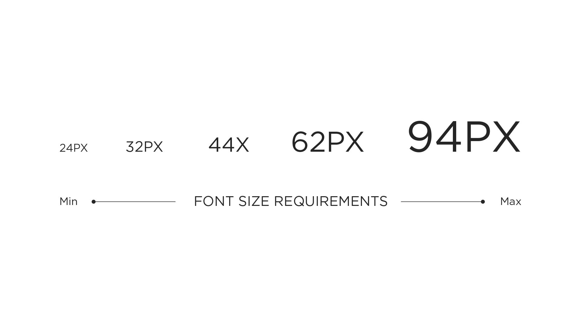
TV screens are generally larger than mobile devices and desktop computer monitors but are viewed from a greater distance. Legibility becomes an important feature, which means that the size of text and other elements must be adjusted accordingly. Depending on your age, 18px would probably be the smallest readable size and only appropriate for nonessential labels, like an eyebrow tab. Even so, as a general rule of thumb, your chosen font sizes should never be smaller than 24 pts. This is what I would consider the minimum font size to accommodate every type of user.

The key to good typography on TV is to test constantly. Thin, small type on your monitor will look clean and crisp, but once on a TV, it may appear blown out or become unintelligible.
Scan Lines
What are scan lines?
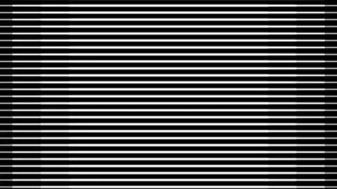
Unlike desktop, mobile, and tablet screens, the image on a television screen is composed of odd and even scan lines. The television renders these lines in phases alternating rapidly between odd and even scan lines. Any single pixel (or line of pixels) falling onto a single scan line will flicker. In order to avoid flickering of your items on screen, you should always keep your lines to even numbers and no thinner than 2 pixels. This is something to consider when working on cross-platform projects and preparing to transfer your designs from touch devices (mobile and tablet), where you can often find yourself creating 1px border buttons, for television.
Another way to avoid these blurry lines or shapes is to make sure your designs are always pixel perfect. The example below is a good example of lines that are created using uneven numbers. As you can see, we can clearly see the effects of this, and it becomes unsettling on the eyes.
Color
TV displays have limits.
The first element to keep in mind is that televisions have a much higher gamma value than desktop, tablet and handset devices. The best way to describe how gamma affects picture quality is that gamma represents the level of brightness difference between each step in the grayscale, or how “fast” blacks get brighter. We perceive twice the light as being only a fraction brighter. Different makes and models of TVs vary widely when it comes to brightness, display and other settings. Like type, color should be tested early and often on TVs.
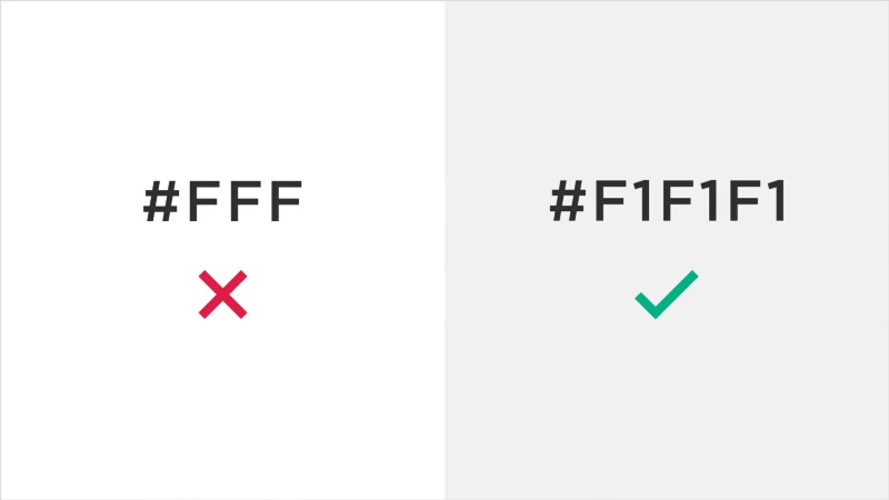
A few guidelines to follow when choosing your colors: Bright colors might get harsh on the eyes when watching television at night or in a dark room. Avoid over-using saturated colors (especially red) and heavy use of white in large elements or backgrounds. Pure white will create halos and other visual distractions. When choosing whites, it is recommended to pick a #f1f1f1 hex value to avoid any flickering. In order to increase readability, make sure you create enough contrast between your elements
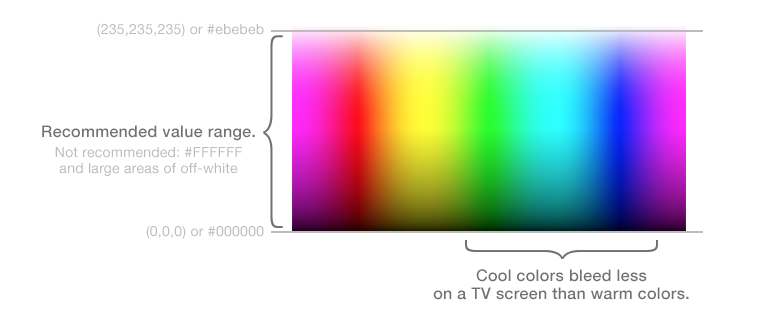
The general rule is to avoid sharp edges between highly-contrasting colors (especially bright colors next to dark colors), and to avoid “hot” colors such as very saturated reds and yellows. These will bleed more easily than less saturated colors, or cooler colors such as blues and greens.
Always test colors on an actual television to understand how your color choices translate to the big screen. If possible, preview your app on multiple TVs because colors can vary dramatically between television models. Simply attach the HDMI cable from your TV set and test it out.
The Basics
Little things to consider.
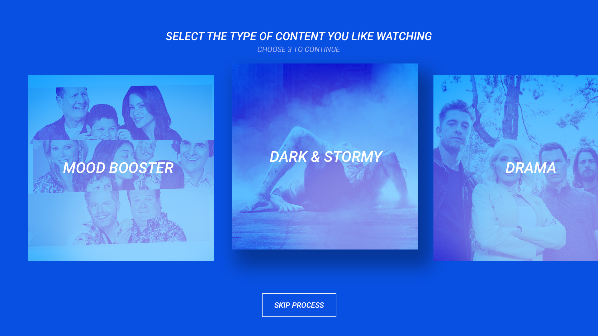
These elements should be used to guide your designs as a whole. The biggest considerations when designing your TV UIs are simplicity and lightweight interaction.
While many of the fundamentals and best practices for interaction design still apply, the television is used in a more relaxed fashion unlike a computer or mobile device. The UI on a television should be clear, simple and visual. The design requires simplicity and clarity with low information density. The elements need to be large and spaced far enough apart to be read from a distance. Present a clear set of actions or options for each screen.
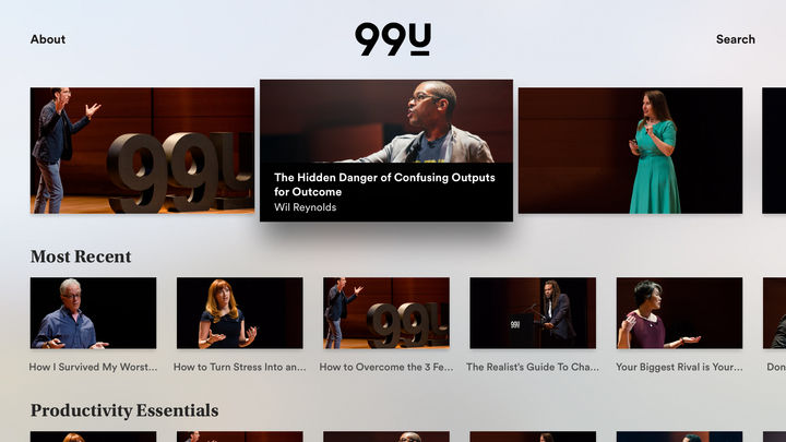
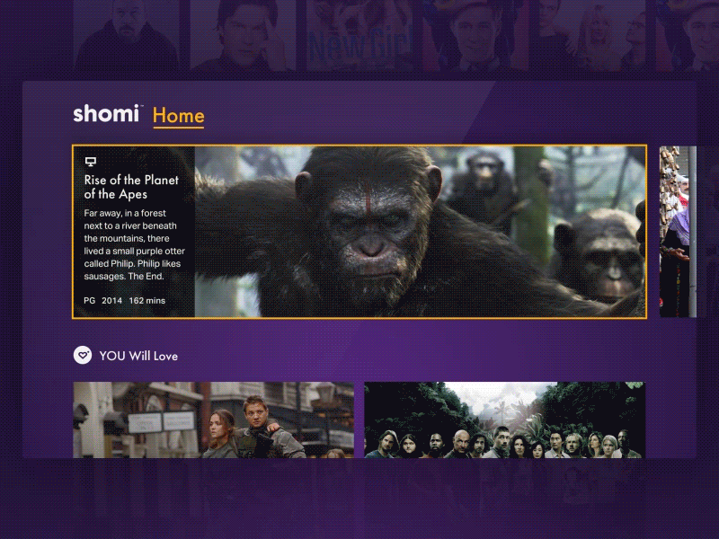
This design is clean and simple, using nice big card treatments. Focus states are achieved with scale and drop shadows which are aligned with the rest of the clean design. Metadata is also only visible on hover, which allows the users to stay focused on the current card.

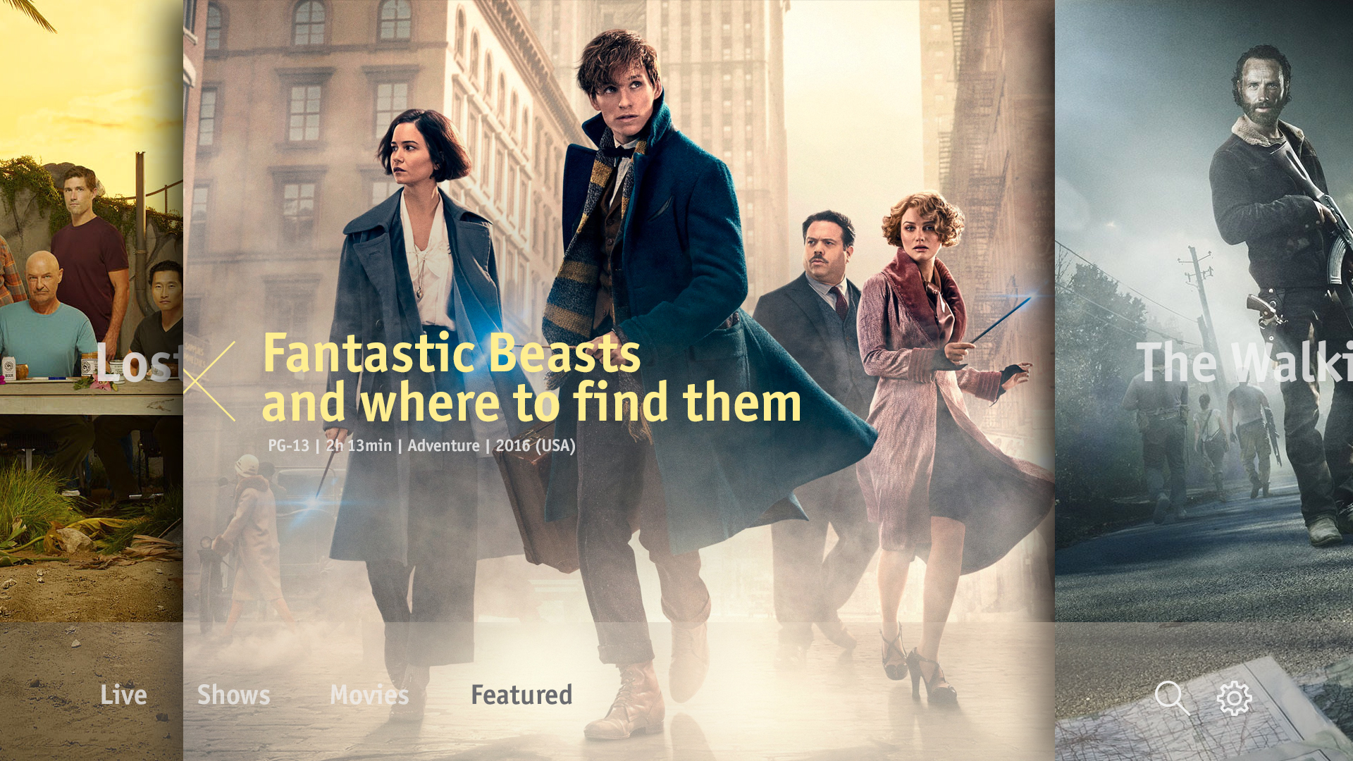
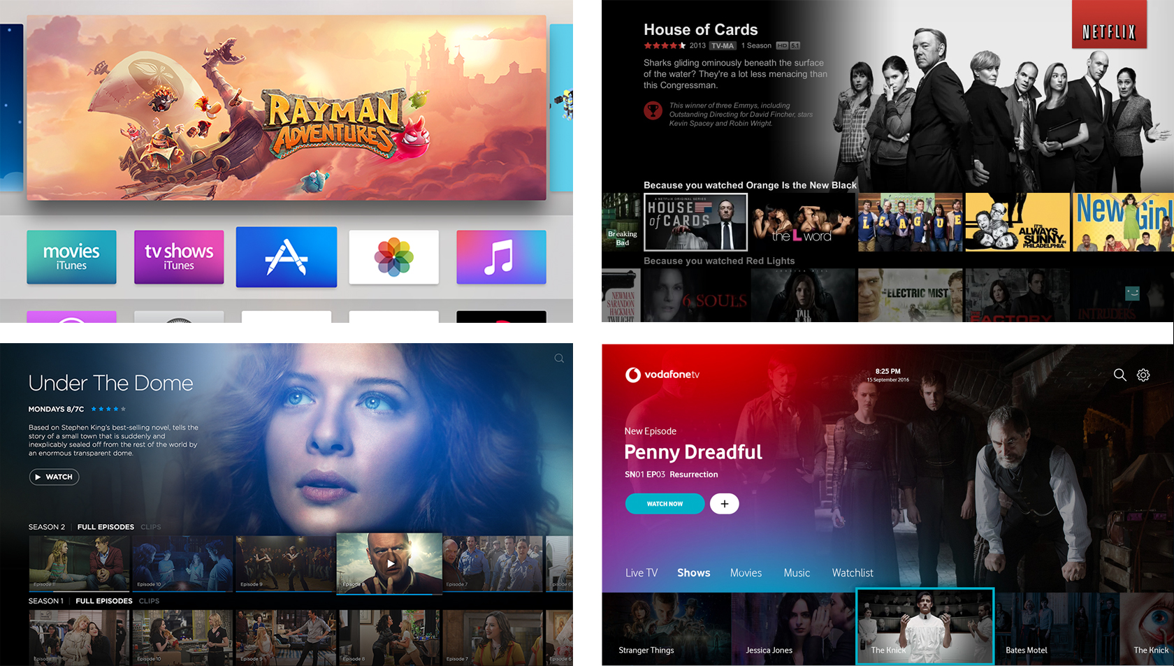
Pushing the limits on traditional TV designs. This provides an alternative cinematic approach to the usual 16 x 9 card treatment that many others use. Compared to many other services, the approach was to bring the menu at the bottom of the screen
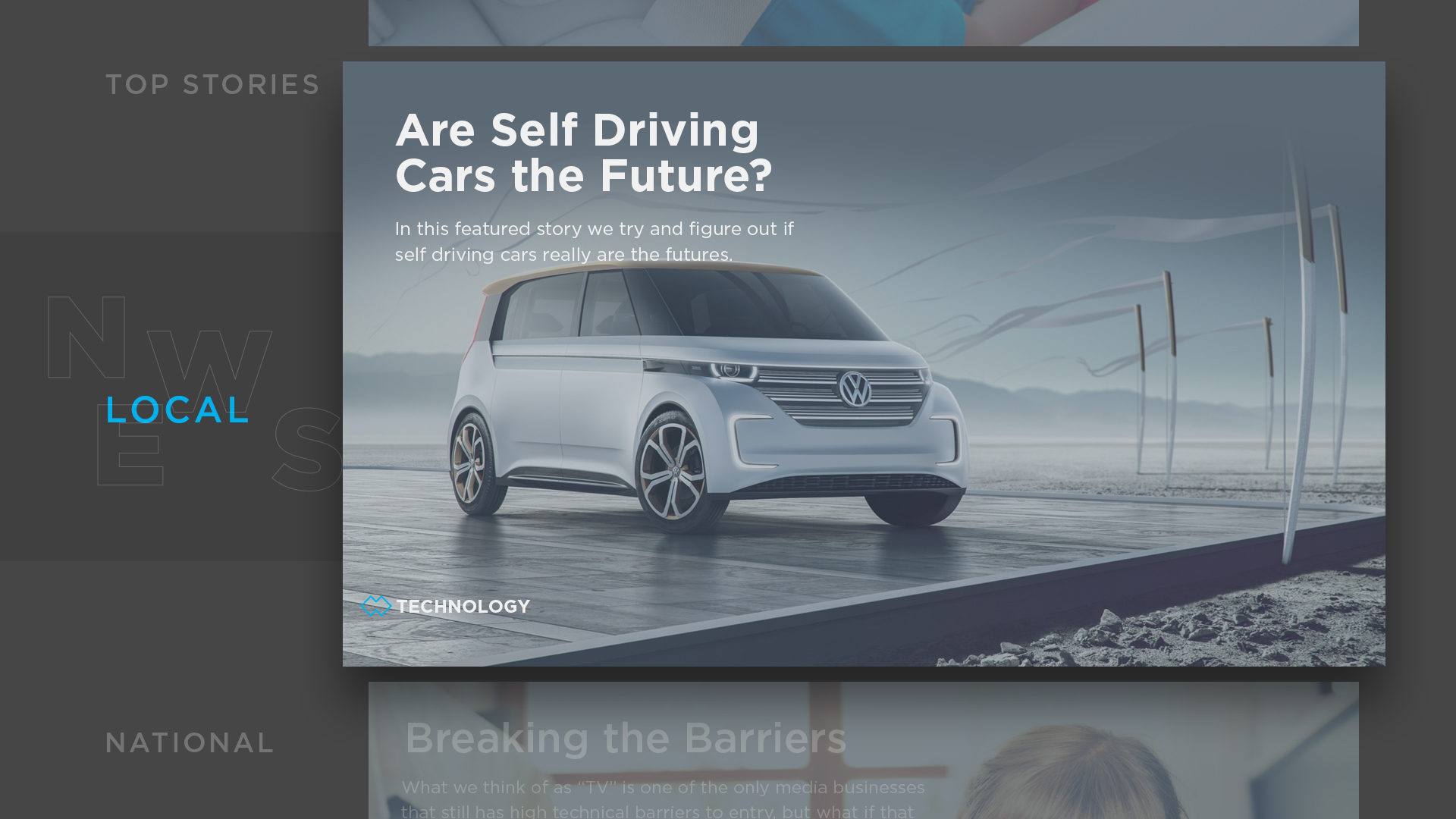
Pushing the limits on traditional TV designs. Bringing news at the forefront, users focus on one piece of news at a time vs. rows and rows of content.
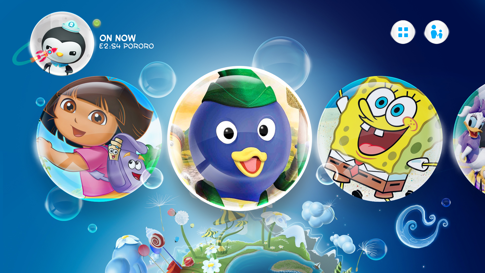
Kid user interfaces should be intuitive, fun, and easy to use. This design showcases that companies are able to push their designs further than a traditional grid system focusing on either 1x1, 2x3, or even 16x9 cards.
Place the most important content or options first on the screen so they are easily viewable and navigable by the user. Unnecessary screen levels must be removed. Going into different levels and getting out again must be easy and obvious.
The most crucial factor when designing a TV application is to include clear and accurate navigation for user operations. If navigation is ambiguous, users will feel confused and insecure.
In short, users should always know exactly where they are within an application. Remember, the user is only using basic controls to navigate. Move, Return, Enter, and other basic navigation functions must be clear. The users should be able to use the operations they want with these actions.
The focus was to push the boundaries of traditional television design. Find creative ways of demonstrating the wide breadth of content available to users while making it intuitive and easy to use.
As designers, our job is to create and design user interfaces that give users access to content in a way that’s clear and easy to navigate. We can’t expect the users to adapt new habits just so they can see our content. Rather, we have to adapt our user interfaces so that they can be operated in the dark by somebody who’s giving us less than their full intention, and with a very limited input device. It’s quite a challenge, but the potential payoff is enormous. Have fun designing!
Further Reading on the Toptal Blog:
Pascal Potvin
Ottawa, ON, Canada
Member since October 31, 2016
About the author
With 12 years in UI/UX and creative direction, Pascal has delivered immersive experiences led design teams for Sony, Fox, Disney, and more.
Expertise
PREVIOUSLY AT