Lines of Communication: A Typeface History (With Infographic)
Typeface evolution has been slower than other areas of design but looking back over the past 500+ years shows staggering advancements, from the invention of the printing press to variable web fonts.

Typeface evolution has been slower than other areas of design but looking back over the past 500+ years shows staggering advancements, from the invention of the printing press to variable web fonts.

Cameron Chapman
Cameron is the former Head of Content at Uxcel, where she was an instructional designer of UX design courses, skill assessments, and other educational design content. She has more than 20 years experience in the design education space, contributing to Toptal’s Design blog, Smashing Magazine, Web Designer News, CodeVisually, and Webdesigner Depot.
Expertise
It’s easy to take books and other printed material for granted. However, before the invention of the printing press by Johannes Gutenberg in the mid-15th century, books were written by hand. They were generally reserved for the elite, though growing literacy among the middle class increased their demand.
Typeface history has largely been influenced by the availability of technology throughout the centuries, starting with Gutenberg’s press and continuing through digital typography advancements by designers in the 20th and 21st centuries.
Typography History: Books for the Masses
Gutenberg recognized that being able to mass-produce books quickly and cheaply was a lucrative prospect. He drew on movable type used in East Asia and screw-type presses being used by farmers in Europe to devise the idea for the first printing press.
Because Gutenberg was a goldsmith, he was able to create durable letter blocks that could be used over and over again. While arranging the letters for each page could take an entire day, the page could then be printed as many times as necessary from that single day’s work.
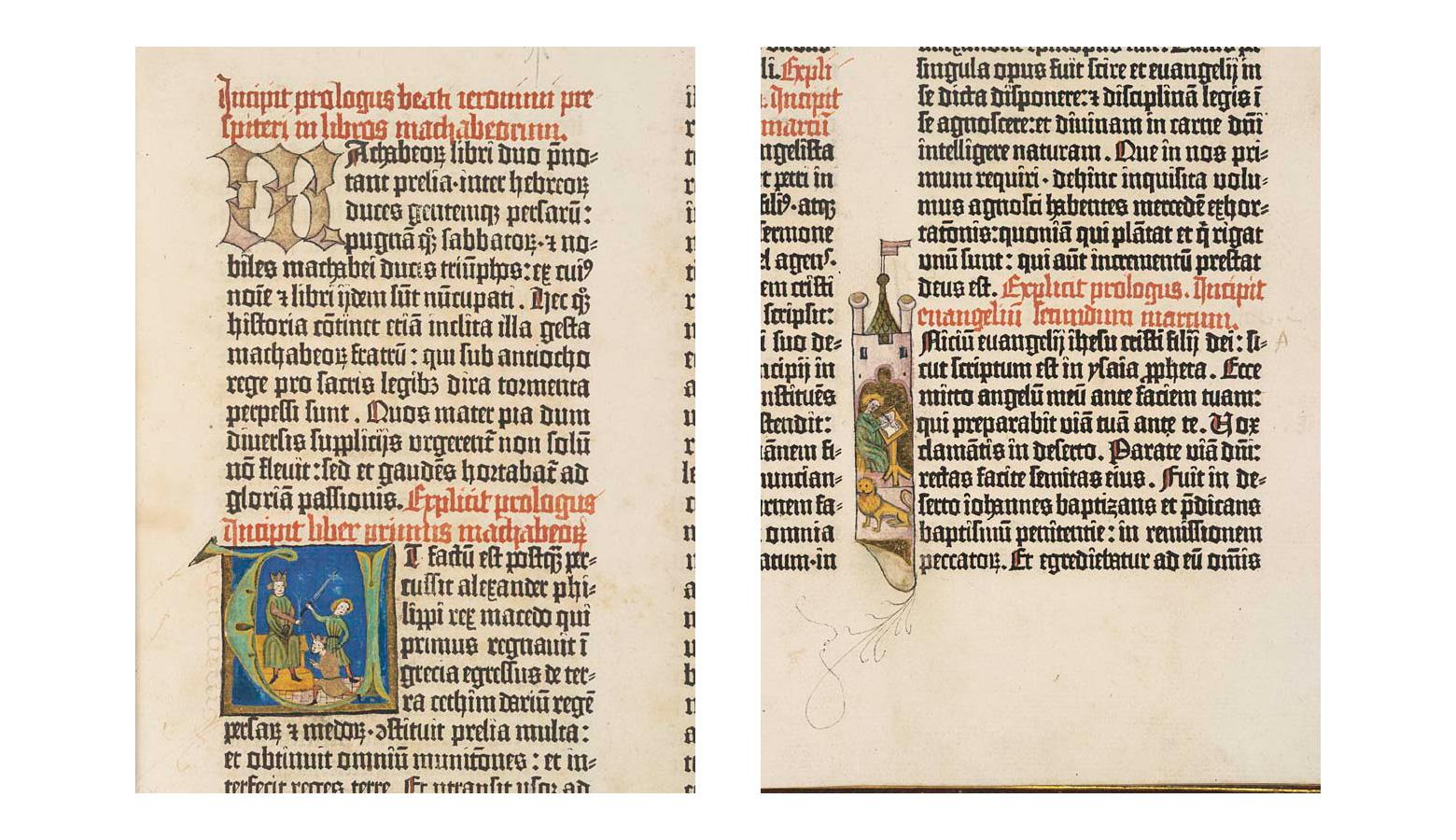
Gutenberg’s letterforms were based on the Blackletter calligraphy that was used to write manuscripts. The downside was that it limited the amount of text that could fit on a single page, creating longer books that required more time to set up.
Space-saving Typefaces
Blackletter typefaces were the original standard for printing, mainly because they mimicked the handwriting style of the time. But as mentioned above, the downside was that they took up considerable space on the page.
In 1470, Nicolas Jenson recognized that simpler letterforms would result in being able to fit more text on a single page, resulting in shorter books with faster setup times. He created the first Roman typeface, based on Blackletter and Italian Humanist lettering.
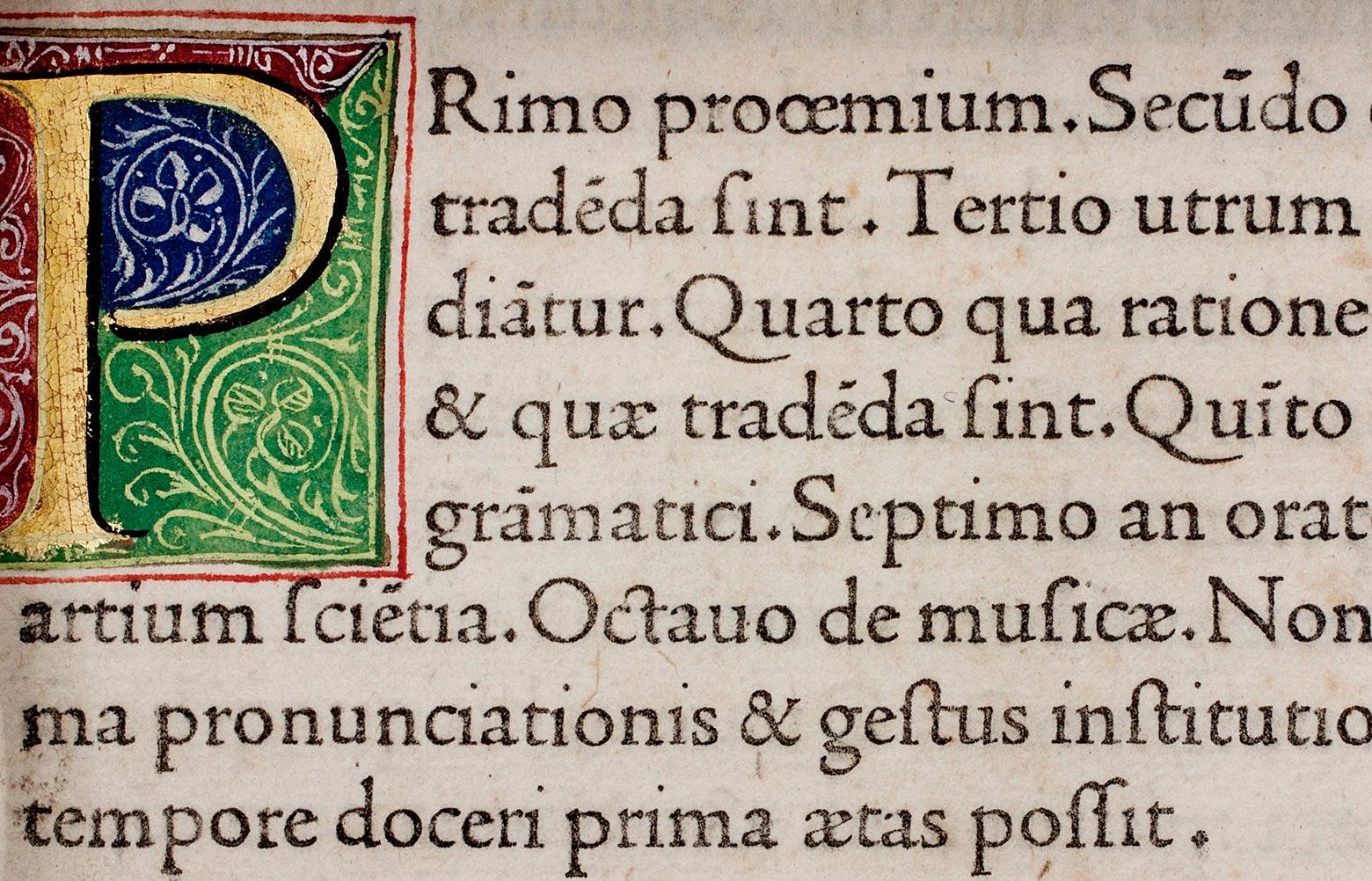
Jenson’s typeface was the first to be created based on typographic principles rather than manuscript models. His Roman type is the basis for multiple modern fonts, including Centaur, created by Bruce Rogers in 1914, and Adobe Jenson, created by Robert Slimbach in 1996.
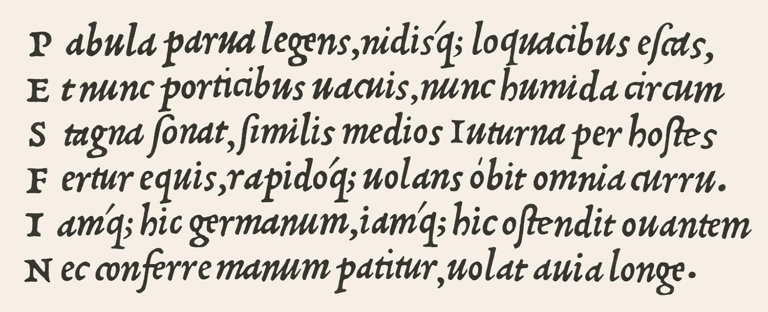
While Jenson’s Roman type saved space on the printed page, others were trying to save even more space to improve the efficiency of book printing. In 1501, Aldus Manutius and Francesco Griffo created the first italic typeface, which allowed even more text to fit onto the page. While initially invented as a space-saving measure, italics are still used to emphasize text.
Improving Readability
Efficiency was not the only typographic challenge tackled by the first type designers. Readability of early typefaces wasn’t ideal, especially the italic typefaces favored for saving space.
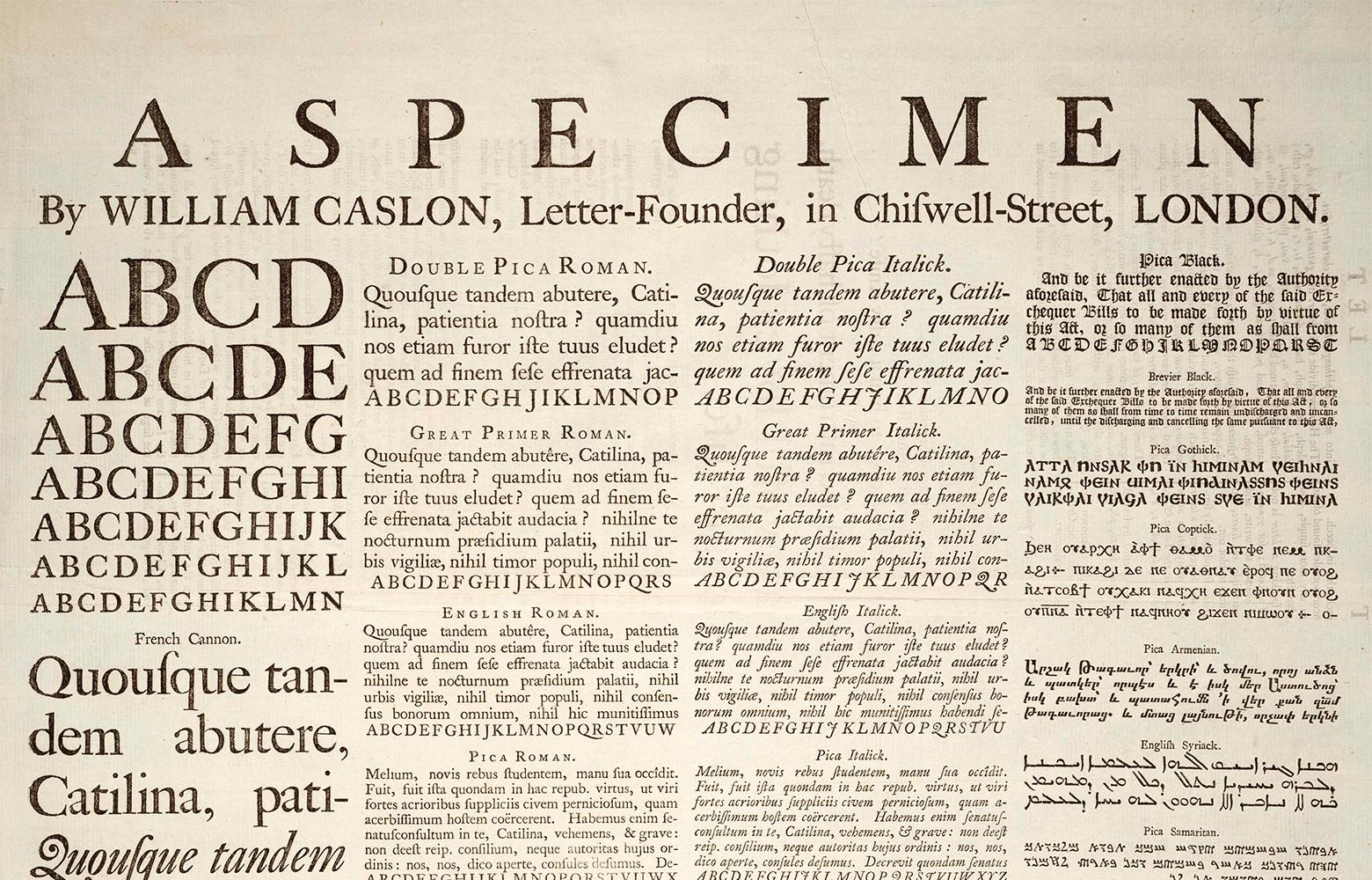
In 1734, William Caslon created a new typeface style that included more contrast between strokes in each letterform. Now referred to as “Old Style” type, these typefaces made letterforms more distinguishable from one another at a glance, improving readability.
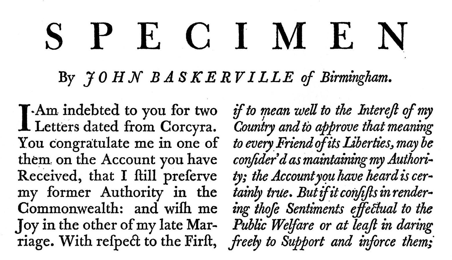
Next in the timeline of typefaces, in 1757, John Baskerville created Transitional typefaces with more distinct letterforms. While he made improvements to type, ink, and printing presses, his typeface was blacker than that of his contemporaries. Baskerville’s design was criticized due to the thickness of the strokes. One of his critics even went so far as to say that his typeface would be “responsible for blinding the nation.” His typeface was a commercial failure but was revived in the 20th century, and he has since been hailed as “the greatest printer England ever produced.”
The Appearance of Modern Serifs
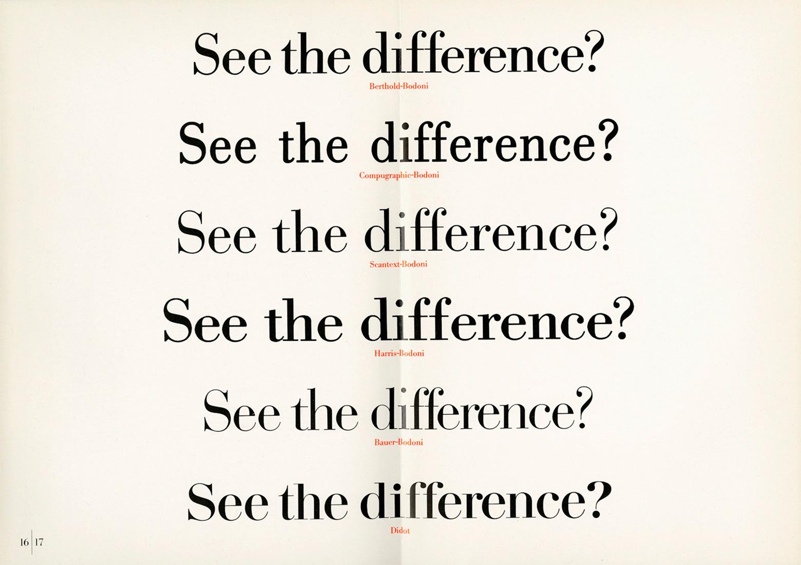
In the 1780s, two type designers—Firmin Didot in France and Giambattista Bodoni in Italy—created modern serifs with extreme contrast between strokes. At first glance, the typefaces are very similar in appearance and showcased the quality of the metal-casting work done by the respective companies, as thinner strokes required much better craftsmanship.
There are some distinct differences between the two fonts, mostly in the appearance and placement of particular letterforms. For example, the uppercase J in Bodoni extends below the baseline, while in Didot it sits on the baseline. The strokes on the “3” in Bodoni are both terminated with balls, while only the upper stroke is terminated with a ball in Didot.
Because of the extent of contrast between thin and thick strokes in modern serifs like Didot and Bodoni, they’re not the most readable typefaces at smaller sizes. They’re best suited for headlines and display uses, though at high resolutions, they can be suitable for body copy.
The First Slab Serif Typeface
The first commercially available slab serif, or Egyptian, typeface—called “Antique”—appeared in 1815 and was designed by Vincent Figgins. They were more attention-grabbing than more traditional serifs. The primary characteristic of slab serif fonts is the lack of curvature on the serifs.
After the first slab serif typeface was released, they quickly grew in popularity early in the 19th century, alongside the rise in printed advertising. Some slab serifs were developed specifically to be used at larger sizes for printed matter like posters. This was a departure from earlier large-scale type designs, which adapted existing forms of book type.
Large-scale advertising design also brought about the first sans serif typeface.
Sans Serif Type Makes Its First Appearance
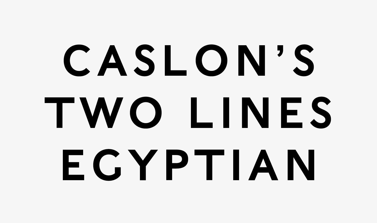
Around the same time as the first slab serif typeface became available, the first sans serif type became commercially available. William Caslon IV developed “Two Lines English Egyptian”—also known as “Caslon Egyptian”—in 1816. It caught on quickly, and advertisements and other printed material from the early 19th century stood out because of its use.
Sans serif type was influenced by block lettering that was commonly used in classical antiquity, in which serifs were minimal or missing entirely. During the early 1800s, Egyptomania took much of the Western world by storm, and both typography and design took cues from Ancient Egyptian art and its blocky lettering style.
The next significant development in sans serif type came 100 years later when Edward Johnston designed the iconic typeface for the London Underground—still in use today.
20th Century Modern Typeface History
The 20th century brought still more important developments in typeface history. The first full-time type designer was Frederic Goudy, who got his start in the 1920s. He created iconic fonts that are still in use, including Copperplate Gothic and Goudy Old Style (based on Jenson’s Old Style typefaces).
In 1957, Max Miedinger designed Helvetica, arguably the most iconic typeface of the 20th century. Other minimalist typefaces were developed in the 20th century, including Futura (developed by Paul Renner) and Optima (developed by Hermann Zapf).
Digital Typography
The first digital typeface—Digi Grotesk—was designed by Rudolf Hell in 1968. Early digital fonts were bitmaps, which resulted in less-than-ideal readability at small sizes. In 1974, the first outline (vector) fonts were developed, which resulted in better readability at the same time as reducing file sizes.

By the late 1980s, TrueType fonts were created, which allowed for both computer displays and output devices like printers to use a single file. In 1997, OpenType fonts were invented, which allowed both Mac and PC platforms to use a single font file.
In the same year, CSS incorporated the first-ever font styling rules, and the following year, the first support for web fonts was added to Internet Explorer 4 (though they weren’t widely adopted at that time).
Typeface Evolution on the Web
The 21st century brought considerable advances in web fonts. In 2009, the Web Open Font Format (WOFF) was developed and added to the W3C open web standard. This development paved the way for widespread adoption of web fonts in 2011 when all major browsers finally adopted support for WOFF.

Widespread support for web fonts revolutionized digital design, allowing designers practically unlimited options in web typography and ushering in trends, including big typography and the use of outline fonts.
The introduction of variable fonts within the OpenType standard in 2016 strengthened the web typography revolution. Variable fonts can change size and weight based on where they’re used in a design, within a single font file. This flexibility means using fewer font files, resulting in faster page load times.
Evolution of Typography: What the Future Holds
Variable fonts have had a significant impact on digital type design, but there’s still room for new trends and technologies to emerge in the future. One area where many typefaces are still lacking is global language coverage. While many typefaces focus on Latin character sets, there are other Western languages (such as Greek and Cyrillic) that should be more widely included as standard in font files.
Some areas of design change and evolve quickly, but typography has been slower to evolve over the centuries. One emerging technology to watch is the development of color fonts, within the OpenType-SVG format. These fonts allow designers to use multiple colors within a single glyph. While the technology to do this has been around for a few years, it hasn’t been widely adopted—yet. Then again, web fonts were technically possible for more than a decade before they were widely adopted.
If typeface history has demonstrated anything, it’s that typography will continue to evolve to meet the needs of designers, new formats, and readers.
Further Reading on the Toptal Blog:
Understanding the basics
What are the seven typeface classifications?
While there is no definitive list of the classifications of typefaces, there are seven that are generally recognized: serif, sans serif, script, blackletter, display, monospaced, and symbol or ornamental. Blackletter typefaces were the first in typeface history, followed by serifs and sans serifs.
What was the first font?
The first typeface was a Blackletter variety used by Johannes Gutenberg on the first printing press, starting in 1440. This typeface design was created to mimic the calligraphic handwriting used by monks to hand-transcribe manuscripts prior to the invention of the printing press.
When was typography first used?
The first historical typeface design that followed typographic principles was Nicolas Jenson’s Roman-style typeface, designed in 1470. Before Jenson’s design, typefaces and book designs were modeled after handwritten manuscripts that predated the invention of the printing press.
How do you describe a typeface?
Typefaces can be described with a few criteria: their classification (serif, sans serif), letter shape (geometric, condensed), mood (formal, casual), suitability for different types of text (headlines, body copy), and things like weight (thin, bold) or style (italic, oblique).
What were the first typefaces based on?
The first commercial typeface styles—called Blackletter—were based on handwritten manuscripts created by monks prior to the invention of the printing press by Johannes Gutenberg in 1440. The letterforms closely resembled calligraphy, with complex shapes and ornamentation.
How are fonts made?
Creating a font is a complex artistic and technical process. The first step is coming up with a concept that is fresh, interesting, or fills a gap in the market. Sketching comes next, often on paper. After letters are sketched, they’re digitized using software, then refined.