Keep It Tasteful: A Guide to Food App Design
The pandemic has intensified the demand for online food ordering, and businesses are rushing to meet the need. With food apps increasing in popularity, providing an exceptional user experience is critical.

The pandemic has intensified the demand for online food ordering, and businesses are rushing to meet the need. With food apps increasing in popularity, providing an exceptional user experience is critical.

Pili is a UX, UI, and product designer who has led teams at Clearco and Compass Digital Labs. At Compass, she worked on the Thrive app, which facilitates ordering from cafes in office buildings. She is an Associate Professor of Brand Design at Universidad Anáhuac in Huixquilucan, Mexico.
Expertise
PREVIOUSLY AT

Featured Experts

When the COVID-19 pandemic prompted a worldwide lockdown, apps that allowed people to order groceries, lunches, cocktails, snacks—you name it—became a lifeline, literally sustaining people and businesses alike. According to a study by grocery e-commerce firm Mercatus, online grocery sales in the US are expected to account for 21.5% of all grocery sales by 2025, a 60% increase over pre-pandemic estimates. The market for restaurant delivery ballooned as well; in 2020 in the UK, for example, it rose by 128%.
But along with demand comes heated competition among food-ordering apps. New ones continue to spring up, while customers display little to no loyalty to any one business. With the competition increasingly fierce, online food-ordering and grocery companies are turning to design experts to distinguish their products and help attract and retain customers.
Maximize Minimalism: The Power of White Space
Of course, food apps call for high-quality photographs to make products look appetizing, but the space in between is just as important; if the app is messy, you may think your food will be as well.
Creating a clean UI is easier said than done when it comes to designing for grocery apps. Grocers operate on razor-thin margins, so online they rely on ads and banners to generate revenue. “You want a site, especially in grocery, to look fresh and clean,” says Simone Theeboom, Head of Digital Product Management for Grocery Gateway, the online ordering arm of Longo’s, a Toronto-based, family-owned supermarket chain. “But you may be giving up being able to showcase more of the products.” Still, she considers it a fair price to pay; white space not only helps achieve a sparer look, it makes it easier for users to scan a page and grasp its visual hierarchy. “I’m always challenging the UX team: Where can we produce more white space?” she says.

Focus on Search in Food App UI
Users must be able to find exactly what they want and find it quickly. It sounds like a no-brainer, but a grocery business typically offers tens of thousands of SKUs and regularly changes its inventory. “There’s an immense amount of information flowing through your system and changing all the time,” says Jonathan Lau, who has worked on projects for Instacart and Loblaw Digital, part of Canada’s largest food retailer. “For furniture and clothing you might have the same catalog of items that last the next quarter or year, but with groceries, things can change daily.”
If customers can’t find what they came for, they’ll move on. UserZoom, a leading experience insights management firm whose platform is used by, among others, Google, PayPal, and Salesforce, and which in April raised $100 million from investors, recently studied online grocery shoppers in the US and UK. It found that nearly a quarter of UK shoppers rank ease of search as the main feature they want when shopping for groceries online. This study also found that integrating search and add-to-cart features is extremely successful. UK supermarkets Asda and Iceland do this with tremendous success, UserZoom VP and Research Partner Dana Bishop tells Toptal: “People are used to having predictive search. In this case, each result has all the information you want, with a thumbnail. It has the description. It has how many grams, the price, whether it’s on sale, and the ability to add it to your cart.” A full third of customers take advantage of this, and Bishop says that it’s no coincidence that these grocery stores rank highest overall in the UK.

Map Out the Shortest Journey
While speed of completing tasks is important for any site, it is especially crucial for meal-delivery apps, since people turn to them when they are short on time. When Andrijana Mrkela was working on the redesign for divoora.com, a meal-delivery app serving the Italian-speaking region of Switzerland, making selection and checkout as fast as possible was the top priority. “People order food because they don’t have enough time to cook or simply don’t have enough time to go to the restaurant. The whole process of ordering needs to be really easy and quick,” Mrkela says, adding that it should take no more than four or five steps.
Minimizing steps is also essential in grocery shopping: “What drives the grocery business is going to be that experience of getting you into the site or onto the app and checking out with your groceries as quickly as possible,” says Theeboom. In the UserZoom Competitive UX Research Benchmark Report, the services that rank highest are also the ones that limit the number of pages users see before they can add something to their carts. In one example, Walmart users completed a task with just three page views; the same task took Amazon Fresh users 10 page views. Walmart consistently ranks first among US grocery stores for user experience.
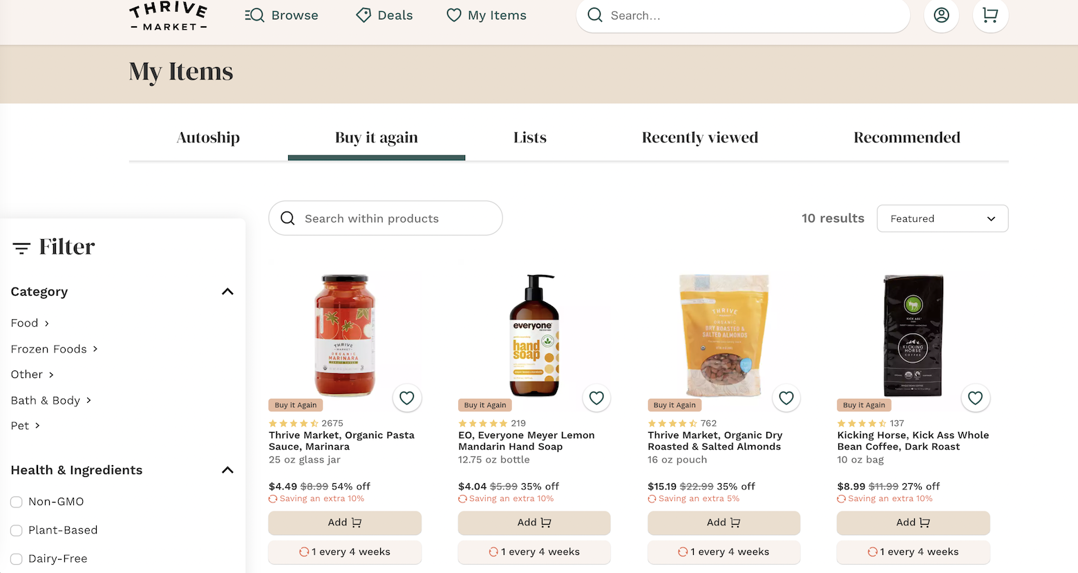
Designers also recommend showing people where they are in the sign-up and checkout experience, especially when there is something specific they are likely aiming for, such as free shipping. August Kreowski, Creative Director of Y Media Labs (YML), which was named to the AdAge 2021 Standout Agency list—one of the industry’s highest honors—recommends designing a stepper to run across the top of the screen. Kreowski, who led the team that redesigned the landing page and onboarding funnel for online natural food startup Thrive Market (unrelated to the Compass product), tells Toptal, “Within checkout, it’s really important for customers to see how many steps they have before they qualify for that first free shipping.”

Personalize the Experience
Designing for speed means not simply minimizing the number of steps to complete a transaction; it also means personalizing the experience to show users the items they want while muting the rest. “The decision-making process is tedious,” says Diego Valencia, who worked on the UX team for Kitchen United, an app that allows users to order from multiple restaurants on the same tab and have everything delivered at once. He advises designers to allow users to set more preferences, thus limiting choices: “I want something to eat. I want something vegetarian that’s delicious. I’m in a group of four. I tell you, the app, what I want and you take care of it.”
Personalization is paramount for membership-based Thrive Market. Kreowski says that when his team at YML embarked on the project, their charge was to design for a “millennial mom” who had no more than an hour and a half to grocery shop—as well as do laundry and clean her home. “For us it was ‘How might we build an experience where someone could do all of their grocery shopping for the week or for several weeks within five or 10 minutes?’” he says. “Time is such a big factor. We talked about cart-building velocity a lot.”
Thrive Market users onboard with a quiz about dietary preferences. From there, Kreowski says, “We were able to take Thrive’s 10,000 SKUs and bring users to a homepage in a way where they see 40 items that they not only recognize but love.” His team designed Thrive’s scrolling experience to be a personalized version of browsing in a grocery store. “You’re not only scrolling down but also scrolling across,” he says. “I can add products as if I’m browsing quickly through an aisle.” They also tried to replicate the experience shoppers have of coming upon featured products and end caps in a physical grocery store: “We thought about merchandising in a similar way, where not only would I see the items that I’ve bought before but I’m encountering new items that feel a little bit more experiential.”
It’s also important to make it easy for people to save their favorite items or to consistently show them items they buy frequently. “The more options you can give a customer on an app on how they want to shop, the better,” says Theeboom. “So allow them to make a list, show them favorites, show them past purchases; you want to give them different ways of how to navigate to actually find the products they want to add to the cart.”
Make It Memorable
There’s no question that consumers are increasingly concerned with where their food comes from. In 2019, 60% of US consumers bought brands according to their stance on social issues, up from 47% in 2017.
In redesigning Thrive Market’s homepage, Kreowski saw the importance of highlighting the company’s social responsibility ethos. For instance, in 2019, Thrive Market had a project in which it donated 10% of its house-brand coffee sales to restoring rainforest land in Peru. The initiative had already garnered attention on social media, so Kreowski wove it seamlessly into the UI. “We want to tell stories that are not only educational, but get customers to click and add a product to their carts,” he says. “What if we could interrupt our shoppers within their own grocery experience with this merchandising that touches on the values that we already know are important to them?”
Granting prominence to a brand story can also help small grocers differentiate themselves from the considerably larger but less personal Walmart and Amazon Fresh. Theeboom recalls that while working on Longo’s delivery app, she directed her team to design a callout highlighting the grocer’s long-standing relationship with the community. “We can focus on being local—the fact that we use local farmers, and the fact that we serve elderly people who can phone in their orders.”
Serving Up Great UX and UI
Perhaps more than with other projects, a designer building a food-ordering app will almost certainly begin the assignment with preconceived notions. Everyone eats, after all, and most people have definite ideas about what they like and what they don’t. Plus, eating elicits strong feelings and memories. That’s why it’s especially important to delve into UX research when undertaking a food app design project. If we didn’t do research to understand the users, we might design based on how we eat, which could be completely different than how our users eat.
These days, there’s almost nothing a hungry customer can’t order online—from cereal at the grocery store to dinner from a five-star restaurant. With so much competition in the food-ordering space, designers should focus on telling an impactful story, designing personalized experiences, and creating clean, easy, and intuitive designs to whet customers’ appetites.
Understanding the basics
What colors are good for food apps?
When it comes to food app design, let the color of the food photography shine through while keeping UI colors limited. Having a minimalistic look with a significant amount of white space is key for signaling to users that their food will be clean and fresh.
What is simple UX?
Creating a simple UX is one of the driving principles in food app design. Simple UX means that users can find what they want to order and check out in just a few steps. It also makes it easier for users to scan a page and grasp its visual hierarchy.
What makes for good UX?
Good UX is intuitive and easy to use. It’s especially important to consider UX in food app design because customers typically order meals or groceries when they are short on time. Food ordering apps should be intuitive, provide easy search functions, and make it convenient for users to reorder the products they want.
Pili Fernandez Davila
Toronto, ON, Canada
Member since January 29, 2019
About the author
Pili is a UX, UI, and product designer who has led teams at Clearco and Compass Digital Labs. At Compass, she worked on the Thrive app, which facilitates ordering from cafes in office buildings. She is an Associate Professor of Brand Design at Universidad Anáhuac in Huixquilucan, Mexico.
Expertise
PREVIOUSLY AT