Mobile UX Design Constraints, Best Practices, and Working With Developers
We can achieve better user experiences with mobile UX design by following best practices, understanding constraints and facilitating a solid working relationship with developers.

We can achieve better user experiences with mobile UX design by following best practices, understanding constraints and facilitating a solid working relationship with developers.

We can achieve better user experiences by following mobile UX design best practices, understanding constraints, and facilitating a solid working relationship with developers.
What Is Mobile UX Design?
A recent article on TechCrunch pointed out that mobile eCommerce accounted for nearly one-third of all online sales during the 2018 Thanksgiving day holiday period, and Digital Trends reported in 2017 that 5 billion people across the world now have a mobile device. Google also announced that mobile-first indexing is now used for over half the web pages in its search results.
People depend on mobile devices every day for communications, eCommerce, content consumption, work, banking, directions, and increasingly as their sole computing device. What’s more, they are using a variety of devices such as mobile phones, smart watches, tablets, phablets, wearables, and hybrid laptops.
Mobile user experience (UX) design refers to the design of positive experiences during the use of mobile devices and wearables, and applications or services running on such devices…Mobile UX design focuses strongly on efficiency and discoverability. - Interaction Design Foundation
For UX designers these mobile device trends represent both challenges and opportunities. On the one hand, we have to account for the variety of devices and ways in which they are used. On the other, this opens up an entirely new set of focus areas in UX design, and that means creating positive experiences for an entirely new generation of users.
Best Practices for Mobile UX Design
Mobile UX design is tricky. As stated previously, there are so many things we have to consider, including the growing list of mobile devices, the ways people interact with them, and the fact that people want consistent and pleasurable experiences across all device types.
Google’s 25 Mobile UX Design Tips
In 2015, Google published 25 mobile UX design best practices based on internal research. These tips were recently updated to bring them more up-to-date. The author also includes a downloadable PDF of all 25 tips that is nice to keep handy for any mobile UX project.
Apple’s Human Interface Guidelines
Another great resource to keep handy is Apple’s Human Interface Guidelines for mobile design. They are easy to read with a beautiful layout and peppered with best practices, tips, and Apple’s own take on design principles. For mobile UX designers these guidelines are a great resource for delivering high quality user experiences.

Additional Mobile UX Best Practices
Here are a few more mobile UX design best practices that might not be as well known as Google’s, but are just as important for mobile designers to take into account.
- UX Research. At a certain point, we may feel inclined to get right into mockups or prototypes, however, doing proper UX research first is something that cannot be understated. Always remember that “you are not your user,” and a positive user experience relies on thorough UX research in every case. Here is Adobe’s comprehensive guide to UX research methods for further reference.
- Clutter. We have all experienced the anxiety of a cluttered desktop—imagine it on a mobile device! Every added button, image, piece of content, etc., makes things that much more complicated. It’s a good idea to get rid of anything in a mobile UI that isn’t absolutely necessary. A great tip is to strive for minimalism, but not at the peril of good usability. This can often be achieved by prioritizing one main action on each screen.
- Prioritize. There is a tendency to try and add as many features as possible. We feel that leaving something out will somehow create less of an experience for users. To the contrary, keep features highly focused based on core objectives, and refine the design by analyzing which features are used the most then put the effort into making those features both intuitive and pleasurable.
- Touch Targets. Users can get physically angry and start hitting their mobile devices when they tap on something and it doesn’t respond. A study done at MIT found that they were tapping on something that had too small of a touch target. A best practice is to create controls, buttons, links, etc. (anything that’s a touch target) at least 7-10 mm which is the average fingertip width. It’s also a good idea to ensure that there is ample spacing between these UI elements.
- Legible Text. Since so much of what users do is based on content consumption, in order to provide a consistent experience across all types of mobile devices, make sure to choose typefaces that work well in multiple sizes and weights. Font sizes of at least 11 points are recommended in order to reduce eye strain. Clean and easy to read typefaces such as Google’s Roboto and Noto or Apple’s new San Francisco font are great choices to explore.
- UI Feedback. Well designed applications keep us informed as we interact with them. Lack of good feedback can confuse users and cause them to question whether something has happened, is happening, or why it did/didn’t happen. A best practice is to use different forms of feedback (sound, haptics, visualizations), based on the UI element or the current state of the app.
- Accessibility. This is probably one of the most overlooked aspects of user experience design and especially mobile UX design. 15% of the world’s population experiences some form of disability. The Web Content Accessibility Guidelines is a freely available resource, and for digital designers, is a “must have” as part of their toolbox.

Mobile UX Design Constraints
The aim of most UX designers is to provide pleasurable experiences and come up with great designs which achieve both discoverability (what actions are possible), and understanding (how is the product supposed to be used). With mobile, however, there are some constraints introduced due to the size, portability, and environments in which these devices are used.
Storage Constraints
When dealing with native mobile apps, designers need to consider that some users may have storage constraints.
A mobile app, as opposed to a web app, uses storage right on the mobile device. This has an impact on mobile UX design because it introduces potential limitations on the quality of video, audio, and images that can be used.
For native apps, we want mobile UX designs that take storage constraints into account. When a user runs into a storage limitation, they have to make hard decisions on what to keep and what to delete. It makes for bad user experience when we force users to have to make those choices.

Screens and Controls
Another constraint we face with mobile UX design is screen size and the controls on our mobile devices.
Mobile screens are smaller: reading through a peephole increases cognitive load and makes it about twice as hard to understand. - Jakob Nielsen, Web Usability Consultant.
The best way to deal with screens and controls is to eliminate as much friction as possible. Restructure information, pay attention to the thumb zones, decrease clicks (especially with eCommerce), and pay attention to the login process which can often be frustrating.

Environment
With mobile devices, there are environmental factors to consider for UX design. Users are subject to dropping offline a lot more frequently, and these situations need to be considered in the overall user experience. How do we bring them back to where they were? How do we make sure they don’t have to start all over with what they were doing?
Another environmental factor is distractions. When we use our mobile phones or tablets, we are often in a noisy or crowded environment that makes it hard to concentrate. How can we ensure a good user experience when distractions are competing for a user’s attention? Are there ways we can save states and allow our users to save states as well?
Small Screen Size, Single Window
Another constraint designers are up against with mobile UX design is the limited size of the screen. Because of that, people can only see one window at a time, and that puts a huge limitation on the user experience.
There are efforts to try and accommodate “multi-screen” and “multi-tasking” but these are not yet the norm and come with their own sets of constraints.
The key to better mobile UX with this single window constraint is that the design should be self-sufficient. Anything that needs to be done by the user should be doable within one single screen or window, i.e., they should not have to leave the app to find information, etc.
When users have to leave apps or open new screens, this adds to the overall cognitive load and that means things become too complex and frustrating.
How People Hold Mobile Devices
There is one last constraint to be aware of: Holding our gadgets. How do people hold them and what does this mean for mobile UX design?
According to research by Steven Hoober and outlined in Design for Fingers, Touch, and People, Part 2, it was discovered that people interact with their devices differently depending on how they hold them, which subsequently has an impact on mobile UX design.
People hold their mobile devices in multiple ways and change their position all the time. This has an impact on what finger(s) they use and how they interact with a mobile UI (see below). As it turns out, users prefer the center of the screen and they don’t like to click items that are too close to the edges.
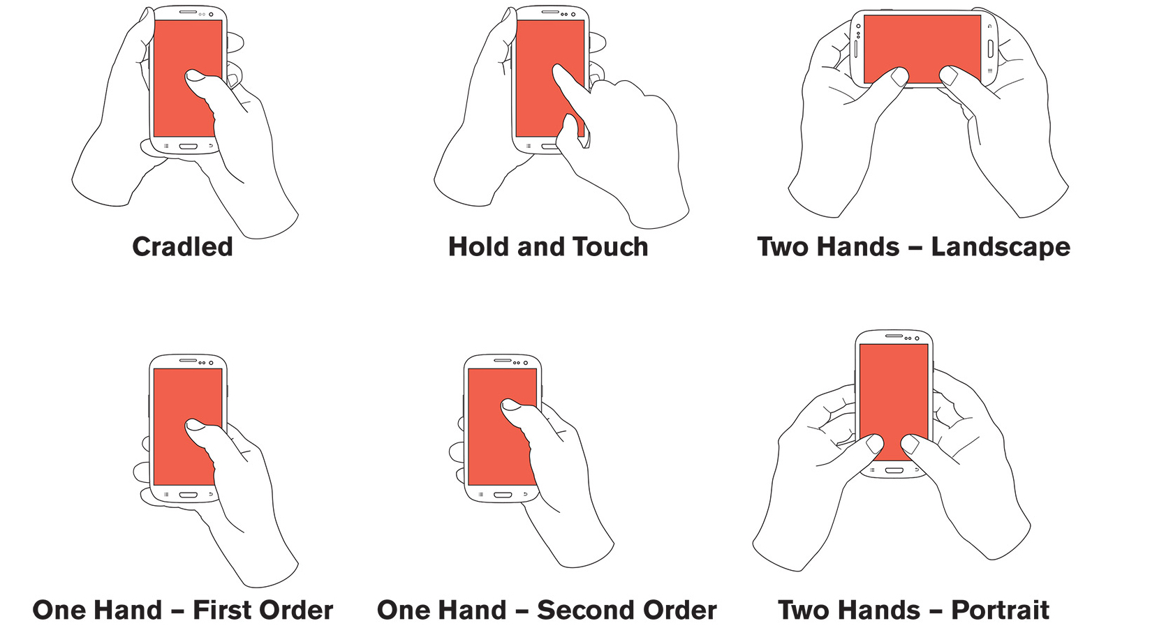
Here are some additional mobile UX tips from Steven’s research:
- Design for every user and every type and size of a mobile device
- Design for all the various ways people work with their devices
- Consider that users prefer to touch the center of their screen in most cases
- Place key actions in the middle half to two-thirds of the screen
- Make sure fingers and thumbs don’t obscure content
- Selectable items should be large enough to be tapped on comfortably
Working with Developers
Whether working in an agile/lean UX environment or not, it’s the developers who have to interpret and implement the designs that have been so carefully crafted. It’s a good idea to establish some tried and true best practices with developers early on to make sure designs are implemented as intended. Here are a few suggestions and tips.
Mockups
When preparing and handing over mockups, try to keep file names simple, consistent, and descriptive. This will save a lot of time going back and forth. It’s also a good idea to finalize all of the mockups before sharing them with devs so they only receive one version of each screen. Another time-saving tip is to test all of the interactions with prototypes so they are working and functional. Good tools for sharing mockups: InVision and Marvel.
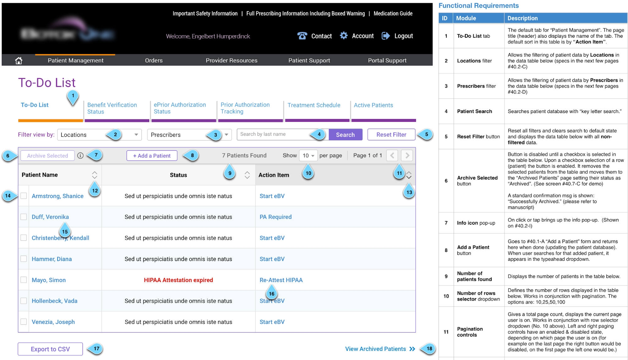
Functional Specifications
Most of the work done as UX designers involves developers early on in the project, and a great way to facilitate an ongoing understanding of the design process and create a better line of communication is by creating and using a Functional Specification document, or a “Func-Spec.”
The Func-Spec document is similar to a blueprint that architects create, except it is shared with developers throughout the design project and allows them to understand how an application or website will function (vs. how the UI will look).
A good example of a working Func-Spec is shown below:
Copy
There is usually a lot of copy that lives outside of a mockup that needs to be communicated to developers. Here is an idea they will definitely appreciate:
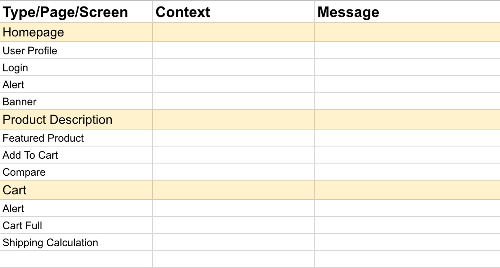
As seen above, the context helps the developer understand when the message should appear or disappear. It should let the developer know what is going on so they do not have to guess. The message is the actual copy that will appear. Use the real copy and not gibberish (i.e., lorem ipsum). Developers don’t want to be copywriters and we want to make things as smooth as possible for them.
Specifications
This is one of the most important parts of communicating designs with developers. Here’s where tools like Zeplin and InVision’s Inspect really shine because they take care of communicating specs like measurements, style guides, fonts, user experience flow, and how every piece of the design works.
Communication IRL (in Real Life)
Designers love their tools. So much so that it can be really easy to forget to pick up the phone, start a video call, or walk over to the developers and talk. A lot of time has been saved by simply meeting with developers after handing off a portion of a design because any questions or nuances can be discussed on the spot. This is often forgotten, but if made a part of the normal hand-off process, everyone will appreciate the time it saves.
Tying It All Together
Mobile isn’t going away. In 2016, the number of users accessing the web on a mobile device surpassed desktop use for the first time. For UX designers, the increased adoption of mobile and the proliferation of various device types will make user experience design that much more challenging.
For these reasons, adhering to a set of best practices, understanding the constraints that mobile introduces, and providing for a smooth working relationship with developers will be key factors in achieving designs that create positive human experiences.
Further Reading on the Toptal Blog:
- The Principles of Design and Their Importance
- Push Notification Best Practices: 7 Questions Designers Should Ask
- Exploring the Gestalt Principles of Design
- Adobe XD vs. Sketch – Which UX Tool Is Right for You?
- The 10 UX Deliverables Top Designers Use
- Designing an Intuitive Mobile Dashboard UI: 4 Best Practices
Understanding the basics
What is UX in mobile?
User experience (UX) in mobile refers to the overall experience a person has interacting with any type of mobile device (phone, tablet, wearable, hybrid). Interactions include apps, interfaces, software, or the hardware itself.
What is meant by UX design?
User experience (UX) design is the process of creating products, services, and processes that provide meaningful and relevant experiences to users. The UX design process focuses heavily on the human perspective and encompasses everything from user research to usability to function.
Who invented UX?
UX has been around in various forms since the 1940s, however, it was not until the spread of PCs in the early 90’s that the term “user experience” design was coined by Donald Norman. Don worked for Apple and saw a need to cover all aspects of a person’s experiences with a system.
How do you do UX research?
UX research is the process of understanding the impact of design on an audience. It is done through observation techniques, task analysis, and other qualitative/quantitative feedback methodologies. Some of the techniques include card sorting, focus groups, heuristic evaluations, and surveys.
Why is UX research important?
User experience (UX) research is important because it helps create designs that are truly relevant, easy and pleasurable to use, and helps us understand the return on investment of our designs. User research influences all aspects of the UX design process.