Death to the Wireframe. Straight to High Fidelity!
In many product design scenarios, wireframes may not be necessary, and skipping them altogether may cut down on confusion and save a lot of time.

In many product design scenarios, wireframes may not be necessary, and skipping them altogether may cut down on confusion and save a lot of time.

Jen has a decade of experience designing award-winning experiences for top agencies, brands, and startups such as Nike, P&G, and R/GA.
Expertise
PREVIOUSLY AT

UX design is a fascinating discipline. To do it well, practitioners must be well versed in a wide variety of topics and skills. To practice user-centered design methodology and create easy-to-use, innovative solutions to everyday product design challenges, a UX practitioner’s craft and understanding involves everything from basic drawing through narrative/journey design to cognitive psychology.
There are a wide variety of tools used, artifacts generated, and findings uncovered in the UX/UI design process, and they are captured in an assortment of documents or even a prototype. Our most recognizable, bread-and-butter artifact is the good ol’ wireframe.
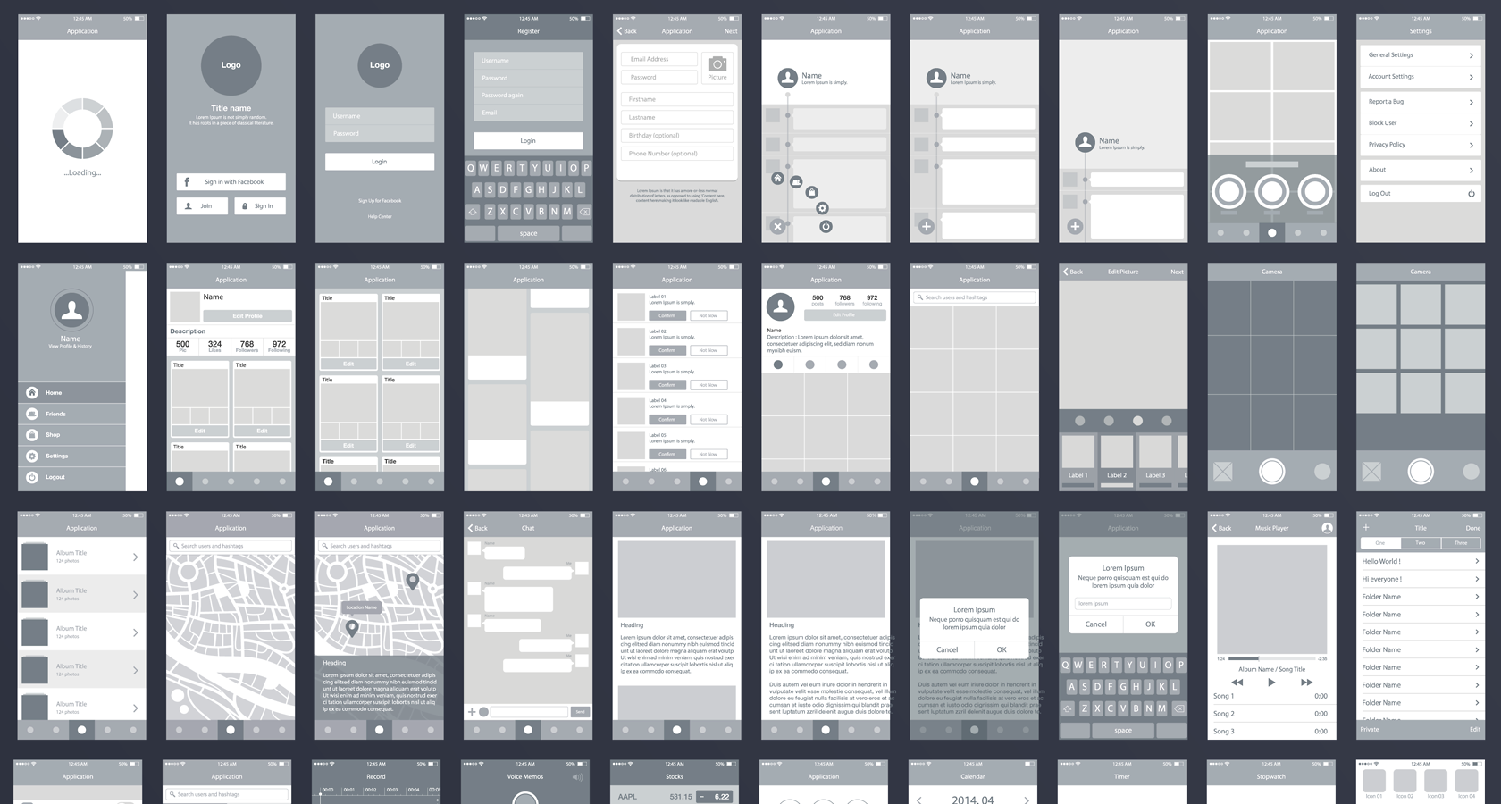
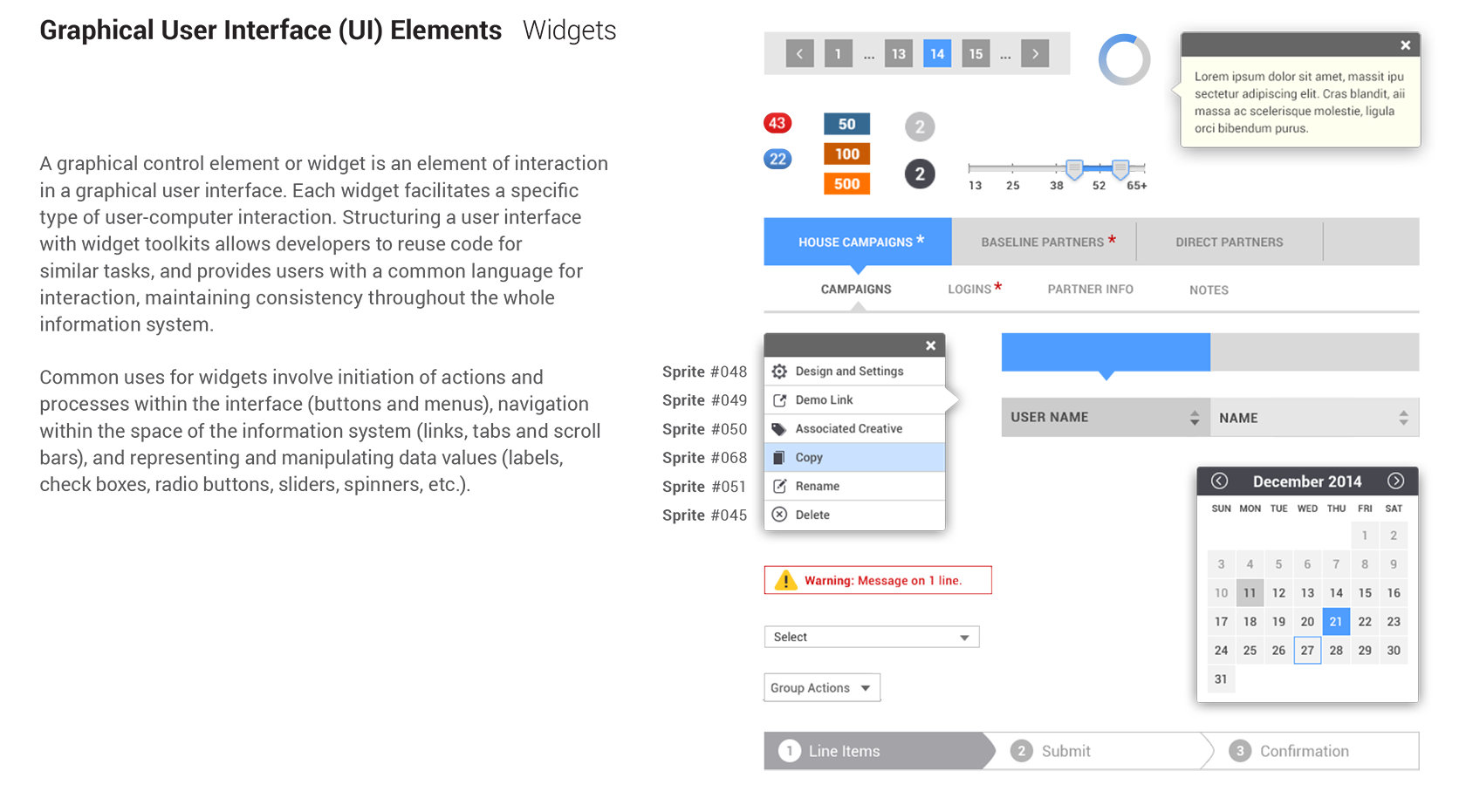
Wireframes—typically monochrome skeletons of designs created for speedy evaluation—are great. They allow us to translate input from many unrelated parties into one document that everybody can review. Many different job functions evaluate wireframes; business analysts, project managers, marketing executives, all sorts of designers and developers, various other vendors and service providers—even the target audience when product testing. The wireframe allows everybody to see how their individual needs will be addressed and gives the entire team a chance to work out all the kinks before any heavy lifting needs to occur.
There are pros and cons, but in certain cases, it makes sense to skip the wireframing phase altogether. A lot of time could be saved by handling the UX and visual design at the high-fidelity level straight after discovery or while preparing for prototyping. This would give others an opportunity to evaluate both the functionality and the look and feel of the product at the same time, from user testing participants to clients and colleagues.
Let’s find out why wireframes can sometimes be problematic, when skipping them makes sense, and how to adapt a no-wireframe process to a workflow.
The Problem with Wireframes
Whether in a waterfall or agile environment, the typical design process involves phases for research, definition, ideating, prototyping, testing, and deployment as well as many touch-points for review with stakeholders along the way.
Let’s look at the design process for examples when wireframe design can be a bottleneck:
Reason 1: Clients Don’t Understand What They’re Looking at
The design process typically starts with some kind of research into the problem. Desk research, stakeholder interviews, and user interviews are just some of the activities that may be undertaken to gain a deeper understanding. After research, the design team begins to evaluate a number of ideas and concepts in order to find the best solution.
When a concept is more fleshed out, the design team will often share a series of wireframes with the client during a review session.
The problem is, wireframes are very abstract.
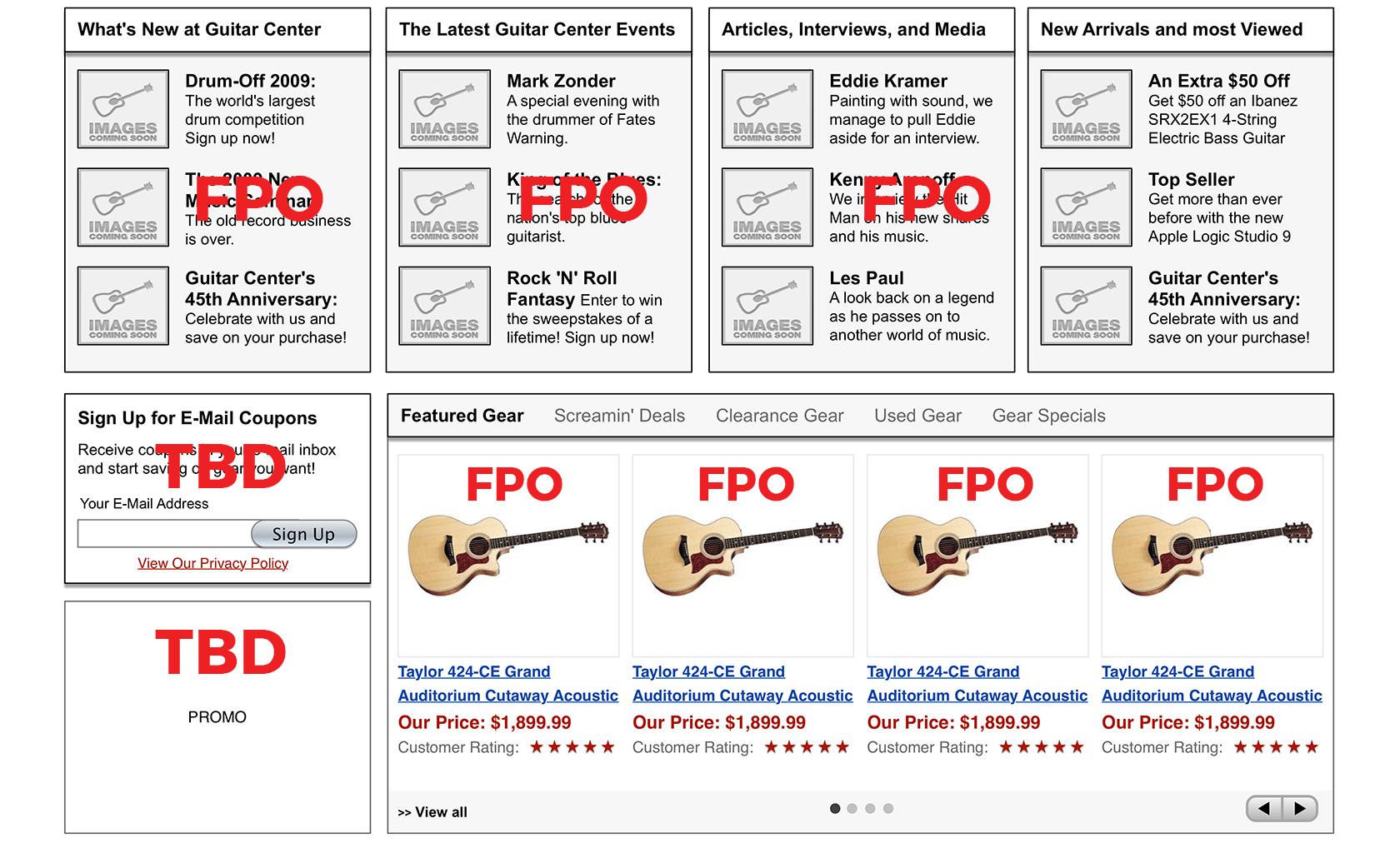
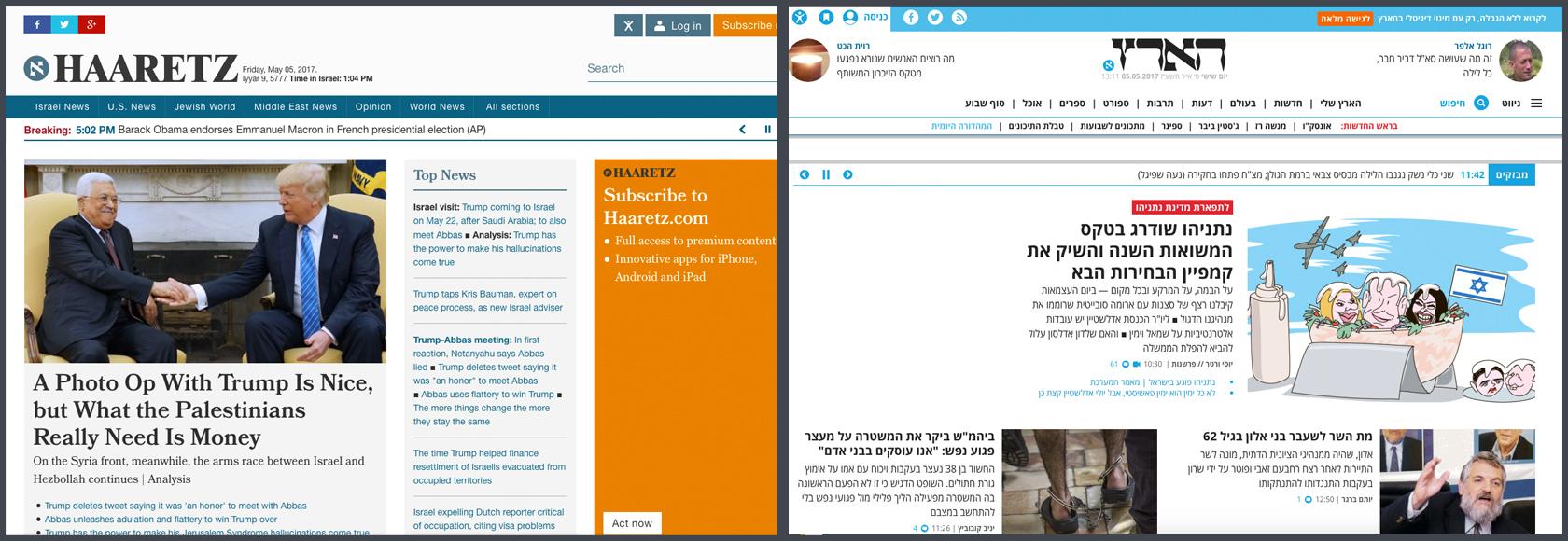
They describe something that is like the thing, but not the actual thing that will be built. At this stage, wireframes would contain placeholder images and all sorts of TKs (to come), FPOs (for placement only), and TBDs (to be decided) such as the example below.
There are probably details about functionality, business requirements, and error handling that will be indicated in a huge list of annotations. Typically, there’s never enough time to comb through these in great detail, so the client will be left to read them on their own.
During wireframe reviews, we ask our clients to focus on the concept being described and to evaluate whether or not it seems to be solving the business and user issues. However, we still get questions about things that, to us, don’t seem to be related. Clients want to know if the wireframe is the “final copy” or if they could see examples of the photos to be displayed in the hero image—or another question about something that will be handled in visual design, ui prototyping, or development.
Wireframes might be too abstract for clients and even internal stakeholders to effectively evaluate. Wireframes tell people how a design is going to be when it’s done, but they still have to do a lot of work mentally to make it come together in their heads. Our clients may or may not be visual thinkers, and it may be too much to expect them to look at a blueprint and imagine a successful product or site.
There were a few clients who have specifically requested to review annotated visual designs because it’s much easier for them to connect the dots, have a thoughtful discussion and give well-considered feedback.
Reason 2: They’re Not Always Suitable for User Testing
Hopefully, some user testing has been scheduled into the design process, as it’s a good way to test everything from the feasibility of an entire concept to the level of detail to display in a transaction.
One typical way to test these sorts of things is through prototyping.
Wireframes can—and do—work for prototyping. The design team is limited to testing flow and functionality only, and because it lacks a visual design layer, visual styles affecting user behavior can be easily ignored.
Is this wise? UX, visual, and copy design all impact one another. It’s hard to pull them apart and isolate them in a test environment. Similar to a scientific study, the results of one function tested in isolation cannot control for—or predict how—it will behave out in the wild.
Sometimes, it’s more effective to test all of these things together holistically.
Case in point: a multilingual product or service. The languages may have different grammar, alphabets, and character widths that could impact the overall design.
Moreover, since copy content affects the UX, the translation itself may affect the UX.
For example, we had an assignment where we were required to test a few different information architectures because of how various concepts needed to be explained in the local language. We wouldn’t have discovered the impact on copywriting and translation without testing the actual copy in the UI.
We discovered more words were needed to describe similar concepts in the local language, and that we would have to alter button sizes and shapes globally to accommodate the verbose wording required for that language. Without zeroing in on text issues while testing actual visual components in the UI, we wouldn’t have discovered that buttons needed to take the full width of the mobile screen, which impacted our UX design going forward.
Key takeaway: It makes sense to prepare high-fidelity UIs right from the start, especially for a multi-lingual project.
Reason 3: They Make Life Hell for Developers and QA
What inevitably happens during the visual design phase is that everything moves around. The stacked images become tiles. The centered text becomes left-aligned. The accordion trigger icons were + and -, but now they’re a couple of chevrons.
This is a normal part of the visual design process. What’s also normal is that any changes made in visual design won’t be reflected in the wireframes because the wireframes have been “signed off on.”
When all the visuals are approved, it’s time to hand everything over to developers. In most cases, they’ll receive a set of detailed, annotated wireframes and a set of beautiful visual designs along with a style guide. Now it’s up to them to cross-reference between these two documents and bring it all to life.
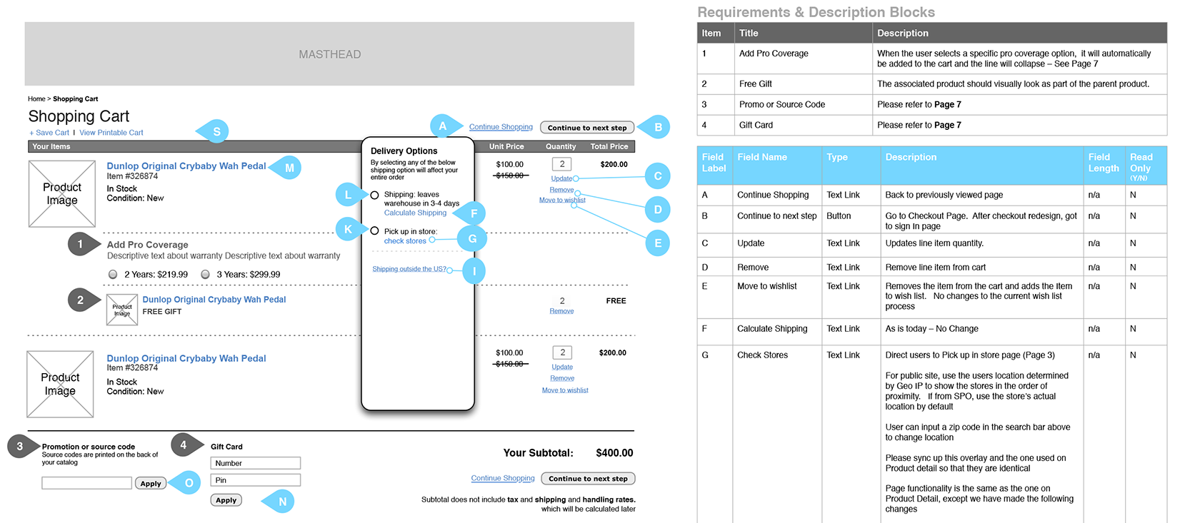
This is an area where the design process can really fail. We give developers too many documents to refer to and leave it up to them to determine which pieces of information take precedence. This increases the amount of time needed for support calls and QA, naturally impacting the time it takes to bring a product or update to market.
Why not just give developers one accurate document that includes everything? Most clients would also appreciate a copy to use as a complete reference for the work.
The Solution: Skip Wireframes
Clearly, there are times when a full wireframe phase is necessary, and there are times when it isn’t. There are even times when going straight to high-fidelity trumps the wireframe phase altogether.
You might consider skipping the wireframe phase if any of these are true:
There is solid reference material in place.
Take a look at the existing work in place. There might already be detailed UI references available. If you’re making updates to an existing website or adding a new feature to an existing app, look at the current website and app to find patterns and styles to reuse.
It would be even better if you had access to source files for the existing work. Some features and elements might have become lost in translation, so to speak, during the development process, and you could refer to the source file to see how that feature ought to have been done.
In addition to (or in absence of) an existing product or site, check to see if there’s a style guide or pattern library in place. The client may have already paid for some branding and visual design work, and these resources could be reused again for your project.
Use as many of the styles and patterns as you can find so that your high-fidelity outputs will be as accurate as possible.
You’ve scheduled a lot of iterative prototyping and testing along the way.
Save yourself some effort over the weeks of prototyping and testing. If you set up your document carefully the first time and make smart use of repeated styles, patterns, and symbols, you can easily make incremental updates in high fidelity and publish them right to your prototyping workflow. No wireframing needed.
As a big plus, you can kill two birds with one stone. You can get visual and UI feedback alongside your UX feedback and make all of these changes in one go.
Your test participants are very literal.
Just as your clients and coworkers may sometimes require concrete examples, so may your project’s target audience.
One recent gig had me designing financial screens for a low-literacy target audience. Reading comprehension was not the only issue—abstract concepts were often very difficult to address. This target audience typically needed to discuss financial concepts using concrete examples; otherwise, they weren’t able to really follow the conversation.
In order to understand the financial concepts, test participants in this audience needed to feel like they were actually transacting. And in order to understand how the product worked, it needed to look and feel like a real application.

Forget about wireframes for an audience like this! You’ll end up spending a lot of time explaining what they are—and your audience won’t be focusing on the tasks, nor how they feel about them because they can’t relate to using something so unfamiliar in their lives.
Your client has limited time and/or budget.
It’s rare to have the time, the resources, and the budget all in your favor. You can often find yourself trying to whittle down the scope and price, or scrambling to see where you can scrimp and save and still deliver a great service to your client.
If you have a client who can’t afford (or who isn’t likely to buy) a full UX workup, may I suggest cutting out the wireframing time? Create some internally if you need to, but keep the project moving for your client. Test real, tangible designs and have your client react to actual work.
How to Kill the Wireframe Phase
This part is rather subjective, as it will depend on your personal workflow and the specific needs of your client.
That being said, this is a process “template” you could initially try adapting to your workflow, and then tweak as you get more practice working this way.
Step 1: Start with your usual research and discovery process.
Interviews, field observations, desk research, competitive analyses—whatever it is you normally do (or have scheduled to do), complete this phase as you would normally.
Step 2: Sketch a bit along the way.
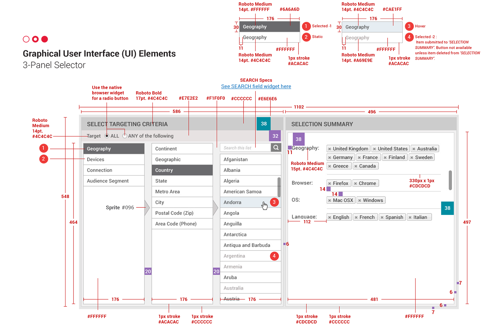
While you’re conducting research, you’re probably getting some ideas for useful layouts and patterns, engaging flows, and the like. Record these however you do usually. I like to make thumbnail sketches in my notebook, with written notes next to them. You might prefer to sketch on a whiteboard or to take screenshots of interesting UI patterns. Whatever helps you remember good ideas, do it.
Step 3: Prepare your high-fidelity document
Open your design tool of choice and set up your document properly. Choose some artboard sizes and start creating repeatable shapes, groups, and symbols.
Take the time to save the brand color palette as individual swatches, create and organize type styles, and make standard drop shadows and filters that you can apply across all shapes as necessary.
Spend a lot of time getting your symbols just right. You might have a button that, depending on its state, could have four different colors. Make use of symbol overrides—if you can—so that you can easily apply different colors and text labels as needed.
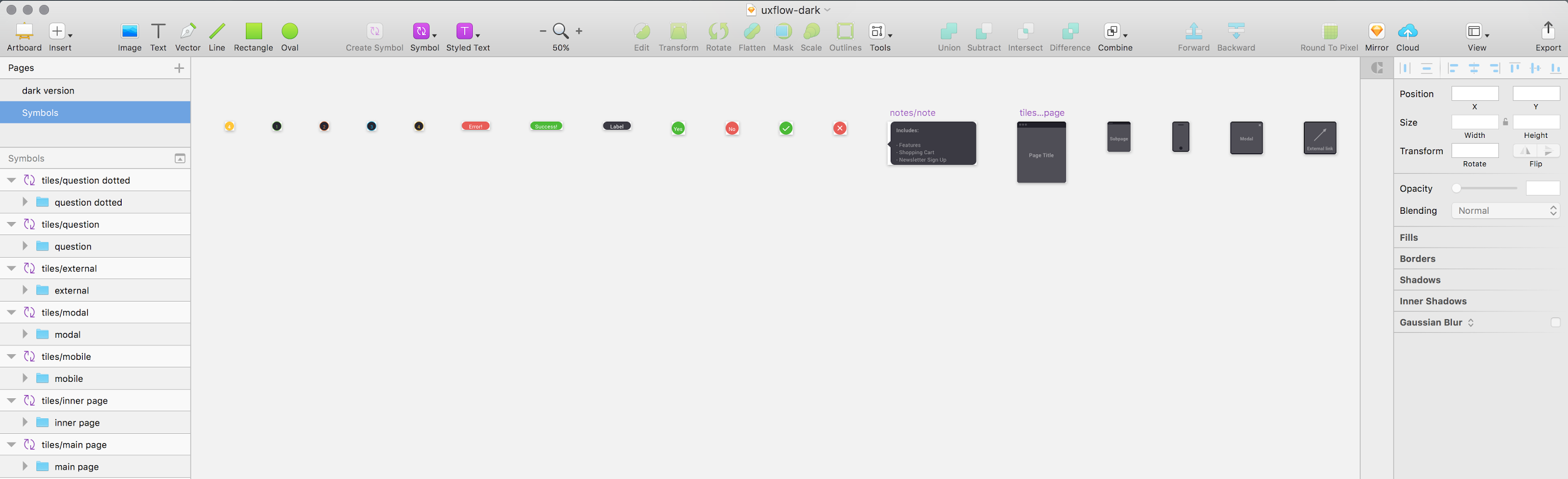
If there are any custom icons used, save them as individual symbols on a square artboard (or whatever shape is appropriate). That way, it will be easy for you to scale them up and down while still maintaining the proper spacing and alignment.
Step 4: Start designing.
Your first round may be a little rough as you get used to working in this fashion and seeing where your style guide holds up (and where it doesn’t). As well as creating solutions for patterns that don’t already have a defined style, expect to be doing quite a bit of tweaking to get all of the styles right.
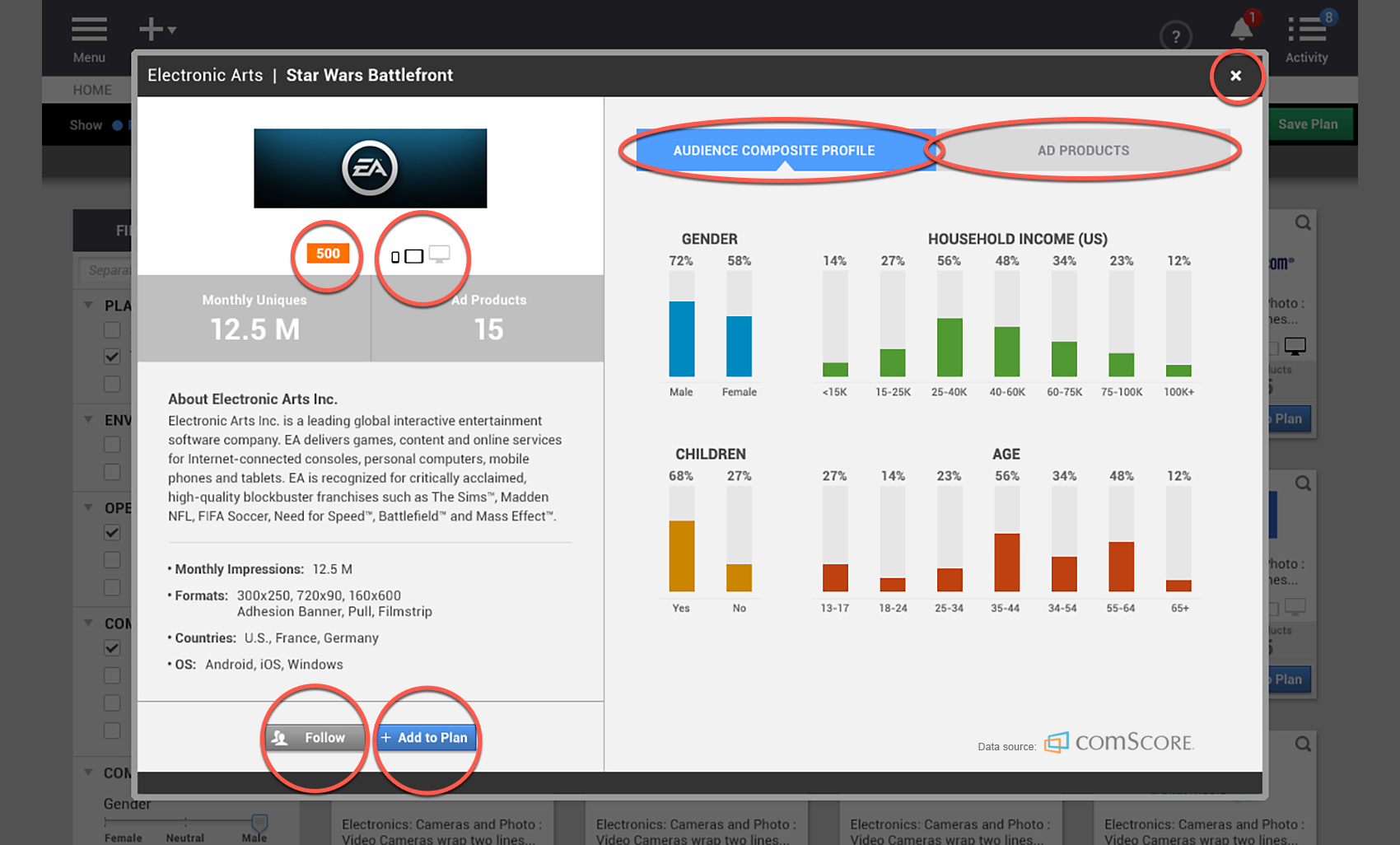
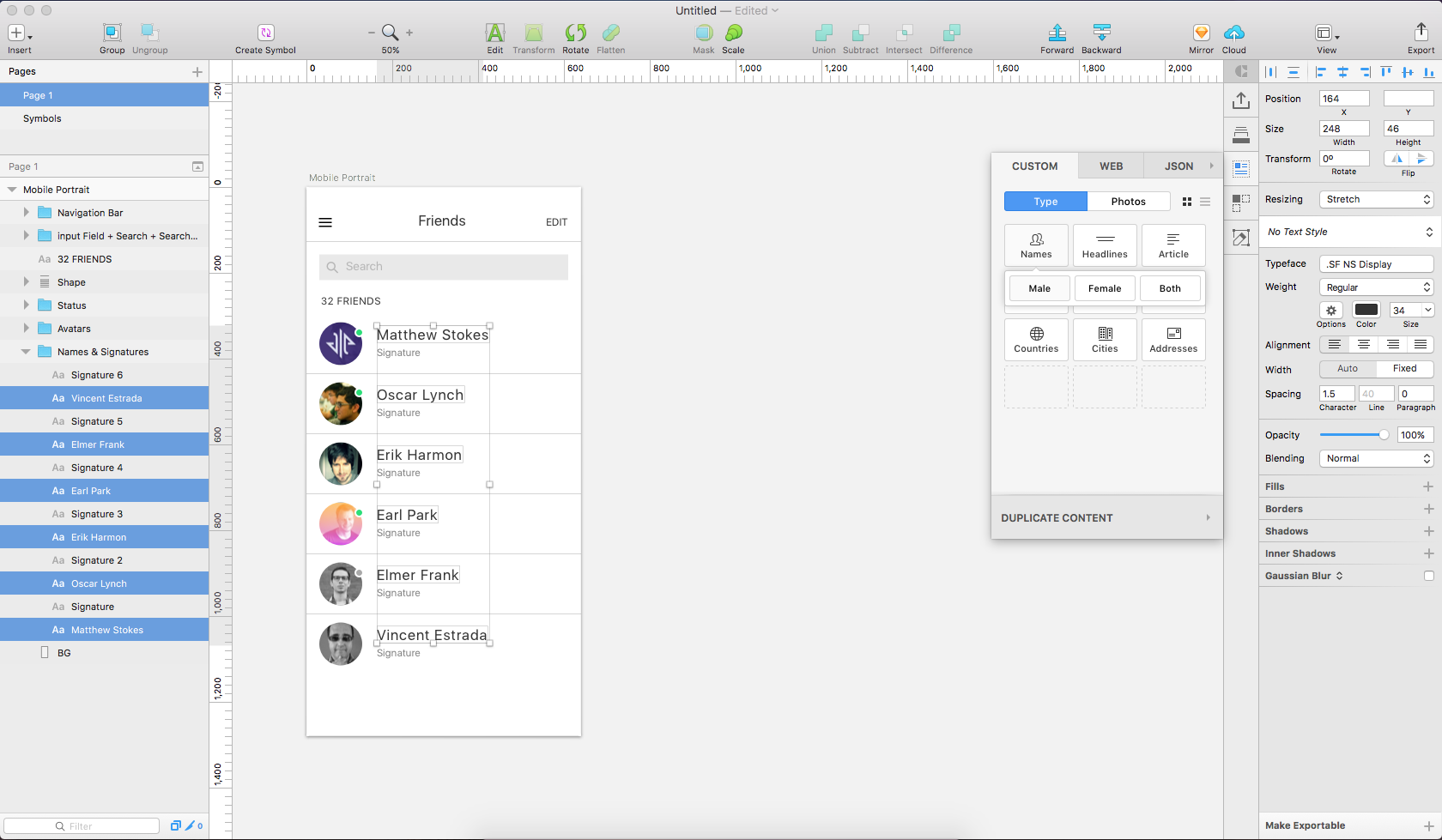
Throughout this process, go with good “copy direction” or with real copy if you have it. Don’t make titles that say, “Page title goes here.” Give the viewer a sense of what would go here if it were real.
Likewise, don’t create a list of names that all say John Smith with the phone number 555-1212. Use a random list generator or plug-in to make different names and numbers, or create whatever data set you need to display. This may seem like overkill, but it lets you solve issues with layout and character widths, and helps your viewer understand that those five entries are all different.
Step 5: Know when to stop designing.
There are some details that you shouldn’t take care of at this point because they truly will take too long. Perhaps it’s choosing the exact image to go into a hero, or designing a custom icon to indicate a download state. These are some cases where you might choose to use a placeholder image or icon and test real imagery or iconography at a later date.
You’ll have to make the call on what’s appropriate here, as it will depend on the objectives of the project, as well as how far along you are with it.
Note that it may depend on what your user test participants need in order to properly evaluate the work. For the low-literacy target audience I mentioned above, nothing was too much detail. For each participant, I made a variant of the prototype with their real name and phone number used throughout so that the application really felt like it was “theirs.” The less they had to assume, the easier it was for them to follow, and the better my results.
Step 6: Enjoy high-quality feedback and test results.
Publish your designs right to your prototyping tool of choice and bring them to the field for testing. You can now get feedback on more than just the functionality. You can uncover potential visual problems, such as issues with color contrast or legibility, and you can discover issues with copy direction or translation. You can also tease out positive or negative feelings users may have about the look and feel or the branding.
These are all things you were probably going to get feedback on anyway when you got to the visual design phase. Why not get all that feedback now? Some of the feedback on visuals could directly affect the UX, and vice versa, so it’s good to work all of this out at the same time if you can.
Wrapping Up
Undoubtedly there are many cases where a full wireframe phase is necessary to the success of the project. A complex design, like a responsive web application, needs a separate and dedicated focus on wireframes. It would save time and money to work out all of the business requirements, edge cases and error handling at the wireframe stage, than it would be if a full visual layer had already been concepted and applied.
However, in the right cases, going straight to high fidelity can improve your process:
- Improve stakeholder feedback. Clients, developers, other designers, and test participants from the target audience can see exactly what they’ll get, enabling them to give higher-quality feedback.
- Speed up your prototyping workflow. Not only will your designs be ready to test right away, you can get feedback on a number of things at once: the UX, the copy, and the visuals.
- Deliver a single document to clients and developers. Eliminate the need to cross-reference and check a variety of documents to understand how a button should work. This is also a great way for your client to discuss the work with their internal stakeholders to get you even more feedback.
- Save time and money. And that’s pretty much always a good thing!
Give this approach a shot next time you have a project where you have some existing design materials to refer to, or where it will make a big difference to your audience if the work is in low or high fidelity.
Further Reading on the Toptal Blog:
Jen Randolph
New York, United States
Member since November 12, 2015
About the author
Jen has a decade of experience designing award-winning experiences for top agencies, brands, and startups such as Nike, P&G, and R/GA.
Expertise
PREVIOUSLY AT