Are All Trends Worth It? The Top 5 Most Common UX Mistakes Web Designers Make
Are the hazards worth it when designers turn into web design trend-chasers? Web design trends, if not considered carefully and implemented with caution, could lead to several common UX mistakes.
Are the hazards worth it when designers turn into web design trend-chasers? Web design trends, if not considered carefully and implemented with caution, could lead to several common UX mistakes.
Bojan is a senior web designer and front-end developer proficient in UX design with 12 years of experience designing for web and mobile.
“Elegance is achieved when all that is superfluous has been discarded and the human being discovers simplicity and concentration: the simpler and more sober the posture, the more beautiful it will be.” –Paulo Coelho
A web designer’s mission is to create engaging user experiences, help site visitors accomplish tasks, and increase conversions. In the process, they often only focus on aesthetics, take shortcuts, and end up relying on various common design patterns and trends. The danger in this is that they can get sidetracked by popular trends, and consequently, common UX design mistakes are made because the trends are inappropriately deployed.
When it comes to the web, people don’t want to learn things, they want to do things. There are plenty of examples on the web where designers opted to focus only on visual appeal and in so doing, sacrificed usability. They presumed a “wow moment” which drove the design would be powerful enough in itself to engage the user. But sadly, the users are having a hard time understanding the UI, have genuine difficulty using the site, and the site’s bounce rates have skyrocketed.
As Kate Rutter stated, “Ugly but useful trumps pretty but pointless.” The key to using web design patterns and trends effectively is to find a balance between what looks aesthetically pleasing and where they add value.

Let’s look at some common UX mistakes.
Web Design Common UX Mistake No. 1: Large, Fixed Headers
More and more tall sticky headers can be seen on websites. “Branding blocks” and navigation menus that have a fixed position and take up a significant amount of space. They stay glued to the top of the browser window (the “sticky header”) and often block the content as it scrolls underneath them.
Some headers on big-brand websites are over 150 pixels in height. Where is their value? Fixed elements, such as sticky headers can have real benefits, but web designers should be careful using them—there are several important UX issues to consider.
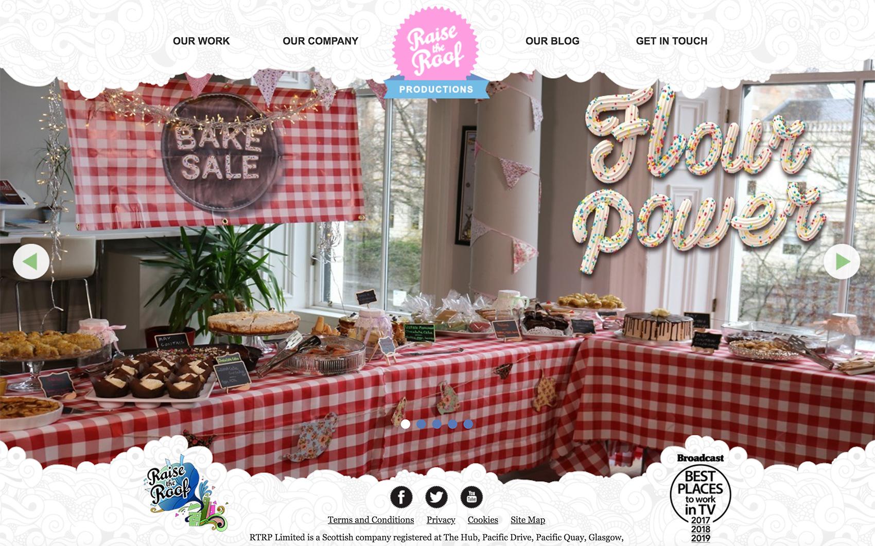
The Sticky Nav Header May Be Too Big for Comfort
If the decision to go with a sticky nav header has already been made, it’s best to test it with users. It’s a common UX mistake to go overboard and stuff the sticky nav header with content. With a fixed header, browsing should still be comfortable for visitors. Failing to find the right balance may result in leaving a small amount of room for the main content and a stifling, claustrophobic site experience for visitors.
Sometimes there is a simple workaround with CSS: by making the sticky header slightly transparent, people are still able to see content through it as they scroll, which makes the content area feel more substantial.
Here is an example of a tall sticky header: ATP’s player profile page on Roger Federer.
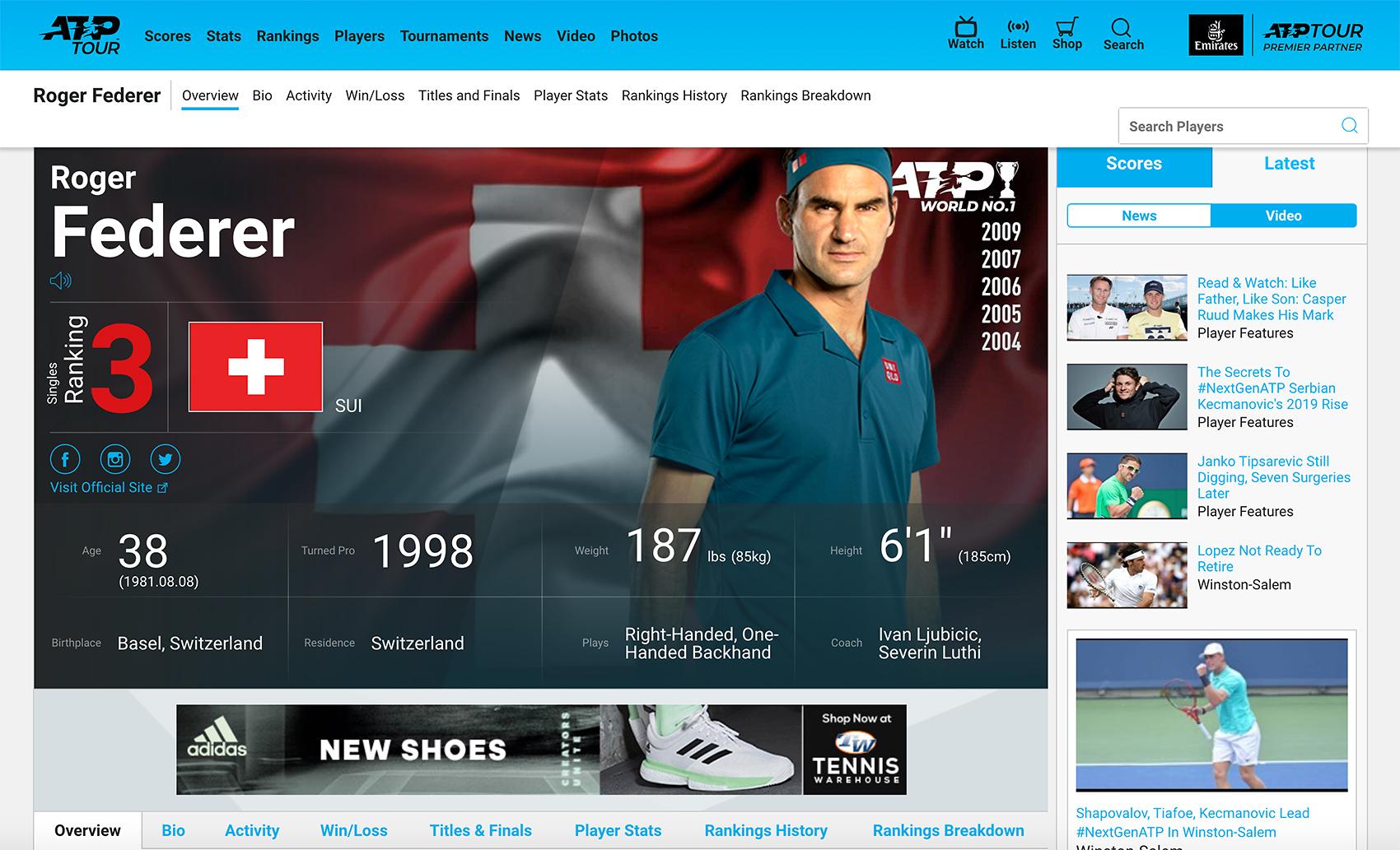
This site’s sticky header has a height of over 180px! That’s over 30% of the entire page height on some laptops: a poor user experience that’s avoidable.
Not Considering the Sticky Nav Header UX Issue on Mobile
Some people may be using large, high-resolution computer displays where a sticky nav header could speed up interactions, but what about mobile? Without a doubt a significant number of site visitors would be accessing the site from a mobile device, so a fixed header may not be the best idea. Luckily, responsive design techniques make it possible to design different solutions for different platforms, and stick with the sticky nav header—pun intended—for desktop browsers.
The Coffee with a Cop site also has a fixed header, but much smaller—less than 80 pixels tall.
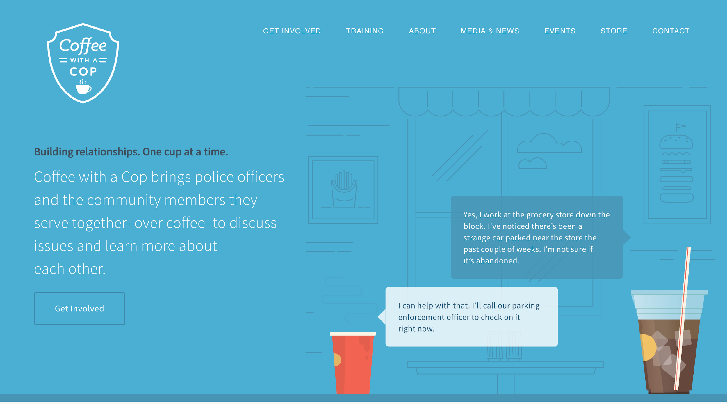
The header navigation, in this case, is arguably the right solution for high-resolution screens, as it enables more efficient navigation. On smaller resolution screens, the header is also fixed but takes up a considerable amount of space. An excellent alternative to a sticky nav header on mobile is the ever-present hamburger menu. Although this pattern is not a universal problem-solver, it does free up a significant amount of space.
Web Design Common UX Mistake No. 2: Thin, Light Fonts
These days thin, light fonts are pervasive on numerous mobile apps and websites. With the advance of screen technology and improved rendering, a lot of designers are using them because they are elegant, clean, and trendy. However, thin typefaces can cause usability problems and therefore hamper the UX.
The goal of all text on a website is to be legible, and thin type can seriously affect readability. Not all visitors will be viewing a site on a display that renders thin type well. Some light type is challenging to read on an iPhone or an iPad with a Retina display.
Above all, text must be legible. If users can't read the words in your app, it doesn't matter how beautiful the typography is.
Apple Human Interface Guidelines
Apple is referring to mobile apps, but the same principle applies to websites. Legibility is mandatory, not optional for good usability. There is no point putting content on a website if it is unreadable.
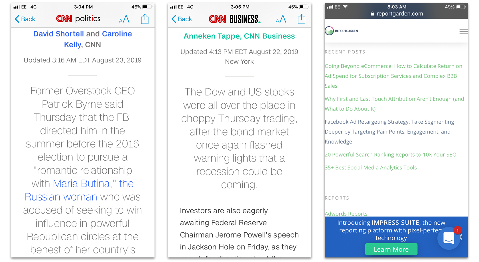
Here are some common UX mistakes to consider before using thin type:
Using Thin and Light Fonts Because It’s Trendy
Fonts should not only look good, but they should also be legible. To achieve proper contrast and legibility, designers should strive for the optimum combination in their designs: size, weight, and color.
It’s best to test the site on various devices and screen sizes to ensure all site text is legible.
Which leads us to the next common UX mistake:
Not Testing the Text Legibility on All Major Devices
Thin, light type may look good on many designers’ expensive, finely-tuned monitors, but the average user who often see our designs on cheaper, substandard displays must also be considered. The best practice is to check how fonts look on all major devices: desktop computers, laptops, tablets, and smartphones.
For example, while testing a mobile design, have participants use the site on mobile devices in daylight—real-world users will not always have perfect browsing and lighting conditions. If using a thin font on a website, there’s a simple way to adapt to mobile users: specify a thicker font on mobile for better readability.

Web Design Common UX Mistake No. 3: Low-Contrast Text
Using low color contrast elements have also become trendy in modern user interface design. It grew out of a minimalist design trend because by reducing contrast in some areas, the design would appear “minimalist.” Designers couldn’t cut the complexity of information that needed to be presented, so they played with low contrast in the design.
We have already covered thin fonts, but there is an even bigger pitfall: a combination of a light typeface with low contrast that seriously impedes UX due to lousy readability. Designers should do anything they can to avoid this usability trap.
Low Text Contrast in Body Copy
Cool Springs Financial uses a thin variant of Helvetica for body text on its website. While it looks elegant and contributes to an aesthetically pleasing UI, it’s difficult to read on several platforms. While low contrast is not necessarily bad, it can have a negative impact on the usability of a website by making text hard to read.

Not Testing Text Contrast
There is a nifty tool for contrast checking on the web called Colorable that will help designers set correct text contrast according to Web Content Accessibility Guidelines. Once designers know they are using the right text contrast, they can adjust other colors on their website and do a quick multiple device/user tests to make sure the text is readable.
Web Design Common UX Mistake No. 4: Scroll Hijacking
Another high-risk trend gaining ground on the web is the “scroll hijack.” Websites that implement this trend take control of page scrolling (usually with JavaScript). When people encounter it, they no longer have control of the page scroll and are unable to predict its behavior, which can easily lead to confusion and frustration. It’s a risky experiment that could hurt website usability and at worst, induce “computer rage.”
Some websites can get away with scroll hijacking, but that doesn’t mean everybody can. For example, many web designers follow Apple’s sites with scroll hijacking, parallax effects, and high-resolution images of various products. Apple has its target market, a unique concept, and exclusive content for their website. Since every site has unique problems, it also must have unique solutions tailored to those problems.
Not Testing with Real-World Users
When borrowing trendy ideas or UI patterns, it’s best to test the prototype of a website on real-world users to avoid common UX issues. Simple usability testing will reveal whether the implementation of a scroll hijack, for example, is feasible or not. Without testing, designers have no way of knowing if scroll hijacking will work, and making assumptions is often costly.
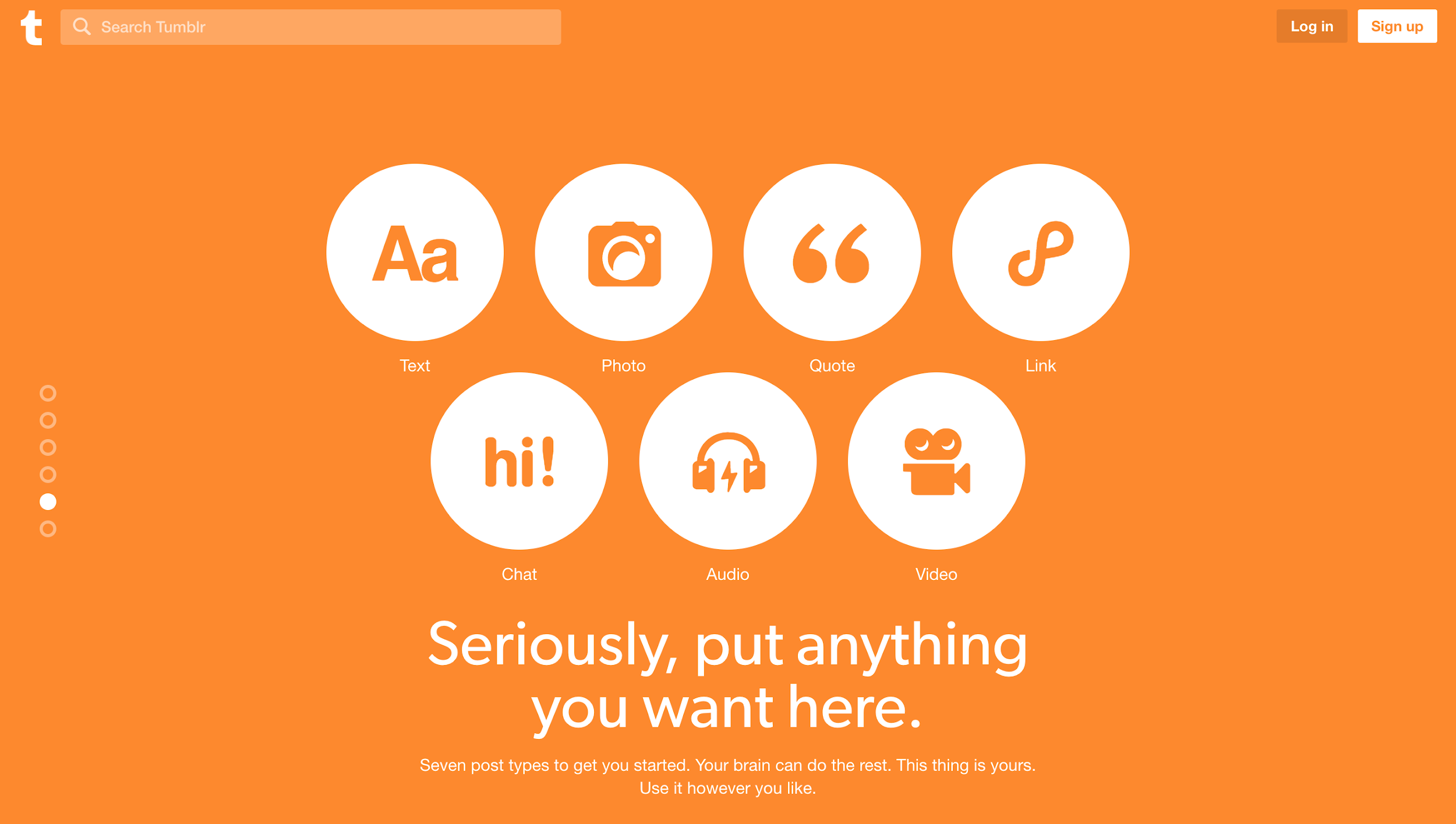
Tumblr, a popular personal blogging site, uses scroll hijacking on their homepage. While doing so could be risky, it’s safe to assume they know their target audience well and the cool, hip user experience they want to present. When site visitors start to scroll, the scroll is hijacked, and people are taken to the next section.
The long scroll page is broken into several sections which are distinguishable by a heavy dose of saturated colors and prominent indicator dots on the left side of the window. As a result, Tumblr’s homepage feels like a big vertical carousel visitors have control over, rather than an unpleasant, experimental website with a mind of its own.
Web Design Common UX Mistake No. 5: Carousels
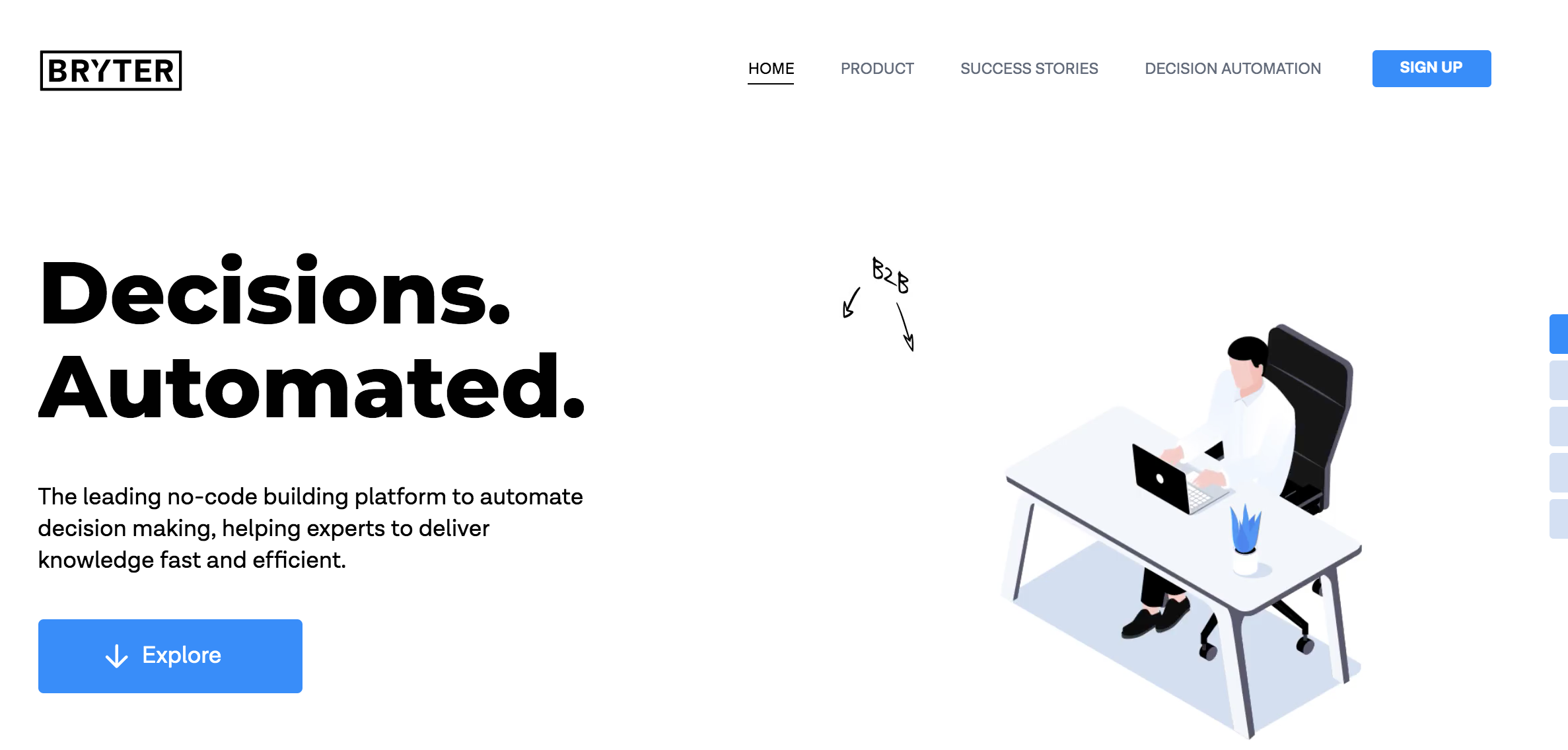
Carousels—a slideshow UX for rotating through a variety of content—are very common on the web, especially on landing pages and homepages. While they can be useful, they have numerous usability issues and therefore qualify as another common UX mistake. According to the Nielsen Norman Group: “people often immediately scroll past these large images and miss all of the content within them.” It could negatively impact UX as visitors may not see valuable content in some of the rotating slides.

Website Carousels May Not Provide Value for Users
If done right, a carousel can engage users with large striking images. The trouble is, carousels often don’t add any additional value but are simply there for decoration and only included because everybody else is using them. A way to test if a site carousel makes sense: write down three benefits a carousel provides for the visitor. If three meaningful benefits can’t be found, it doesn’t add any value.
The previous and next Arrows Have Low Discoverability
Important information in a website carousel could remain hidden if the next and previous arrows are not discoverable. The controls should also be tap-compatible for mobile.
Often there are no arrows to control the carousel; only the slide indicator dots are included to advance the slides. However, they are often low contrast, have low discoverability, and lack a large enough clickable or tappable area. The small clickable targets may lead to poor UX, a frustrated website visitor, and a quick exit from the website.
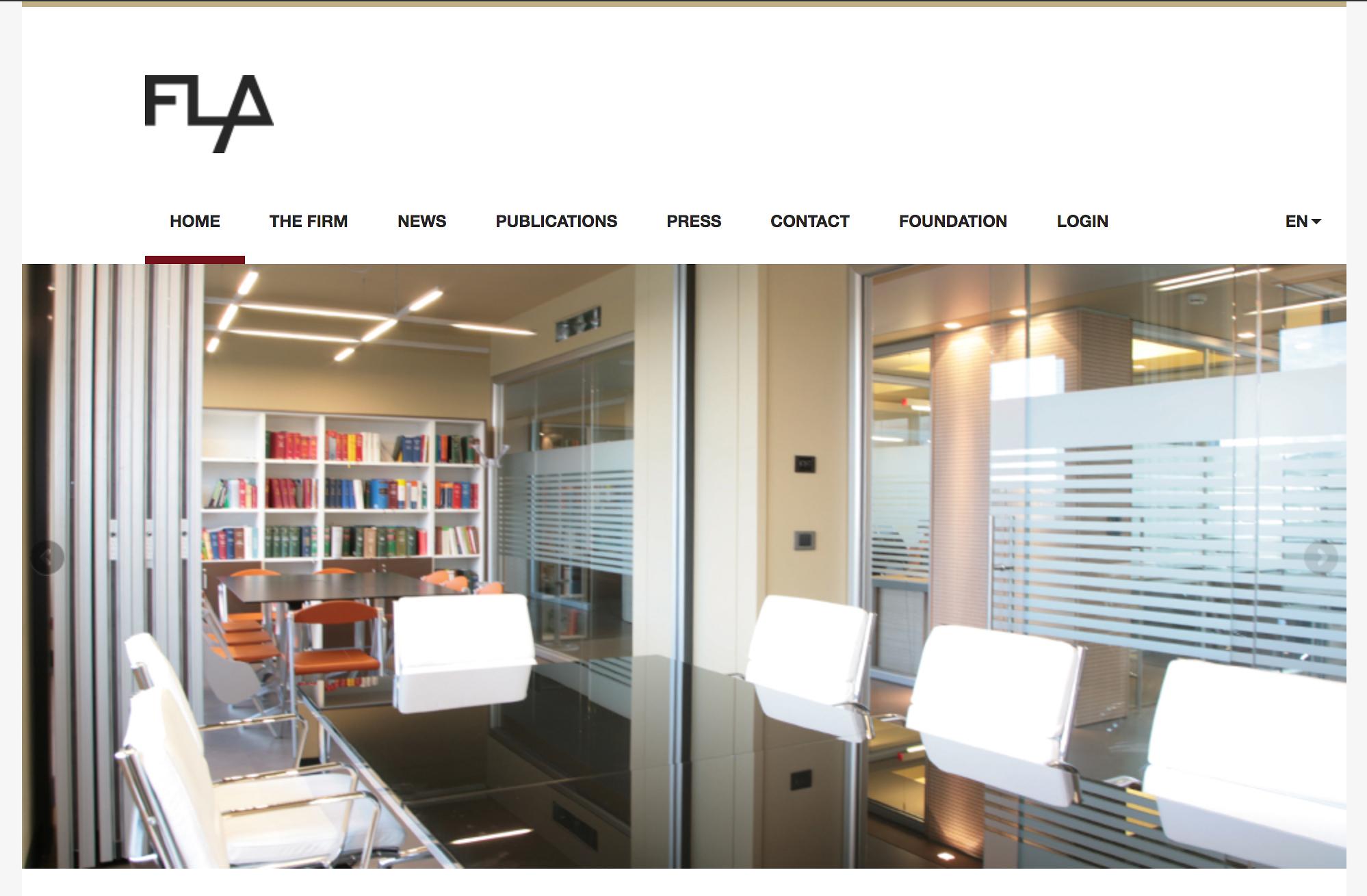
For example, the Floresta Longo Foundation website has a rotating carousel of images on its homepage. It’s set to autoplay and rotates through five photographs. The previous and next arrows, however, are small and transparent, which makes them hard to spot and challenging to click. There are no indicators for the slide visitors are on, and no labels to signify what the images represent. The images are not links and act as pure decoration. While this type of carousel may hold some value for engaging the visitor, overall it leaves a lot to be desired.
Conclusion
Web design trends, if not considered carefully and implemented with caution, could lead to several common UX design mistakes. UX designers should use their best judgment and not be afraid to innovate, but to ensure great website usability it would serve them well to test their design thoroughly with real-world users.
In the crazy profusion of web design trends, things in vogue come and go. Amid this chaos, the balanced use of aesthetics, efficiency, and usability plays a significant role in distinguishing the UX trends that have proved to be the strongest and garnered the most user acceptance.
Web designers can come up with the coolest color scheme, the fanciest scrolling animation, or the most fantastic parallax effects, but if the human interaction suffers as a result, the UX will be poor, and people will quickly move on. Another site is just a click away.
Further Reading on the Toptal Blog:
- UI Design Best Practices and Common Mistakes
- Mobile App Design Best Practices and Mistakes
- The Comprehensive Guide to Information Architecture
- Empty States: The Most Overlooked Aspect of UX
- Numbers Shouldn't Lie: An Overview of Common Data Visualization Mistakes
- Play Is the Point: How UX Designers Can Break Into the Gaming Industry
- The Ultimate UX Guide for Designers and Organizations
Understanding the basics
What is a fixed header?
A fixed header typically refers to a navigation bar in a fixed position in web design that “sticks” to the top of the browser window. It is, however, a common UX mistake to use it without looking at how it affects the website’s usability, especially on mobile. It’s best not to use it with mobile browsers.
What is the benefit of responsive design?
Responsive design in web design has many benefits. They can be developed once instead of multiple versions for different devices, and responsive websites adapt to all screen sizes and resolutions, not only on desktop but also on mobile, tablet, and sometimes even TV.
Why do we need responsive web design?
The reason why we need responsive web design is because businesses without a mobile site will be left behind. Most website visitors will stop engaging with a website that doesn’t display well on their device. What is more, Google ranks websites that are not responsive lower in their search.
What is a normal font weight?
Normal font weight is meant for setting the weight (boldness) of the font, and it refers to the “normal,” or regular appearance of a font. Other font weights may be heavy, bold, semi-bold, thin, light, etc. which refer to the thickness type variant of a normal font.
What is contrast in color theory?
Color contrast is the visual difference between two colors. A good way to see contrast is to put one color on top of another. If the colors are high contrast, it will be easy to distinguish one from the other. If they are low contrast, they will appear to blend together. Contrast is crucial to color accessibility.
What is good UX?
The first requirement for excellent user experience is to meet the exact needs of the customer, without fuss or bother. Great user experiences deliver exactly what people want at the right place, at the right time, in the right way, and are a must if digital product design is to succeed.
Zabok, Croatia
Member since August 22, 2014
About the author
Bojan is a senior web designer and front-end developer proficient in UX design with 12 years of experience designing for web and mobile.


