A Guide to Effective User Onboarding Best Practices
User onboarding best practices help designers create an onboarding experience that works well from the start. Knowing which onboarding pattern works best for each type of app puts designers ahead.
User onboarding best practices help designers create an onboarding experience that works well from the start. Knowing which onboarding pattern works best for each type of app puts designers ahead.

Cameron Chapman
Cameron comes from a design background and is the author of two web design books: Color for Web Design and The Smashing Idea Book.
Expertise
User onboarding varies significantly between platforms and individual applications. Without proper onboarding, people are left confused about how to use an app and how it can benefit them. With so many apps available, customers generally won’t take the time to learn one through trial and error when they can choose something similar that simplifies the learning process.
Lack of good onboarding is one reason people abandon apps in droves. UX designers can be tempted to rely entirely on onboarding examples similar apps use, often turning to onboarding teardowns. Those teardowns come with limitations—namely, that the people doing them generally lack information about onboarding conversion rates, internal goals, pressure from product teams, and even legal constraints.
New User Onboarding Starts with the Customer
Apps have one chance to make a first impression. With one in four people abandoning an app after the first use (and more than 70% of people eventually quitting mobile apps), that impression is vital to a brand’s success.
By the time a person gets to an app’s onboarding process, they’ve already cleared the most significant hurdle—downloading the app. Onboarding then introduces people to the app’s functionality and encourages them to keep using it.

There are generally two types of people who go through app onboarding. The first are users who are entirely new to the product and haven’t used a web (or desktop) version of the app in the past. Then there are people who are trying a different version of an app they already use.
It’s smart for designers to think through use cases for both types of people. Someone who’s already used a version of the product will have an idea of what the product does and how it works. They’ll need onboarding for the specifics of the version they’ve just downloaded.
Completely new customers need more guidance on what the app does and the features it includes. They’ll want to know what the app can do for them in addition to how to do it.
Designers can figure out which type of person is using the app for the first time by asking them to log in if they already have an account. That doesn’t mean that requiring entirely new users to sign up is necessary at this point. More on that later.
Once a designer has thought through the goals of a new customer, they can map out the journey that person will take to get there. The best onboarding experiences are built around these customer journeys.
More complex apps require more thorough new user onboarding. An email app might only need a few hints and tips for new customers. But a more complicated app, like one for project management or photo editing, needs more thorough onboarding.
Friction Is the Enemy in Onboarding UX
Friction in a new user onboarding experience is the quickest way to get people to abandon the app. Friction can occur at a number of points in the onboarding experience. Designers should identify those areas within their apps and address them in user-friendly ways.
One potential danger for onboarding is that it can become more complex than the app it’s introducing. If the app is simple (i.e., a list app), the onboarding should be simple, too. If an app has more complex features, onboarding can be more complex. Providing the person the information they need to use the app should still be kept as simple as possible, though.
Tailoring the onboarding UX to the experience level of the customer is key to reducing friction. Completely new customers who have never used any version of the app will need a bit more hand-holding in the onboarding process than someone who’s using a different app version or platform.
Using personas for the two types of customers helps designers figure out what information each needs. Onboarding can then be tailored to each, giving them the knowledge they need without boring them with information they don’t (or leaving them questioning different functions).

Requests for permissions is one of the biggest points of friction, particularly on mobile apps. When an app needs access to features like a phone’s camera, notifications, or location, it’s smart for designers to prime customers before they get a permissions popup.
Most apps handle this in their onboarding by showing a popup that explains why they need the permissions. Another user onboarding best practice is to make sure permissions are only asked for when necessary for the app to function and once customers have gained trust in the app.
A notifications request that comes when a person logs in for the first time is more likely to be rejected since the person doesn’t yet see the value in those notifications. On the other hand, a request from a photo editing app for access to a phone’s camera or photo gallery functions popping up soon after logging in presents a lower barrier because the person can see the necessity in granting those permissions—it’s the purpose of the app.
App designers need to remember that they only have one (easy) shot to get people to grant necessary permissions. Asking for permissions too soon or without justification can mean people won’t grant those permissions. If that happens and they later want to use those functions of the app, they’ll have to go through a much more complicated process in the settings to grant permissions.
Parts of a Great User Onboarding Experience
The goal of onboarding is to get people to the point where they see exactly how the app can help them. It’s getting them to the “aha” moment that delights them with their choice to try something new.

Different companies take different approaches to creating new user onboarding. The most common, however, aren’t necessarily the ones that work best. User onboarding best practices vary based on the specific type of app, with some patterns perfect for one type of app but terrible for another.
Welcome Screens
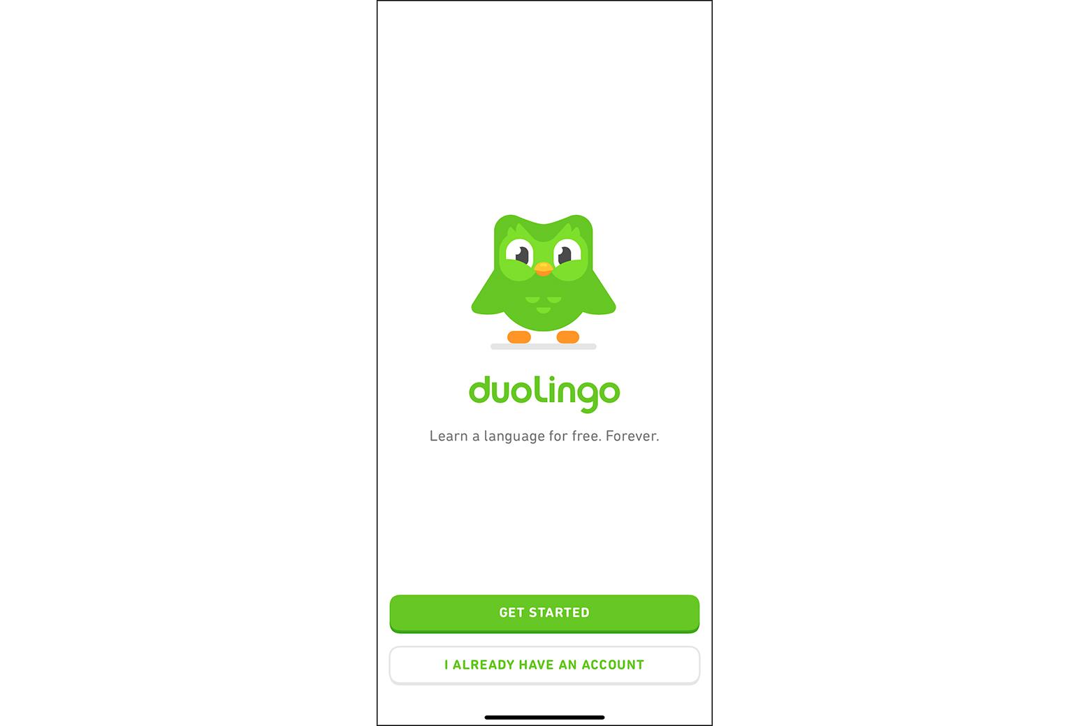
Welcome screens are one of the most common elements of any user onboarding experience. These screens serve to introduce a new customer to an app. Sometimes, they contain no other content besides a welcome message, but other times they’re combined with log-in or sign-up options. If those things are necessary to the functionality of the app, it’s a good idea to get people to them immediately, so the welcome screen makes sense.
In cases where logging in or signing up for an account isn’t immediately necessary to benefit from the functions of an app, UX designers should consider it a best practice to skip that step (or make it optional) until a person reaches a point where it’s essential.
Product Tours
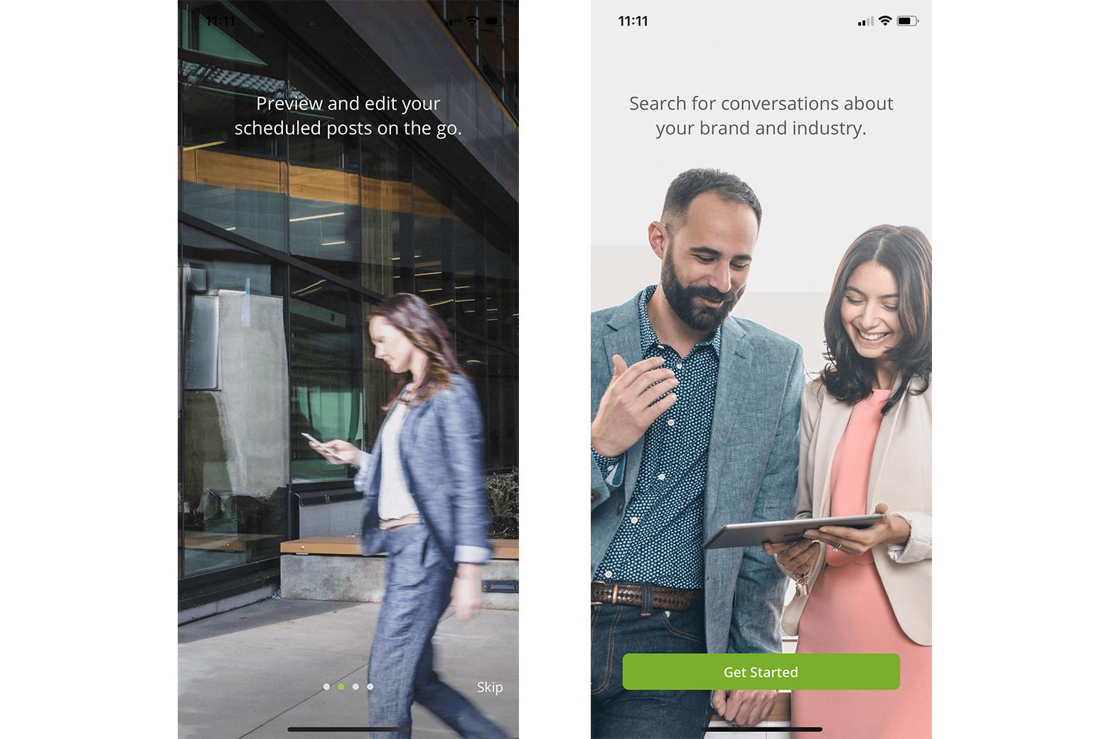
Product tours generally take two forms in user onboarding: video to give people a walkthrough of how the app works, or a slideshow format with a series of screens.
While product tours can provide people new to an app with valuable information, the number of people who actually take the time to go through them isn’t always high. How often do people simply use the “skip” feature or close a video and dive directly into using the app? People are impatient and don’t want to spend a lot of time on things they view as “useless” regardless of whether that assessment is accurate.
There are some use cases where a product tour makes more sense than other types of onboarding. Camera apps are one example, as patterns like meta onboarding (covered later) don’t work well for that type of functionality.
Progress Bars and Checklists
Showing people the progress they’ve made in the onboarding process is one way to keep them interested and moving forward. Progress bars trigger the urge for accomplishment in people. They want to finish the things they start, and seeing the progress bar chart their movement is a strong motivator.
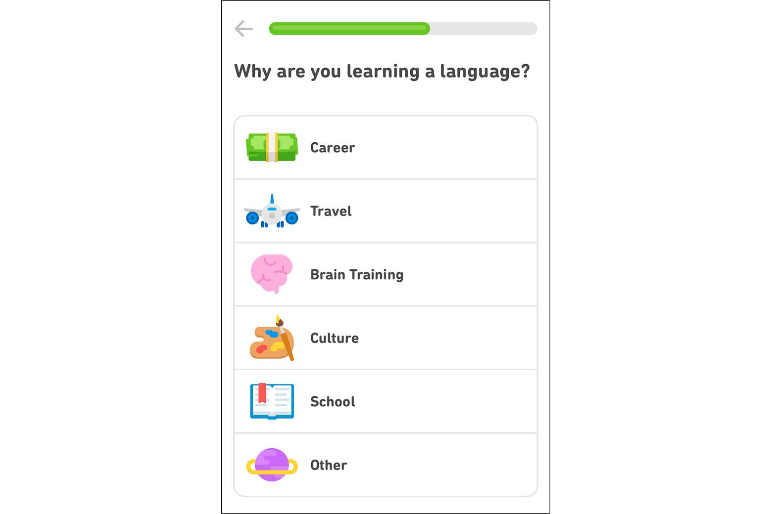
Checklists can similarly trigger the accomplishment motivator. People like checking things off a list, and showing them exactly which steps they’ve completed and what’s left is similar to the purpose of a progress bar (but with more detailed information).
Tooltips and Hot Spots
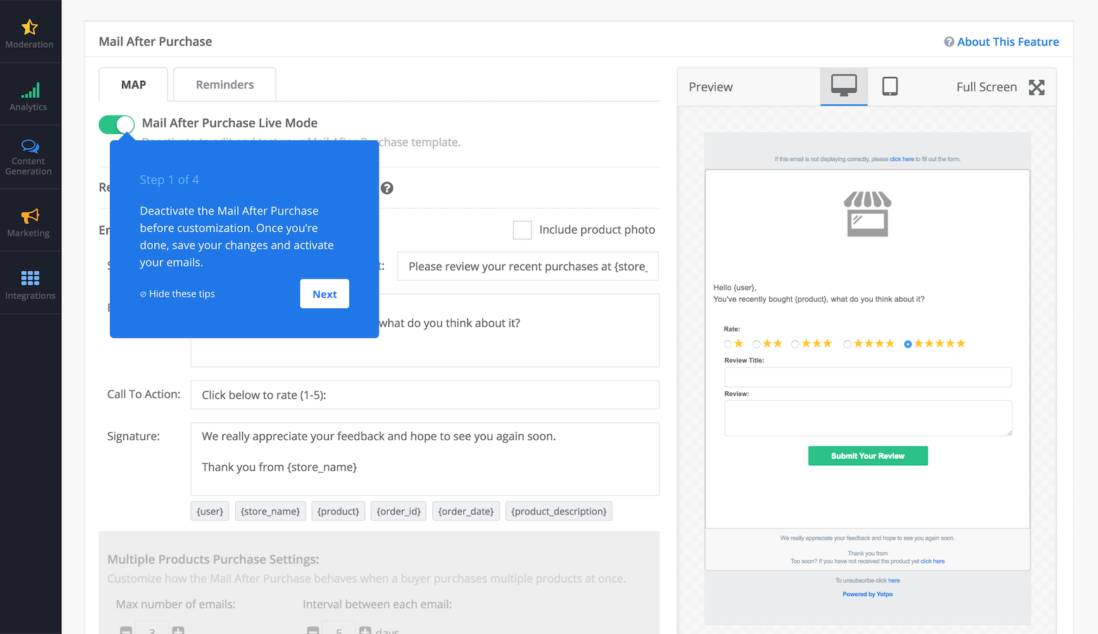
Some apps skip product tours and welcome screens and opt to show people tooltips and hot spots instead. This is more common on desktop and web apps than mobile apps due to the increased screen real estate (and the ease of clicking on a tooltip or hot spot rather than trying to tap one).
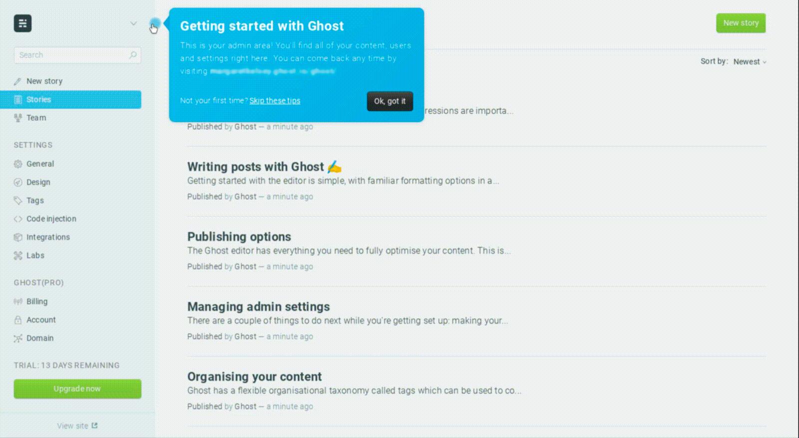
Allowing customers to explore functionality at their own pace and when they actually need to use different parts of the app makes this an excellent onboarding strategy, especially for users switching from a different platform for the same product.
Meta Onboarding
This is arguably the best way to onboard new customers for most apps, whether on mobile, desktop, or web. So-called meta onboarding teaches people to use an app by using the app—think of tutorial levels in video games.
A to-do list app might use a list pre-populated with instructions (such as “swipe left to delete” or “swipe right to mark done”). A Markdown writing app might start with a document that explains what each function does. The person learns to use the app by completing the actions listed.
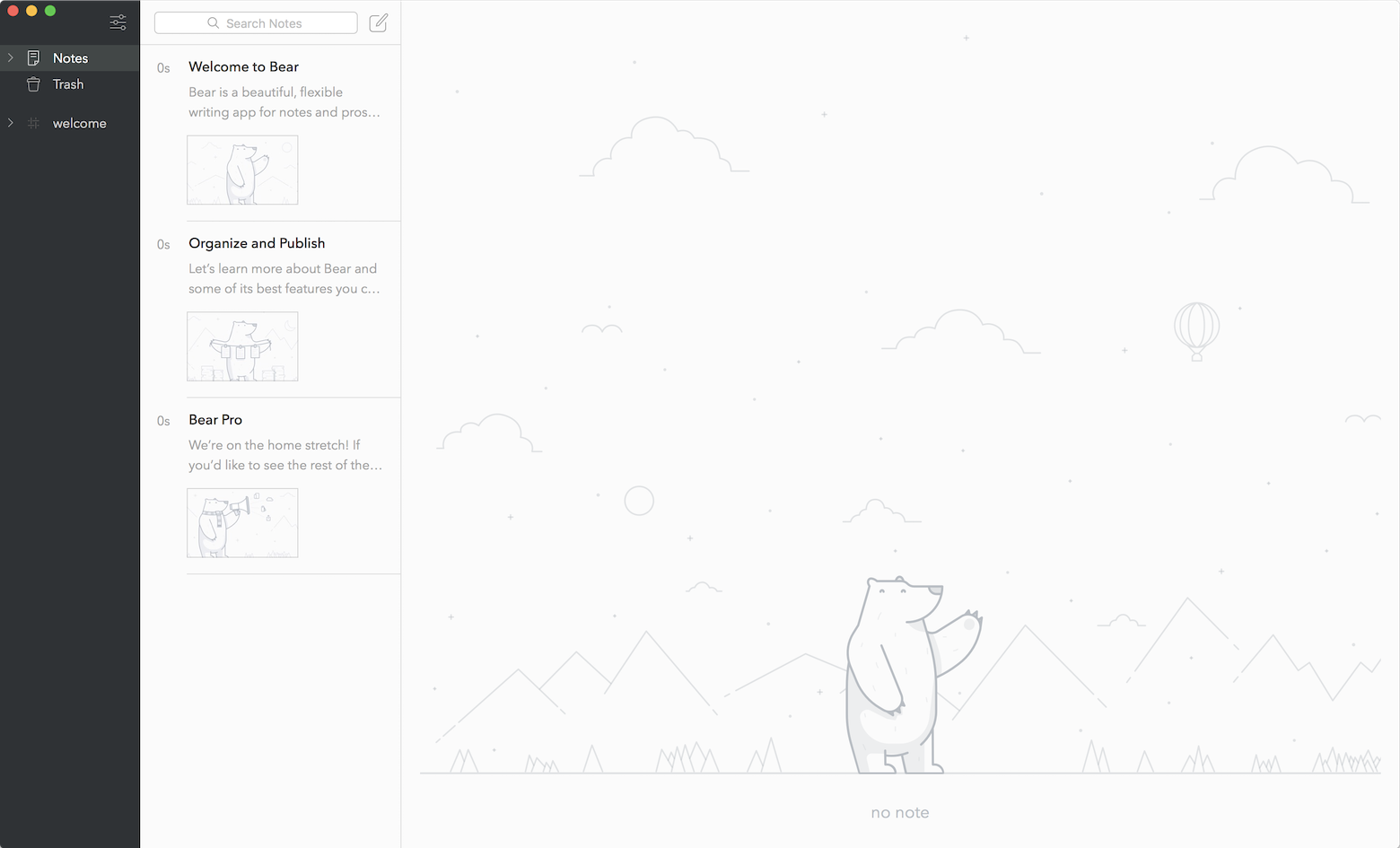
A lot of people learn best by doing, making this method of new user onboarding logical. While it can be a slightly more involved process to create (depending on the specifics of the app), it’s also more user-friendly. People can move at their own pace, especially if they can leave the starter content in the app to refer to as needed.
There are some types of apps where meta onboarding doesn’t work well. Photo editing apps come to mind as particularly difficult to set up in this way.
Following the user onboarding best practices here helps designers create experiences that keep people engaged with the product. A product’s usefulness to a customer directly correlates to how well they know how to use it.
Testing and Iterating the Onboarding Experience
User onboarding is not a “set it and forget it” affair. App designers need to test their onboarding process. A/B tests for different onboarding experiences provide valuable insights into how people respond to different methods.
From there, designers can iterate new onboarding experiences based on retention metrics. If people are abandoning the app in high numbers, or opening it once and then never again, it’s time to try something new.
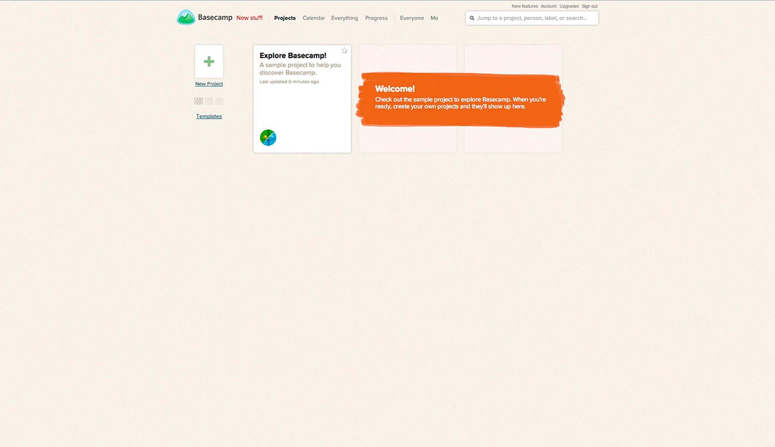
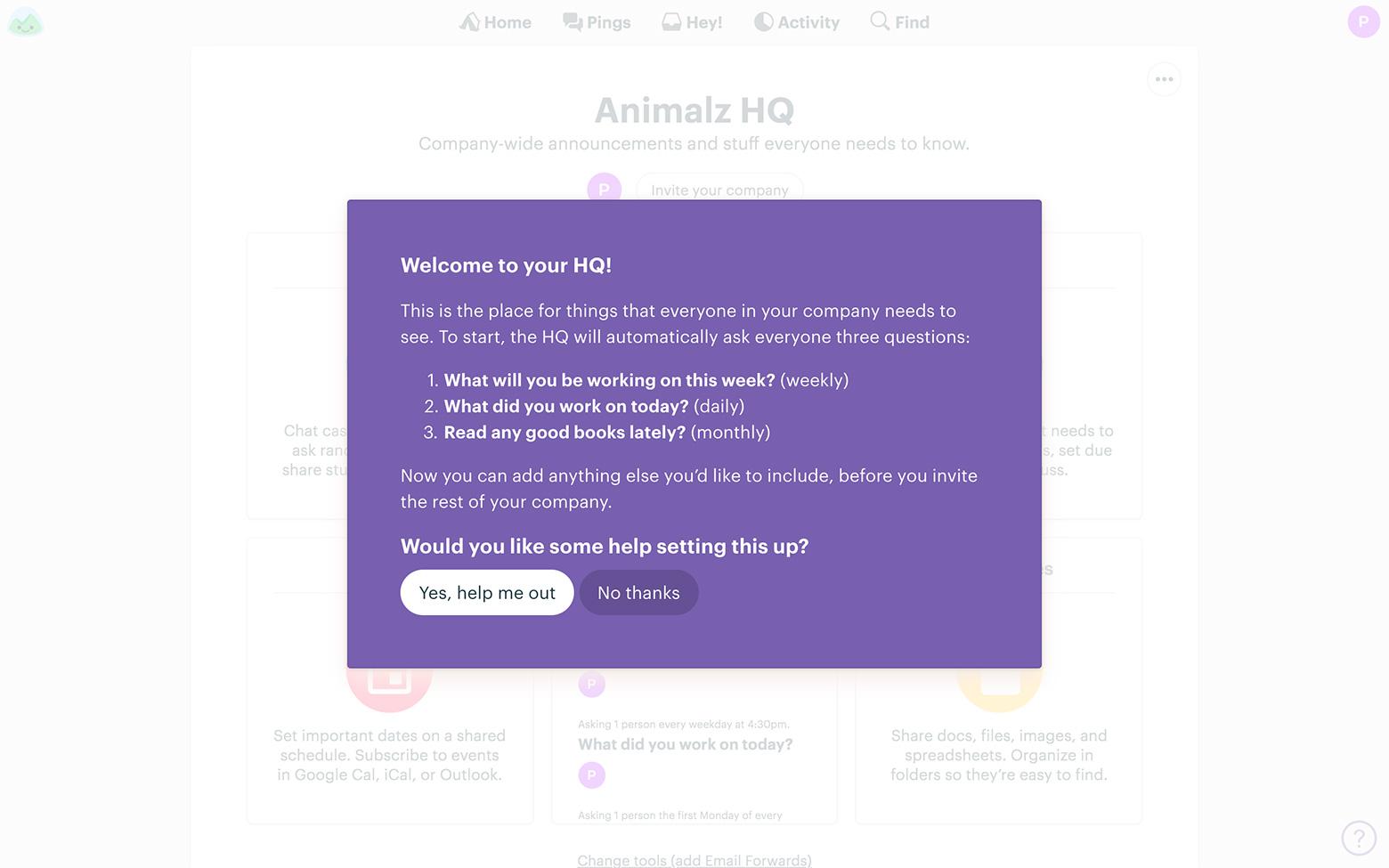
This can be hard for some designers who have created what they think is an excellent onboarding UX. But it’s important that they’re willing to “kill their darlings”—the parts of an onboarding experience they really love—if something isn’t working for the people using the app (or attempting to).
Conclusion
New user onboarding is a vital step in the creation and launch of any new app. When people understand how to use an app and all of its useful features, they’re more likely to continue using it. Whether UX designers choose welcome screens, meta onboarding, or a series of tooltips, knowing the options and which works best for each situation puts them ahead.
Following user onboarding best practices helps ensure designers create an onboarding experience that works well from the start. Designers can then make improved iterations based on testing to create an onboarding UX that retains the maximum number of customers.
Further Reading on the Toptal Blog:
Understanding the basics
Why is customer onboarding important?
Customers abandon apps at alarming rates (one in four abandon after the first use). Effective new user onboarding not only teaches people how to use an app but also convinces them that they should continue to use the app, increasing user retention rates.
What defines successful product onboarding?
Successful new user onboarding has two closely related parts: user retention and making sure people new to the product understand how to use it and the benefits it offers them. When people understand how to make an app’s functions benefit them from the first use, they’re less likely to abandon that app.
What is a UX teardown?
A UX teardown looks at particular UX problems (such as new user onboarding) and how a particular product solves (or attempts to solve) those problems. For example, a teardown of onboarding UX would walk through every step of the process and point out both what works and what doesn’t.
How do I onboard a new user?
New user onboarding for apps and digital products usually follows one of a few patterns: meta onboarding (learning by using the app), product tours, welcome screens, tooltips, and hot spots, or some combination of those things. Mapping out the journey a new customer will take helps identify which pattern is best.
How do you design onboarding?
Designing an onboarding UX should start with identifying the journey a new customer will take when using the product. From there, designers can determine which onboarding pattern is best suited to the app based on the app’s complexity and what will teach the customer best.
