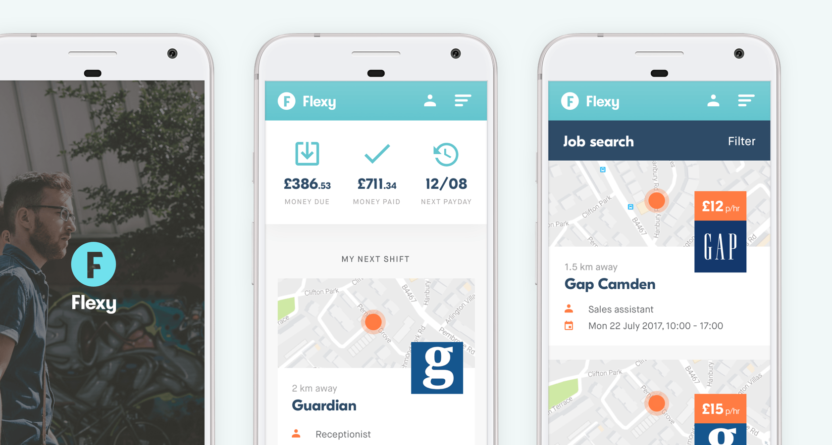
Boost Your UX With Clear Visual Hierarchy
A vital part of creating an optimal user experience, visual hierarchy determines the order in which people take in and process information on a page, regardless of whether it’s digital or print.

A vital part of creating an optimal user experience, visual hierarchy determines the order in which people take in and process information on a page, regardless of whether it’s digital or print.

Chris is a highly experienced brand and UX/UI designer who’s successfully led design projects for clients from Google to numerous startups.
PREVIOUSLY AT

The concept of visual hierarchy has been applied in design since the internet was a distant fantasy, and it is just as important in modern product design as it was at the zenith of the print ad.
Visual hierarchy determines the order in which people take in and process information on a page, regardless of whether it’s digital or print. It’s a vital part of creating an optimal user experience.
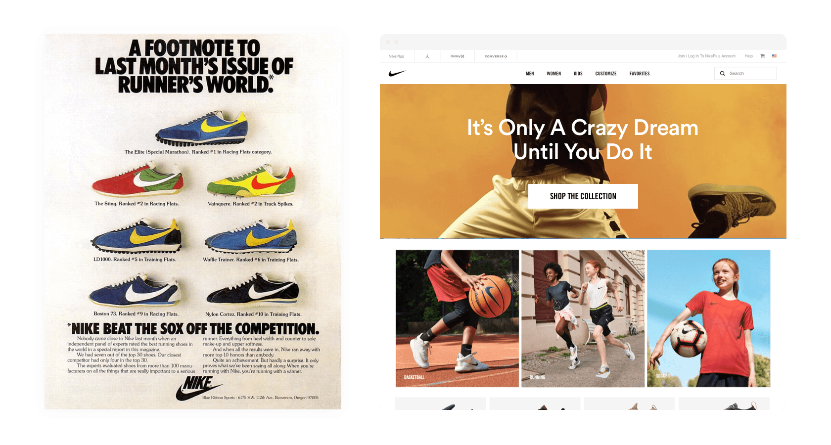
Put simply, a clear sense of visual hierarchy guides people toward content or actions of importance. In a print advertisement, this would be the strapline, whereas in a digital product, it could be brand messaging or a primary call to action.
It’s an incredibly useful way of creating an orderly and purposeful customer experience while improving the chances of achieving a strategic outcome.
Here are a few steps UX designers can take to achieve a clear sense of visual hierarchy in digital products and take customer experiences to the next level.
Define UX and Brand Objectives
Using a variety of methods, many product teams are already defining the UX goals for each section of their product.
Shaping the definition of UX goals by meeting the criteria for S.M.A.R.T. methodology (Specific, Measurable, Actionable, Relevant, Trackable) is one popular way of doing this. There is a good article about it here.
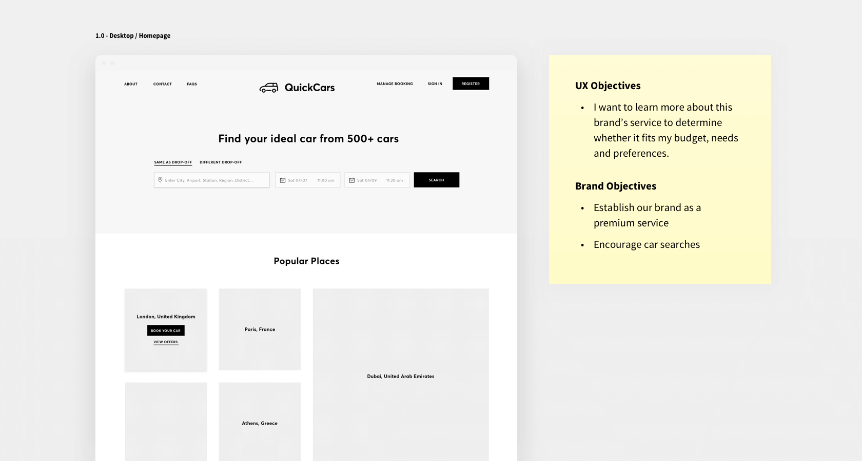
Equally important are brand objectives. These reflect the overarching goals of the business, from both brand and commercial perspectives. An example of brand objectives for an automotive service landing page would be: a) establish the brand as a premium service, and b) encourage car searches.
The easiest and most effective way of documenting the UX and brand objectives of the various phases of the customer journey is to run a collaborative visual hierarchy workshop.
Using a broad-canvas collaboration tool such as Milanote, or even Sketch, lay out the prototype screens in broadly chronological order. Invite the key practitioners to an online or physical meeting, making sure there is representation from both UX and brand perspectives.
Then, screen share (or plug in to a monitor), and start annotating!
This kicks off the process of identifying the UX and brand objectives for each section of the customer experience and sets in motion a strategic workflow that can be leveraged throughout the rest of the design process.
Rank Actions and Content for Clear Visual Hierarchy
Now that the UX and brand objectives are in place, it’s time to define the appropriate visual hierarchy of each action or piece of content and document that for reference during subsequent design work.
First of all, a taxonomy is needed. It’s best to use a 1 to 3 scale—1 being the most important, 3 being the least.
Using the broad-canvas format profiled earlier, start collaboratively annotating the prototype layout.
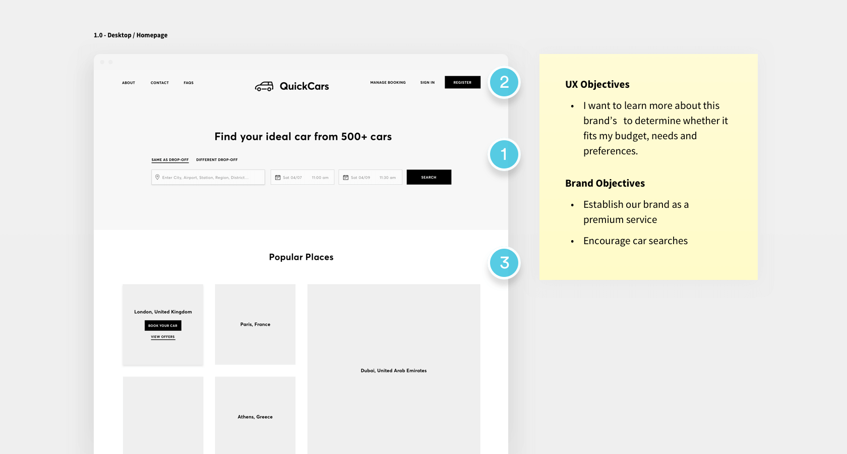
In this example, there is a UX objective of “I want to learn more about this brand’s service to determine whether it fits my budget, needs, and preferences.” The brand objectives are to a) establish the brand as a premium service, and b) encourage car searches.
In light of this, the brand messaging Find your ideal car from 500+ cars has been assigned a hierarchy of 1, as has the accompanying form and CTA.
Despite its importance to the overarching customer experience, the actual logo (and navigation) has been assigned a 2, as it doesn’t play as big a part in meeting the UX and brand objectives.
Supporting content is marked a 3, which may seem counterintuitive. However, it adheres to the narrative flow that’s starting to take shape, with the brand messaging and “get started” functionality as the primary focus, then the logo and navigation to establish the premium identity and structure of the service, then the supporting content to reassure, provide context, and inspire the customer.
As designers become accustomed to taking visual hierarchy into account, it’s easy to start to appreciate the narrative possibilities it reveals, adding real depth to user interfaces and the stories they tell.
Build Visual Hierarchy Into the Design System
Now that the objectives and visual hierarchy rankings are set, the visual language that is going to bring them to life can be created. Let’s assume that there is already a design system in place (if not, this should be done first!) and that a range of UI elements have already been designed.
The first place to begin is composition—the layout of the necessary templates. Consider where highly ranked elements should appear (as described earlier, it’s not always the most expected). Multiple variations may be needed to cater for a range of scenarios. To make sure nothing is overlooked later on in the project, designers should take the time to create them now.
Later in the design process, a number of example mockups can be included in the design system document, with live symbols of UI patterns (so designers working on the project have the latest versions).
Once a broad idea of the composition has been established, variants of UI elements can start to be created.
Take the humble page header. In this example from a recent project for an HR consultancy, there are three variants in the design system in order to cater for the varying ranks of visual hierarchy.

Designers can expand upon this with the building blocks of their UI. For instance, on a recent project for a popular recruitment app, depth was used to differentiate content panels — the greater the depth, the higher the visual hierarchy.
Visual hierarchy can be designed into just about every element of a brand’s visual language: composition, typography, depth, imagery, iconography, and tone of voice. The deeper the design goes, the more cohesive and focused the customer experience is going to be.
Wrap-up
Incorporating a visual hierarchy workflow into the design process results in considerably better user experiences. It does this by giving designers a means of assigning a rank to different types of content, resulting in user interfaces that not only feel ordered and intuitive but also allow core brand objectives to be met.
Clear visual hierarchy not only boosts your UX, it also sets in place a sustainable workflow that gives the design process a strategic focus—essential in a modern product design environment.
Further Reading on the Toptal Blog:
Understanding the basics
What are the 5 SMART goals?
The five criteria for setting SMART goals that can be used in the UX process are Specific, Measurable, Actionable, Relevant, and Trackable. Utilizing these five criteria can help UX designers plan designs that use a strong visual hierarchy to achieve brand and usability goals.
Why is visual hierarchy important?
Put simply, a clear sense of visual hierarchy guides people toward content or actions of importance. It determines the order in which people take in and process information on a page, regardless of whether it’s digital or print. It’s a vital part of creating an optimal user experience.
What is visual hierarchy in web design?
Visual hierarchy guides people toward content or actions of importance. It determines the order in which people take in and process information on a page, regardless of whether it’s a web page, web app, or even a print design. It’s a vital part of creating an optimal user experience.
Why is establishing a visual hierarchy important to communication?
Visual hierarchy guides people toward content or actions of importance. It determines the order in which people take in and process information on a page. This is a vital part of communicating with users to ensure they see the most important content in a design.
What are brand goals?
Brand goals are the valuable end results that a company wants to achieve. They include things like building brand awareness, gaining loyalty and trust, and creating an emotional connection with customers, and can be reinforced through things like visual hierarchy in brand designs.
Chris Berridge
Bristol, United Kingdom
Member since January 16, 2017
About the author
Chris is a highly experienced brand and UX/UI designer who’s successfully led design projects for clients from Google to numerous startups.
PREVIOUSLY AT