Responsive Web Design Media Query Examples Explained
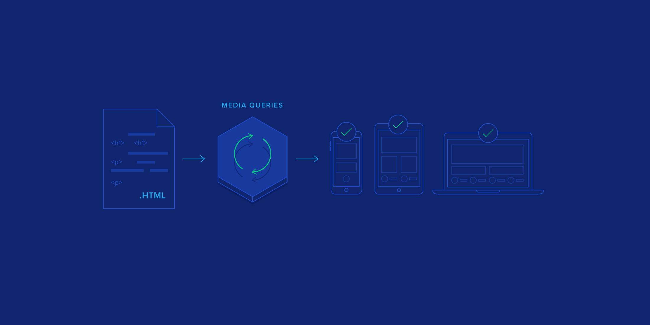
RWD allows a site to adapt for optimal viewing on a variety of devices that range in size based on a media query for mobile and other screen widths. Nowadays, your website will be visited by a wide variety of devices: desktops with large monitors, mid-sized laptops, tablets, smartphones, and more. To achieve an optimal user experience, your site should be adjusting its layout in response to these varied devices (i.e., to their varied screen resolutions and dimensions).
8 minute readContinue Reading

Tomislav Krnic
World-class articles, delivered weekly.
Toptal Developers
- Algorithm Developers
- Angular Developers
- AWS Developers
- Azure Developers
- Big Data Architects
- Blockchain Developers
- Business Intelligence Developers
- C Developers
- Computer Vision Developers
- Django Developers
- Docker Developers
- Elixir Developers
- Go Engineers
- GraphQL Developers
- Jenkins Developers
- Kotlin Developers
- Kubernetes Experts
- Machine Learning Engineers
- Magento Developers
- .NET Developers
- R Developers
- React Native Developers
- Ruby on Rails Developers
- Salesforce Developers
- SQL Developers
- Sys Admins
- Tableau Developers
- Unreal Engine Developers
- Xamarin Developers
- View More Freelance Developers
Join the Toptal® community.
