A How-to Guide to SVG Animation
The advantages of SVG on the web go beyond producing resolution-independent graphics. With a little CSS and JavaScript, you can apply cool animations and effects to your front end without requiring the user to install bulky plugins.
The advantages of SVG on the web go beyond producing resolution-independent graphics. With a little CSS and JavaScript, you can apply cool animations and effects to your front end without requiring the user to install bulky plugins.
Juan is a systems engineer since 2005. He is an eager learner, a versatile developer, and has great attention to detail.
Expertise
Any front-end engineer worth their salt is aware of the challenges that the fragmented ecosystem of devices brings. Different screen sizes, resolutions, and aspect ratios make it difficult to deliver a consistent experience. More so for those who want to deliver a pixel-perfect experience.
Scalable Vector Graphics (SVGs) help in solving a part of that problem, and do it very well. Although they have their limitations, SVGs can be very helpful for certain occasions and, if you have a good design team, you can also create a more visually stunning experience without putting undue burden the web browser or hampering the load times.

During the last few months, I have been working on a project that is making extensive use of SVG and its animation and effect capabilities. In this article, I will share how you can use SVG and its animation techniques to bring some new life to your web front-end work.
Scalable Vector Graphics
SVG is an image format that is based on XML, much like how HTML works. It defines different elements for a number of familiar geometric shapes that can be combined in the markup to produce two-dimensional graphics.
The SVG specification is an open standard developed by the World Wide Web Consortium (W3C) in 1999.
All major web browsers have had SVG rendering support for a while now.
Since SVG graphics are XML documents, web browsers provide DOM node-based APIs that can be used to interact with the images. Talk about bringing pictures to life!
SVG Paths
If there is one overpowered element in SVG, that would be the <path> element.
The path element is a basic shape that may be used to create almost any advanced 2D shape you can imagine.
The element works by taking a sequence of drawing commands. It is a lot like the Logo programming language from 1967, only modernized and designed for fancy graphics. The element takes this sequence of drawing commands through the attribute d.
<!-- A right-angled triangle -->
<path d="M10 10 L75 10 L75 75 Z" />
You can think of a virtual pen that draws on the screen, and the drawing comments in the path element merely controls the pen. In the example above, the pen is being instructed to move to position (10, 10) (M10 10), to draw a line to (75, 10) (L75 10), to draw a line to (75, 75) L75 75 and then to close the path by returning to the starting point (Z).
Using other drawing commands, such as arcs (A), quadratic bezier curves (Q), cubic bezier curves (C), etc you can create much more complex shapes and graphics in SVG.
You can learn a lot more about the path element here.
SVG Paths and CSS
“Okay Juan, I get it. Paths are powerful, but how do I animate them?” you say.
For our first technique, we are going to take advantage of two SVG attributes: stroke-dasharray and stroke-dashoffset.
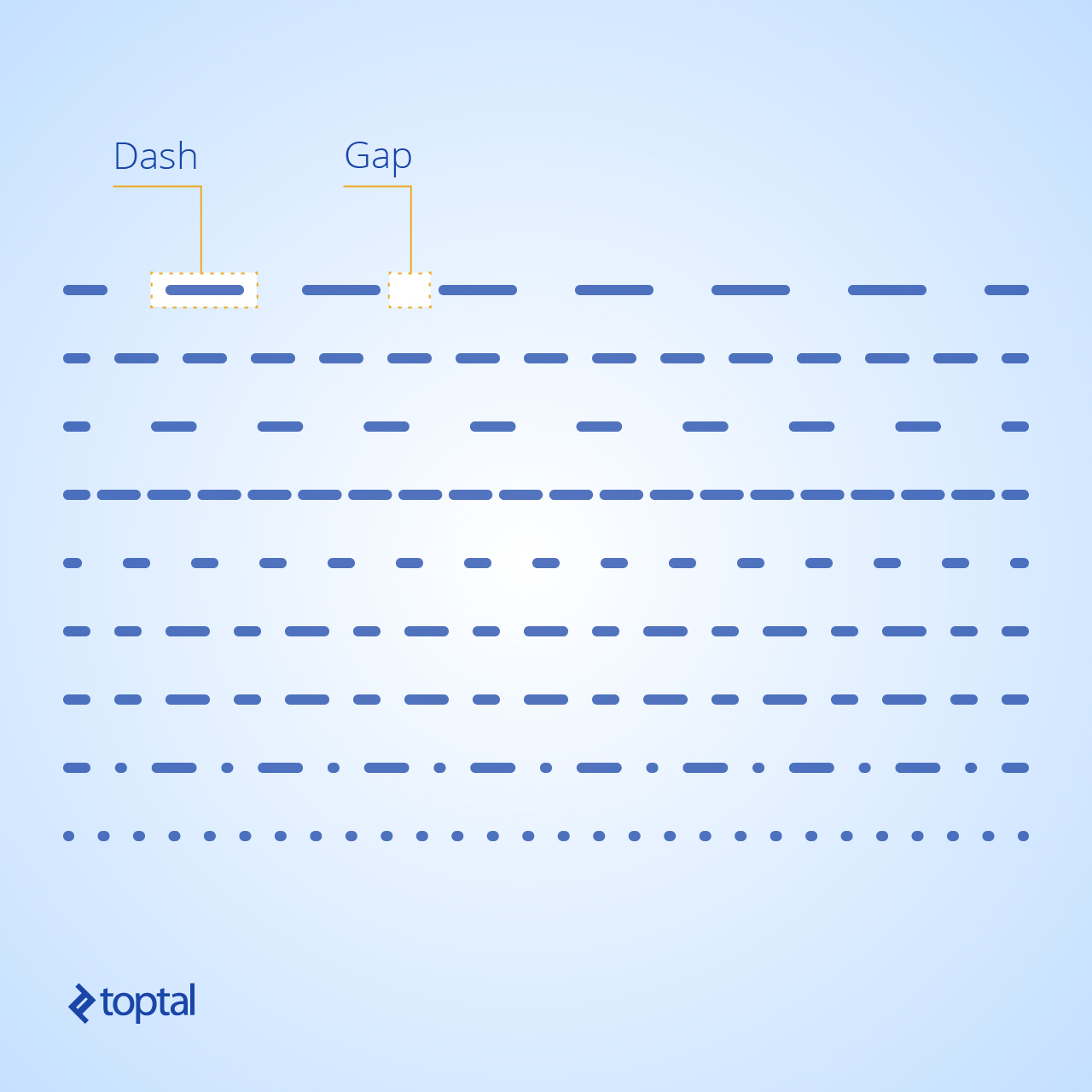
The stroke-dasharray attribute controls the pattern of dashes and gaps used to stroke the path. If you wanted to draw your lines as a group of dashes and gaps instead of one continuous stroke of ink, this is the attribute you would use.
With SVG images being a part of the web browser’s DOM and stroke-dasharray being a presentation element, the attribute can also be set using CSS.
Similarly, the stroke-dashoffset attribute (which specifies how far into the dash pattern to start the dash) can also be controlled using CSS.
These two SVG attributes, together, can be used to animate SVG paths, giving the viewer the illusion that the paths are being drawn gradually.
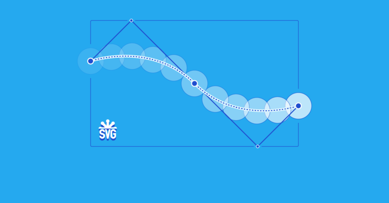
Take this quadratic bezier curve, for example:
<path fill="transparent" stroke="#000000" stroke-width="5" d="M10 80 Q 77.5 10, 145 80 T 280 80" class="path"></path>
To animate this path as if it is being drawn gradually and smoothly on the screen, we will have to set the dash (and gap) lengths, using the stroke-dasharray attribute, equal to the path length. This is so that the length of each dash and gap in the dashed curve is equal to the length of the entire path.
Next, we will set the dash offset, using the stroke-dashoffset attribute, to 0. This will make the path appear on screen as a solid curve (we are essentially looking at the first dash, and we already made each dash span the entire length of the curve). By setting the dash offset equal to the length of the curve, we will end up with an invisible curve (we are now looking at the curve being rendered as an entire gap—the part that immediately follows a dash).
Now by animating the stroke-dashoffset property, you can make the curve appear on screen gradually.
See the Pen Toptal - SVG & CSS paths by Toptal Blog (@toptalblog) on CodePen.
As you can see, the curve is always there. We are only changing the dash offset to make the dashed part appear bit by bit.
You can take this a step further by using the same principle but with more paths:
See the Pen Toptal - SVG & CSS paths by Toptal Blog (@toptalblog) on CodePen.
Here you have one black curve that is fixed, a red one that is moving along the path, and another black one following the red one but 40px behind.
Stroke-dasharray and stroke-dashoffset are two very powerful attributes that can be used to apply a plethora of animations and effects to your SVG paths. You can try this handy tool that you can use to experiment with the two attributes.
Animating Objects Along SVG Paths
With SVG and CSS, another cool thing you can do is animate objects or elements following a path.
There are 2 SVG attributes we are going to use for the animation:
-
offset-path: The offset-path CSS property specifies the offset path where the element gets positioned.
-
offset-distance: The offset-distance CSS property specifies a position along an offset-path.
By combining these two properties, you can come up with animations like this easily:
See the Pen Toptal - SVG & CSS paths by Toptal Blog (@toptalblog) on CodePen.
As you can see, we have a new element div.ball.
This element can be anything, a div, an image, text, whatever. The idea in this example is that with the use of offset-path and offset-distance you can give the element a path to follow and animate the distance and the element will move through the path.
SVG Animations Using JavaScript
If all of these are not fancy enough already, you can always resort to JavaScript.
Animating SVG elements with JavaScript can be much like animating DOM elements. However, with JavaScript, you can achieve the animation techniques we have checked out above, but more easily.
Previously, we had to hardcode the path lengths in our CSS. With the help of the JavaScript function path.getTotalLength() it is possible to calculate the length of the path on-the-fly and use it as needed. You can learn more about it here.
Besides, a number of libraries are already at your disposal that can make SVG animations a lot easier than it already is.
Snap.svg not only makes it easy to draw SVG images using JavaScript, it makes animating them as simple as calling .animate({}).
Another library, anime.js, lets you make a div element follow an SVG path with just a few lines of code.
If you are looking for a library that does more on its own but makes the results still look stunning, then Vivus is what you are looking for. It takes a different, more configuration-driven approach to SVG path animation. With this library, you just have to add an ID to the SVG element you want to draw and define a Vivus object with that ID. Vivus will take care of the rest.
Further Reading
Below are a list of resources that you may find useful when dealing with SVG images and animating them:
To go more in depth with SVG animation, you can read this short article on the three ways to animate SVG images and watch the video screencast by CSS Tricks.
One thing this article didn’t cover is animating SVG images with Synchronized Multimedia Integration Language (SMIL). While using CSV for SVG gives you the advantage of working with something you are already familiar with, SMIL takes things to the next level.
With SMIL, you can implement advanced animation effects such as shape morphing using SVG alone. A short, yet effective guide to using SMIL for such effects is available here.
Although, support for SMIL is a bit edgy at this moment (no pun intended).
No-compromise Animations for the Web
In this article, you have gone through several ways you can animate SVG elements using CSS or HTML element on SVG paths.
SVG is lightweight and can be used to produce sharp graphics regardless of screen size, zoom level, and screen resolution. With SVG, delivering a modern, vivid experience now is easier than ever, all while reaping the benefits of using standard web technologies.
And that’s it! Hopefully you have found this SVG animation tutorial useful and enjoyed reading it.
Further Reading on the Toptal Blog:
Understanding the basics
What are the stroke-dasharray and stroke-dashoffset attributes?
The stroke-dasharray attribute determines the pattern of dashes and gaps to be used as the stroke for an SVG path. The stroke-dashoffset determines the distance into the pattern from which the path’s stroke will start.
How can you determine the exact length of an SVG path?
To determine the exact length of an SVG path, you can use the path.getTotalLength() function, where path is the DOM Node for the
element.
Buenos Aires, Argentina
Member since December 20, 2016
About the author
Juan is a systems engineer since 2005. He is an eager learner, a versatile developer, and has great attention to detail.