Flexbox and Sass Grid Tutorial: How to Streamline Responsive Design
Recently, I was challenged to create my own grid system and, since re-inventing the wheel is always useful as a learning experience, I went for it. I knew it would be an interesting challenge, but I was surprised by how easy it turned out to be!

Recently, I was challenged to create my own grid system and, since re-inventing the wheel is always useful as a learning experience, I went for it. I knew it would be an interesting challenge, but I was surprised by how easy it turned out to be!

Juan is a front-end and back-end developer, passionate about UX, usability, and design. He has over a decade of professional experience.
PREVIOUSLY AT

Recently, I was challenged to create my own grid system and, since re-inventing the wheel is always useful as a learning experience, I went for it. I knew it would be an interesting challenge, but I was surprised by how easy it turned out to be!

In this experiment, we’ll look into Flexbox layouts and how they allow for graceful implementations of layouts without doing any crazy hacks. Also, if you’re not familiar with Sass, we’ll see how it works and use some handy Sass utilities. You might even learn something new about CSS grids like the one that is part of Bootstrap.
A Very Short Introduction of Sass and Flexbox
Sass is basically a tool that allows you to avoid some of CSS’s shortcomings, it’s a scripting language that gets interpreted to CSS. The syntax looks very familiar if you are already writing CSS styles but its toolbox includes variables, mixins for re-usability and if, for, each and while directives among others. One of the handiest things about Sass is that any valid CSS code is valid Sass, so you can progressively transform your code base.
A simple example of a for loop:
@for $i from 1 through 3 {
  .a-numbered-class-#{$i} {
    width: (20 * $i) * 1px;
  }
}
This simple loop iterates from 1 to 3 and creates classes. The index of the iteration will be handily stored in $i. We can also do math and print the .a-numbered-class-X three times with different a different width each time. This code outputs:
.a-numbered-class-1 {
  width: 20px;
}

.a-numbered-class-2 {
  width: 40px;
}

.a-numbered-class-3 {
  width: 60px;
}
As we can see, we can abstract a lot of the work you would have to do in CSS. In CSS, you’d have to copy and paste and modify manually, which is obviously more error prone and less elegant, If you haven’t tried it yet, don’t waste any more time!
Flexbox stands for Flexible Box, a CSS3 layout system that positions and distributes elements dynamically. It is a very powerful tool that allows for flexible layouts with minimal effort. For more details on how to learn Flexbox, check out Chris Coyier’s Complete Guide to Flexbox.
The Grid
Moving on to the grid itself, let’s start with its basic elements. They will be inspired by Bootstrap’s grid elements: Containers, Rows, and Columns, each contained within the former.
We’ll be using the BEM naming conventions for the classes’ names. BEM conventions are pretty simple to use and add a lot of information about the element and its context. Briefly put, you have:
-
Blocks, which “encapsulate a standalone entity that is meaningful on its own”:
.block. -
Elements, which are “parts of a block and have no standalone meaning” which are denoted by a the block name, two underscores and the element:
.block__elem -
Modifiers, like “Flags on blocks or elements,” which are represented with two dashes:
.block .block--mod.
Containers
This is the outermost element of the grid, it will contain our row elements. There are two types of containers: .container and .container--fluid.
The behavior of .container is defined by being 100% of the width below a certain point, having a maximum fixed width above it and have equal margins left and right:
$grid__bp-md: 768;
.container {
  max-width: $grid__bp-md * 1px;
  margin: 0 auto;
}
Play with it here by expanding and contracting the “output” window
For the fluid container, which always has 100% width, we just override those properties with a modifier:
&--fluid {
    margin: 0;
    max-width: 100%;
  }
That was easy! We now have both containers implemented. Let’s move on to the next element.
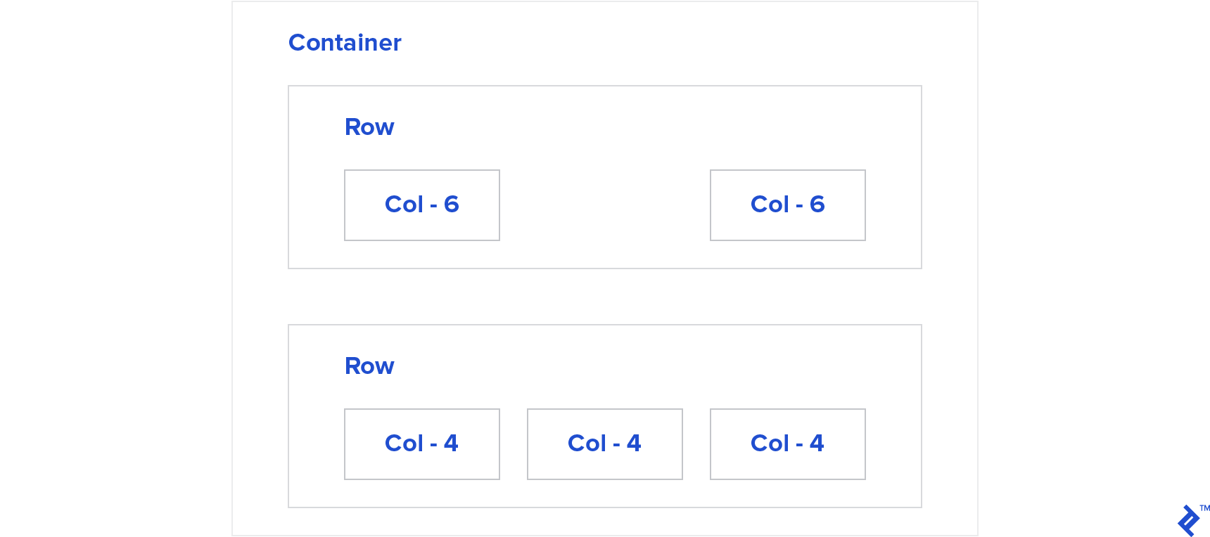
Rows
Rows will be the horizontal organizers of our content.
We will use Flexbox to position a row’s child elements, making them wrap so they don’t overflow and giving them 100% width inside the row (so we can nest them later).
&__row {
  display: flex;
  flex-wrap: wrap;
  width: 100%;
}
This will position the child elements side by side and wrap them into new lines if the sum of their width is greater than itself. We now just need to add some divs in and it will look like this:
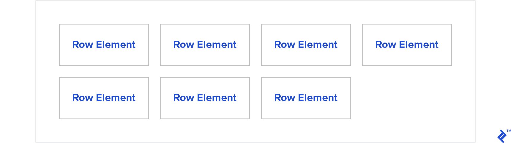
Play with it here by expanding and contracting the “output” window.
Things are starting to take shape, but this is no CSS grid yet. It’s missing…
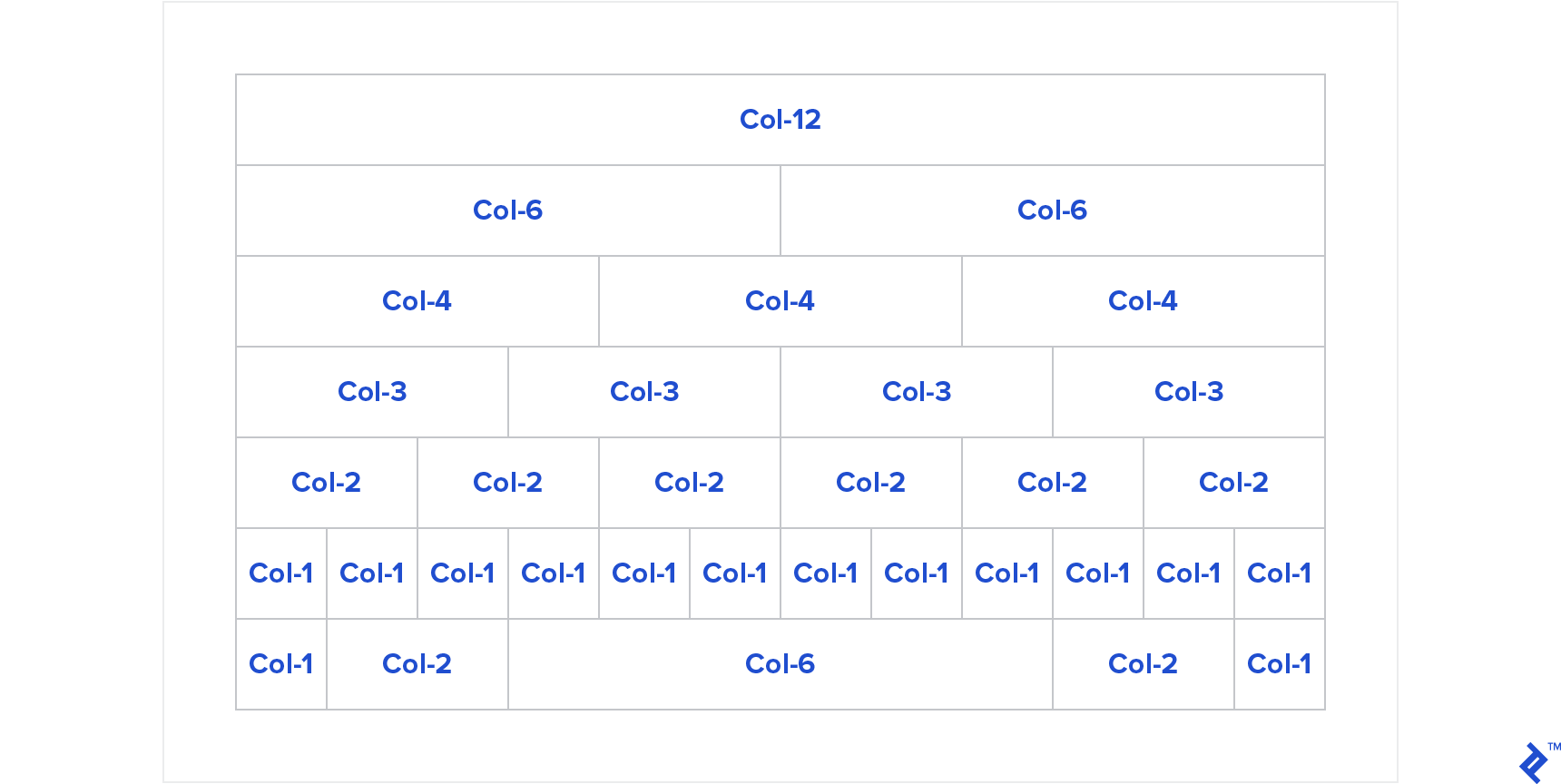
Columns
Columns are where the content of the site lives. They define into how many parts the row is divided and how much they occupy. We’re going to do a twelve column layout. This means we can divide the row in one or up to twelve parts.
To start with, some basic math. When we want to have one column, its width should be of 100%. If we want twelve columns. Then each should occupy 8.333…% or 100/12 of the width.
With Flexbox, to distribute content in this manner, we can use flex-basis.
In order to divide in four columns, we now would add something like:
flex-basis: (100 / 4 ) * 1%;
This way, we can get the elements each to occupy 25% of the width—or whatever percentage we want.
Let’s make that more dynamic. Since we want this to reflect our possible classes, let’s call .col-1, a class for a column div that will have 8.333% of the width since twelve of them should fit before they have to wrap to a new line. The percentage will increment all throughout until .col-12, which will occupy 100%.
$grid__cols: 12;
@for $i from 1 through $grid__cols {
  .col-#{$i} {
    flex-basis: (100 / ($grid__cols / $i) ) * 1%;
  }
}
Just to clarify what’s going on, let’s say we want to divide the width into four equal parts. We would need .col-3 since it fits 4 times in 12, that means that .col-3 should have 25% flex-basis:
100 / ($grid__cols / $i)
100 /     (12  / 3)       =  25
This already is starting to look like a grid!
Screen Width-dependent Columns
We now want to be able to have an element that has a certain width on mobile but a different one on tablets and so on. We will use certain breakpoints dependent on the width of the window. Our UI will react on those breakpoints and adapt to an ideal layout catered to the screen sizes of different devices. We’ll name the breakpoints by size: small (sm), medium (md) and so on, .col-sm-12 will be an element that occupies 12 columns at least until the sm breakpoint.
Let’s rename the .col-* class .col-sm-*. Since our grid will be mobile first, we’ll be applying its properties to all screen sizes. For the ones that we need to behave differently with bigger screens, we’ll add the class: .col-md-*.
Imagine an element with .col-sm-12 and .col-md-4. The expected behavior will be that below the breakpoint “md” (medium) it will have 100% width and above it it will have 33.333%—a very common occurrence, since on mobile you might need to stack elements on top rather than next to each other when your width is much more limited.

For this, we’ll need to add a media query (an expression that contains code that will only execute above or below a certain width or on a specific device) at the breakpoint and create our md columns the like we did before for sm:
@media screen and (min-width: $grid__bp-md * 1px) {
  @for $i from 1 through $grid__cols {
    &__col-md-#{$i} {
      flex-basis: (100 / ($grid__cols / $i) ) * 1%;
    }
  }
}
That’s getting close to something useful already. That’s quite a bit WET (Get it? It isn’t DRY…), so let’s make it more abstract.
As we saw, we’re going to need a media query for each breakpoint, so let’s create a mixin that receives a breakpoint that dynamically creates media queries. It could look something like this:
@mixin create-mq($breakpoint) {
  @if($breakpoint == 0) {
    @content;
  } @else {
    @media screen and (min-width: $breakpoint *1px) {
      @content;
    }
  }
}
Now, let’s just wrap what we had for creating the __col classes in a mixin called create-col-classes and use the create-mq mixin.
@mixin create-col-classes($modifier, $grid__cols, $breakpoint) {
  @include create-mq($breakpoint) {
    @for $i from 1 through $grid__cols {
      &__col#{$modifier}-#{$i} {
        flex-basis: (100 / ($grid__cols / $i) ) * 1%;
      }
    }
  }
}
And that’s it. To use it, we now define our breakpoints in a Sass map, and iterate them.
$map-grid-props: ('-sm': 0, '-md': $grid__bp-md, '-lg': $grid__bp-lg);
@each $modifier , $breakpoint in $map-grid-props {
  @include create-col-classes($modifier, $grid__cols, $breakpoint);
}
Our grid system is basically done! We have defined an .container__col-sm-* class that will be the default and we can modify its behavior on bigger screens with container__col-md-* and container__col-lg-*.
We can even nest rows! Play with it here.
The nice thing about this is that if we now wanted it to have all the same breakpoints as Bootstrap v4 we would just need to do:
$grid__bp-sm: 576;
$grid__bp-md: 768;
$grid__bp-lg: 992;
$grid__bp-xl: 1200;
$map-grid-props: (
        '': 0,
        '-sm': $grid__bp-sm,
        '-md': $grid__bp-md,
        '-lg': $grid__bp-lg,
        '-xl': $grid__bp-xl
);
And that’s it! Play with it here.
Notice how Bootstrap takes a more complete mobile-first approach than we initially discussed. The smallest window sizes have no suffix like sm or md, the reasoning being that the class equivalent to .container__col-X will not only be applied from a window width of 0 to 576px; if we don’t overwrite it explicitly, it will be that number of columns at every window size. Otherwise, we could add the class .container__col-sm-Y to make it a width of Y columns between the sm breakpoints.
Offsets
Offsets will add a margin left with regards to the previous column. A .container__col-offset-4 will add a margin-left: 33.333% on all screen sizes. .container__col-md-offset-4 will do the same but above the md breakpoint.
The implementation is now trivial; we add an -offset property on the same loop we create the classes, but instead of flex-bases, we write the property margin-left. We have to do an extra one for -offset-0 too, since we may want to clear out the margin on bigger screens:
@mixin create-col-classes($modifier, $grid-cols, $breakpoint) {
  @include create-mq($breakpoint) {
    &__col#{$modifier}-offset-0 {
      margin-left: 0;
    }
    @for $i from 1 through $grid-cols {
      &__col#{$modifier}-#{$i} {
        flex-basis: (100 / ($grid-cols / $i) ) * 1%;
      }
      &__col#{$modifier}-offset-#{$i} {
        margin-left: (100 / ($grid-cols / $i) ) * 1%;
      }
    }
  }
}
We now have fully functional offsets! Play with it here.
Displayability
We sometimes want to display/hide an element below or above a certain point. For this, we can make classes available like the ones of Bootstrap v4.
For example, the class .hidden-md-up will hide any element with this class from the md breakpoint upwards; conversely, .hidden-md-down will hide it from the breakpoint down.
The code for this is simple yet again: We just iterate our breakpoints and create a .hidden-* class with a for each breakpoint. We modified the create-mq class to be a little more abstract, though:
@each $modifier , $breakpoint in $map-grid-props {
  @if($modifier == '') {
    $modifier: '-xs';
  }
  @include create-mq($breakpoint - 1, 'max') {
    .hidden#{$modifier}-down {
      display: none !important;
    }
  }
  @include create-mq($breakpoint, 'min') {
    .hidden#{$modifier}-up {
      display: none !important;
    }
  }
}
As a side note, isn’t this one of the few good uses for !important? Notice that the element may have an arbitrarily greater specificity with a display: block rule, but we would still want to hide it below or a above the breakpoint. If you disagree with this approach, let me know in the comments!
So that’s it: We have a displayability system now.
Conclusion
While this “framework” is not production ready, it shows how powerful Flexbox layouts can be and how handy Sass is. With just a few lines of code, we implemented the core functionality of a CSS framework/grid.
May it also serve as a lesson that a basic version of virtually any software can be implemented very easily. It is the concrete problems of the real world that start adding up and make it hard.
I created a GitHub repo where you can submit issues or pull requests.
What features would you like to see implemented? Could the implementation be simplified or more elegant?
Feel free to let me know your opinion on the comments below.
Understanding the basics
What is Sass?
Sass is a scripting language which gets translated to CSS. It provides a set of tools and functionalities which enhance the experience of writing CSS making the code more elegant and succinct. Sass also happens to be a superset of CSS3 so any CSS3 stylesheet is a valid Sass stylesheet.
What is CSS3 Flexbox?
A new way to layout elements which allows for more flexible positioning. It helps you position, align and space your HTML more elegantly and it is compatible with modern browsers. Check out caniuse.com/flexbox for a list.
What is a grid system?
A grid system is a way of distributing the content of your site with a responsive layout based on, well, a grid. In this case, we analyzed a column based grid where you specified how many columns an element should occupy given a screen size.
Juan Varela
Graz, Austria
Member since April 19, 2017
About the author
Juan is a front-end and back-end developer, passionate about UX, usability, and design. He has over a decade of professional experience.
PREVIOUSLY AT