
6 Model-driven App Controls and When to Use Them
In this article, you will learn about six model-driven app controls. This is an overview of various controls that enhance user interaction within model-driven apps for a better experience.

In this article, you will learn about six model-driven app controls. This is an overview of various controls that enhance user interaction within model-driven apps for a better experience.

Larry Saytee
Larry is a Power Platform & M365 Solutions Architect, Developer, and Author. He specializes in Power Platform and SharePoint (cloud and on-premises). He writes articles that make complex topics easy to understand with clear steps and visuals. Knowing how hard it can be to learn new technology, he supports better tools to make it simpler.
In this article, you will learn about six model-driven app controls. This is an overview of various controls that enhance user interaction within model-driven apps for a better experience.
These controls include toggles, star ratings, calendars, number inputs, and more. They can be configured at both the table and form levels to allow users to visualize and interact with data effectively on various devices.
Important:
A model-driven app starts with a data model and uses predefined, consistent layouts to organize how users interact with information. In the app designer, developers can add components, configure field controls, and arrange data through dashboards, forms, views, and charts to create a complete app experience.
Additionally, model-driven apps facilitate connecting your tables via relationships, to permit navigation between them and reduce the likelihood of duplicate data.</em>
Note:
With model-driven apps, much of the layout is determined by the components you add. The emphasis is more on quickly viewing your business data and making decisions than on intricate app design. With canvas apps, the app maker has total control over the app layout.
Using Controls in the Form Designer:
To add these controls:
- Sign in to Power Apps.
- Navigate to Tables in the left navigation pane.
- Select the desired table and go to the Forms area.
- Choose the main form to edit.
- Select the column or section to add the control.
- In the Properties pane, click + Component to view available controls and select the desired one.
- Specify the devices (web, tablet, phone) where the control should appear.
- Configure the control’s properties as needed.
- Click Done to apply the configurations.
- Click “Publish Customizations”.
In this article, you will learn about six model-driven app controls. We’ll review them one by one.
Grid Controls
- Subgrid: Displays a view of data related to the current record, allowing users to view and open records within the grid.
- Editable Grid: Enables inline editing of records directly from views and subgrids across web apps, tablets, and phones.
- Power Apps Grid Control (Preview): The next evolution of grid controls, allowing users to view, open, and edit records from views and subgrids. By default, it is read-only but can be configured to be editable.
Display Controls
- Calendar: Shows scheduled activities and their details in a calendar format, supporting day, week, or month views.
- Canvas App: Embeds a canvas app within a model-driven form, integrating data from various sources alongside Microsoft Dataverse.
- External Website (iFrame): Integrates content from external websites within a form using inline frames.
- HTML and Image Web Resource: Displays HTML pages or image files on a form via web resources.
Input Controls
- Checkbox: Allows users to select a binary value by checking or clearing a checkbox. It can be configured with “Yes/No” choice columns.
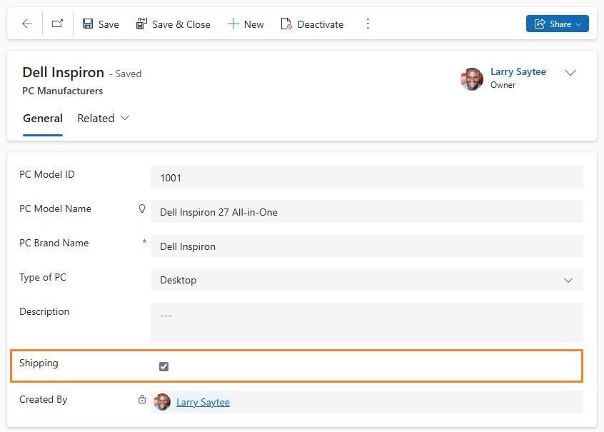
Figure 1: Checkbox: control
- Number input: The number input control allows users to enter data quickly. Users only have to tap the plus and minus buttons to change a numeric value in increments you set. Users can also type a number directly into the column. This column is only supported in edit mode.
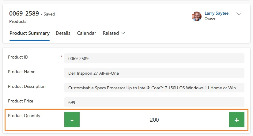
Figure 2: Number input: control
- Option set: The option set control allows users to select from a set of choices when entering data. It is made available by default when a choice column is added to a form.
- Pen input: The pen input control allows users to capture written input, such as signatures. The pen input control can be configured for multiline text columns for use with web, tablet, and phone clients. The minimum recommended “Maximum Length” specified for the column this control maps to is 15000.
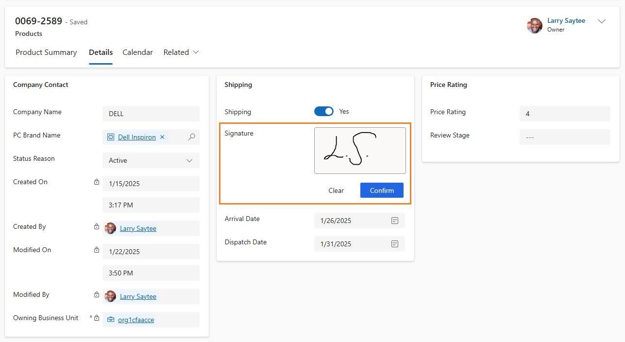
Figure 3: Pen input: control
- Rich text editor: The rich text editor control provides a WYSIWYG editing area for formatting text. The control’s input and output format is HTML. The control allows copied rich text, such as from a web browser or Word, to be pasted into the control. It can be configured with text columns.
- Toggle: The toggle control allows users to choose between binary values, such as on/off and yes/no, by toggling the button. It can be configured with yes/no choice columns.
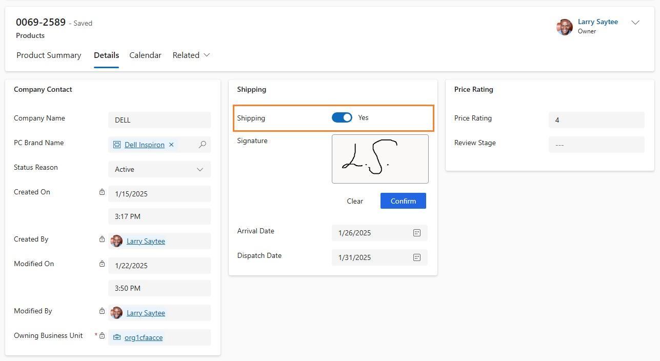
Figure 4 - Toggle: control
Additional “AI Builder” Controls
- Business card reader: The AI Builder business card reader control enables users to detect business cards and extract their information, including images and text. You can take photos directly in the component or load images that you’ve taken.
Additional “Power BI” Controls
- Power BI report: Allows users to add a Power BI report to the form.
More Components Controls
- Form component: Allows users to edit information of a related table record directly from another table’s form. For instance, the form component on a separate tab on the main account form allows the user to edit a contact record without leaving the account form.
- Collaboration controls: Allows users to work with approvals, files, meetings, notes, and tasks from M365 and Microsoft Teams without switching contexts between apps.
Legacy controls (available in classic, mostly):
- Auto-complete: Allows a user to filter an item list as they type and select a value from the drop-down list. For instance, you can use this control to let users choose from a dropdown list of states or countries/regions. This control maps to a Single Line of Text type column. This control is only available in the Classic Interface.
- Flip: Allows users to turn a value on/off, providing a choice between two values. This control is available in the Classic Interface and Modern App Designer.
- Multimedia: Allows users to embed videos, providing a richer customer experience for sales and people on the go. Use this control to map to a URL column that contains the audio or video link to play in the control. Supported media types include: Streaming MP4 files, YouTube videos, Azure media, and Audio streams. This control is available only in the Classic Interface.
- Linear gauge: Allows users to input numerical values by dragging a slider instead of typing in the exact quantity. The slider provides whole number input and displays only. Use this control for any numerical and money columns. This control was deprecated in April 2021. It is available only in the Classic Interface.
- Star rating: Provides users with a visual representation of a rating. The maximum number of stars you can set is five. You can use this control with whole number columns. It can’t be used with decimal columns. This control was deprecated in April 2021. It remains available in the Classic Interface and Modern App Designer.
- Arc knob: Provides users with a way to enter data by sliding a knob, which appears on the screen as an arc. It is a whole-number input and display-only. Use this control for any numeric or monetary columns. You can use touch to change the value, or focus on the number and edit it using the keypad. This control is available only in the Classic Interface.
- Timer control: Shows users how much time remains to complete an action in the resolution of an active row, or how much time has passed since the time to complete the action began. This control is available in the Classic Interface and Modern App Designer.
- News control: Provides valuable insights into your customers, competitors, and contacts. The news control delivers relevant information from Bing News. This control is available only on the Classic Interface.
Key Takeaways
In this article, you have learned about six model-driven app controls that enhance functionality and user experience by providing interactive and intuitive data visualization and manipulation.
FAQs
Q: How do you add custom controls in model-driven apps?
To add a custom control, open Power Apps, go to Tables, then Forms. Select a form, choose a field or section, click “+ Component” in the properties pane, and pick a control. Configure settings and target devices, then click “Done” and “Publish Customizations” to apply changes.
Q: Do model-driven apps require Dataverse?
Yes, model-driven apps are built on Microsoft Dataverse. Dataverse stores and manages the app’s underlying data using standardized tables and relationships, which support consistent layouts and connected experiences across forms, views, and dashboards. It’s an essential part of the model-driven app architecture.
Q: What is the primary data source for a model-driven app?
The primary data source for a model-driven app is Microsoft Dataverse. It provides a secure and scalable environment for storing structured business data, enabling relationships between tables, easy integration, and powerful features like role-based access and business logic within the app’s framework.