

Hire iOS Developers
Hire the Top 3% of Freelance iOS Developers
Hire iOS developers, engineers, experts, and programmers on demand. Top companies and startups choose iOS and iPhone app developers from Toptal for Swift and Objective-C development, mobile UI/UX, app performance optimization, App Store deployment, and more.
Hire a Top iOS Developer Now
No-Risk Trial, Pay Only If Satisfied.


Hire Freelance iOS Developers

Stephen Lindauer
Freelance iOS Developer
Verified Expert in Engineering
UTC-07:00
United States
Toptal Member Since July 3, 2017
Stephen is a senior software engineer with 15+ years of experience. He spent 5+ years at Meta working on video products like Facebook and Instagram Live, including time as a team lead. Since then, his code has gone to space and sent video back down. He joined another startup and led the video platform, launching live streaming, building a mobile app, and improving creator tools. With a background as an Army Intel Analyst, he has served as a former CTO and co-founder of successful startups.
Show More
Mehul Dhorda
Freelance iOS Developer
Verified Expert in Engineering
UTC-05:00
United States
Toptal Member Since November 11, 2022
Mehul is a full-stack engineer with 15 years of professional experience, specializing in iOS development for the last seven years. He has led consumer-facing projects impacting millions of Uber, BlackBerry, and Bolt users. His professional background includes working with various technologies, including iOS, web, back-end, and desktop. Mehul is eager to take on iOS projects where he can leverage his experience to drive projects forward efficiently and with high-quality work.
Show More
Vishal Sharma
Freelance iOS Developer
Verified Expert in Engineering
UTC-05:00
Canada
Toptal Member Since March 12, 2025
Vishal is a skilled iOS developer with 12 years of experience building high-performance, user-centric apps. With expertise in SwiftUI, Swift, Objective-C, and the latest iOS frameworks, Vishal is committed to delivering innovative solutions and seamless user experiences.
Show More
Nidhi Patel
Freelance iOS Developer
Verified Expert in Engineering
UTC-05:00
Canada
Toptal Member Since February 18, 2025
Nidhi is a highly skilled and proactive iOS developer with 7+ years of experience building and deploying robust applications using Swift, Objective-C, UIKit, and SwiftUI. With expertise in mobile development, including UI design, REST APIs, and various architecture patterns, Nidhi excels in collaborating with cross-functional teams to deliver seamless, innovative mobile solutions. Her dedication to staying ahead of the curve ensures that clients receive cutting-edge, high-quality products.
Show More
Vipul Arvind
Freelance iOS Developer
Verified Expert in Engineering
UTC-05:00
United States
Toptal Member Since April 10, 2025
Vipul is a staff iOS engineer and architect with an executive MBA from Duke University. He has extensive experience developing Apple iOS productivity apps. A publisher of two apps for Apple Vision Pro and multiple iOS apps in iTunes, Vipul has also collaborated with well-known companies, such as Dell, USA Today, Accenture, DMI, and InMobi.
Show More
Alexey Lebedev
Freelance iOS Developer
Verified Expert in Engineering
UTC+01:00
Poland
Toptal Member Since May 24, 2022
Alexey is an accomplished mobile developer with over 14 years of experience in iOS and macOS using Swift and Objective-C. He has worked on complex projects, including apps with 10+ million monthly users. As both a seasoned developer and indie creator, Alexey values simplicity and efficiency, crafting apps with smooth user experiences and intricate animations.
Show More
Chintan Patel
Freelance iOS Developer
Verified Expert in Engineering
UTC+05:00
India
Toptal Member Since August 19, 2013
Chintan is an iOS developer with 15+ years of experience with 20+ apps shipped to various clients, including some Fortune 500 companies. Multiple apps he developed have reached 1+ million downloads, and some have been featured in TechCrunch. After being employed full-time for the first three years of his career, Chintan started his self-employment journey in November 2012 and has helped multiple clients achieve App Store success.
Show More
Steven Liu
Freelance iOS Developer
Verified Expert in Engineering
UTC+08:00
Taiwan
Toptal Member Since May 6, 2022
Steven has been a game developer for over nine years with great enthusiasm for game development. He's helped develop and publish multiple titles on Android, iOS, and PC Steam platforms. He loves to work with artists and designers to create great experiences for players. He is a strong problem solver and a good communicator. He can work fast and efficiently, whether solo or leading and working with a team.
Show More
Yupeng Gu
Freelance iOS Developer
Verified Expert in Engineering
UTC+08:00
China
Toptal Member Since May 17, 2021
Yupeng is an experienced iOS developer with expert knowledge of object-oriented programming and design patterns. He specializes in TDD in Swift, with four years of experience working onsite in a startup and one and a half years of freelance experience with remote clients. Moreover, he is familiar with Python and C++, with one and a half years of experience in indoor robot SLAM. He has recently also completed some basic training in React front-end development.
Show More
Nathan Broadbent
Freelance iOS Developer
Verified Expert in Engineering
UTC+12:00
New Zealand
Toptal Member Since May 29, 2015
Nathan has been developing web applications with Ruby on Rails since 2009 and iOS applications with Swift since 2015. He can pick up new programming languages or frameworks very quickly and is comfortable with a wide variety of technologies. Nathan is passionate about solving problems with elegant and maintainable code and delivers high-quality work on time.
Show More
Matic Oblak
Freelance iOS Developer
Verified Expert in Engineering
UTC+12:00
New Zealand
Toptal Member Since February 17, 2025
Matic Oblak is a proven iOS software developer and architect with over a decade of experience delivering high-performance mobile applications and scalable systems. With expertise in process optimization, team leadership, and driving innovation, he has delivered award-winning cross-platform solutions. Matic excels in mentoring teams, defining best practices, and developing apps with offline functionality, Bluetooth integration, and seamless back-end synchronization.
Show MoreLast updated: Dec 30, 2025
Discover More iOS Developers in the Toptal Network
Start HiringA Hiring Guide
Guide to Hiring a Great iOS Developer
iOS developers are crucial to mobile app development projects, serving nearly one-third of all mobile users globally by building and maintaining native apps for Apple products. This hiring guide presents actionable instructions for assessing iOS developers, as well as advice for crafting compelling job listings and interview questions.
Read Hiring GuideiOS Hiring Resources
Toptal in the press
... allows corporations to quickly assemble teams that have the right skills for specific projects.
Despite accelerating demand for coders, Toptal prides itself on almost Ivy League-level vetting.
Our clients


Creating an app for the game

Leading a digital transformation

Building a cross-platform app to be used worldwide


Drilling into real-time data creates an industry game changer
Testimonials
How to Hire iOS App Developers Through Toptal
1
Talk to One of Our Client Advisors
A Toptal client advisor will work with you to understand your goals, technical needs, and team dynamics.
2
Work With Hand-selected Talent
Within days, we’ll introduce you to the right iPhone app developer for your project. Average time to match is under 24 hours.
3
The Right Fit, Guaranteed
Work with your new iPhone developer for a trial period (pay only if satisfied), ensuring they’re the right fit before starting the engagement.
EXCEPTIONAL TALENT
How We Source the Top 3% of iOS Developers
Our name “Toptal” comes from Top Talent—meaning we constantly strive to find and work with the best from around the world. Our rigorous screening process identifies experts in their domains who have passion and drive.
Of the thousands of applications Toptal sees each month, typically fewer than 3% are accepted.
Toptal iOS Case Studies
Discover how our iOS developers help the world’s top companies drive innovation at scale.
CASE STUDY
Fintech Mobile App for Top 5 Financial Firm
CASE STUDY
Android and iOS apps for automotive manufacturer
CASE STUDY
Toptal Transforms Dental Photo Capture
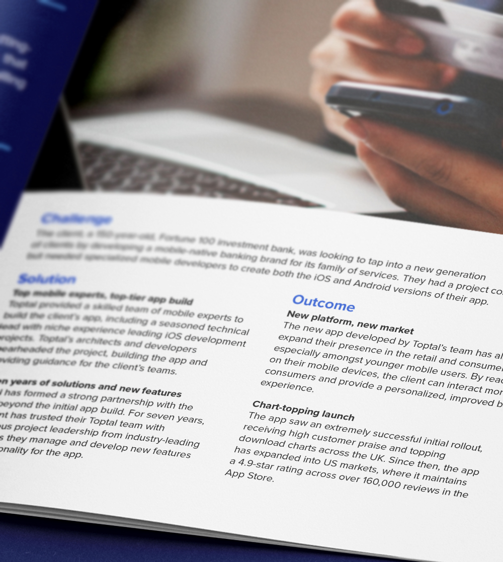
Top-five global financial services firm partners with Toptal iOS developers to reach new market with fintech mobile app.
Challenge: A 150-year-old Fortune 100 investment bank was looking to tap into a new generation of clients by developing a mobile-native banking brand for its family of services. They had a project concept, but needed specialized mobile developers to create both the iOS and Android versions of their app.
Solution: Toptal provided a skilled team of iOS developers and Android experts, including a seasoned technical lead, to build the client’s app. Toptal’s architects and developers spearheaded the project, building the app and providing guidance for the client’s teams.
Outcome: The new app allowed the client to expand its presence in the retail and consumer banking sector, especially amongst younger mobile users. The app saw an extremely successful initial rollout, receiving high customer praise and topping download charts across the UK. Since then, it has expanded into US markets, where it maintains a 4.9-star rating across over 160,000 reviews in the App Store.
RELATED CAPABILITIES
- iOS
- Android
- Mobile App
Toptal’s developers and software architects have played a pivotal role in building our app from the ground up. Their commitment to excellence and continuous delivery of new functionality aligns perfectly with our vision for our app, ensuring its ongoing success.
Managing Director, Consumer & Wealth Management
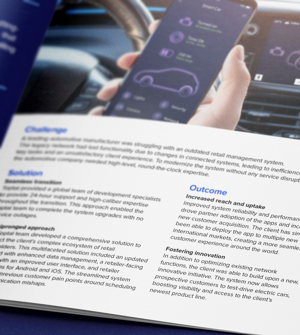
Toptal helps Fortune 500 automotive manufacturer improve CX through legacy software modernization.
Challenge: A leading automotive manufacturer was struggling with an outdated retail management system. The legacy network had lost functionality due to changes in connected systems, leading to inefficiencies in key tasks and an unsatisfactory client experience.
Solution: Toptal’s team, including a seasoned iOS developer, drafted a comprehensive, multifaceted solution to connect the client’s complex ecosystem of retail stakeholders. The team updated the back end with enhanced data management, developed a retailer-facing website with an improved UI, and created retailer applications for iOS and Android.
Impact: Improved system reliability and performance drove partner adoption of the apps and increased new customer acquisition. The client has since been able to deploy the app to multiple new international markets, creating a more seamless customer experience around the world.
RELATED CAPABILITIES
- Mobile App
- iOS
- Android
- Software Development
- Node.js
The most gratifying aspect was realizing the significant contribution I made and seeing it appreciated. It was fulfilling to see how my expertise and ideas could shape a large-scale product.
Asi Farran
Senior Full-stack Developer
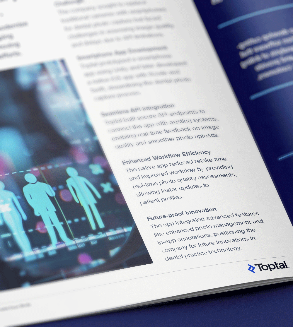
Toptal iOS developer streamlines dental photo capture for healthcare company with native app.
Challenge: The company sought to replace traditional cameras with smartphones for dental photo capture, but due to API limitations, it faced challenges in assessing image quality and delays. A Toptal iOS developer helped modernize the industry leader’s dental photo process, improving efficiency and reducing manual efforts.
Solution: Toptal prototyped a smartphone app using Unity and later developed a native iOS app with Xcode and Swift, streamlining the dental photo capture process. The iOS developer built secure API endpoints to connect the app with existing systems, enabling real-time feedback on image quality and smoother photo uploads.
Outcome: The native app reduced retake time and improved workflow by providing real-time photo quality assessments, allowing faster updates to patient profiles. The app integrated advanced features like enhanced photo management and in-app annotations, positioning the company for future innovations in dental practice technology.
RELATED CAPABILITIES
- iOS
- Unity
- Xcode
- Swift
- Mobile App
- API
Capabilities of iOS Developers
Get a responsive, high-performance mobile app with help from iOS developers from Toptal. Our developers create sleek, user-friendly applications specifically designed and optimized for the Apple ecosystem.
Native iOS App Development
Building native iOS applications ensures your app integrates seamlessly within Apple’s ecosystem and provides users with a responsive experience on iPhone and iPad. Toptal’s iOS and iPhone app developers code with Swift and Objective-C, providing clients with high-performing iOS-optimized applications.
User Interface Design With UIKit and SwiftUI
It’s important to make sure your user interfaces are intuitive, responsive, and visually appealing to your users. Using Apple’s UIKit and SwiftUI, our developers ensure that your app provides an exceptional end-user experience and follows Apple’s Human Interface Guidelines.
API Integration
Integrating APIs into your mobile app makes data more accessible and facilitates a wealth of functionality, including more personalized user experiences. Our iOS developers integrate RESTful APIs and third-party services, enabling real-time data synchronization and secure communication between your app and back-end systems.
Push Notifications and In-app Messaging
Keeping users engaged and within your ecosystem can lead to better conversion rates. To provide timely information tailored to user preferences, our developers implement push notifications and in-app messaging using Apple’s Push Notification Service (APNs) and libraries like Firebase, as well as implementing custom solutions.
Core Data and Offline Data Storage
Providing users with access to key app features even when they’re offline increases the potential time spent in your app. Our developers enable offline access by leveraging managed object contexts and persistent stores, implementing data fetching and saving methods for seamless transitions.
Integration With Apple Services (iCloud, HealthKit, etc.)
Give users a full in-app experience across iOS devices and services. Our developers integrate your app with Apple Services, such as iCloud for data synchronization, HealthKit for fitness and health data, and Apple Pay for secure in-app payments.
Mobile Security Best Practices
Increase trust by protecting sensitive information and complying with regulations like GDPR and HIPAA. To keep your app secure, our developers use data encryption, secure coding best practices, and authentication methods like Face ID or Touch ID, in addition to regularly updating dependencies to protect against vulnerabilities.
Performance Optimization and Memory Management
Make sure users have a good experience with your app by speeding up performance and decreasing load times. Our developers implement lazy loading, reduce memory footprint, and utilize caching strategies to enhance overall app responsiveness and user experience.
Testing and Debugging With Xcode
Toptal’s iOS developers use Xcode for testing and debugging by employing unit tests and UI tests to validate app functionality. By leveraging the XCTest framework, they ensure code quality and a seamless user experience through systematic testing.
iOS App Store Submission and Compliance
Complying with Apple’s guidelines makes it easier to get your app approved and available on the app store. Our developers handle the full process of submitting apps to the Apple App Store, optimizing their work for approval, and, once approved, managing app store listings.
Trusted by 25,000+ Clients Worldwide
Find the Right Talent for Every Project
Accelerate your project with versatile, expert talent. From short-term solutions to long-term collaboration, Toptal delivers impactful results.
Senior iOS Developers
Senior iOS developers bring deep technical expertise and advanced problem-solving skills to address your most complex challenges. Toptal’s rigorous vetting process provides access to professionals who combine robust technical experience with proven leadership.
Dedicated iOS Developers
Dedicated iOS developers focus exclusively on your projects, leverage advanced iOS expertise, and align with your long-term objectives to enable seamless integration and deliver high-quality outcomes.
Offshore iOS Developers
Offshore iOS developers combine exceptional expertise with competitive rates, making them ideal for scaling projects efficiently. Operating across multiple time zones, they provide global coverage and 24/7 support for time-sensitive requests.
Remote iOS Developers
Remote iOS developers offer top-tier expertise worldwide, removing location barriers to connect you with the best talent for your projects. They integrate seamlessly with distributed or hybrid teams, enabling flexible collaboration from anywhere.
FAQs
The cost associated with hiring an iOS developer depends on various factors, including preferred talent location, complexity and size of the project you’re hiring for, seniority, engagement commitment (hourly, part-time, or full-time), and more. In the US, for example, Glassdoor’s reported average total annual pay for iOS developers is $132,500 as of October 2024. With Toptal, you can speak with an expert talent matcher who will help you understand the cost of talent with the right skills and seniority level for your needs. To get started, schedule a call with us — it’s free, and there’s no obligation to hire with Toptal.
Typically, you can hire iOS developers with Toptal in about 48 hours. For larger teams of talent or full end-to-end project delivery, timelines may vary. Our talent matchers are highly skilled in the same fields they’re matching in—they’re not recruiters or HR reps. They’ll work with you to understand your goals, technical needs, and team dynamics, and match you with ideal candidates from our vetted global talent network.
Once you select your iPhone developer, you’ll have a no-risk trial period to ensure they’re the perfect fit. Our matching process has a 98% trial-to-hire rate, so you can rest assured that you’re getting the best fit every time.
To hire the right dedicated iOS app developer, it’s important to evaluate a candidate’s experience, technical skills, and communication skills. You’ll also want to consider the fit with your particular industry, company, and project. Toptal’s rigorous screening process ensures that every member of our network has excellent experience and skills, and our team will match you with the perfect iOS developers for your project.
At Toptal, we thoroughly screen our iOS programmers to ensure we only match you with the highest caliber of talent. Of the more than 200,000 people who apply to join the Toptal network each year, fewer than 3% make the cut.
In addition to screening for industry-leading expertise, we also assess candidates’ language and interpersonal skills to ensure that you have a smooth working relationship.
When you hire iPhone app developers with Toptal, you’ll always work with world-class, custom-matched iOS developers ready to help you achieve your goals.
You can hire iPhone developers on an hourly, part-time, or full-time basis. Toptal can also manage the project end-to-end based on your specific requirements as part of our Consulting and Services offerings. Whether you hire a iOS developer for a full- or part-time position, you’ll have the control and flexibility to scale your team up or down as your needs evolve. Our iOS developers can fully integrate into your existing team for a seamless working experience.
We make sure that each engagement between you and your iOS developer begins with a trial period of up to two weeks. This means that you have time to confirm the engagement will be successful. If you’re completely satisfied with the results, we’ll bill you for the time and continue the engagement for as long as you’d like. If you’re not completely satisfied, you won’t be billed. From there, we can either part ways, or we can provide you with another iOS developer who may be a better fit and with whom we will begin a second, no-risk trial.
Explore Related Toptal Services
Looking for an end-to-end business solution? Browse Toptal's portfolio of services.
How to Hire iOS Developers

Verified Expert in Engineering
10 Years of Experience
Dennis is a full-stack mobile developer with more than a decade of iOS and Swift expertise. He specializes in growth experience and in-app monetization and has held many technical leadership positions. As VP of Research and Development at SocialKit, he oversaw the launches of multiple apps that reached six-figure monthly downloads.
Expertise
Demand for iOS Developers Continues to Expand
When it comes to apps that run on Apple’s iOS platform, it’s not easy to hire app developers who can deliver a high-quality finished product. As of August 2025, the Apple App Store featured more than 1.9 million apps, but in 2024 alone, the App Store rejected 1.9 million apps for falling below its standards. Still, an iOS app has to succeed in measures of user satisfaction and user engagement, not just in the App Store.
In terms of mobile app market share, is iOS app development worth the challenge? Absolutely: iOS accounts for approximately 28% of the global market share yet drives more than 68% of total consumer spending on apps—and it consistently leads the US market. Regardless of location, it’s lucrative for companies with their own mobile apps to support iOS.
To prepare for hiring top iOS developers, this guide helps you navigate relevant tech trends, understand the essentials to include in iOS developer job descriptions, and effectively interview candidates who seek to contribute to your development projects.

What Attributes Distinguish Quality iOS Developers From Others?
iOS developers are often responsible for several crucial aspects of an iOS app and its life cycle. They work in dedicated teams within a development environment like the Xcode IDE to create, debug, and maintain code written in either Swift or Objective-C (to a lesser extent). They may work heavily on the front end, collaborating with UI/UX designers to create user-friendly apps in accordance with Apple’s Human Interface Guidelines.
In addition, mobile developers on smaller teams may be further tasked with creating corresponding back-end services, running DevOps processes, and helping with both manual and automated QA. Mobile apps come with various challenges that make the ability to manage data on Apple ecosystem devices like iPhones, iPads, and Apple Watches very important.
Like all mobile app developers, iOS developers may be assigned to integrate common features such as push notifications, purchase flows, or location services—it all depends on business requirements. Here are a few of the most important areas an iOS developer might work on:
- Web API Integration and Networking: Working with REST APIs and back-end services may be a hard requirement for certain app features. Candidates may then need to be comfortable with parsing JSON or XML data, handling network error cases appropriately, and making requests using URLSession or Alamofire in Swift, or NSURLSession in Objective-C.
- Push Notifications: If your project aims to get a user’s attention in real time (even when their phone is locked), you may need an iOS programmer who knows how to use the Apple Push Notification service to leverage this popular engagement technique.
- Background Tasks: Your app may need to perform short tasks (e.g., refresh or fetch) or long tasks (e.g., extensive data processing) in the background. If so, you’ll need an application developer who knows how to enable these capabilities and register tasks with Apple’s background task scheduler.
- Authentication: If your app requires a login, you’ll need an iOS developer who has experience with secure frameworks like OAuth and services specific to your tech stack like Auth0 or Firebase Authentication.
Skilled developers know when a solution already exists within the built-in features of the iOS frameworks they’re using, and won’t waste resources on needless problem-solving. They also keep themselves current regarding Apple’s App Store guidelines so their app submissions succeed rather than requiring rework.
Core Skills for iOS App Development
No software skill sets exist in a vacuum, even in the context of proprietary technologies. Regardless of the specific use case, all iOS developers should be skilled with the following tools:
Swift/Objective-C: Swift skills alone are suitable for most projects, since Swift is Apple’s preferred language for iOS development. However, if your company maintains an Objective-C code base, this skill is a must-have for your candidates. If you’re migrating to Swift, you’ll want someone with both skills.
Swift developers should know how to leverage functional programming concepts in implementing business logic, such as composing via higher-order functions and using map(), filter(), and reduce(). They should also know how to keep apps running stably using optional types, and how to optimize compilation times by avoiding heavy reliance on type inference.
An Objective-C developer’s knowledge should go beyond basic object-oriented programming concepts like classes, objects, methods, and properties, and include protocols and categories, as well as memory management best practices, such as when to use automatic reference counting and how to avoid memory leaks. They should also be skilled with Cocoa Touch, which enables developers to access iOS-specific hardware and software features like the camera, GPS, and touch screen.
Xcode: Apple’s official IDE for iOS development, Xcode, has few viable alternatives. The best iOS developer candidates should be power users of Xcode’s code editor, integrated source control, and debugger, and have mastery of Xcode’s Interface Builder—or alternatively, SwiftUI—for building user interfaces. Candidates should also know their way around Xcode’s Instruments for performance optimization; poor performance is often caused by increasing the complexity of the UI without adequately profiling and optimizing hangs.
On smaller teams where candidates might be tasked with publishing, they should be familiar with App Store Connect as well as Xcode app signing and provisioning processes; you may even require them to have their own Apple Developer account. On any size team—even one large enough to have dedicated QA staff—proficiency using Xcode’s Simulator is a requirement for the front-line testing that developers do before releasing a build.
Complementary Skills for iOS App Development
While some complementary iOS developer technical skills will depend on your project specifics, the ones worth paying attention to on an iOS developer’s résumé will often include the following:
Core Data: In the Core Data framework, Apple provides a robust way for iOS developers to model, store, and query data without needing to know the details of underlying data technologies like SQL. Core Data yields many user benefits, such as the ability to sync app data across any Apple devices sharing an iCloud account. Knowing the standard way to do this using Core Data allows developers to spend less time reinventing a sync solution, and provides users with a sync experience that is consistent across numerous iOS apps. Most iOS development teams will be right at home with solutions done the Core Data way, so your current candidates need to be too.
Unit Testing: Creating and maintaining automated tests of lower-level components (units) of your iOS codebase are a very worthwhile investment: Regression prevention, reduced QA costs, easier debugging, and a stabler codebase make unit testing a boon from both a developer and a business perspective. Meticulous developers will be in the habit of integrating unit testing with the coding and debugging workflows of their development process.
Swift Usage for iOS App Development: Hiring Swift vs. Objective-C Specialists
Swift was released in 2014 and created to be the successor to Objective-C, offering clearer and more concise syntax, faster performance, and features like automatic memory management. As a result, Objective-C has fallen out of fashion for building new apps, and is now mostly relevant in the hiring market when it comes to the maintenance and refactoring of legacy software.
Because Swift is the default choice these days, if your iOS app development project only uses Swift, the candidate pool will be a lot bigger. If you’re looking for mobile app developers to migrate a legacy Objective-C app to Swift, you’ll want to make sure they have prior experience with this process. Objective-C specialists are often proficient with Swift due to its current popularity, but Swift specialists early in their career may not have any experience with Objective-C.
How Can You Identify the Ideal iOS Developer for You?
To find your ideal iOS developer, you must first have an accurate picture of your project and its overall requirements. Start by thinking about questions like these, as applicable:
- Is it a greenfield project, an MVP, a recent launch needing scaling, or a well-established app experiencing a change in team structure?
- Does your app use any special integrations, uncommon APIs, or advanced features like real-time video processing?
- Is it written in Swift or Objective-C, and is there any plan for that to change?
- Will you be using any cross-platform frameworks like React Native or .NET MAUI?
- Will knowledge of any back-end programming languages such as PHP, Python, or Node.js be required?
- What are the strengths of your current developers and adjacent team members (designers, project managers, etc.)? What skill gaps do you need to fill?
- Is iOS the only operating system the developer will be working with, or should they also be an Android developer working on Android apps? (In this case, proficiency in Flutter, Java, and Kotlin is highly valued, as these technologies enable cross-platform development and seamless integration with Android.)
iOS Development Common Use Cases
It’s worth considering whether your project intersects with these common use cases to ensure that candidates have the appropriate experience and specialization. The use cases for native iOS development services are far-reaching and apply to nearly every industry, but broadly speaking, they most often fall into these categories:
- Apps made to generate revenue via:
- In-app purchases, as is common with subscriptions in utility and lifestyle apps as well as mobile games.
- Advertising, which is prevalent not only with games but also with apps that provide free services.
- Sales of the app itself, as seen in all app categories.
- Apps built for non-revenue purposes such as:
- Customer engagement apps that are usually provided free of charge.
- Companion apps for specific hardware, like smart home and other IoT devices.
- Internal apps meant only for employees, most common among larger enterprises.
Whether creating e-commerce apps, social media clients, productivity tools, home automation, mobile games, or myriad other categories of mobile apps, companies wanting their offerings to run on iPhones will need iOS developers.

After you’ve considered your particular use case, you can list the gaps in your team. Next up in the hiring process is to discover what sort of iOS developer will fill them best. Many companies supplement their in-house teams with freelance iOS developers. It’s important to narrow your search to the specific level of experience necessary to get the job done and satisfy all project requirements.
Distinguishing Between Junior, Mid-level, and Senior iOS Developers
Often having less than two years of experience in iOS development, a junior developer can create (and perhaps publish) basic iOS applications independently, but will raise time requirements for senior team members, who will need to mentor them in best practices, advanced feature implementation, scaling, and enterprise-quality publishing standards. For example, if they’ve mainly created apps that rely on real-time online data, they may not have delved into Core Data as a storage component for more complex projects. Or perhaps they’ve never had to implement more sophisticated graphics using a lower-level technology like Core Graphics.
A larger iOS project might benefit from a junior developer working on smaller tasks—for example, in a news reader app, they might be tasked with implementing a dark mode option—but when bugs arise, it may take the help of a mid-level or senior developer to navigate the project and troubleshoot effectively. This is especially true if their tasks affect multiple project components.
With between two and five years of experience in iOS development, a mid-level developer is a cost-effective option who will have worked on several iOS apps from start to finish to publication, and learned valuable architectural lessons from their maintenance periods as well. They will likely know both Swift and Objective-C, along with several common iOS architectures, so that they can start making positive contributions soon after onboarding with most iOS codebases.
Mid-level developers will have likely implemented a greater variety of features, so they’ll be comfortable with more advanced technologies like Core Animation, Core Location, and Core ML. They’re used to taking ownership of entire features, whether that means integrating with third-party services, implementing custom user interface or user experience components, or creating novel solutions to address business- and app-specific challenges in projects of any size.
With at least five years of software development experience focused on iOS, a senior software engineer will have no trouble proving their reliability in delivering successful projects. Senior developers will know how—and more importantly, when—to use expert-level iOS developer skills like leveraging Grand Central Dispatch or optimizing graphics performance using iOS Metal. They have the Swift and Objective-C skill sets needed to maintain or even migrate an Objective-C project, and also to create a well-architected project in either language from scratch. They’ll have a deep familiarity with common iOS design patterns like MVC, MVVM, and VIPER, as well as common Apple frameworks like UIKit (and others provided by Cocoa Touch), AppKit, and SwiftUI. Good candidates will have the soft skills (especially the communication skills) needed to mentor developers, but they’ll also be comfortable collaborating with cross-functional teams and stakeholders to keep project requirements clear and easy to translate into actionable goals. Startups can benefit greatly from a full-stack developer with senior-level experience. Hire a senior developer with extensive experience if you don’t have one already for any mission-critical or complex iOS project.
In the end, projects and teams have their nuances, and the target experience level is up to you. When it’s not clear what you need, it’s worth consulting the senior developers on your team. If you don’t have any, hire iOS developers with the best track record you can find.
How to Write an iOS Developer Job Description for Your Project
With a rough list of requirements, especially technical ones, you can start customizing an iOS developer job description template. You may also want to incorporate elements from a Swift developer job description template if it applies to your project. The more detail you’re able to include, the better—this way, candidates will self-filter more accurately, saving your time and theirs. But the job description has to be accurate to be effective, so it’s worth having someone close to the project check the final listing to make sure that you’re on the right track to hire iOS app developers who will best help your development team meet your business needs.
In your job description, it is important to specify whether the position is part- or full-time, and if you are looking for on-site, hybrid, or remote iOS developers. Because remote developers can work in different time zones, look for developers whose work hours overlap.
What Are the Most Important iOS Developer Interview Questions?
Interviewing and vetting applicants is easier if you have both a list of iOS developer interview questions and someone to help you understand your candidate’s answers. If your iOS project uses Swift, consider adding some Swift interview questions to the mix. It also makes sense to get less specific (while remaining appropriately technical) by including interview questions about mobile app development.
What does an iOS developer do?
It sounds simple enough, but a question like this can be a great icebreaker to kick off a conversation and begin to assess a candidate’s understanding of how their role fits into the bigger picture of an organization. An iOS developer primarily writes and maintains code in the Objective-C or Swift programming languages to build mobile applications for the iPhone. But to write that code in a way that aligns with your brand and business goals, iPhone app developers’ daily tasks may overlap significantly with several other roles, depending on the size of your team. A skilled iOS developer should be able to draw upon their direct experiences interacting with these overlapping and adjacent roles: UI/UX designer, graphic designer, DevOps engineer, app publisher, project manager, team lead, marketer, software architect, back-end developer, network engineer, accessibility specialist, and security expert. However they approach your project, an iOS developer must be skilled at translating user requirements into functional, visually appealing, and on-brand mobile features.
If you were to choose between SwiftUI and UIKit for a greenfield project, which project aspects would you need to consider, and why?
This is a great question to ask to get a sense of the candidate’s decision-making process and experience with software architecture. SwiftUI, significantly newer but still mature, makes sense as a default choice for new iOS projects, especially if their feature set will be fairly standard. But an experienced developer should recognize that SwiftUI still lacks some features that the older UIKit has full support for. Apple is improving this situation incrementally, but for more complex or feature-rich projects (for example, those relying on concurrent programming), SwiftUI may come with an unnecessary development burden. A pragmatic candidate may propose a hybrid approach to benefit from the strengths of the two frameworks—especially SwiftUI’s speed in terms of both rapid application development and superior on-hardware runtime performance. That said, a brand-new project may still need to support older versions of iOS that will limit the use of certain features in newer versions of SwiftUI, in which case it isn’t a wise option.
How do you approach accessibility in iOS projects?
Accessibility should be one of the highest priorities in the development process—in fact, regulations may impose accessibility requirements on your project. Strong candidates should know their way around the XCode IDE’s Accessibility Inspector for initial auditing. They should be able to describe their experience with this feature, what they found helpful about it, and some of its limitations. They should also know how to make apps compatible with iOS accessibility features like VoiceOver, Voice Control, and Dynamic Type, and be able to provide examples of how accessibility has changed how they’ve approached UI label texts.
When should you use Apple’s Security framework?
Much like accessibility, security is of the utmost concern when building and maintaining any app that handles user data. The Security framework provides low-level functionality for security aspects like code signing, secure data storage and transportation, cryptography, and user authentication and authorization. But it’s not meant to be a catchall solution, or even the first choice when it comes to developer security considerations. A good answer will highlight that a higher-level framework should be used instead whenever possible. For example, developers tasked with implementing HTTPS functionality would use the URL Loading System API, which uses the Security framework, rather than just using the Security framework directly.
Why Do Companies Hire iOS Developers?
Regardless of industry, any company with a serious mobile strategy needs to offer an iOS-specific app, and therefore needs experienced iOS developers. Your company’s app may well be the primary way your clients interact with you; if so, keeping high standards for your app’s user experience is a crucial strategy for maintaining your organization’s reputation and profitability.
Whether launching a minimum viable product, optimizing an iOS app as it scales, or maintaining a legacy application, companies continue to fuel the demand for iOS developers for hire. But as a hiring manager, you need to know your project’s specific technical needs before you can find a suitable iOS developer.
With the relevant topics and technologies from this guide at hand, you’re ready to start shaping your job description and narrowing your candidate pool. Hiring the right developer or development company for your project will let you see firsthand how offering a professionally made iOS application can bolster your company’s success.
Featured Toptal iOS Publications


Top iOS Developers Are in High Demand.