Build Ultra-modern Web Apps with Angular Material
Material Design uses a paper metaphor, bold intentions, and meaningful motion to give user interfaces an ultra-modern feel. Web applications built using AngularJS can now easily adopt these design principles using Angular Material, a reference implementation of Google’s Material Design Specification.
In this article, Toptal engineer Matt Spaulding walks us through the principles of Material Design and showcases some modern user interface elements built using the Angular Material library.
Matt is a full-stack developer that specializes in developing V1.0 software. He takes an idea and crafts it into a beautiful product.
PREVIOUSLY AT

At the Google I/O Conference back in 2014, Google announced Material Design, their new design language. They have since converted much of their popular applications to adhere to this new spec in an effort to provide a consistent experience. Now they are trying to convince you to follow along as well.
What Is Material Design?
After a visit to the official Material Design spec, you will immediately get a feeling of ultra-modern minimalism. Basic shapes and flat colors are the theme here. Going through the documentation is quite an experience. I recommend taking a look for yourself, but I will summarize it here.
Goal
The purpose is to create a visual language that synthesizes classic principles of good design with the innovation and possibility of technology and science. Also to develop a single underlying system that allows for a unified experience across various platforms and device sizes.
Principles
Material Design is founded on three principles.
Material Is the Metaphor
Inspired by the study of paper and ink, the material lives in 3D space and is grounded in tactile reality. It gives the illusion of space by using realistic shadows. The paper material must abide by the laws of physics (i.e. two pieces of paper may not travel through each other), but may supercede the physical world (i.e. a paper may grow or shrink).
Bold, Graphic, Intentional
Deliberate color choices, edge-to-edge imagery, large-scale typography, and intentional white space create a bold and graphic interface that immerse the user in the experience. The Floating Action Button, or FAB, is a prime example of this principle. Have you noticed that little circle with the ‘plus’ symbol floating around in your Google Inbox app? Material Design makes it very apparent that this is an important button.
Motion Provides Meaning
Motion is meaningful and appropriate, serving to focus attention and maintain continuity. Feedback is subtle yet clear. Transitions are efficient yet coherent. The main point here is to animate only when it has a purpose and not to overdo it.
How Does AngularJS Fit into Material Design?
AngularJS, Google’s “Superheroic JavaScript MVW Framework”, addresses many of the challenges encountered in developing single-page applications (SPA). It provides the framework needed for creating modern web applications that connect to APIs and never need the page to be refreshed.
AngularJS: A New Approach
Angular is what HTML would have been, had it been designed for applications. HTML is a great declarative language for static documents, but creating dynamic applications not so much.
Creating dynamic applications with HTML has always been an exercise in tricking the browser into doing things it wasn’t meant to do. There are a couple of approaches to doing this.
- Library - a collection of functions. (jQuery)
- Framework - code dynamically fills in static elements when needed. (Durandal, Ember)
Angular takes a different approach to solve this problem. Instead of struggling with the HTML it is given, it creates new HTML constructs. Angular teaches the browser new HTML syntax through a construct called ‘directives’. Angular comes with a set of these directives built-in, but also allows you to create custom directives, so it allows you to write your own HTML elements.
Wouldn’t it be neat if Google created a set of directives based on Material Design principles?
Introducing Angular Material
Google is actively developing Angular Material, an implementation of Material Design in AngularJS. Angular Material provides a set of reusable UI components based on the Material Design system. Angular Material is composed of several pieces. It has a CSS library for typography and other elements, it provides an interesting JavaScript approach for theming, and its responsive layout uses a flex grid. But the most appealing feature of Angular Material is its amazing collection of directives.
Getting Started
I have created an open source project to help jumpstart your next Angular Material project. The purpose of this project is to give an example of everything Angular Material has to offer, all under one roof. Navigation, paging, theming, and the entire collection of directives are ready to go, all you have to do is feed in your data and bind it to the HTML.
Take a look at the demo here or fork the code on GitHub.
Directives
Directives are a core Angular feature. Angular comes with several directives that you use all of the time like ng-model or ng-repeat. They are a very important piece of Angular that makes the framework function as it should.
How to Use an Angular Material Directive
Angular Material extends this directive library with a set of beautiful Material Design inspired directives. Angular Material directives are HTML tags that begin with ‘md’; short for Material Design. They couldn’t be much easier to use. For example, let’s take a look at the good old button.
A standard HTML button might look something like this.
<button>Click Me</button>
An Angular Material button looks like this.
<md-button>Click Me</md-button>
And this is all that is needed to make a Material button. Now, there are several other options that are available for this directive such as theming it and raising it from the surface to imply importance.
<md-button class="md-raised md-primary md-hue-1">Click Me</md-button>
Services
Services are also core to Angular functionality. They are used to share code across the application. A common core service like $http is used and reused for data calls in Angular applications.
Angular services are:
- Lazily instantiated – Angular only instantiates a service when an application component depends on it.
- Singletons – Each component dependent on a service gets a reference to the single instance generated by the service factory.
How to Use an Angular Material Service
Angular Material comes packaged with some services that provide some extra functionality to the application. They also contribute to the performance of some of the directives. A great example of a service is the ‘toast’.
A toast is a small notification that slides in from the top of the screen and goes away after a few seconds. Using this service is easy.
In JavaScript,
$mdToast.show(
      $mdToast.simple('Simple Toast!')
        .position('left bottom')
        .hideDelay(3000)
    );
This example shows a simple toast that pops up on the bottom left of the screen and retreats after 3 seconds.
Some services can be personalized with custom templates. In this case, the $mdToast service can use a custom HTML template by using the md-toast directive.
Theming
Material Design is a visual language where themes convey meaning through color, tones, and contrast. These themes are expressed throughout the components in the entire application to provide a more unified feel.

According to the Material Design guidelines, you must “limit your selection of colors by choosing three color hues from the primary palette and one accent color from the secondary palette.” Angular Material makes following this guideline simple by using JavaScript to configure the theme. But first, what is a palette and a hue?
- Hue: A hue is a single color in a palette.
- Palette: A palette is a collection of hues.
For example, a palette would be ‘green’ and a hue is a particular shade of green. Angular Material comes packaged with all of the valid palettes from the Material Design spec. You can learn about more about the valid color palettes here.
Configuring the Theme
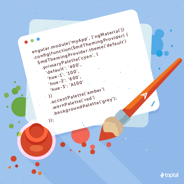
Theming your project is a piece of cake. In the app.js file, set your desired palettes and hues using the Theming Provider service.
angular.module('myApp', ['ngMaterial'])
.config(function($mdThemingProvider) {
  $mdThemingProvider.theme('default')
    .primaryPalette(‘cyan’, {
      'default': '400',
      'hue-1': '100',
      'hue-2': '600',
      'hue-3': 'A100'
    })
    .accentPalette('amber')
    .warnPalette('red')
    .backgroundPalette('grey');
});
Using the Theme
To apply the theme to the components, set the class of the element to the desired palette and hue.
<md-button class="md-primary">Click me</md-button>
<md-button class="md-primary md-hue-1">Click me</md-button>
<md-button class="md-primary md-hue-2">Click me</md-button>
<md-button class="md-accent">or maybe me</md-button>
<md-button class="md-warn">Careful</md-button>
Layout
Flexbox is the latest and greatest addition to responsive design and Angular Material comes packaged with it. If you are familiar with the Bootstrap grid system, then you should be able to catch on quickly. In fact, Bootstrap is switching to Flexbox in its upcoming release. It has the familiar rows and columns layout you have become accustomed to, but with much more. Learn how to use Flexbox with this tutorial or study the official documentation.
Top 9 Best Angular Material Directives
There are too many Angular Material directives to list them all, so I would like to share with you my favorites.
9. Progress Linear
Often in SPAs, pages need time to load data from the server. If the application shows a blank page during this time, users may think the application is broken and will leave. Let users know the data is loading with the Progress Linear directive. Users will know to wait when they see an animated progress bar indicating that something is happening. Alternatively, use the Progress Circular directive for a round indicator.

8. Date Picker
The Date Picker directive makes choosing a date a clean, simple experience for the user and a true one-liner to write. Simply use md-datepicker and optionally confine the range with md-min-date and md-max-date and that’s it.

7. Autocomplete
Autocomplete provides a pleasant user experience by helping the user choose an option. It is what makes Google’s search engine the best. The Autocomplete directive adds this functionality to your application by completing a user’s words as they type. But the best part about this directive is customization. By filling your autocomplete with md-item-template you can give more meaning to the suggestions. For instance, if a user was searching for names in a company, the autocomplete could show the matching names with their picture and company role, giving a more robust user experience.

6. Bottom Sheet
The bottom sheet is a little menu that slides up from the bottom of your screen, covering content and taking focus. Originally intended to be used solely for mobile devices, the bottom sheet has been gaining popularity on larger screens. To use it, create a template with md-bottom-sheet containing either an md-grid or an md-list for a grid layout or list layout, respectively. Then call it with the Bottom Sheet service, $mdBottomSheet.show().

5. Input
Input forms are boring and have been since the beginning of the internet. But they don’t have to be! Give your inputs some flair with the Input directive. Wrap your input tag with md-input-container and watch it come to life. Watch as your placeholder animates into a floating label. Easily validate your input with instant, but subtle, color changes and warning messages. Input directive takes an element that is expected to be boring and delivers a pleasant surprise.

4. Toast
The most aggravating user experience is not knowing what the application is doing. We ease this aggravation with toasters, or little unobtrusive notifications. In the olden days, when we sent a request to the server we waited on that page until the response came back before we could move on. User attention span has dropped drastically since then. In today’s SPAs, we click a button and expect to move along immediately, dealing with the server response when it comes. The Toast directive makes this a piece of cake. A toaster is summoned by simply using the Toast Service, $mdToast.show(), and setting the text, duration, and which corner to appear in. Make your own custom toaster with md-toast.

3. Grid List
Are your lists lacking pizazz? Grid lists are an alternative to standard list views. A grid list is best for presenting images, and is optimized for visual comprehension. It works by laying different sized tiles on a grid, giving a scattered, eclectic feel. The tile size and layout then respond to the screen size. This directive is sure to give your application an exciting and fun look.

2. Whiteframe
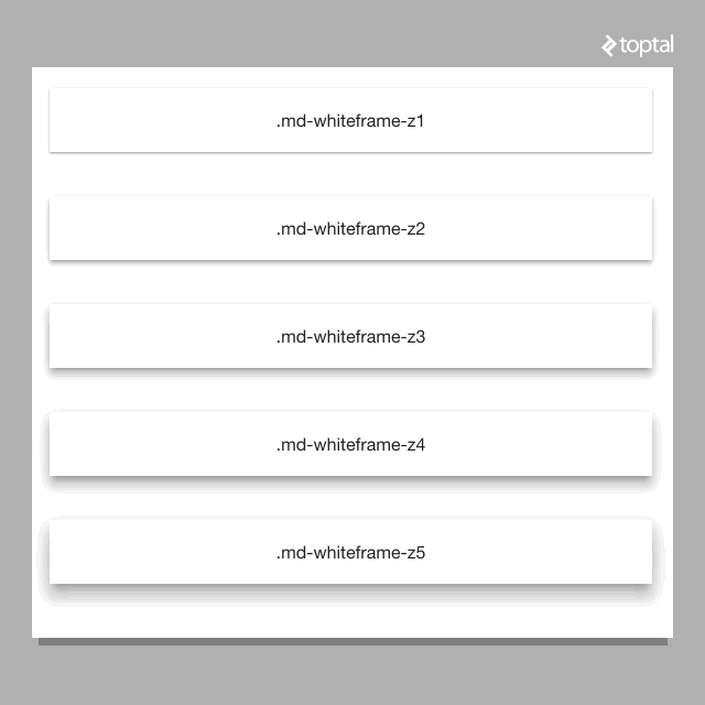
The concept of space is the core of Material Design and its paper metaphor. Two sheets of paper in the same z-position (or depth), form a seam and must move together. Two overlapping sheets of paper, with different z-positions, form a step. They move independently of each other. To follow the design, we must be able to shift elements along the z-axis. Angular Material provides a simple way to do this. Using the Whiteframe directive, set the class to md-whiteframe-z{x}, where x is the units of depth up from the background. The larger the number, the larger the shadow cast by the paper.

1. Sidenav
Creating a side navigation menu has never been easier. The Sidenav directive places a navigation menu on either the left or right of the screen. Keeping mobile in mind, it swipes in and out as expected, or programmatically with a button click. A nice addition is the lock open feature. The side navigation can be set to lock open when the screen reaches a certain size. By setting the parameter md-is-locked-open=”$mdMedia(‘gt-sm’)” the menu will be tucked away on the phone but locked open on tablet and larger.

Conclusion
Google is converting their most popular applications to Material Design. Now they are heading the development of Angular Material, an implementation of Material Design written in AngularJS. Material Design uses a paper metaphor, bold intentions, and meaningful motion. AngularJS organizes single page applications. Angular Material applies Material Design principles to AngularJS applications.
Material Design is here and Angular Material is a fantastic way to apply the Material design spec to your single page applications. If you want to create your own Angular Material application, don’t waste your time starting from scratch. Rather, start off with a fully functioning app with demos of the directives, theming already set up, and navigation and routing ready to go. Take a look at the demo here or fork the code on GitHub. Of course, you can also learn all about Angular Material by visiting the official documentation.
What do you think about my picks for the best Angular Material directives? Did I get them right? What are your favorites?
About the author
Matt is a full-stack developer that specializes in developing V1.0 software. He takes an idea and crafts it into a beautiful product.
PREVIOUSLY AT


