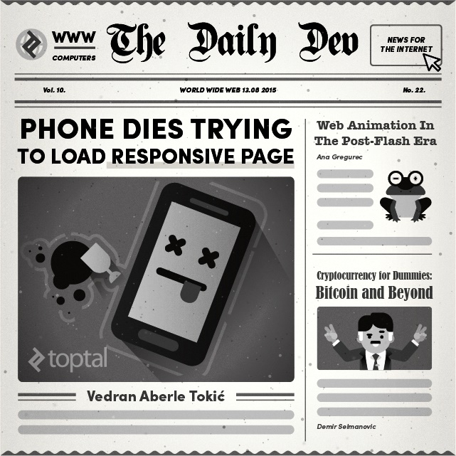
Responsive Design Is Not Enough, We Need Responsive Performance
Between square inch smart wristwatches and mammoth smart TVs, a responsive website capable of adapting to a wide array of screen sizes and device capabilities is something no one complains about. However, many websites are still plagued by desktop-first design paradigms, or mobile-first paradigms with absolutely no focus on performance. These traditional approaches to responsive web design have various shortcomings. Fortunately, some simple ideas can help solve these problems.

Between square inch smart wristwatches and mammoth smart TVs, a responsive website capable of adapting to a wide array of screen sizes and device capabilities is something no one complains about. However, many websites are still plagued by desktop-first design paradigms, or mobile-first paradigms with absolutely no focus on performance. These traditional approaches to responsive web design have various shortcomings. Fortunately, some simple ideas can help solve these problems.

With over two decades in full-stack development, Vedran’s a JavaScript veteran who loves to problem-solve user interfaces.
Expertise
Recently I’ve been running into a lot of responsive websites with a lot of performance issues. On most of them, the issues are so evident that they’re almost useless on anything besides the latest generation of smartphones. Considering the fact that responsiveness as a concept is intended to reach a wider audience, this seems rather counterproductive.
The greatest contributor to this issue is the still prevalent desktop-first design paradigm. Thinking from the perspective of mobile-first seems to address the issue, but that alone does not guarantee satisfactory performance. We all seem to rely far too much on more or less graceful degradation. We rely on shims and polyfills to enable missing functionality. We rely on libraries to enable rapid development and to have our back when browser compatibility is an issue.
“Why worry?” you might ask. “Most of our visitors have high performing smartphones running their latest OS versions. They can handle our sites. The analytics tell us so.”
I’m sorry about the straw-man argument, but I think it deserves stating out-loud that the people who can use your site will be the majority of your users. If you don’t see Android 2.3 in your analytics, does that mean that there are no users with those devices? Or does it mean your site has nothing to offer those users? Consider that a lot of devices of that generation are still on the shelves, being bought brand-new even today. You shouldn’t dismiss it outright as a yesteryear technology.
Therefore, I would like to talk about the ideal cases and actual goals of web development. And about practices and paradigms that get us closer to those goals.
Brick-First Design Paradigm
A significant portion of annual phone sales are still taken by feature phones. An even larger portion of population is not buying phones every year, but nevertheless have some web capable device in their possession. Add to those numbers last generation smartphones still in use, add the kindles and other web semi-capable devices (WAP devices, TV’s, toasters, t-shirts and bricks). Add them all up and you might reach a staggering sum.

Consider the use cases for this audience. They’re not going to read long articles, browse, and research on their devices. But they might go through the horrors of trying to type in a URL on the numeric keyboard and navigating the page using directional keys to get to a phone number or double-check an address on the fly.
How hard is it then for us to implement a sub-mobile-first layout that will provide only that information to the devices below a certain threshold of capabilities and performance?
Graceful Improvement
With graceful degradation as a minimum best practice, we’ve created a catch-all principle that (to some extent) obstructs thinking beyond it. Once graceful degradation is in place we can surely say our job is done, and done well. More and more often we don’t even have to think about it as it is already covered by the various frameworks and libraries in use. And finally polyfills and shims completely remove the need for functionality degradation in some cases.
As this functionality becomes more and more readily available, the need for thinking about it (let alone beyond it) becomes more and more remote.
From the standpoint of this article it could be broken down like this:
Ungraceful degradation: If a feature is not readily available, the implementation fails in such a way that it becomes unusable or usable in a prohibitively impractical way.
Graceful degradation: If a feature is not readily available, it fails in a way that still enables acceptable usability.
Ungraceful improvement: If the feature is not readily available it is emulated by a polyfill or shim.
There, problem solved.
Well unless you consider the performance of those same low end devices.
Lacking the processing power and data capabilities of their younger siblings, they are asked to carry a much greater load. Taking polyfills as a solution creates an illusion that all modern functionalities are now available on all devices and can be used without concern.
And so you implement modernizr and polyfill everything just in case. The least competent device ends up loading the greatest amount of data, and performing the greatest amount of processing. Thus ensuring the “best” end user experience.

The idea of graceful improvement would reverse the concept by starting with the lowest feature requirements and loading upgrades until the performance-usability balance is optimal based on device capabilities. Thus the data traffic and processing requirements would be moved to the devices best suited to handle them.
Sure, at the moment the concept is prohibitively complex: it is unsupported by most of the frameworks and libraries, it is mostly undiscussed, and references to such practices are few, far-apart, and localized to micro-functionalities. But at some point it was that way with all concepts and functionalities.
It Can, But Does It Have To?
Another best practice with web development is checking if a feature is available on a device before activating it.
However, take into account that you can install the latest version of Google Chrome on your years-old Android phone, and it will claim that it can run CSS animations, WebGL, background parallax effects, and many other functionalities. But it really, really, can’t. So much so that the browser will crash, and the entire device will become unresponsive to a point that it will have to be rebooted to regain control.
This issue has lately started affecting Android applications in a big way (from a user standpoint). One of the most noticeable degradations in this sense has affected Google Talk/Hangouts app upgrade that has turned their service from the most lightweight chat application available to an almost unusable application due to performance issues on older devices. (Just to stress this point once more: “older” here means that you can still buy it off-the-shelf, brand-new in almost any store). The same issue affected the YouTube app and the Twitter app (in my experience) and apparently many others.
So, take a moment at some point during your planning phase to evaluate the value of a high performance core feature over cutting-edge makeup. Or at least leave the last generation of your app/service/content available in some form for the legacy users. Speaking of which…
Let the Users Opt-Out from the Bleeding Edge
Have you ever found yourself trying to use Gmail from an old device, or over a poor connection? That “load basic HTML” link sure comes in handy.
Why doesn’t your cutting-edge, responsive, animated, touch-oriented online storefront have that functionality?
Think about it: you requested that it be responsive so you can reach more potential customers. You made it cutting edge to leave the best first impression. And as a result, less potential customers can reach even the basic information about you and your services. If graceful improvement is too costly a concept for you, why don’t you at least offer your visitors the option to access a text only version of your content if the “WOW” version is too much for their devices.
Do You Really Need the Whole Library?
Finally, the last best-practice I’d like to see pushed a bit beyond the standard is “use it or lose it”. Keeping track of which libraries and modules are actually in use and including only them is sometimes tedious, but keeping your entire toolset on every page is just sloppy.

Recently, I’ve taken to keeping track of how much functionality I actually use once I include a library. And the tool I use most often is jQuery. Often I find that I’ve used just one or two functionalities (such as $.extend or $.ready), or even worse, that I’ve used it just to get elements by class or ID. Sometimes I leave it like that, other times I go back through the code to remove or decouple the dependency.
Wouldn’t it be neat if you could automatically analyze what and how much of a library has ended up being used and losing weight based on the results?
A lot of libraries and applications offer the option to customize the loadout before you start using it. But I keep having this feeling that it shouldn’t be too far out of our reach to standardize an automated “use it or lose it” build architecture in our libraries.
I have an allergy for the “include everything” approach. But using it in conjunction with such a functionality might turn the approach to something similar to a prototyping board: an overly flexible development tool that gets minified not only in syntax, but in actual functionality itself.
What would be required is a development only version of the library that would, through a unit test of dependant functionality, enable tracing of used features and outputting the minimal dependency or at least scale of utilization (such as asking have I included jQuery for 8% of its functionality or 80%). The dependency output could then be used to cherry-pick, aggregate, and minimize the output for production.
But What Can I Do About It?
First of all, engage the issue. Think about it, discuss it with your peers, and try to spot the issue in real world scenarios.
Try it out. Dig out that last-gen phone that you have stashed away in a drawer somewhere. Try using it on your own websites and check if the content is even remotely usable. Go visit some behind-the-times relatives out in the country and try being a tech evangelist to them. See if their lag in tech adoption is actually facilitated by accessibility issues.
If you’re a buyer commissioning a website, make sure to ask for (at least) a low level support on this issue. Remember: the goal is not to create a full port of all your features to low level devices. All that’s being asked is that those users get your contact information instead of their device crashing.
Set aside actual resources for this: the simplest solution for the issue shouldn’t take more than a day or two and some forward thinking. Do keep in mind the most basic reasons for making the website in the first place (let alone making a responsive site).
If you’re a package developer working on a library, framework, bundle, or any other embeddable software: you’re the one who can make the most difference here. If you can facilitate or incorporate these concepts into your platform, you’ll be affecting the whole landscape of web development. If you do incorporate it into your package design, let me know and I’ll evangelize for you.
And finally, **if you’re a developer or a designer**, don’t just stop at best practices. Always try to look just a little over that horizon. The hard work is on you to push these concepts that no one yet asked for, that are unsupported and undocumented for the benefit of your clients and users.
Ultimately, if you want to hear someone go on about this for hours and find yourself near Zagreb, let me know. We could go grab a cup of coffee.
Further Reading on the Toptal Blog:
Zagreb, Croatia
Member since July 23, 2015
About the author
With over two decades in full-stack development, Vedran’s a JavaScript veteran who loves to problem-solve user interfaces.