
Building Simple and Efficient Components With React-Bootstrap
With websites being viewed on so many different types of devices and in so many screen sizes, a responsive user interface is more important than ever. Leverage the power of two popular technologies with the React-Bootstrap library for performant, responsive components.

With websites being viewed on so many different types of devices and in so many screen sizes, a responsive user interface is more important than ever. Leverage the power of two popular technologies with the React-Bootstrap library for performant, responsive components.

Matej is a full-stack developer with expertise across a variety of back-end and web technologies, including React, React Native, Bootstrap, and Django. He specializes in advanced web applications and built a global, bilingual travel and tourism app using React and React Native.
Expertise
Previous Role
Full-stack Web DeveloperPreviously At


The majority of web traffic now comes from mobile devices, not desktops. As such, modern web applications must readily adapt to various resolutions, aspect ratios, and devices. The React-Bootstrap library draws from two popular frameworks (React and Bootstrap) to facilitate the creation of effective, efficient, and responsive web applications.
This article discusses the building blocks and benefits of using a React-Bootstrap layout and explores detailed examples in a sample application, offering an improved development experience for your next web project.
Foundations: The What and Why of React-Bootstrap
Bootstrap, built on CSS and JavaScript, is a CSS framework that enables responsive web design using a grid layout of rows and columns. Let’s examine React-Bootstrap in the context of CSS frameworks and vanilla Bootstrap to identify the projects that it might best serve.
Bootstrap and CSS Frameworks
When building a website, CSS describes the visual elements on a page, and changing a site’s CSS can provide a much-needed makeover. In modern web styling, however, CSS alone won’t suffice—responsive web design is mandatory, and frameworks make CSS developers’ lives easier.
Responsive web design allows applications to modify layouts and elements based on a variety of devices and window or screen sizes. CSS frameworks provide additional benefits such as accelerated development, reduced code duplication, and improved code base maintainability.
There are many frameworks and component libraries that simplify front-end styling and UI development. Utility-first frameworks like Tailwind CSS focus on low-level styling utilities, while headless component libraries like Radix UI provide unstyled accessibility primitives for building custom interfaces. However, Bootstrap remains a widely used choice for responsive CSS and component-driven development due to benefits like:
- A strong community and extensive documentation.
- A well-established ecosystem with a variety of styling components, including pre-made blocks, themes, and templates.
- Customizability and cross-browser compatibility.
React-Bootstrap occupies an important middle ground by combining Bootstrap’s responsive design system with React-friendly component APIs.
Let’s examine the trade-offs when deciding between React-Bootstrap and vanilla Bootstrap.
Bootstrap vs. React-Bootstrap
With so many advantages out of the box, why wouldn’t we want to use plain Bootstrap for React applications? The answer lies in the way React is built.
React doesn’t recommend that developers modify the DOM directly; instead, it primarily employs the virtual DOM, or VDOM, to track all the changes to the DOM. React can miss changes outside the VDOM, leading to bugs, errors, and unexpected behaviors.
Earlier versions of Bootstrap relied heavily on jQuery, which directly changed the DOM and could therefore produce these undesirable outcomes. Enter React-Bootstrap, the library that provides access to Bootstrap components through React-friendly APIs instead of direct DOM manipulation.
In addition to preventing undesirable behavior related to the DOM, React-Bootstrap also offers clean and readable syntax. Let’s create the same example card using Bootstrap and React-Bootstrap to compare:
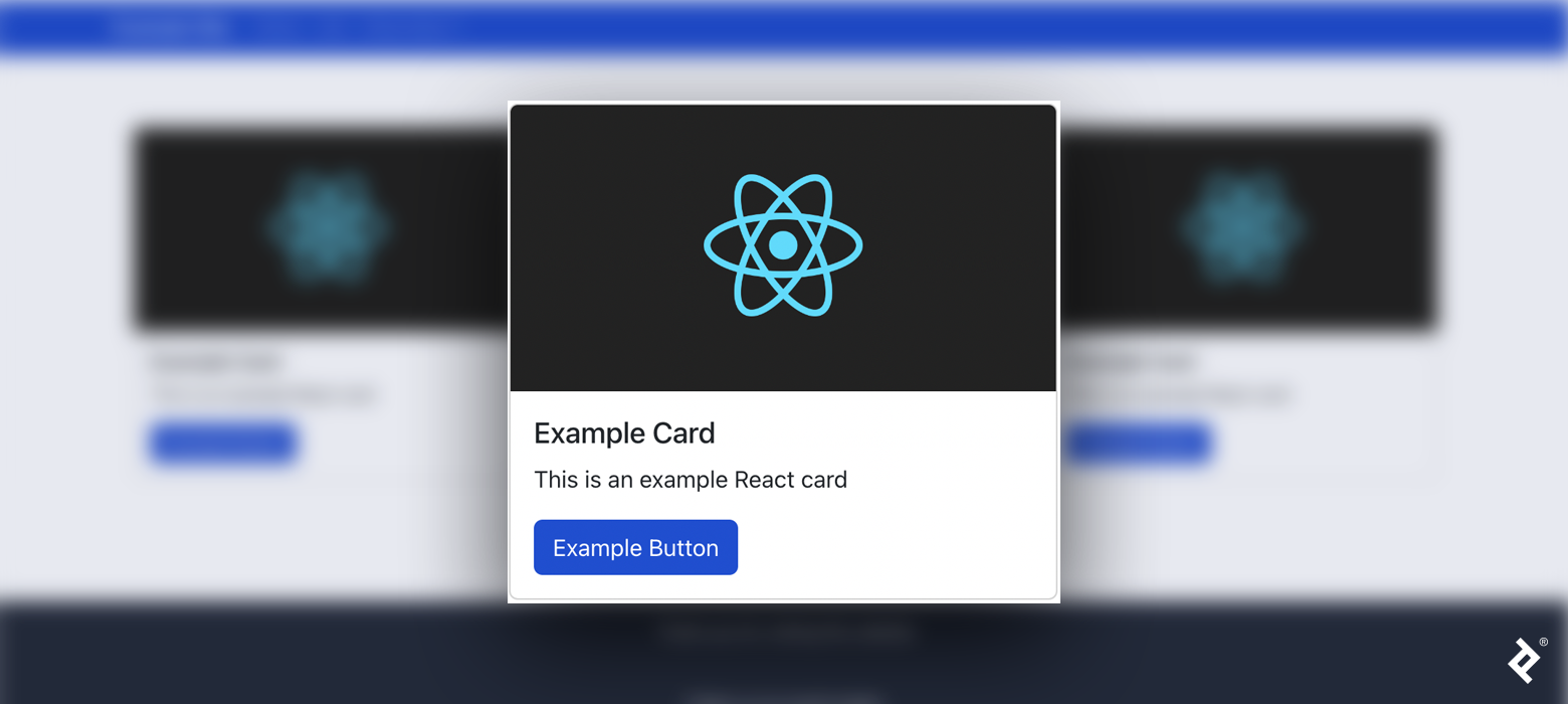
Our Bootstrap card’s code contains many div tags, making it difficult to identify each component:
<div class="card">
  <img src="https://bs-uploads.toptal.io/blackfish-uploads/public-files/React-icon-8e26f22094a11f6a689d8302dc30782c" class="card-img-top" alt="..." />
  <div class="card-body">
      <h5 class="card-title">Example Card</h5>
      <p class="card-text">This is an example React card</p>
      <a href="#" class="btn btn-primary">Example Button</a>
    </div>
</div>
On the other hand, our React-Bootstrap example card’s code clearly labels each component:
<Card>
  <Card.Img variant="top" src="https://upload.wikimedia.org/wikipedia/commons/a/a7/React-icon.svg" />
  <Card.Body>
    <Card.Title>Example Card</Card.Title>
    <Card.Text>This is an example React card</Card.Text>
    <Button variant="primary">Example Button</Button>
  </Card.Body>
</Card>
Do these two benefits make React-Bootstrap superior to Bootstrap in every way? No. Modern versions of Bootstrap no longer use jQuery and integrate cleanly with React applications. Likewise, current versions of React-Bootstrap closely track Bootstrap releases and provide compatibility with modern Bootstrap features while preserving React-friendly component APIs.
If you are considering migrating your project from React to some other framework, such as Vue, Bootstrap may offer greater flexibility. You can reuse most of the plain Bootstrap code, but React-Bootstrap users will have to convert their code. Bootstrap and React-Bootstrap each have their pros and cons, and which one you decide to use depends on your specific needs. In our case, we’re prioritizing component readability and development ergonomics over framework portability.
Implementation: React-Bootstrap Components
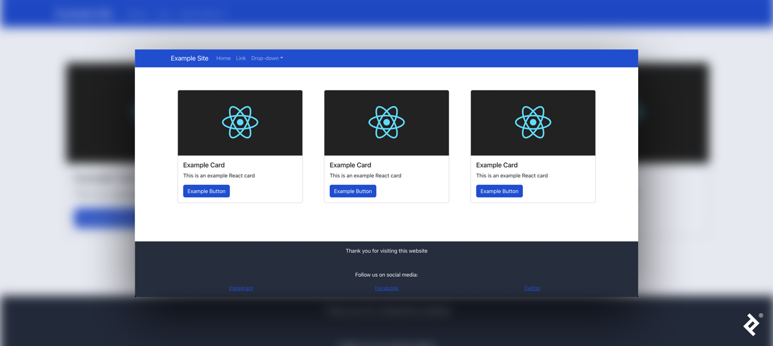
To examine a functional React-Bootstrap implementation, let’s create a standard website UI with a navbar, a footer, and a responsive grid.
Setup and Basics
First, let’s create a new React app in the terminal:
npm create vite@latest react-bootstrap-example -- --template react-ts
cd react-bootstrap-example
npm install
Next, install both React-Bootstrap and Bootstrap (installing Bootstrap is necessary because it contains all the styles for React-Bootstrap components):
npm install bootstrap react-bootstrap
If you don’t plan to override Bootstrap’s default styles, it will be necessary at this point to import Bootstrap’s stylesheet, bootstrap/dist/css/bootstrap.min.css, in the src/App.tsx file. (We will override default Bootstrap styles to use custom styling, so we don’t need to perform this step.)
In general, there are two ways to import React-Bootstrap components. The first way imports the React-Bootstrap container separately from the button:
import Button from 'react-bootstrap/Button';
import Container from 'react-bootstrap/Container';
However, I prefer using destructured imports because they condense and simplify the code for multiple components:
import { Button, Container } from 'react-bootstrap';
Finally, we render a React-Bootstrap component with this syntax:
<Button>This is a button</Button>
Custom Styles
Default Bootstrap styles (such as colors) can be overridden with custom styling for a more unique web design. Let’s override Bootstrap’s default theme colors with our own. First, we install Sass:
npm install sass
Next, rename the App.css file to App.scss, to indicate it is a Sass file, and import './App.scss'; in the App.tsx file. In our App.scss file, we override the primary and secondary colors before importing the Sass Bootstrap stylesheet:
$primary: #204ecf;
$secondary: #262d3d;

@import 'bootstrap/scss/bootstrap';
Always make sure to override styles before importing Bootstrap stylesheets. Otherwise, the custom styles won’t be applied.
Containers
Containers are the most basic, foundational React-Bootstrap component; they are a building block in the implementation of more complex components such as grids. Containers optionally center and horizontally pad the content within them.
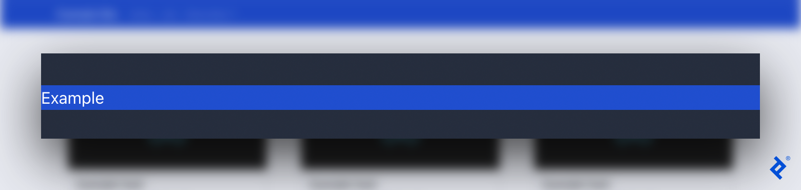
Before adding the navbar, footer, and grid system to our website, let’s see how containers affect their contents. We create a simple text (p) inside of a generic section (div) temporarily in src/App.tsx. We make the section blue and our overall background gray to make the layout easier to view:
<div className="bg-primary">
  <p>Example</p>
</div>
Without a React-Bootstrap container, our content is unpadded and unresponsive:
Let’s try the same code with a React-Bootstrap Container instead of a generic div (we’ll have to import Container before using it):
<Container className="bg-primary">
  <p>Example</p>
</Container>
Now, our content appears with padding:
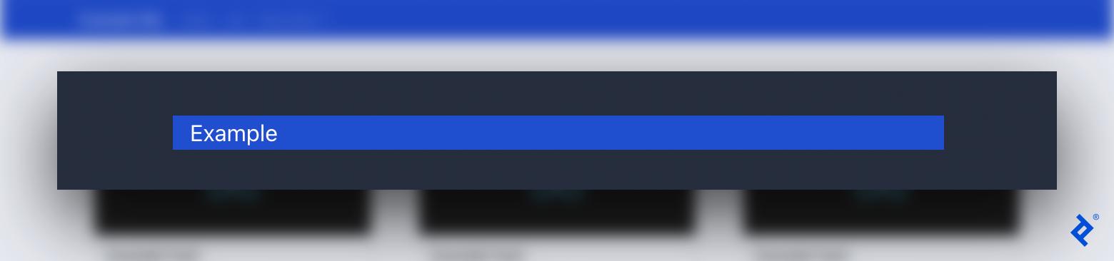
Change the width of the browser window to see the responsive design in action.
Navbars
The first component to add to our example site is the navbar. Creating a separate React component for the navbar (as opposed to writing it alongside other code) makes it easier to find components and make changes.
Create a src/components folder and add the file ResponsiveNavbar.tsx. We import the Navbar and other necessary components. Then, we add a basic navbar, wrapped in the responsive Container component, which displays our site logo or title (Navbar.Brand):
import { Navbar, NavDropdown, Nav, Container } from 'react-bootstrap';

const ResponsiveNavbar = () => {
  return (
    <Navbar bg="primary" collapseOnSelect expand="sm">
      <Container>
        <Navbar.Brand href="/">Example Site</Navbar.Brand>
      </Container>
    </Navbar>
  );
};

export default ResponsiveNavbar;
We are passing three arguments to the navbar:
-
bginfluences the color of the navbar. -
collapseOnSelectcauses the navbar to automatically collapse when the user selects an item. -
expanddetermines when the navbar switches between its collapsed mobile layout and expanded desktop layout (smmeans the navbar expands at widths of 576 px and above).
For a more advanced navbar, we’ll add a toggled burger menu (Navbar.Toggle) displaying “Home,” “Link,” and “Drop-down” sections. Navbar.Toggle is invisible in desktop mode. However, when viewing the website on smaller screens, it condenses horizontal sections, wrapped by Navbar.Collapse, into a mobile-friendly burger menu.
<Navbar bg="primary" collapseOnSelect expand="sm">
  <Container>
    <Navbar.Brand href="/">Example Site</Navbar.Brand>
    <Navbar.Toggle aria-controls="navbar-toggle" />
    <Navbar.Collapse id="navbar-toggle">
      <Nav className="me-auto">
        <Nav.Link href="/">Home</Nav.Link>
        <Nav.Link href="/link">Link</Nav.Link>
        <NavDropdown title="Drop-down" id="nav-dropdown">
          <NavDropdown.Item href="/action1">Action 1</NavDropdown.Item>
          <NavDropdown.Item href="/ruby/choosing-a-tech-stack">Action 2</NavDropdown.Item>
          <NavDropdown.Item href="/action3">Action 3</NavDropdown.Item>
        </NavDropdown>
      </Nav>
    </Navbar.Collapse>
  </Container>
</Navbar>
Navbar.Toggle and Navbar.Collapse are powerful tools that help developers create responsive navigation bars with few lines of code.
Finally, we import ResponsiveNavbar from './components/ResponsiveNavbar'; and include it in our main App:
<div className="d-flex flex-column">
  <ResponsiveNavbar />
</div>
You may test the app at any time by running npm run dev to see it update with each component added.
Footers
Our navbar is complete, so let’s work on the site’s footer. As with ResponsiveNavbar, we need to declare Footer and export it in a new Footer.tsx file. We create a basic footer using text, links, and a Container:
<div className="bg-secondary mt-auto">
  <Container className="p-3">
    <p className="text-center text-white">Thank you for visiting this website</p>
    <p className="text-center mt-5 text-white">Follow us on social media:</p>
    <a href="/">Instagram</a>
    <a href="/">Facebook</a>
    <a href="/">Twitter</a>
  </Container>
</div>
The classes p-3 and mt-5 represent padding and margin-top, and their values can range between zero and five (e.g., p-5 and mt-1 are also options) or be set to auto. It is also important to add mt-auto, as it will push the footer to the bottom of the page once we add Footer to our App in the next step.
Next, to display the social links side by side with correct spacing, we add a Row component and nest every link within a Col (column) component (we must also add Row and Col to our React-Bootstrap imports):
<div className="bg-secondary mt-auto">
  <Container className="p-3">
    <p className="text-center text-white">Thank you for visiting this website</p>
    <p className="text-center mt-5 text-white">Follow us on social media:</p>
    <Row>
      <Col className="text-center">
        <a href="/">Instagram</a>
      </Col>
      <Col className="text-center">
        <a href="/">Facebook</a>
      </Col>
      <Col className="text-center">
        <a href="/">Twitter</a>
      </Col>
    </Row>
  </Container>
</div>
Our last step is to place the footer at the bottom of our page in our App:
<div className="d-flex flex-column min-vh-100">
  <ResponsiveNavbar />
  <Footer />
</div>
Here, we’ve also set the minimum height of the webpage to 100vh; this is the full height of the screen (100% of the viewport height) and ensures the footer appears at the true bottom of the screen instead of appearing directly below other content.
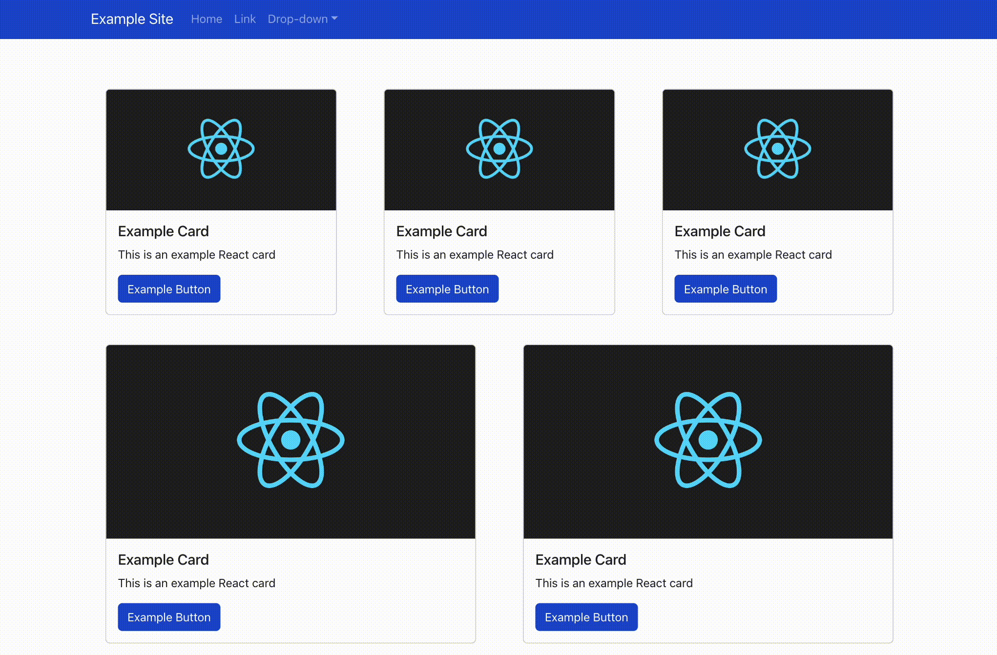
Grid Systems
With our navbar and footer in place, we finish the website by adding a grid system to the page. Our grid will contain Card components, which we define and export in a new Item.tsx file:
<Card style={{ minWidth: '18rem', margin: '20px' }}>
  <Card.Img variant="top" src="..." />
  <Card.Body>
    <Card.Title>Example Card</Card.Title>
    <Card.Text>This is an example React card</Card.Text>
    <Button variant="primary">Example Button</Button>
  </Card.Body>
</Card>
Now we can go back to App.tsx and add a dynamic grid of rows and columns in between the navbar and the footer. We must wrap our grid system in a Container:
<Container className="mt-5">
  <Row>
    {Array.from(Array(numberOfItems).keys()).map(number => (
      <Col key={number}>
        <Item />
      </Col>
    ))}
  </Row>
</Container>
We can choose a constant for numberOfItems to control how many times the Item component is rendered. The columns are automatically sized and responsive for all screen sizes. Try resizing your browser window to test the final result.
Responsive Web Development Made Easy
React-Bootstrap’s clean syntax and straightforward components make responsive design simple to implement on any project. The ability to work with Bootstrap and React-Bootstrap is a must for front-end developers. With these tools in your skill set, you’re ready for easier web application design and prototyping.
The editorial team of the Toptal Engineering Blog extends its gratitude to Said Kholov for reviewing the code samples and other technical content presented in this article.
Further Reading on the Toptal Blog:
Understanding the basics
Yes, you can use React with vanilla (JavaScript) Bootstrap or with the React-Bootstrap library.
No, it is not required to install Bootstrap when using React. However, Bootstrap is a highly popular framework for developing responsive web applications.
React components are functions or classes representing an individual part of an app’s UI to be rendered on the screen.
There are many different types of React components; in this article, we discuss those specific to React-Bootstrap. Containers are the most basic type of component; they contain, pad, and center other components. React-Bootstrap also supports navbars, footers, cards, and grid systems.
React components simplify and expedite the process of building an application’s UI when paired with React-Bootstrap; they are reusable and make code more readable.
Bošnjaci, Croatia
Member since November 4, 2021
About the author
Matej is a full-stack developer with expertise across a variety of back-end and web technologies, including React, React Native, Bootstrap, and Django. He specializes in advanced web applications and built a global, bilingual travel and tourism app using React and React Native.
Expertise
Previous Role
Full-stack Web DeveloperPREVIOUSLY AT