

Hire UI Designers
Hire the Top 3% of Freelance UI Designers
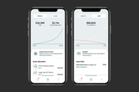
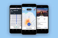
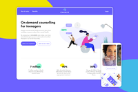
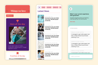
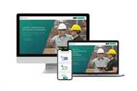
Hire UI designers, artists, and experts on demand. Top companies and startups choose UI designers from Toptal for interface design, responsive layouts, design systems, micro-interactions, and more.
Hire a Top UI Designer Now
No-Risk Trial, Pay Only If Satisfied.


Hire Freelance UI Designers

Daniela Coiset
Freelance UI Designer
Verified Expert in Design
United States
Toptal Member Since September 9, 2020
Daniela is a Senior Product and Interaction Designer with 14+ years of experience designing complex systems, AI-powered experiences, and high-impact visual communication for global consumer and enterprise products. She specializes in interaction design, information architecture, and cross-functional collaboration. Daniela excels at translating ambiguity into intuitive, scalable, user-centered solutions across platforms.
Show More

Brett Calzada
Freelance UI Designer
Verified Expert in Design
Japan
Toptal Member Since January 11, 2023
Brett is a designer, UI/UX director, and creative director with over 20 years of hands-on and senior leadership experience. He has worked in senior management positions for Fortune 5, 50, 250, and 500 companies. Additionally, Brett maintains state-of-the-industry hands-on skills that give him a unique ability to work directly with leaders, founders, and stakeholders of all levels and parts of an organization.
Show More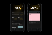


Phil Pham
Freelance UI Designer
Verified Expert in Design
United States
Toptal Member Since August 24, 2022
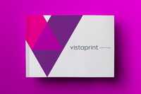
Phil is a senior product design leader with a decade of experience specializing in UI, UX, product, responsive web design, and brand identity design. He's had the privilege of designing for Fortune 500 Companies, startups, multi-billion dollar companies, and innovative organizations like Uber, FedEx, Harvard, Vistaprint, and more. Phil works well under time constraints, has exceptionally high craftsmanship, and communicates clearly to meet objectives and exceed expectations.
Show More


Michal Florczak
Freelance UI Designer
Verified Expert in Design
United Kingdom
Toptal Member Since November 19, 2021
Michal is an experienced design lead with 16+ years of experience delivering digital platforms. He specializes in complex UI/UX systems across finance and fintech, including at Goldman Sachs, Thomson Reuters, and Travelex. He brings a user-centred mindset, strong stakeholder alignment, and a broader design perspective shaped by work in healthcare, luxury, music, and the public sector, informing a more human approach to financial product design.
Show More


Guilherme Cerqueira
Freelance UI Designer
Verified Expert in Design
Brazil
Toptal Member Since January 27, 2022
Guilherme is a seasoned UI/UX product designer with over 15 years of experience. He has a proven track record designing products for millions of users at Booking.com and helping SaaS startups achieve success through user-centered design and data-informed solutions. Specializing in web and mobile design, design systems, conversational AI interfaces, and rapid prototyping with AI tools, his work has been used by major brands including GSK, Unilever, Danone, Nestlé, and BRF.
Show More


Adel Benzehda
Freelance UI Designer
Verified Expert in Design
Canada
Toptal Member Since November 4, 2022
Adel is a UI/UX designer with over six years of experience working on products from early-stage startups (0→1) to larger scale-ups, with a strong focus on AI. He has collaborated with teams at Airbnb, Colgate, and Supercell, as well as several emerging companies building AI-driven products. Adel’s work centers on turning complex technology into clear, easy-to-use interfaces.
Show More


Evgeny Vasenev
Freelance UI Designer
Verified Expert in Design
United States
Toptal Member Since April 25, 2016
Evgeny is a self-described hybrid designer which means that he's very experienced and successful in both UX/UI and visual design. He has over 15 years of experience in designing the UX/UI for web and mobile applications across a broad range of industries including the internet of things (IoT), retail, computer games, design, real estate, and entertainment. His specialties are UX design, UI interaction design, and mobile/web application design.
Show More

Paula Barcante
Freelance UI Designer
Verified Expert in Design
Canada
Toptal Member Since February 26, 2020
Paula is an award-winning UX/UI designer, advisor, and illustrator with more than six years of hands-on experience in making complex interfaces delightful and user friendly. She has made a significant impact in large corporations, such as Amazon, Zillow, Google, as well as startups. Her mission is to create efficient, beautiful, innovative, and high-quality experiences for the greater good of society.
Show More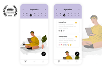


Anna Gondzik
Freelance UI Designer
Verified Expert in Design
United States
Toptal Member Since September 8, 2021
Anna has 16 years of experience in web design, CRO, UI/UX, responsive design, WordPress, web development, landing pages, sales funnels, and on-page SEO. She has completed 2,000+ website projects, focusing on conversion optimization and lead generation. Anna has worked with B2B and B2C brands to create websites that grab viewers' eyeballs and get them to convert at the highest rates possible.
Show More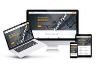


Alexander Eckhart
Freelance UI Designer
Verified Expert in Design
Austria
Toptal Member Since November 12, 2017
Alexander is a seasoned product designer with 15+ years of experience in eCommerce, healthcare, and enterprise software. An expert in UI/UX, he's led teams of up to 40 people and delivered innovative products to diverse companies ranging from dynamic early-stage startups to established Fortune 500 firms. Skilled in product management and passionate about entrepreneurship, machine learning, and no-code tools, Alexander excels in driving enterprise projects to success.
Show More


Charles Matthew Atos
Freelance UI Designer
Verified Expert in Design
Philippines
Toptal Member Since September 9, 2022
Charles is an expert brand strategist, product designer, and art director with 10 years of professional design experience in branding, marketing, and advertising. He has worked with SMEs, startups, and companies such as Coca-Cola, Netflix, Spotify, TikTok, ING, Unilever, Nestlé, H&M, Jollibee, and many more. Charles specializes in crafting winning stories and human-centric experiences through purposeful brand strategies and identity design, visual direction, and UI/UX design.
Show More
Discover More UI Designers in the Toptal Network
Start HiringA Hiring Guide
Guide to Hiring a Great UI Designer
User interface designers are experts who create interface layouts and human-computer interactions for websites and mobile apps. This guide to hiring UI designers features an overview of relevant skills, job description tips, and interview questions and answers that will help you identify the best candidates for your company.
Read Hiring GuideUI Hiring Resources
Toptal in the press
... allows corporations to quickly assemble teams that have the right skills for specific projects.
Despite accelerating demand for coders, Toptal prides itself on almost Ivy League-level vetting.
Our clients


Creating an app for the game

Leading a digital transformation

Building a cross-platform app to be used worldwide


Drilling into real-time data creates an industry game changer
Testimonials
How to Hire User Interface Designers Through Toptal
1
Talk to One of Our Client Advisors
A Toptal client advisor will work with you to understand your goals, technical needs, and team dynamics.
2
Work With Hand-selected Talent
Within days, we’ll introduce you to the right mobile UI designer for your project. Average time to match is under 24 hours.
3
The Right Fit, Guaranteed
Work with your new web UI designer for a trial period (pay only if satisfied), ensuring they’re the right fit before starting the engagement.
EXCEPTIONAL TALENT
How We Source the Top 3% of UI Designers
Our name “Toptal” comes from Top Talent—meaning we constantly strive to find and work with the best from around the world. Our rigorous screening process identifies experts in their domains who have passion and drive.
Of the thousands of applications Toptal sees each month, typically fewer than 3% are accepted.
Toptal UI Design Case Studies
Discover how our UI designers help the world’s top companies drive innovation at scale.

A new hosted system mitigates one of Bridgestone’s biggest expenses.
Challenge: Bridgestone needed UI designers to create a solution to manage and track tires through the retreading process.
Solution: Bridgestone partnered with Toptal to create Basys, a system that tracks a tire from collection through retreading to delivery. A chief goal of the solution was to ensure that data input was easy for Bridgestone’s factory employees.
Impact: Tire costs are the third-largest expense for trucking companies, but Basys helped Bridgestone achieve significant savings through its efficiency and intuitive user interface. With greater visibility into every touchpoint, Bridgestone now delivers improved service and cost transparency to its customers.
RELATED CAPABILITIES
- UI Design
- UX Design
- Agile Development
- Software Development
- Data Engineering
Toptal gave us access to the best designers out there, and they’re not easy to find. Those designers integrated very quickly with our existing teams and very quickly understood our business case—the business value of our solution.
Thierry Jakriceic
General Manager of Digital Solutions

Capabilities of UI Designers
UI designers are essential in creating intuitive, user-friendly digital experiences. Their expertise in layout, wireframing, and prototyping ensures seamless interactions and visually engaging interfaces, enhancing the overall user journey.
Wireframing and Prototyping
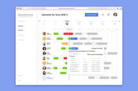
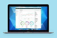
Toptal’s UI designers create seamless user experiences by crafting detailed wireframes and interactive prototypes. Visualizing layout and functionality also enables cross-functional alignment and refinement before development starts, resulting in more efficient workflows and better optimized design output.
Responsive and Mobile-first Design
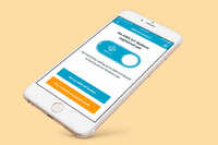
Deliver consistent and intuitive user experiences across devices by combining responsive layouts with mobile-first design principles. Our mobile UI designers create touch-optimized interfaces for small screens and variable connectivity, ensuring accessibility, speed, and engagement for all users.
UI Design for Web and Mobile Applications
Our UI designers develop intuitive and visually appealing experiences for web and mobile apps. They combine efficient layouts, relevant interactions, and accessible design principles to enhance the overall user experience, making it enjoyable and efficient for a wide range of users.
Design Systems and Style Guides
Ensure brand consistency and cohesion across all digital products with a comprehensive design system. Our UI experts craft scalable systems that encompass UI components, typography, color schemes, and guidelines to support efficient front-end development and deliver a unified user experience.
Iconography and Visual Elements
Establish a unified design language that enhances brand recognition and user experience. Toptal’s UI artists create custom icons, buttons, and visual elements tailored to your brand, ensuring all components and design artifacts align with your brand identity.
Interactive and Animated UI Elements
Elevate user experience and engagement with interactive and animated UI components. Our UI developers and designers collaborate to implement elements such as hover effects, transitions, and micro-interactions, creating dynamic and enjoyable experiences across digital products.
Collaborating with UX Designers and Developers
UI designers from Toptal collaborate closely with UX designers and UI developers to ensure visual designs are implemented precisely. Strong alignment between these disciplines balances aesthetics and functionality, resulting in polished, effective, and cohesive end-user experiences.
Designing for Accessibility (WCAG Compliance)
Our UI designers implement WCAG (Web Content Accessibility Guidelines) standards, ensuring interfaces are usable for all. They focus on features like keyboard navigation, color contrast, and screen reader compatibility, creating experiences that meet essential accessibility requirements.
E-commerce and Checkout Flows
Build user-friendly e-commerce interfaces that streamline your customers’ shopping experience and increase their enjoyment. To enhance usability, reduce friction, and encourage conversions, Toptal’s UI designers optimize the key areas of your online store, including checkout, product pages, and site navigation.
User Feedback and Iterative Design Improvements
Our UI experts analyze user feedback to refine UI designs, ensuring interfaces evolve based on real-world usage. By iterating based on user insights, they make continuous improvements that enhance usability, address user needs, and maintain a high-quality experience.
FAQs
The cost associated with hiring a UI designer depends on various factors, including preferred talent location, complexity and size of the project you’re hiring for, seniority, engagement commitment (hourly, part-time, or full-time), and more. In the US, for example, Glassdoor’s reported average total annual pay for UI designers is $130,000 as of November 2024. With Toptal, you can speak with an expert talent matcher who will help you understand the cost of talent with the right skills and seniority level for your needs. To get started, schedule a call with us — it’s free, and there’s no obligation to hire with Toptal.
Typically, you can hire UI designers with Toptal in about 48 hours. For larger teams of talent or full end-to-end project delivery, timelines may vary. Our talent matchers are highly skilled in the same fields they’re matching in—they’re not recruiters or HR reps. They’ll work with you to understand your goals, technical needs, and team dynamics, and match you with ideal candidates from our vetted global talent network.
Once you select your web UI designer, you’ll have a no-risk trial period to ensure they’re the perfect fit. Our matching process has a 98% trial-to-hire rate, so you can rest assured that you’re getting the best fit every time.
To hire the right UI designer, it’s important to evaluate a candidate’s experience, technical skills, and communication skills. You’ll also want to consider the fit with your particular industry, company, and project. Toptal’s rigorous screening process ensures that every member of our network has excellent experience and skills, and our team will match you with the perfect UI designers for your project.
A UI designer develops visually engaging and user-friendly interfaces for digital assets such as apps, video games, and websites. They work to combine fundamental design principles, user research, and industry best practices to craft layouts that are intuitive, responsive, and interactive. Their overall goal is to optimize user interaction and satisfaction while maintaining a high level of consistency with the brand identity. UI designers often work with cross-functional teams, which include UX designers, graphic designers, and developers, in order to ensure a seamless implementation of their designs. UI designers also continually fine-tune their work based on user feedback as a way to enhance the overall user experience design.
When hiring a UI designer, seek out qualities such as creativity, strong technical skills, and a user-centric mindset. An ideal UI design candidate should have a command over visual design principles, be proficient in design software tools, and possess the ability to design and execute intuitive interfaces. UI designers must be comfortable collaborating with partners in different disciplines and design teams, which reflects effective communication and problem-solving skills. Aside from a compelling portfolio, look for a UI designer who has a proven history of delivering successful and memorable end products. Soft skills such as empathy, adaptability, attention to detail, receptiveness to feedback, and drive are also markers of a qualified candidate.
At Toptal, we thoroughly screen our user interface designers to ensure we only match you with the highest caliber of talent. Of the more than 200,000 people who apply to join the Toptal network each year, fewer than 3% make the cut.
In addition to screening for industry-leading expertise, we also assess candidates’ language and interpersonal skills to ensure that you have a smooth working relationship.
When you hire mobile UI designers with Toptal, you’ll always work with world-class, custom-matched UI designers ready to help you achieve your goals.
You can hire web UI designers on an hourly, part-time, or full-time basis. Toptal can also manage the project end-to-end based on your specific requirements as part of our Consulting and Services offerings. Whether you hire a UI designer for a full- or part-time position, you’ll have the control and flexibility to scale your team up or down as your needs evolve. Our UI designers can fully integrate into your existing team for a seamless working experience.
We make sure that each engagement between you and your UI designer begins with a trial period of up to two weeks. This means that you have time to confirm the engagement will be successful. If you’re completely satisfied with the results, we’ll bill you for the time and continue the engagement for as long as you’d like. If you’re not completely satisfied, you won’t be billed. From there, we can either part ways, or we can provide you with another UI designer who may be a better fit and with whom we will begin a second, no-risk trial.
UI design is primarily concerned with the visual layer of a product, such as colors, typography, spacing, icons, and how interactive elements respond. It’s about making the interface appealing, consistent, and intuitive. UX design, on the other hand, defines the structure and flow that the UI is built upon and focuses on ensuring the product is useful and usable.
Explore Related Toptal Services
Looking for an end-to-end business solution? Browse Toptal's portfolio of services.

How to Hire Top-tier UI Designers

Verified Expert in Design
13 Years of Experience
Alejandro is a digital product designer specializing in user-centered design, UI/UX, and developing visual and interaction languages. He was the senior designer on projects with New Relic, Telefónica, and Personio. Alejandro holds a master’s degree in industrial and product design from the Scuola Politecnica di Design in Milan.
Expertise
Previously at

Demand for UI Designers Continues to Expand
The demand for highly skilled user interface (UI) designers is on the rise. The US Bureau of Labor Statistics reports that there were approximately 128,600 digital interface and web designers (which includes UI designers) in 2023, with an 8% growth rate projected from 2023 to 2033.
Despite a vast talent pool of UI designers, finding and hiring a high-level professional can be daunting. The difficulty arises not only from the growing demand for UI design services, but also from the rare attributes UI designers possess: a blend of creativity, web design proficiency, and industry experience. Further complicating the challenge is that companies seek full-time or freelance UI designers who have experience in particular business sectors, or delivery formats, such as mobile apps or e-commerce sites. Meanwhile, rapidly evolving technologies like generative artificial intelligence (Gen AI), virtual reality (VR), augmented reality (AR), and voice-based digital assistants are radically transforming the field, creating new business opportunities but exposing a sizable talent gap.
With business and technology needs shifting, it is more important than ever to hire highly qualified UI designers. By ensuring that digital interfaces are intuitive, accessible, and aesthetically pleasing, user interface designers can help engage users, maintain brand consistency, and boost profitability.
In this guide, we describe the attributes first-class UI artists possess and provide suggestions for crafting a compelling job description, along with FAQs and a focused set of interview questions to guide your hiring process.

What Attributes Distinguish Quality UI Designers from Others?
It’s no secret that hiring a proficient UI designer can have a significant impact on the long-term success of a digital product. In fact, Forbes, citing a 2016 Forrester Research report, notes that a well-designed user interface can raise conversion rates by up to 200%. But to achieve such high-impact results, you need to know the skills and attributes to look for in your search for qualified candidates. In general, outstanding UI designers share the following traits:
Command of Design and Developer Tools
The best UI designers show proficiency in the use of design tools such as Sketch, Figma, and UXPin. They understand the strengths and weaknesses of such platforms and can readily adapt to your company’s preferred software. Hiring a UI designer with a knowledge of HTML and CSS is an added bonus, as they tend to have a more holistic understanding of the development process and the technical vernacular to collaborate effectively with developers.
Mastery of Visual Design
To create products that prioritize accessibility and are visually compelling, a UI designer should have a solid foundation in graphic design principles and techniques. A strong grasp of color theory, layout principles, compositional balance, and visual hierarchy is essential to build functional, aesthetically pleasing digital assets.
In addition, UI designers should be familiar with fundamental design patterns, components, and input and selection controls for iOS, macOS, and Android. Highly qualified UI designers will align typography and iconography choices with brand standards, while ensuring legibility and appealing to users’ expectations for visual clarity and consistency. In your selection process, look for detail-oriented designers who have a discerning eye for the latest style trends and demonstrate a comprehensive understanding of the World Wide Web Consortium’s (W3C) Web Content Accessibility Guidelines (WCAG) 2.1.
Knowledge of Interaction Design Principles
Experienced UI designers apply familiar interaction patterns and user flows to create interfaces that function intuitively and help users achieve their goals. They simplify the presentation of complex information by ensuring high-priority content lies “above the fold,” where it can be engaged without scrolling. Much like interaction designers, UI designers apply best-practice approaches for arranging and presenting call-to-action (CTA) buttons, error handling messages, status indicators, interactive states (such as “hover” states), and navigation and search tools. Highly skilled designers adhere to the principle of progressive disclosure, presenting information only when it best serves users.

Expertise in Responsive and Mobile Design
The data analysis firm Statista reports that approximately 59% of global web traffic is generated through mobile devices. To meet the needs of a massive mobile audience, driven in part by the popularity of social media platforms, a capable mobile UI designer should be comfortable developing user-friendly, responsive designs that adjust their display to the screen size and orientation of tablets, mobile phones, and desktops. When hiring a full-time or freelance mobile UI designer on a platform like Toptal, consider their technical skills and familiarity with adaptive layouts, fluid grids, media queries, usability testing, and performance optimization.
Proficiency in Prototyping and Wireframing
A skilled UI designer is capable of using prototyping and wireframing tools, such as Figma and Sketch, to efficiently arrange visual elements and communicate their design concepts. Being able to visualize a digital application allows stakeholders and developers to feel confident about the UI artist’s decisions and methods. During design reviews or team collaborations, an expert UI designer will often use interactive prototypes and wireframes to generate meaningful discussions around product use, development, and implementation.
How Can You Identify the Ideal UI Designer for You?
UI designers have varied levels of professional experience, and it’s important to decide whether a junior or more seasoned user interface designer best suits your needs. Several factors, including your budget, project requirements, timeline, workplace culture, and the design services your company specializes in will factor into your choice. As a first step, however, it’s useful to consider the distinctions between junior and senior UI designers.
Junior UI Designers
Junior UI designers typically have limited professional experience and only a few years of practical training. With limited time in the trenches, they may have only worked on smaller, less complex tasks, such as registration forms or landing pages, or assisted more established designers on larger projects. These designers are proficient in UI principles and can create high-quality wireframes, mock-ups, page layouts, and onboarding flows, but they may lack the intuition and professional experience to consider a design holistically.
Nevertheless, junior UI designers are considerably more affordable than senior designers and may be more malleable to your company’s standards and culture. They are also more likely to share design work exhibiting fresh ideas and show an eagerness to learn and take on responsibilities. Because of their flexibility and enthusiasm, junior UI designers are suitable for projects with evolving requirements, as well as technical tasks with hard deadlines and clearly scoped deliverables.
Senior UI Designers
Senior UI designers, on the other hand, tend to have robust knowledge spanning multiple industries, including SaaS and e-commerce, enabling them to create sophisticated, impactful interfaces aligned with business and brand objectives. Those with leadership experience can leverage their talent to rally teams around product design decisions that can be applied strategically across a platform (or multiple platforms) to satisfy users and deliver exceptional performance outcomes.
In addition, senior UI designers tend to work faster and more independently than early-career user interface designers. With a keen understanding of the web development process, they are likely to view their work in the context of broader organizational goals. Collaborating closely with designers, growth strategists, and developers, they plan and conduct user testing, often using mock-ups, and design prototypes to gather feedback and insight. Applied strategically, these findings can inform interface refinements that help optimize acquisition, retention, and conversion rates.
Another benefit of hiring a senior UI designer is they often have a deep knowledge of design thinking, a methodology that emphasizes the importance of user behavior research. To tailor interface models to target audiences, a UI artist versed in design thinking might evaluate their decisions against industry benchmarks and use surveys, funnel analyses, and A/B testing to evaluate the effectiveness of their choices. This work is highly collaborative: Coordinating the workflows of multiple internal stakeholders and project teams requires exceptional communication skills and the project management experience of a senior UI designer. While more expensive than early career designers, hiring designers at the senior level is wise if you’re looking to grow and scale your platform.
Keep in mind, too, that hiring decisions are rarely a zero-sum game. Often the best scenario for a company, whether it be a startup or established enterprise, is to build a well-rounded design team that includes a mix of junior and senior talent. By blending the enthusiasm of junior designers with the expert design skills and strategic insight of a senior UI designer, you will give UI design projects the best chances for success.
Strategic Factors to Consider
When evaluating candidates, several other considerations are worth noting. First, the best UI designers should be familiar with emerging technologies. As startups and large companies turn to Gen AI, voice user interfaces (VUIs), and VR/AR to engage users and deliver content in new ways, traditional formats and symbolic frameworks for interface design are changing. Even highly qualified UI developers will have gaps in their knowledge base, but it’s important that they show an eagerness to learn and adapt to innovation. Look for UI designers who have experience designing contemporary or next-generation interface models your company is actively pursuing, whether that’s an AI-powered chat dialog, a contactless payment service, or a dark mode interface.
Second, highly qualified UI designers should understand how to use visual elements to capture users’ attention and direct it to key information and CTAs. According to DataReportal, an affiliate site of the data advisory group Kepios, Internet users spend 6 hours and 37 minutes per day, on average, engaging with screens. To command their attention, experienced UI designers optimize their page layouts using tools, such as in-app analytics, heat maps, scrollmaps, and session recordings. Understanding where a user’s eyes are directed and where they click and scroll is crucial to improving site experience. Look for UI designers who use empirical data to guide layout decisions.
Finally, there is a tendency to conflate UI designer and experience design roles; however, these positions cater to different skill sets. The key distinction is that a UI designer focuses primarily on the visual appearance of a product. UX designers, by contrast, specialize in the holistic experience for users and all that entails, typically including user journey mapping, persona development, usability testing, and information architecture. Unless you are seeking a UX/UI designer with a dual skill set, be sure not to filter out highly qualified UI designers by over-indexing, “experience design” in your search criteria.
How to Write a UI Designer Job Description for Your Project
Writing a compelling job description is crucial to attract top-tier user interface designers. Start with a clear, role-specific job title, such as “UI Designer,” ”UI Artist,” “User Interface Designer,” “UI Developer,” or “Visual Designer.” Define the role succinctly by outlining key responsibilities like designing intuitive interfaces, creating wireframes, developing prototypes, and collaborating with cross-functional teams.
In the body of the job description, highlight essential skills and qualifications. Be sure to emphasize proficiency in design tools such as Sketch, Figma, or Adobe XD, and request a resume and portfolio. You’ll also want to mention soft skills, such as strong communication, problem-solving abilities, and teamwork; important attributes for UI designers to have when collaborating with developers, product managers, and other stakeholders. Consider the following qualifications and requirements as a starting point for your LinkedIn or Behance job board posting:
Qualifications:
- Proficiency in industry-standard design tools such as Sketch, Figma, and Adobe XD.
- A strong portfolio showcasing design work that demonstrates their expertise in user-centric design principles.
- Solid understanding of user research, interaction design, mobile app design, and responsive design.
- Excellent communication and problem-solving skills, with a proven ability to work collaboratively on a design team.
Responsibilities:
- Translate user needs and business requirements into engaging visual solutions.
- Develop and maintain design systems and style guides.
- Work closely with developers to ensure seamless implementation of designs.
- Stay up-to-date with the latest UI trends, techniques, and technologies.
Remember, an expertly written job description doesn’t just attract the right candidates; it also sets clear expectations for the role, ensuring a smoother hiring process and better alignment between the UI developer and your company’s goals. Before posting to a job board, make sure to describe your company’s vision and culture to give candidates a sense of what it’s like to work there. Clearly state the experience level required, along with the desired years of experience, and any specific industry expertise, for instance SaaS or e-commerce, that’s relevant to your company. Conclude the post with a succinct call to action, encouraging qualified candidates to apply.
What Are the Most Important UI Designer Interview Questions?
The following interview questions can help you hold productive discussions and make well-informed decisions:
Can you explain your design process?
While individual project goals vary, a skilled UI developer will strive to meet high standards throughout their design process. Listen for answers that touch on conducting user research, exploring user behavior patterns, brainstorming functional design concepts, prototyping, seeking feedback, iteration, and maintaining brand consistency. The creative design process can be highly personal, but collaboration and communication are broadly applicable keys to success.
How do you incorporate accessibility into your designs?
Accessibility should be fundamental to any UI designer’s approach. Ensuring a broad range of users can access your application, whether it be a SaaS, e-commerce, or healthcare-related product, is not only ethical but it is also good business practice. A thoughtful UI designer should be committed to implementing accessibility standards in their work. Listen for responses that speak to semantic markups, screen readers, responsive design, color contrast, alt text, keyboard navigation, and W3C accessibility standards.
How do you stay updated on the latest UI trends and technologies?
Taking a proactive approach to learning allows a UI designer to be aware of new innovations, best-practice design solutions, and industry insights. Listen for answers that mention reading (or subscribing to) design-related publications, participating in conferences or attending webinars, joining in-person or online UI artist communities, taking courses to stay updated and adaptable, or networking with cross-disciplinary professionals.
Can you describe a project where you improved the user interface significantly?
A skilled UI designer will be able to provide an answer that highlights a professional project with tangible, real-world results that leaves their client satisfied. Answers will vary, but a strong web UI designer might touch on acquiring insights through user research and testing, collaborating with colleagues to identify and address pain points, making a site responsive across devices, or improving user engagement by refining the visual organization of a page or introducing interactive elements.
What metrics do you use to evaluate the success of your design?
When evaluating design work, a qualified UI designer will use both qualitative and quantitative metrics. They might assess a web experience with user satisfaction surveys, gather feedback from customer success representatives or product managers, or use web analytics tools to measure click-through rates, users’ average time on a page, or registration or sales conversion percentages. Regardless of the methods they use, a strong candidate will be able to articulate a clear connection between data and design decisions.
Why Do Companies Hire UI Designers?
In a competitive digital landscape where companies are in a daily contest for users’ attention and trust, UI designers play an indispensable role, bridging the gap between users and technology. They provide design services that help companies deliver exceptional digital product experiences by ensuring that interfaces are not only functional but also user-centered, visually appealing, and responsive to multiple screen sizes and orientations. As research has shown, UI designers’ work to optimize interfaces can have a direct impact on user engagement and retention, thereby driving business growth.
But hiring highly skilled full-time or freelance UI designers is becoming increasingly difficult. Today, finding proficient web UI designers requires persistence and a sharp eye for the attributes that help transform complex ideas into user-friendly interfaces aligned with business goals. Technical expertise in user research, visual hierarchy, and interaction design is part of what companies seek when hiring UI designers, but qualified candidates also need to keep pace with emerging technologies. Moreover, they need to be able to organize information effectively, communicate clearly with stakeholders, and ensure front-end applications are broadly accessible and inclusive for users. These skills, while rare, are crucial to help businesses stay competitive.
As digital transformation continues to evolve, the demand for skilled UI designers is only likely to increase, underscoring their crucial role in shaping the future of digital experiences. Companies interested in capturing the attention of specific audiences, standing out from competitors, and increasing brand loyalty and sales are wise to hire top-tier UI designers.
Featured Toptal UI Design Publications


Top UI Designers Are in High Demand.