Design Dilemma: Balancing Aesthetics and Functionality
Ideally, aesthetics and functionality would merge seamlessly in digital design, but that isn’t always the case. Here, we discuss when to prioritize one or the other for the optimal user experience.
Ideally, aesthetics and functionality would merge seamlessly in digital design, but that isn’t always the case. Here, we discuss when to prioritize one or the other for the optimal user experience.
Merehan is a product designer who crafts functional and visually appealing user interfaces for education, management, health, transportation, SaaS, and e-commerce companies. She has led design workshops for multiple EU-funded projects and has given design thinking lectures at leading European universities.
Previous Role
Product DesignerIn September 2021, the short-form video app TikTok became the most downloaded application worldwide, with 656 million downloads. The app’s success is due to many factors, but arguably the most important is its functional interface. Framing the seeming chaos of full-screen videos is an uncluttered grid that users can effortlessly navigate to reach their desired content. By following a functional design approach, TikTok has eliminated unnecessary friction, reduced cognitive load, and created a sense of order for its users.
Aesthetics versus functionality is an age-old dilemma for designers, as both are essential concepts in UX design. While a visually appealing interface helps users connect emotionally with a product and impacts initial user engagement, a seamless user experience directly affects how easily users perform tasks and get what they need out of the product. Ideally, aesthetics and functionality would merge seamlessly in digital design, but this isn’t always the case. Often, factors such as user needs and industry-specific market regulations pull designers in one direction or another.
Having spent the past 14 years striving to craft user-friendly and visually appealing digital experiences—most recently a Web3 music-sharing mobile app—I understand this dilemma. In my experience, while aesthetics are important for attracting users and creating a positive first impression, they should never come at the expense of functionality, without which a digital product would lack purpose and utility. But that doesn’t mean there aren’t cases when aesthetics would take center stage. Let’s discuss.
Aesthetics in the UX Design Process
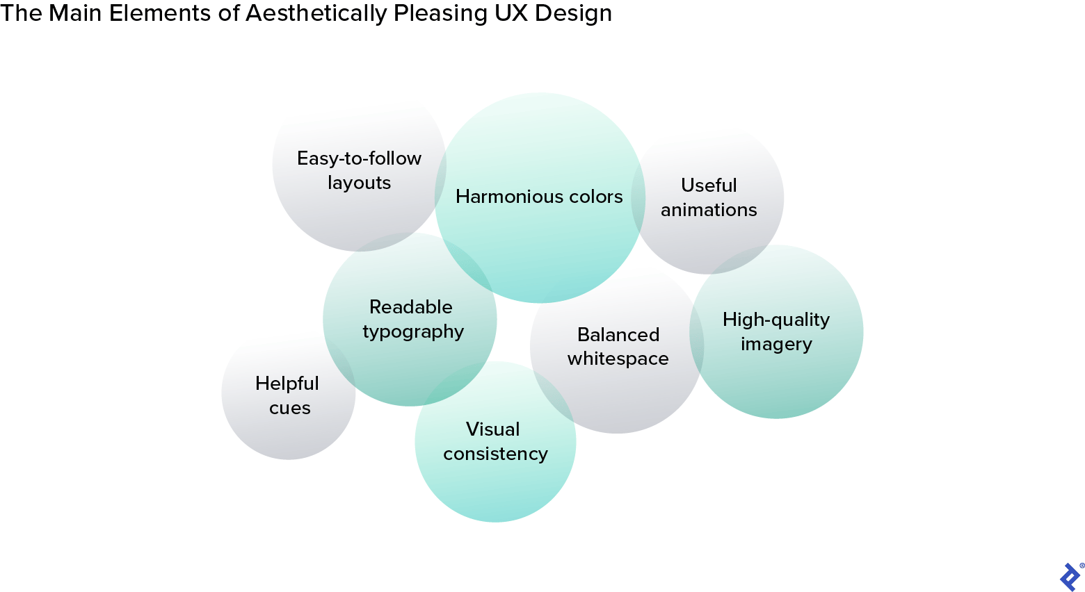
Visually pleasing UX design refers to creating user experiences that are appealing, engaging, and enjoyable. This approach involves implementing graphic design principles such as color, typography, whitespace, imagery, and visual feedback to craft a visual composition. Such an approach aims to enhance user satisfaction, enable the user to connect emotionally with the product, and convey a recognizable and memorable brand presence.
There are several ways aesthetics contribute to the overall user experience of digital products. Firstly, a visually attractive interface can create a positive initial impression, attracting users and encouraging further exploration. A seminal study by a team of MIT neuroscientists found that the brain processes visual information within milliseconds. When users interact with a website or application for the first time, the immediate visual impact significantly influences their perception.
Moreover, consistently applied aesthetic elements contribute to shaping and reinforcing a brand’s image and making it memorable. A unique and visually consistent website helps create a lasting impression and a sense of trust, making users more likely to return.
In addition, users often perceive aesthetically pleasing designs as usable and efficient, even if they might not objectively be so, according to a pioneering study of ATM interfaces. Researchers asked participants to interact with ATMs with different designs and found that participants rated the ATMs with more aesthetically pleasing designs as easier to use—despite similar functionality across all machines. This led the researchers to the conclusion that aesthetic appeal positively influenced perceived usability.
A Functional Approach to UX Design
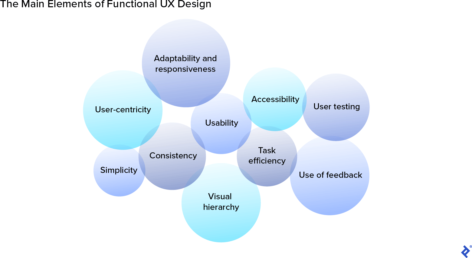
Functionality refers to how well a product or system works and how easily users can accomplish their goals. Functional considerations of digital design include user-centricity, usability, and accessibility. User-centricity is a philosophy that places the user or customer at the center of product development. Usability is the ease of use of the interface’s layout and navigation system. And accessibility refers to making sure users with different levels of experience and ability can access the website or platform.
Functional UX design prioritizes features that enhance usability, simplify tasks, and remove irrelevant elements, whether it’s a distracting icon, a complex navigational structure, or unnecessary animation. This approach reduces the cognitive load that can overwhelm users and cause them to abandon a product. When implemented correctly, this design strategy can boost user retention and customer satisfaction, and help interfaces adapt to evolving technologies.
Aesthetics vs. Functionality: Choosing a Design Approach
Ideally, designers should balance aesthetic and functional design. A classic example of this ultimate balance is Apple’s iPhone. The interface’s sleek design, intuitiveness, and innovative features, such as AirDrop for file sharing with nearby Apple devices, continue to set it apart from other devices.
Both aesthetics and functionality are essential for successful digital design. So when designers are pulled in one direction or another in order to meet user needs or market regulations, which design approach should they follow?
When to Prioritize Aesthetics
Industries focused on visual content or marketing tend to lean toward an aesthetics-first design process. E-commerce companies, for example, often prioritize aesthetic designs because first impressions and brand recognition contribute to their success. Online fashion and cosmetic retailer ASOS is a great example of an aesthetically pleasing user interface.
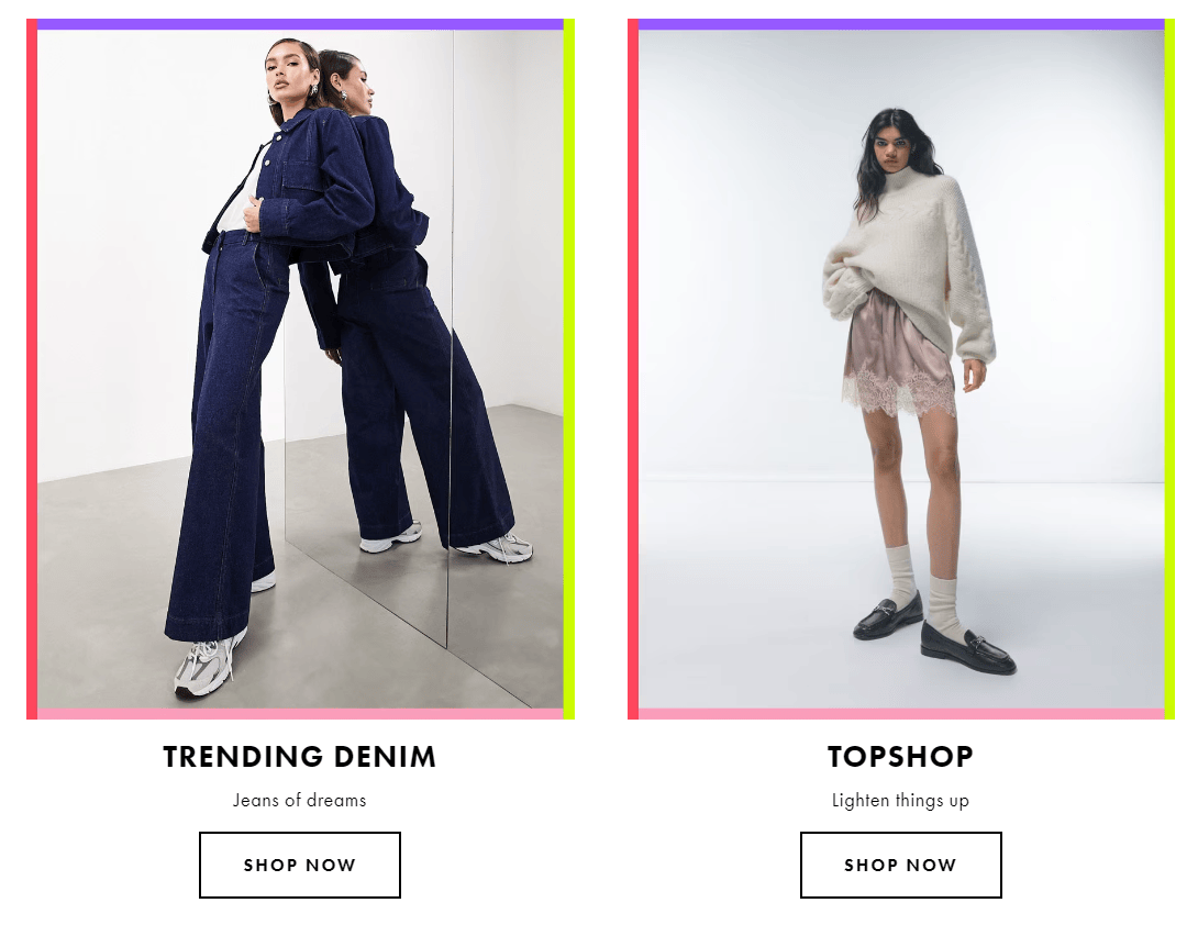
The platform contrasts multicolored bright graphic elements against a white background. This contrast helps the user visually absorb the content by creating a degree of separation between page elements and leading the reader’s eye from one place to another, making the whole reading process feel natural and linear.
The brand has also invested in high-quality images to showcase its products. In a traditional brick-and-mortar store, customers can physically see and inspect product quality. Without this physical interaction, online product images are users’ primary reference point. High-quality photos mimic the in-store experience as closely as possible. Clear and detailed images also give buyers confidence and help them make better-informed purchasing decisions.
Beyond online fashion, aesthetics play a significant role in many other industries. Duolingo has a playful interface with a cartoon mascot that appeals to both children and adults, and embodies the brand’s values: Make learning languages fun and universally available. Moreover, bold colors and distinct icons help users distinguish between lessons and modules, and keep track of their progress. The aesthetic design of Fenty Beauty includes engaging imagery, rollover animations, and splashy videos to highlight the products and create a compelling experience for the beauty and skincare brand’s shoppers.
However, aesthetics alone cannot keep users engaged. Successful products also rely on rich features and usability best practices, such as intuitive search and navigation systems and a seamless checkout flow. For instance, to help navigate roughly 85,000 products, ASOS’ mobile users can utilize the platform’s Style Match feature to take a photo or upload an image and search ASOS for similar products. This visual search tool offers a personalized and accessible shopping experience, particularly for users who struggle to articulate what they want in words but can easily recognize it visually. Duolingo employs gamified elements such as points, levels, streaks, and rewards to keep users motivated and wanting to continue learning. Beyond a visually appealing interface, Fenty Beauty offers features like a virtual try-on for finding the right foundation and the option to book an appointment with a beauty expert.
When to Focus on Functionality
Designers often prioritize functionality when dealing with complex workflows because this approach helps simplify and reduce the steps users must take to accomplish tasks. Such streamlining is almost always a requirement for technology-related products and services. Google’s homepage—and its single input field where users can enter search queries—is the ultimate example of a minimalistic design that eliminates distractions and focuses the user’s attention on the task at hand.
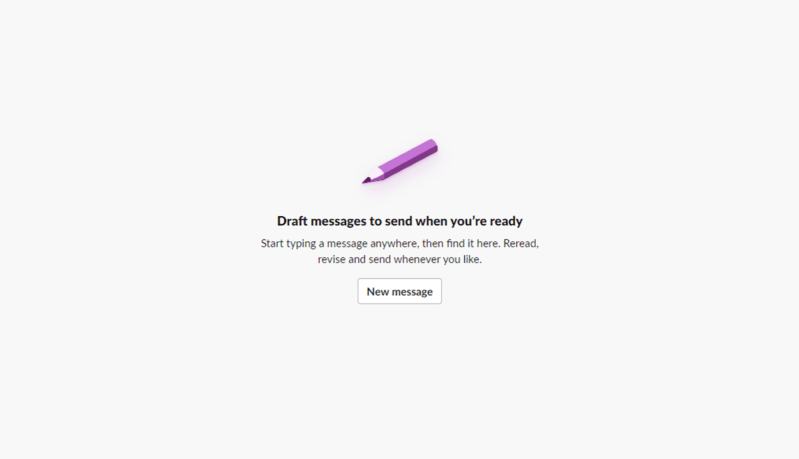
Another effective feature for improving functionality and user experience is a simple call to action (CTA) that helps fast-track users to where they want to go. For example, if a user visits their “Drafts & sent” folder in Slack but has no drafts in progress, a short suggestion and CTA prompt them to start a new message.
In the healthcare, aerospace, and automotive industries, functionality often takes precedence over aesthetics in order to meet stringent compliance regulations and standards, minimize the risk of system failures, and prioritize safety. Medical information is inherently tricky to decipher, so clarity is king. Accessibility is also key, and a functional design approach can help ensure digital healthcare products are usable for everyone, including users with limited digital literacy skills and visual disabilities.
There are many ways to improve accessibility and functionality, such as implementing user-friendly information architecture and applying straightforward language for menu items and navigational buttons. Medisafe, a pill minder and tracker platform shortlisted for the most valuable digital therapy award by the Reuters Events Pharma Awards USA in 2022, is an example of excellent functional design in digital health.
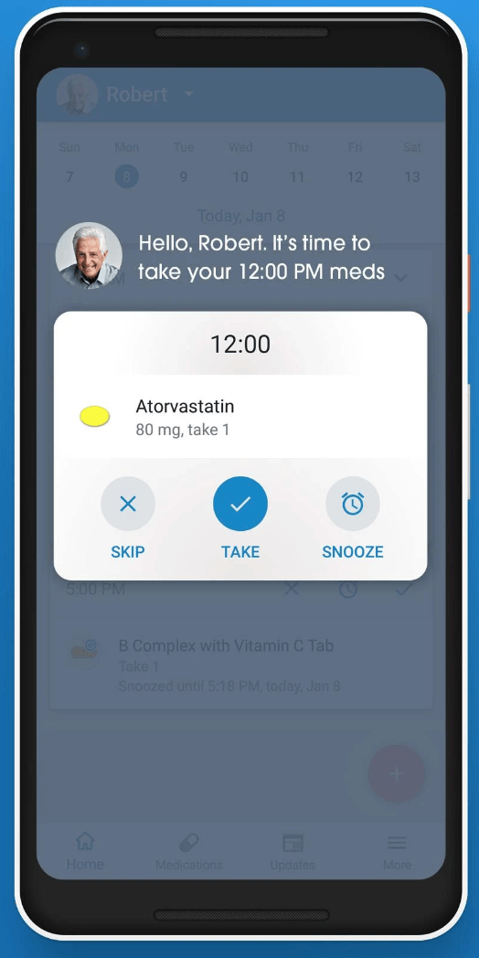
The Medisafe app emphasizes functionality and usability via an innovative notification system in which users can mark doses as taken right from the lock screen of their smartphones. When they receive a notification, they simply press and hold down on it to open the reminder and mark the dose as complete.
A Functional Design Case Study: Prioritizing Usability and User Needs
Each project is different. Here’s an example of a time when I prioritized functionality in the design process:
I recently led a project to design the interface of a decentralized music-sharing app. Our objective was to deliver a transparent, purpose-driven, and user-centric product, aligning with evolving expectations for decentralized music-sharing in the Web3 era. To achieve this, we focused on developing essential and easily accessible features.
We wanted to ensure the home screen prioritized key user actions, such as searching for music, browsing playlists, and accessing profile information. We therefore designed a panoramic view of the user’s music library, shared tracks, and engagement metrics.
In addition, we added a personalized categorization system and rich search features to ensure users could discover and manage their music effortlessly. To make this possible, we designed a way for artists to directly curate their own genre classifications to represent their music more authentically rather than relying solely on learning algorithms. We also introduced advanced search filters that allowed users to browse music based on the mood or emotion they wanted to experience, as well as genre, artist, and keyword. These features were crucial for giving users of our decentralized music app more control over their music preferences.
Regardless of whether a project’s focus is on aesthetics or functionality, the designer’s ultimate goal should always be to create a positive and meaningful experience for the user. By focusing our efforts on designing key features that are easy to navigate, rather than on design aesthetics, we delivered a highly usable and user-oriented interface. Our client was pleased with the outcome and will soon launch the MVP so that artists and listeners can test the app in beta format.
Striking the Right Balance for Seamless UX
By understanding user needs and market regulations specific to an industry, designers can craft digital experiences that surpass expectations and enhance the user experience. Certain industries, such as healthcare or finance, often prioritize functionality and usability due to the critical nature of their applications. Other sectors, such as online retail, place more emphasis on visually appealing design to create a positive first impression and a sense of trust and professionalism.
Ensuring that a product functions correctly is crucial, as it is functionality that determines the product’s usefulness. However, a successful digital product is one that strikes the right balance between a visually appealing design and a user-friendly, functional experience.
Further Reading on the Toptal Blog:
Understanding the basics
What is the difference between an aesthetic and a functional approach to design?
There are clear differences between aesthetic and functional design approaches. Aesthetics concentrate on visual appeal and helping users connect emotionally with a product. Functionality focuses on the usability, practicality, and performance of a product or system to fulfill its intended purpose effectively.
What does function over aesthetics mean?
Function over aesthetics is a design principle that prioritizes functionality and usability over visual appeal or decorative elements. It proposes that the primary focus should be on making a product or system work effectively to fulfill its intended purpose, rather than emphasizing its visual attractiveness.
How do you balance aesthetics and functionality in design?
To balance aesthetics and functionality in design, start by conducting user research to understand your target audience’s needs. Then, define clear design goals that encompass both functionality and aesthetics. Establish what functionality is essential and how aesthetics can enhance the user experience without compromising usability.
Barcelona, Spain
Member since August 3, 2022
About the author
Merehan is a product designer who crafts functional and visually appealing user interfaces for education, management, health, transportation, SaaS, and e-commerce companies. She has led design workshops for multiple EU-funded projects and has given design thinking lectures at leading European universities.
