
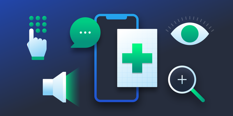
Vital Design: The Importance of Healthcare App Accessibility
COVID-19 made telemedicine popular—and in some cases, necessary. But many platforms and apps are inaccessible to those who need them most. Designers can change that.
COVID-19 made telemedicine popular—and in some cases, necessary. But many platforms and apps are inaccessible to those who need them most. Designers can change that.

Amy is a digital design expert who specializes in analyzing big data and designing high-converting interfaces for applications, SaaS products, and websites. She focuses on the healthcare, finance, nonprofit, and government sectors.
Expertise
Previous Role
UI/UX DesignerPreviously At


Featured Experts


Before the COVID-19 pandemic, University of Washington Medical Center physician Jonathan Wright was beginning to incorporate some virtual appointments at his clinic, as part of a research project led by one of his partners. But after the pandemic began, his telehealth visits ballooned.
“It was almost as if a light switch went on,” Wright says. “All of a sudden, we were doing a ton of telemedicine. For a while, we were doing almost exclusively telemedicine.”
Only 11% of consumers used telehealth services in 2019. That number increased to 46% by the middle of 2020. A 2020 UK-based survey also found a 37% increase in health app use during the pandemic. Unfortunately, healthcare app accessibility has not kept up with demand.
Users with disabilities, older users, low-literacy users, and users facing socioeconomic barriers often encounter significant accessibility challenges with telehealth services and healthcare apps. Though not all accessibility issues relate to design, designers can mitigate a number of obstacles.
By adhering to established guidelines for accessibility and integrating lesser-known practices into every step of the process, designers can build intuitive healthcare apps that better serve all users.
Disability Can Affect All of Us
The Centers for Disease Control and Prevention estimates that approximately 1 in 4 American adults have some form of disability. The most recent data from the World Health Organization’s World Report on Disability found that 15% of all people live with some form of disability—and almost everyone will be impacted by a temporary or permanent disability at some point in their lives.
People are more likely to be impacted by disability as they get older, when conditions like arthritis, declining eyesight, and hearing loss often emerge. Older adults may also feel less comfortable with the latest digital products and thus are more likely to struggle when circumstances, such as the COVID-19 pandemic, make tech tools necessary.

The US Office of Disease Prevention and Health Promotion’s Health Literacy Online project found that up to 90% of Americans struggle with health literacy. Limited health literacy can make it difficult for a person to benefit from apps that provide health education or enable doctors to gather health information.
Limits in general literacy also create major barriers to using all but the simplest applications. Insufficient tech literacy, which can impact older people and users who lack everyday access to computers and smartphones, can also make healthcare apps inaccessible.
Inaccessible Design Is Everywhere
While designers can’t solve problems of device access and connectivity, there is much they can do to make their products easier for more people to use.
“I haven’t found any single application [that’s] fully digitally accessible,” says Cezary Tomczyk, a former Apple accessibility expert based in Prague, who is part of the Toptal network. He says he has tested dozens of telemedicine apps, and virtually all are digitally inaccessible.
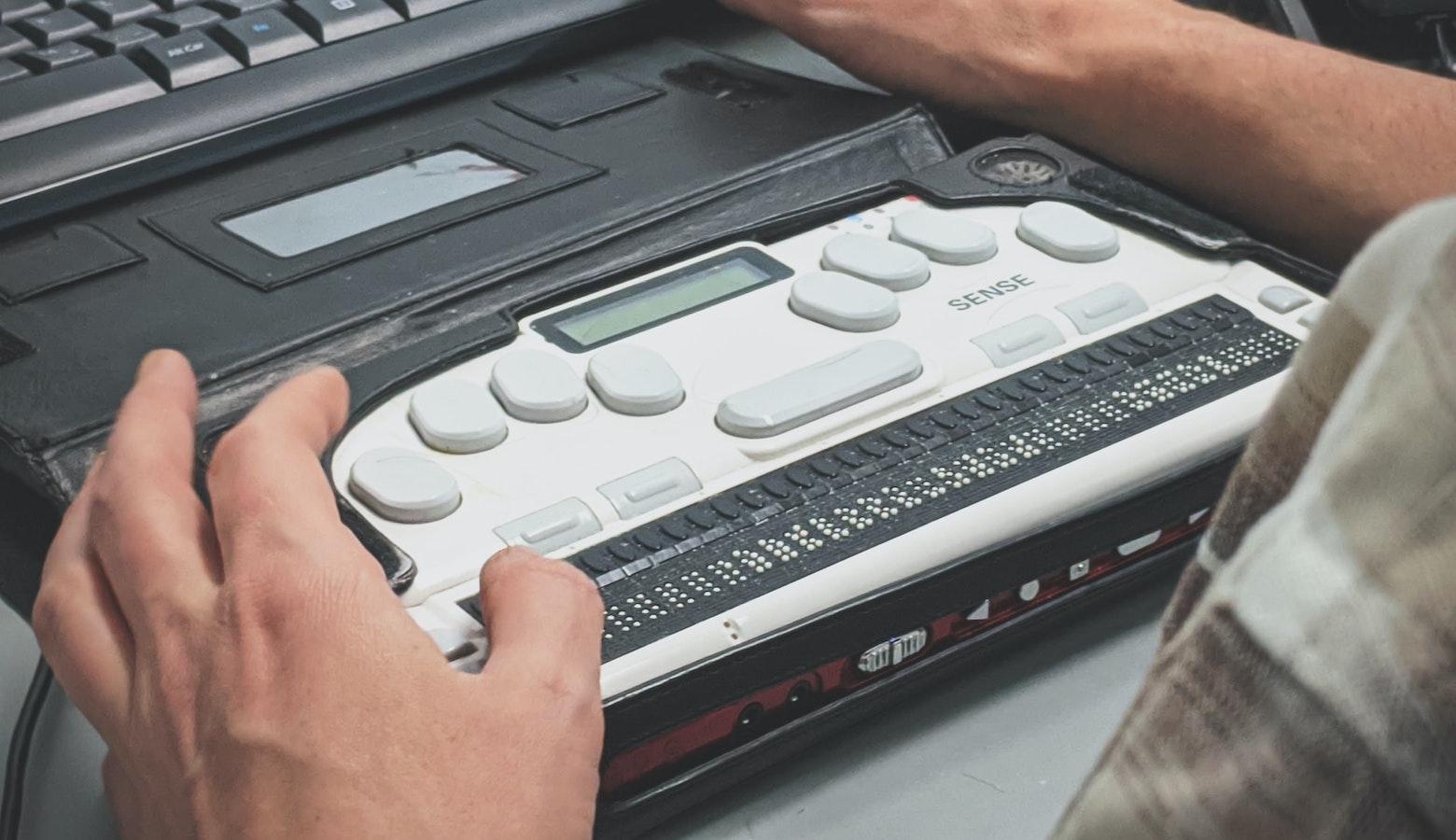
A common problem is an app’s incompatibility with screen readers, says Tomczyk. Many blind and visually impaired people rely on screen readers to read out text and visual information. “Using medical digital services is impossible for them,” he says. In a study of nine mobile health apps, researchers found that none were fully accessible to blind users.
A lack of contrast between an app’s background and text color can also make it challenging for those with poor eyesight to distinguish elements, including icons and placeholder text. Angela Edwards, a Toptal designer and accessibility consultant based in Auckland, New Zealand, says that too often, placeholder text in form fields “tends to be a light gray” and isn’t easily visible. That can make it difficult for users to see the example text and understand what they’re meant to enter.
Color blindness, which impacts around 1 in 12 men and 1 in 200 women, also can affect how users interact with a health app. It’s common to use red to represent errors, but some people who are colorblind will not be able to see it, says Daniyal Ahmed Khawaja, a Toptal designer based in Lahore, Pakistan.
Many apps are also incompatible with keyboard navigation, Tomczyk adds, which creates pain points for users who cannot use a mouse—such as those with visual impairments or dexterity challenges.
Buttons that are very small or have insufficient touch targets may also cause problems for those with limited dexterity. A small study of nine people with various dexterity levels found that those with less dexterity made significantly more errors while using an app. About half of the errors participants made required assistance to correct.
Information presented without a clear visual hierarchy is difficult for most users to scan. This can be a barrier for older people and those with limited health or general literacy. Likewise, information in health and wellness apps designed to educate will not fulfill its purpose if the copy contains too much jargon or assumes a very high level of literacy or health literacy.
Overly complicated forms can also create an obstacle. Many doctors’ offices try to expedite paperwork by providing it to patients electronically in advance of a visit. However, users with a wide variety of disabilities and literacy challenges can become discouraged by lengthy onboarding questionnaires and forms, which can be difficult to comprehend and complete.
“I don’t really use apps because it’s more complicated for me to get into them,” says Paula Cottom of Orange, New Jersey, who is visually impaired. Instead of filling out healthcare-related forms on apps, she opts to print them. If these apps were simpler to use, she says, she would likely take advantage of them.
Videos can be a good way to present complex information or demonstrate concepts, but without captions or transcripts, they become inaccessible for people who are deaf or hard of hearing. Some video conferencing apps, many of which are used for telehealth, offer live captions or transcription, though most are auto-generated and are only 70%-90% accurate.
UX Accessibility Standards
One simple way designers and developers can ensure apps are accessible is to follow the Web Content Accessibility Guidelines (WCAG), which were set out by the World Wide Web Consortium and have been adopted internationally.
Though there are more than 60 WCAG guidelines, they fall into four main categories: perceivable, operable, understandable, and robust.
Perceivable
Everyone should be able to access the content, regardless of ability. Perceivability guidelines recommend including text alternatives to images and video, and providing captions or transcripts for audio and video.
Operable
Everyone should be able to use the app. That might mean enabling keyboard navigation or voice commands, or ensuring that the app is free of features that might induce photosensitive reactions such as seizures. The app should also provide users with adequate time to consume the content and interact when necessary.
Understandable
Websites and apps should include a variety of ways for users of differing abilities to understand content—for example, by offering summaries, diagrams, or videos. Navigation should be consistent and interactions should align with user expectations. Users should have enough guidance to be able to avoid errors or correct them when needed.
Robust
Every site or app should be optimized for use with current and future assistive technologies.
“If you’re following those guidelines, assistive technology is easy to use,” says Ahmed Khawaja.
Accessibility Is the Law
WCAG specifies three levels of accessibility: A, AA, and AAA, with the AAA standard having the most stringent guidelines. In many cases, A-level is considered the minimum standard, but depending on the intended users, it might be necessary to implement AA or AAA standards.
“You want to strive for triple-A compliance when your target audience has a disability,” says Edwards, who consulted for a client that worked on the website for the Royal National Institute for the Blind in the UK. “When your primary user is blind, you can understand how important that extra level of detail is for them.”
Different countries have different ways of enforcing these standards. In the UK, websites and apps developed by the public sector, such as those directly involved with the UK’s government-run National Health Service, must meet the WCAG AA standard. Canadian law requires websites to be accessible to people with disabilities, with organizations under federal jurisdiction required to comply or be fined up to CA$250,000.
In the US, the Americans with Disabilities Act (ADA) is intended to provide equal opportunities for people with disabilities and protect them from discrimination. Though the US Department of Justice has never formally adopted WCAG as the standard for compliance with the ADA, the A and AA levels are the de facto standards, and organizations that do not comply may face lawsuits. In 2019, more than 2,200 lawsuits were filed alleging inaccessibility of websites and mobile apps, up from just 262 such ADA lawsuits in 2016.
Google and Apple both have guidelines for accessible app design, though those guidelines primarily echo those of the WCAG, Ahmed Khawaja says. Google’s Material Design guidelines, for instance, emphasize that accessible design should be clear, robust, and specific. Apple lists simplicity and perceivability as key elements and recommends that developers support personalization and perform audits with accessibility features enabled to ensure WCAG compliance.
Accessibility Solutions for Healthcare Apps
Luckily, designing healthcare apps and websites to be more accessible doesn’t have to be difficult. “There’s so much you can do,” says Edwards.
Designers can take advantage of accessibility resources built into design applications. Figma, for example, offers a number of plug-ins that check for contrast, text resizing, meaningful focus orders for keyboard users, and more. Sketch’s Accessibility Assistant helps designers ensure their work complies with WCAG AA guidelines. W3.org offers a list of approved accessibility checkers.
But it’s also necessary to internalize best practices.
When designing for users with vision disabilities, be mindful of contrast ratio and avoid depending too heavily on color as a means of conveying important information, says Ahmed Khawaja. For example, a mental health app might allow users to color-code a calendar to track how their moods change over time. Because color blindness and low vision can make colors difficult to detect or interpret, designers might also incorporate a different visual element, such as an emoji or distinct pattern, to represent each color option.
Designers should also work with developers to ensure that elements like tables and headings will work with assistive technology. This is particularly relevant for screens that display test results or other health data. Edwards says tables need to be properly coded so that someone using a screen reader will always know what column and row each item is associated with.
For users who are deaf or hard of hearing, video and audio content captions and transcriptions should be written by a person, not generated by artificial intelligence. This reduces the risk of transcription errors, which might be particularly detrimental in a medical situation.
To accommodate users with dexterity challenges, consider the sizing and spacing of UI elements like buttons, fields, and check boxes. “You want to make sure that elements, especially interactive elements on mobile, are easily selectable,” Edwards says. It is important to ensure that touch targets are large enough for these elements. Like many accessibility features, this benefits more than one population: Larger icons and sufficient spacing make apps easier to use for people with vision impairments too.

Another feature that benefits multiple populations is clear and concise copy, with headings and subheads to set off important information and separate topics. Precise, descriptive headings and subheads make an app or site easier to scan and navigate using screen readers. They play a significant role in making apps accessible for people with poor literacy and poor health literacy.
Information should be well organized and congruent with common reading patterns, with the most important information highlighted for easy scanning. Eye-gaze research cited by the US Office of Disease Prevention and Health Promotion shows that text rich with headings, subheads, and bullet points is more comprehensible for users who have difficulty with reading and understanding health information. This is important because poor health literacy can make it challenging for patients to understand and adhere to their treatment regimens.
Site architecture is an essential component of accessibility as well. Ahmed Khawaja says conducting thorough research early in the UX design process ensures that the site will be organized intuitively. He recommends beginning every design process with empathy mapping and card sorting to better understand not only users’ needs but also the mental models that inform their expectations.
“You need to create user personas and then you have to do user journey mapping,” he says. “Most designers skip all these steps and move on directly toward designing the app.”
These preliminary steps are important because while assistive technology can help more people use a site or app, some users may not be able to navigate through it at the same speed or with the same degree of ease as users without a disability. Disorganized, unwieldy menu structure or poor findability might be an annoyance to a user without a disability, but for someone who navigates with a keyboard or laser pointer, those issues could make the app impossible to use.
Ahmed Khawaja also says that feedback is an important aspect of UX accessibility. “When you press a button or you perform a task, [but] don’t get feedback, you don’t have the sense that it’s done,” he says. “So you keep pressing it again and again.” A user should receive a clear sign that the app or website has registered their action and they don’t need to repeat it. This is important for every user but particularly for those with poor tech literacy, who may need extra reassurance that they’re operating the app correctly.
User testing also presents an opportunity to solicit feedback from people with disabilities to ensure that a website or app is accessible to them. “Getting the feedback and an understanding of how they interact with and use the internet—and what things frustrate them and make it difficult for them—that’s really valuable input,” says Edwards.
Though meeting UX accessibility guidelines might seem intimidating to designers and developers, much of this work should already be part of a designer’s practice. User research and testing, clear navigation and visual hierarchy, and other usability best practices benefit all users—as long as all users are considered from the start.
“People think quite often that building fully digitally accessible products and services means that it will add extra work,” says Tomczyk. “But that is not true. Because if you know how to do it, you can do it properly from the beginning.”
Keep Lines of Communication Open
Despite the best efforts of designers, developers, and project managers, no health or telemedicine app can be accessible to everyone. An unseen design flaw—something that designers had not considered before launching the app—could be the culprit.
A good solution is to solicit feedback through the app so users can flag issues as they encounter them. “If there is a way to submit your questions and comments, they should have that as part of the app,” says Kate Geick, senior manager with Lumina Health Partners, which provides healthcare consulting services. “And then to make that public so that when they do make updates, they are available to everybody so that [users] know that improvements are getting made.”
It can also be helpful to have some sort of workaround for users who find themselves unable to navigate the app—for instance, a phone number to call so a customer service representative can direct a user through the app or even complete a task on their behalf.
“That’s really important, and that enables a level of accessibility—although it’s not perfect, because they should just be able to do it on the product,” says Edwards.
A study by Microsoft researchers found that in cases where a large portion of an audience may be uncomfortable with smartphone interfaces or have limited literacy, a phone-only system, rather than a mobile app or website, would be most effective.
These results highlight another reality: No matter how digitally accessible a health app might be, there will always be some who are unable to use it. Those who lack a reliable internet connection or who don’t own a computer, smartphone, or tablet won’t be able to access any app, no matter how well designed.
However, using workarounds has its drawbacks, especially in the context of telehealth. A virtual doctor visit can already limit a doctor’s ability to interact with their patient, and substituting a phone call for a video visit is “inferior [in] so many ways,” says Wright, the University of Washington Medical Center physician. “Being able to see each other is so crucial.”
Accessibility Benefits Everyone
Curb ramps make sidewalks accessible to wheelchair users but also benefit parents with strollers, delivery drivers with hand trucks, and many others. Similarly, assistive technology and accessibility features are becoming more universally popular—most notably, captioning. According to a 2021 survey by the captioning firm Stagetext, caption use is increasingly common among hearing users, with 80% of users ages 18-25 preferring them.
But regardless of whether app accessibility features cross over to non-disabled users, providers and companies behind health-related apps have a responsibility to reach people with disabilities. It’s important to remember that health app users are people, not just consumers, says Ahmed Khawaja. “We should be able to empathize with them so we can create a better solution.”
Further Reading on the Toptal Blog:
Understanding the basics
To make an app accessible, consult the Web Content Accessibility Guidelines compiled by the global World Wide Web Consortium. These ensure an app is perceivable, operable, understandable, and robust enough to work with accessibility tools. In some countries, they serve as the legal standard for accessibility.
UX accessibility is the practice of designing a user experience that is available to people with a wide range of abilities and challenges, including people with disabilities, people with low literacy, and older people.
UX accessibility is important for both legal and ethical reasons. In many countries, digital sites are required by law to accommodate people with disabilities. Plus, many accessibility features, such as captions, are increasingly popular among users without disabilities.
Arlington, VA, United States
Member since February 1, 2017
About the author
Amy is a digital design expert who specializes in analyzing big data and designing high-converting interfaces for applications, SaaS products, and websites. She focuses on the healthcare, finance, nonprofit, and government sectors.
Expertise
Previous Role
UI/UX DesignerPREVIOUSLY AT