
Timeless Branding: How to Build a Brand That Lasts
Classic brands aren’t built on fleeting trends. They honor their brand promise, use enduring design principles, and balance legacy with innovation to inspire customers through the decades.

Classic brands aren’t built on fleeting trends. They honor their brand promise, use enduring design principles, and balance legacy with innovation to inspire customers through the decades.

Micah is a digital designer who has worked with clients such as Google, Deloitte, and Autodesk. He is also the Managing Editor of Toptal’s Design and Technical Content. His design expertise has been featured in Fast Company, TNW, and other notable publications.
Expertise
Previous Role
Brand DesignerPreviously At


The Sagrada Família, Hamlet, American Gothic—some works evoke curiosity and wonder decades or even centuries after their creation. However, in corporate branding, a relatively young creative discipline born out of the Industrial Revolution, achieving the longevity of classic architecture, literature, or fine art is complicated. Today, it’s not uncommon for a business to launch a rebrand that immediately falls flat with customers. Indeed, companies in need of a new or updated brand face daunting challenges:
- The flood of content on social media has made brand trends more fleeting than ever. Consumers are constantly exposed to changing aesthetics and messaging strategies—and with so many platforms to voice their opinions, they’re quick to critique brands that feel outdated or inauthentic.
- The increase in customer touchpoints across digital products and physical spaces has made cross-platform flexibility essential. Yet maintaining a cohesive identity in so many contexts remains a significant challenge.
- The advancement of generative AI has saturated the market with derivative visuals, copy, and video, making it harder than ever for brands to truly stand out.
As a brand designer who has created visual identities for startups and established companies in industries like travel, e-commerce, and insurance, I often encounter clients hoping current trends will spark fresh interest in their businesses. In such circumstances, my advice is always the same: Designing an identity based on what’s popular today practically guarantees it will feel dated tomorrow. Instead, I advocate for identities and brand elements that stand the test of time while remaining flexible enough to evolve.
In this article, we’ll explore three essential strategies for designing for brand longevity:
- Creating brand elements that resonate with a company’s mission and connect with its customers.
- Building flexible designs grounded in timeless principles like simplicity, balance, and scalability.
- Incorporating lessons from timeless brands that harmonize legacy with innovation.
Timeless vs. Trendy: The Cost of Branding Mistakes
Timeless branding matters because mistakes are costly. By following time-tested design principles, you can avoid branding missteps that weaken credibility, erode customer loyalty, and affect your bottom line.
So what can happen when a branding project goes sideways?
One of the most common mistakes is rebranding a core identity in pursuit of momentary trends. Recently, a prominent car company with decades of brand credibility made this mistake. It overhauled its long-standing identity in favor of a hypermodern direction detached from its history and values. They introduced a new logo that blends uppercase and lowercase letters, made satin pink a featured brand color, and released ads without any images of their vehicles. The changes ignited a media firestorm, with critics scolding the brand for abandoning its heritage and loyal customers expressing confusion over the absence of the company’s iconic emblem in its new identity.
This kind of backlash isn’t just lousy PR; it’s expensive. While timeless branding can evolve over time, wholesale rebranding initiatives carry significant risks. A new or updated brand requires substantial investment in both design and the time needed to roll it out across print, digital, and promotional touchpoints. But if the brand goes live and doesn’t resonate as intended, those upfront costs pale in comparison to what follows: alienated customers, damaged trust, and plummeting sales.
Unfortunately, the car company’s rebranding fiasco isn’t unique. Time and again, organizations have faced fallout from brand blunders, proving that a poorly executed branding strategy doesn’t just disrupt perception—it imperils the business.
Examples of Timeless Brands
The best way to understand timeless branding is by looking at real-world examples. While many companies chase relevance through fleeting trends, brands like Patagonia, USAA, and Chick-fil-A take a different approach: They build identities around a clear mission and a deep understanding of how their customers perceive them. One of the clearest statements I’ve heard about branding—one that fundamentally shaped my design philosophy —is that a brand is a promise. It’s a company’s core pledge to its customers about what it values and how it operates.
Patagonia: Branding Rooted in Core Values
Patagonia is a prime example of this principle in action. The company lives its promise to champion sustainability and environmentalism at every level, from manufacturing processes to its used gear trade-in policy.
For instance, Patagonia carefully vets its farms, mills, and factories to verify they meet high environmental standards, prioritize fair labor practices, and source materials sustainably. The company also donates 1% of its annual sales to environmental nonprofits working to protect natural resources. Meanwhile, its Worn Wear program aims to reduce consumption by offering customers store credit for used Patagonia gear, which is then repaired and resold online at discounted prices.
Because Patagonia’s brand promise is so clearly articulated and obsessively upheld, its nearly 50-year-old logo has come to symbolize a company committed to quality and authenticity. While the logo’s design—featuring an intricate mountain background and an unusually wide horizontal layout—might not align with today’s minimalist logo conventions, its staying power comes from something deeper. It’s not just a logo; it’s the mark of a company that has remained steadfast in its values. In a business landscape where brands reinvent themselves to chase relevance, Patagonia’s consistency has made its identity timeless.
USAA and Chick-fil-A: Delivering on Brand Promises
While Patagonia aligns its branding with environmental and social values, brands like USAA and Chick-fil-A demonstrate how to build authenticity around promises made directly to core consumers. They express those promises through every element in their style guide—from logos to web icons to product photography.
USAA built its financial services brand on a promise to serve military personnel and their families. Its messaging consistently emphasizes trust, loyalty, and security, and its visual identity reinforces these values in web assets and marketing campaigns through large, conservatively set typefaces; a blue monochromatic color scheme; simple geometric illustrations and icons; and poignant photos featuring service members with loved ones.
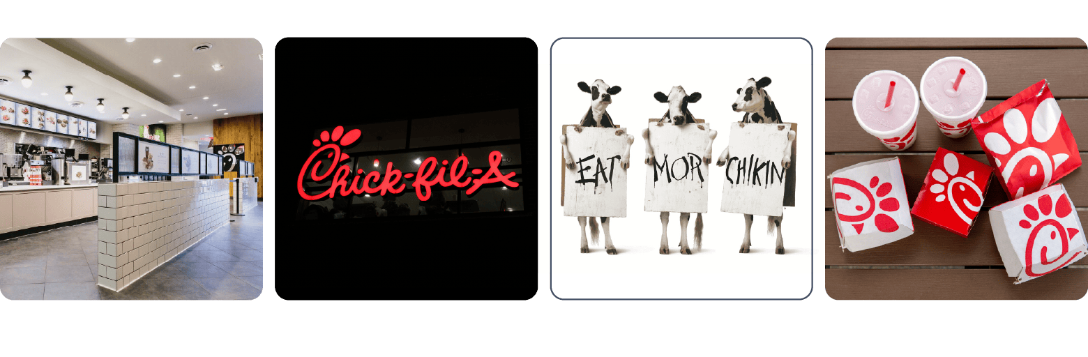
Similarly, Chick-fil-A demonstrates a strong grasp of its promise to customers. While the company sells chicken sandwiches and waffle fries, its actual offering is hospitality—a radically different concept in the fast-food industry. Chick-fil-A promises a high-quality, convenient meal in a kind and welcoming environment. Its core visual elements, largely unchanged since the 1960s, reflect this ethos. The hand-scrawled logotype, farmhouse interiors, “Eat Mor Chikin” slogan, and humorously cow-centric advertising consistently reinforce the brand’s warmth and approachability.
How to Create a Timeless Brand: Strategy Exercises
The first step in developing a strong and timeless visual identity involves defining your brand ethos. Numerous exercises can spark conversations with client stakeholders—often founders, executives, marketing teams, and creative directors—many of whom have an intimate understanding of their business but may not have formally articulated its ethos to customers.
The following strategy exercises are a great way to initiate a branding initiative. They build trust between designers and stakeholders and lead to insights that become the foundation for the brand’s identity. While structured exercises aren’t always necessary, especially if you’re skilled at facilitating open dialogue, the methods below can help guide the process.
The “Why” Exercise (Golden Circle)
This exercise helps uncover a brand’s core purpose by breaking it down into three fundamental questions. It starts with two questions that most people can answer—the what and the how—before zeroing in on the why.
- What do we do? — Tangible products, services, or actions
- How do we do it? — Methods or processes
- Why do we do it? — Motivating purpose, cause, or belief
Answering these questions can foster stakeholder alignment and create a compelling brand narrative that cements the company’s ethos, mission, and promise. This exercise is especially valuable when conducted with founders, executives, and leadership teams, as it ensures that the brand’s purpose is rooted in the people who drive its vision.
Founder’s Story Exercise
The founder’s story exercise uncovers the personal motivations, challenges, and values that shaped the company’s inception. By exploring the founder’s journey—why they started the business, the obstacles they faced, and their vision for the future—you can uncover guiding principles that will likely resonate with potential customers. These insights make powerful messaging points and connect the brand to its human roots. Engaging founders, early team members, and longtime employees in this process ensures a firsthand account of the company’s origins and the values that continue to shape its growth.
Brand Archetype Exploration
Archetypes are a cornerstone of storytelling and can be instrumental in brand identity design. Whether it’s the Creator (focused on innovation and self-expression), the Hero (driven by courage and overcoming challenges), or the Caregiver (dedicated to nurturing and protecting others), exploring archetypes helps align a brand with universal patterns of human behavior. This exercise defines the brand’s personality, emotional appeal, and ethical stance, enabling it to build deep connections with its target market. It’s particularly effective when done with marketing teams, creative directors, and brand strategists, as they play a key role in shaping the brand’s identity and voice.
The Brand Manifesto
A manifesto is a narrative-driven document that captures a brand’s essence in compelling, emotional language. Starting with statements like “We believe …,” or “We stand for …,” it clearly outlines the brand’s values, mission, and promise. Manifestos are inspiring tools that can motivate internal teams and captivate target audiences, providing both with a shared sense of purpose. To ensure alignment across messaging, this process involves leadership, marketing, and product teams, all of whom contribute to defining the brand’s vision and how it’s communicated.
Best Practices for Timeless Brand Design
Timeless design principles like balance, emphasis, shape, and scale are the aesthetic building blocks of enduring brand identities. These principles provide visual harmony and the flexibility to adapt to evolving consumer expectations and platforms. With your brand promise and customer needs clearly defined, the next step is to translate these principles into design choices that ensure longevity and adaptability.
1. Avoid Trend-driven Design
First, a warning: Overly trend-dependent designs often fail to adapt as platforms and tastes evolve. Remember the 3D logos and skeuomorphic UI elements popular during the early iPhone era, when hyperrealistic textures and material renderings were everywhere? At the time, designers spent countless hours creating these effects, but today they feel outdated. The same could happen with today’s brand design trends—like maximalist aesthetics, heavily distorted typography, and metallic textures—styles that feel fresh now but could soon seem stale as preferences shift.
2. Prioritize Symmetry, Restraint, and Adaptability
In contrast, Chevrolet’s bow-tie logo, which has been used since 1913, is an enduring brand mark that adheres to basic design principles. The bow tie’s applied symmetry creates a sense of balance and stability, while its slanted bevels—though asymmetrical—add a directional rhythm that guides your eye across the logo. This thoughtful interplay of stability and forward movement has kept the bow tie relevant for more than 100 years.
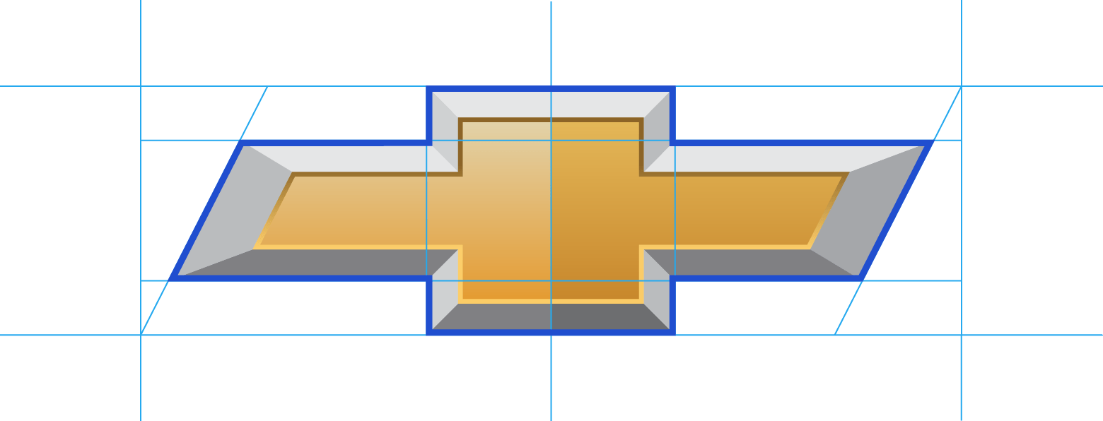
From a purely technical standpoint, Chevy’s logo could be recreated in Adobe Illustrator in about five minutes. But the logo’s restraint—its deliberate omission of unnecessary flourishes—has helped it endure. Its simplicity doesn’t just make it timeless; it also enhances its versatility. Chevy’s bow-tie shape acts as a flexible frame that allows the brand to experiment with interior effects and colors as needed—without betraying its identity.
As a designer, one of my more troublesome instincts is trying to cram all my ideas into a single brand mark. While this can lead to some interesting designs within the pristine confines of Illustrator, the practical reality is that extraneous visual elements—lines, cutouts, flourishes, effects, and so on—tend to age poorly. In your work, you can take a cue from Chevy’s use of simplicity by resisting the urge to overcomplicate identity elements.
3. Embrace the Power of Simplicity
One of the first lessons drilled into every design student’s head is the importance of simplicity. While simplicity can sometimes lead to bland or uninspired designs, it’s often a gateway to flexibility and long-term adaptability. Nike’s swoosh is a great example. From a formal perspective, the swoosh is incredibly simple yet distinct. Its simplicity allows Nike to use it across countless applications—retail stores, social media, and product packaging—while incorporating bold color palettes and creative layouts.
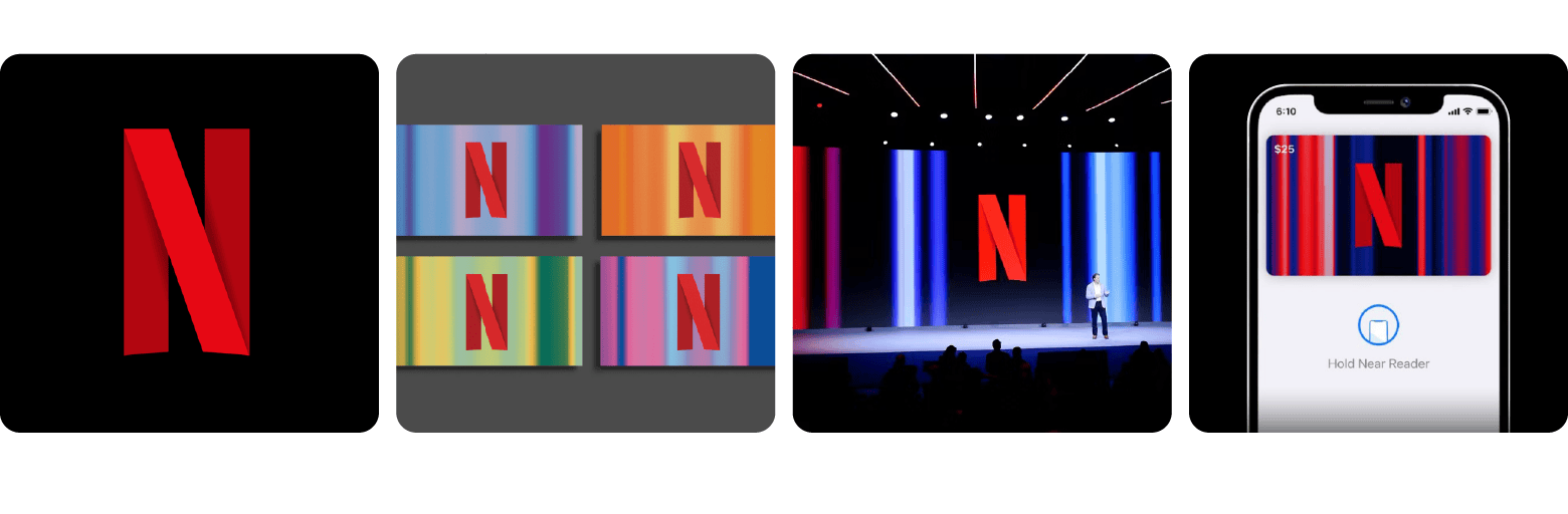
Simplicity also enables modularity and scalability. It allows brand assets to be broken down into adaptable components like submarks, color variants, and animations. Netflix’s “N” is a perfect example. It’s equally effective as an app icon, a stage backdrop, or the centerpiece of a vanity plate at the start of a movie.
In my experience, simplicity is a byproduct of intentionality and awareness. This deliberate choice must be rooted in the earliest stages of a project and revisited at every design decision. For many creatives, simplicity doesn’t come naturally. To keep it at the forefront, I rely on a practical approach: maintaining a list of potential applications for the visual identity I’m designing.
For example, if I’m working on a color palette and am enamored with a wide array of hues, I consult my list and ask, “Will this expansive palette create clear and immediate associations for consumers on social media?” Or, if I’m creating a set of branded illustrations and find myself adding intricate details to enhance a single scene, I consider scalability: “How much time and effort will it take to replicate this level of detail across the dozens of places these illustrations will appear?”
Reassessing design decisions this way often serves as a reality check, helping me pare down visual elements that aren’t impactful, scalable, or essential. This process ensures that simplicity remains central, enabling designs to be effective and adaptable across applications.
4. Design for Flexibility and Future Growth
Adhering to basic design principles allows for flexibility in the present and creates the foundation to plan for future applications and evolving platforms. I’ve often encountered clients who want their visual identities to grow with their business. For example, while working with a D2C company in the fitness industry, my primary focus was branding their online storefront, but the client also shared plans to expand their product line and create presentations to secure additional funding. This meant designing elements of their identity—such as word marks, colors, and typography—with an eye toward applications like apparel, packaging, and pitch decks. I created a visual identity that seamlessly transitioned from the digital space to these future contexts by adhering to fundamental design principles.
How to Balance Legacy and Innovation
Enduring brands succeed by balancing respect for their heritage with thoughtful evolution. Their visual identities adapt to meet changing expectations while preserving the trust and familiarity they’ve built over time. This balance—honoring the past while innovating for the future—makes brands like Coca-Cola and Nintendo timeless.
Coca-Cola: Consistency Through Iteration
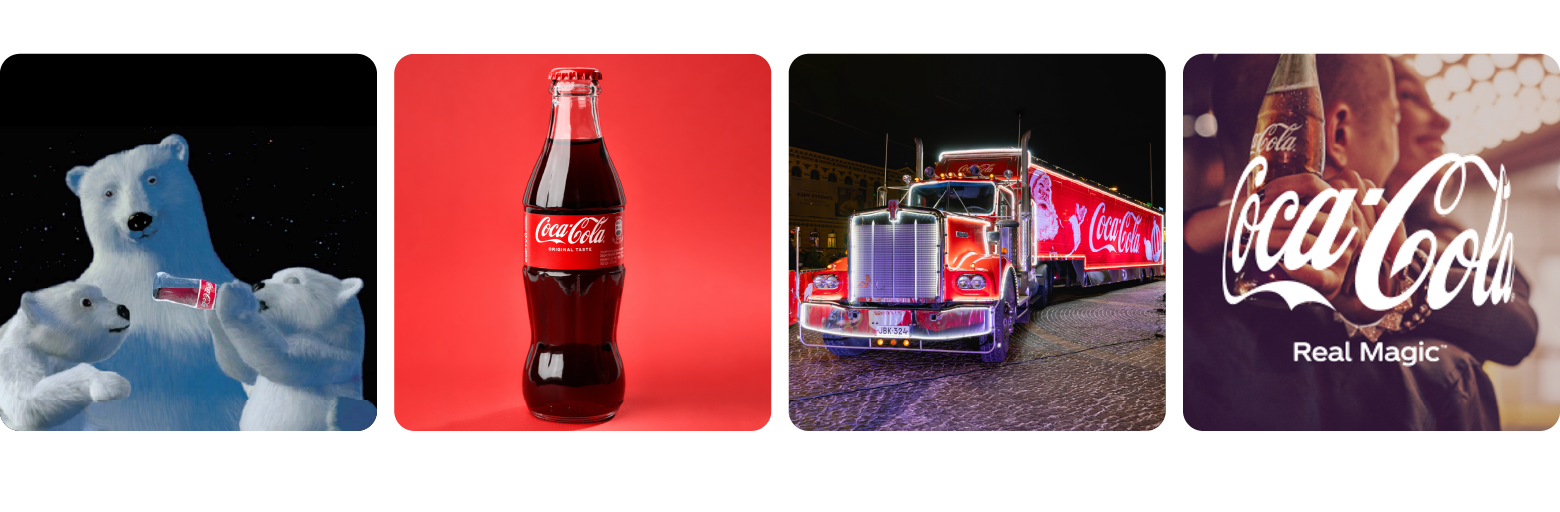
As I mentioned, Coca-Cola’s logo is often celebrated for its longevity. The logotype in use today is remarkably similar to the 1905 version, but the truth is that the mark has subtly evolved over the decades.
Each adjustment—thinning the script, refining spacing, or adding the Coca-Cola wave line—has modernized the brand without straying from its roots. Even more radical experiments, like the “New Coke” logo of the 1980s, reflected an effort to stay relevant while maintaining a connection to the brand’s classic identity.
However, Coca-Cola’s visual consistency extends far beyond its logo. Its iconic red-and-white color palette, recurring thematic elements like polar bear mascots and holiday ads, and even the unmistakable silhouette of its glass bottle have all contributed to the brand’s continuity. The current Coca-Cola logo subtly references the bottle shape by tapering at the edges, mimicking how the mark might wrap around the bottle’s curves.
Coca-Cola’s branding also has global implications. Its color palette and flowing script are recognizable in nearly every country, transcending cultural differences while still allowing for localized campaigns. This universality is part of the brand’s enduring power: According to Kantar BrandZ, Coca-Cola ranks as the world’s most valuable brand in the food and beverage industry.
Nintendo: Innovation Rooted in Play
On the opposite end of the visual spectrum from Coca-Cola’s Victorian-inspired script lies Nintendo—a brand rooted in the aesthetics of the digital age.
Nintendo’s journey is unique: For nearly 100 years, it operated as a playing card and board game company before transitioning to home electronics in the 1970s. With this shift came a dramatic evolution in its visual identity. The company moved away from kanji characters in its branding, adopting a sleek, modern style that reflected the innovation of its new products.
By the mid-1970s, Nintendo released the “Family Computer” console and introduced its now-iconic racetrack logo, which became a cornerstone of the brand. Interestingly, Nintendo’s branding is inherently tied to its product design and game characters. Mario, for example, serves as a brand ambassador, appearing in games, marketing campaigns, merchandise, and even as the company’s favicon in 8-bit form.
Nintendo also leverages product design elements in its branding. The Nintendo Switch logo, for instance, references the system’s button configuration and the rounded curves of its controllers. Similarly, the GameCube logo cleverly embraced the console’s defining feature—its cuboid shape. Integrating product design cues into its branding creates a seamless connection between the company’s identity and its innovations.
What makes Nintendo’s consistency remarkable is the context in which it operates: the fast-moving consumer electronics industry, where visual updates are often necessary to signal technological advancement. Yet, by iterating on its existing identity rather than overhauling it, Nintendo has managed to stay modern without losing sight of its playful, creative roots.
Why Timeless Branding Matters for the Future
The lessons are clear: Brands that last have visual identities that stem from strong values and resonate with customer perceptions. These brands aren’t afraid to experiment with visual trends, but their core elements are built on foundational design principles like balance, movement, and symmetry. And when they evolve, as all brands must, they do so in ways that honor their roots.
For designers, that means advocating for timeless branding that is built to last. Remember, a failed brand launch isn’t just a design misstep; it’s a costly mistake that can damage credibility and destroy profits.
Looking ahead, the stakes will only grow higher. Generative AI and other emerging technologies are accelerating trend cycles and flooding markets with derivative content. In this environment, authenticity and consistency—core components of timeless branding—become more critical than ever. Brands that build their identities on clear values and adaptable design principles are better positioned to stand out and endure.
Ultimately, long-lasting design is bound by a paradox: You’re designing something to grow old while remaining seemingly new. To achieve this, you can’t design solely for today—you must keep an eye on what was, what is, and what might be. This anticipatory approach is what allows brands to endure and become truly iconic.
Further Reading on the Toptal Blog:
Understanding the basics
A timeless brand remains relevant and trusted across decades. Instead of relying on passing trends, timeless brands build identities on core values and classic design principles. Ultimately, they nurture connections with their customers and maintain visual and messaging consistency as markets evolve.
Making a timeless brand requires consistency and clarity. Long-lasting brands define clear values that resonate with customers and build their visual identities around colors, fonts, and graphics that rely on classic design principles like simplicity, symmetry, and scalability.
Timeless logos continue to be recognizable and compelling for generations. They often rely on simple, balanced compositions that work well across a variety of platforms and contexts. Many timeless logos have a distinctive feature—for instance, Apple’s bitten apple, FedEx’s hidden arrow, and BMW’s roundel.
David Ogilvy is often called the “father of advertising” for his role in shaping contemporary branding. Ogilvy emphasized visual consistency, brand storytelling, and forming emotional connections with customers. Additionally, Paul Rand is a legendary graphic designer who created some of the most iconic logos in modern history, including those for IBM, UPS, ABC, and Westinghouse.
Brands can last for decades—or even well over a century—when they are built on clear values and consistent design principles. Coca-Cola and Ford are classic examples of legacy brands that have maintained core design elements while allowing for thoughtful evolution and global flexibility.
Vancouver, WA, United States
Member since March 30, 2016
About the author
Micah is a digital designer who has worked with clients such as Google, Deloitte, and Autodesk. He is also the Managing Editor of Toptal’s Design and Technical Content. His design expertise has been featured in Fast Company, TNW, and other notable publications.
Expertise
Previous Role
Brand DesignerPREVIOUSLY AT