

Hire Data Visualization Designers
Hire the Top 3% of Freelance Data Visualization Designers
Hire data visualization designers, experts, and artists on demand. Top companies and startups choose data visualization designers from Toptal for interactive dashboards, data storytelling, visual analytics, chart design, and more.
Hire a Top Data Visualization Designer Now
No-Risk Trial, Pay Only If Satisfied.


Hire Freelance Data Visualization Designers

Dragos-Valentin Bubu
Freelance Data Visualization Designer
Verified Expert in Design
Romania
Toptal Member Since November 11, 2022
A product designer with a background in computer science, Dragos has worked as a multidisciplinary product designer at various creative agencies, startups, and Fortune 500 companies for a decade, including NATO. Most of his experience comes from designing many enterprise software and SaaS web applications. Dragos enjoys creating with intention and helping clients achieve their goals through digital strategy and design.
Show More


Great Ndidi
Freelance Data Visualization Designer
Verified Expert in Design
United Kingdom
Toptal Member Since July 9, 2018
Great is a digital product designer with 10 years of experience designing mobile devices and web applications with clients like McKinsey, Spotify, Wise, and Checkout.com. He is skilled in user experience design, wireframing, prototyping, usability research, and user interface design. As a proven team player, he can work with teams of different sizes or independently. Great is an excellent communicator and enjoys solving complex problems.
Show More

Hyun Kim
Freelance Data Visualization Designer
Verified Expert in Design
United States
Toptal Member Since May 19, 2020
Hyun has 10+ years of experience designing digital products for Fortune 500 companies and Bay Area startups. He loves to build intuitive, thoughtful, and beautifully crafted products for organizations looking for an autonomous designer who loves to ship quickly. Hyun works closely with top Bay Area VC firms like Greylock Partners and Bain Capital to help their portfolio companies with product design needs. Hyun has worked for many companies, including Intel, Walmart, J&J, Genentech, and more.
Show More


Matt Barringer
Freelance Data Visualization Designer
Verified Expert in Design
United Kingdom
Toptal Member Since March 29, 2016
Matt is an illustrator and designer who loves creative coding and animation. He loves to solve problems in the digital space and hopefully tell a story along the way. He has over a decade of professional experience working with film and TV companies to produce branded websites, data visualization, and infographics for news items, as well as on-air title sequences and GFX.
Show More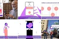

Dennys Hess
Freelance Data Visualization Designer
Verified Expert in Design
Hong Kong
Toptal Member Since September 15, 2022
Dennys is a design director with a distinct passion for data visualization and cartography. He has over a decade of experience building complex websites, apps, and design systems for some of the world’s largest websites, including clients such as HSBC, Deutsche Telekom, Xbox, Google, and Facebook. With his high standard in creating beautiful, precise, very usable, and joyful experiences, Dennys has profound knowledge of web development which is an excellent addition to any design process.
Show More


Sudhir Nain
Freelance Data Visualization Designer
Verified Expert in Design
Singapore
Toptal Member Since November 30, 2021
With 20 years of experience, Sudhir specializes in UI/UX design of digital technologies, mobile apps, and SaaS platforms. He has helped tech businesses build better products and rising startups raise capital from Sequoia and get accepted into YCombinator. Sudhir applies design thinking to deeply understand customer behavior, innovate product experiences, and build differentiated products. He loves working with customers with the highest expectations and hardest-to-solve design problems.
Show More

Barry Iyengar
Freelance Data Visualization Designer
Verified Expert in Design
New Zealand
Toptal Member Since March 1, 2022
Barry is a strategic product designer who works as a lead product designer at Kothai Logistics. He focuses on designing, conducting research, and collaborating with other designers and project teams. With a work experience of more than six years, Barry has delivered projects in logistics, telecom, real estate, transport, and eCommerce and helped them win big in the digital space.
Show More

Mohammed Fathi
Freelance Data Visualization Designer
Verified Expert in Design
United Arab Emirates
Toptal Member Since October 31, 2022
Mohammed is a UI/UX product designer who builds quality products from ideation to launch, providing solutions centered on user design. He has 13+ years of experience working for companies in the MENA region in both the private and government sectors, and he specializes in user experience, user interface, and visual design. Mohammed enjoys collaborating with other team members to develop advanced and effective products that meet business needs and facilitate end users' jobs.
Show More

William Kawai
Freelance Data Visualization Designer
Verified Expert in Design
Brazil
Toptal Member Since March 12, 2021
With over eight years of experience in User Experience (UX) and three years in leadership, William has consistently demonstrated his ability to manage and develop teams in renowned companies within the tech, payments, and retail sectors. In his most recent position as a UX manager, he led a team remotely, focusing on designing and implementing UX strategies that align business needs with those of the customers to enhance performance and results.
Show More

Maria Andreina Nunes De Oliveira
Freelance Data Visualization Designer
Verified Expert in Design
Georgia
Toptal Member Since October 17, 2022
Andreina is a graphic designer with over 10 years of experience in branding, digital and motion design, and marketing. She has worked in various industries, including healthcare and hospitality, and has worked with clients across the US, UK, and Spain. Andreina has extensive relationships with leading companies such as AbbVie, Novo Nordisk, and Nestlé, providing relevant insight into brand development processes, from identity to marketing channels.
Show More


Mariano A. Goren
Freelance Data Visualization Designer
Verified Expert in Design
Mexico
Toptal Member Since July 5, 2017
As a product strategy consultant, Mariano's been helping both Fortune 500 and startups to unite design and technology efforts around a common vision anchored in user needs. With more than 25 years of experience in digital business, he's able to understand and define the big picture, and then jump into the details to deliver. He's also a Singularity University mentor, serial entrepreneur, and teacher influencing 18 000+ students through his book and courses.
Show More


Discover More Data Visualization Designers in the Toptal Network
Start HiringA Hiring Guide
Guide to Hiring a Great Data Visualization Designer
Data visualization designers transform complex datasets into clear and compelling visualizations that strengthen storytelling and support decision-making. Toptal design specialists use tools like Tableau, D3.js, and Python libraries to design charts, dashboards, and data stories that combine graphic simplicity with technical nuance, all thoughtfully tailored to the audience.
Read Hiring GuideToptal in the press
... allows corporations to quickly assemble teams that have the right skills for specific projects.
Despite accelerating demand for coders, Toptal prides itself on almost Ivy League-level vetting.
Our clients


Creating an app for the game

Leading a digital transformation

Building a cross-platform app to be used worldwide


Drilling into real-time data creates an industry game changer
Testimonials
How to Hire Data Visualization Artists Through Toptal
1
Talk to One of Our Client Advisors
A Toptal client advisor will work with you to understand your goals, technical needs, and team dynamics.
2
Work With Hand-selected Talent
Within days, we’ll introduce you to the right data visualization expert for your project. Average time to match is under 24 hours.
3
The Right Fit, Guaranteed
Work with your new data visualization designer for a trial period (pay only if satisfied), ensuring they’re the right fit before starting the engagement.
EXCEPTIONAL TALENT
How We Source the Top 3% of Data Visualization Designers
Our name “Toptal” comes from Top Talent—meaning we constantly strive to find and work with the best from around the world. Our rigorous screening process identifies experts in their domains who have passion and drive.
Of the thousands of applications Toptal sees each month, typically fewer than 3% are accepted.
Capabilities of Data Visualization Designers
Data visualization designers combine analytical rigor with creative design to transform raw datasets into compelling visuals. They specialize in dashboard creation, chart design, and data storytelling that supports strategic decision-making while using tools like Tableau, Power BI, D3.js, and Looker to uncover insights, simplify complexity, and present information in ways that drive understanding and engagement.
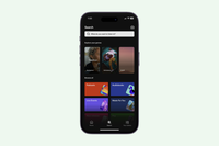
Custom Dashboards
Dashboards offer real-time visibility into performance and operational trends. Our data designers use tools like Tableau, Power BI, and Looker to build interactive dashboards with dynamic filters, calculated metrics, and user-friendly layouts that highlight business KPIs.
Data-driven Visuals and Narratives
Effective data visuals make nuanced insights easier to grasp and act upon. Our designers interpret raw datasets and shape them into narrative-driven visuals by combining line charts, annotations, and infographics to convey patterns and business context.
Visual Formatting and Design
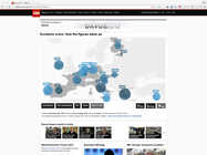
Choosing the wrong chart can obscure meaning rather than reveal it. Our design pros match visual types—bar, line, scatter, treemaps, or choropleths—to the data’s structure and the analytical task at hand to ensure clarity and impact.
Interactive Visualizations
Interactivity turns static charts into exploratory tools. Our visualization experts implement drilldowns, hover states, and filtering capabilities using tools like D3.js or embedded Tableau dashboards to let users engage with the data.
Collaboration with Data Analysts and Stakeholders
Alignment with business goals ensures visuals tell the right story. Toptal’s data viz designers work closely with analysts and decision-makers to define key metrics, understand audience needs, and translate analytical findings into compelling graphics.
Reports and Presentations
Well-designed reports enhance communication across teams and stakeholders. Our data designers create visuals for quarterly reviews, investor decks, and executive briefings—incorporating snapshot dashboards, trend charts, and explanatory text for clarity.
Design Clarity and Accessibility
Clear, accessible design is core to effective communication. Toptal’s data visualization specialists apply visual hierarchy, contrast ratios, and colorblind-safe palettes to ensure all visuals are professional, readable, accessible across use cases.
Visualization of Trends, Patterns, and Outliers
Spotting insights depends on how the data is framed. Our designers highlight patterns, seasonal trends, or anomalies by adjusting axis scales, layering reference lines, and using techniques like small multiples or conditional formatting.
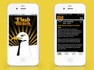
Data Viz for Web and Mobile
Making data visualizations responsive expands the reach of insights across viewing platforms. Our design experts build mobile-ready charts using frameworks like D3.js, Chart.js, or embed-ready BI tools to ensure usability and legibility on different screen sizes.
Visual Consistency Across Projects
Consistency builds trust and reinforces brand identity. Toptal data designers define and implement visual standards—such as typography systems and branded color schemes—so all charts and dashboards align with organizational style guidelines.
FAQs
Typically, you can hire data visualization designers with Toptal in about 48 hours. For larger teams of talent or full end-to-end project delivery, timelines may vary. Our talent matchers are highly skilled in the same fields they’re matching in—they’re not recruiters or HR reps. They’ll work with you to understand your goals, technical needs, and team dynamics, and match you with ideal candidates from our vetted global talent network.
Once you select your data visualization designer, you’ll have a no-risk trial period to ensure they’re the perfect fit. Our matching process has a 98% trial-to-hire rate, so you can rest assured that you’re getting the best fit every time.
To hire the right data visualization artist, it’s important to evaluate a candidate’s experience, technical skills, and communication skills. You’ll also want to consider the fit with your particular industry, company, and project. Toptal’s rigorous screening process ensures that every member of our network has excellent experience and skills, and our team will match you with the perfect data visualization designers for your project.
At Toptal, we thoroughly screen our data visualization experts to ensure we only match you with the highest caliber of talent. Of the more than 200,000 people who apply to join the Toptal network each year, fewer than 3% make the cut.
In addition to screening for industry-leading expertise, we also assess candidates’ language and interpersonal skills to ensure that you have a smooth working relationship.
When you hire data visualization experts with Toptal, you’ll always work with world-class, custom-matched data visualization designers ready to help you achieve your goals.
You can hire data visualization designers on an hourly, part-time, or full-time basis. Toptal can also manage the project end-to-end based on your specific requirements as part of our Consulting and Services offerings. Whether you hire a data visualization designer for a full- or part-time position, you’ll have the control and flexibility to scale your team up or down as your needs evolve. Our data visualization designers can fully integrate into your existing team for a seamless working experience.
We make sure that each engagement between you and your data visualization designer begins with a trial period of up to two weeks. This means that you have time to confirm the engagement will be successful. If you’re completely satisfied with the results, we’ll bill you for the time and continue the engagement for as long as you’d like. If you’re not completely satisfied, you won’t be billed. From there, we can either part ways, or we can provide you with another data visualization designer who may be a better fit and with whom we will begin a second, no-risk trial.
Explore Related Toptal Services
Looking for an end-to-end business solution? Browse Toptal's portfolio of services.
How to Hire Data Visualization Designers

Verified Expert in Design
15 Years of Experience
Dhilan is a lead experience designer with more than 15 years of experience designing enterprise-scale digital products and data-rich platforms. He has led design initiatives at Microsoft, Salesforce, and Adobe, working across global commerce ecosystems, cloud platforms, and complex enterprise workflows. Dhilan specializes in translating complex systems and information into clear, scalable user experiences that support effective decision-making.
Previous Role
Head of DesignPreviously at


Demand for Data Visualization Designers Continues to Expand
According to the US Bureau of Labor Statistics, employment of data scientists is expected to grow 36% from 2023 to 2033, much faster than the average across all occupations. Businesses increasingly rely on complex data to guide strategy, and this surge in demand points to a need for data visualization designers who can transform raw information into clear graphics with actionable takeaways. These designers help decision-makers in tech, finance, healthcare, and government spot patterns, identify outliers, and communicate insights through compelling visual stories.
Yet hiring a standout data viz designer presents a unique challenge. Visually strong portfolios don’t always reflect the depth of data literacy needed for high-stakes projects. Meanwhile, technically minded candidates may lack the visual storytelling skills to create work that influences users and business leaders. The best data visualization designers are difficult to find because they effortlessly combine statistical awareness, aesthetic clarity, and tool fluency.
This guide will help you identify and hire data visualization designers who know how to compose graphics that deliver compelling insights. We’ll cover the core attributes of high-performing candidates, break down skill levels, suggest what to include in your job post, and walk you through interview questions that reveal true expertise.
What Attributes Distinguish Quality Data Visualization Designers From Others?
Data visualization designers are responsible for transforming complex datasets into digestible visuals that support analysis and decision-making. The best data viz designers do more than display data—they uncover patterns, highlight meaning, and shape visual stories that inspire action.
Expert-level designers have a keen awareness of their audience and know how to identify what the viewer needs to understand or act on. They choose the most appropriate chart types, optimize designs for readability, and sequence information to tell a story. They’re fluent in quantitative reasoning and visual hierarchy, and they make design decisions that reflect an understanding of statistical significance, context, and cognitive load.
Top-tier data designers pair clarity with restraint. They avoid what renowned data visualization expert Edward Tufte—the so-called Galileo of Graphics—described as “chart junk.” They know when a bar chart communicates better than a bubble plot, use color to encode meaning, and understand the intricacies of their medium: Dashboards should prioritize interactivity; infographics need to flow as narratives; executive reports must be scannable and precise.
The best data visualization designers are also fluent across tools and platforms. They know when to use Tableau, D3.js, or Python-based libraries like Plotly or Seaborn, selecting the right technology for the project requirements. While they may not always be developers, they understand how to work within a product or analytics environment. Just as importantly, they are skilled at parsing and interpreting data, meaning they can spot inconsistencies, ask smart questions about methodology, and never treat a dataset as a static input.
Complementary Skills of Top Data Visualization Designers
Tableau: Tableau is a leading business intelligence (BI) and dashboard tool that enables designers to create interactive, real-time visualizations from large datasets. Top candidates will show experience with calculated fields, dynamic filters, and dashboard design optimized for business users.
D3.js: A JavaScript library used for building fully custom, web-based data visualizations. Candidates skilled in D3.js can create interactive and responsive visuals that are embedded directly into web products or analytics platforms.
Python (Matplotlib, Seaborn, Plotly): For designers who work with data science teams or in technical environments, fluency in Python-based libraries enables programmatic charting, reproducibility, and integration with data pipelines.
Data Cleaning and Preparation: Strong candidates often know how to prepare datasets using tools like Excel, SQL, or Pandas. They understand the structure of high-quality input data and can spot issues like missing values, outliers, or misaligned categories before they start designing.
Chart Selection and Statistical Literacy: High-level designers understand when to use scatterplots, treemaps, heatmaps, or small multiples. They can explain concepts like logarithmic scaling, moving averages, or confidence intervals, ensuring that visualizations accurately represent the underlying data.
Responsive and Interactive Visualization Design: Especially for web-based outputs, top designers know how to build or collaborate on responsive visuals that work across screen sizes and allow users to explore the data. This may include features like tooltips, drill-downs, filters, or animated transitions.
Accessibility in Data Visualization: Advanced designers understand how to make visual content inclusive and accessible. This includes applying proper color contrast, ensuring screen reader compatibility, and adhering to Web Content Accessibility Guidelines (WCAG) or other data-viz-specific accessibility standards.
Figma or Adobe Illustrator for Static Design: When the output is a report, slide deck, or editorial piece, candidates should be able to translate raw charts into clean, high-resolution, on-brand visuals using professional design tools.
How Can You Identify the Ideal Data Visualization Designer for You?
Hiring a data visualization designer starts with a clear understanding of your message and your audience. Are you building internal dashboards for analysts? Interactive data stories for a marketing audience? Investor-facing visuals for a pitch deck? Each of these requires a different design skill set and mindset. For instance, a designer working on internal dashboards needs to prioritize usability and speed, whereas a designer developing executive presentations must be capable of creating polished, narrative-driven graphics that emphasize key information.
Domain alignment is another important consideration. Visualization in a healthcare context is different from fintech, journalism, or climate science. Top candidates have domain awareness. They know what metrics matter, what conventions are already in use, and how to avoid misrepresenting data through poor framing or visual bias.
Once you’ve determined your project’s message and audience, consider the required level of experience.
Junior data visualization designers are capable of transforming existing data into basic charts or formatting visuals in tools like Excel, Tableau, or Canva. They often work best when given tight constraints and clear direction, and they are ideal for supporting roles on large teams or for templated outputs where consistency is more important than creativity.
Mid-level data visualization designers should be fluent in one or more visualization tools (e.g., Tableau, Power BI, Illustrator, Figma) and able to operate independently. They understand visual hierarchy, chart selection, and design systems, and they can turn a rough dataset into a clean, purpose-driven graphic. They’re a good fit for ongoing marketing or analytics support, especially when collaborating with someone managing the data strategy.
Senior data visualization designers combine highly developed technical skills with impeccable creative judgment. They understand data structure, context, audience, and platform constraints and tailor their visualizations accordingly. They’re able to shape the story, flag misleading interpretations, and build visuals that hold up under scrutiny. If your visualizations need to influence decisions, withstand press or investor scrutiny, or integrate seamlessly into a digital product, senior talent is worth the investment.
What tools do the best data visualization designers use?
Leading data visualization designers select tools based on the specific context of the work. For interactive dashboards, they may use Tableau, Power BI, or Looker. For web-based graphics, D3.js or Plotly are common. For design-heavy or editorial visuals, they often use Adobe Illustrator, Figma, or Sketch. In data science contexts, they may rely on Python libraries like Matplotlib, Seaborn, or Altair. The best candidates can explain trade-offs, such as speed versus flexibility or visual control versus interactivity, and tailor their workflow to the project’s needs.
What’s the difference between a data analyst and a data visualization designer?
A data analyst focuses on uncovering insights from data. They run queries, spot trends, and build models. A data visualization designer determines how those insights are communicated visually. While there’s some overlap, the best visualization designers specialize in visual strategy, layout, and storytelling. They know how to turn a dense spreadsheet or SQL query into a visual that immediately makes a point. Although analysts may build dashboards, visualization designers shape the viewing experience and refine the story.
How to Write a Data Visualization Job Description for Your Project
Start with a clear, outcome-driven title, such as “Senior Data Visualization Designer for Executive Reporting” or “Freelance Dashboard Designer for SaaS Analytics Platform.” Be specific about the use case, audience, and level of expertise required.
In the description, outline what kind of data the designer will be working with, what tools are involved, and what the final output should achieve, whether it’s interactivity, clarity, speed, or visual polish. Specify whether the role includes data preparation or if clean datasets will be provided.
Highlight key skills like chart selection, visual hierarchy, responsiveness, tool fluency, and domain-specific knowledge. Clearly state whether collaboration with analysts, developers, or other stakeholders is an important part of the role.
Common roles that align with this skill set include:
- Data dashboard designer
- BI visualization specialist
- Editorial or infographic designer
- Custom web visualization developer
- Data storytelling consultant
What Are the Most Important Data Visualization Interview Questions?
The most effective interview questions reveal how a design candidate thinks about data, tool use, audience needs, and communication. Below are four core questions, along with a description of what thoughtful responses typically look like.
Can you walk me through a visualization you’re especially proud of and explain the decisions behind it?
Leading candidates will describe the audience, the type of data they were working with, and the takeaway their visualization needed to deliver. They’ll justify their chart choices, layout decisions, and visual elements like typography, color, and hierarchy. Look for clear reasoning, technical execution, and an understanding of how to balance viewer perceptions with business outcomes. The strongest responses may also reflect on challenges, such as data limitations, shifting stakeholder needs, or technical constraints, and explain how they adapted their approach to maintain clarity and effectiveness.
How do you decide what kind of chart or visual to use?
Strong designers will discuss how they align their chart choices with the type of data they’re working with—whether categorical, time series, relational, or hierarchical—and how these decisions support audience understanding while reducing cognitive load. Great answers go beyond aesthetics, demonstrating awareness of what the audience needs to absorb and act on. Look for candidates who reference key principles like visual hierarchy, data-ink ratio, or preattentive attributes (such as position, color, or size), showing they can translate data characteristics into effective visual communication.
How do you handle messy or incomplete data?
Experienced candidates will discuss cleaning strategies (e.g., flagging outliers, handling nulls, joining datasets) and how they document or communicate limitations to stakeholders. They will emphasize the importance of collaborating with data owners or analysts to understand the source of issues and avoid misrepresenting results. This signals real-world experience, not just ideal-case scenarios. Be cautious of candidates who charge ahead with design before resolving data issues.
Which tools do you prefer for data visualization, and why?
Great candidates will discuss the differences between tools and talk about how they use different programs for specific purposes. For example, a candidate may say, “I use Tableau when I need quick interactivity but D3 when I need full customization,” or “I prefer Seaborn for exploratory analysis but Illustrator when visual polish is critical.” Listen for thoughtful reasoning that names trade-offs like speed, flexibility, and collaboration. The best candidates will also show openness to learning new tools as needed and the ability to explain these choices in terms of the project’s audience and technical context, not just personal preference.
Why Do Companies Hire Data Visualization Designers?
Companies hire data visualization designers to turn raw information into compelling imagery that helps audiences make informed decisions. Whether it’s a dashboard that drives business strategies, a slide deck that secures funding, or an interactive graphic that tells a story, great data visuals make complex ideas easier to understand and act on. These designers also help stakeholders see patterns, evaluate performance, and align around insights supported by real data.
Yet hiring the right designer isn’t always straightforward. The best candidates bring a rare mix of design instinct, technical fluency, and data literacy. They know how to shape information for different audiences, choose the right visual frameworks, and apply the tools that bring your data to life.
Featured Toptal Data Visualization Design Publications


Top Data Visualization Designers Are in High Demand.