
Designing GitHub’s Octoverse: A Data Visualization Case Study
Designer Gemma Busquets shares how she created a responsive website and 20+ engaging charts and graphs for the software development platform’s annual report.
Designer Gemma Busquets shares how she created a responsive website and 20+ engaging charts and graphs for the software development platform’s annual report.

Gemma is a designer and creative director with over 15 years of experience in UX, data visualization, and branding. She has taught data visualization for 7+ years at the university level and has directed a master’s degree program on the subject. Gemma’s portfolio includes collaborations with GitHub, Coca-Cola, Nike, Visa, and Seat.
Previous Role
Senior Graphic DesignerPreviously At

In 2021, I collaborated with GitHub to design that year’s State of the Octoverse report. GitHub’s Octoverse analyzes real-world data from millions of developers and repositories in order to present the year’s software development industry insights. The 2021 report covers three major trends: improving performance and well-being by developing code, creating documentation, and supporting communities in a smarter, more sustainable way.
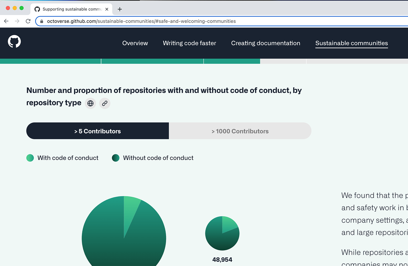
As the project’s creative liaison, it was my job to assist the GitHub team in making the data-heavy report easy to understand. Using data visualization, I designed 20+ charts, maps, and graphs to help readers unravel the information that GitHub data scientists collected.
In this data visualization case study, I explain my design process, showcase the website I helped to create for GitHub’s Octoverse, and share key learnings from the project.
Designing Engaging Digital Experiences With Data Visualization
State of the Octoverse 2021 is a sprawling report, with data collected from over 73 million GitHub developers and more than 61 million new repositories. It’s also the first time a survey on respondent demographics has been included. Making sense of the data required an extensive design effort.
Our modest team, which included developer Jose Luis Garrido and project manager Miquel Lopez, was tasked with synthesizing this immense amount of information for readers. Despite a delayed start and other simultaneous projects, we delivered.
Kicking Off the Design Process
The first stage of my data visualization design process was discovery. GitHub’s data scientists collected and analyzed information from developers and repositories through Excel files, PowerPoint presentations, and other data sets.
With this information, along with GitHub’s initial data visualization sketches and a 60-page context document, I began to think about how best to illustrate each data set. Then, I set about designing each chart, map, and diagram for maximum user engagement and an intuitive user experience.
Choosing Your Chart
There are three key points to choosing an effective data visualization:
1. Identify the Chart’s Purpose
Data can be represented in numerous ways–bar charts, line graphs, heatmaps, waterfall charts, and more. Each chart serves a purpose, and it’s important to use the right one to ensure that a clear and accurate message is conveyed.
For example, if you want to present the difference between two quantities, use a bar chart. If you want to show a trend over time, use a line graph.
2. Consider the End User
You also need to be aware of your users’ ability to read and analyze data. Most of us are familiar with pie, bar, and line charts. We see them everywhere, and we know how to read them.
On the other hand, fewer people know how to read box plots, which are used in many research publications to summarize multiple data variables into one chart.
If you present users with unfamiliar visualizations, they’ll have a hard time interpreting the data.
3. Design With Clarity
Is the data visualization clear and concise, or is there too much noise? Bar charts can be a great way to display data, but not if there are 100 bars with individual labels. Likewise, streamgraphs are beautiful and functional, but only when there’s a clear data pattern. Sometimes less is more.
Designing Perfect Data Visualizations
Throughout the 2021 State of the Octoverse report, you’ll find a variety of data visualizations that have been carefully composed in accordance with the corresponding data insight.
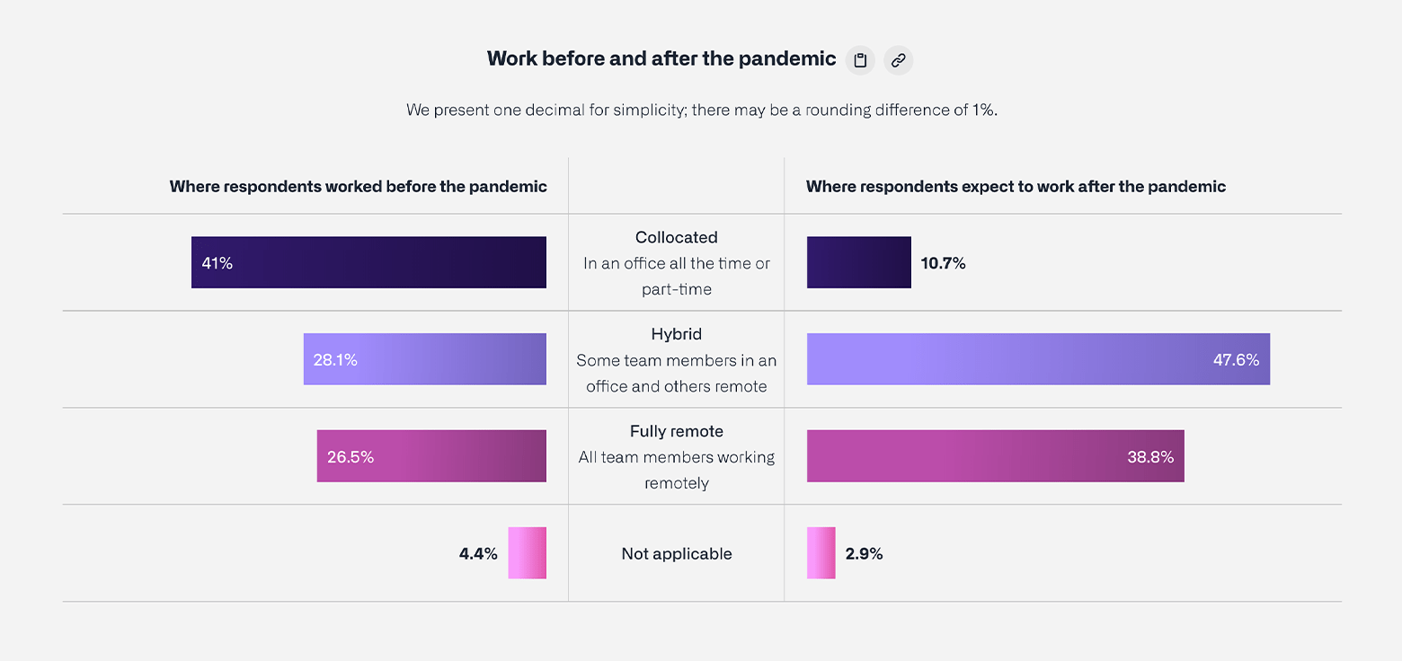
The Butterfly Chart
On the Overview page, I needed to design an infographic for two sets of data—showing where respondents worked before the pandemic and after it. GitHub provided me with two pie charts that each mapped out four data points: collocated, hybrid, fully remote, and not applicable. However, pie charts are not particularly effective when comparing two sets of data.
Instead, I opted for a butterfly chart. Butterfly charts plot the data as two horizontal bars side by side, resembling butterfly wings. These charts clearly show the difference between two groups that share the same parameters, and make comparing two sets of data much easier.
The Bump Chart
Another effective data visualization is the bump chart. We used this chart to present the information on the most popular computer programming languages used by developers over the past eight years. Bump charts are great for displaying changes in rank over a period of time, and they have become a staple in the Octoverse report.

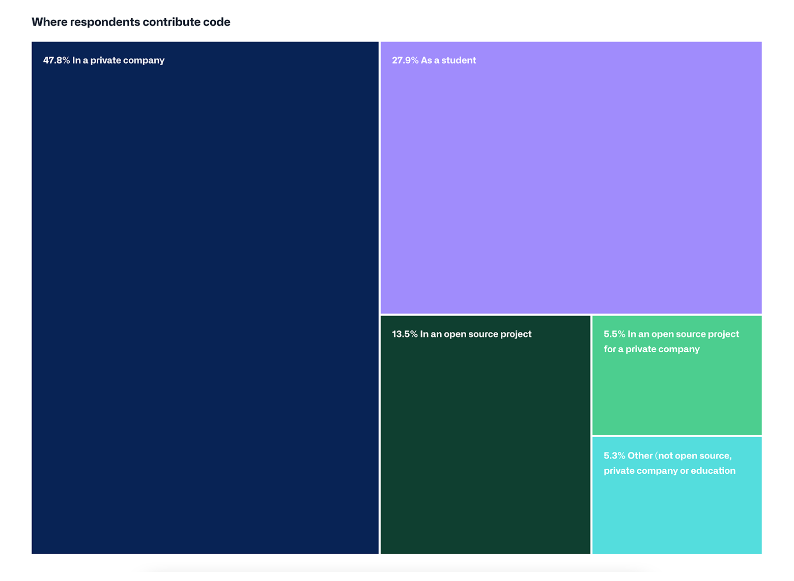
The Treemap
I needed to illustrate the different sectors to which respondents contribute code. The final decision came down to pie charts versus treemaps.
Pie charts are useful when you have three or four sectors and when the quantities are clearly different. However, our brains don’t process angles well, so when there’s a pie chart with lots of similarly sized wedges, people have a hard time deciphering which is bigger.
In contrast, treemaps allow users to easily compare segments to each other, as well as to the whole. The largest rectangles are placed in the top left, followed by progressively smaller rectangles. It’s easier to compare straight lines than it is to compare wedges or angles.
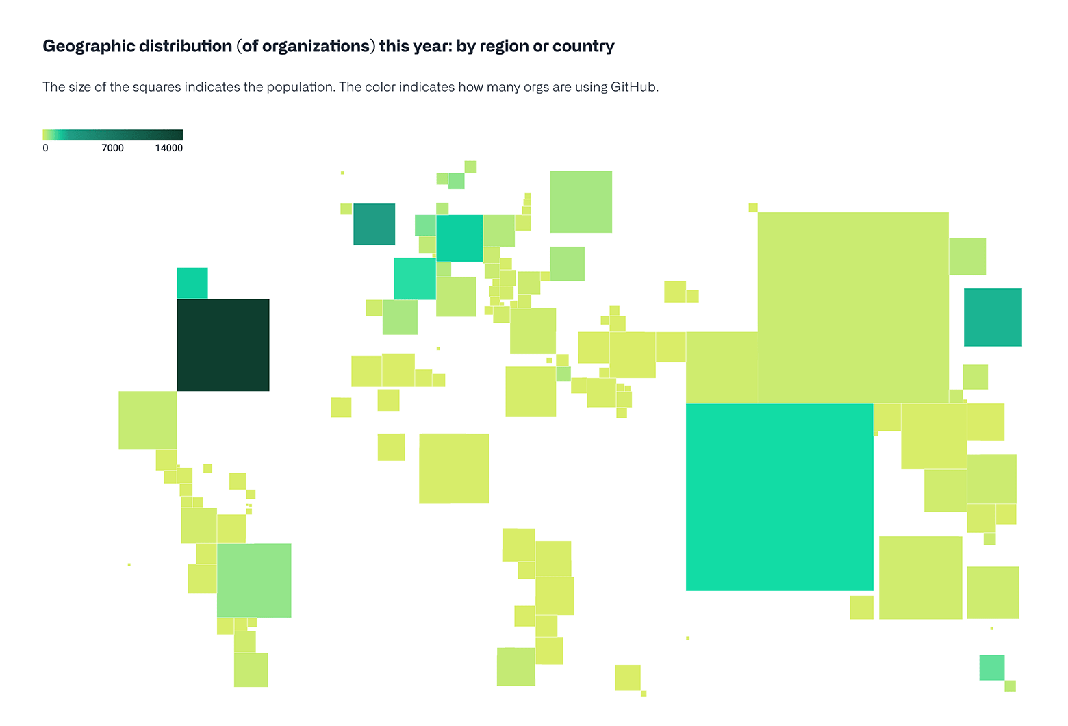
The Cartogram
Finally, I needed to illustrate the geographical distribution of organizations using GitHub in 2021 by region or country. For this, I used a population cartogram. Cartograms are maps in which the geometry is distorted to accommodate a particular economic, social, political, or environmental feature.
In this data visualization, the size of the squares indicates the population size. Additionally, the saturation of the square’s color indicates how many organizations in that area are using GitHub.
Responsive Website Design For GitHub’s Octoverse 2021
In addition to designing data visualizations, I also helped the GitHub team produce a website for Octoverse 2021. This site was a hub for users to read, explore, and interact with the report’s data insights.
To encourage user engagement, we opted for a fully responsive website that would adapt the site’s rendering to different sized viewports. GitHub asked us to pay special attention to the desktop version after finding that larger devices drove the majority of Octoverse visits.
When designing the responsive site, I followed these best practices:
- Composing text with desktop-friendly and mobile-friendly typefaces. This included choosing optimal font sizes, typefaces, and line length and height, and refining how the text looks at different breakpoints.
- Laying out the visual elements on each page to encourage scrolling.
- Designing a user-friendly top navigation bar that adapts its layout to the viewport size.
Because I designed the website with different devices in mind from the start, most charts rendered well on all screen sizes. I only needed to make minor adjustments for optimal viewability, such as to the circular dendrogram at the end of the “Sustainable communities” section.

Organizing the Information Architecture
I explored different options for the website’s information architecture. I didn’t want to overwhelm users with too much information, but I also didn’t want the site to be scattered or difficult to navigate.
With this in mind, I started by designing a long scrolling website, with all the content on the same page. When that became visually overwhelming, I tried placing each chart on a separate page. To help with navigation, I added a side navigation menu to each page with a table of contents, similar to what you might find in a book. The final design on the Octoverse website consists of separate webpages for the three main trends, plus a homepage that serves as a summary of the most important data.
After deciding on the information architecture, I moved on to designing the site’s content structure, navigation flow, images, and graphics. I created wireframes to map out the content and show paths between different pages.
Making the Website Interactive
The Scroll Progress Indicator
To satisfy GitHub’s request for an engaging, dynamic website, we added interactive elements. For instance, under the top navigation bar, I designed a scroll progress indicator so visitors could keep track of where they were on the site. As readers scroll down a page, the indicator bar scales incrementally, and each page has a different fill color for the bar: gray, purple, blue, or green.
Animated Headers, Images, and Data Visualization
To keep the website from looking flat, we decided to animate the section headers. I created the illustrations and our team’s developer animated them. We also animated the hero image for the homepage and each subsection, and their corresponding chapter cards at the bottom of each webpage.

We also made some of the static data visualization charts interactive. For example, as you scroll over a line in the bump chart, the line thickens to emphasize the corresponding data point. It’s a simple but effective animation that lets site visitors interact with the data and quickly compare languages.
Creating Successful Data Visualizations and Digital Designs for GitHub: Key Learnings
Data is only useful if you can make sense of it, and the process of designing data-heavy content that users can easily decipher is challenging. Nevertheless, this collaboration with GitHub broadened my knowledge in data visualization design. Here are the most important takeaways from this data visualization case study:
- Know the brand: Being familiar with a brand’s core style guidelines—such as its use of type, color, and images—speeds up the design process because it frees designers to move on to the creative process. I was lucky that I knew a lot about GitHub’s brand before the collaboration, and I was able to use this knowledge to inform my designs.
- Choose the right types of data visualizations: Selecting the correct visualization to represent a data point is essential. An incorrect representation can cause confusion or convey the wrong message.
- Use color wisely: The right color combination will guide the reader’s eye and draw attention to a particular data point.
- Stay curious: When you’re trying to tell a compelling data story, you’re bound to encounter complex design problems, so it’s important to be open to uncommon solutions and continuous learning.
Understanding the basics
GitHub’s State of the Octoverse is a report that presents software development trends and insights. Data from millions of developers and repositories is collected and analyzed to make up the annual report. Trends include working habits, productivity, and career satisfaction.
Data visualization is the process of creating graphical representations of data sets, such as charts, graphs, and maps. This design technique is used to clearly communicate complex data to users.
GitHub is an open-source code-hosting platform for version control and collaboration where developers and programmers can download, review, and evaluate each other’s work. It is the platform of choice for millions of developers.
Barcelona, Spain
Member since February 1, 2017
About the author
Gemma is a designer and creative director with over 15 years of experience in UX, data visualization, and branding. She has taught data visualization for 7+ years at the university level and has directed a master’s degree program on the subject. Gemma’s portfolio includes collaborations with GitHub, Coca-Cola, Nike, Visa, and Seat.
Previous Role
Senior Graphic DesignerPREVIOUSLY AT