The Principles of Design and Their Importance
Good design is possible without understanding the principles of design. But it may take a lot of trial and error to create something that both looks good and creates an optimal user experience. 🔊
Good design is possible without understanding the principles of design. But it may take a lot of trial and error to create something that both looks good and creates an optimal user experience. 🔊
Listen to the audio version of this article
One of the most difficult parts of talking about the principles of design is figuring out just how many principles there actually are (are there five? Seven? 10?). And once that’s been figured out, which of these supposed design fundamentals should be included?
Search for “principles of design” and Google will return results for articles that include from five to more than a dozen individual visual design principles. Even the articles that agree on the number don’t necessarily agree on which ones should be included in that number.
In reality, there are roughly a dozen basic principles of design that beginning and expert designers alike should keep in mind when working on their projects. In addition, there are another dozen or so “secondary” design principles that are sometimes included as basics (for example, the Gestalt Principles, typography, color, and framing). The main design principles are explained and illustrated below.
Basic Visual Design Principles
As already mentioned, there is no real consensus in the design community about what the main principles of design actually are. That said, the following twelve principles of visual design are those mentioned most often in articles and books on the subject.
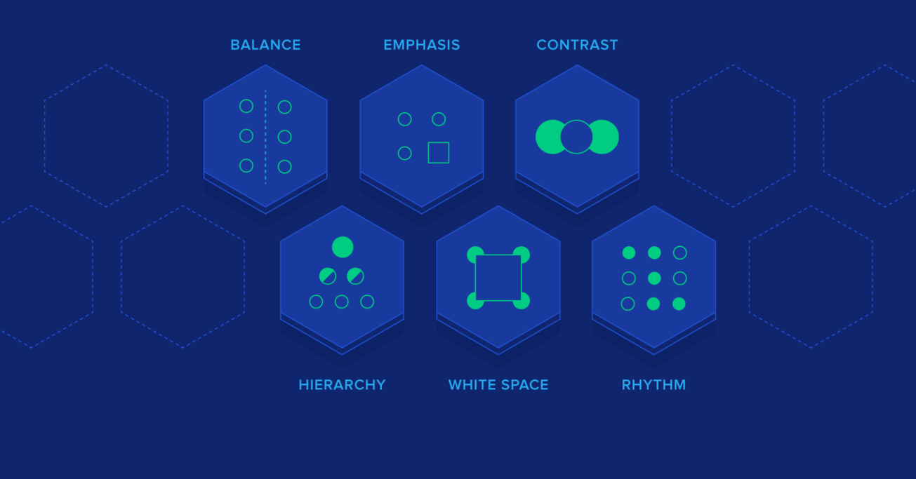
Contrast
One of the most common complaints designers have about client feedback often revolves around clients who say a design needs to “pop” more. While that sounds like a completely arbitrary term, what the client generally means is that the design needs more contrast.
Contrast refers to how different elements are in a design, particularly adjacent elements. These differences make various elements stand out. Contrast is also a very important aspect of creating accessible designs. Insufficient contrast can make text content in particular very difficult to read, especially for people with visual impairments.

Balance
All design elements and principles—typography, colors, images, shapes, patterns, etc.—carry a visual weight. Some elements are heavy and draw the eye, while other elements are lighter. The way these elements are laid out on a page should create a feeling of balance.
There are two basic types of balance: symmetrical and asymmetrical. Symmetrical designs layout elements of equal weight on either side of an imaginary center line. Asymmetrical balance uses elements of differing weights, often laid out in relation to a line that is not centered within the overall design.

Emphasis
Emphasis deals with the parts of a design that are meant to stand out. In most cases, this means the most important information the design is meant to convey.

Emphasis can also be used to reduce the impact of certain information. This is most apparent in instances where “fine print” is used for ancillary information in a design. Tiny typography tucked away at the bottom of a page carries much less weight than almost anything else in a design, and is therefore deemphasized.
Proportion
Proportion is one of the easier principles of graphic design to understand. Simply put, it’s the size of elements in relation to one another. Proportion signals what’s important in a design and what isn’t. Larger elements are more important, smaller elements less.
Hierarchy
Hierarchy is another principle of design that directly relates to how well content can be processed by people using a website. It refers to the importance of elements within a design. The most important elements (or content) should appear to be the most important.
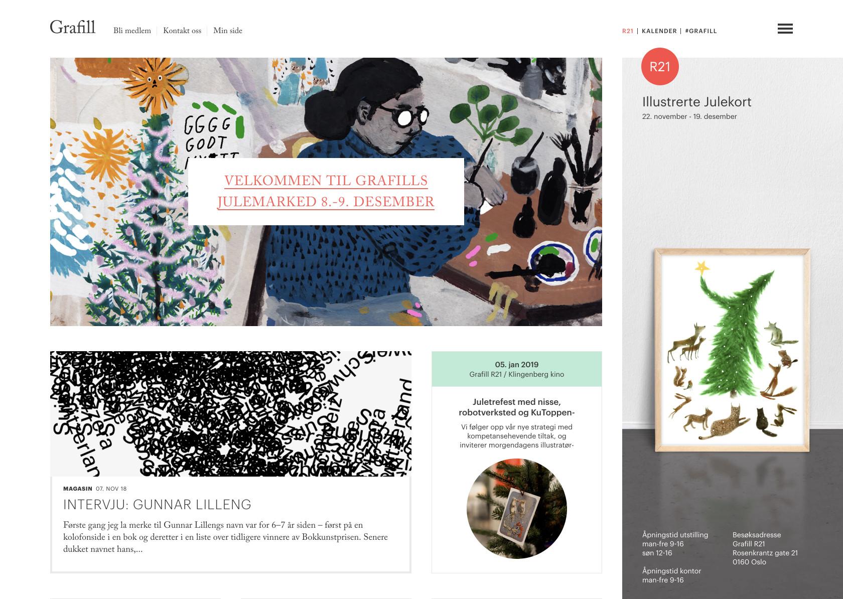
Hierarchy is most easily illustrated through the use of titles and headings in a design. The title of a page should be given the most importance, and therefore should be immediately recognizable as the most important element on a page. Headings and subheadings should be formatted in a way that shows their importance in relation to each other as well as in relation to the title and body copy.
Repetition
Repetition is a great way to reinforce an idea. It’s also a great way to unify a design that brings together a lot of different elements. Repetition can be done in a number of ways: via repeating the same colors, typefaces, shapes, or other elements of a design.
This article, for example, uses repetition in the format of the headings. Each design principle is formatted the same as the others in this section, signaling to readers that they’re all of equal importance and that they’re all related. Consistent headings unify these elements across the page.
Rhythm
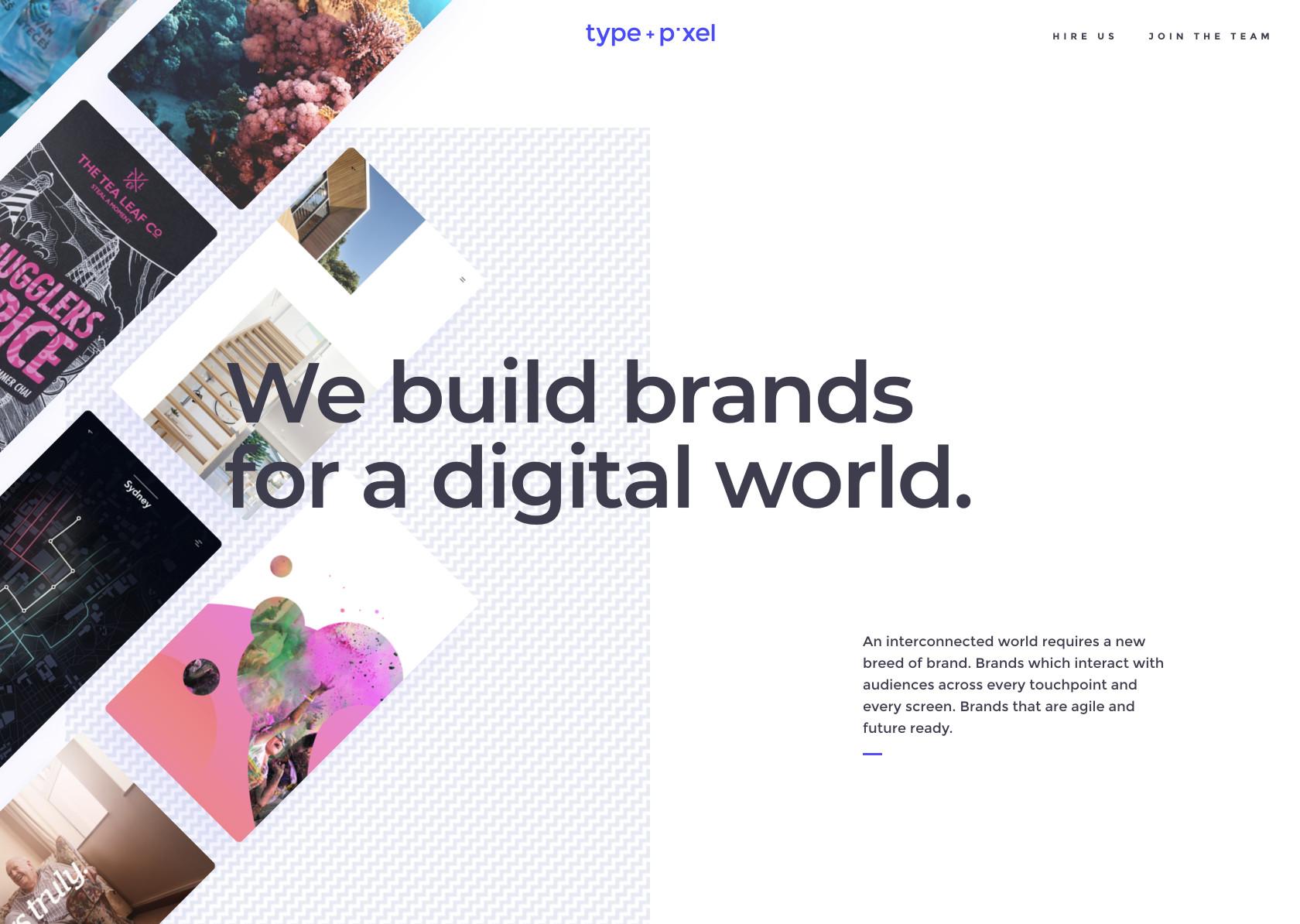
The spaces between repeating elements can cause a sense of rhythm to form, similar to the way the space between notes in a musical composition create a rhythm. There are five basic types of visual rhythm that designers can create: random, regular, alternating, flowing, and progressive.
Random rhythms have no discernable pattern. Regular rhythms follow the same spacing between each element with no variation. Alternating rhythms follow a set pattern that repeats, but there is variation between the actual elements (such as a 1-2-3-1-2-3 pattern). Flowing rhythms follow bends and curves, similar to the way sand dunes undulate or waves flow. Progressive rhythms change as they go along, with each change adding to the previous iterations.
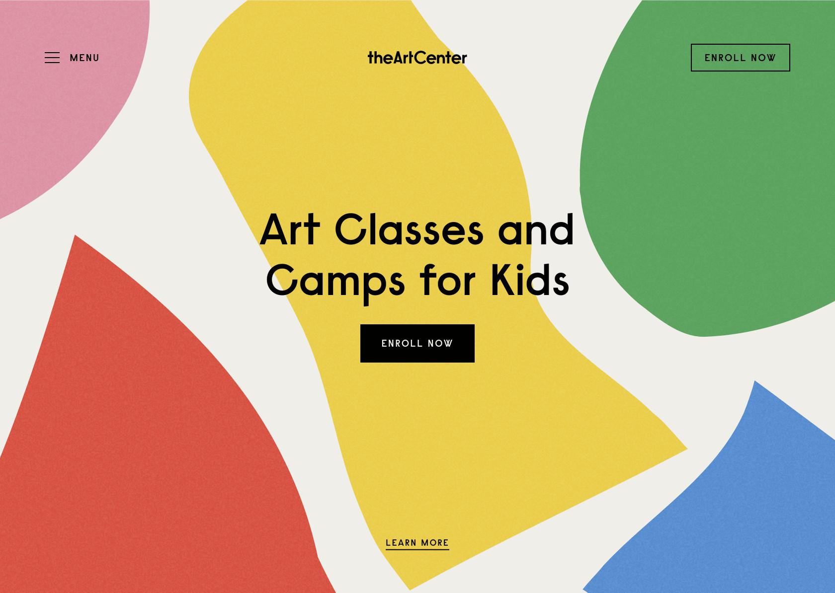
Rhythms can be used to create a number of feelings. They can create excitement (particularly flowing and progressive rhythms) or create reassurance and consistency. It all depends on the way they are implemented.
Pattern
Patterns are nothing more than a repetition of multiple design elements working together. Wallpaper patterns are the most ubiquitous example of patterns that virtually everyone is familiar with.
In design, however, patterns can also refer to set standards for how certain elements are designed. For example, top navigation is a design pattern that the majority of internet users have interacted with.
White Space
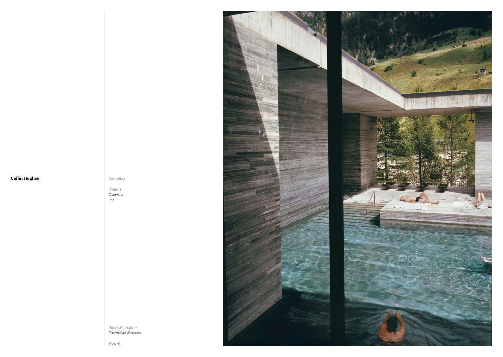
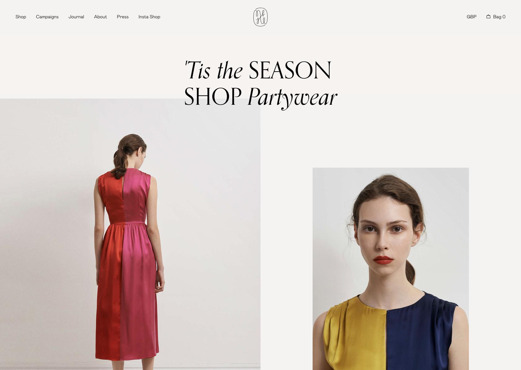
White space—also referred to as “negative space”— is the areas of a design that do not include any design elements. The space is, effectively, empty.
Many beginning designers feel the need to pack every pixel with some type of “design” and overlook the value of white space. But white space serves many important purposes in a design, foremost being giving elements of the design room to breathe. Negative space can also help highlight specific content or specific parts of a design.
It can also make elements of a design easier to discern. This is why typography is more legible when upper and lowercase letters are used since negative space is more varied around lowercase letters, which allows people to interpret them more quickly.

In some cases, negative space is used to create secondary images that may not be immediately apparent to the viewer. This can be a valuable part of branding that can delight customers. Take the hidden arrow in the FedEx logo, for just one example.

Movement
Movement refers to the way the eye travels over a design. The most important element should lead to the next most important and so on. This is done through positioning (the eye naturally falls on certain areas of a design first), emphasis, and other design elements already mentioned.

Variety
Variety in design is used to create visual interest. Without variety, a design can very quickly become monotonous, causing the user to lose interest. Variety can be created in a variety of ways, through color, typography, images, shapes, and virtually any other design element.
However, variety for the sake of variety is pointless. Variety should reinforce the other elements of a design and be used alongside them to create a more interesting and aesthetically pleasing outcome that improves the user’s experience.
Unity
Everyone has seen a website or other design out there that seemed to just throw elements on a page with no regard for how they worked together. Newspaper ads that use ten different fonts come to mind almost immediately.
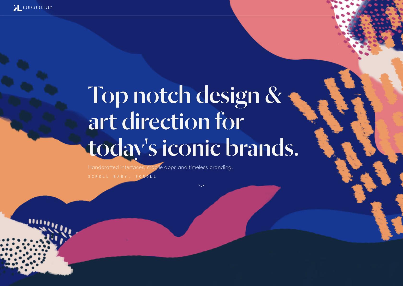
Unity refers to how well the elements of a design work together. Visual elements should have clear relationships with each other in a design. Unity also helps ensure concepts are being communicated in a clear, cohesive fashion. Designs with good unity also appear to be more organized and of higher quality and authority than designs with poor unity.
Other Principles of Design
Other principles of design are also touched upon in various articles on the subject. These include typography, color, Gestalt Principles, grid and alignment, framing, and shape. Some definitely fit the definition of “principles” while others are more like elements of design.
Typography refers to the way text is arranged in a design. That includes the fonts used, their spacing, size, and weight, and the way different text elements relate to each other. Good typographic design is heavily influenced by all of the other design principles mentioned earlier in this article.
The use of color in design is one of the most psychologically important parts of a design and has a huge influence on user experience. Color psychology and theory heavily influences some of the other principles mentioned earlier.
Gestalt Principles include similarity, continuation, closure, proximity, figure/ground, and symmetry & order (also called prägnanz). Some of those principles are closely related to the principles mentioned above.
Grid and alignment are closely related to balance and refer to the way elements are arranged in relation to an invisible grid on the page.
Framing refers to how the primary subject of a design is placed in relation to other elements on the page. It’s most often heard referred to in cinematography or photography, with how the main focus of an image is placed within the overall image. But the principle carries over into design.
Shape is also a major part of any design, both in terms of specific shapes used as elements within the design, and the overall shape of the design itself. Different shapes can evoke different feelings, i.e circles are organic and fluid, while squares are more rigid and formal, and triangles give a sense of energy or movement.
These design “principles” or elements are important aspects of good design and should be considered alongside the other basic principles to create the best user experiences.
Conclusion
What constitutes the “basic” principles of design is certainly up for debate. But understanding and implementing the principles covered above is vital to the success of any design project.
Designers should aim to understand how each of these design principles actually impact their work. Studying how other designers have implemented these ideas to structure their own designs is also an incredibly valuable tool in learning to create better designs.
It’s entirely possible to create a good design without a thorough understanding of these elements and principles of design. However, it’s typically done by “designer’s intuition” and may take a lot of trial and error in order to create something that actually looks good and creates an optimal user experience. Designers could save a lot of time and energy by practicing the principles we have discussed until they become second-nature.
Further Reading on the Toptal Blog:
Understanding the basics
What are the elements of visual design?
The elements, or principles, of visual design include Contrast, Balance, Emphasis, Movement, White Space, Proportion, Hierarchy, Repetition, Rhythm, Pattern, Unity, and Variety. These principles of design work together to create something that is aesthetically pleasing and optimizes the user experience.
Why is contrast important in design?
Contrast refers to how different elements are in a design, making them more easily discernible from one another. Contrast is very important in creating accessible designs. Insufficient contrast can make text content in particular very difficult to read, especially for people with visual impairments.
What does rhythm mean in design?
The spaces between repeating visual elements create the basic design principle of rhythm to form, similar to the way the space between notes in a musical composition create a rhythm. There are five basic types of visual rhythm that designers can create: random, regular, alternating, flowing, and progressive.
What is the balance design principle?
Every element and principle of a design—typography, colors, images, shapes, patterns, etc.—carries a visual weight. Some elements are heavy and draw the eye, while other elements are lighter. The way that these elements are laid out on a page should create a feeling of balance.
How is emphasis achieved in design?
The basic design principle of emphasis is used to either make certain elements of a design stand out (such as through using contrasting colors, making an element larger, increasing the white space around it, etc.), or not stand out (like when including tiny “fine print” at the bottom of a page).
