How to Structure an Effective Typographic Hierarchy
Since designers work with so much text-based content, creating an effective typographic hierarchy—one that clearly shows what information is most important—is a vital skill for designers to master.
Since designers work with so much text-based content, creating an effective typographic hierarchy—one that clearly shows what information is most important—is a vital skill for designers to master.

Cameron Chapman
Cameron comes from a design background and is the author of two web design books: Color for Web Design and The Smashing Idea Book.
Expertise
Effectively organizing content within a design so that it’s easy to understand and consume is one of a designer’s most important jobs. And since much of the content designers work with is text-based, creating an effective typographic hierarchy is one of the most important things a designer can learn.
While practicing and experimenting with creating an effective hierarchy is the best way to really master the skill, there are a number of guidelines designers should learn first, before setting out on their own. After all, it’s impossible to break the rules effectively without first knowing what they are.
What Is Typographic Hierarchy?
Beginning designers sometimes underestimate the necessity of using a hierarchy of typography. Yet look at this example:
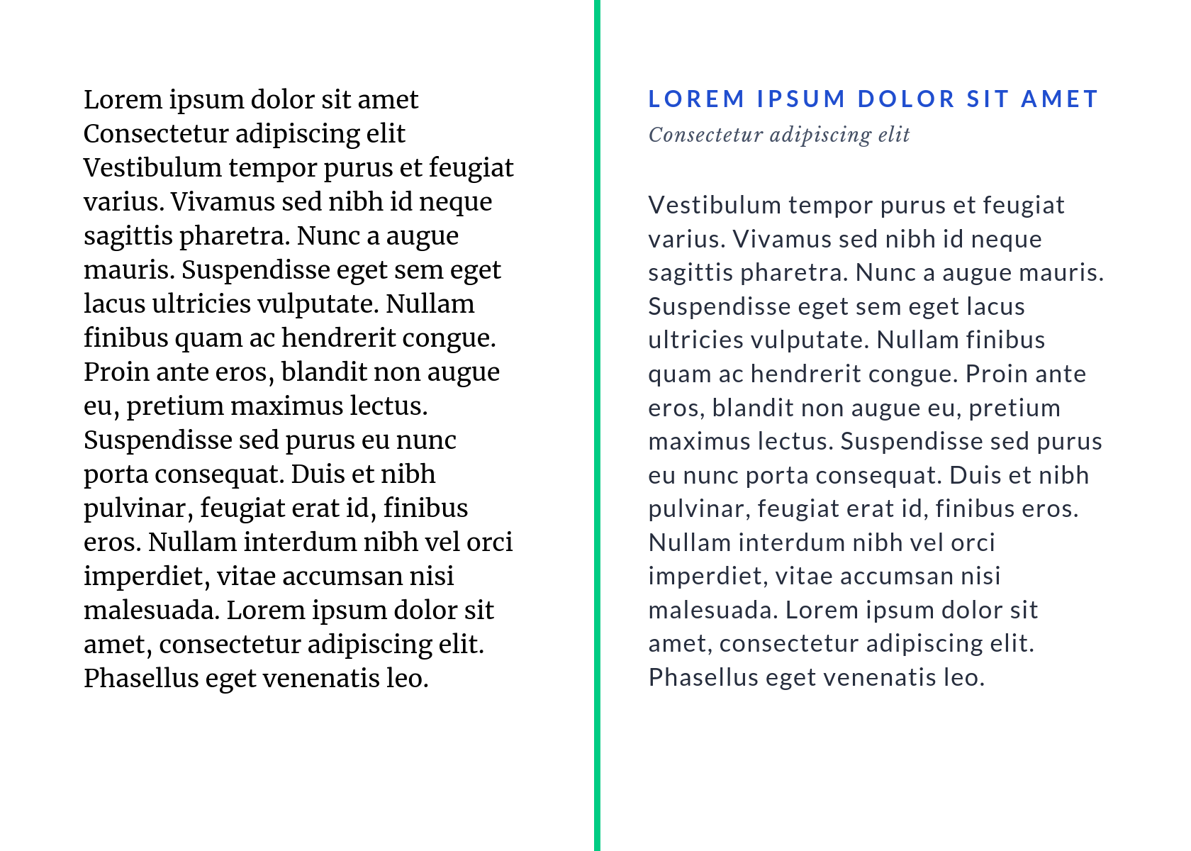
The same information is being conveyed on both sides, yet on the left, it’s impossible to tell that there is a header, subheader, and body text. On the right, it’s immediately apparent that there is a hierarchy to the information being provided.
Typographic hierarchy shows the reader which information to focus on—which is most important and which is simply supporting the main points.
There are a variety of things that make up typographic hierarchy on the web. These include:
Size. Size is generally the first thing new designers turn to when trying to create typographic hierarchy. And for good reason: It’s immediately, easily identifiable by readers. Bigger = more important, smaller = less important. But size can become a crutch when there are so many other options to create hierarchy.
Weight. Making a typeface bolder or thinner is another easily recognizable way to create hierarchy that’s easily identifiable even by non-designers.
Color. Color is often overlooked as a way to create a hierarchy, but it’s a fantastic option. Even using lighter and darker shades of a given color can create a more distinct hierarchy. Creating more contrast between type and it’s background can also add to typographic hierarchy.
Contrast. Beyond contrasting colors, the contrast between different type sizes, weights, and styles is also key to creating typographic hierarchy. A difference of only one or two points in type size won’t create enough contrast to make the hierarchy apparent to most users. Instead, designers should use easily distinguishable sizes, weights, and styles to easily create contrast between things like headers or body text.
Case. While capitalizing body text is generally not a good idea from a readability perspective, using uppercase characters in headings or subheadings can help differentiate different headings or other type.
Position and Alignment. The positioning of headings and subheadings, along with other type that a designer wants to stand out, can have a lot of impact on where type falls within a hierarchy. Centering type, for instance, tends to make it stand out. Setting type outside of the regular margins of a page can also make that type stand out within the hierarchy of a page.
How to Create Typographic Hierarchy (and Visually Organize Your Design)
Designers have a lot of options when it comes to creating a typographic hierarchy. But just knowing what goes into creating a hierarchy alone won’t necessarily help designers create an effective hierarchy.
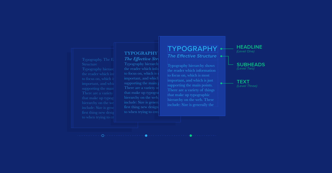
One of the first things to consider is how many levels of hierarchy a design should have. As a general rule, every design should include three levels of hierarchy: heading, subheading, and body text. From there, it’s up to the designer to consider additional levels that might be necessary. These could include captions, additional subheadings, pull quotes, and meta information (for things like authors or dates on an article).
From there, it’s key to figure out how to distinguish between the different parts of the hierarchy. It should go without saying, but headings should be more prominent than subheadings, which should be more prominent than body copy. Captions should generally be less prominent than body copy, and pull quotes should be somewhere between body copy and subheadings.
Type Size
Traditional typographic scales exist to help designers get started. But these are only a starting point, and designers should feel free to experiment with different weights and styles while deviating from these traditional scales. Most base their scale on the size of the body text and expand from there.
The classic typographic scale from The Elements of Typographic Style are familiar to most designers as they tend to be the defaults most word processing programs offer when selecting font sizes. The scale is:
6, 7, 8, 9, 10, 11, 12, 14, 16, 18, 21, 24, 30, 36, 48, 60, and 72.
There are additional typographic scale examples out there that follow various mathematical equations for calculating increasing sizes.
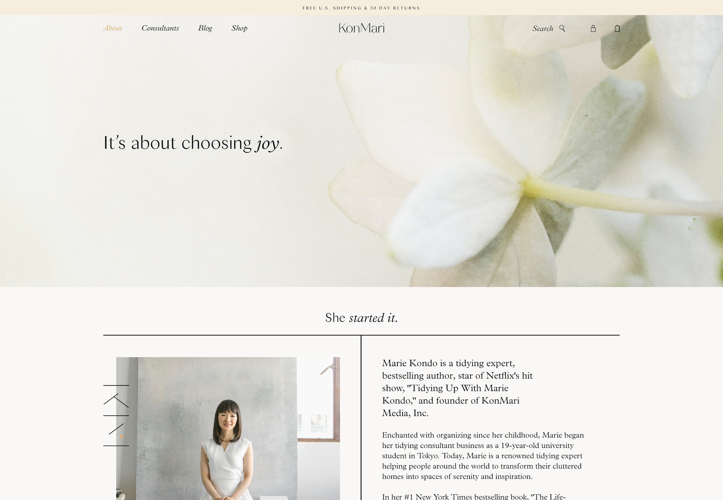
Designers have a tendency to default to a 12-point body text size, but increasing that to 14 or 16 (or even as high as 24) can lead to increased readability depending on the typeface being used. Jeffrey Zeldman’s personal website, for example, uses a 24px font size for the body copy, while Vogue.com uses a 19px body text size.

Before finalizing the actual scale, though, designers should make sure the typefaces being used in the design have been finalized. Different typefaces can appear significantly larger or smaller even when they’re technically the “same” size.
Choosing Coordinating Typefaces
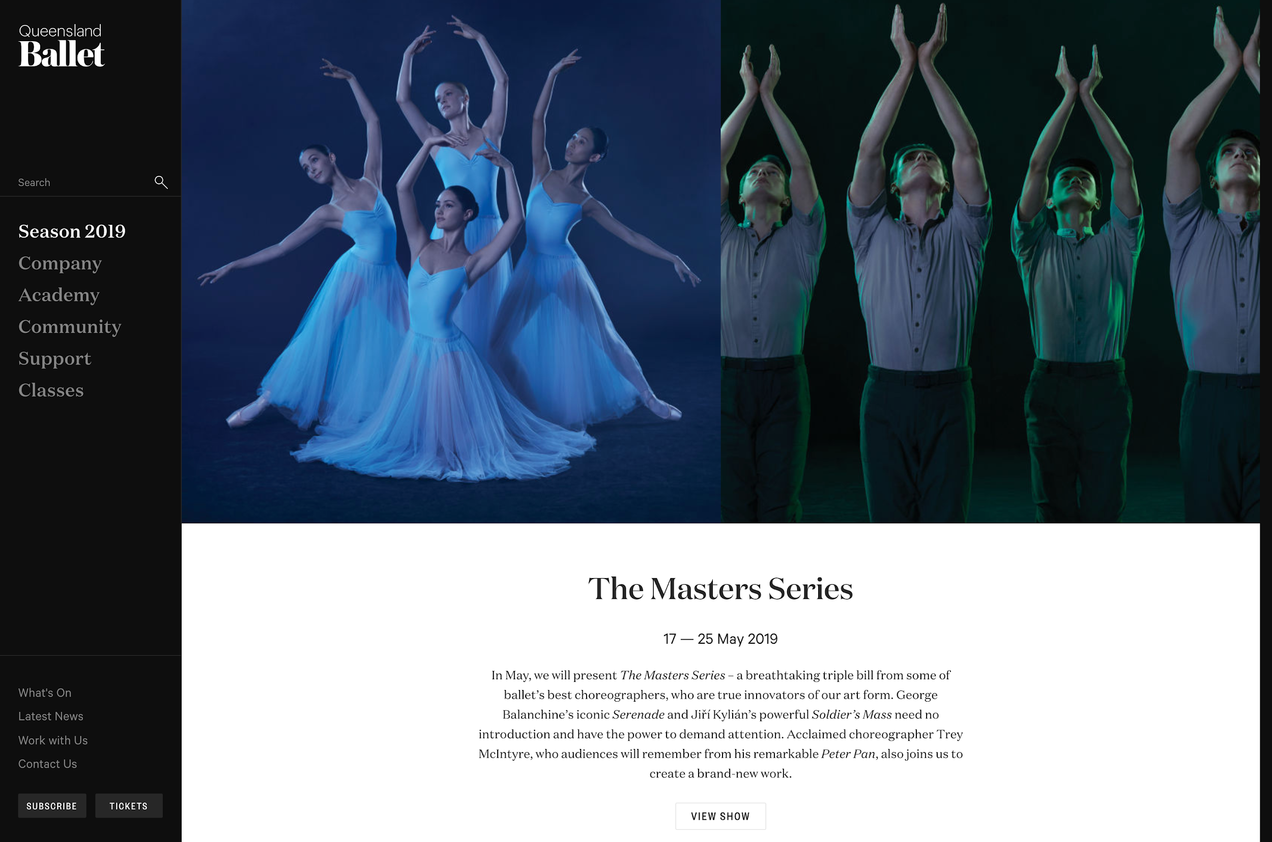
What often sets a “professional” design apart from more amateurish efforts is the combination of typefaces. Effectively combining typefaces is part gut instinct and part science, but there are some guidelines designers can follow to combine typefaces from different families.
First, mixing serifs with sans serifs is significantly easier than combining two serifs or two sans serifs. But it’s not as simple as just grabbing any serif and any sans serif, and throwing them together in a design.
Consider the context in which the typefaces will be used. For example, if the design is supposed to be light and fun, then make sure the typefaces fit that mood. If the design is more serious, then the typefaces should reflect that. In other words, the mood of whatever typefaces are being combined should match.

Designers should use contrast to their advantage, too. Combining thin and thick typefaces often works better than combining two that are very similar in weight.

Look for typefaces with similar x-heights (the distance between the baseline and the mean line of lower-case letters in a typeface). This helps prevent conflict between typefaces. Other things that help prevent conflict include similar kerning and character shapes. Typefaces with very round letterforms shouldn’t be combined with more square typefaces.
While guidelines can be helpful in creating typeface combinations, nothing will replace experimentation and practice. Designers should spend time experimenting with typefaces and practice combining them as often as they can. Finding a few fallback typeface combinations that can work in a variety of contexts is also helpful for projects where the budget and resources available don’t allow for a ton of trial and error.
With these guidelines in hand, designers can follow the four-step process that the web typography source Better Web Type sets out for creating effective combinations:
- Find an anchor font for your main body text
- Find a few secondary fonts for possible combinations
- Evaluate the combinations
- Eliminate/choose font combinations
Additional Considerations
Experimenting with different styles and weights after selecting the final typefaces can create additional levels of hierarchy without having to create super-sized main headings. Keeping typefaces approximately the same size, but making the more important heading bold, while making the less important one italic creates definite visual hierarchy.
The same can be done with color. A subheading in an accent color will stand out more than a subheading that’s the same color as the body text. Designers should play with color in their subheadings to set more important text apart without relying solely on type size.
Spacing can also be used to set important headings and subheadings apart. Creating more space around headings so they stand out from accompanying body text makes them even more prominent. By contrast, subheadings that are spaced the same as body text are made less important.
Even spacing between characters can be used to create hierarchy. Spacing out characters can make a particular line more prominent. This is particularly effective when combined with capitalizing those letters. Designers should be careful not to overdo this, though, as it can also look amateurish if overused.
Conclusion
Experimentation and practice are the best ways to master typographic hierarchy, but learning these guidelines will help designers start out on the right foot. Learning how size, color, spacing, weight, and other factors contribute to effective hierarchy is the first step.
Once those basics are established in a designer’s mind (and practice), they can more intuitively create visual hierarchies that follow or break the “rules” as necessary in order to create unique designs that are inspired and delightful to users.
Further Reading on the Toptal Blog:
- Understanding the Nuances of Typeface Classification
- Designing for Readability: A Guide to Web Typography (With Infographic)
- Design Foundations – A Guide to Visual Hierarchy (with Infographic)
- Typeface Styles for Web and Print Design
- Boost Your UX With Clear Visual Hierarchy
- Mastering Mobile Typography: Font Usage Tips and Best Practices
Understanding the basics
What is typography design?
Typography design is the art and science of combining typefaces to support the meaning of text-based content and make it easier for the reader to consume. Typography hierarchy plays a vital role in this process, cueing readers into what content is most important on a page.
What is the point of typography?
Good typography adds value to the content of a page. Selecting appropriate fonts and creating a strong typography hierarchy makes text easier to consume and understand. Bad typography, on the other hand, can make even the best information impossible to read and understand.
What is typography and what does it have to do with design?
Put simply, typography is the process of arranging type within a page. In design, this includes not just arranging the type but also selecting the best fonts, creating a typography hierarchy, and determining the best way to present text-based information.
Why is typography important in web design?
Typography is arguably one of the most important aspects of good web design. Bad typography can make a web page impossible to read and understand. Good typography, on the other hand, adds value to the content of the page and makes it easy for visitors to understand the information being presented.
What is good typography?
Good typography adds value to the content it presents. In practice, this means that the principles of typography are well executed to ensure that the people consuming content can do so easily. The best typography generally fades into the background for most readers and simply improves their overall experience.
