Typeface Styles for Web and Print Design
No matter what design discipline you are working in—whether it’s visual design, UX, or traditional print—typefaces are essential elements of virtually every bit of design produced.
No matter what design discipline you are working in—whether it’s visual design, UX, or traditional print—typefaces are essential elements of virtually every bit of design produced.

Cameron Chapman
Cameron comes from a design background and is the author of two web design books: Color for Web Design and The Smashing Idea Book.
Expertise
The vast majority of people are bombarded with typefaces from the moment they wake up in the morning until the moment they go to bed at night. From the apps on their phones to the grooming products in their bathrooms to the signs they see on their morning commute, typography is everywhere. But how many people ever really notice the typeface styles they’re surrounded by every day?
Even designers underappreciate typefaces and often form type decisions on loosely-based opinion rather than objective understanding. Do most designers even know about the original industrial contexts for which various typefaces were designed? What do these contexts and histories mean for determining the legibility, appropriate character, and use of a given typeface? No matter what design discipline one is working in—whether it’s visual design or UX or traditional print design, typefaces are essential elements of virtually every bit of design produced.
Some of the most influential typefaces in use today are often overlooked in favor of unique typeface designs that are newer to the market—and sometimes rightly so. Each of the typefaces in this article is decades, if not centuries old, and were all designed for different technological contexts. Thus, there have been many alternatives or updates created since they were introduced. Even some of the fonts originally designed for screens have become outdated as displays and printers become higher resolution and capable of displaying more complex shapes accurately.
Serif Typefaces
Understanding the difference between serif and sans-serif typeface styles is one of the most fundamental rules of type. For many, this may be obvious, but the serif is the stroke given to the end of main horizontal and vertical lines of a character. There are many subclasses within serifs, including hairline, wedge, and slab serifs, which all describe the visual qualities of the serif itself.
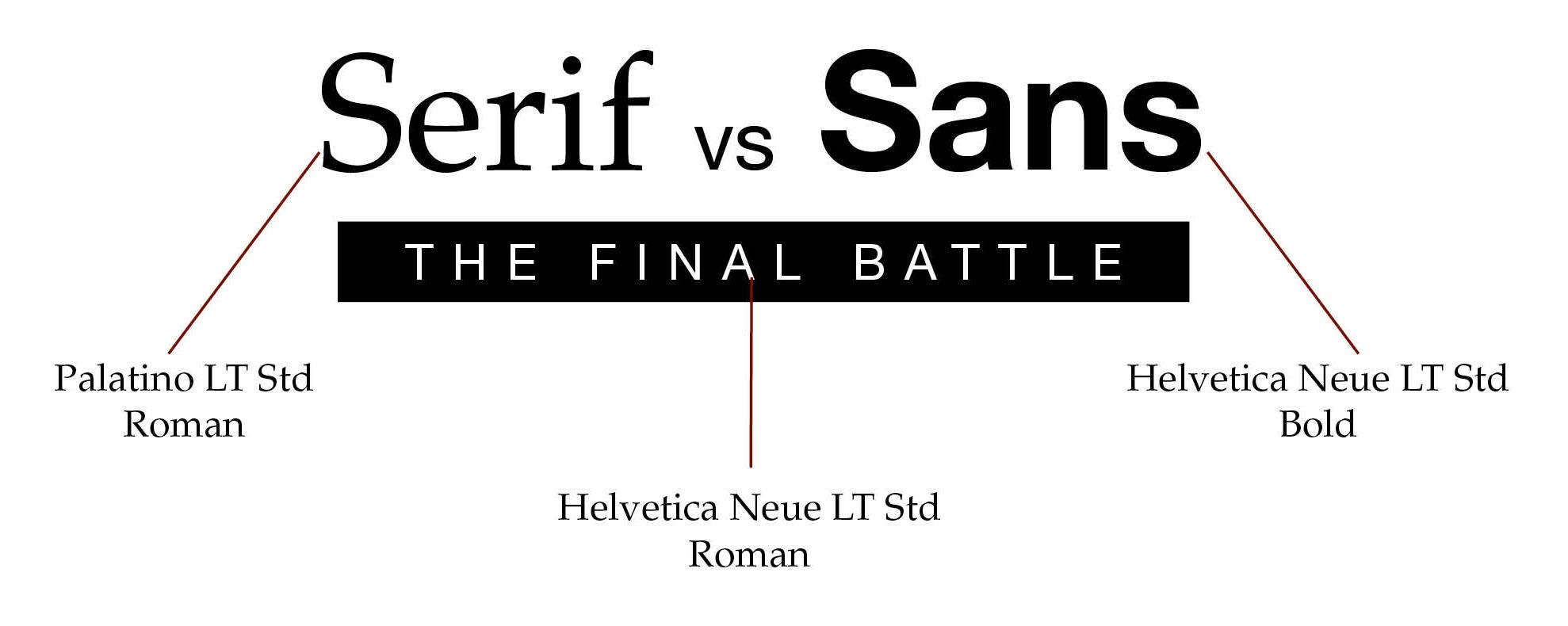
Generally, serifs have a longer history than san serifs, as they were the first typefaces used to print books following the invention of the Gutenberg Press. Essentially, serifs allow for more comfortable reading at length, as the serifs guide the eye smoothly from character to character, making the serif ideal for long-form printed works. Because of this, serifs are still generally the go-to typeface for printed works such as books or reports, though it’s not an absolute rule. Each typeface has its own specific qualities, and there are some serif typefaces that aren’t really suitable for large chunks of body text (and some sans-serif typefaces that are perfectly legible and readable for long-form works).
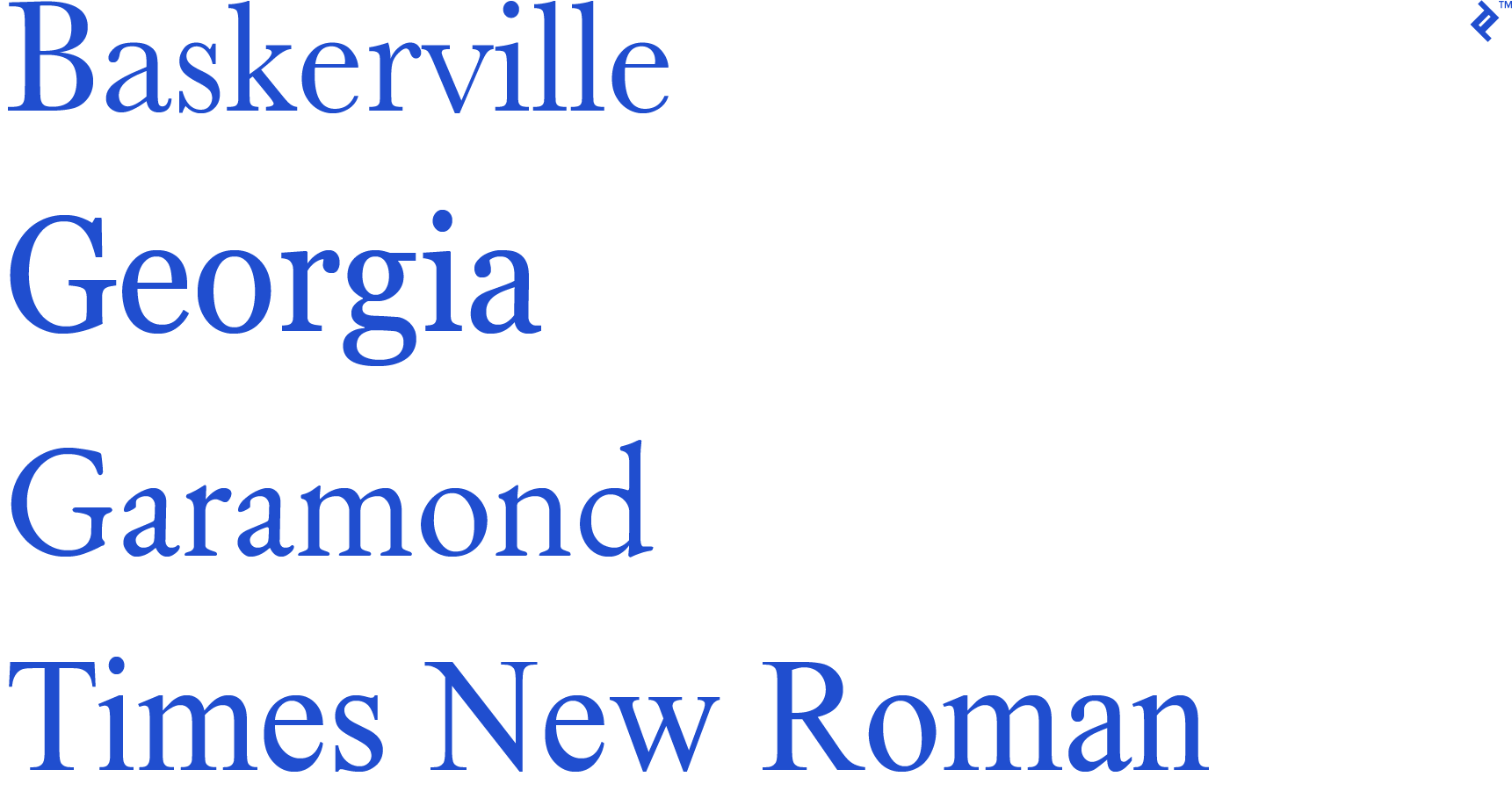
Baskerville
Baskerville is one of the classic serifs that has stood the test of time and is still in wide use today. Baskerville was designed in a transitional period between the first typeset faces (Bodoni and Didot) and the 19th- and 20th-century typefaces to come. Baskerville has succeeded due to its noticeably high-contrast letterforms.
The designer, John Baskerville, was an intense perfectionist and thus created a font with beautiful detail. The typeface could only be printed on his own machines to ensure that the letterforms be transferred correctly to the page. This history is significant, as Baskerville has been adapted to the various mediums we work in today. The details incorporated into each letterform make Baskerville unsuitable for low-resolution mediums, including low-resolution displays or bad printers. That being said, when Baskerville is given the opportunity to express its quality, it’s an excellent serif typeface.
A good example of a modern, digital typeface that Baskerville has heavily influenced is the typeface that Amazon has commissioned for the Kindle, Bookerly. If you’re looking for an alternative to Baskerville that maintains its 200-year-old richness while being updated for legibility on-screen, Bookerly could be a good solution. Other alternatives include Mrs. Eaves and Plantin.
Times New Roman
Times New Roman, like many widely-used fonts that have been around for a while, is a polarizing typeface that is loved by many but loathed by some as well. Often, what people either love or hate about TNR is the same: its apathetic neutrality.
Matthew Butterick writes “Times New Roman is not a font choice so much as the absence of a font choice, like the blackness of deep space is not a color. To look at Times New Roman is to gaze into the void.” Times New Roman feels so plain largely due to its overwhelming ubiquity as a result of its exposure from the paper it was designed for, the Times of London.
Times New Roman was designed for the commercial interests of the newspaper, which was to maintain legibility while cramming as many words into a line—and therefore page—as possible. The designers were very public about the font’s use with newspapers, as it is narrower and more legible in thin columns, but not ideal for books with longer line lengths. This efficiency was achieved by increasing the x-height and significantly reduced the tracking, or space between characters.
Due to the success of the typeface with the Times, Times New Roman became adopted soon after by most American newspapers, thus making it one of the most ubiquitous typefaces. Because of this ubiquity, some designers advise against using Times New Roman, as it can give the impression of apathy or cheapness. Some other editorial-style fonts you might consider are Arnhem, Le Monde Journal, or Plantin.
Garamond
Garamond Antiqua is a purist old-style typeface designed by the iconic Parisian punchcutter Claude Garamond. Garamond was one of the first faces designed for the type set, meaning that it was ideal for the long body texts of the newest craze of its time: novels.
As an inherent quality of the era in which it was designed, Garamond gives text a sense of old-world style. Yet, its rounded serifs keep the text more informal than many of its serif counterparts. Garamond has remained a prolific font by virtue of its clear forms, allowing users to read at length without tiring. The characters’ large bodies and tall x-heights create a lot of space around each letter, making the words perceptively bigger and thus more legible.
Although many designers would argue for Garamond’s timelessness, its forms simply are not ideal for web typography. Garamond’s virtues in print include its soft curves that blend from character to character, making it more readable for long periods of time. The downside is that these curves become blurry at smaller sizes on screen, impeding its legibility. Thus, despite the numerous recreations of Garamond that you may find online, most designers for the screen believe it has become obsolete. That said, the designers of EB Garamond still think otherwise and are trying to revitalize this classic in the open source community.
If you’re looking for alternatives to Garamond, check out Sabon or Minion.
Georgia
Perhaps in response to typefaces like Garamond’s failure on screen, Matthew Carter was commissioned by Microsoft in the 1990s to design a typeface specifically for on-screen legibility. And Georgia was born.
Many believe that Georgia lacks the neutral quality of other mass produced serifs, such as TNR, and it gives the text a friendly and charming quality. Thus, Carter’s impressive design feat is that he managed to solve the issue of on-screen legibility while maintaining the attractive character of print faces.
The story is that Carter designed Georgia while working on a new version of the 19th-century font Scotch Roman. Georgia maintains many of its predecessor’s qualities. However, in order to craft Georgia for the screen, Carter made some essential changes: increasing the x-height, rounding out the numerals, and creating slight misalignments in order to maintain a sense of character.
Although Georgia is now established as a classic, it’s also widely considered to have a more modern feel than many other serif typefaces. Miller and Abril have a similar feel and are good alternatives.
Sans-Serif Typefaces
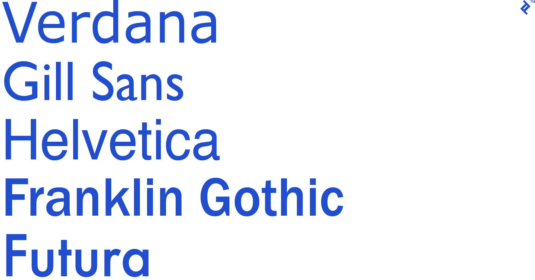
Although some may argue that the sans-serif typeface style first occurred in ancient times, they weren’t officially incorporated into widespread use and modern society until the 19th century. As advertising, newspaper, and media boomed, there was a need for typefaces that could be read as clear headings from a distance as well as be representative of a new era of industry.
Verdana
Verdana shares a similar story with its cousin, Georgia, as they were both designed by Matthew Carter for Microsoft in the 90s. Thus, Verdana is a sans-serif designed specifically for the screen. Similar to many fonts striving for clarity, Verdana has a large x-height to increase legibility. Verdana is referred to as a humanist sans-serif, which means that it maintains some of the qualities and design logic of serif typefaces.
However, Matthew Carter was aware of the potentially constraining spaces that some text may get crammed into on screen, so Verdana’s character sizes are balanced just enough to avoid cramming in apps or in platforms without stable leading. Considering that Verdana was designed for use in the 90s, it is especially effective still on low-resolution devices. Yet, as screens become higher in quality, Verdana’s strengths are lost, and it does not perform quite as well as it once did.
If using Verdana in print, its wide-set spacing gives it the quality of a monospaced typewriter font. This quality makes Verdana a poor choice for large bodies of text in print. An alternative that you might consider now instead is Colfax. The designers of Colfax take into account the lack of mechanical constraints on type design today and have crafted a font that’s more appropriate for both high-resolution displays and inkjet printing.
Gesta and PT Sans are both good alternatives to Verdana.
Franklin Gothic
Franklin Gothic is a realist sans-serif typeface that was originally created in 1902 by Morris Fuller Benton of American Type Founders (ATF) and expanded to include more weights in the 1970s and 1990s by ITC. Digital versions of the typeface have been created by Adobe, International Typeface Corporation (ITC), Monotype Imaging, and URW.
The original typeface, which Benton admitted was designed as an homage to Benjamin Franklin, was most suitable for headlines and trade use rather than long blocks of body text. Updates with additional weights and styles have since expanded the usage options.
Franklin Gothic’s timeless quality makes it a popular choice for many media outlets still, more than a century after its original release. Time Magazine and The New York Times both use it for various headlines, Scrabble tiles in the US and Canadian versions of the game feature it, and the condensed version was even used for the opening crawl in the Star Wars films.
While Franklin Gothic is incredibly popular still, a popular alternative is News Gothic, Benton’s popular successor to the original, with a narrower build and less stroke contrast. Other alternatives include Trade Gothic, Benton Sans, and Maple.
Futura
Futura, released in 1927, is a direct result of one of the first geometric sans-serif (as opposed to humanist sans-serif) typefaces. Futura’s largest competitor, Erbar Grotesk (released in 1926), was designed at the hugely influential Bauhaus, with the intent of communicating everything that the school felt to be modern at the turn of the 20th century. This meant that geometric logic did away with any hint of ornamentation and aimed for pure logic in the letterforms created.
Like Erbar Grotesk, Futura includes letterforms based on geometric shapes, primarily the circle (though also squares and triangles where circles weren’t appropriate). It includes low contrast between its strokes, with tall lowercase ascenders and uppercase characters that share proportions similar to Roman capitals. Its designer, Paul Renner, believed that modern typefaces should have modern sensibilities rather than simply being reiterations of previous designs.
Futura has experienced a lot of fame over the course of the 20th century, as the Apollo 11 astronauts left a plaque on the moon in Futura; Volkswagen and many other brands have adopted it; and several filmmakers, including Stanley Kubrick and Wes Anderson, have reappropriated it. If you appreciate the modern quality of Futura but find it a little bit overused, considering trying FF Super Grotesk, HK Grotesk (open source), or Neuzeit.
Gill Sans
Monotype, the same typeface foundry that brought us Times New Roman, commissioned polymath Eric Gill (a sculptor/typesetter/graphic artist) to produce a font for London’s modern signage. Gill Sans, contrary to Futura, is a humanist font with a less regimented style than its German contemporaries. The “R” is slightly flared and the “eyeglass” lowercase “g” is near iconic. The font’s naturally bold quality works well for displays and headings, yet the lighter weights released later are well suited for body text.
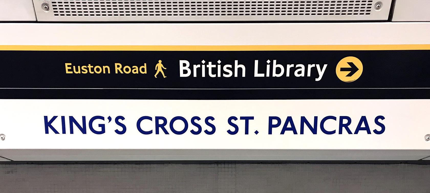
Its history in the London Underground, the BBC, and The Church of England, plus its modern yet human quality make the typeface quintessentially British. Although the font is classic in proportion, it has some artistic flares which make it more cheerful than its austere German counterpart, DIN.
That said, many of these artistic flares have made Gill Sans undesirable by some graphic designers. Specifically, the lower case “a’” is often criticized for being unbalanced and throwing off the legibility.
Looking for alternatives to Gill Sans? Check out ITC Johnston or P22 Underground.
Helvetica
Helvetica is the only typeface to have inspired its own film (2007). It’s arguably the most famous/ubiquitous font today. The font was born out of a widespread competition in the 50s for new versions of the widely popular Grotesk fonts.
The Grotesk fonts had evolved gradually to increase legibility. However, not all of the typefaces worked well with both handset linotypes and mechanical ones. The linotype machine required both regular and italic characters to be set with the same width, thus forcing italics to appear too wide and regulars to appear too narrow.
Helvetica was designed specifically with acute character adjustments to maintain the modern beauty and legibility of Grotesk typefaces while allowing designers the benefits of mass production. First released at the “Graphic 57” trade show, the font became ubiquitous throughout Swiss design.
Other typefaces that make good alternatives to Helvetica include Maison Neue, Univers, and Folio.
Monospaced Typefaces
Monospaced typeface styles were originally designed for the typewriter. The main quality to understand about this category of typeface is that the typewriter required each character to be typed out with equal spacing. Thus, every character is placed within a single organizing matrix in a body of text whereas, often, other fonts vary in spacing in order to manage legibility.
Ultimately, outside the context of the typewriter, there are few applications where it makes sense to use monospaced typefaces. The equal spacing means that they are less efficient and generally less legible as well. An exception to this rule is in applications designed for writing code, where equal spacing can actually aid legibility.
Some examples of these are Courier, Consolas, Letter Gothic, or Source Code Pro (free). However, some designers just can’t deny the nostalgic aesthetic; thus, they remain popular.
System Typefaces
System typefaces are the ones that come with your device or program. There are different system typefaces for Mac, Windows, and even Adobe products. All of the typefaces included in this article have at least some variations that are system fonts.
There are a few drawbacks to using system fonts. The largest is that these typefaces are generally incredibly overexposed. Because they’re included on almost everyone’s computer, people see them day in and day out, in both good designs and terrible ones. While not every typographic project needs to be on the bleeding edge of originality, it’s important to understand that if the brand you’re designing for is supposed to be unique and original, using a system font will often undermine that.
Another major drawback to using system fonts is that some of them just aren’t very good. Arial comes to mind…
Finally, many system fonts are designed specifically to be highly legible on screen and may not be particularly readable in print. This might not be an issue for every project a designer undertakes, but it is something that should be kept in mind.
Choosing a Great Typeface for Design Work
When designing for a particular brand, choosing an appropriate professional typeface is a critical job for any designer, especially when considering that licenses for some typeface families can exceed $1,000.
Choosing a typeface family that includes a large variety of weights, widths, and even both serif and sans-serif variations is a smart idea for many projects. This gives designers a lot of options for any project that may come down the pipeline for a particular brand and even allows updates to marketing collateral using “different” fonts that aren’t really that different (and therefore less likely to incense consumers and brand loyalists, as has happened in many large redesigns from major brands). A deep font family can be paired with itself easily and carry a variety of personalities.
When looking for a typeface to pair with an existing type library for more general use in projects, focus on choosing fonts with similar characteristics. This means considering all of the qualities of the caps and lower cases, x-heights, and formal geometry. Sites like Typewolf can be invaluable for finding fonts to pair with existing options already available (as well as great alternatives for those times a client says they want something “like” Helvetica but definitely not Helvetica).
Understanding the basics
What are the different types of fonts?
There are four basic types of fonts: serif, sans-serif, monospaced, and display. Within each of those types are multiple subtypes, such as script, slab serif, grotesque sans-serif, and old style.
What is typography and why is it important?
Typography is the visual presentation of the written word. Good typography reinforces the meaning of text and makes it more legible or readable. Bad typography can make text hard to read or convey the wrong meaning (such as using Comic Sans on a legal document, rather than something more formal like Garamond).
What is the difference between a typeface and a font?
“Typeface” refers to a family of fonts, each of which contains glyphs that share similar design characteristics. Traditionally, a font referred to a particular size and weight of a typeface, although the two terms are often used interchangeably now.
What is the best font to use on a web page?
When choosing the “best” font to use for a web page, it’s important to choose a font that reinforces the content of the page and the image of the brand. Formal, professional sites should use formal, professional fonts. More relaxed sites can use more casual fonts.
