Design Principles: An Introduction to Visual Hierarchy
The theory of visual hierarchy is different from its practical application. More advanced concepts of visual perception are worth exploring because their mastery is key for great visual design.
The theory of visual hierarchy is different from its practical application. More advanced concepts of visual perception are worth exploring because their mastery is key for great visual design.
Miklos is a UX designer, product design strategist, author, and speaker with more than 18 years of experience in the design field.
PREVIOUSLY AT

As technologies and user interfaces change, the need for design skills in visual design continues to grow. With fresh examples of a typical user interface emerging every year, has our fundamental understanding of visual hierarchy, perception, and composition changed?
The modern concept of visual perception is rooted not only in science but also in psychology. Consequently, regardless of continually changing user interfaces, the way we see and perceive visual information will remain the same. Considering this, is it possible for contemporary interaction design to improve upon the foundations of graphic composition and visual hierarchy?
The foundational rules of visual perception are critical for any visual design, as they instruct how information with an embedded meaning can be conveyed as quickly as possible. However, since visual design is a close cousin of graphic design, these standards were established for print media, and are yet to be redefined for digital.
Something like a “digital Bauhaus school” that could potentially establish new design principles has not yet formed. As people experience a UI in an entirely different way from print, the rules of visual hierarchy and composition are not only dated, they simply collapse in a user interface.
For the most part, designers still tend to treat the screen as a static, two-dimensional object, and the challenge for interactive designers is to innovate beyond simply applying print formats to their digital media projects. But before new designs can advance, a fundamental understanding of visual hierarchy, perception, and composition needs to be revisited.
Visual Hierarchy: A New Understanding of Visual Composition for Interactive Interfaces
What is visual hierarchy, and why is it important? Visual hierarchy is the laying out of content in a composition in order to effectively communicate information and convey meaning. Visual hierarchy directs viewers to the most important information first, and then to secondary content.
Established through the appropriate use of size, color, shape, distance, proportion, and orientation, the meaning, concept, and mood of a composition is conveyed through the creative use of graphic elements that determine the visual hierarchy.
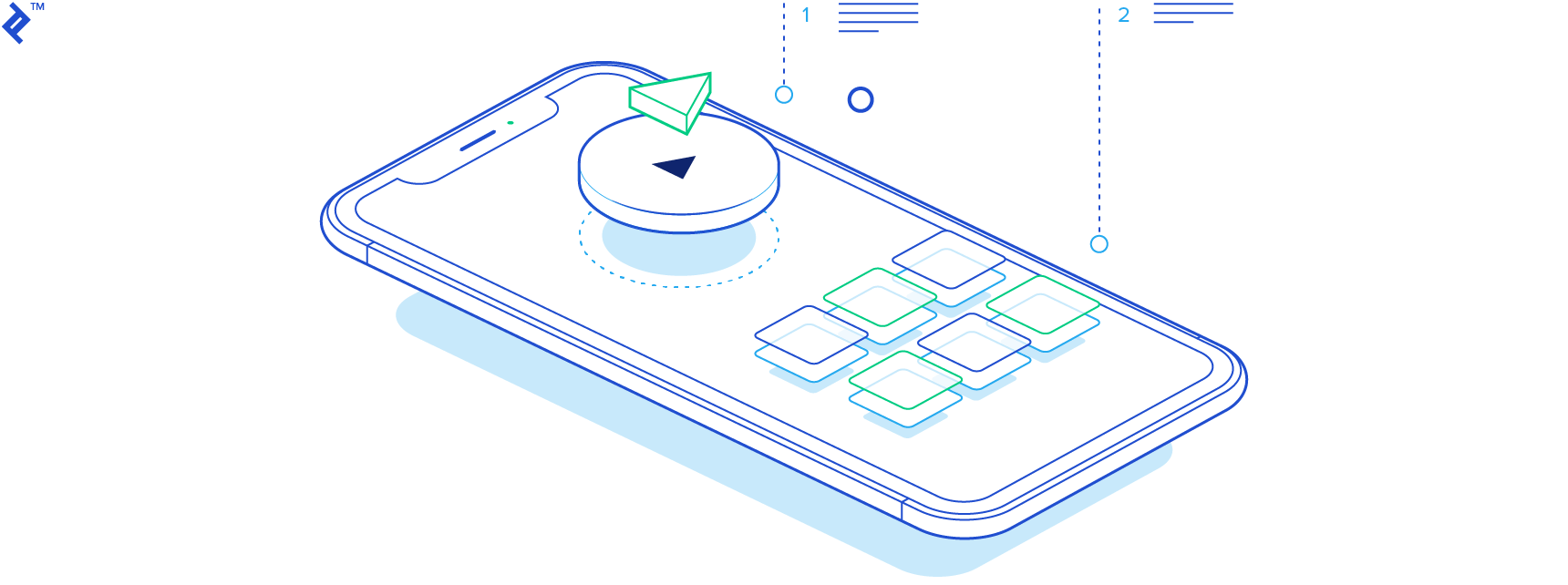
Visual hierarchy is critical for every type of visual design, whether it’s a landing page that needs to guide the visitor’s eye or the navigation of a mobile UI. The user’s understanding of every element is predicated on the other elements in the composition and their context. Compositional elements are treated accordingly in order to form visual relationships and thereby establish visual hierarchy across a design.
Color in Visual Hierarchy
Many of the rules of visual hierarchy may seem quite simple and even banal, but they are a critical foundation for good visual design. For example, color is the most impactful creative element in visual design.
Consider the immediate connotations of a red cross versus a monochrome one. Almost universally, the red cross signifies neutrality and protection. Such is the potential for immediate communication with the use of color. Color is also often used to identify groups, as when one red cross amongst three monochromatic ones somehow stands out as more significant.
Bright, rich colors stand out more than muted ones and therefore have a greater visual impact. In an interface, color could be used to present a sense of structure and point to available interactions. A single color within a monochromatic interface can distinguish a selection, and even suggest what is beyond a button the user is hovering over.
Color is also seeded with meaning and emotion that can transmit explicit information to a viewer’s subconscious. In branding, a great deal of psychological research has been done on color because it creates a visceral response in consumers prior to them having any meaningful interaction with a brand. For example, blues are often perceived as dependable, secure, and calming, while reds are stimulating and are have been known to increase people’s heart rates. However, colors may have a different significance depending on the culture.
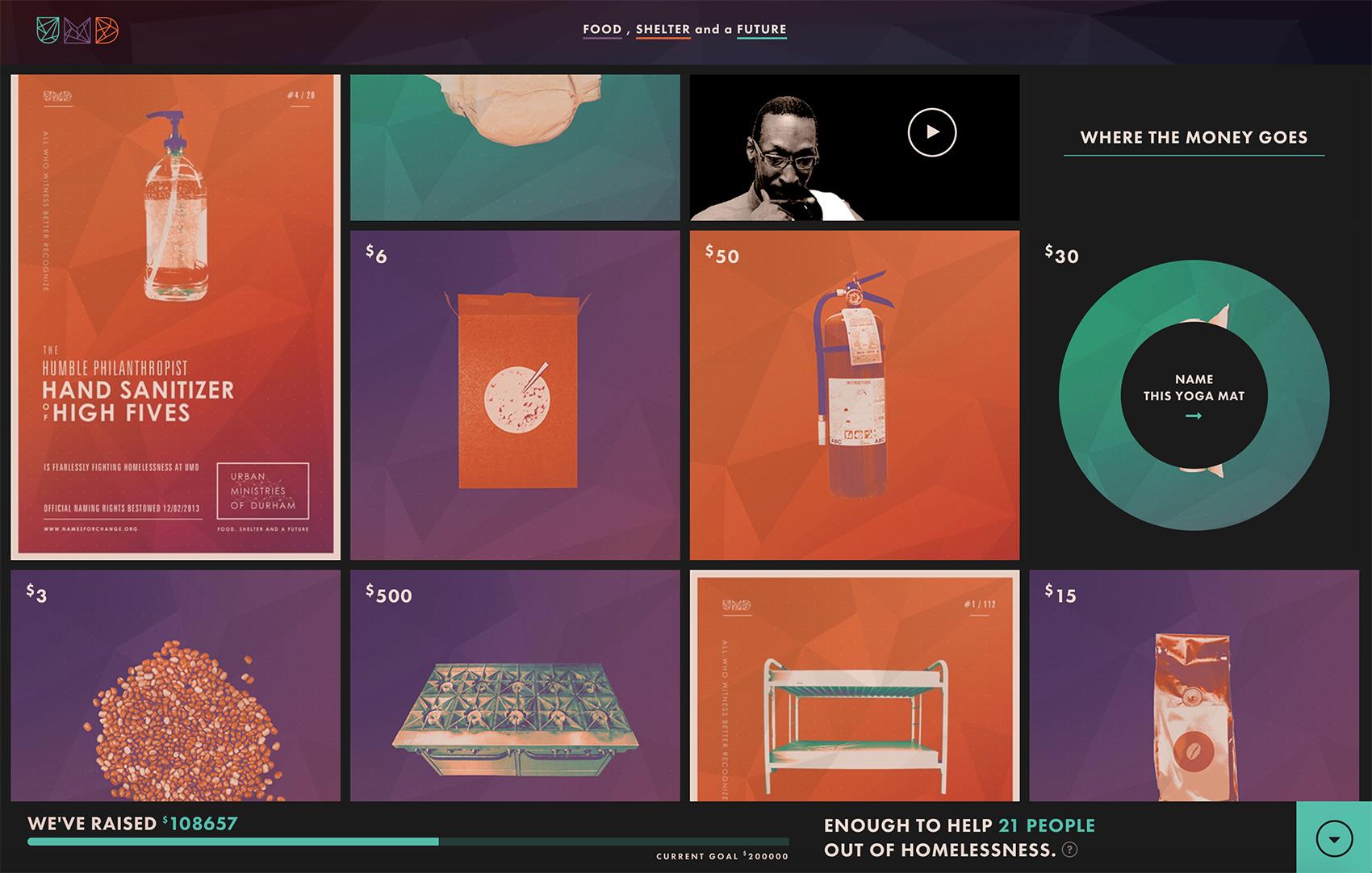
A good example of a meaningful, structural use of color in web design is The Names for Change site. The site immediately communicates its structure through the use of color; the organization is scattered by default but can be rearranged by topic and/or color.
However, the chosen tones help to overcome one of the potential difficulties for the meaning of the site. Fundraising for daily items such as socks or tampons isn’t exciting enough to sell itself, so the radical graphic tone of the site raises the perceptual value of everyday items while establishing the necessary underlying organizational structure.
Size in Visual Hierarchy
Let’s imagine an illustration of one large bird sitting next to three smaller ones. Without any further information, this simple graphic immediately communicates the relationship between its elements: a parent and children, which collectively communicates a family.
In traditional graphic design, a typical strategy is to make the most important elements the largest, and then step downsizing the elements hierarchically. Size establishes visual hierarchy because the largest elements grab attention first, and therefore appear to be the most important.
Different font sizes are also often used in bodies of text to indicate significant differences, such as headers, sections, and quotes. Secondary content, such as image captions, are usually smaller so as not to compete with the main body of text.
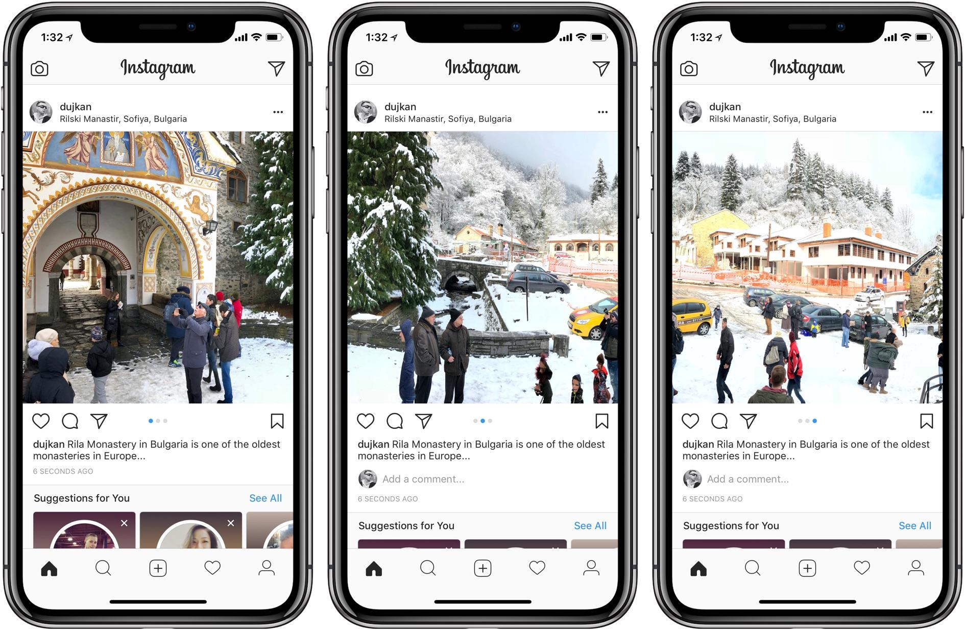
Consider some of the most widely used visual interfaces, such as Instagram. Nothing on the screen competes with the images and videos—they take up more than 60 percent of most screens. The purpose of the UI is immediate.
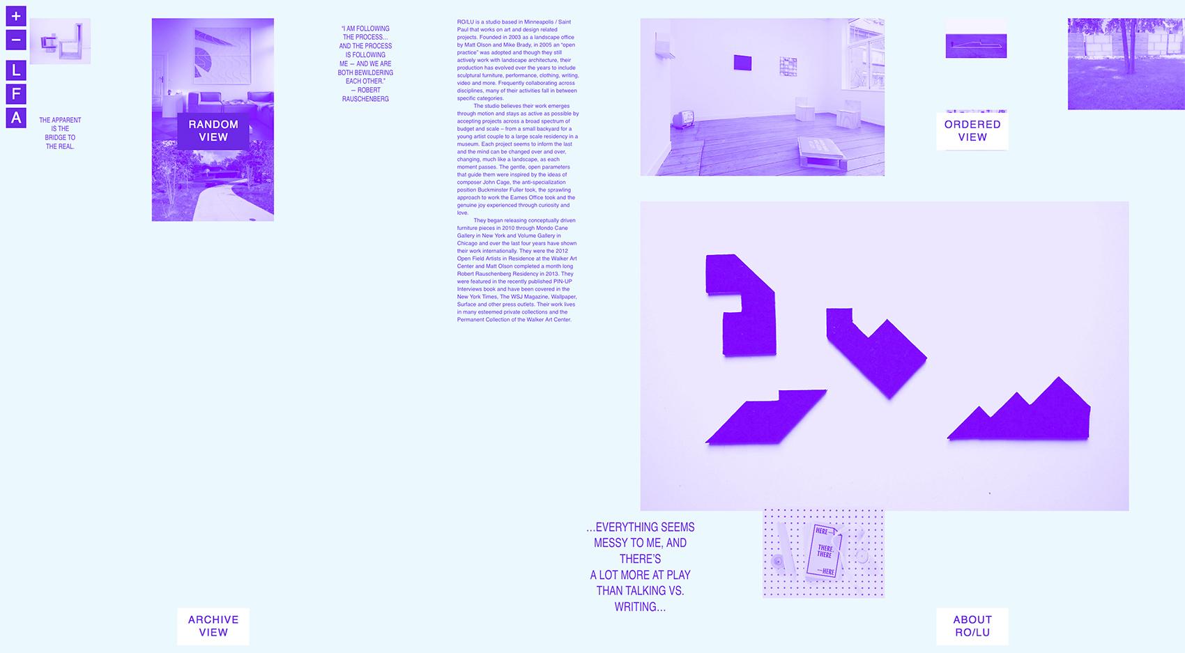
An example upending the typical structure of visual hierarchy in web design is the portfolio site for the art/design studio Ro/Lu. Their unusual site may not be the most intuitive, but it challenges the visual arrangement of the typical online creative portfolio. Due to the intentional randomization of their varied projects, a different one appears as dominant each time a visitor comes to the site, which makes each visit unique and interesting.
Work is not organized hierarchically in the portfolios of most creative design studios because each project is unique and considered equally important. The design of the Ro/Lu site creates a dynamic composition with varying levels of interest at each visit and encourages viewers to investigate the studio’s extensive portfolio. Consequently, the eclectic, interdisciplinary nature of the design studio is represented by the randomized display of content.
Alignment in Visual Hierarchy
Alignment in visual hierarchy communicates a sense of order by connecting elements spatially. As with chapters in a non-linear novel, imagine a square standing out of line in a graphic composition. When a single element breaks an established structure, it stands out from the composition and thereby attains meaning relative to the rest.
A rigid composition may appear stagnant and visually uninteresting unless an element stands out from the visual grid, i.e., from a sense of order. Misalignment, or “breaking the grid,” is an opportunity to give a graphic element more visual weight. This concept is fundamental to visual hierarchy in design.
According to a principle in traditional visual design, elements that are placed in the center of a frame appear to be more significant. For example, primary content or interface elements may be put in the center, while navigation, menus, and other secondary content are often kept out to the sides.
But pioneering designers like to challenge the status quo. When interactive design applies fundamental visual hierarchy principles and then pushes the boundaries into innovative visual compositions, interesting new experiences are created. By using a different alignment, new associations and meanings are made between elements.
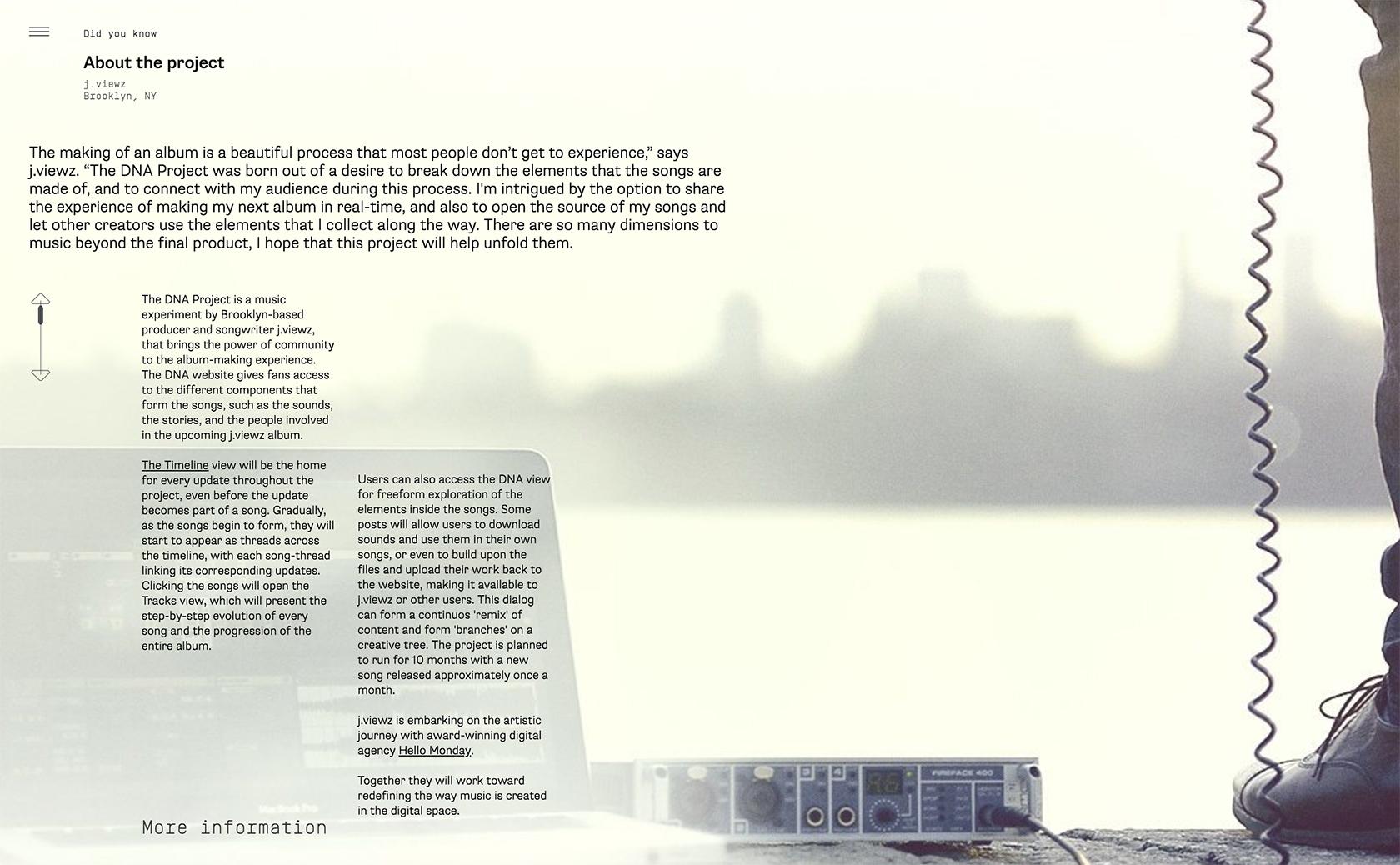
For example, the DNA project is a site that uses a series of disjointed hierarchies to communicate the creative construction of the musician’s album. The site’s structure is complex, as is the construction of the album.
First, visitors are invited to listen to the music by clicking through the album’s tracks, which are traditionally aligned in an album format. However, by allowing visitors to realign the DNA elements of the site, the concept of the album is communicated, not just as a series of tracks, but as a non-linear construction of fragmented elements over time.
Shapes in Visual Hierarchy
When it comes to shapes, let’s consider how immediately the simple heart shape communicates its potential use for ‘like’ in most social networking UIs. To establish importance or groups, consider one heart among four circles. Geometric forms are like colors in that shapes carry certain connotations that give elements personality or meaning.
In interactive design, geometric shapes are essential for efficient communication as they convey meaning more quickly and universally than text. Instead of text, icons (symbols), which are often simple geometric shapes, have become the analog for most navigation systems and UIs.
The objective behind ‘liking’ an image, downloading a file, making a phone call, or checking a message is conveyed simply and directly with icons (geometric shapes). This form of efficient visual communication becomes increasingly important in a global market where digital products often serve vast international audiences with multiple languages.
To highlight the different modes of interaction between traditional print and digital media, consider the difference between searching through an actual newspaper for the Arts section, and using the search icon in most apps. Until recently, most newspaper websites laid out their pages the same as if they were in print, and the experience of sifting through content was clumsy and disorienting.
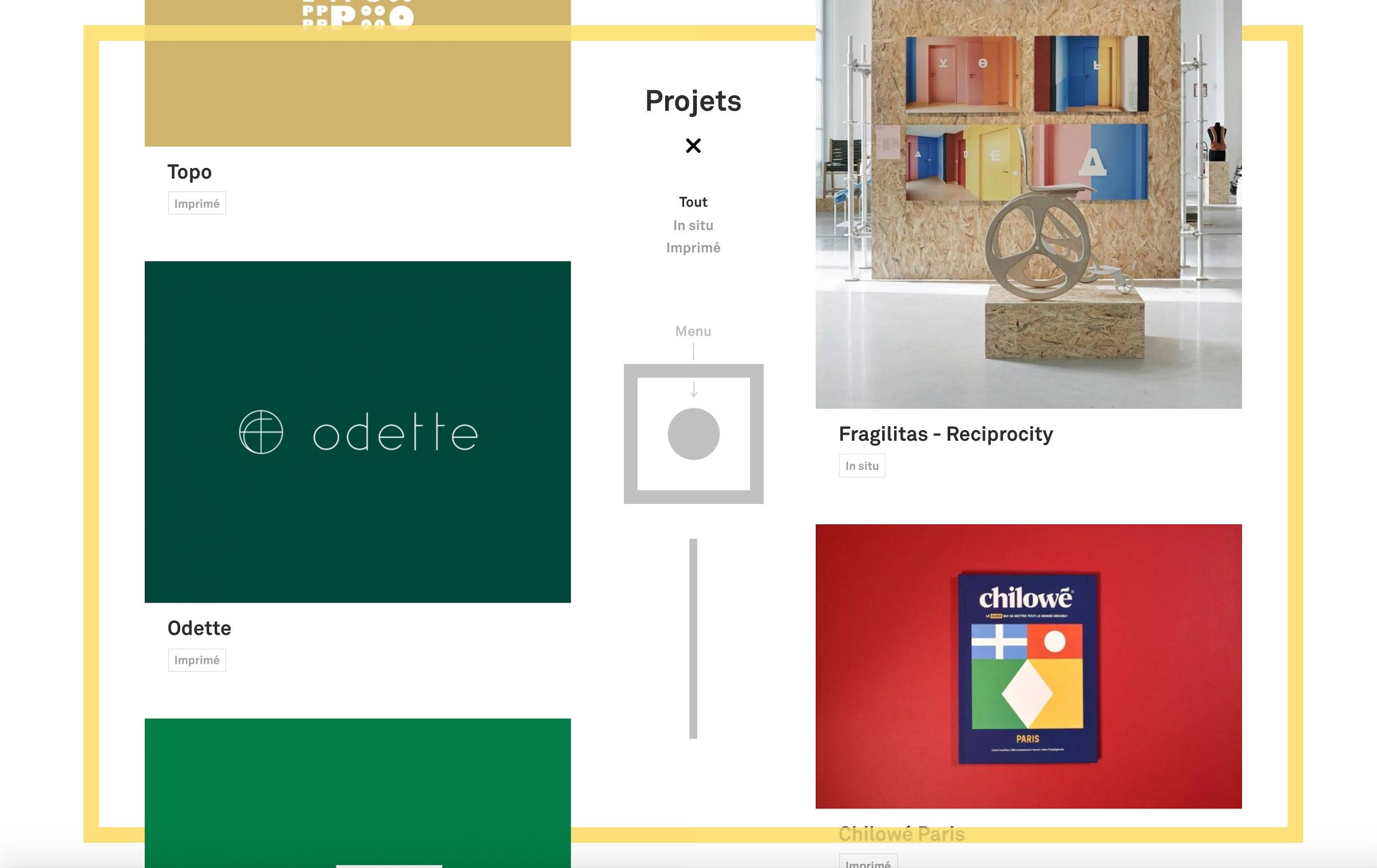
Breaking traditional web layouts, the Signes du Quotidien website uses basic square and circle shapes in a subtle way to present a unique visual hierarchy that guides visitors through the content. The menu is in the center of the page, and when visitors click it, four colored dots representing the four sections of the site appear. Visitors then drag one of the dots into the square to go to that section.
Motion in Visual Hierarchy
A moving element will carry greater visual weight in a group of stagnant elements, and motion in visual hierarchy is a principle that is impossible to use in print but can definitely be included in the visual designer’s toolkit.
What can motion communicate other than a literal translation of itself? Motion is often used in a UI as a clue that an element can be interacted with. Can the use of motion be pushed further and used as a way to communicate something unique? If visual hierarchy is not only about the efficiency of communication, but also about embedded meaning, how might motion be used as an essential visual communication tool?
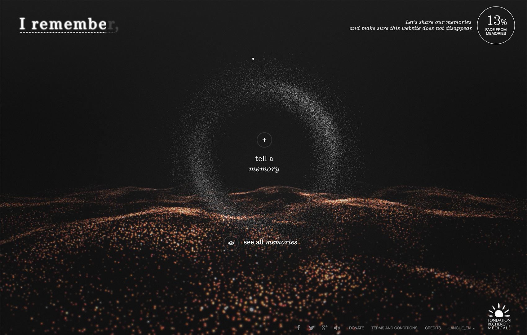
For the I Remember site, the main interface (which is animated) immediately stands out as it invites interaction. Although the motion and interface are functional navigational tools, visual designers used the potential loss of these elements as a way to communicate the underlying mission of the website: Alzheimer’s disease. Just like the fading memories of patients for whom the organization raises funds, the website slowly disappears into nothing without active interaction.
Sound in the Hierarchy of Information
Sound is another tool impossible to use in print media, but yet to be developed within the principles of hierarchy. Since sound is entirely non-visual, there are no rules to refer to. But sound can also be a design tool that effectively communicates content, as well as mood or meaning. Design elements that carry certain sounds may be grouped relative to one another, and those that are the boldest may seem to be the most important or may signify separation from the group.
The quality of a sound attached to an element should quickly identify, characterize, or help structure content. How might a sound that contrasts with its associated visual element convey new meaning?
Sounds themselves can be so complex that they establish an entire mood or the message of a design before anything visual is perceived. Just as a colorful backdrop establishes a mood, a sound can sit in the background, or provide feedback in a UI, such as responding to the tap of a button on mobile. The principle of the technique is basic, but the creativity with which it can be employed is where magic can happen.
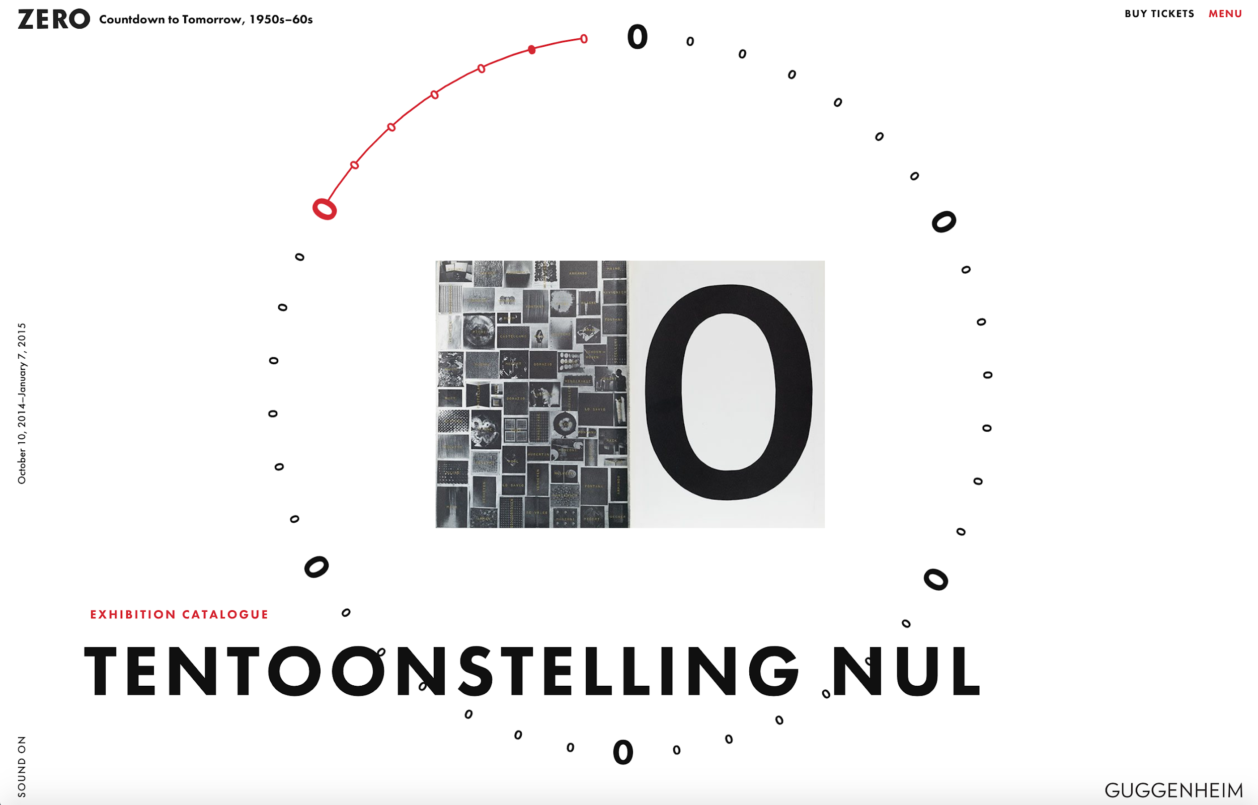
Due to its importance in the creative work of the collective, the website created for the exhibition of the German artist group ZERO at the Guggenheim uses sound as an atmospheric backdrop, and also as a form of feedback when navigating the site. Bold ringtones establish the pieces that represent the beginnings of a theme, while tertiary projects click in the background.
The Concept of Visual Hierarchy
Visual hierarchy is a straightforward concept, and understanding the theory is actually easier than a designer’s practical ability to execute a well-structured composition. Nevertheless, to be inventive in a new medium while maintaining good design is challenging.
New mediums appear all the time, and challenging situations will not abate—quite the opposite. Today there are over 200 different screen sizes in use. And that’s just the two-dimensional ones. First, it was the internet, desktop browsers, then came mobiles and tablets, and now we are moving into new territory with technologies such as interactive TV, IoT, wearables, virtual, and augmented reality.
Design that truly pushes the boundaries of digital media is still in its infancy. Hopefully, the principles of visual hierarchy and good design will keep up with the rapid advance of technology so that our experience of digital media remains full of meaning and pleasure.
Further Reading on the Toptal Blog:
Miklos Philips
London, United Kingdom
Member since May 20, 2016
About the author
Miklos is a UX designer, product design strategist, author, and speaker with more than 18 years of experience in the design field.
PREVIOUSLY AT


