A Spectrum of Possibilities: The Go-to UI Color Guide
Color is the master key to compelling design communication, but UI designers must learn to wield its power. This guide simplifies color theory concepts and shows designers how to use color with precision.
Color is the master key to compelling design communication, but UI designers must learn to wield its power. This guide simplifies color theory concepts and shows designers how to use color with precision.
Micah helps businesses craft meaningful engagement through branding, illustration, and design.
There’s no way around it: Color is the most impactful creative element in visual design. From the enchanting scenic backdrops of set design to the intricate compositions of pixel art, a robust understanding of color is the master key to compelling communication. Need proof?
When participants in a recent brand-focused study were challenged to draw the logos of 10 iconic corporations, only 16% were able to recall accurate shapes and design features. However, when asked to identify a brand’s color palette, the number of correct replies shot up to 80%.
Color also plays an influential role in the world of user interface design. The digital products we interact with on a daily basis rely on the strategic use of color to communicate important information, so it’s critical that UX and UI designers understand how to wield color wisely.
In this guide, we’ll:
- Demystify the basics of color theory,
- Provide rock-solid principles for working with color in digital interfaces,
- Share helpful resources for building color awareness, and
- Empower UI designers to create their own remarkable color schemes.
The goal of this guide is color competence, followed by color confidence, all for the sake of amazing color execution in the user interfaces we encounter every day.

Crash Course: Color Theory for UI Designers
Color theory is an expansive field of study with its own terminology, methodology, and scientific underpinnings. It can be complicated, but that’s not what we want. What we want is an understanding of color that can be applied with lightning-quick precision. We want to use color the way we use shapes—effortlessly, boldly, and effectively.
To use color this way, UI designers must have a solid understanding of these core color theory concepts:
- Color is relative.
- Saturation overload kills color vibrancy.
- Simultaneous contrast has pros and cons.
- Basic color schemes are best.
- Hue always impacts value.
Let’s dig in.
Color Is Relative
Color never stands alone. As the human eye and brain work together to see a color, they are always influenced by:
- Light shining on the color
- Other colors surrounding the color
Check out this example from nature:
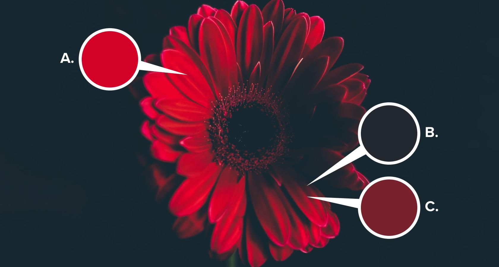
A: The brain and eye work together to help us understand that the flower as a whole is actually bright red.
B & C: The dark brown of the flower’s shadow (B) makes the highlight on the petal’s ridge (C) appear much brighter than the dull maroon color it actually is. Essentially, the light shining on the petal’s ridge and the color of the shadow work in tandem to trick the eye and intensify the highlight.
Here’s another example that shows how deceptive color can be:
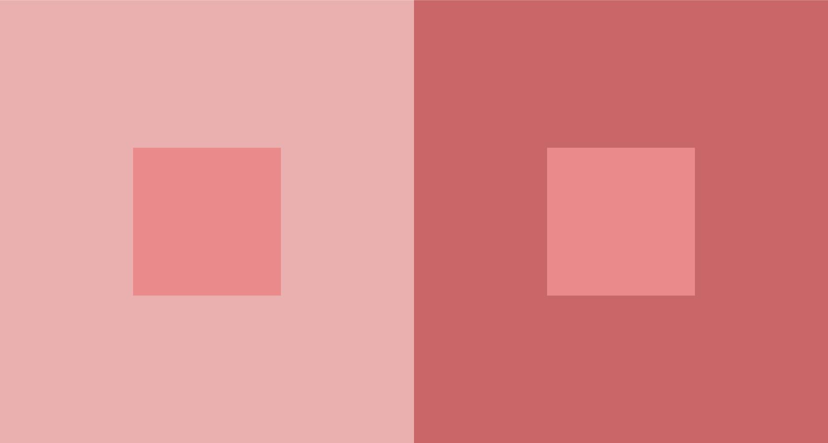
In UI design, color relativity isn’t always as obvious, so colors within a scheme should be tested against each other. Why? Because that beautifully arranged selection of colors in your style guide may turn out to be problematic when applied to an interface.
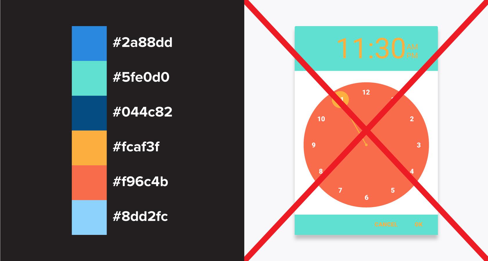
The big takeaway? Don’t coddle your color concepts. If a swatch of accent yellow looks lush when surrounded by whitespace in Sketch but clashes with a UI’s dominant color scheme, find a different solution.
Saturation Overload Kills Color Vibrancy
Color saturation is integral to color vibrancy. However, a scheme assembled around nothing but highly saturated colors overwhelms the eye, and vibrancy is diminished. With color, less is more. A highly saturated color becomes vibrant when used in tandem with less saturated colors.
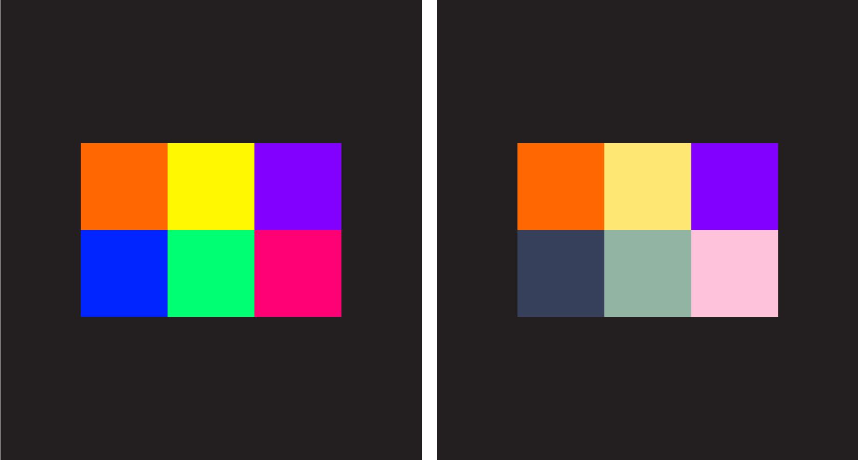
Simultaneous Contrast Has Pros and Cons
Simultaneous contrast occurs when color complements of the exact same value are placed adjacent to one another. The effect is so intense that it causes the point where the two colors meet to vibrate or pulse.

For UI designers, simultaneous contrast can have positive and negative outcomes, so it’s important to understand how to control the potency of this visual phenomenon.
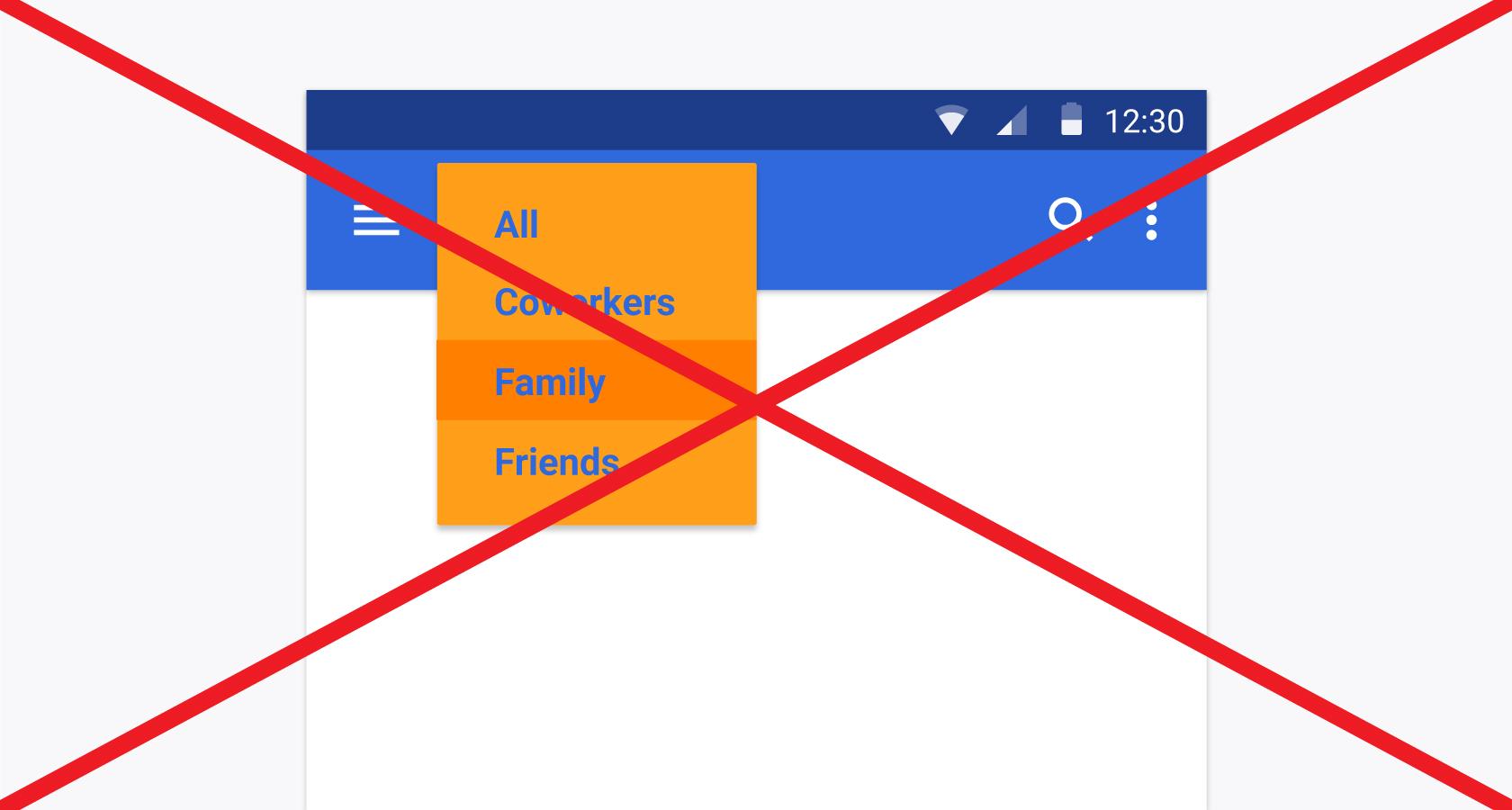
For instance, in an interface designed around a variety of blues, using a complementary orange with the same value as the blue anchor color would be a great way to draw attention to notification icons.
However, that same orange and blue combo would be migraine-inducing if used for the text and background of drop-down menus.
Basic Color Schemes Are Best
Rainbows are beautiful—in nature. In UI design, color must be used more selectively or it overwhelms the experience. Even when brands have high-impact palettes with a wide array of options, it’s best to show restraint and build user interfaces around simple color schemes.
Here are two foolproof plans for building a basic UI color scheme:
1. Analogous UI Color Schemes
- These eye-pleasing schemes consist of colors that are closely grouped on the color wheel.
- Analogous color schemes are easy to find in photos of natural environments, especially plant life, and they tend to be visually calming.
- Variety in analogous schemes comes from shifts in saturation and brightness, not major hue changes.
- When using an analogous scheme, try adding one highly saturated color from directly across the color wheel to create emphasis within an interface.

2. Complementary UI Color Schemes
- Complementary color schemes are based on the interplay of complementing cool and warm colors that exist across from one another on the color wheel.
- Color variety is achieved by altering saturation and brightness between the complementing extremes.
- Using too many bright, highly saturated colors undermines the impact of complementary schemes.

Hue Always Impacts Value
This may sound strange, but colors have corresponding gray values. Here’s proof:

In the image above, we have a range of hues at 100% brightness and saturation, but look at what happens when these colors are converted to grayscale:
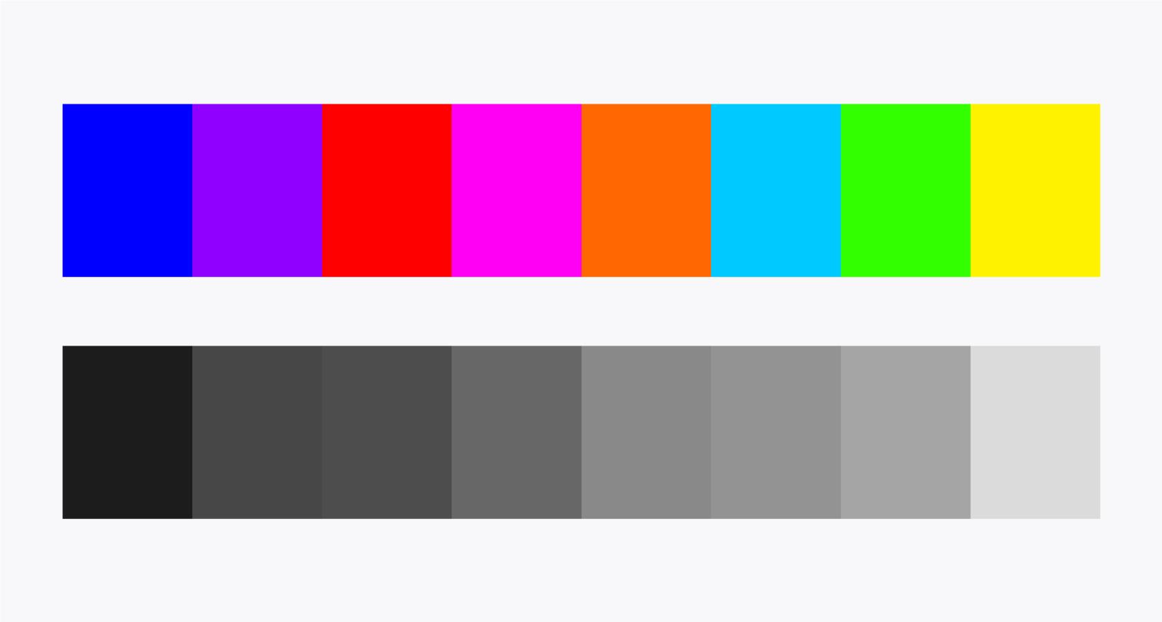
Boom! A whole range of gray values is revealed. Why does this matter for UI designers? One word: Contrast.
Switch your mind to grayscale for a moment. If you were looking to create contrast, would you ever use a 40% gray value on top of a 50%? Of course not, but this is exactly what’s risked when hue is left out of the color contrast equation.
Remember, hue always impacts value.
4 Essential Color Principles for Digital Interfaces
Now that we’ve simplified color theory and related its core concepts to UI design, it’s time to take a more focused look at the role color plays in digital interfaces. These are the four color principles that must be considered from the earliest efforts of every UI design project.
- The relationship between text and color is crucial.
- Color accessibility can’t be ignored.
- Contrast is essential, but it’s not a design cure-all.
- Color works best when applied proportionately.
The Relationship Between Text and Color Is Crucial
Color affects readability. Most UI designers understand this in principle, which is why we don’t see many interfaces with green body text on red backgrounds. Instead, the tension between text and color comes on subtly, creeping in through common UI components like forms, buttons, headers, and icons.
Maintain a healthy text/color relationship by following these simple guidelines:
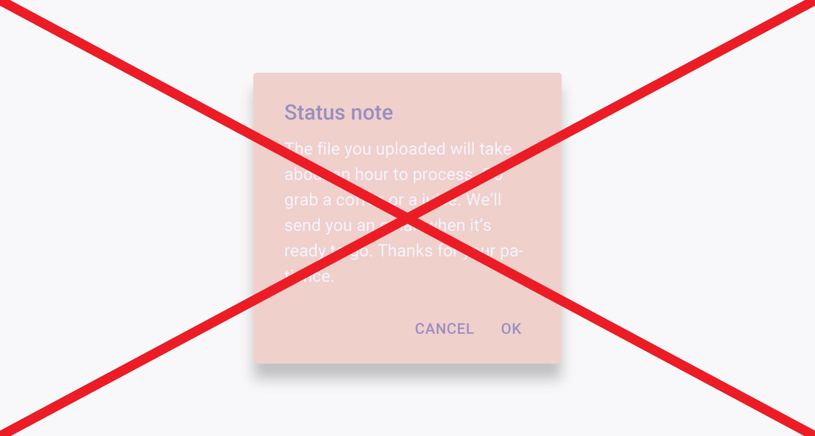
- Always avoid low contrast between text and background.
- Don’t use complementary colors for text and background, especially when the colors are of similar brightness and saturation (e.g., yellow text on a purple background).
- Even on white backgrounds, don’t set body text in bright colors. Black and dark gray are the easiest to read.
Color Accessibility Can’t Be Ignored
Color is communicative, but it can’t be the only design element used to convey information in a UI. Why not? Because some web users perceive color differently (or not at all) than the majority of the population.
For example, a person that experiences color blindness may not be able to tell when a product icon is in its “pressed” state if the only difference in the icon is a color change.

Additionally, some people have difficulty seeing important UI components that are low in color contrast to an interface’s background. Sites like Colorable and Contrast Ratio allow designers to quickly test a range of color pairings for contrast accessibility.
Contrast Is Essential, but It’s Not a Design Cure-all
Yes, color contrast in UI design is important. Plan for it, implement it, benefit from it. But don’t expect to wave it like a magic wand and fix poor design.
Shape, space, size, and other design elements must not be ignored. Color contrast can make an awful UI look appealing, but it won’t fix a bad user experience.
Color Works Best When Applied Proportionately
Imagine a news app where every instance of text is set in title case or an eCommerce website designed on a 9x9 image grid. Both would be terrible!

Savvy UI designers employ design elements like typography and repetition proportionately to enhance design hierarchy. Color deserves the same thoughtful consideration. In UI design, using too many colors confuses the way information is perceived.
Color Resources for Continued Progress
Here’s an inconvenient truth: Designing with color is a skill, and skills must be developed. Most UI designers have an innate sense of what colors look good together (aka color taste), but this doesn’t always translate to application.
To truly master color and see its full impact on UI design, designers must practice. Luckily, there are plenty of resources to help with continued color learning and skill building.
Ctrl+Paint
If you’re a UI designer looking to gain immediate color confidence, start with ctrlpaint.com, a website dedicated to digital painting instruction. Digital painting? Really?
Absolutely. Professional concept artist Matt Kohr teaches digital color use through quick video tutorials and hands-on exercises. The curriculum is wonderfully simple and centered on “painting what you see,” both in the physical world and imagination.
Start with the free video library (Section 11) before moving to the more intensive exercises in the Color Starter Kit.

Josef Albers and the Interaction of Color App
The contemporary understanding of color relativity was heavily explored and advanced by the practice-before-theory approach of artist/educator Josef Albers.
Albers proposed that a single color could have “many faces” and encouraged extensive play and experimentation among his students in hopes that “eyes would be opened” to see color as it truly behaves in the real world (as opposed to the symbolic colors we envision in our minds).
In 1963 Albers authored Interaction of Color, a textbook that continues to be highly influential in the world art and design education. To celebrate the 50-year anniversary of the book’s publication, Yale University released an interactive iPad app that contains the full text but also allows users to play and experiment with Albers’ color plates.
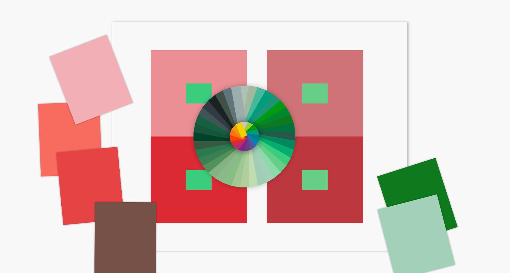
For UI designers, the Interaction of Color app provides an opportunity to experience analog color exercises in a digital environment and see firsthand how color relativity impacts user interfaces.
Andrew Loomis
During the first half of the 20th century, Andrew Loomis was a prominent illustrator and instructor at the American Academy of Art in Chicago, but his enduring legacy is that of author. Loomis wrote six books on commercial art and design and covered a range of topics from figure drawing to product placement.
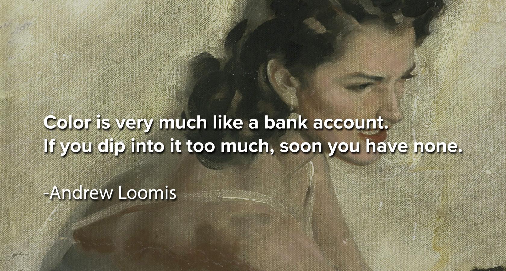
In his books Creative Illustration and Eye of the Painter (both available on archive.org), Loomis drops a number of enduring lines that remain relevant to the modern day field of UI design:
The greatest mistake in color, and one that causes lack of unity and harmony, is having too many colors on the palette.
Any two colors will be harmonious when one or both contain some of the other.
Color lends itself to experiment more than does any other element of beauty.
Other Designers’ Interfaces
Once a basic level of color competency is achieved, color scheme creation blossoms into a fascinating pursuit. Every interface encountered becomes an opportunity for learning and critique, and observations abound.
This is the stage of a UI designer’s development when referencing the work of other designers becomes empowering. How so? Because referencing moves from destination to journey, from endpoint to inspiration.
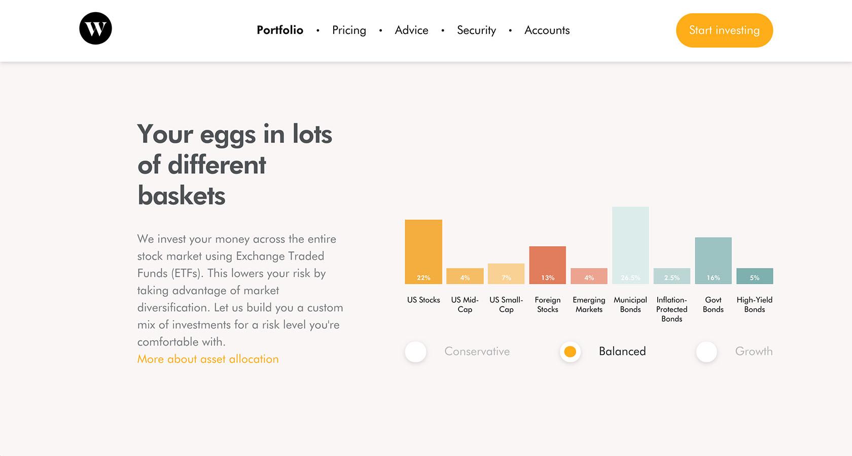
UI designers of all skill levels stand to benefit from keeping an ongoing record of found UI color schemes. Take screenshots, keep a physical color journal, start a mood board—whatever it takes to imprint moments of color illumination for future implementation.
Color Is Too Important to Be Ignored
When it comes to the design of digital interfaces, color isn’t an optional consideration. Even in UIs that employ minimal color (or those that are entirely black and white), it’s imperative that UI designers understand why color is or isn’t being used and how this affects the user experience.
It’s also important that UI designers have the ability to generate and implement original color schemes. Referencing the work of other designers and digital products is a worthwhile practice, but this becomes limiting when it’s the only method of color exploration undertaken during the design process. There’s immense value in being able to capture color pairings seen in the real world or mind’s eye.
If you’re a designer that’s struggled to use color skillfully or you’ve ever thought, “I don’t really have a knack for color,” don’t be discouraged. Designing with color isn’t some form of creative wizardry or special gifting; it’s a practical discipline founded on simple techniques that can be repeated and improved upon.
Remember, color is the master key to clear and compelling design communication. Whether implemented with care or reckless abandon, it impacts conversion, brand awareness, and the user experience. For the UI designer, color is a powerful tool that simply can’t be ignored.
Further Reading on the Toptal Blog:
Understanding the basics
What is a palette of colors?
In digital design, a palette of colors is the range of colors that are available to a designer. However, these colors are not necessarily in harmony with one another.
What is a color scheme?
A color scheme is a selection of intentionally paired colors that are in harmony with one another. Color schemes are typically assembled according to logical relationships suggested by a color wheel.
What is the function of a user interface?
A user interface allows a human to interact with a computer. This interaction, which is often visual, can take place through a range of devices such as a mobile touchscreen, a keyboard, or a control panel.
Tags
Micah Bowers
Vancouver, WA, United States
Member since January 3, 2016
About the author
Micah helps businesses craft meaningful engagement through branding, illustration, and design.


