The Role of Color in UX
A well-thought-out color palette can elevate a design from “good” to “great” while a mediocre palette can detract from a user’s experience and even interfere with their ability to use a site or app.
A well-thought-out color palette can elevate a design from “good” to “great” while a mediocre palette can detract from a user’s experience and even interfere with their ability to use a site or app.
Understanding color psychology in UX design is a key aspect of creating a color palette that works well in for users. While color is sometimes thought of as a purely aesthetic choice by some designers, it is, in fact, a key component of the psychological impact of a design on users, and as such, its UX.
A well-thought-out out UX color palette can elevate a design from “good” to “great” while a mediocre or bad color palette can detract from a user’s overall experience and even interfere with their ability to use a site or app.
While color theory in UI design is a complex subject, and the use of color in UX design covers much more than just creating a palette that looks nice (such as accessibility and the psychological effects of even different shades within the same hue); designers can gradually incorporate UX color best practices in their designs without needing to rethink their entire process. Once a designer has the basics covered, one of the most rewarding parts of color theory is learning to incorporate more unexpected colors into their designs.
The Psychology of Color
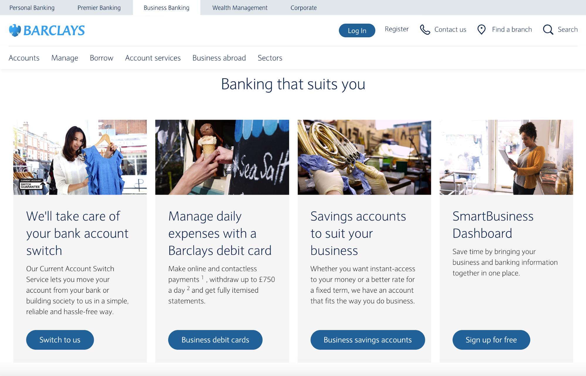
UX color theory and the psychological effects color can have on users is a complex and often subjective topic. But there are certain aspects that can be addressed on a more universal level.
Things like the common meanings of the main colors (primary, secondary, and tertiary), traditional color palettes, and cultural variations in color meanings are all fairly straightforward. Designers can easily learn these basics and apply them to their work. But there are finer points to be learned when it comes to using colors in UX design.

The emotional impact of interface colors shouldn’t be overlooked. And while some colors are “universal” in UX design (such as black, white, and gray, at least one of which is used in virtually every good design out there), the colors they’re combined with can have a huge impact on a user’s perception.
Of course, the way in which color is used can also have a dramatic impact on how it’s perceived. For example, blue used as a primary color in a modern, minimalist design will have a very different feel than the same blue used as an accent color in a more complex, corporate design.

Cultural Differences in Color
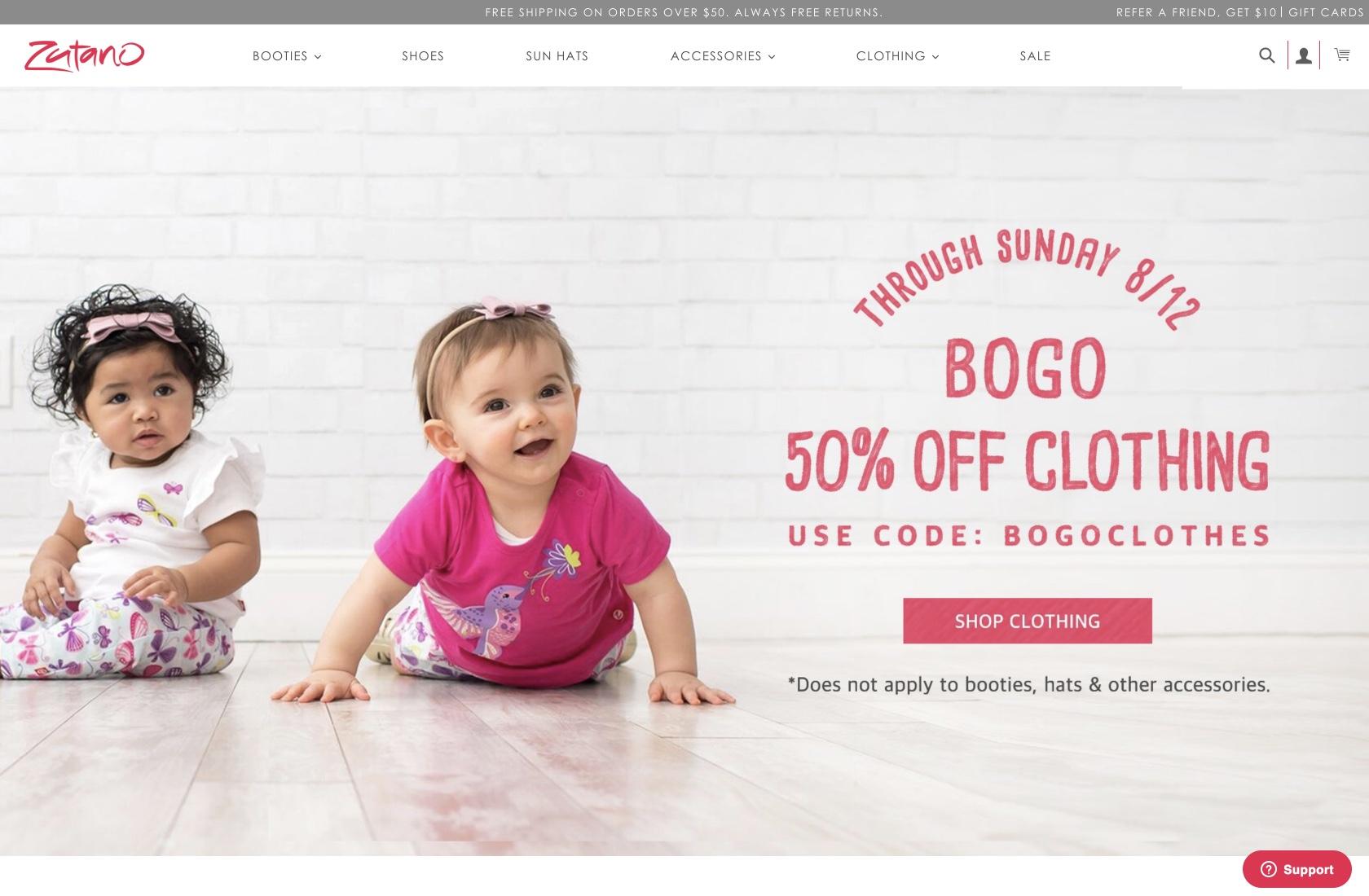
One issue designers tend to overlook is the cultural differences that can exist around different colors. For example, in many Western cultures, white is associated with things like purity, innocence, and hope. But in parts of Asia, white is associated with death, mourning, and bad luck.
Some colors have generally positive connotations regardless of culture (such as orange), while others, like white, vary greatly between different countries. This can certainly complicate a designer’s life when trying to create a design that will appeal to the largest possible audience.
It’s important that designers look at the cultural implications of their color palettes based on the intended audience for the product or website. If a product is going to target a worldwide audience, be sure to balance the colors and imagery being used to prevent negative cultural connotations. If a product will be primarily only targeting a particular culture, designers can pay less attention to the implications the chosen palette may have in other cultures.
Matching UX Colors to the Brand
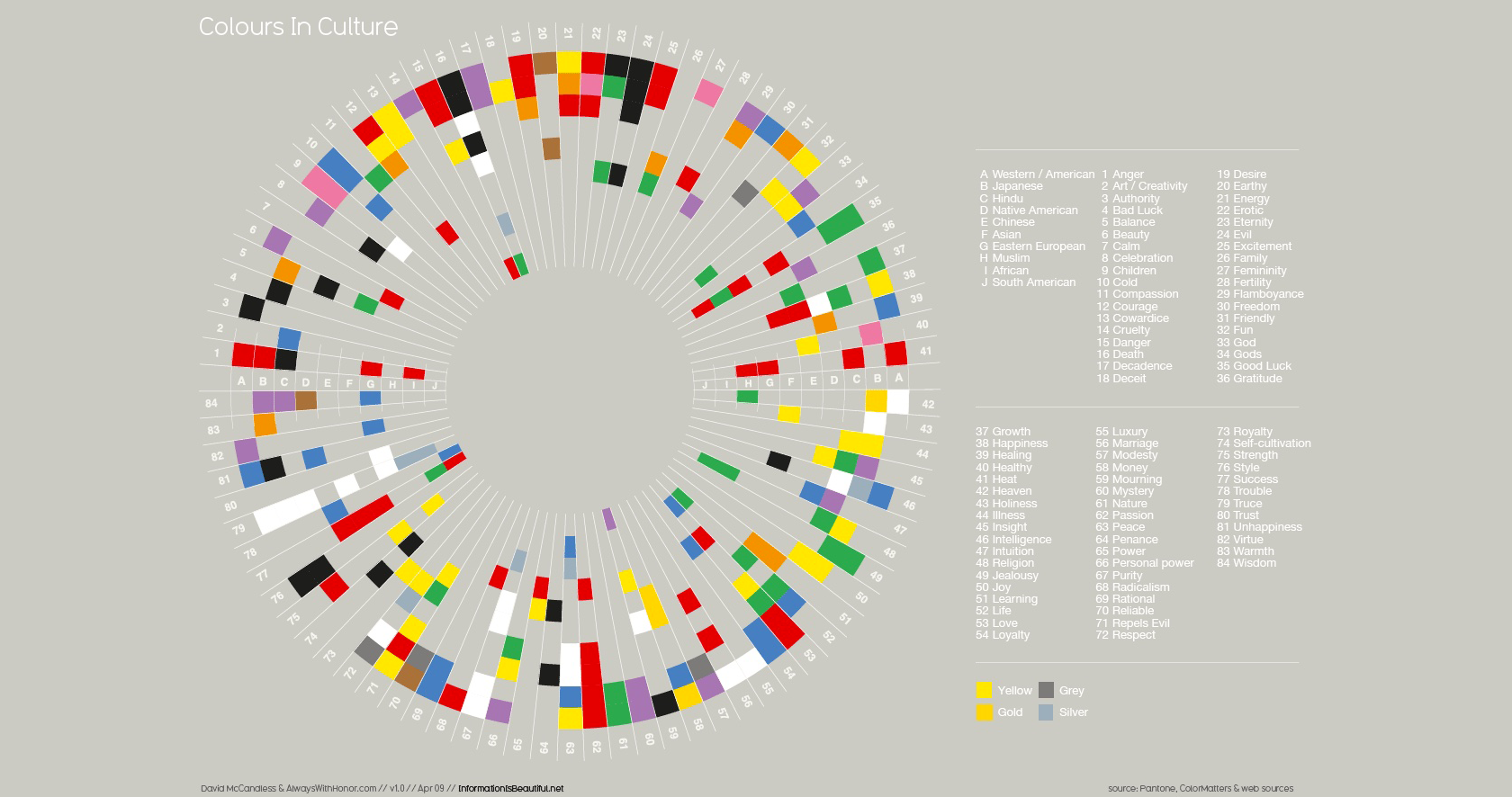
Brand values should play a key role in creating a color palette. But they’re not the only important factor. Industry norms are also key, as are colors already being used by competitors. Using a color palette that is nearly identical to a brand’s primary competition is a great way to breed confusion and ensure the brand won’t stand out.
Granted, there are exceptions to this. Take, for example, McDonald’s and Wendy’s. Both are fast food restaurants that are in direct competition with each other. And both use a red and yellow color palette. However, looking at their logos, Wendy’s logo is primarily red with yellow accents, while McDonald’s is the opposite. Their packaging also uses these colors in different ways, further differentiating between the brands. Because of this, neither would be easily confused with the other, even if logos and other identifying marks were removed from their packaging.

The first step to creating a brand color palette that supports the brand’s values is to understand the meaning of the various colors, and how making them lighter/brighter/darker/duller/etc. can affect them. Here’s a basic breakdown of what different colors mean:
- Red — Red is the color of danger and passion, as well as excitement. It’s a very strong color and can elicit strong reactions in people. Lightening it to pink makes it more feminine and romantic while darkening the hue to maroon makes it more subdued and traditional.
- Orange — Orange is a very creative color that’s also associated with adventure and youth. It’s very energetic, too. Because of orange’s strong ties to 70s style, it can also evoke a retro feeling.
- Yellow — Yellow is happy, optimistic, and cheerful. It’s popular in designs for children and adults alike. More pastel hues are often used as a gender-neutral baby color, while brighter yellows are popular in creative designs. Darker shades of yellow become gold, which is associated with wealth and success.
- Green — Green has varied associations. On one hand, it provokes feelings of wealth and tradition (particularly darker hues), while on the other it’s strongly associated with environmentalism and nature. Lime greens are often associated with renewal and growth.
- Blue — Blue is most often associated with loyalty and trust. Brighter blues can be affiliated with communication, while duller and darker blues can be associated with sadness and depression. Blue is the most universally liked color in the world, which may explain why so many companies opt for blue shades for their branding.
- Purple — Purple is another hue with varied meanings. It’s long been associated with royalty and wealth (since purple dye was rare in many ancient civilizations, it was reserved for royalty). But it’s also associated with mystery and spirituality. Purple can also evoke creativity.
- Black — Black implies sophistication and luxury. It can also be tied to sorrow and negativity, however. Depending on the other UX colors being used alongside black, it can feel modern or traditional, formal or casual.
- White — White is tied to purity, innocence, and positivity. White is also very popular in minimalist designs, due to its neutrality and simplicity. Like black, white easily takes on the characteristics of other colors it’s used with.
- Gray — Gray has varied meanings, depending on context. It can be conservative and sophisticated or dingy and dull. It can be emotionless or moody. It can also be associated with sorrow and sadness.
- Brown — Brown (which is actually a dark shade of orange) is associated with being down to earth and grounded. It’s also associated with nature and even coziness. And, of course, it can be affiliated with being dirty or dingy.
Knowing these basic color meanings gives designers a solid basis on which to build color palettes for any brand or product.
Color theory, however, is part science and part art. Just because a color is generally associated with a particular feeling or mood doesn’t mean it can’t be perceived in other ways by combining it with different colors, altering the exact hue, or varying how it is used among other design elements.
Using Unconventional UX Colors
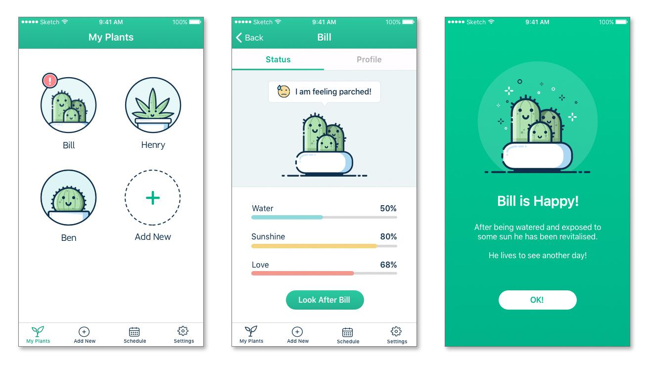
Unconventional use of UX colors is a great way to set a brand apart. And while it takes more finesse than simply combining any old colors a designer feels like combining, it’s not that difficult to learn how to use unexpected colors in UX designs.
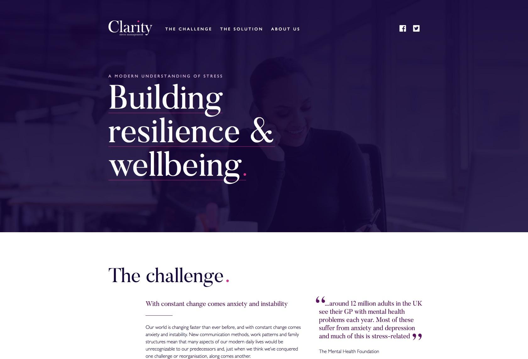
Accent colors are the easiest place to start when it comes to adding unconventional colors into a design. For example, a law firm website might use a traditional color palette of navy blue and gray. But add in some lime green accents and suddenly the design is set apart from the sea of other law firms with navy blue and gray websites. Or look at this example from Hogan Lovells, which uses a white, gray, and lime green color palette to create a modern website that definitely stands out from other legal industry sites. It would appeal to a younger, more modern crowd than your average legal site.

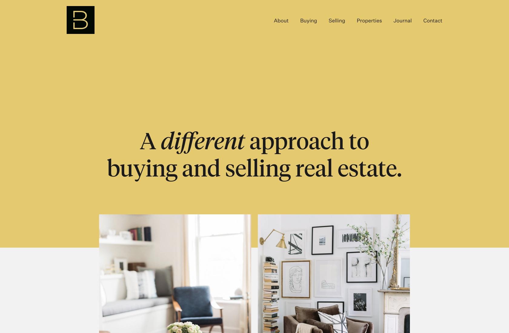
Berdan Real Estate is another site that uses an unexpected color palette. The real estate site uses shades of yellow and peach, both of which are much more energetic than your average property site (where large swaths of blue, red, and green dominate).
Insurance isn’t generally thought of as a modern, groundbreaking industry, but that doesn’t mean their designs can’t be. Lemonade’s website uses a gray and white color scheme with fuchsia accents. It’s completely unexpected in an industry that isn’t known for taking risks.

There is a multitude of other examples of unconventional UX colors used in practice around the web that can be used for inspiration.
The 60-30-10 Rule
The 60-30-10 Rule is a simple theory for creating color palettes that are well-balanced and visually interesting. The idea is that one color—generally something fairly neutral (either literally or psychologically)—makes up 60% of the palette. Another complementary color makes up 30% of the palette. And then a third color is used as an accent for the remaining 10% of the design.
This method makes it much easier for designers to start experimenting with unconventional color palettes without stepping too far outside the expected norms within an industry or brand. Adding a pop of some unexpected hue can elevate a design that otherwise fits within what is expected of a particular company. It can also be the first step toward creating a brand palette that is much more forward-thinking than its competitors, thereby setting the brand apart and making it more memorable.
Conclusion
While color theory is a complex subject, it isn’t particularly complicated to learn the basics. From there, designers can build on their knowledge to create more varied and sophisticated color palettes for their designs.
A well-designed color palette, particularly one that includes some unexpected hues, isn’t merely an aesthetic choice. It can have significant psychological effects on users, which UX designers should capitalize on in order to create better experiences.
Further Reading on the Toptal Blog:
- Design Psychology and the Neuroscience of Awesome UX
- Dark UIs. The Good and the Bad. Dos and Don’ts.
- Emotional Branding for Sustainable Product Design
- Use Your Inspiration – A Guide to Mood Boards
- Persuasive Design: Using Advanced Psychology Effectively
- Pragmatic Pixel Perfection: A Manifesto for Balancing Design Quality and Speed
Understanding the basics
Why is it important to learn color theory?
Learning the psychological impacts of colors and their ability to influence emotion to create better experiences for users is a key aspect of becoming an exceptional designer.
Why is color contrast important on the web?
Proper color contrast is an important accessibility concern. In addition to accessibility, it also has an impact on user behavior (such as additional contrast making CTAs stand out more and influencing users to click more frequently).
What is a web safe color?
There are 216 generally accepted “web safe” colors widely used. When computer displays were limited to 256 colors, “web safe” colors could be relied upon to render the same across major browsers. Modern devices can now render millions of colors, so designers are no longer restricted to their use.


