Boost Your UX With These Successful Interaction Design Principles
Interaction design principles form the bedrock of awesome UX. Truly great interaction design relies on a set of conventions, standards, best practices and rules-of-thumb.
Interaction design principles form the bedrock of awesome UX. Truly great interaction design relies on a set of conventions, standards, best practices and rules-of-thumb.
Miklos is a design leader, author, and speaker with more than 18 years of experience in the design field.
Expertise
PREVIOUSLY AT

There’s a fine line between an interaction that works and one that is unusable. Interaction design principles help bridge the divide.
Well-executed interaction design plays a huge role in the implementation of great UX, and is indisputably one of the fundamentals of UX design principles.
“Unusable” means “I’m moving on,” and no matter how “good looking” the visual design—how fancy that animation is—mess up the principles of interaction design and your UX is kaput. Get it right and you’ll be well on your way to a much better UX even if the aesthetics fall short. The product will have a much better chance of succeeding, which in turn contributes to the bottom line.
Interaction design (IxD) is defined by the Interaction Design Association (IxDA) as “the structure and behavior of interactive systems. Interaction designers strive to create meaningful relationships between people and the products and services they use, from computers to mobile devices to appliances and beyond.”
Experience is critical, for it determines how fondly people remember their interactions. —Don Norman in The Design of Everyday Things.
Following interaction design principles contributes immensely to great interaction design, which in turn will contribute to the experience.

It’s possible that all of today’s devices and tech could be replaced with something entirely different overnight, yet because of its lasting principles, great interaction design would still be achievable. Those constant principles are about what motivates people, their behavior, and how they think.
Imagine if every door handle on every door worked differently. For one you would have to push first into the door then down; for another you’d have to pull up instead of pressing down, and yet another you’d have to pull up twice and then down—a total disaster. In fact, the phrase “turn the door handle” assumes there is only one way to do it.
Nobody likes being beaten over the head by cries of “follow the rules,” but truly excellent interaction design relies on a set of standards, best practices, conventions, and rules of thumb (heuristics). It’s no squishy science, but they form the bedrock of IxD and make interaction possible with the least amount of friction. Interface standards don’t stifle creativity—they are not hard and fast rules, but foundational guidelines that help a designer establish a “usable and familiar design” base from which to innovate.
Interaction Design Principles and Best Practices
Interaction design falls under discipline of Human-Computer Interaction (HCI), “A multidisciplinary field of study focusing on the design of computer technology and, in particular, the interaction between humans (the users) and computers.”–as defined by the Interaction Design Foundation.
Great UI design achieves pure user delight by combining basic UI design principles with goal-driven interaction design.
- Successful interaction design employs simple, clearly defined goals, a strong purpose, and an intuitive UI.
- In an effort to keep interactions simple and easy, goal-driven interaction design puts nothing more than the absolute minimum necessary in front of users in order for them to complete a task.
Let’s dive into some of the most important principles (not an exhaustive list by any means):
Discoverability
Basically, if the user cannot find it, it does not exist. It must be made clear as a bell what actions are possible in a UI in less than a microsecond—for example, labeling icons as a best practice. Unlabeled icons are tantamount to throwing roadblocks into a user’s path because they’ll have to stop to decipher meaning. You’re interrupting the “flow.” And here’s a shocker… They’re not interested in learning your UI.

Signifiers
Very much tied to discoverability, effective use of signifiers ensures that affordances—the possibility of an action on an object—are clearly indicated in the UI. Signifiers provide strong clues like signals or signposts. Indicating an available interaction, they flash green lights at the user shouting, “Here I am, you can tap (click, swipe, etc.) me!” An affordance may exist in the UI, but may stay hidden because if it lacks a signifier, it remains invisible. An example might be a “hidden gestural interaction” that doesn’t reveal itself unless the user accidentally swipes left or right (to delete something, for example).
Affordances define what actions are possible. Signifiers specify how people discover those possibilities: signifiers are signs, perceptible signals of what can be done. Signifiers are of far more importance to designers than are affordances. —Don Norman (Norman, 2013)

Feedback
After signifiers, the next most important communication to the user is feedback. Feedback means: explicit information about the impact of the action. It also means constant visibility of system status, i.e., the system should make sure that:
- Users are kept informed about what’s going on.
- There is continuous information about the results of their actions and the current state of the product (system).
- There is no confusion in the mind of a user as to the state of the product, i.e., processing, loading, searching, uploading, etc., or some other state change.
- After an action has been executed, it’s easy to determine the new state.

Conceptual Models and Mental Models
Great interaction design presents all the information a user needs to create a good conceptual model of the system, thereby leading to their understanding and a sense of control. A conceptual model enhances both discoverability and evaluation of results when using the system.
Mental models—or cognitive maps—are the images in a user’s mind that inform their expectation of a certain interaction and how something works in the real world. Cognitive maps are internal representations of our physical environment, particularly associated with spatial relationships. By effectively using the user’s mental model, interaction designers can create interaction design systems that “feel” intuitive.

The designer invents a conceptual model—the design model, and this is how the designer intends the device or software to work. The only way to communicate this model to users is to implement it through a UI. Users then interact with the conceptual model and create their own mental model of how something works.
Designers can’t tell users how they intended an app to work—they need to design a UI appropriately in order to clearly communicate its purpose. In other words, make the interface easy to understand and use. Bad interaction design runs the risk of creating the wrong mental model for the user. This leads to confusion and user error because they are trying to operate the app in a way the designer did not intend.
Mappings
Mapping is the relationship between controls and their effect in the world. The principle of feedback is a close cousin of mapping because the two principles work together to create a seamless experience. Nearly all artifacts need some kind of mapping between controls and effects—in the case of interface design, it’s the relationship between a control and its resulting function.

Natural mapping—taking advantage of physical analogies and cultural standards—leads to an immediate understanding. For example, a designer can use spatial analogy in the UI:
- To increase some value with a slider component, swipe a slider to the right,
- To decrease it, swipe left.
Some natural mappings are biological, as in the universal standard that a rising level represents more, a diminishing level, less.

Constraints
The design concept of constraints is a way to determine how to restrict the kind of user interaction that can take place in a given moment. Interaction design constraints help efficient interaction by providing “guide rails” for users—almost like a guiding hand steering the interactions that can occur.
Constraints in design make sure only specific things are enabled, or even visible, in order to guide the user towards certain interactions. It considers size, scale, proportion, emphasis, and state, and how these, working together in harmony, help create hierarchy and consequently influence the user. Constraints put in place correctly also help reduce the chance of user error.
The opposite of constraint is when every option is offered to the user, making it difficult for them to decide what to do next. It’s the principle of choice. The more options, the more difficult it is to choose any one of them—we become overwhelmed by all the possibilities.
Great interaction design doesn’t put every available option on the interface, but restricts it to what’s most important in any given moment.
Consistency, Standards, and Heuristics
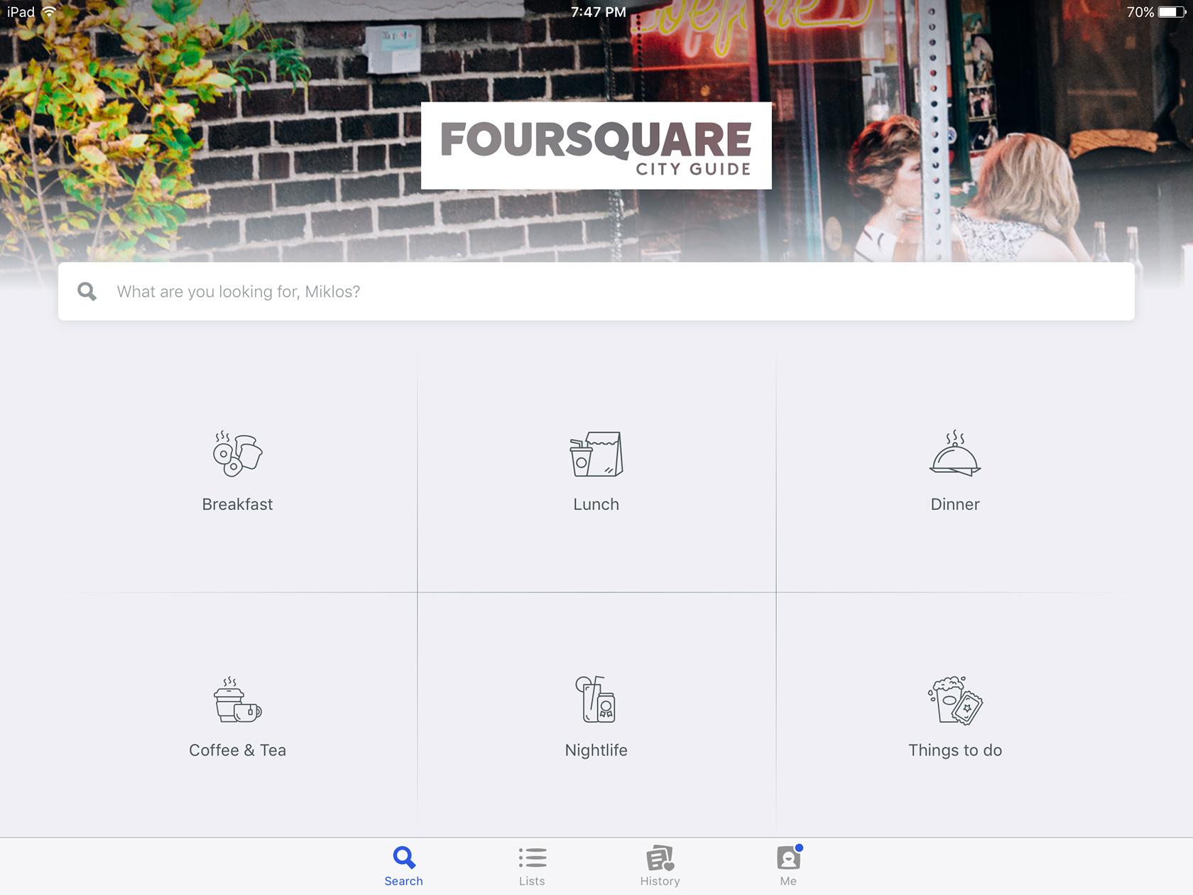
These are all related—brothers to patterns (below), if you will. To prevent user error and make an application easy to learn, it is essential that an interaction model be consistent. Consistency improves UX, general usability, and the efficiency with which users can use digital products.
Consistency means using similar elements to achieve similar tasks, and having similar functions and behaviors throughout—a consistent interface is one that follows rules, such as using the same operation to do something.

Products that strive to be highly usable follow well-established UX design conventions, standards, best practices and usability heuristics (broad rules of thumb, not specific usability guidelines).
Conforming to a convention for example, may be in the way a page is laid out. Web users spend 69% of their time viewing the left half of the page and 30% viewing the right half. Therefore, a site is more likely to be profitable if it follows a conventional layout.
A standard could be a breadcrumb trail (an orientation and navigation device that’s immediately recognizable), or a global navigation menu across the top of the page as on the BCC site.
Patterns and Learnability
How easily can a new user learn to navigate an interface? Nobody wants to learn a new way of doing things unless it provides a significant benefit over what came before it—yet we’re constantly inundated with untested, unconventional interactions.
Common components or patterns provide instant learnability. Once you’ve learned how to use a spoon, you will always know how to use a spoon. Same with riding a bicycle, skating… the same construct applies to the UI components we use every day: buttons, text fields, dropdown menus, checkboxes, radio buttons, spinners, sliders, icons, accordions, search boxes, etc.
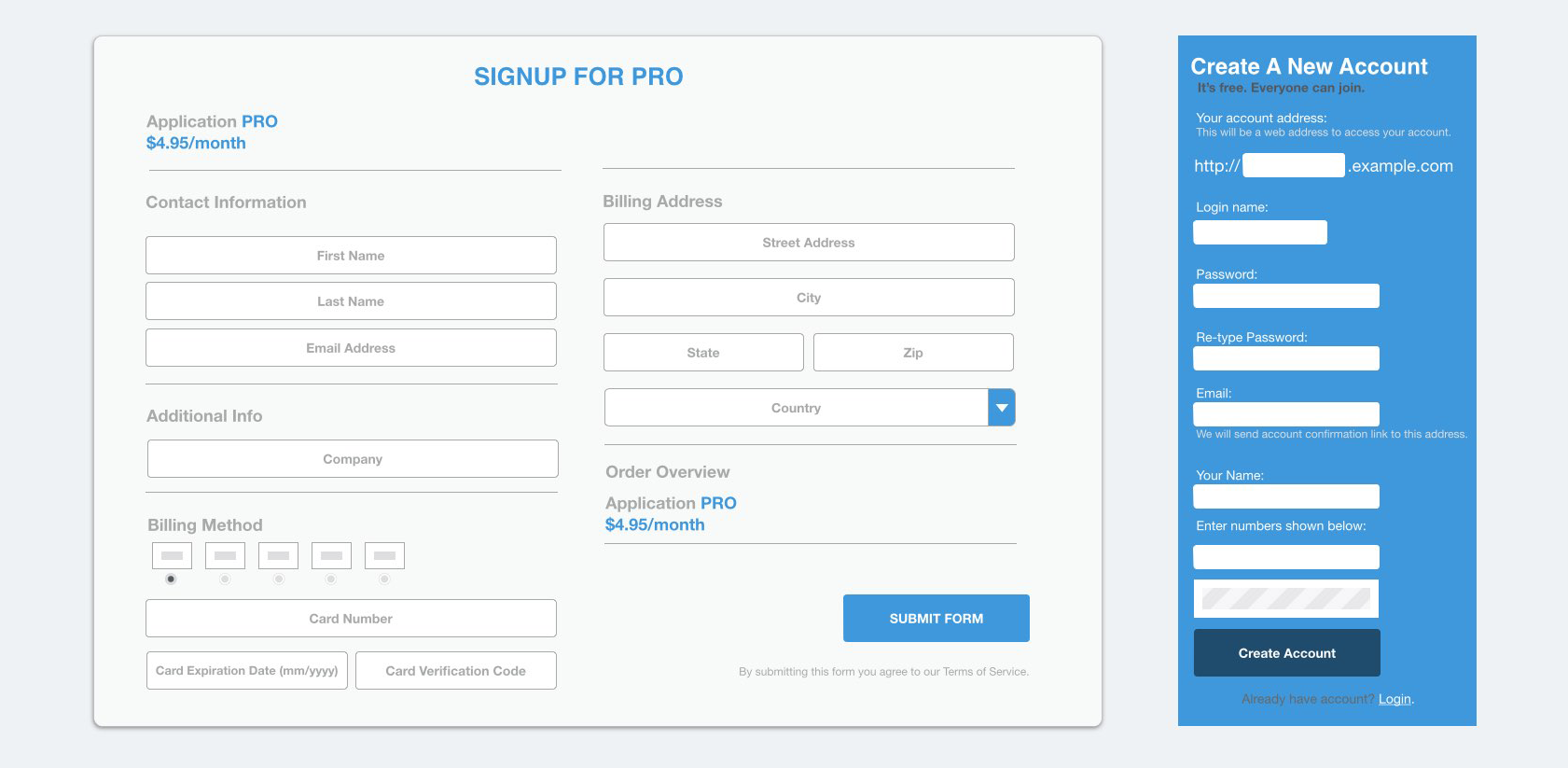
The best interaction designs don’t try to reinvent the wheel, but make efficient and effective use of patterns in a new way.
Patterns not only encourage learnability, but also provide consistency (another principle, discussed above) and bring it in line with the user’s expectations of how things should work.
Visual Hierarchy and Emphasis
During their interaction with a site or an app, people are looking for the information most relevant to their search. Visual hierarchy concerns the arrangement of elements in a way that implies importance. Visual hierarchy in design influences the order in which the human eye perceives what it sees. Not everything is given equal “weight”; order is created by visual contrast between objects in a field of perception. Visual contrast emphasis can be achieved by size, proximity, color, opacity, and actual tonal contrast between elements.
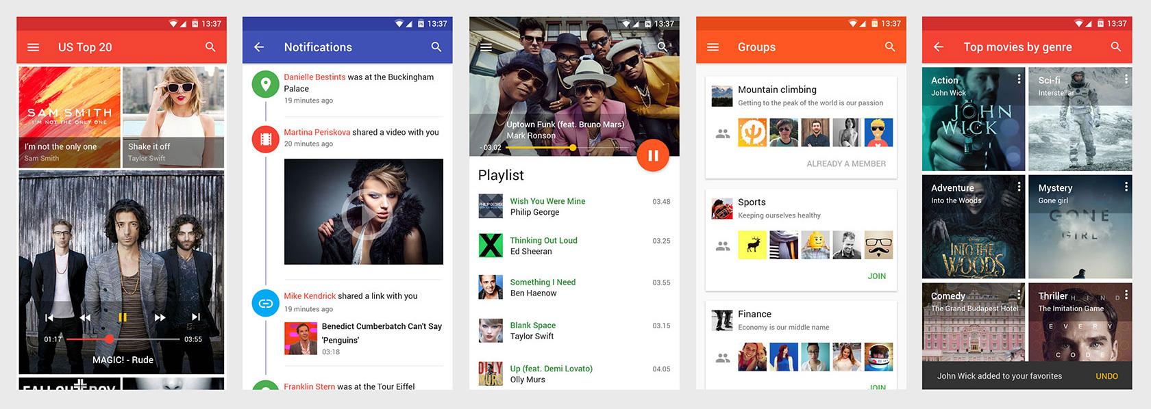
Do not underestimate the power of visual hierarchy. It’s been very effectively used in all kinds of design for eons, in architecture and industrial design as well as print design. Check out some great poster designs. Using this technique well in interaction design, the right things seem to appear at the right time in the right way.
Great interaction designers use the power of emphasis to successfully achieve “lean and mean” interface designs that seem to work like magic.
Fitts’ Law
Believe it or not, this law comes from early studies looking at human muscle movement and targeting of telegraph operator and production line task performance, and was later adapted to HCI (human-computer interaction). It basically says: “The time to acquire a target is a function of the distance to and size of the target.”
In simpler terms, it’s about how far and how large a target is, and how close it is in relation to other targets. Shorter mouse movements or taps are better—it is always faster to click or swipe a target if it is closer to your starting position. Related tasks should also be in close proximity to each other so users don’t have to dart around the screen interacting with the UI.
Fitts’ law can accurately predict the amount of time it takes to move to and select a target. A target can be a button, a dropdown, or some other interactive element on a screen. If it’s too far, too small, or if clickable elements are too close together, the efficiency and usability of the UI is greatly reduced.
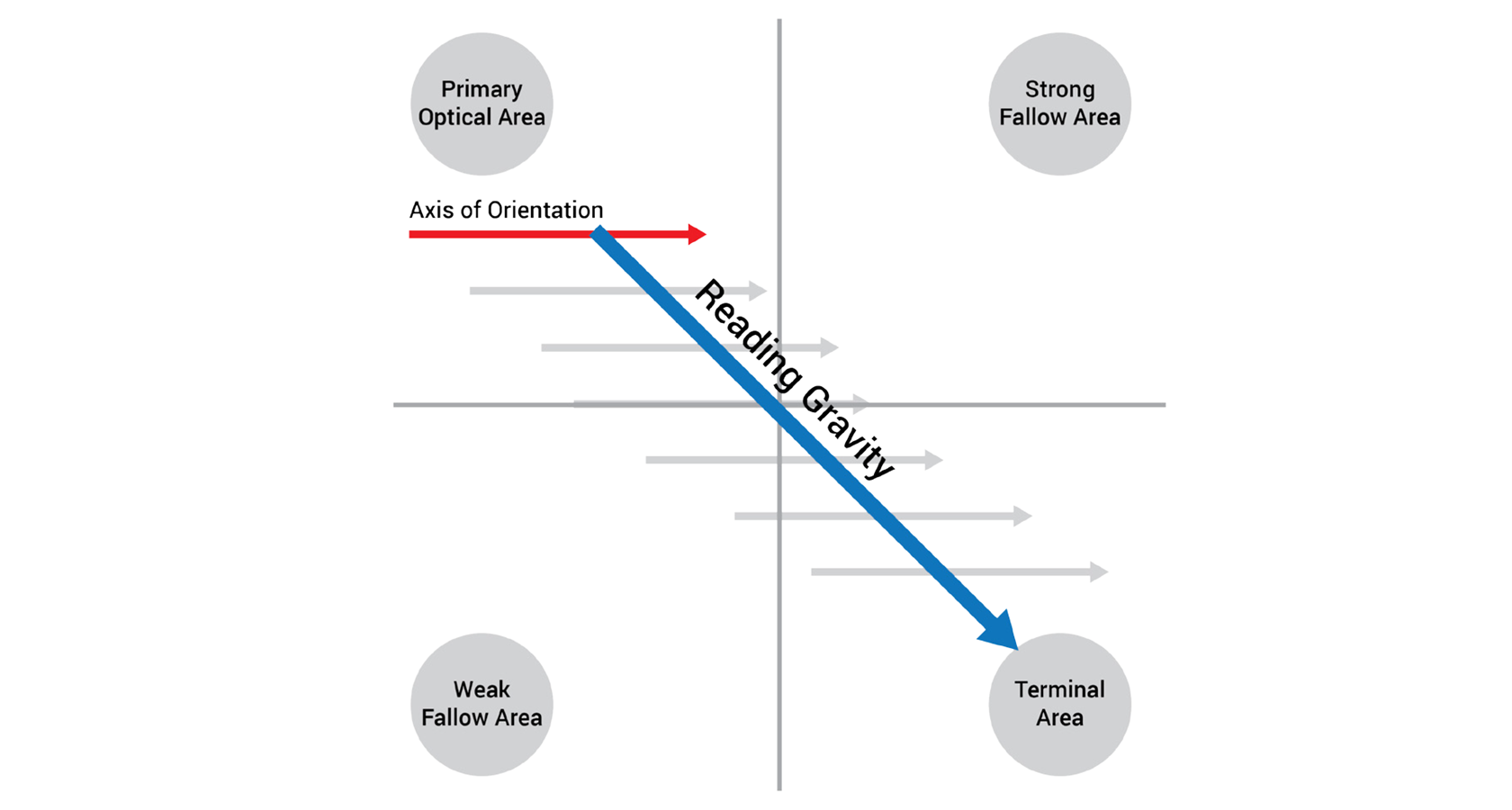
Gutenberg Diagram, Z- and F-Pattern Layouts
These patterns are applicable in different situations depending on content, and are mostly used by western audiences. The Gutenberg diagram describes a general pattern that the eyes move through when looking at evenly distributed, homogenous information—mostly text-heavy sites such as blogs or news sites. The Gutenberg diagram suggests that the strong and weak fallow areas fall outside the reading gravity path, and receive minimal attention unless emphasized visually in some way.
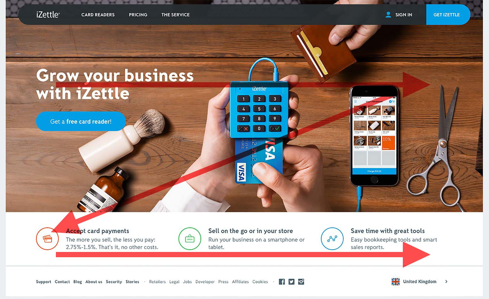
The Z-pattern follows the shape of the letter Z. In certain cases this pattern is also referred to as a Zig-Zag pattern. The main difference with the Gutenberg diagram is that the Z-pattern suggests viewers will pass through the two fallow areas. Otherwise they still start and end in the same places, and still pass through the middle. As with Gutenberg, a designer would place the most important information along the Z-pattern’s path.
F is for fast and refers to how users read content. The F-pattern was popularized by an NNGroup eyetracking study which recorded more than 200 users reading content on the web. It found that people’s scanning patterns were pretty consistent across many different types of sites.

Why is this important? On an eCommerce site for example, to maximize scanning, you might want to arrange the most important content in a way that follows the F-pattern.
Recognition Rather than Recall
Recognition refers to our ability to “recognize” an event or piece of information as being familiar, while recall is much more of a “cognitive burden” that involves pulling related details from memory. Showing users things they can recognize improves usability over needing to recall items from scratch.
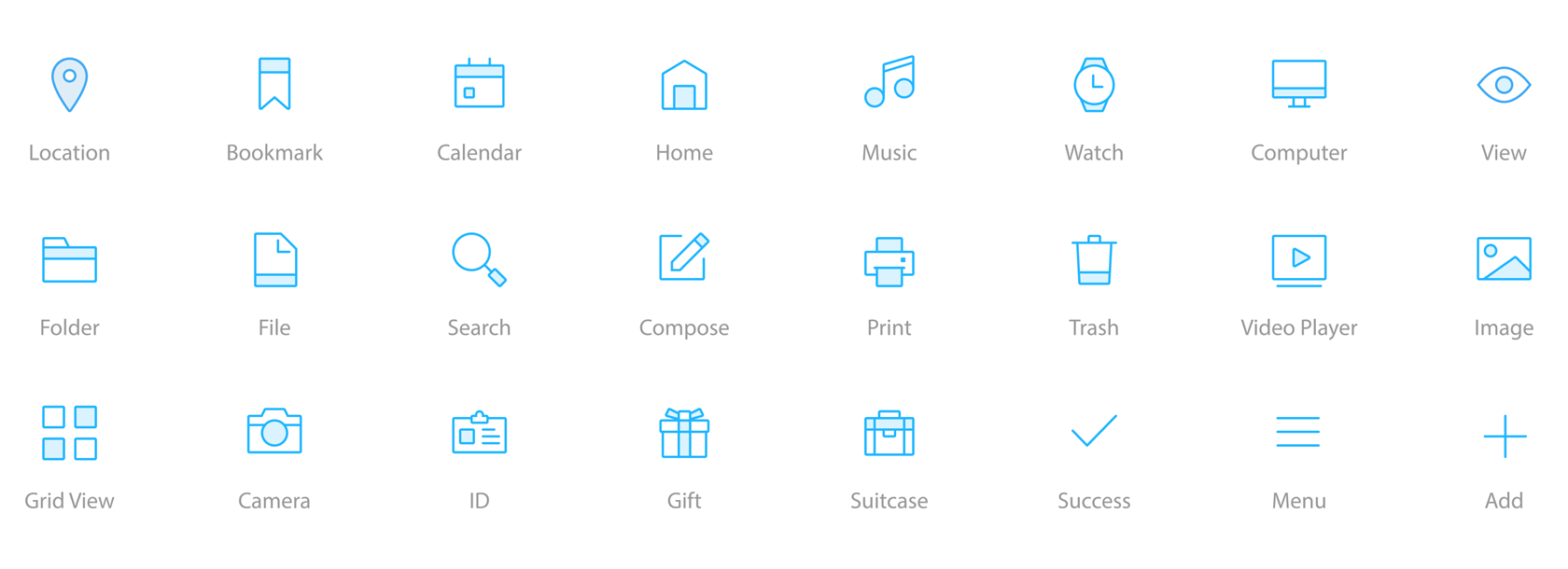
For example, using icons in a UI is powerful because it allows for the instant recognition of a symbol. Our brain processes (recognizes) symbols about 1000x faster than reading text. If a designer displays a standard warning sign icon in a dialog, it immediately makes the user focus and pay attention because the next action may be destructive. But if an icon is designed in such a way that forces users to recall and decipher meaning—a hand held up for example instead of the warning icon—it decreases efficiency and the usability of the UI.
Aesthetic and Minimalist Design
You have to deeply understand the essence of a product in order to be able to get rid of the parts that are not essential. —Jonathan Ive.
This is one of the most challenging principles because it’s hard. The tendency is for designers and product managers to add every available option under the sun, and let the user decide the path they want to take. That’s really the lazy approach, and leads to products full of nonessential clutter.

Interfaces need to be cleared of the unnecessary elements and content that does not support the user’s goals and tasks. Designers should not only design aesthetically pleasing UIs, but also prioritize information screen-to-screen in the user flow. Using visual hierarchy and the magic of emphasis, only the essential and absolute minimum of information needed for the user to complete a task should be presented.
Michelangelo said of his work: “I saw the angel in the marble and carved until I set him free.”

Designing an interaction that is minimalist, aesthetically pleasing, and simple requires the designer to understand what’s going on precisely in the moment people will be using the product, and get rid of all that’s not necessary. Performing deep user research and testing to understand how users will use the product is typically the best approach.
Error Prevention
Users are often distracted when performing a task, so preventing unconscious errors by visual emphasis, offering suggestions and the use of carefully designed constraints is key. A form of error-proofing—also known as Poka-Yoke—refers to the implementation of failsafe mechanisms to prevent a process from producing errors.
One of the best ways to prevent errors is to design a better mental model. Many user mistakes occur when the designer’s model and interpretation of how the system should work does not match the user’s mental model.
Standard design conventions help (one of the principles mentioned above) because they help users understand what actions they can take. Users that interact with your website or application have used thousands of other sites and apps, and expect common interactive elements to look and work a certain way. Error-prone situations can arise when your product deviates from those conventions.

Warn before errors are made and confirm before destructive actions. Even better than well-implemented error messages is a careful design which prevents a problem from occurring in the first place. Try to eliminate error-prone circumstances and keep checking for them.
The Future of Interaction Design
New devices, environments, and interfaces will continue to advance with new interaction possibilities. Video-game controllers are constantly evolving, and provide a diverse array of input controls, as well as haptic feedback. Gestural interfaces will mature from touchscreens that support 2D and 3D gestures—for example, gestures on iOS and Android devices—to using hand gestures in 3D spaces to interact with virtual-reality spaces, gaming consoles, and IoT devices that let us control our environment.
As in the case of Google’s Project Soli, we may say sayonara to the mouse, trackpads, and joysticks, and switch to more natural gestural interactions using our hand and fingers to control devices. In certain instances—in conversational UIs for example—input methods may change from keyboard to voice. Nevertheless, the principle of immediate and continuous feedback in some form (voice, haptic and visual) will still be needed.

Fundamental interaction design principles will always play a central role in the design of future systems and it’s important for UX/UI designers to keep them in mind. They’re not hard and fast rules, but will make for better and more engaging products and services. Just as successful movies use ancient storytelling techniques that follow a tried and true, time-honored structure, there are principles of interactive design that exist for a good reason. Following them will benefit any product designer by improving usability and driving wider adoption of their products.
Further Reading on the Toptal Blog:
Miklos Philips
London, United Kingdom
Member since May 20, 2016
About the author
Miklos is a design leader, author, and speaker with more than 18 years of experience in the design field.
Expertise
PREVIOUSLY AT

