
The Comprehensive Guide to Information Architecture
As a standard part of the UX process, designers create information architecture when building products. Learn about information architecture—how designers and product managers build an IA using design principles, as well as IA tools and best practices.

As a standard part of the UX process, designers create information architecture when building products. Learn about information architecture—how designers and product managers build an IA using design principles, as well as IA tools and best practices.

James Pikover
James has written about consumer tech and video games for over 6 years including VentureBeat, IGN, and Gizmodo.
As a standard part of the UX process, designers create information architecture when building products. Defining every avenue and path that users can take through a digital product, information architecture is much more than just a sitemap to show what page leads where.
Similar to building architects using a blueprint to construct every part of a house, from physical structures to more complex inner workings like electrical and plumbing, information architecture describes the hierarchy, navigation, features, and interactions of a website or application. And just as blueprints are the most valuable document for an architect to use in the construction of a building, information architecture can be the most powerful tool in a designer’s arsenal.
However, developing one isn’t as simple as putting a list of features together and mapping out how they work—let’s investigate the process.
What Is Information Architecture, and Why Is It Important?
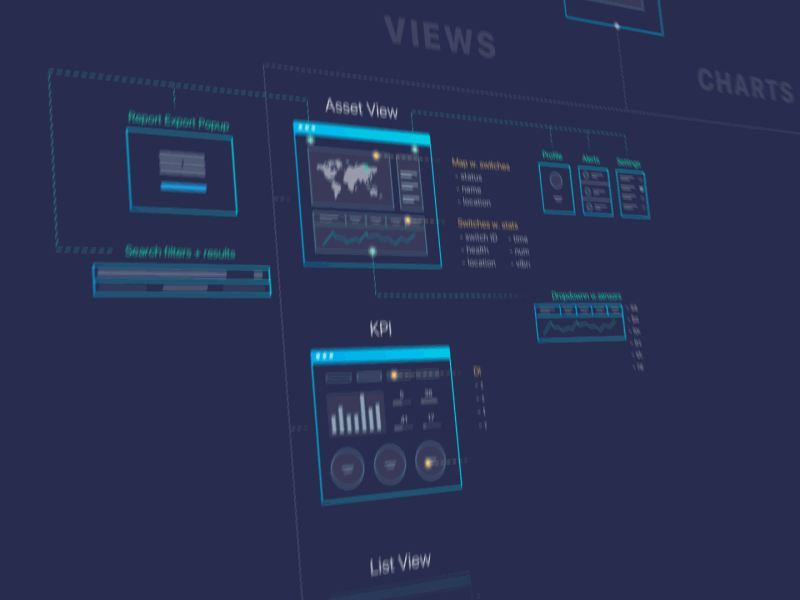
Information architecture (IA) is, like a blueprint, a visual representation of the product’s infrastructure, features, and hierarchy. The level of detail is up to the designer, so IA may also include navigation, application functions and behaviors, content, and flows. There is no set limit to the size or shape of IA; nevertheless, it should encompass the generalized structure of the product so anyone (theoretically) should be able to read it and understand how the product works.
We’ll use the blueprint reference often because the purpose of both documents is nearly identical. Just like a blueprint, IA provides designers (as well as product development and engineering teams) a bird’s-eye view of the entire product. Having a single document that delivers a simple and understandable representation of how the application or website works is vital for developing new features, updating existing ones, and for seeing what is possible considering the existing product.
With IA available, it becomes significantly easier to make key decisions for new features and implementations, to understand timelines for product changes, and to follow user behavior through multiple processes.
Let’s dive into a basic video to see how an IA is built.
How to Design Information Architecture
As part of the UX process, IA design follows very similar patterns to flowcharting: Add shapes and connect them with lines in an organized fashion to a single document. The challenge when building IA is in understanding how your app or website actually works from the user’s perspective, and how to organize that information into a readable, legible format.
There are two major requirements for actually constructing IA: organizing it through a visual hierarchy (that is, a hierarchy of features, functions, and behavior) and creating a legend for displaying different types of features, interactions, and flows. With a standard flowchart, the shapes follow specific requirements (rectangles are processes, diamonds are decision points, etc.); however, following that nomenclature isn’t a requirement.
In other words, the most important factors to building your IA are where individual components of the architecture are placed (hierarchically), and how they’re labeled and displayed.
Understanding and Showing Visual Hierarchy
Determining the hierarchy is the most challenging aspect of creating a new information architecture. In an IA context, hierarchy isn’t simply about what appears at the top of a page. It describes how screens, features, interactions, and content connect throughout a product. A homepage might branch into search, product pages, account settings, or support sections, and each of those areas may contain several additional layers below it.
Representing that structure clearly can be complicated because IA often condenses large, interconnected systems into a single document, even though users rarely follow a single, linear path through an application.
It’s a common misconception that IA must be built “from the top down.” That approach may be manageable when working with an existing product where the major sections, navigation patterns, and user flows are already established. When building IA from scratch, however, anything beyond the top level can become hard to define unless the product follows a fairly standard format. It’s like asking a mechanic to build a car from the top down instead of in parts. Each piece requires its own research, design considerations, and development planning before it can be assembled into the larger system. The same is true with IA.

Displaying visual hierarchy is valuable in IA not only because it provides better context for the reader, but also because it helps clarify the major regions of the product. If your app’s most significant feature is ordering a ride (a la Uber or Lyft), which can be done from the homepage, then that page will have the most touchpoints and the most value to the product. The most important parts of the product should also be the most prominent within the IA itself.
Using Shapes, Labels, and Legends
Beyond hierarchy, a strong IA must clearly display every engagement point, typically through a simple legend and consistent shape usage. The legend denotes content and interaction type, and shapes do the work that color might otherwise handle, keeping the document readable even in black and white.
The game IA below illustrates how this works in practice:

Using just four shapes (rectangles for screens, ovals for pop-ups, diamonds for actions, and a tab shape for tabs) and consistent labeling throughout, this IA identifies every major interaction. Short contextual labels on connecting lines (“Walk to Treasure Location,” “Decline Location Access”) add meaning without cluttering the diagram. Anyone working on the product can pick this up and understand what the user sees or does at any given point.
This model isn’t perfect, but it organizes app hierarchy clearly and delineates what the user either sees or does at any given point.
The Best Information Architecture Tools
There are plenty of software applications that support IA creation, and fortunately, the tools have become more flexible in recent years, making the entire process more efficient and easier to manage.
Draw.io, used in the video above, is completely free for personal and professional use and automatically plugs into Google Drive. It also has integrations with Confluence and Jira, which are paid. Draw.io is excellent for flowcharting, creating user flows and information architecture, and with Drive functionality, multiple people can work on the same document and see changes live. There’s also a free offline version.
Lucidchart is another great tool that provides a slightly better experience than Draw.io and has additional benefits like prebuilt templates, many more integrations, a mobile app, and support for enterprise. Lucidchart has also introduced AI-assisted features that can help teams generate diagrams and organize information during early-stage planning.

OmniGraffle and Visio are long-time industry mainstays and work excellently for building and maintaining an IA design, though Visio is primarily Windows-based but also available through Microsoft 365 on the web, while OmniGraffle is Mac-only and requires separate purchases for the macOS and iOS versions. OmniGraffle has one benefit over the major competitors in that it provides JavaScript and AppleScript automation, which may be unnecessary for most designers, but full-time information architects typically appreciate it.
The diagramming tools listed above are made for speed and ease of use, specifically around flowcharting, which follows nearly identical principles to information architecture. Other applications like Balsamiq, MindMeister, MindManager, or XMind all offer similar-style behavior but are built for other major purposes, such as prototyping or mind mapping.
Collaborative whiteboarding tools such as FigJam (part of Figma) and Miro have also become increasingly common in IA and UX workflows, particularly for distributed teams. While these platforms are often used for workshops and early ideation, their infinite canvases and AI-assisted diagramming and planning features also make them well-suited for mapping navigation systems, user flows, and broader information structures.
Information Architecture Best Practices
While there are few defined rules for what constitutes information architecture, when going through the process, consider the following:
Don’t Focus on Hierarchy, Focus on Structure
Hierarchy is adjustable. The homepage will always be the homepage, but where it leads, how users get to those places, and everything in between and beyond is determined later.
All Processes Should Be Logical
Even though the IA in the UX process is for user interactions, every step of the way has to make sense. Registration screens shouldn’t lead to settings, a camera function shouldn’t jump to a map view…the list goes on.
Design for Accessibility from the Start
It’s easy to treat accessibility as something to address later in the design process, but many accessibility decisions are actually made at the IA stage. The way content is organized, labeled, and navigated affects whether users can move through a product clearly and consistently across devices and assistive technologies. Building accessibility considerations into the structure early, following modern standards like WCAG 2.2, is far easier than retrofitting them later.
Remember the UX Process
A common mistake is to just make IA, without resources, research, or other assets or work. That’s like telling an author to write a book without an outline, or a programmer to code an app without prototypes.
You Are the Cartographer
Cartographers take everything about a map into consideration, from mountain ranges to state borders. Just like map makers, designers determine what goes into the IA design. Individual pages, specific user behaviors, context for decision points… and so on.
Ultimately, the cartographer decides what goes on the map based on user needs. The same is true for designers, so construct the IA for the end user, namely the product development and design teams.
Information Architecture Is Ever-Changing and Evolving
To drill the point home once more, all IAs are built for change. Products evolve, designs change, users adapt, and the cycle continues, over and over. Don’t take it too seriously and know that there will always be room for improvement. Don’t aim for perfection; build a simple, adaptable IA.
My Information Architecture Is Done… Now What?
It’s a common conception that any design work is never truly done, and that’s certainly the case with information architecture. They grow and shrink and change as our products do. Unlike a blueprint for a building, IA will always evolve based on anything from user needs to new features or a product overhaul. Much of the structure may stay the same and provide consistency between versions so users don’t get confused.
And that’s a good thing. Knowing that IA is a fluid document—one that likely changes weekly, and sometimes even daily—is a powerful way to maintain the overall structure of your app or website without ever touching the code or creating new prototypes. The better the entire product development team knows the IA, the faster everyone will know what is and isn’t possible, and how serious any supposed “easy work” really is.
Which brings us to the real beauty of information architecture: There is no predefined starting point. While the traditional UX design process dictates that the IA is built after completing enough user flows; armed with plenty of user and competitive research, it can also be the first thing done… or the last. The prototyping process often brings up information on how certain behaviors or actions should occur that would be hard to imagine from a logical or unimaginative IA.
As an ever-evolving practice, IA design is an art as much as a skill, which is partly why large corporations have information architect positions. These designers are the gatekeepers of massive systems, and with their understanding of product growth over time, they help drive product, design, and engineering teams to make the right decisions over the span of years. That scale of organization isn’t for all designers, but every designer can build a simple, understandable information architecture.
Further Reading on the Toptal Blog:
Understanding the basics
An information architecture is a document that provides an operational map to how a product acts and functions work for users. It’s akin to a blueprint for digital products, and it displays pages, content, interactions, and behaviors for the entire product.
Architecture’s purpose for digital designers is to understand and appreciate the framework for a product, both from the perspective of the user and the business.
Hierarchical design is the structuring of content, data, and interactions in a physical way, typically by focusing priority to the top. Lower-value portions fall lower on the hierarchy, and can be found either further down a page or on a completely different page.
User-centered design is a design philosophy that puts the user first. All product design and development decisions are determined by testing against the UX offered to ensure that user needs are always met without sacrificing existing user expectations.
Visual hierarchy in web design is the intentional structuring of content and data on a page to provide users a clear understanding of where content exists and how to utilize it by where all content and data are placed and in what format.
According to Glassdoor, the US national average salary for information architects is around $95,000 annually.