UI Design Best Practices for Better Scannability
Scannability is often an overlooked usability factor, but it is one of the most impactful. These UI design tips make it easy for designers to convert a brief visitor to a long-lasting user.
Scannability is often an overlooked usability factor, but it is one of the most impactful. These UI design tips make it easy for designers to convert a brief visitor to a long-lasting user.
Nemanja is a designer who creates distinctive and visually appealing UI/UX. He leads large-scale user-centric and result-driven projects.
Product designers often communicate a lot of information in a short period of time. Those who understand the term “scannability,” common eye-tracking patterns, and modern design principles are better equipped to create easily consumable content and “sticky UIs.”
Every day, the internet is expanding with new apps, websites, articles, and more. It’s becoming increasingly difficult to hold the attention of information-overloaded users who find it challenging to filter relevant information from irrelevant content. Marketing expert David Zheng found that in over 60% of cases, visitors give up and leave a website in less than 15 seconds.
The research indicates that users don’t actually read everything they see word by word—they scan and then determine whether the material is worth their time. By making appropriate content instantly scannable, a product designer may convert a short-term visitor into a long-lasting user. Below is a selection of UI design best practices to help amplify the important factor of usability design that often gets overlooked: scannability.
What Is Scannability?
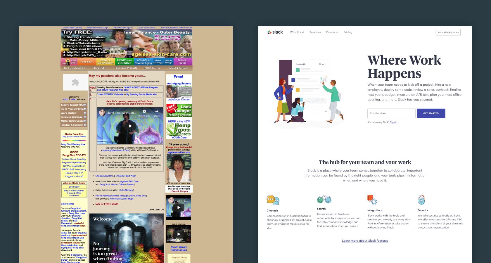
UX experts at the Nielsen Norman Group conducted research to answer the question: How do people read on the web? His findings were simple. They don’t.
The group found that only 16% of first-time visitors to a website are likely to read it word by word. The other 84% will quickly scan for hook elements, such as headlines, sentences, images, or animations before deciding to dig deeper into the material. This behavior isn’t limited to digital interfaces. For instance, people rarely read every word in a newspaper. Instead, they scan the same elements—headlines, images, etc.—to determine what is worthy of their time.
Scannability is, therefore, the approach of laying out content so it is easy to scan. There is often only a short period of time to impress a visitor with valuable content on-screen, making it critical to fully optimize an interface for how users read on the web. Whether the digital product is a website, application, or other type of user interface, scannability is one of the most significant factors of user-friendly design.
The Benefits of a Scannable Interface
The ideal way to determine the scannability of a digital product is to observe it from the user’s perspective and answer these key questions:
- Does the content of the page correspond to audience expectations?
- Is the main message of the page easy to understand in a short time period?
Although scannable interfaces take effort to produce, it pays off in the long run by creating a sticky UI design. Nielsen Norman Group’s study shows that pages optimized for scannability become much more effective in the following ways:
- Users have faster task-completion times
- Users can easily define whether the content is right for them
- Users make fewer errors in recollection
- Users get a better sense of a page’s structure
- A site receives more favorable subjective ratings for credibility and content quality
- Bounce rates are reduced
- The probability of return visits is increased
- Search engine optimization (SEO) is improved
The Power of User Habits in Scanning Patterns
Everyone consumes content differently. However, through research, well-defined eye-tracking patterns have emerged. Knowing how users interact with interfaces within the first few seconds can help designers prioritize content, place important information in the primary visible zones, and establish a strong visual hierarchy.
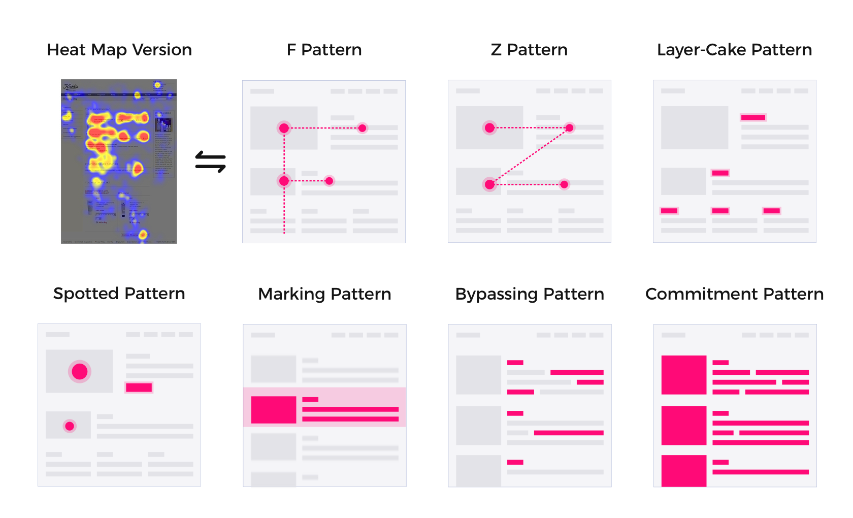
According to the Nielsen Norman Group, there are seven common patterns in which users scan an interface:
- The Famous F Pattern: Twelve years after its discovery, this pattern is still the most common scanning pattern—even when scanning mobile interfaces. The eye moves horizontally, as is typical when reading, then skips to the content below. This can be done slowly and systematically or quickly with a spottier heatmap.
- Z Pattern: The zig-zag model is typical in web pages with a uniform presentation of information and a weak visual hierarchy.
- Layer Cake Pattern: Users follow this pattern when scanning headings and subheadings to quickly determine where (and if) the information they’re seeking can be found on the page.
- Spotted Pattern: Creatives typically follow this scanning model, where they skip big chunks of text and scan visual components such as color, shapes, and proportion anomalies to find a specific piece of information.
- Marking Pattern: Like a dancer fixating on an object to stay balanced as they twirl, users keep the eye focused on one place while scrolling—a very common pattern for mobile UX.
- Bypassing Pattern: Users deliberately skip the first words of a line when multiple lines of text in a list all start with the same word(s).
- Commitment Pattern: This is a rare pattern and only occurs when a user is highly interested in the content and motivated to consume all of it.
Patterns adopted by the user will primarily relate to the motivation for visiting the web page: What type of information are they seeking? How much time are they willing to devote to find it? Are there other websites that could provide this information more quickly?
Delivering Value Through User Research and Scanning Patterns
Dr. Donald Norman, the cognitive science researcher who coined the term “user-centered design,” wrote, “It’s not enough that we build products that function, that are understandable and usable, we also need to build products that bring joy and excitement, pleasure and fun, and yes, beauty to people’s lives.”
User research is a cornerstone of user-centered design and UI design best practices. Subsequently, to improve the scannability of a digital interface, a designer must understand the end user. When UI patterns are designed from the perspective of the end user, a natural and intuitive experience occurs.
Impactful solutions aren’t made of abstractions. Below are a set of digital products that are beautiful, workable, and sustainable. Each design team defined the key audience, used eye-tracking patterns, and designed content layouts to produce a sticky UI.
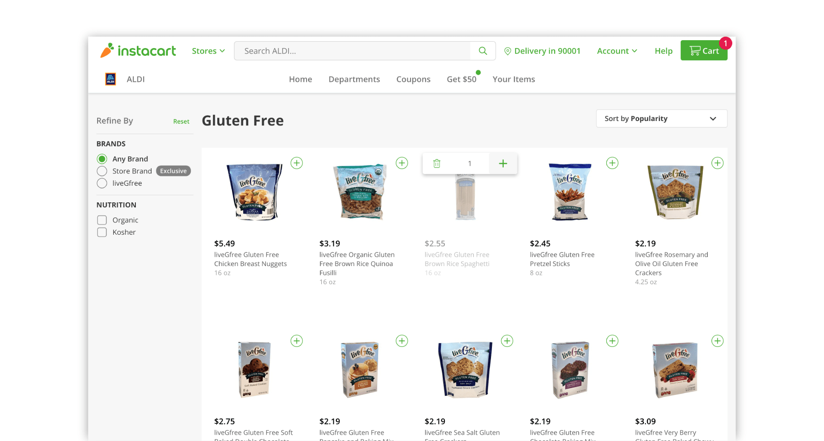
Instacart leverages user-centered design through their UI design patterns. A significant portion of their audience is made up of seniors and users with visual impairments, so the items are listed in a high-contrast grid with a clear emphasis on the main CTAs. The design allows for the Spotted Pattern scanning mode to accommodate long-lasting visitors.
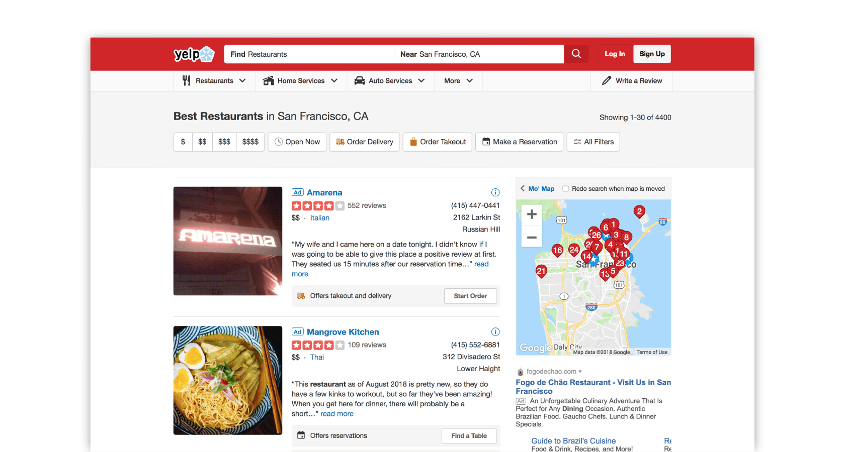
Yelp serves users searching for the absolute best restaurants, shopping, nightlife, food, etc. People are likely to assess reviews based on their own personal criteria and thorough research, making the F Pattern the most applicable scanning model. Yelp, therefore, presents content in a way that is easily scannable, with an emphasis on specific elements such as ratings, images, and addresses.
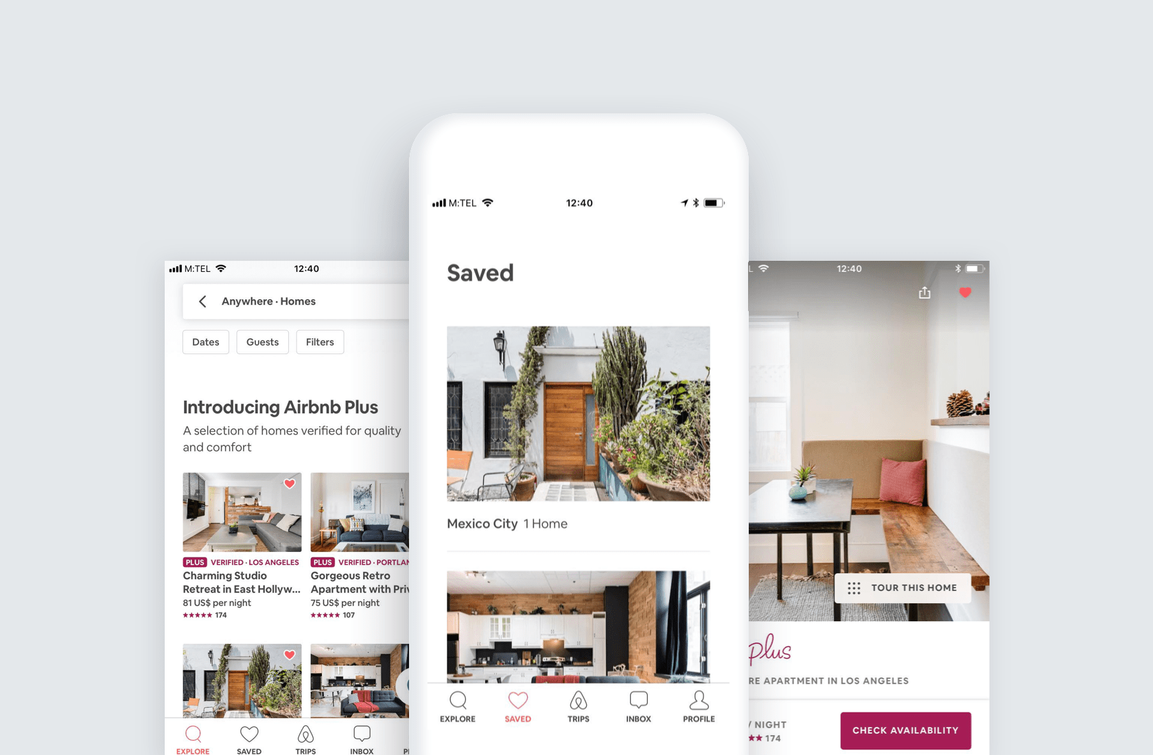
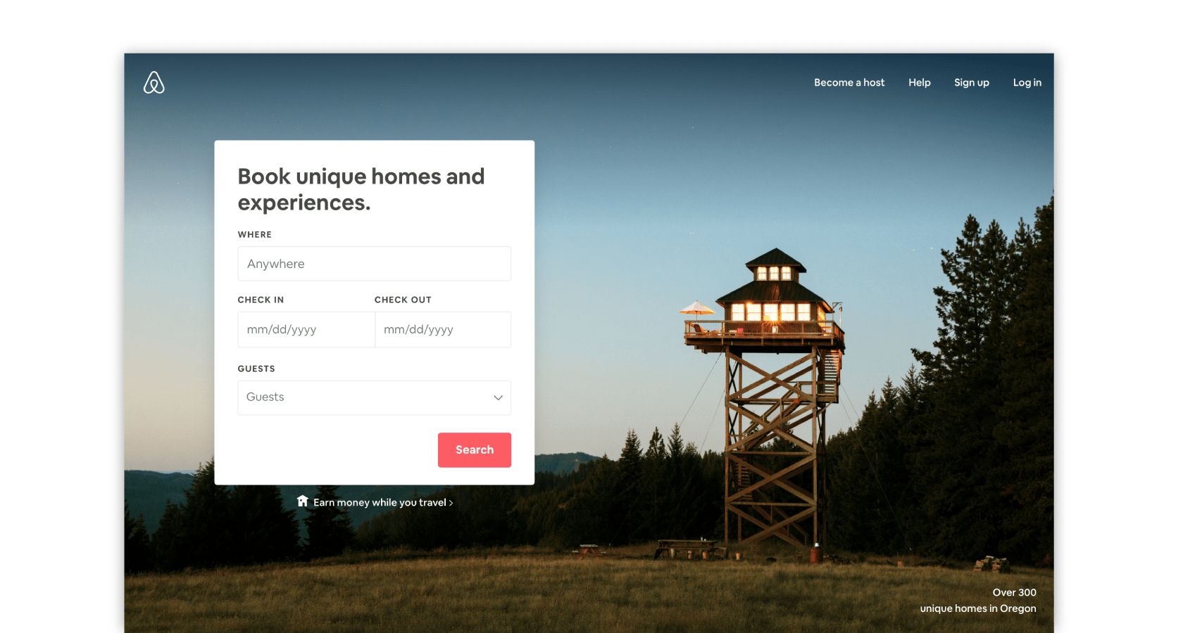
Airbnb is arguably one of the most loved apps out there, and it’s in large part due to their user research. Because they know their users are often on mobile devices, they design to accommodate the Marking Pattern. The clean and intuitive interface is laid out in order to emphasize the large, full-width apartment images. They intentionally kept the number of cover images per screen limited to two so the user can properly dedicate their time and see whether the listing catches their eye or not.
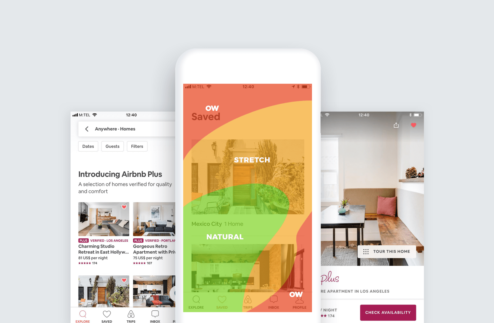
One factor to keep in mind when improving the scannability of a digital product is to define the type of device on which it will be viewed. Airbnb’s mobile platform receives significant traffic. As seen in the heat map of thumb usage, Airbnb strategically placed the most commonly used UI elements, such as “Explore” and “Saved Searches,” within easy access while scrolling—and scanning.
UI Design Best Practices for Better Scannability
Create a Proper Visual Hierarchy
The visual hierarchy of a digital interface refers to the arrangement and presentation of UI design elements to communicate levels of importance so users can quickly scan for desired information. There are several factors in designing a layout with proper visual hierarchy:
- Size
- Color
- Contrast
- Proximity
- Alignment
- Negative Space
- Repetition
By taking these UI design patterns into consideration while creating a UI layout design, a designer will ensure that the final product has a great looking, harmonious, and intuitively scannable layout.
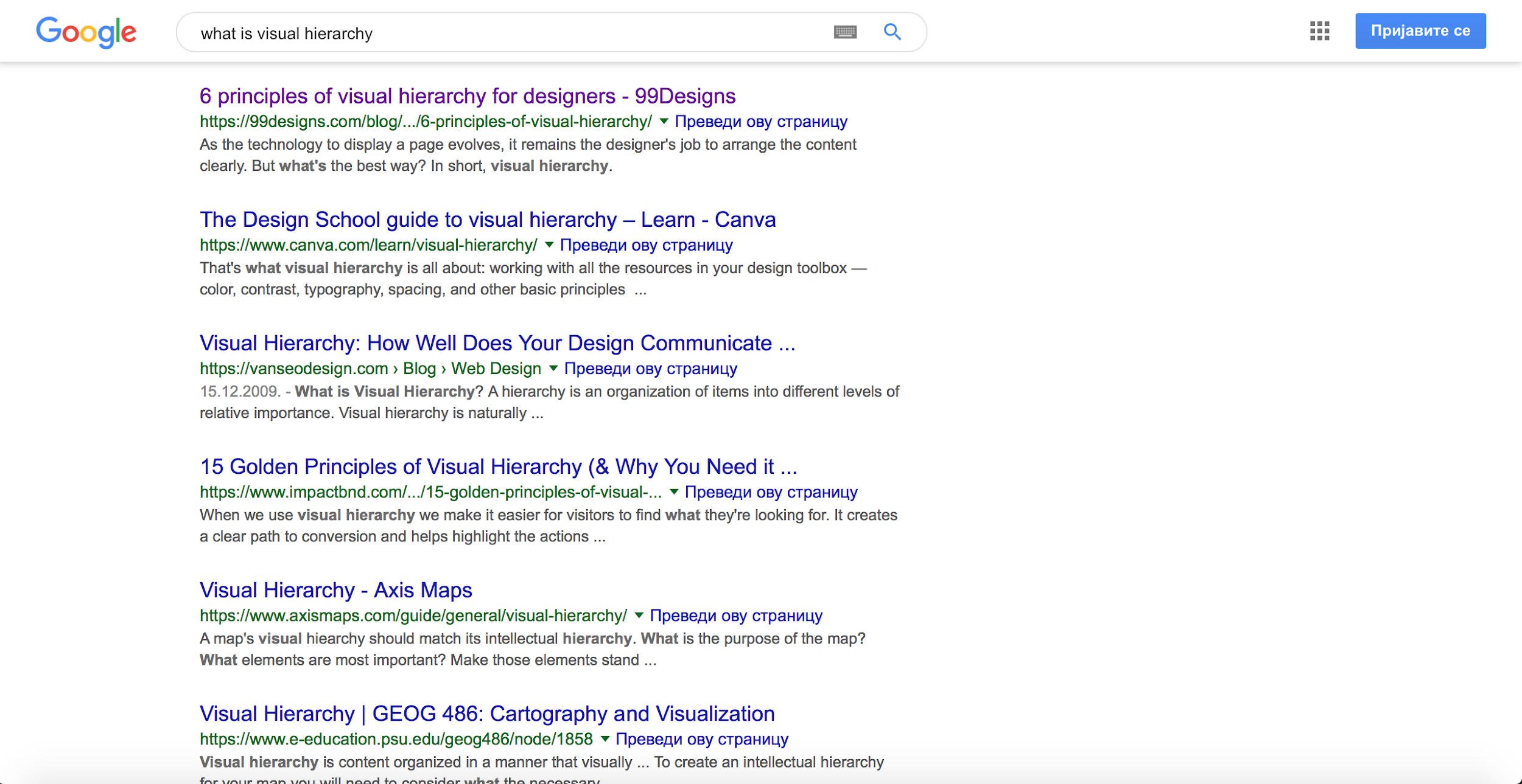
Google’s search results page uses all of the visual hierarchy factors to increase scannability. The headlines are emphasized by the use of color, size, and subsequently, contrast. The negative space surrounding each headline contributes to it being the first thing a user will scan.
When a user finds a relevant headline, they might check the link for credibility—an element that is easily recognizable due to color and proximity. Next, to better evaluate the result, they will dig into the content copy which is consistent in color, size, and proximity. In addition to these factors, repetition and alignment make Google search results generally easy to scan.
Leverage Negative Space
The brilliant Claude Debussy once said, “Music is the space between the notes.” The same sentiment is true for scannability—negative space between elements is what makes a layout successful. The proper amount of negative (white) space around UI elements brings focus to the elements themselves. It emphasizes the content and provides the necessary breathing space to ensure the layout doesn’t feel cluttered. Without breathing space, the human brain is less likely to scan points of interest and more likely to be confused.

Use Subheadings to Summarize Content
People often respond negatively to large chunks of text. It can trigger the assumption that they will lose time if the paragraph doesn’t match their interests. UI design best practices offer a solution to this issue. By adding brief subheadings at the beginning of long articles, the user has ultimate insight into the topic.
While writing the subheading, it is crucial to keep it to the point. Simply communicate the key message the content below is offering.
Create Bulleted and Numbered Lists
The human brain is very systematic—it observes content and then groups it into meaningful units. Therefore, a user is more likely to comprehend a bulleted or numbered list than several points merged into a textual paragraph.
The negative space created by lists makes it easier for a user to scan, so it is beneficial to look carefully for opportunities. If more than two points within a text parallel one another and they each require no more than two sentences to describe, this is a strong candidate for a list. Nielsen Norman Group provides even further insight into creating bulleted digital content.
Visualize the Content
Modern digital users are naturally visual and are not always likely to respond well to textual content (even if it is perfectly structured and follows all the UI design tips for ideal scannability). External environments will always be a factor. Therefore, to offset text-heavy layouts, the use of images and graphics offer both informative and emotionally appealing visual breaks. As the saying goes, a picture is worth a thousand words!
Original visuals (illustrations, engaging photos, etc.) can easily capture a user’s attention and support the general stylistic concept. What’s more, they can improve the visual hierarchy and make the text easier to digest. However, there is a danger that a graphic can cause a counter effect if not used properly. Before transforming key ideas into graphics, it’s critical that designers completely understand the content they are designing.
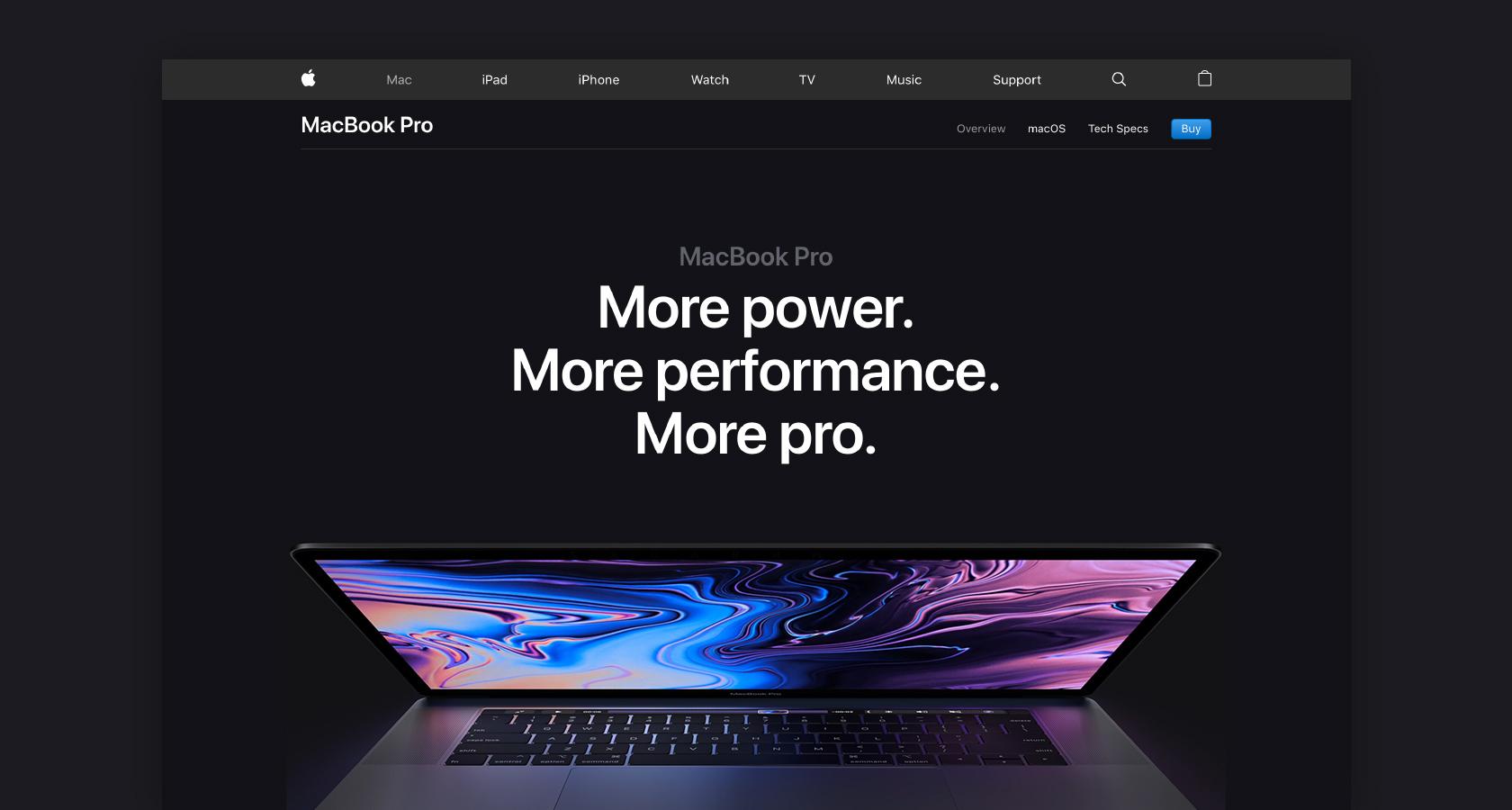
Set Appropriate Emphasis on the CTAs
The majority of digital experiences are aimed at eliciting a particular action from the user. Although call-to-action (CTA) buttons often look very simple, they are strategically designed to help the user complete an action—such as buy, add to a basket, or simply go to another page.
UI design best practices suggests positioning the CTA close to the content that describes the action, making it intuitive for the user. An effective way to test whether the CTA is well proportioned, colored, and positioned is to temporarily convert the final design to grayscale. If the CTA remains distinctly visible and emphasized, the sticky UI is done well.
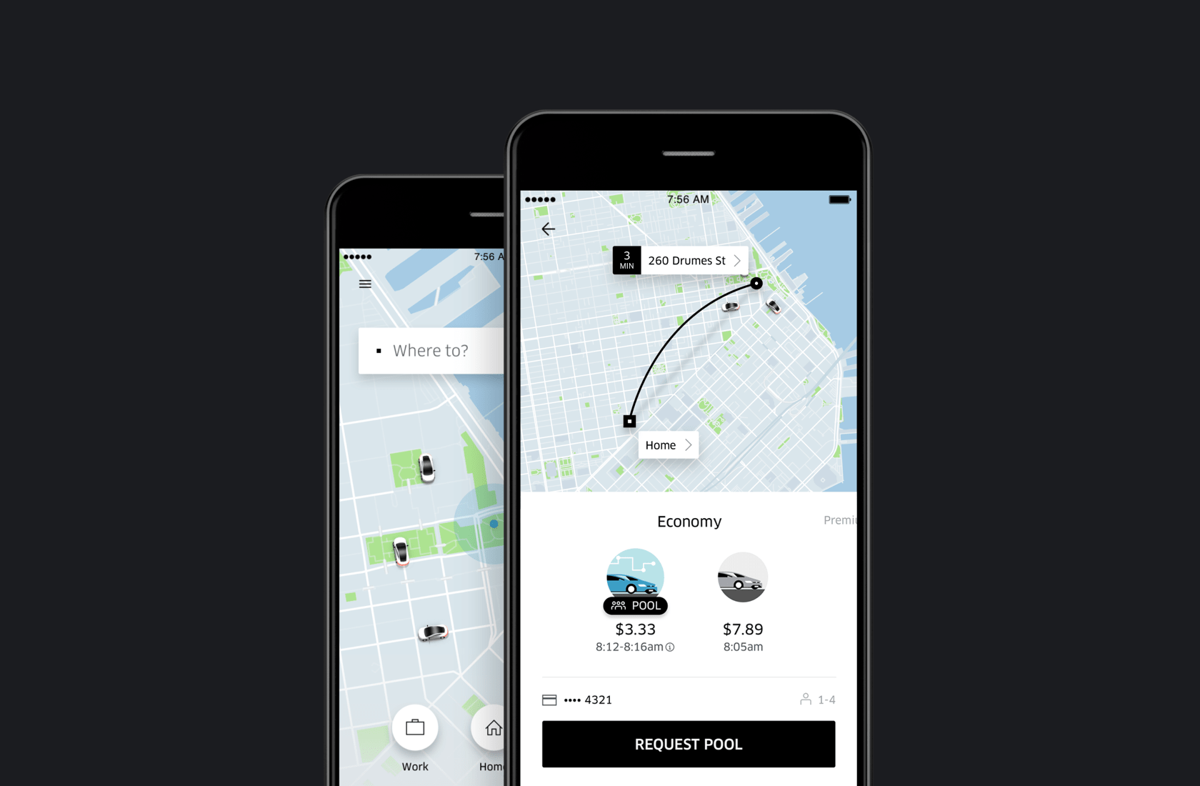
The Importance of Scannability
There are a lot of elements that determine whether a UI layout design will be well received by people—such as content relevance, competitor solutions, and business logic. According to Forbes, scannability may be the most overlooked factor of content marketing. By creating scannable content, a short-term visitor can become a long-lasting user.
Scannable content demonstrates to the end user that their time is valued and provides the opportunity to understand the core message by simply glancing over a layout design. Viral blogger and journalism professor Kim Keller points out to designers that “you’re starting a conversation with someone whom you want as a customer. It’s a relationship, and no relationship can survive if you don’t spend time together. Respect their time and make it worthwhile.”
Further Reading on the Toptal Blog:
Understanding the basics
What is a UI pattern?
UI design patterns are a collection of UI design best practices for visual user interface design. They offer guidance to commonly occurring problems that product designers face. They indicate how to handle the design of elements such as notifications, galleries, user chats, and other common pieces of UI design.
What is a UX pattern?
UX design patterns are a collection of best practices for the user experience of a design. They offer guidance to commonly occurring problems that product designers face. Combined with UI design patterns, they provide consistency and familiarity in interactions within a user experience.
What is eye tracking used for?
Eye tracking can be used for many reasons, especially in psychological studies. In UX design, eye tracking indicates how a user moves through a design. Eye movements reflect the thought process of a user, which can be difficult to articulate otherwise. It informs the layout design to create sticky UI.
What is scannable content?
Simply put, scannable content is text and images in a layout that a user can quickly read at a glance. This is accomplished through the strategic layout of content. It creates sticky UI and is used in UI design best practices to effectively turn a brief visitor into a long-lasting user.
Banja Luka, Republika Srpska, Bosnia and Herzegovina
Member since November 19, 2018
About the author
Nemanja is a designer who creates distinctive and visually appealing UI/UX. He leads large-scale user-centric and result-driven projects.
