
Data Visualization: Best Practices and Foundations
Data visualization is a coherent way to visually communicate quantitative content. Depending on its attributes, data may be represented in different ways, such as line graphs and scatter plots.

Data visualization is a coherent way to visually communicate quantitative content. Depending on its attributes, data may be represented in different ways, such as line graphs and scatter plots.

Mayra is an illustrator, graphic designer, and web designer, providing solutions for Canon, Salesforce, and Johnson & Johnson. With more than 10 years of experience, she creates solutions to fit any company’s needs—from simple and complex.
Clutter and confusion are not attributes of data—they are shortcomings of design. – Edward Tufte
Michael Friendly defines data visualization as “information which has been abstracted in some schematic form, including attributes or variables for the units of information.” In other words, it is a coherent way to visually communicate quantitative content. Depending on its attributes, the data may be represented in many different ways, such as a line graph, bar chart, pie chart, scatter plot, or map.
It’s important for graphic designers to adhere to data visualization best practices and determine the best way to present a data set visually. Data visualizations should be useful, visually appealing and never misleading. Especially when working with very large data sets, developing a cohesive format is vital to creating visualizations that are both useful and aesthetic.

Why Use Data Visualization
According to IBM, 2.5 quintillion bytes of data are created every day. The Research Scientist Andrew McAfee and Professor Erik Brynjolfsson of MIT point out that “more data cross the internet every second than were stored in the entire internet just 20 years ago.”
As the world becomes more and more connected with an increasing number of electronic devices, the volume of data will continue to grow exponentially. IDC predicts there will be 175 zettabytes of data by 2025.
All of this data is hard for the human brain to comprehend—in fact, it’s difficult for the human brain to comprehend numbers larger than five without drawing some kind of analogy or abstraction. Data visualization designers can play a vital role in creating those abstractions.
After all, big data is useless if it can’t be comprehended and consumed in a useful way. That’s why data visualization plays an important role in everything from economics to science and technology, to healthcare and human services. By turning complex numbers and other pieces of information into graphs, content becomes easier to understand and use.

When to Use It
Since large numbers are so difficult to comprehend in any meaningful way, and many of the most useful data sets contain huge amounts of valuable data, data visualization has become a vital resource for decision-makers. To take advantage of all this data, many businesses see the value of data visualizations in the clear and efficient comprehension of important information, enabling decision-makers to understand difficult concepts, identify new patterns, and get data-driven insights in order to make better decisions.
It is worth spending resources on data visualization design solutions. Understanding large data sets is necessary for making an informed decision—whether it be in business, technology, science, or another field. Clear visualizations make complex data easier to grasp, and therefore easier to take action on.
AI-powered tools are changing how designers approach early data visualization explorations. Designers can use AI platforms to synthesize large datasets and identify trends or to generate initial concepts for charts and dashboards. Human oversight is essential to provide proper context, accuracy, and an unbiased, ethical presentation, but these tools can speed first explorations and help designers uncover elusive patterns.

Principles
Define a Clear Purpose
Data visualization should answer vital strategic questions, provide real value, and help solve real problems. It can be used to track performance, monitor customer behavior, and measure effectiveness of processes, for instance. Taking time at the outset of a data visualization project to clearly define the purpose and priorities will make the end result more useful and prevent wasting time creating visuals that are unnecessary.
Know the Audience
A data visualization is useless if not designed to communicate clearly with the target audience. It should be compatible with the audience’s expertise and allow viewers to view and process data easily and quickly. Take into account how familiar the audience is with the basic principles being presented by the data, as well as whether they’re likely to have a background in STEM fields, where charts and graphs are more likely to be viewed on a regular basis.
Use Visual Features to Show the Data Properly
There are so many different types of charts. Deciding what type is best for visualizing the data being presented is an art unto itself. The right chart will not only make the data easier to understand, but also present it in the most accurate light. To make the right choice, consider what type of data you need to convey, and to whom it is being conveyed.
Here Are the Most Popular Types of Charts for Data Visualization:
Line Charts: Line charts should be used to compare values over time, and are excellent for displaying both large and small changes. They can also be used to compare changes to more than one group of data.

Bar Charts: Bar charts should be used to compare quantitative data from several categories. They can be used to track changes over time as well, but are best used only when those changes are significant.
Scatter Plots: Scatter plots should be used to display values for two variables for a set of data. They’re excellent for exploring the relationships between the two sets.

Pie Charts: Pie charts should be used to show parts of a whole. They can’t display things like changes over time.

Keep It Organized and Coherent
Coherence is especially important when compiling a big data set into a visualization. A coherent design will effectively fade into the background, enabling users to process information easily. The best visualizations help viewers reach conclusions about the data being presented without being “in-your-face” or otherwise drawing attention to themselves. They simply show the data in the best possible way.
Creating a hierarchy of data shows the various data points in a relevant way for decision-makers. You can sort from highest to lowest to emphasize the largest values or display a category that is more important to users in a prominent way.
Even the order in which data is displayed, the colors used (such as brighter colors for the most important points, or gray for baseline data), and the size of various elements of a chart (like expanding certain slices of a pie chart beyond the chart’s regular border) can help users interpret data more easily. Beware of creating bias where there should be none when using these techniques.
Make Data Visualization Inclusive
Color is used extensively as a way to represent and differentiate information. According to a recent study conducted by Salesforce, it is also a key factor in user decisions.
They analyzed how people responded to different color combinations used in charts, assuming that they would have stronger preferences for palettes that had subtle color variations since it would be more aesthetically appealing.
However, they found that while appealing, subtle palettes made the charts more difficult to analyze and gain insights. That entirely defeats the purpose of creating a visualization to display data.
If charts with similar colors—and less contrast—are difficult to read for the average person, they are even more difficult for people that don’t have perfect vision—and they represent a significant part of the population. According to WHO, an estimated 253 million people live with vision impairment.
Fortunately, there are tools available to check how an image will be visualized by people with these impairments, like the color blindness proofing in Photoshop and Illustrator. Other things like using sufficiently large font sizes and adequate contrast between type and the background are also helpful.
There are also accessibility-focused plugins and browser-based tools that make testing easier during the design process. In Figma, for example, plugins like Stark, Contrast, and Color Blind help designers simulate visual impairments and evaluate color contrast to identify accessibility issues before development.
On the web, tools like the WebAIM Contrast Checker and Adobe Color Accessibility Tools help designers validate their palettes and improve readability across all interfaces.
If the simulation tools reveal problems with the color palette, there are techniques that can improve the graph readability:
- Use colors that have high contrast.
- Complement the use of color with pattern or texture to convey different types of information.
- Use text or icons to label elements.
The font choice can affect the legibility of text, enhancing or detracting from the intended meaning. Because of this, it’s better to avoid display fonts and stick to more basic serif or sans serif typefaces.
Make sure the data visualization has a legible font size for its medium. Smashing Magazine suggests “16 pixels should generally be the minimum size for body copy in modern web design.”
Don’t Distort the Data
A great data visualization should tell the story clearly, avoiding distortions. Avoid the use of visual representations that don’t accurately represent the data set, like pie charts in 3D.
Data visualizations can lead viewers to certain conclusions without distorting the data itself. This can be particularly useful in designing things like infographics for public consumption, usually created to support a specific conclusion rather than to just generally convey data. Things like color choices and calling out specific data points can be used to this end without creating graphics that are misleading (which could potentially call a designer’s credibility into question).
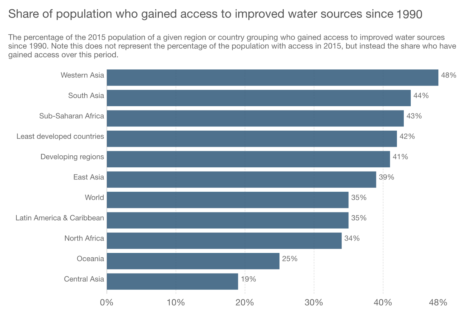
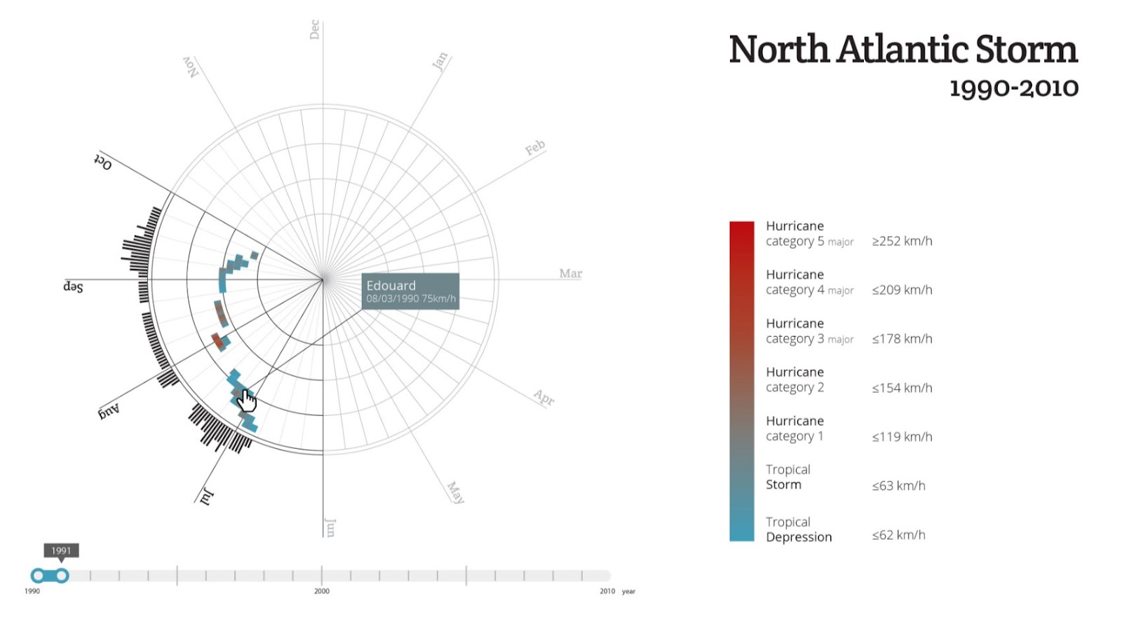
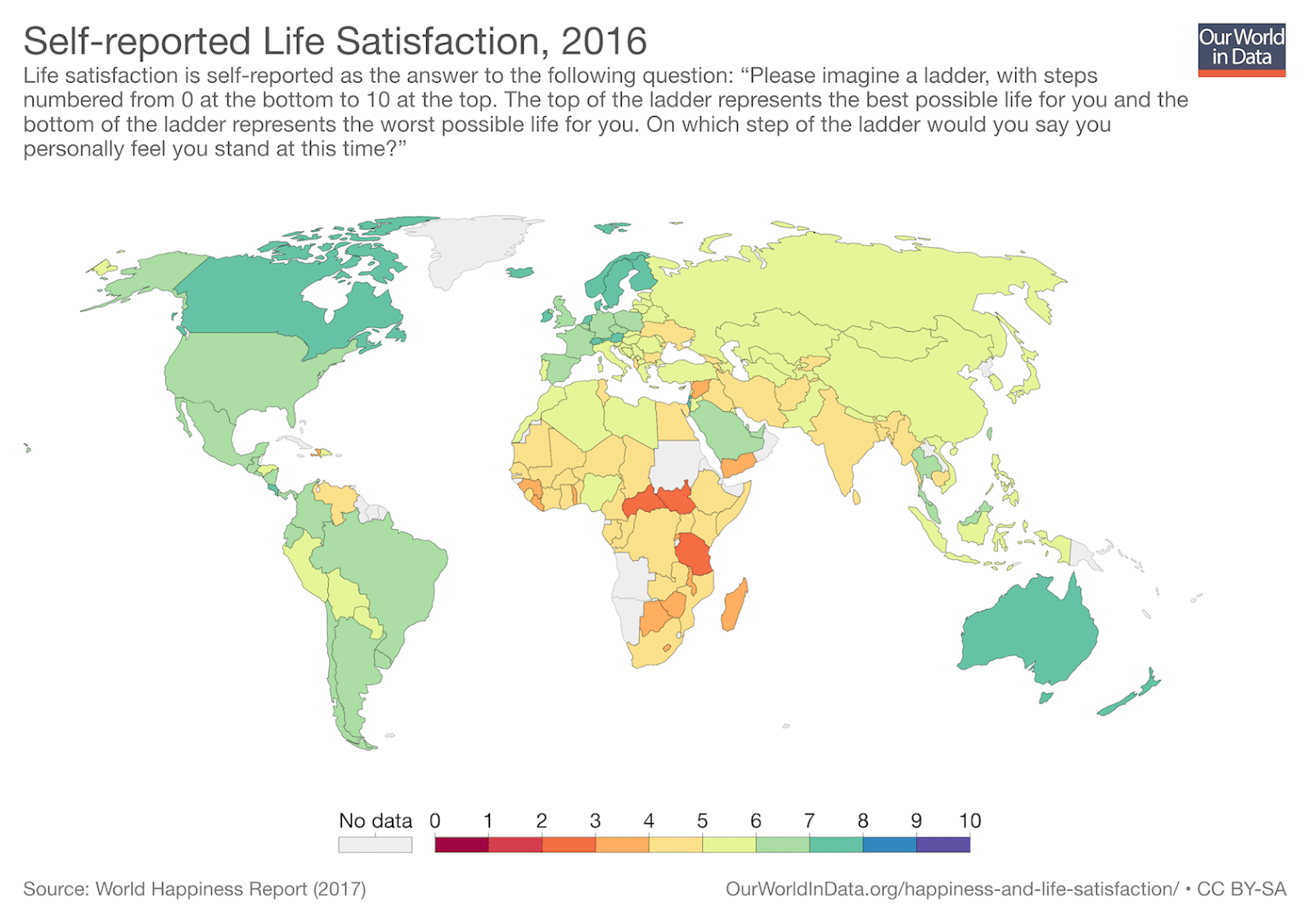
Examples of Bad Data Visualizations
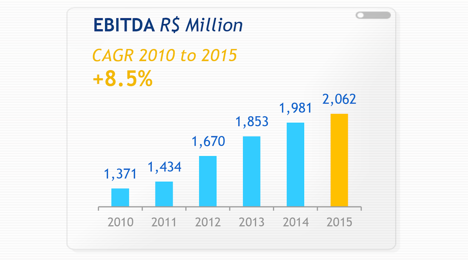


Examples of Good Data Visualizations


Conclusion
Good data visualization should communicate a data set clearly and effectively by using graphics. The best visualizations make it easy to comprehend data at a glance. They take complex information and break it down in a way that makes it simple for the target audience to understand and on which to base their decisions.
As Edward R. Tufte pointed out, “the essential test of design is how well it assists the understanding of the content, not how stylish it is.” Data visualizations, especially, should adhere to this idea. The goal is to enhance the data through design, not draw attention to the design itself.
Keeping these data visualization best practices in mind simplifies the process of designing infographics that are genuinely useful to their audience.
Further Reading on the Toptal Blog:
- Dashboard Design: Considerations and Best Practices
- A Complete Overview of the Best Data Visualization Tools
- Empty States: The Most Overlooked Aspect of UX
- Upgrade Your Analytics With These Dashboard Design Inspirations
- Presentation Design and the Art of Visual Storytelling
- The Importance of Human-centered Design in Product Design
Understanding the basics
Data visualization is a type of visual communication that provides a coherent way to present quantitative content, such as large data sets. It makes complex data more accessible and easier to understand.
Contrasting colors have a significant difference in luminance or hue that makes them distinguishable from one another. For example, white and black are at opposite ends of the luminance spectrum and are therefore high contrast. Blue and orange are on opposite sides of the color wheel, and also have high contrast.
Sufficient color contrast on the web makes it easier for users to distinguish between objects or design elements, improving user experience. Adequate color contrast is also key to creating websites that are accessible to visually impaired users.
São Paulo - State of São Paulo, Brazil
Member since February 9, 2018
About the author
Mayra is an illustrator, graphic designer, and web designer, providing solutions for Canon, Salesforce, and Johnson & Johnson. With more than 10 years of experience, she creates solutions to fit any company’s needs—from simple and complex.